


Good Grains, Designing Honesty into the Cereal Aisle
Gel Builds Good Grains Into a Transparency-Led Cereal Identity With Ancient Grain Roots and a Yeti at the Table
There is a particular kind of challenge that does not announce itself as a branding problem. It shows up disguised as a category problem, a trust problem, a timing problem. When Good Grains came to Gel, it looked like all three.
The cereal aisle has been in a slow collapse of credibility for years. Families that once reached for a box without thinking now read every label with suspicion. “Better for you” had become a marketing phrase hollowed out by repetition. Brands promising clean ingredients often buried the less flattering details in small type, behind bright colors and cartoon mascots designed to distract. Parents noticed. And over time, many of them simply stopped buying cereal altogether.
Good Grains founder Cory Olson had watched this happen and decided to do something about it. His belief was simple: cereal should be made from real food, not formulas. No refined sugar, no seed oils, nothing ultra-processed. He had a name. He had a character — a yeti named Freddy, carried over from an earlier version of the brand. And he had a launch target: Expo West, one of the most watched stages in the natural products industry, roughly two months away.
What he needed was everything else.
The Brief
Brand strategy. Identity system. Packaging across five SKUs. Character development. A fully custom e-commerce website. All of it built from the ground up on an accelerated timeline.
The scope was not unusual. What made it interesting was the constraint baked into the brief: this brand could not afford to look like it was hiding anything. Every decision — color, type, layout, character, tone — had to earn trust before it earned attention.
That is a harder design problem than it sounds. Most consumer packaging is built on a logic of appeal: lead with what is exciting and manage what is complicated. Good Grains needed to invert that. The label had to be the pitch.
Audience: The Harmony-Driven Household
Before anything went to paper, Gel spent time understanding the audience — not just demographic data but the actual tension they were living with.
The primary buyer is a millennial parent. A label reader. Someone who has done enough research to be skeptical and has been burned by brands that looked clean on the outside and read like a chemistry experiment on the back. They want to make good choices for their family, but mornings are busy. They need convenience without compromise.
Their kids, meanwhile, are at the table. And kids want something that feels fun, something with a little magic to it.
That gap — parent skepticism and kid joy — is where most cereal brands collapse. They either go clinical and lose the children, or they go playful and lose the parents. Good Grains needed to live in the middle. Not as a compromise, but as a genuine point of view.
Gel defined this target as the harmony-driven household: families seeking balance between health and taste, parent priorities and kid preferences, responsibility and ease. That framing became the filter for every creative decision that followed.
Strategy: Nothing to Hide
The strategic question Gel kept returning to was simple: what does Good Grains actually own that no one else in the category can claim?
There were a few honest answers. The Non-UPF certification — which Good Grains became the first cereal brand in the category to earn — was one. The use of Khorasan wheat, an ancient grain essentially untouched for thousands of years, was another. And then there was the most straightforward thing: an ingredient list short enough and clean enough to read in ten seconds, with every word on it understandable to a regular person.
That last one became the foundation. Not as a claim. As a design decision.
The ingredients were not going to be hidden on the back panel, listed in six-point type below the nutrition facts. They were going to be front and center. They were going to be the brand.
“Nothing to hide” is not just a tagline. It is a structural principle that ran through every creative decision from that point forward — from the color palette to the typography to the way flavor is expressed on pack.
The Creative Inspiration: Nostalgia, Modernized
Before getting to visual decisions, Gel needed to answer a question that sits underneath strategy: what should this brand feel like?
The answer came from an honest place. There was a time when cereal meant something at the breakfast table. Characters on the box. Flavors that felt like a treat. A ritual that kids looked forward to and parents did not think twice about. That era was not perfect — the sugar content alone tells that story — but it produced something real: a genuine sense of joy around breakfast that has largely disappeared from the category.
The modern response to that history has mostly been to erase it. Clean eating brands stripped out the fun along with the additives. The result is a cereal aisle full of products that feel like homework. Trustworthy, perhaps. But not something anyone gets excited about.
Good Grains was not trying to be that. The design brief was, in a sense, to recover what was worth keeping from the old era — the warmth, the playfulness, the sense that breakfast could be something the whole table looks forward to — and rebuild it on a foundation the category had never really had: full transparency about what is inside the box.
Nostalgia was the emotional starting point. Modernization was the discipline applied to every decision. The result is a brand that feels familiar without being retro, fun without being dishonest, and warm without being soft on the thing that matters most: the ingredients.
That tension — honoring the past, demanding more of it — runs through every visual choice in the system.
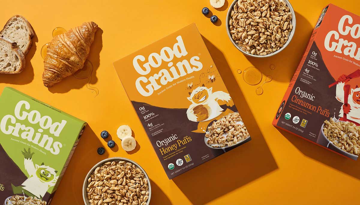
Visual Identity
If the ingredients are the hero, the packaging has to step back and let them lead. That sounds simple. It is harder to execute than it appears, because packaging design has decades of conventions pointing in the opposite direction.
Gel built the identity around a grounded, natural color palette — earthy tones that carry the warmth of that earlier cereal era without any of its artificiality. Not the bright synthetic colors that signal sugar-forward products, and not the beige-and-white minimalism that reads as expensive but joyless. The palette sits somewhere more honest: a real kitchen, a real morning, a table that feels lived in.
Typography is clean and confident. No flourishes, no decorative decisions that add complexity without adding meaning. The type communicates and steps aside.
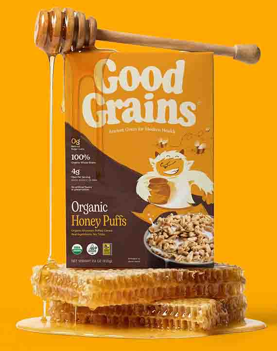
Flavor is present — chocolate, cinnamon, honey — but expressed through organic forms. Actual cinnamon. Actual cocoa. Actual honeycomb. These are flavors people grew up loving, now shown as they actually exist in nature rather than as illustrated approximations designed to look more intense than the product inside. The visual language reinforces the same promise as the ingredient list: what you see is what you get.
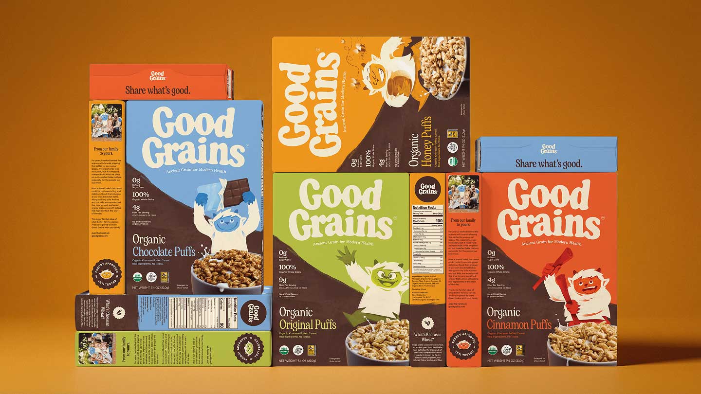
Across five SKUs, the system needed to be flexible without becoming fragmented. Each flavor carries its own color accent and flavor signature, but the family reads as one brand on shelf. That kind of coherence requires making decisions at the system level — not the individual package level — and holding to them.
Packaging as the Full Pitch
One of the more considered decisions in the project: Gel designed the back panel with the same intentionality as the front.
On most cereal boxes, the back is an afterthought. Nutrition facts, maybe a game or a recipe, some regulatory copy. The Good Grains back panel is a continuation of the brand story. The ingredient list reads like something worth reading — because there is nothing to hide.
Khorasan wheat is treated as a featured point of difference. A grain with a story: thousands of years old, never modified, naturally rich in protein and fiber, with a flavor that is genuinely satisfying. Most brands would bury that detail in a footnote. Gel made it part of the brand architecture.
The Non-UPF certification mark appears clearly. Being the first cereal brand to earn this certification is a meaningful credential, and the packaging reflects that. The result is a box parents can hand to a skeptical friend and say: read it. Everything is right there.
Freddy and the Character World
Freddy the Yeti came with the project. Founder Cory Olson brought the character as something worth preserving, and Gel agreed — not out of deference, but because the instinct was right for the brand, and because it connected directly to the nostalgic spirit the design was trying to recover.
Characters on cereal boxes used to mean something. They were the reason kids remembered the brand, the reason breakfast felt like something worth getting up for. That relationship between character and cereal is part of what got lost when the category swung hard toward health-first positioning and stripped the joy out.
Freddy is the bridge. He carries the warmth and playfulness of that earlier era while fitting comfortably into a brand built on honesty. There is a version of “real ingredients, nothing hidden, no nonsense” that ends up being joyless — all credibility, no warmth. Those brands exist. They feel like they are reprimanding you for enjoying breakfast. Freddy prevents that.
But the version of fun had to be right. A hyperactive or cartoonishly loud character would have pulled against the transparency the brand was built on — too reminiscent of the mascots that used to distract from what was actually inside the box.
Gel reimagined Freddy as something mythological and calm. A creature of the wild, naturally drawn to pure things. The illustration style is simple and friendly — modern rather than retro, approachable without being infantile. He works for a six-year-old and does not embarrass a thirty-five-year-old buying the box. He is nostalgic in feeling, not in form.
Alongside Freddy, Gel developed a supporting cast — including Tess, a Loch Ness Monster figure — beginning to build what the team thinks of as the Good Grains world. Characters that connect to brand health, to an active and joyful lifestyle, to the idea that eating well and having fun are not mutually exclusive.
What makes this more than a packaging decision is the long-term design logic behind it. Each new flavor Good Grains introduces will bring a new character with it — mythological creatures drawn from different traditions, each with their own personality and visual language, each belonging to the same world. The characters are not decorative. They are the architecture of a growing brand universe, one that deepens with every SKU and gives consumers something to follow over time.
This is a design strategy that rewards loyalty. The more flavors a family tries, the more of the world they discover. It is the kind of thinking that turns a cereal brand into something closer to a story — and stories, when they are told honestly, are what people remember.
Digital: A Custom Shopify Plus Experience
Good Grains needed more than a template-built site. The brand had genuine visual ambition, and the website had to match it.
Gel designed and built a fully custom Shopify Plus experience from the ground up — UX, visual design, development, and AI-assisted imagery — all within the same two-month window as the packaging work.
The challenge on the digital side was translation. Everything built into the physical packaging — the honesty, the warmth, the balance of credibility and playfulness — had to come through on a screen. A dynamic color system shifts with each product flavor: when viewing the Honey SKU, the site reflects that. Moving to Chocolate, the experience adjusts. It sounds like a small decision. It significantly changes how the brand feels in a digital environment.
The site is built for performance and accessibility, designed to scale as the brand grows. It was live and ready for Expo West.
Expo West: What Happened in the Room
All of this work was designed in service of a moment — the Good Grains booth at Expo West, one of the most important launch stages in the natural products industry.
The booth brought the full brand system into physical space. Same color logic, same character presence, same transparency as the packaging. People who walked up to the booth understood what the brand was before anyone said a word.
And then they tasted it.
Something happened in that sequence that is hard to engineer and nearly impossible to fake. People would walk up, read the label — really read it, the way you do when you are not sure what to expect — and then take a bite. And then smile.
The team heard “this tastes like the cereal I loved as a kid” repeatedly throughout the show. They heard “I have been waiting for something like this.” Buyers stopped mid-conversation to say they were blown away by how little sugar was in the product.
The trade response matched the consumer response. Good Grains received a Golden Ticket from KeHE — one of the highest honors a new brand can receive at that show — and secured national distribution pickup from Sprouts, Erewhon, and Whole Foods. For a brand at launch, that is not just a good outcome. It is confirmation that the design work did what it was supposed to do.
What the Work Was Really About
There is a tendency in design coverage to talk about aesthetics first. The palette, the typography, the illustration style. Those things matter, and Gel is proud of the craft in every one of them.
But the design that performed at Expo West was not primarily about aesthetics. It was about conviction. Cory Olson believed something — that families deserve a cereal with nothing to hide — and Gel’s job was to make sure that belief was visible, legible, and felt across every touchpoint of the brand.
When the label is the pitch, you cannot fake it. Honesty has a visual logic. It shows up in decisions that are easy to overlook: how much white space you leave, how you name the flavors, whether the ingredient list reads like copy or chemistry.
Gel made hundreds of those decisions across a compressed timeline, under the pressure of a fixed launch date, in service of a founder with a clear vision and the confidence to trust the team to execute it.
The smile that happened when people tasted the cereal — that was the payoff. But the smile started when they read the label. That is the design working.
Good Grains launched at Expo West 2025. The brand is the first cereal to earn Non-UPF certification and holds a KeHE Golden Ticket. Available nationally at Sprouts, Erewhon, and Whole Foods. Brand strategy, identity, packaging, characters, and website by Gel — gelcomm.com.
CREDIT
- Agency/Creative: Gel
- Article Title: Gel Launches Good Grains with a Transparency First Cereal Identity Built for Modern Families
- Organisation/Entity: Agency
- Project Type: Packaging
- Project Status: Published
- Agency/Creative Country: United States
- Agency/Creative City: Los Angeles
- Market Region: North America
- Project Deliverables: Brand Architecture, Brand Design, Brand Strategy, Character Design, Packaging Design
- Format: Blister-Pack, Box
- Industry: Food/Beverage
- Keywords: Good Grains, Cereal, Gel, Package Design
-
Credits:
Agency Principal: Patricio Fuentes


