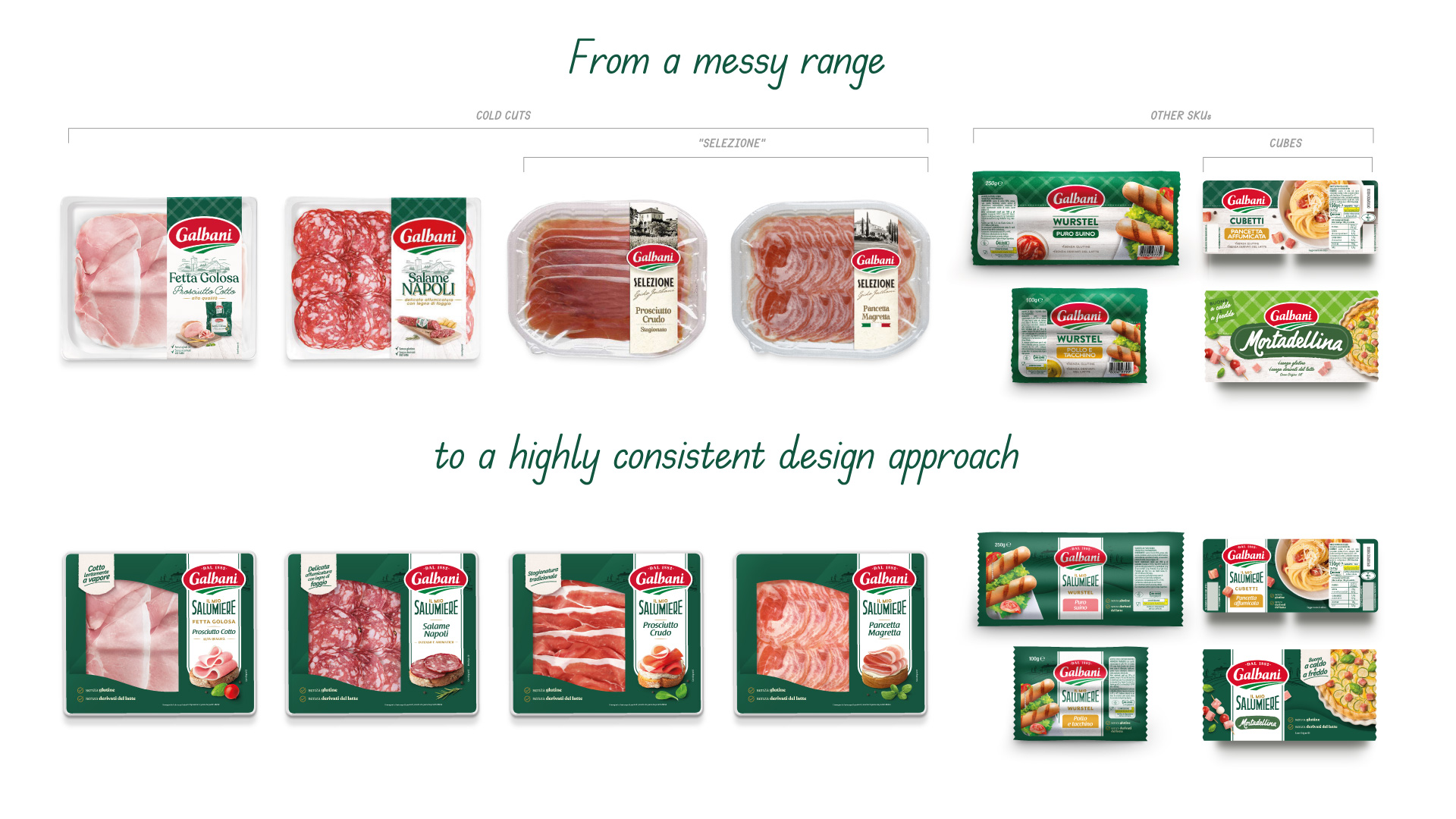
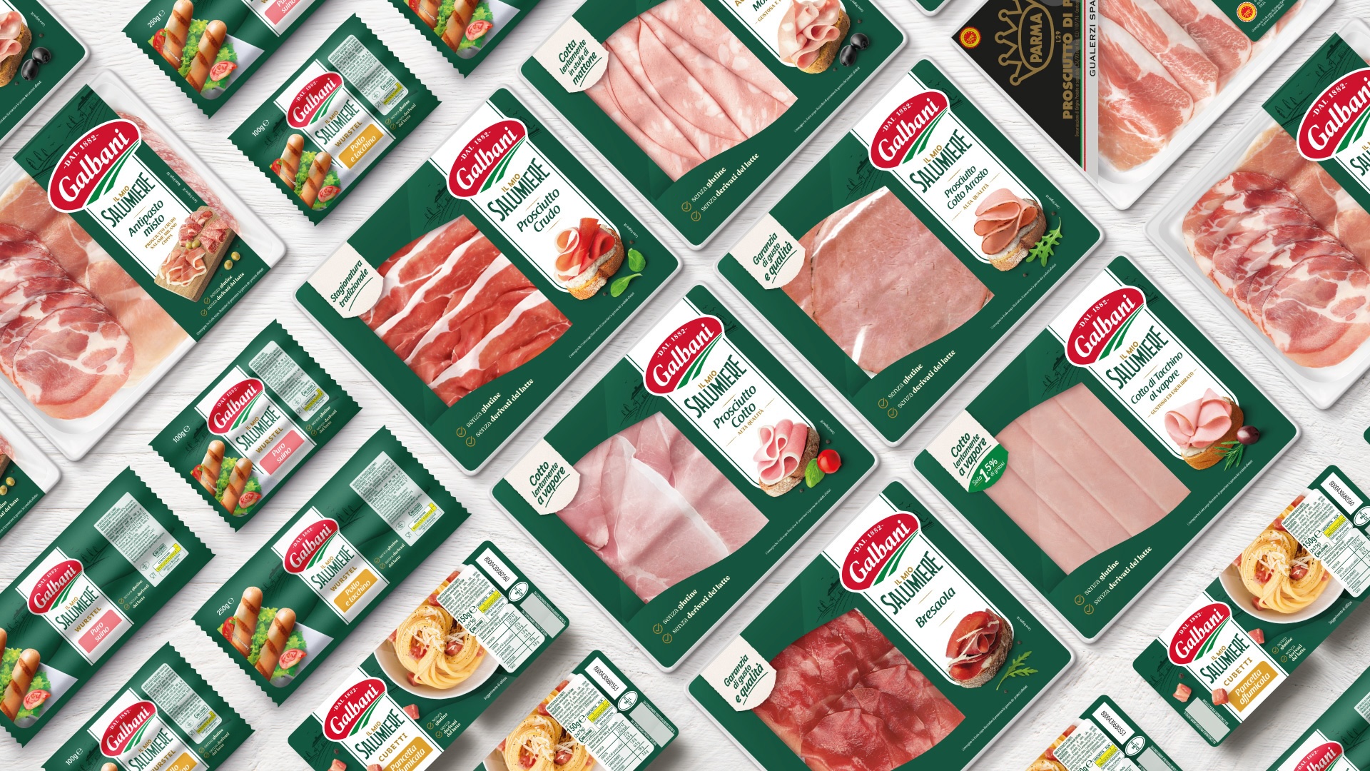
Arc’s renews the cold cuts line packaging with a recognizable and distinctive design.
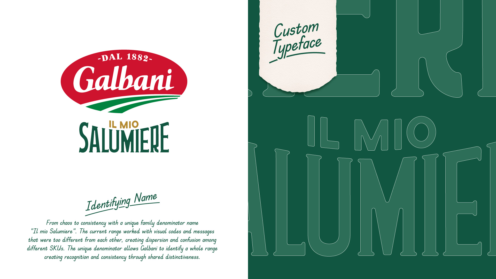
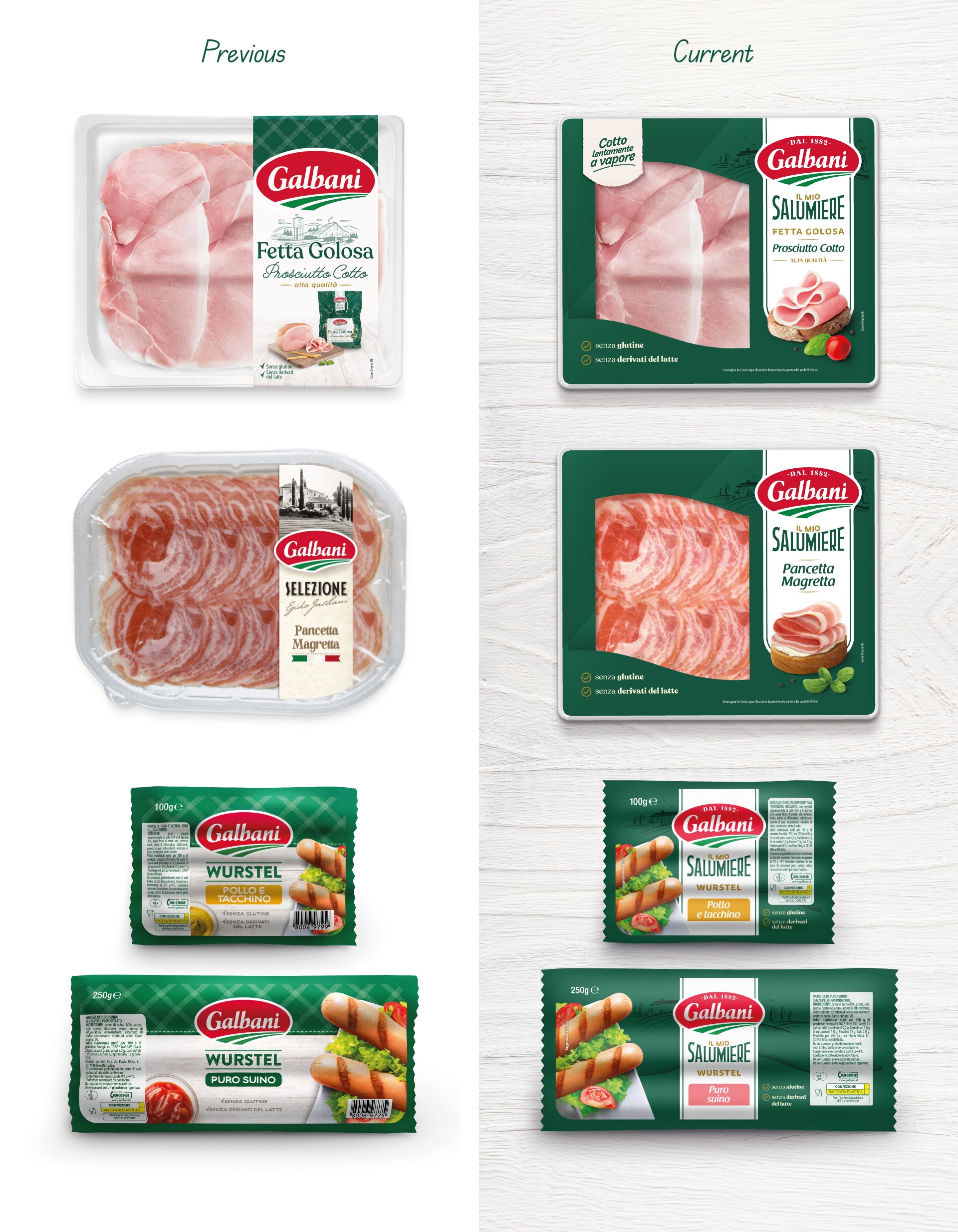
From a common thread research coming up with the naming, “Il Mio Salumiere” (“My Butcher”), to the complete graphic system’s revision to redefine the coherence and balance of each element.
The result is a contemporary and stylish design in which messages coexist and interact, providing consumers with clear and coherent information that reflects the Brand.
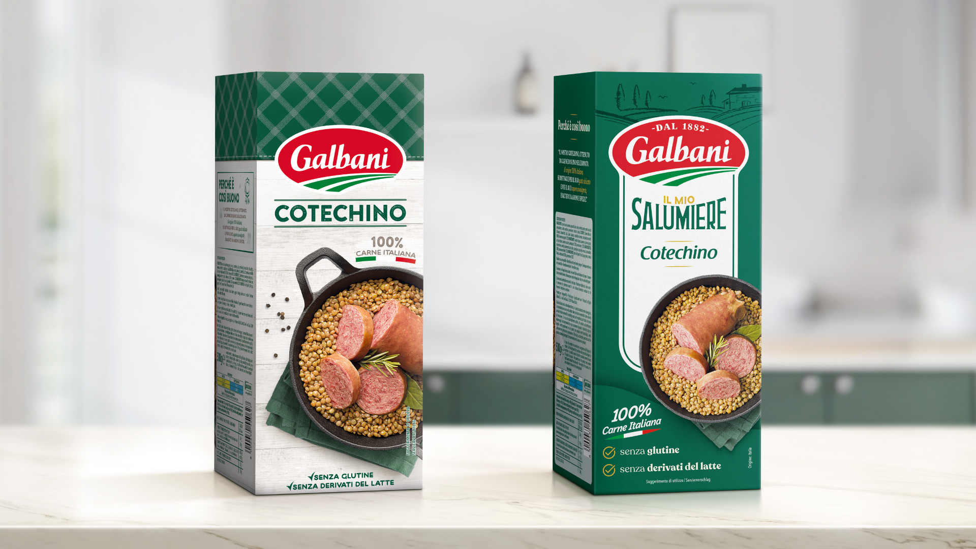
The choice of green as the main color secures the association with the cold cuts category, and the tablecloth texture is replaced by the corporate image also present in dairy products.
The vertical structure of the information is kept and the reading hierarchy is optimized and streamlined.
Brand, range denominator, reference name, and a more inviting key visual coexist in an organic and functional space for the consumer. Secondary information also finds a dedicated space and gains visibility through simple elements integrated with the new packaging’s look&feel.
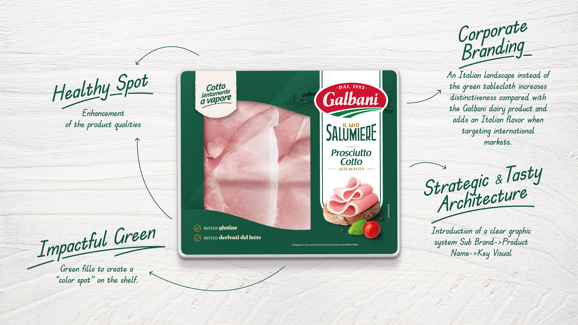
This packaging design for Galbani “Il Mio Salumiere” Prosciutto Cotto reflects a blend of tradition, health-conscious messaging, and strategic visual branding. Here’s a breakdown of its key design elements:
1. Healthy Spot
•The packaging communicates the product’s health benefits prominently:
o Labels such as “Cotto lentamente a vapore” (slowly steamed) emphasize a natural preparation method.
o Icons indicating the absence of gluten (senza glutine) and dairy derivatives (senza derivati del latte) reassure health-conscious consumers.
• This aspect highlights the product’s quality and suitability for modern dietary needs.
2. Corporate Branding
• A stylized Italian landscape illustration is featured in place of the traditional green tablecloth, enhancing the brand’s distinctiveness.
• This element ties the product to its Italian heritage, appealing to international audiences looking for authentic Italian flavors.
• The iconic red Galbani logo stands out against the green background, ensuring instant brand recognition.
3. Impactful Green
• The dominant green color creates a vibrant “color spot” on store shelves, helping the product stand out among competitors.
• The green tone also reinforces the brand’s natural and premium positioning, as green is often associated with freshness and health.
4. Strategic & Tasty Architecture
• The layout is clean and hierarchical, making the product’s identity clear:
o Sub-brand: “Il Mio Salumiere” suggests an artisanal, deli-inspired product line.
o Product Name: “Prosciutto Cotto” is displayed prominently in elegant typography for easy recognition.
o Key Visual: A high-quality image of thinly sliced ham placed on rustic bread, garnished with basil and a cherry tomato, conveys freshness, taste, and quality.
• The integration of text and visuals ensures an appealing and informative presentation.
5. Material and Texture
• While not visible directly, the design appears to be printed on a sleek, high-quality package, which enhances the premium feel.
• A transparent window allows consumers to see the product, building trust and ensuring transparency.
The design strikes a balance between health-focused messaging, Italian authenticity, and visual appeal. It successfully communicates freshness, quality, and tradition, making it attractive to both health-conscious and taste-driven consumers.
CREDIT
- Agency/Creative: Arc's
- Article Title: Galbani Il Mio Salumiere A Tasty Restyling for the New Visual Identity of Galbani’s Charcuterie Range
- Organisation/Entity: Agency
- Project Type: Packaging
- Project Status: Published
- Agency/Creative Country: Italy
- Agency/Creative City: Arc's
- Market Region: Europe
- Project Deliverables: Packaging Design
- Format: Box
- Industry: Food/Beverage
- Keywords: charcuterie range
-
Credits:
General Manager: Matteo Rolfo


