


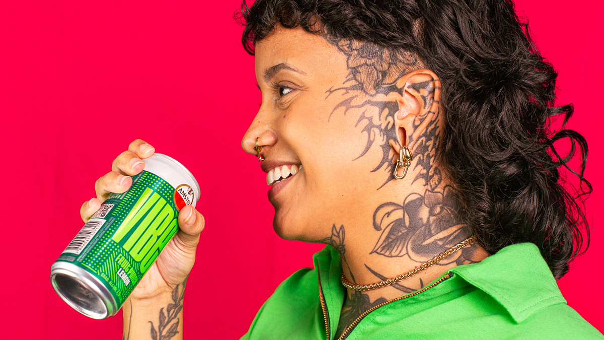
Intro: Created to redefine Amstel’s image in Brazil, Amstel Vibes stands out amid the Heineken group’s product portfolio approach, which is currently heavily centered on beers. The creation of a new Ready-To-Drink product sought to revitalise the context of the Amstel brand, in order to guide its strategy and attention towards a new audience, with a completely different narrative, in an unprecedented product context.
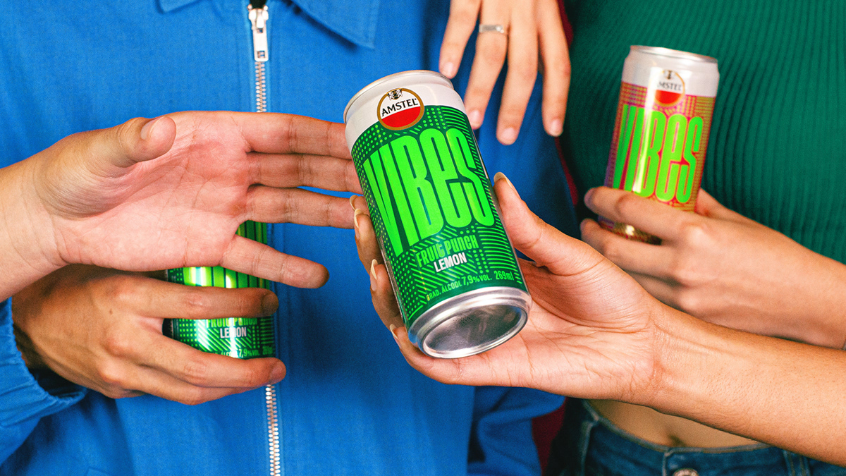
Challenge: Part of our strategy was to understand and connect with Brazilian Gen-Z, Amstel Vibes’ main target audience. A bold generation, which prioritizes authenticity and community experiences that align with their individual values. And despite their natural immersion in the digital world, they seek physical and sensorial experiences amidst the high exposure to information.
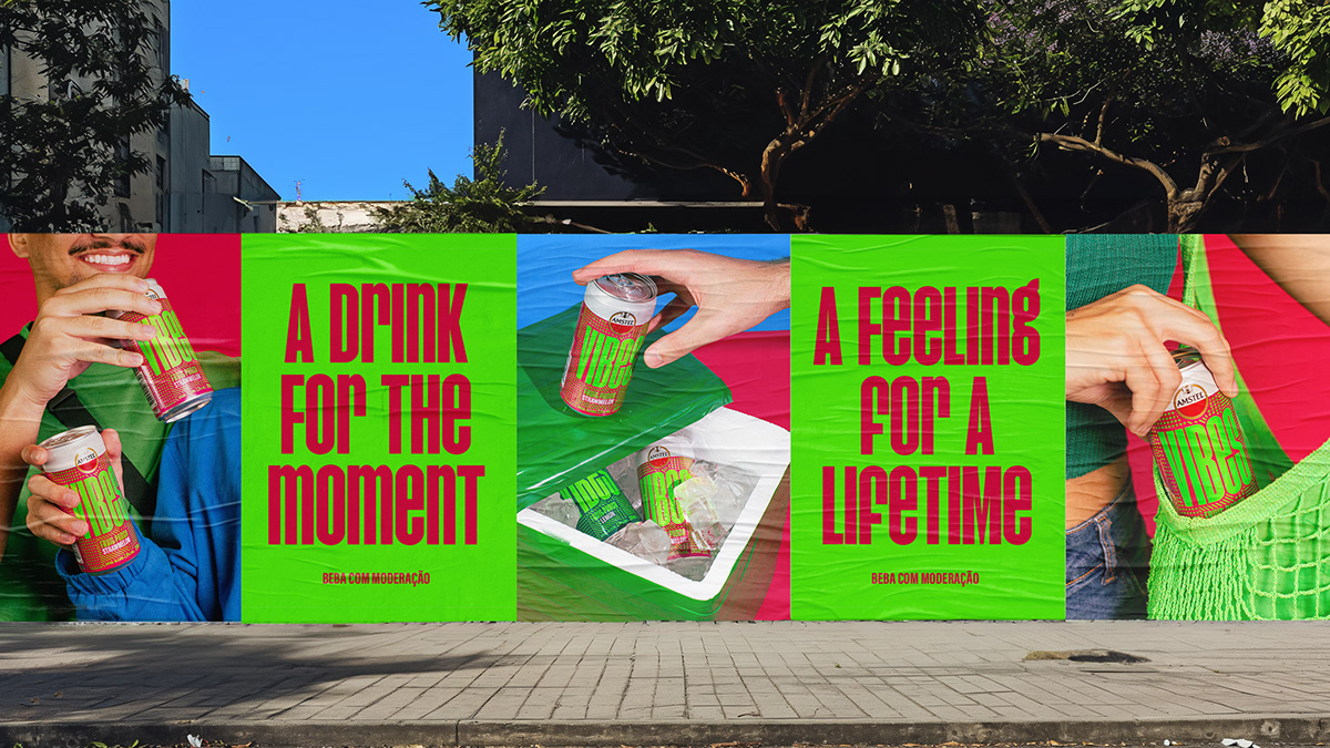
Solution: Understanding the ever-evolving landscape of our target audience, we recognised the importance of transcending traditional associations with the Brazilian RTD (Ready-to-Drink) market, which typically revolve around summertime parties and urban clubs. Instead, we focused on capturing the essence of their feelings and state of mind, going beyond the time of day or location. This insight led us to explore sensory experiences, blending rational and emotional appeals seamlessly.
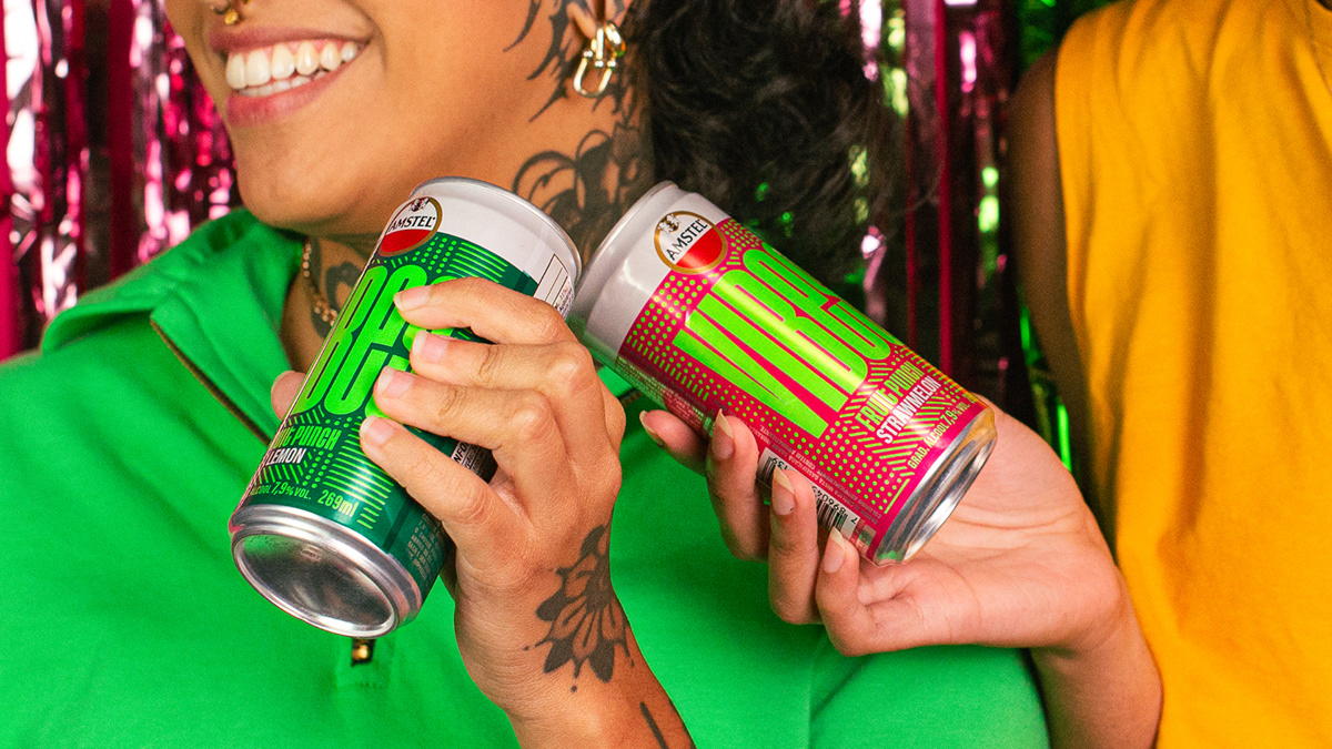
We call it ‘Fizzy Feels’, a concept that encapsulates the moment of peak pleasure when drinking Amstel Vibes, bringing to the brand a sensorial depth that reflects the nature of our audience, inclined towards sensory experiences, emotions and authenticity.
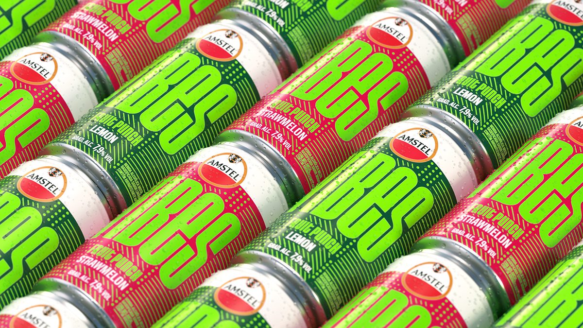
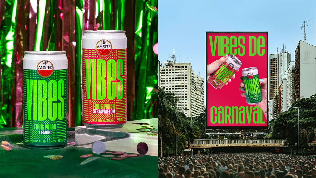
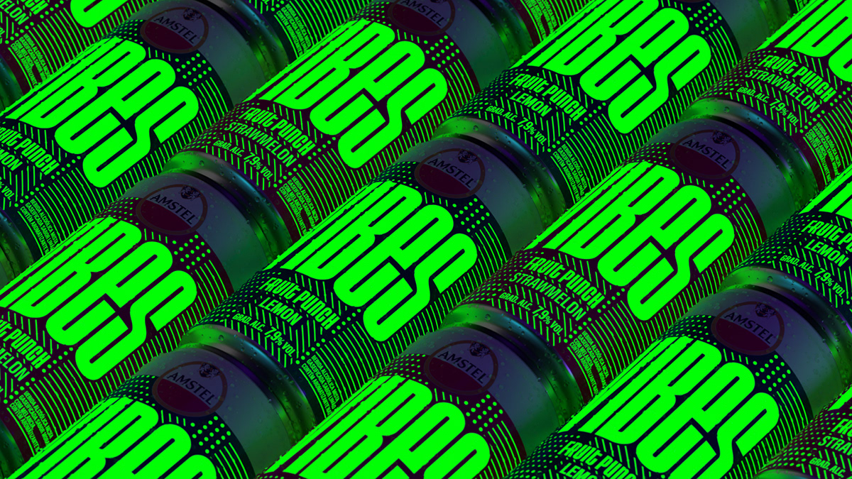
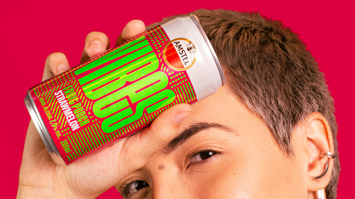
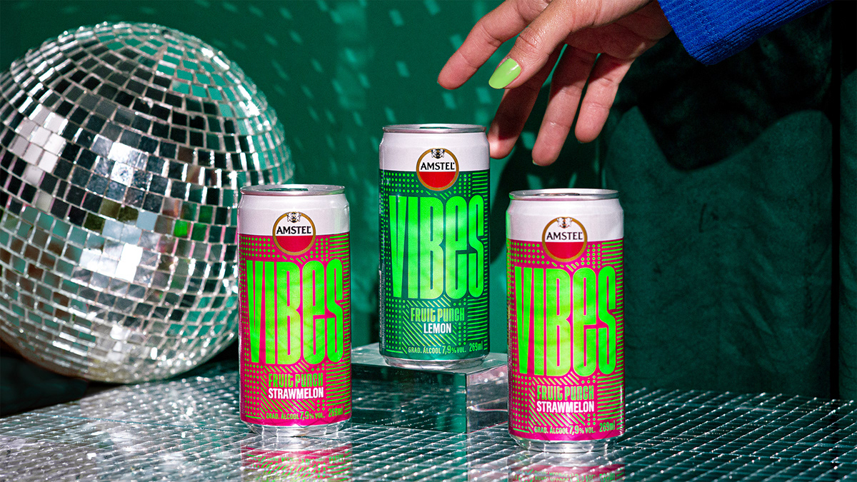
To visually express this concept, our design mix conflicting vibrant colors, inspired by Vibes fruit flavors. The colors on the packaging cause unexpected reactions to our eyes, embracing the sensorial fizzy feel and the dynamism of this generation’s way of life. And here’s where Amstel Vibes sets itself apart: we crafted it to radiate vibrant colors during the day, but also shine with a special glow-in-the-dark printing, transforming it into a visual and sensorial experience at night.
The boldness and spontaneous nature of the typography also expresses the young audience behavior and willingness to be different, white the crafted texture, composed by a mix of dots and lines, was created to evoke that mix of emotions that you can’t really define, but just feel.

CREDIT
- Agency/Creative: FutureBrand São Paulo
- Article Title: FutureBrand São Paulo redefine Amstel’s Vibes and Image in Brazil Amstel
- Organisation/Entity: Agency
- Project Type: Packaging
- Project Status: Published
- Agency/Creative Country: Brazil
- Agency/Creative City: FutureBrand São Paulo
- Market Region: South America
- Project Deliverables: Brand Identity, Packaging Design
- Format: Can
- Industry: Food/Beverage
- Keywords: drink, fresh, amstel, heinkein, packaging design
-
Credits:
Creative Direction: Lucas Machado, Arnaldo Bastos
Lead Design: Carlos Teles
Design: Gustavo Vasconcelos, Carlos Teles, Yara Santos, Pedro Silva, Sofia Ohanna, Nelio Bernadelli
Photography: Gustavo Vasconcelos, Sofia Ohanna
3D and Motion Graphics: Cesar Quirino
Copy & Naming: Camila Gouvea
Strategy: Ana Virtuozo, Gabriel Pacheco, Marina Bruzadin, Isabel Etchenique, Luisa Assaf
Account: David Morais


