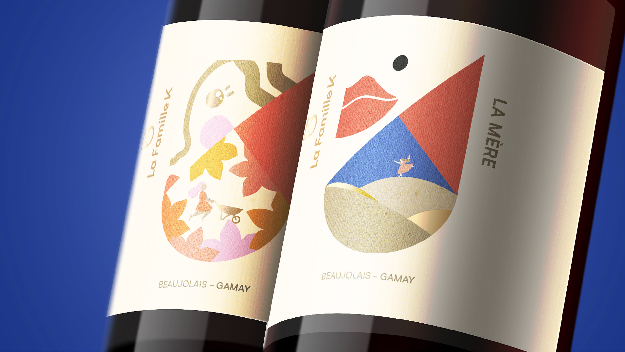
Global brand transformation company, FutureBrand, is excited to reveal details of their work creating the brand identity and packaging for a new range of organic, sustainable and affordable wines – La Famille K – harvested in the Beaujolais region of France.
Beaujolais wines can suffer a mixed reputation and FutureBrand needed to overcome this obstacle by conveying the high quality of La Famille K wines whilst staying true to La Famille K’s humble ambition: to produce organic and sustainable fine wines that are desirable and affordable for all. A further challenge lay in creating a strong and original design that reflected the spirit and personality of the family whilst respecting the rich and old terroir of the Beaujolais wines and region.
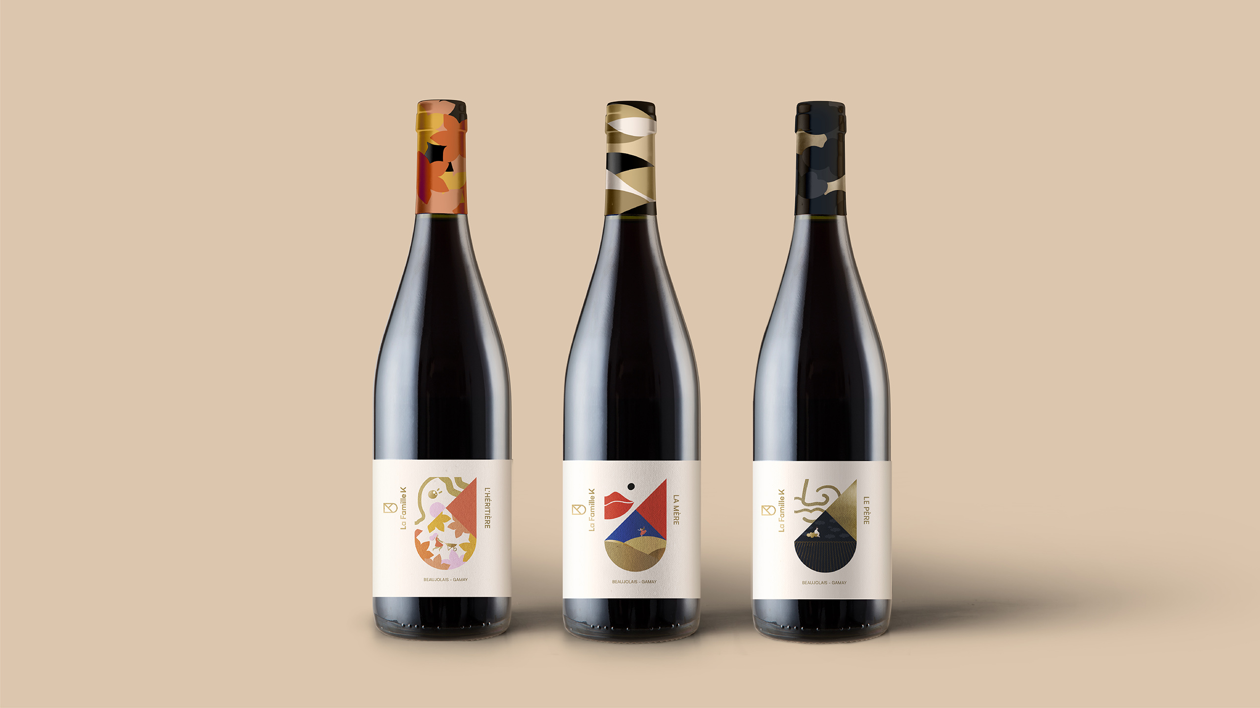
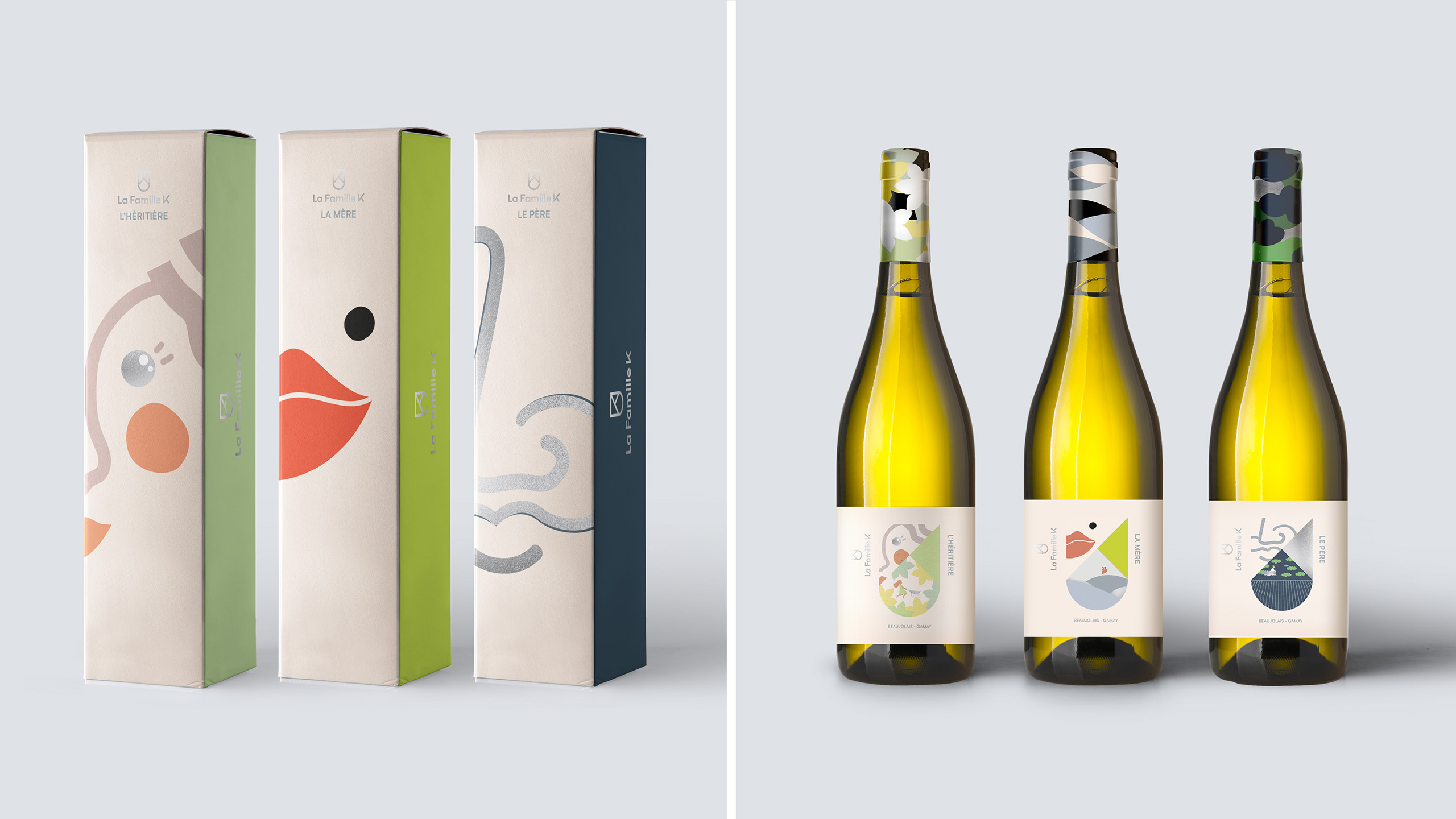
Charlotte Gosset at FutureBrand, commented, “An essential challenge we had to face with this project was to stand out from an overcrowded category with a truly unique and embodied story: La Famille K have two bottles of wine to represent each family member, one red, one white. We used this opportunity to personalise the labels of the wines offering a quirkiness and personality unique to La Famille K. The result is fun and playful, capturing the spirit of the family through jubilant yet uncomplicated illustrations.”
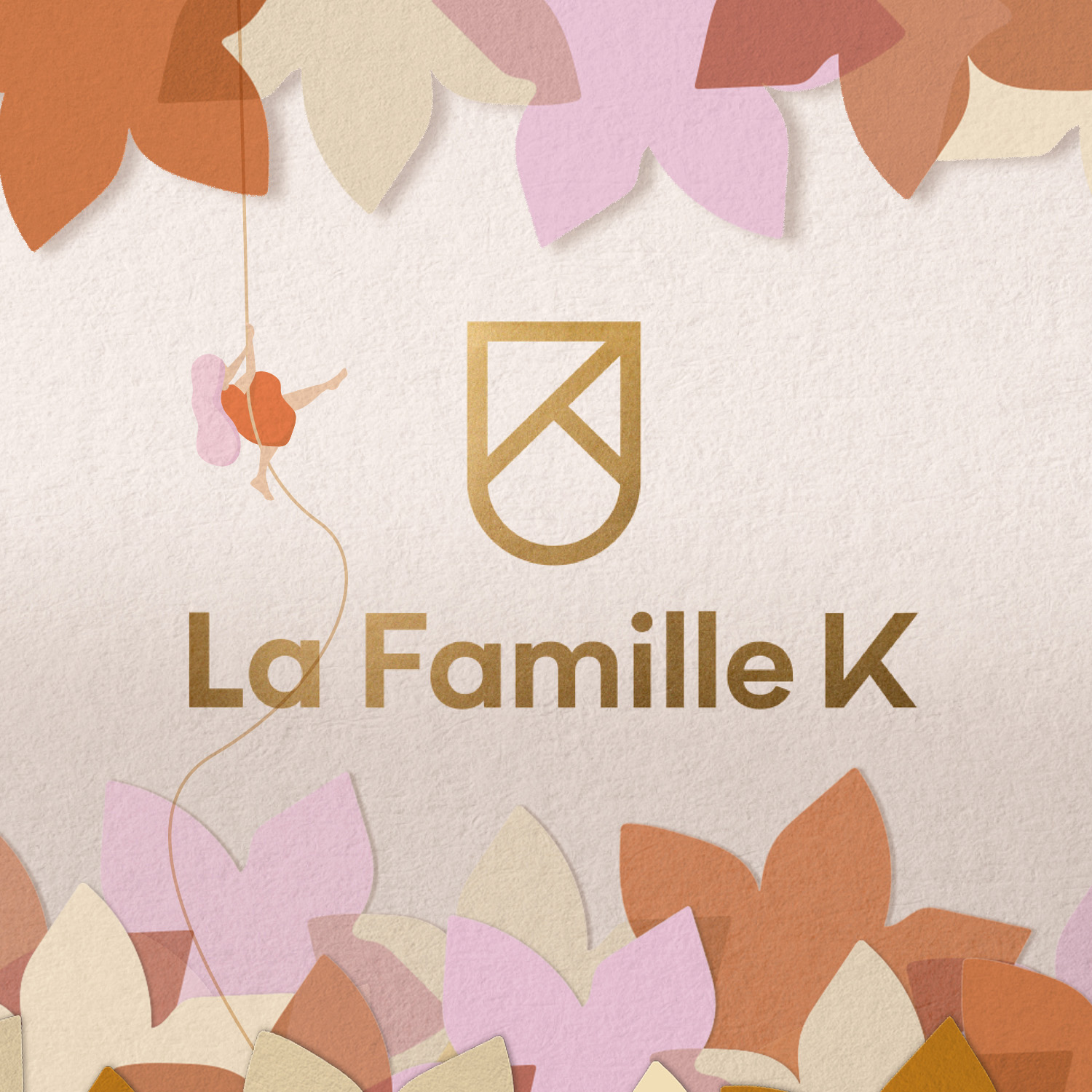
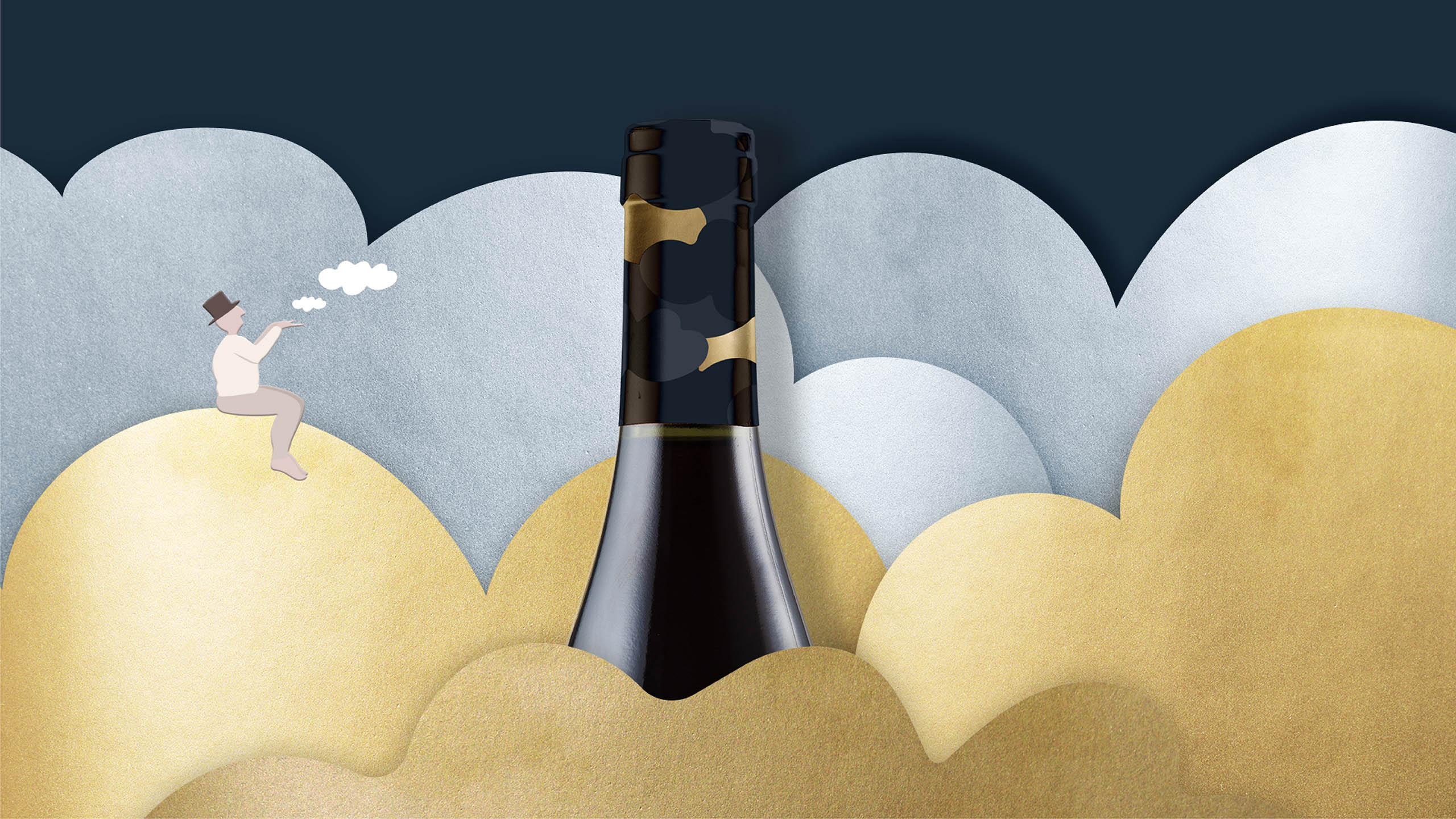
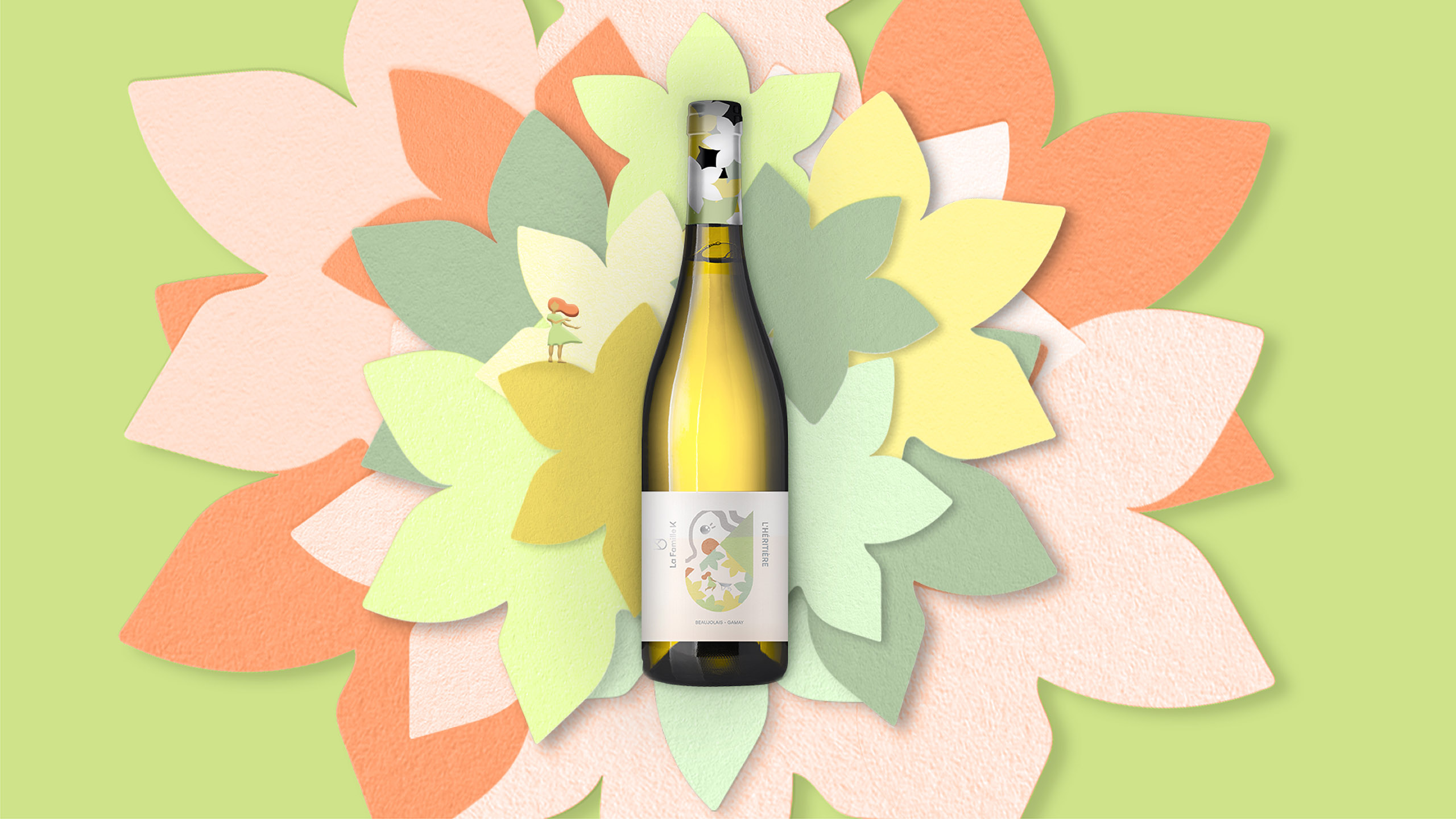
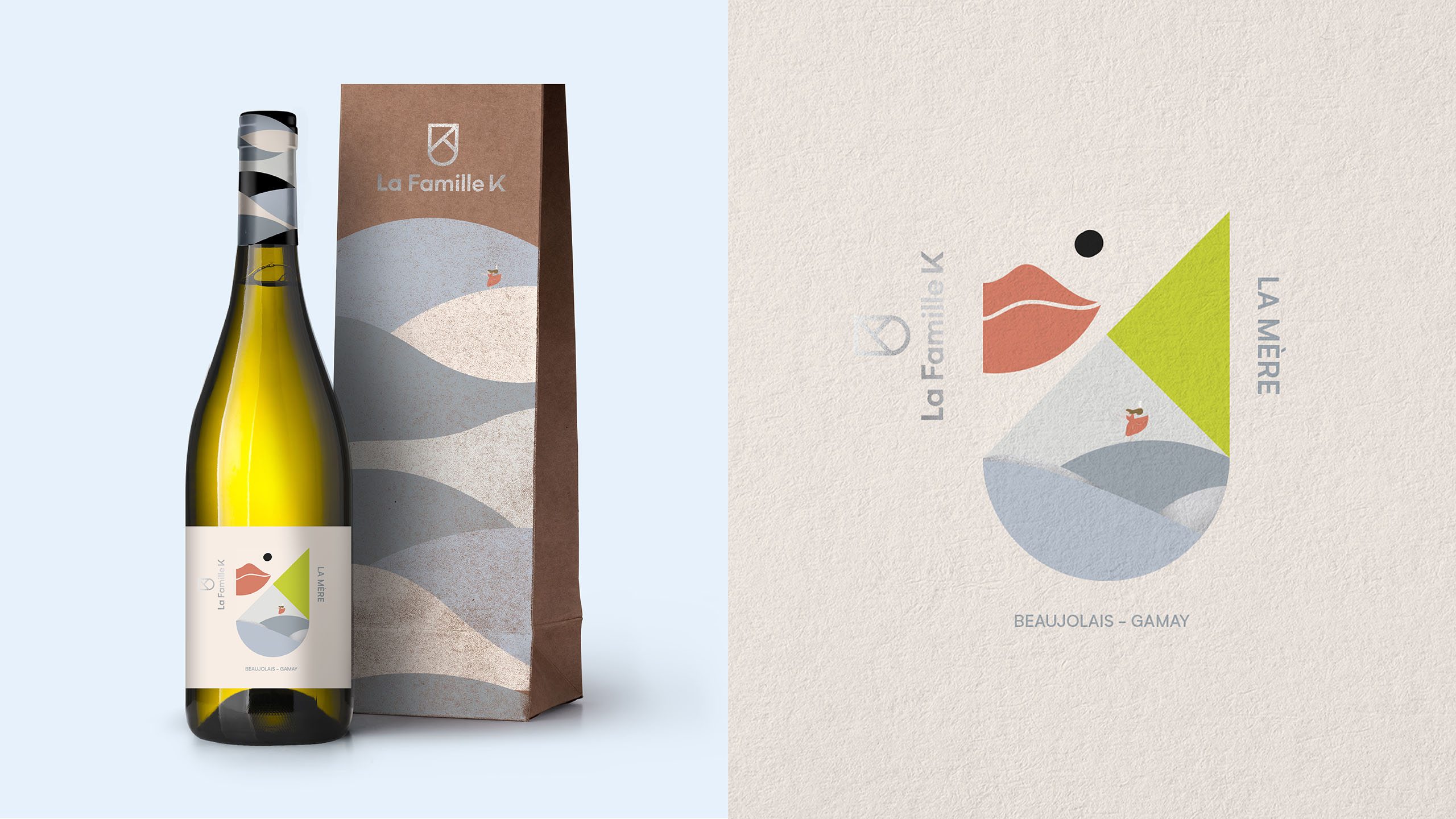
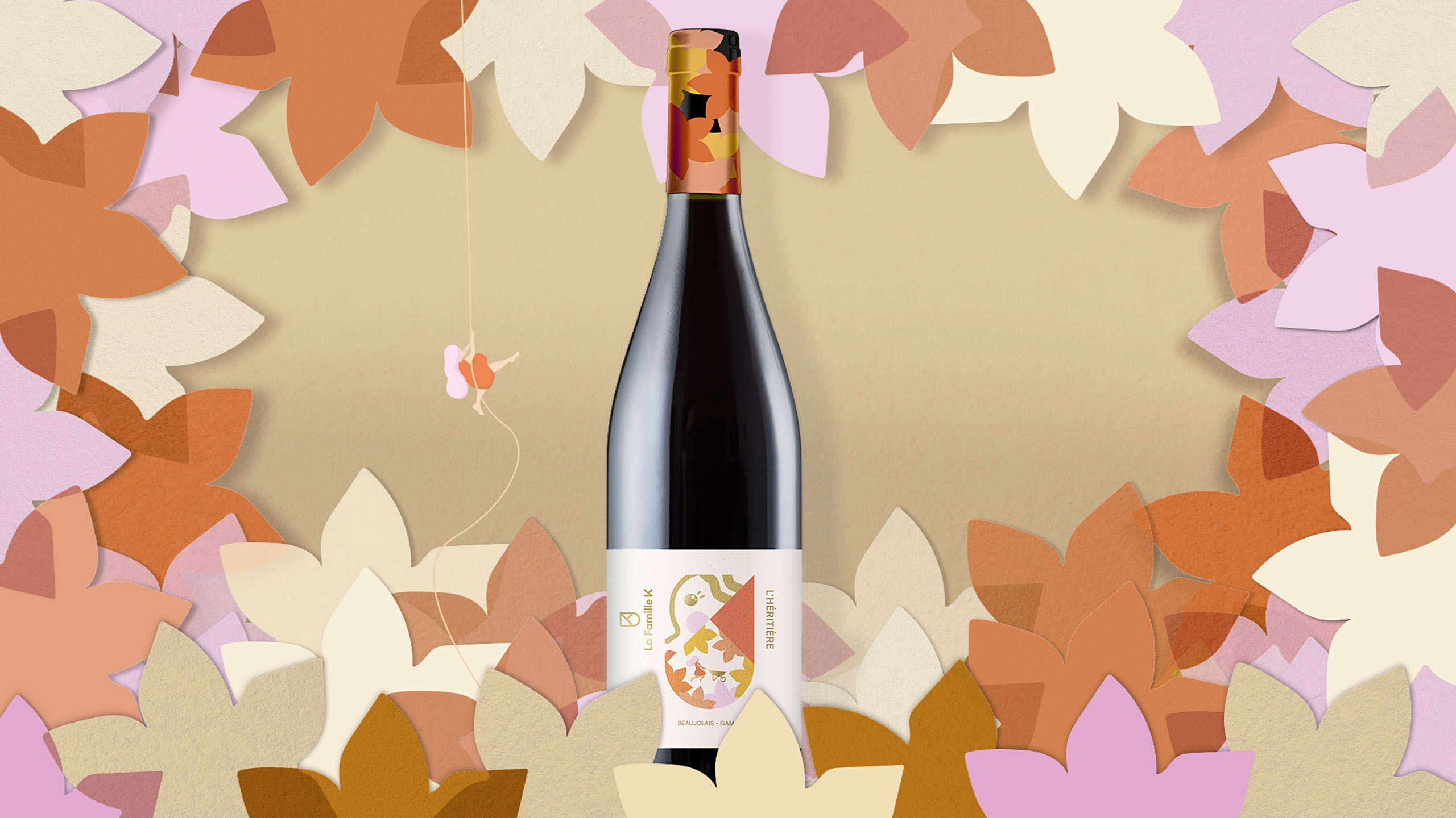
In order to produce modern and refreshing labelling and packaging, whilst remaining loyal to the heritage of Beaujolais wines, FutureBrand designed a family crest for La Famille K. This crest – a K within a coat of arms – creates a contemporary sense of heritage around the wine and each bottle has its own variation on the crest depending on which family member the wine represents. For example, Jeanne is the daughter and heiress to the business and so her youthful, curious outlook is embodied in the designs for the younger wines, whereas Benoit, the father who takes on the main farming duties of the vineyard, is embodied in the designs for the mature – but not overpowering – wines.
Furthermore, the K in the crest of all the labels is used to divide the crest design into three sections:
a coloured section to indicate the maturity of the wine in harmony with the maturity of the family member it represents;
a section to express one of the senses used to drink wine which is reminiscent of the family member the wine is inspired by;
a section with an illustrated picture to convey the spirit of the family member embodied in the wine.
Benoit Merchier at La Famille K commented, “FutureBrand has expertly captured the young and playful nature of our brand and family whilst respecting and paying homage to the heritage of Beaujolais wines.”
CREDIT
- Agency/Creative: FutureBrand
- Article Title: FutureBrand Creates Joyful Brand and Packaging for La Famille K
- Organisation/Entity: Agency, Published Commercial Design
- Project Type: Identity
- Agency/Creative Country: United Kingdom
- Market Region: Europe
- Project Deliverables: Brand Architecture, Brand Identity, Branding, Packaging Design, Research
- Industry: Food/Beverage
- Keywords: Wine, Food and Beverage, Rebrand, Alcohol, Sustainable


