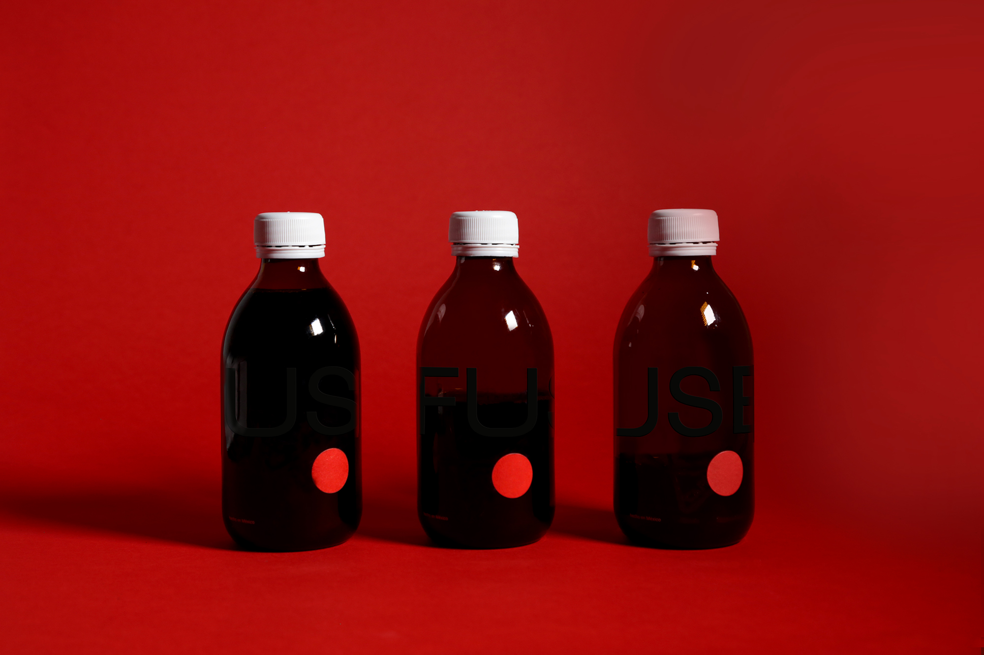
FUSE. Coffee Roasters.
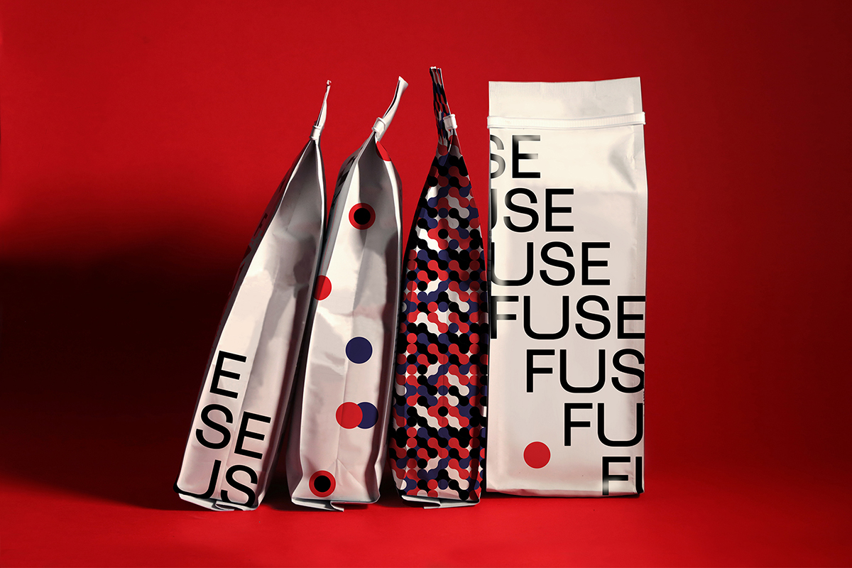
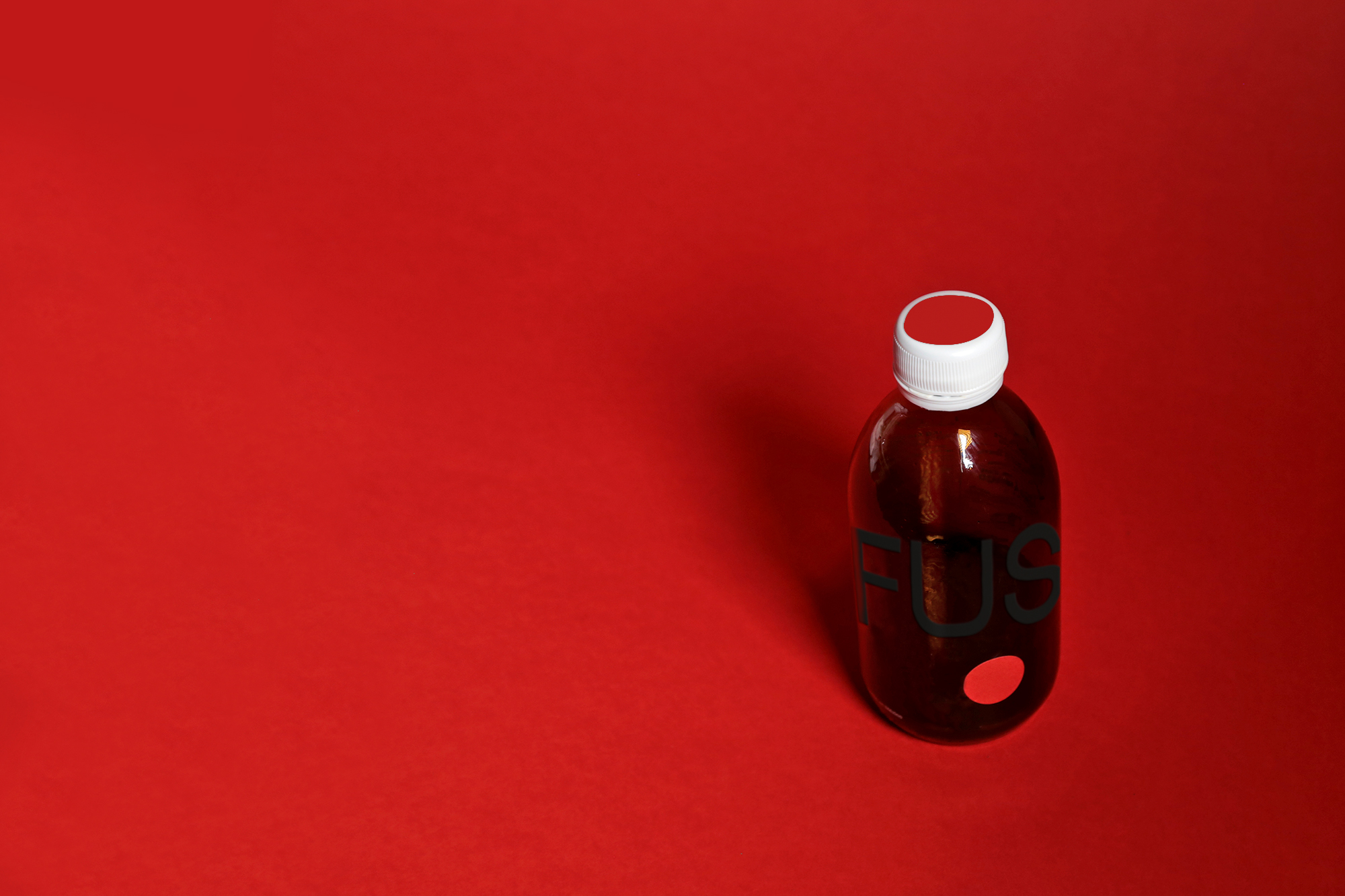
Branding & Packaging Design: Inspired by the simplicity of a coffee cherry and the cheerful that produces when we simply smell it.
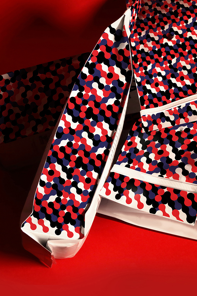
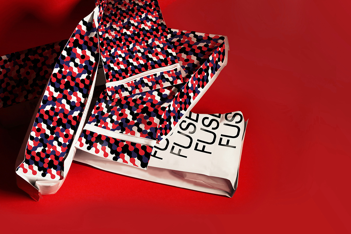
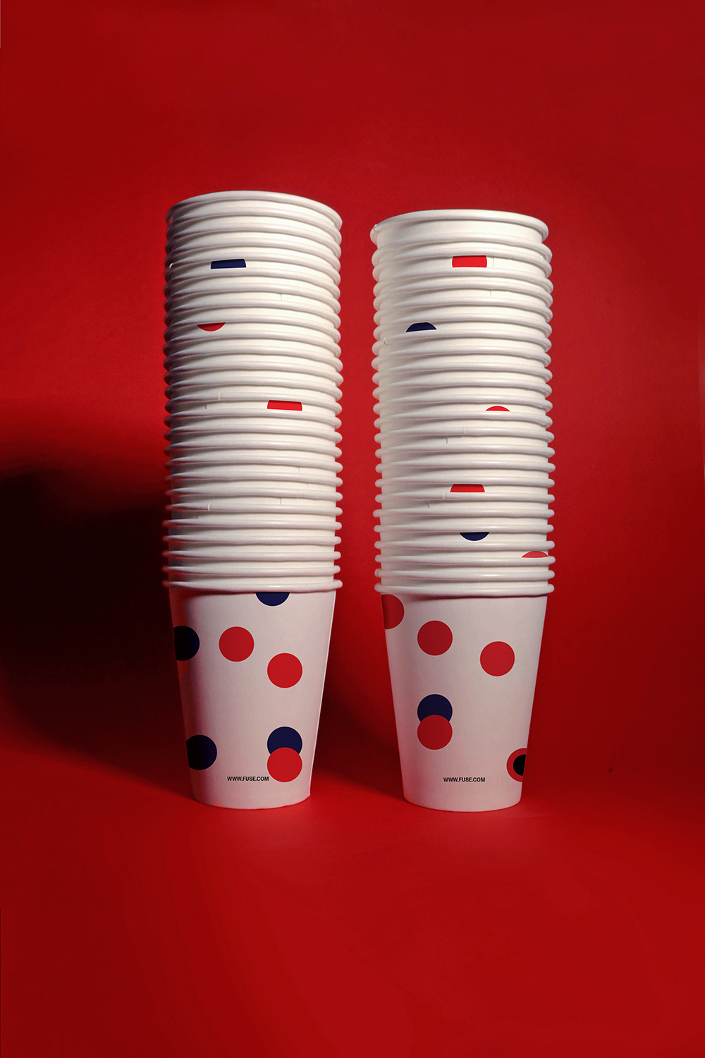
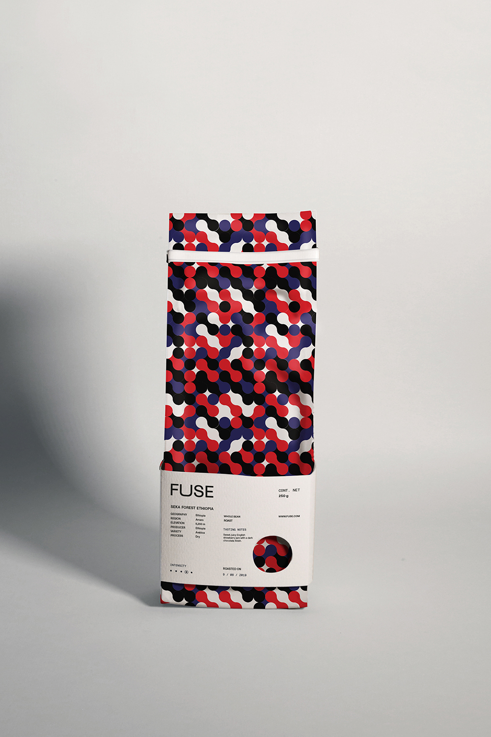
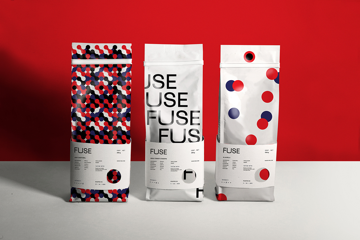
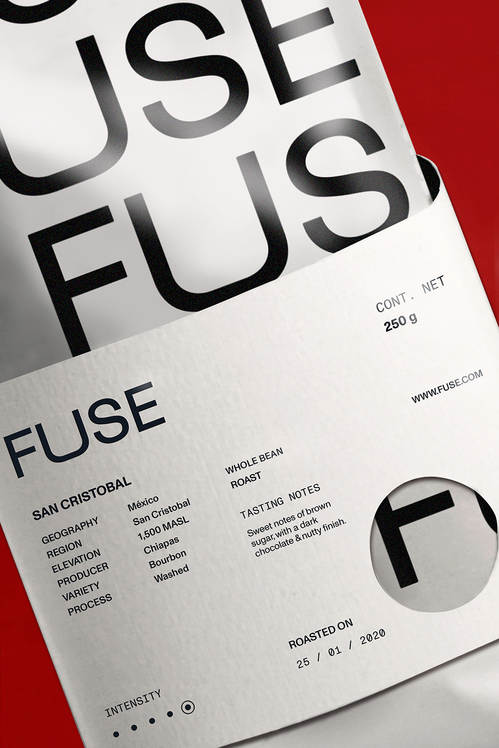
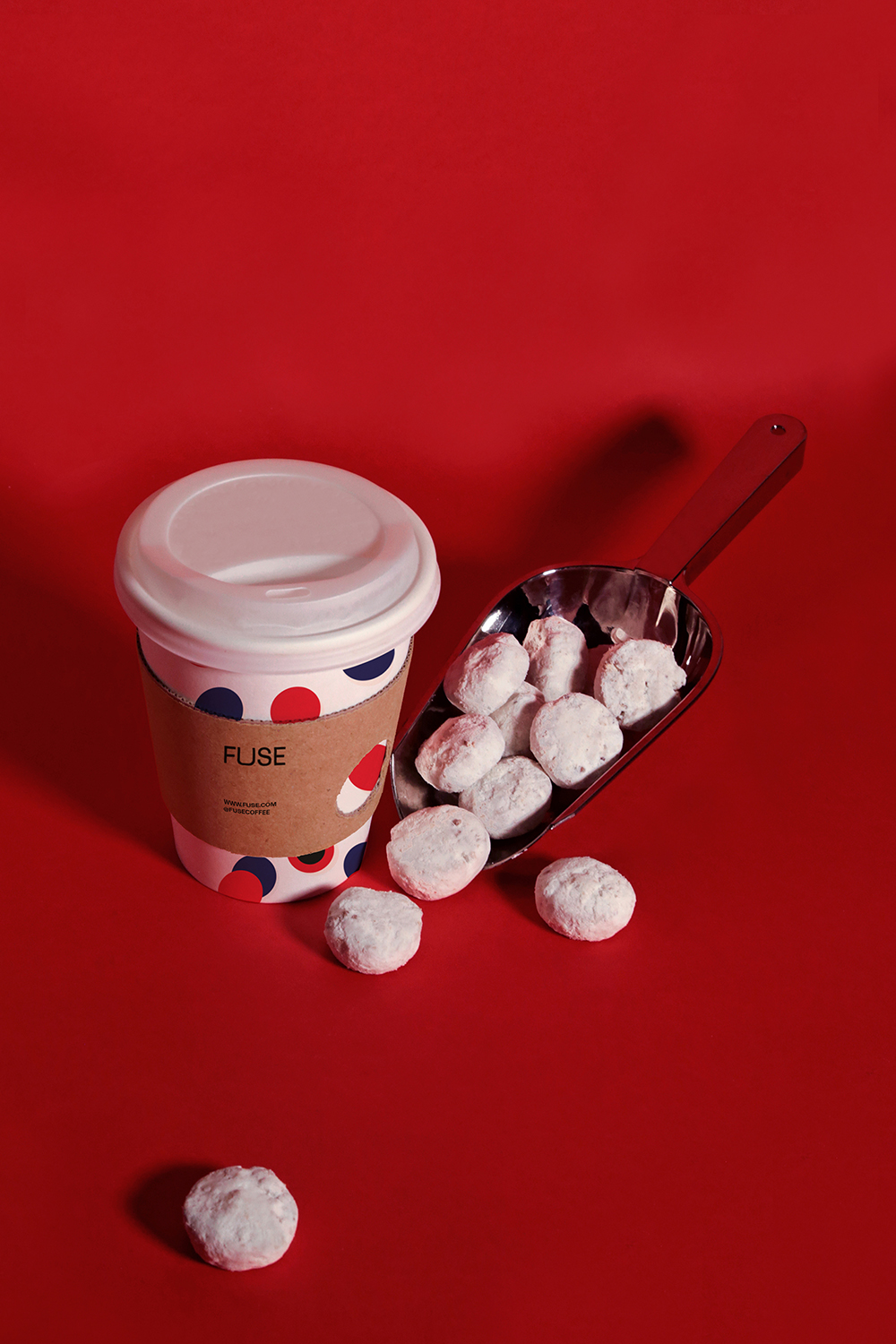
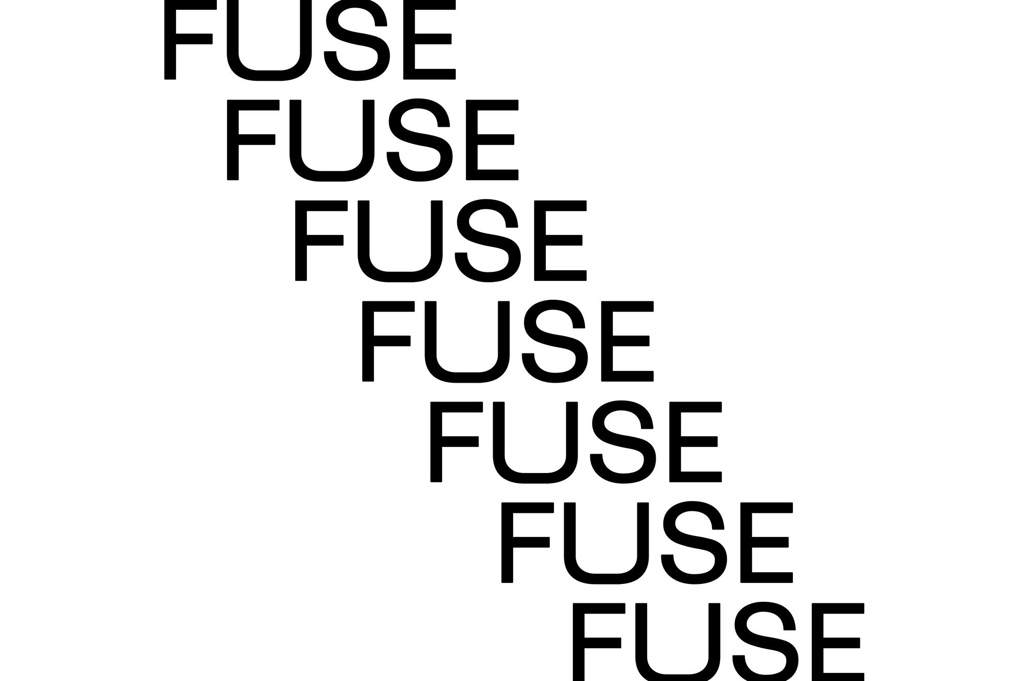
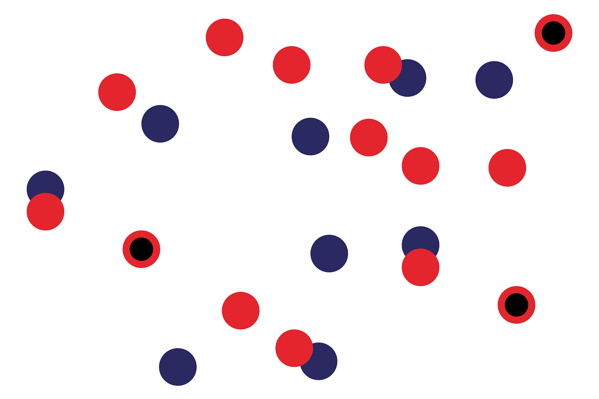
The letter U of the logo is a wink referring to a cup of coffee while the pattern plays with different forms representing movement and energy. The complementary graphics are shapes and textures created from the dot, there are abstract as the feeling we perceive individually when we are in contact with the coffee.
CREDIT
- Agency/Creative: Karla Heredia KHM
- Article Title: FUSE. Coffee Roasters
- Organisation/Entity: Freelance, Published Commercial Design
- Project Type: Packaging
- Agency/Creative Country: Mexico
- Market Region: Middle East
- Project Deliverables: Brand Architecture, Brand Creation, Brand Identity, Brand World, Branding, Graphic Design, Packaging Design, Photography, Research
- Format: Bag
- Substrate: Plastic
FEEDBACK
Relevance: Solution/idea in relation to brand, product or service
Implementation: Attention, detailing and finishing of final solution
Presentation: Text, visualisation and quality of the presentation


