


Cookie delivery business identity , created for a fun and young audience.
With that in mind, we decided to develop an illustration-oriented brand project. In these types of projects, illustrations and auxiliary graphics are responsible for communicating the idea and sensations of the brand. In this case, we wanted a receptive, friendly and classic brand. I wanted to give the brand a classic tone but leaving it in its very modern applications.
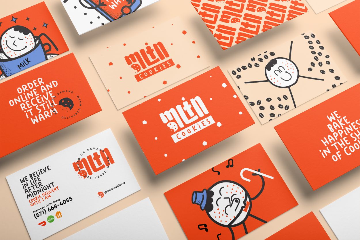
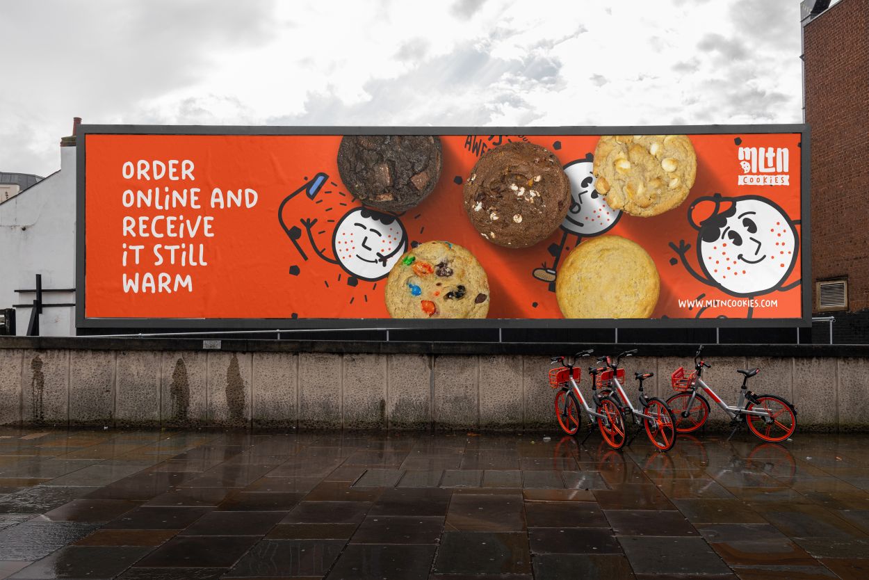
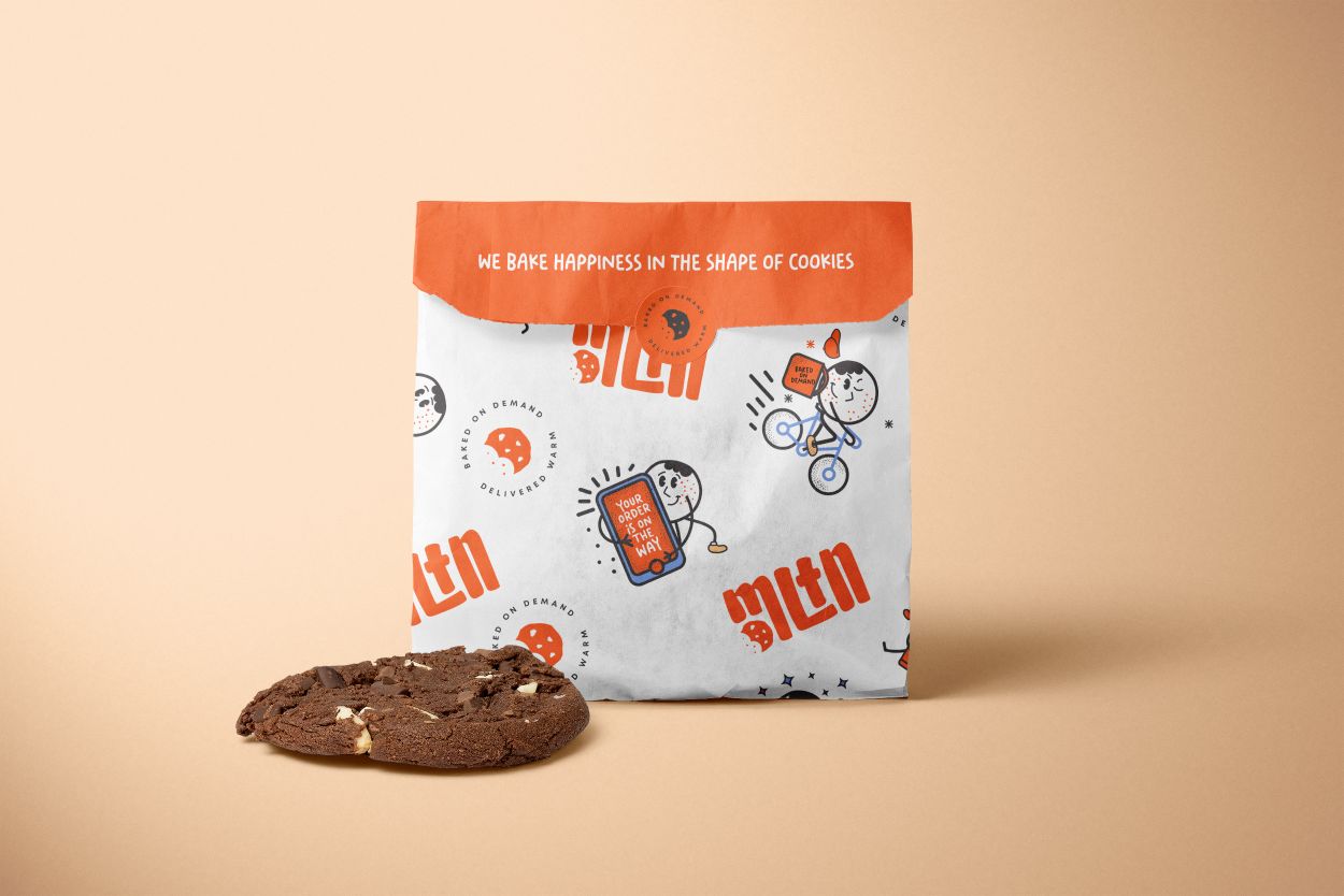
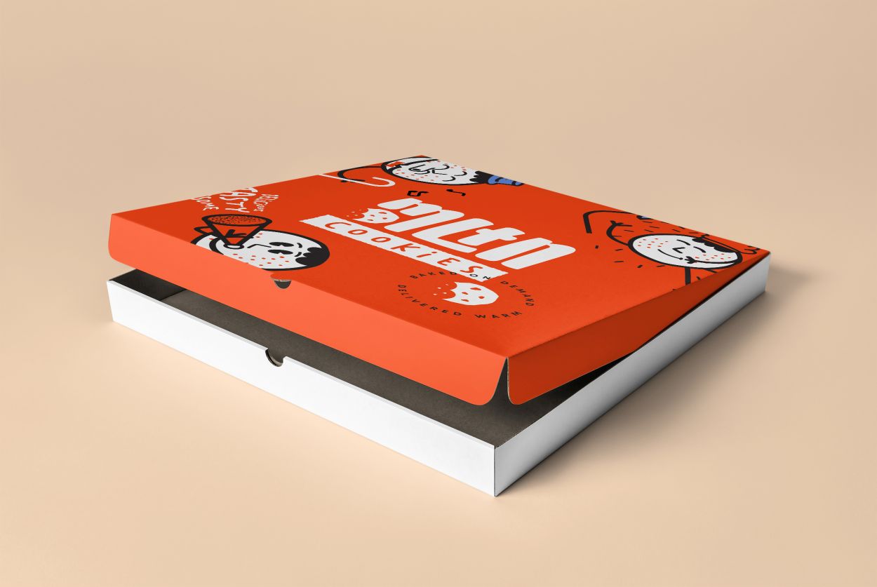
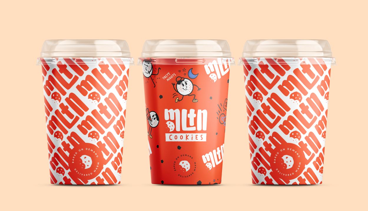
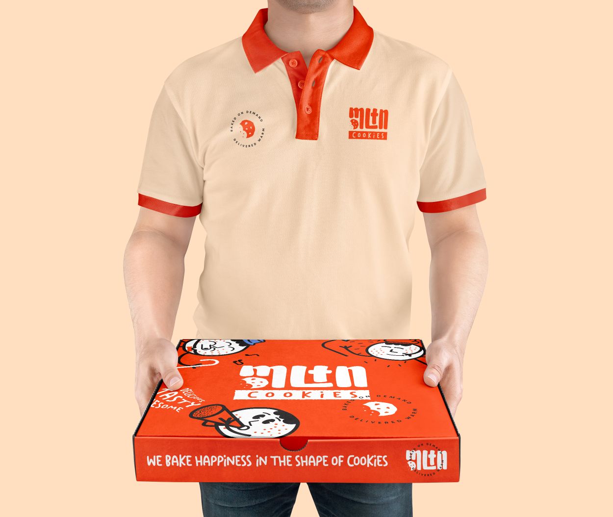
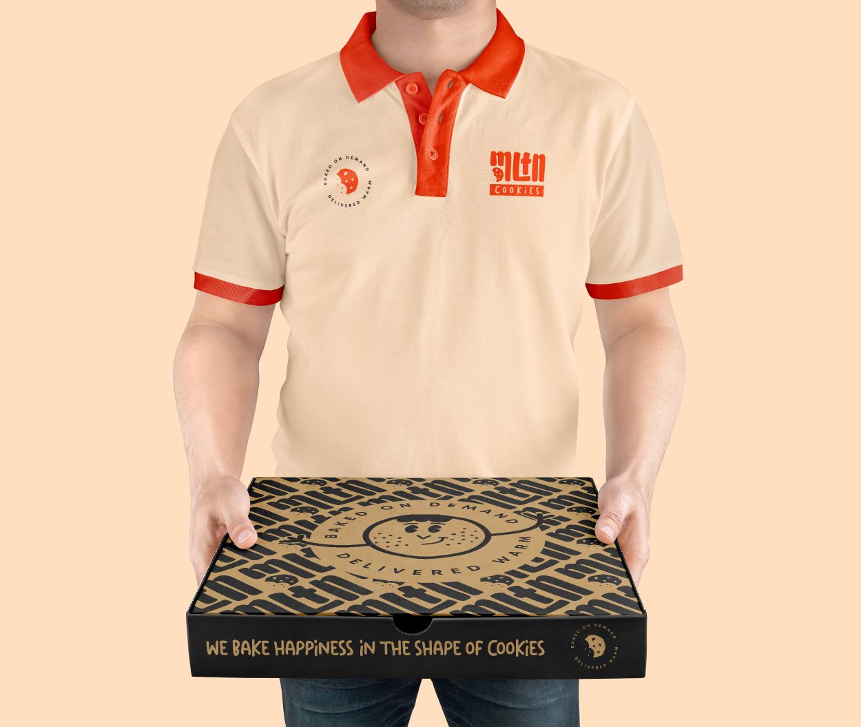
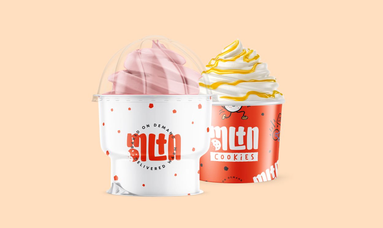
For this, we illustrated a character that represents a cookie, in several actions that are connected with the brand and its proposal. The classic design style is a trend among brands today and was even present on their moodboard. So I believe it was the right choice.
For the colors we used a combination of energetic and cool colors. The color palette remains retro and is also connected with one of the brand’s differentials, which is the delivery of products until 2 am. We used a shade of blue that refers to the night and night sky. Despite the color being there, it is only secondary, if the business logistics have to change in the future, you will not be stuck with it.
Typography was a challenge, monograms and acronyms are tricky to work with. Fortunately, we believe I have found a balance. The typography plays with the letter while embedding a simple, easily recognizable symbol next to it. Since the brand has the illustration as its base point, the typography doesn’t have to be extremely strong and with personality. Nor would it be nice to have two elements fighting. So we stick with a simple but strong typography.
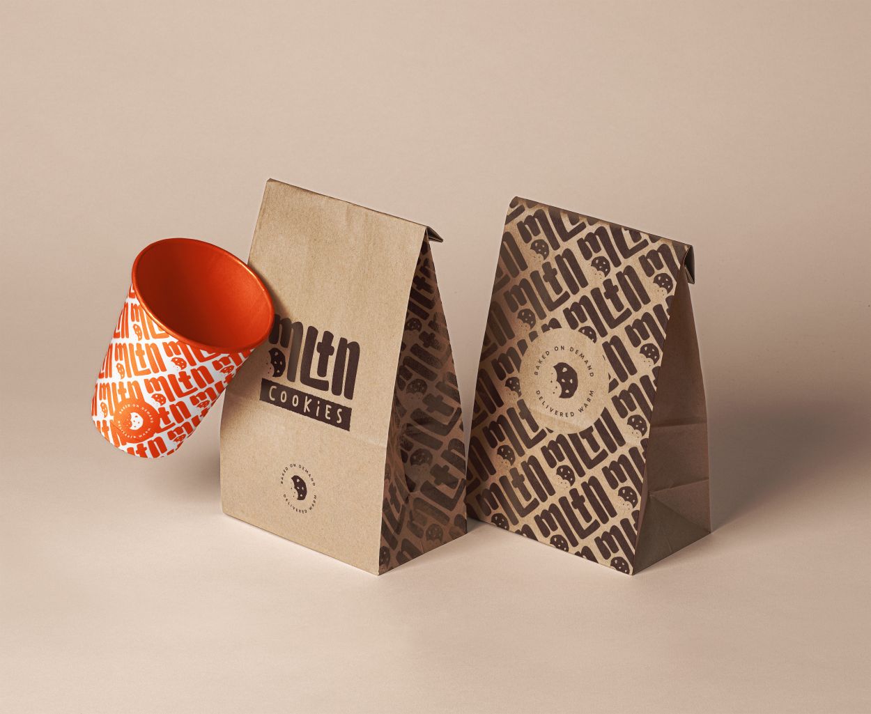
For stationery, thanks to the nature of the brand being illustrative, the possibilities are almost endless. I created a series of patterns and graphics that can be used interchangeably in the material, increasing the brand’s freshness and also expanding the brand horizon for the future.

CREDIT
- Agency/Creative: Navorsky Studio
- Article Title: Fun and Playful Design of Cookie Delivery Business by Navorsky Studio
- Organisation/Entity: Agency
- Project Type: Identity
- Project Status: Non Published
- Agency/Creative Country: Brazil
- Agency/Creative City: Navorsky Studio / Porto Velho
- Market Region: North America
- Project Deliverables: Brand Identity, Illustration
- Industry: Food/Beverage
- Keywords: Cookies, Delivery, Fun
-
Credits:
Art Director: Viktor Navorsky


