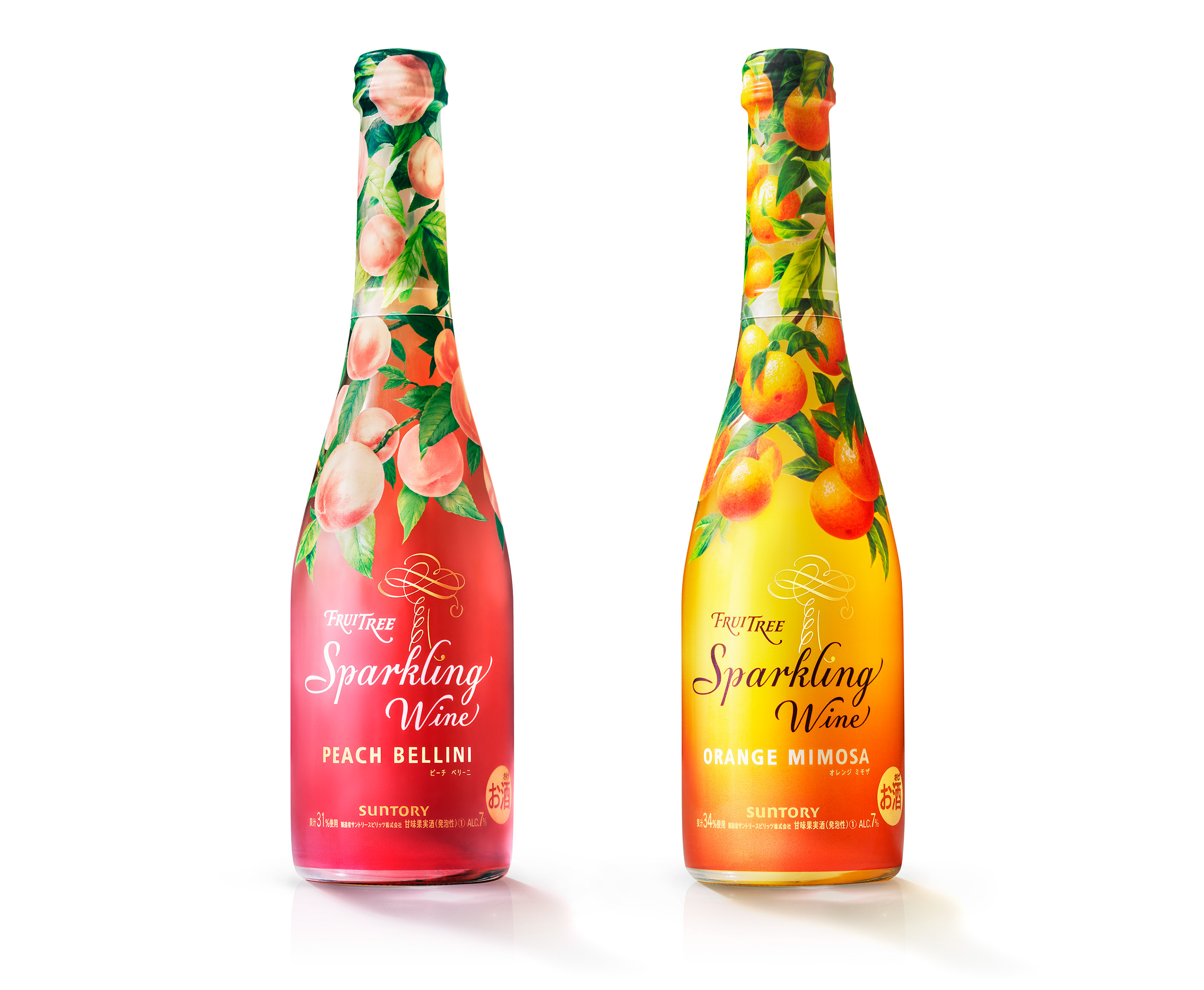
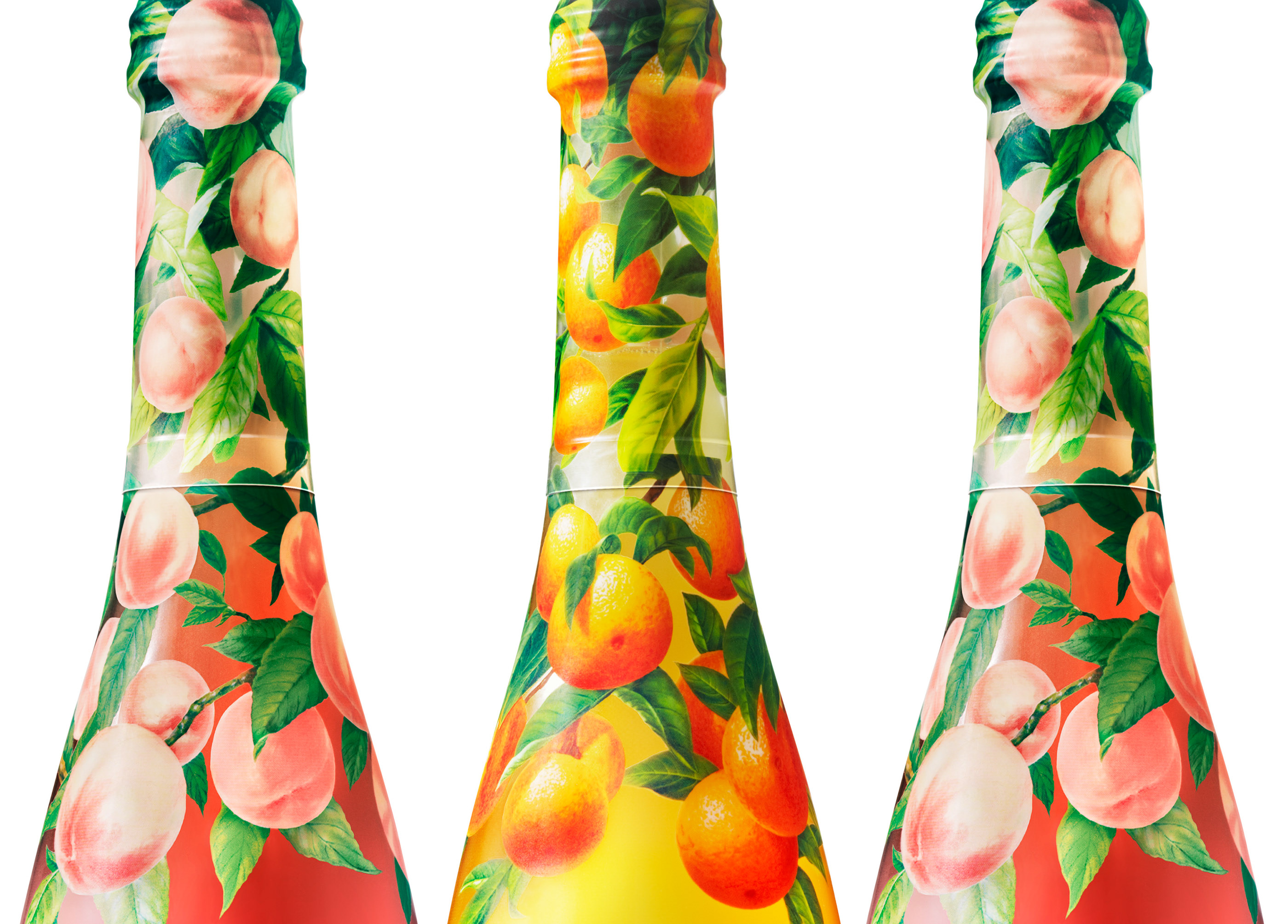
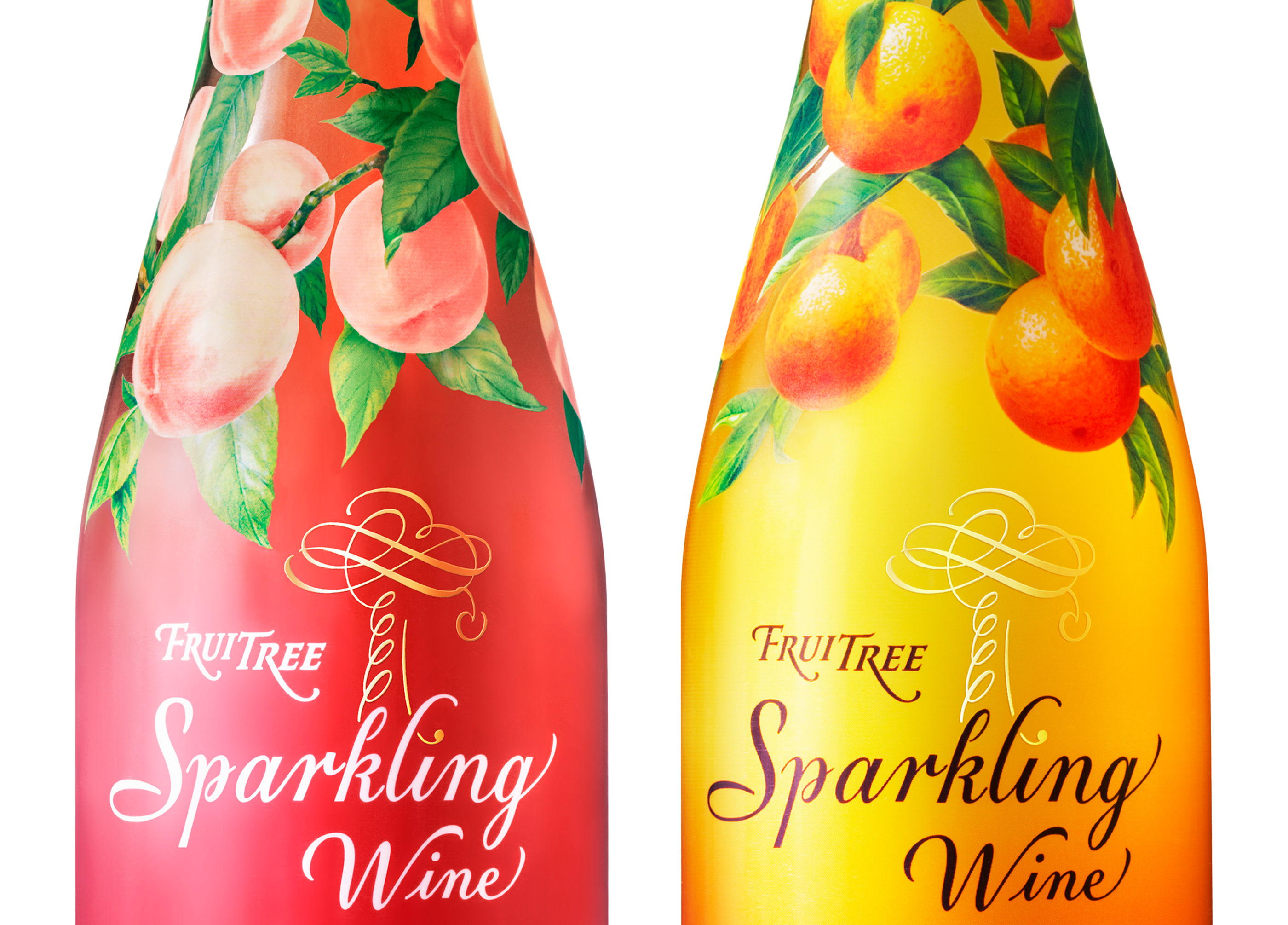
Concept: Fruitree is a sparkling wine with high fruit juice content. To communicate this feature of the sparkling wine—which uses over 30% fruit juice—the bottle itself was designed to look like a fruit tree. Most other sparkling wines have plain design bottles, so for this product images of tasty-looking fruits were put on the cap seal and all over the bottle to distinguish it from competing products.
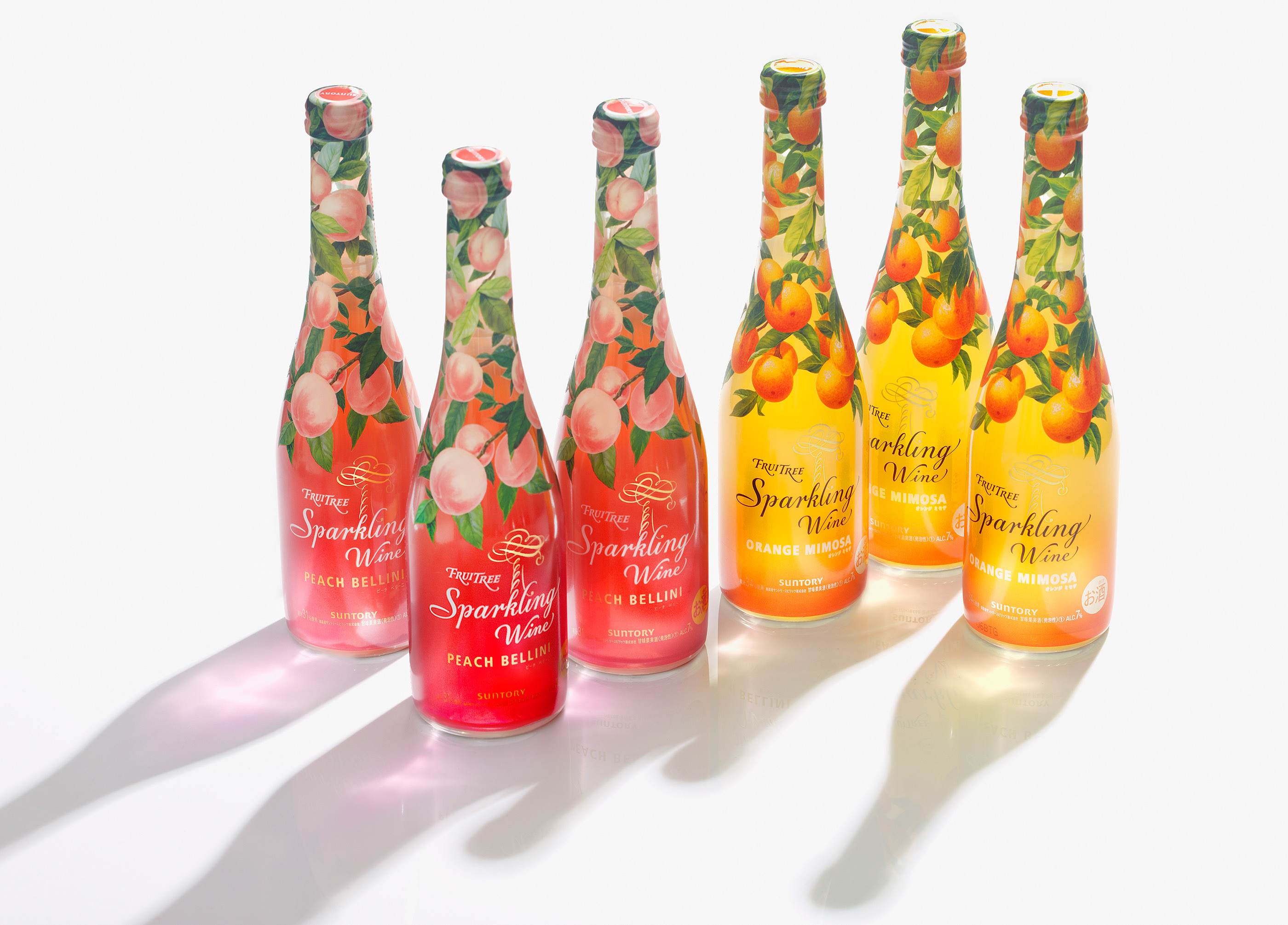
On the shelf: When the products are on the shelf they stand out and look like Fruit trees and The product sold very well in Japan. After Peach Bellini and Orange Mimosa were launched we created more products.
As this is the new brand it is important to have distinctive look and strong concept that consumers don’t forget. Fruit +Tree (Naming)and the Fruit +Tree (packaging) were iconic and they become especially popular among young female consumers.
Target: 20-30 years old female wine entry consumers were the core target. Who likes fruit juice, cocktails but wine is too high alcohol for them so this product is 7% alcohol so it is a reasonable ALC percentage for them.


CREDIT
- Agency/Creative: Yuko Takagi
- Article Title: Fruittree Sparkling Wine Packaging Design by Yuko Takagi
- Organisation/Entity: Freelance, Published Commercial Design
- Project Type: Packaging
- Agency/Creative Country: Japan
- Market Region: Asia
- Project Deliverables: Brand Identity, Brand Naming, Brand Strategy, Branding, Graphic Design, Illustration, Packaging Design, Product Naming, Tone of Voice
- Format: Bottle, Wrap
- Substrate: Glass Bottle


