Overview
Fruitfull is an organic fruit tea drink that is marketed in North America. This product is renowned for its health benefits, as it is made from all-natural ingredients and contains no caffeine or sugar. The target audience for Fruitfull predominantly comprises women aged 20 to 35. Compared to similar beverages, Fruitfull is positioned in the upper-middle price range. It is primarily distributed through a wide range of large and small supermarkets.The target audience of Fruitfull holds specific expectations for their quality of life and values a healthy and comfortable lifestyle. They appreciate freshness and are receptive to new and innovative products.
Solution
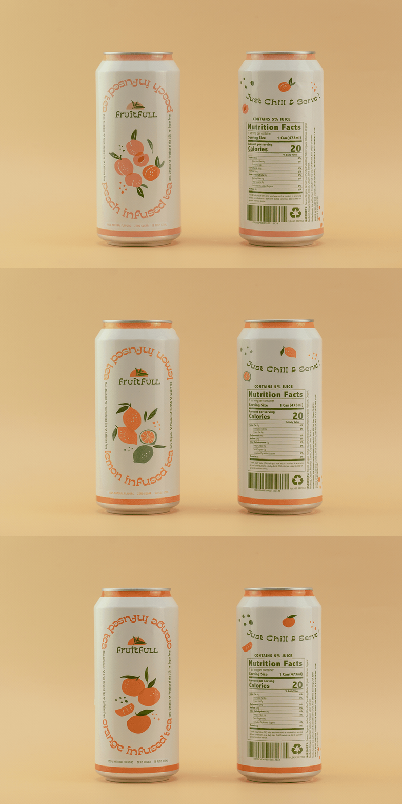
To align with the brand attributes and features, the typeface chosen for Fruitfull is Kish, which exudes a sophisticated, playful, and cheerful visual feel. The use of this typeface enhances the brand’s personality. In addition, the illustrations incorporated into the branding convey a handmade quality, reminiscent of sketches. This choice emphasizes the brand’s commitment to naturalness and originality. The color palette of the illustrations consists of soft and muted tones, which not only enhance the overall aesthetic appeal of the brand but also create a striking contrast against the main colors used. This carefully selected palette allows Fruitfull to stand out on market shelves and capture the attention of its target audience.
Identity
The KISH font used in the Fruitfull logo exudes a cheerful and playful feel, perfectly capturing the essence of the brand. To enhance its vivacity and dynamism, the font has been modified, giving it a distinct and lively appearance. To further emphasize the brand’s attributes and evoke a natural and healthy mood, leaf graphics have been strategically integrated into the font. This integration serves to highlight the brand’s commitment to nature and reinforces its association with health and well-being.
Packaging
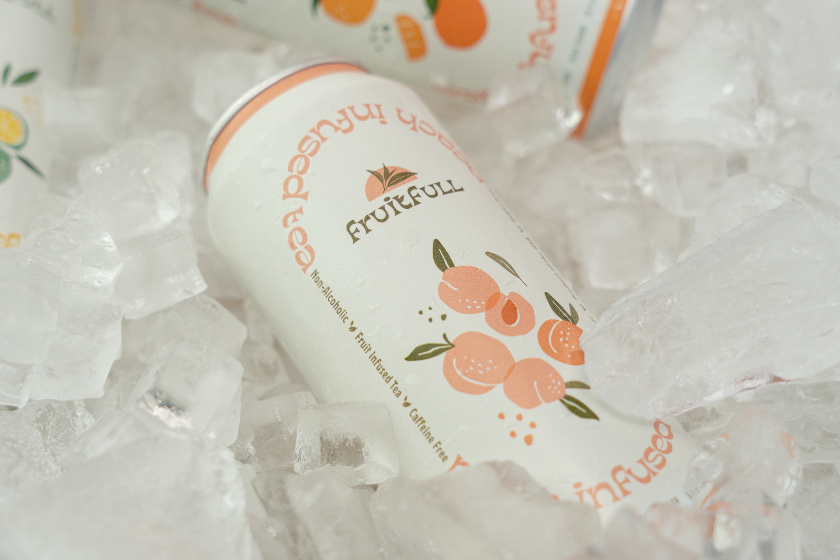
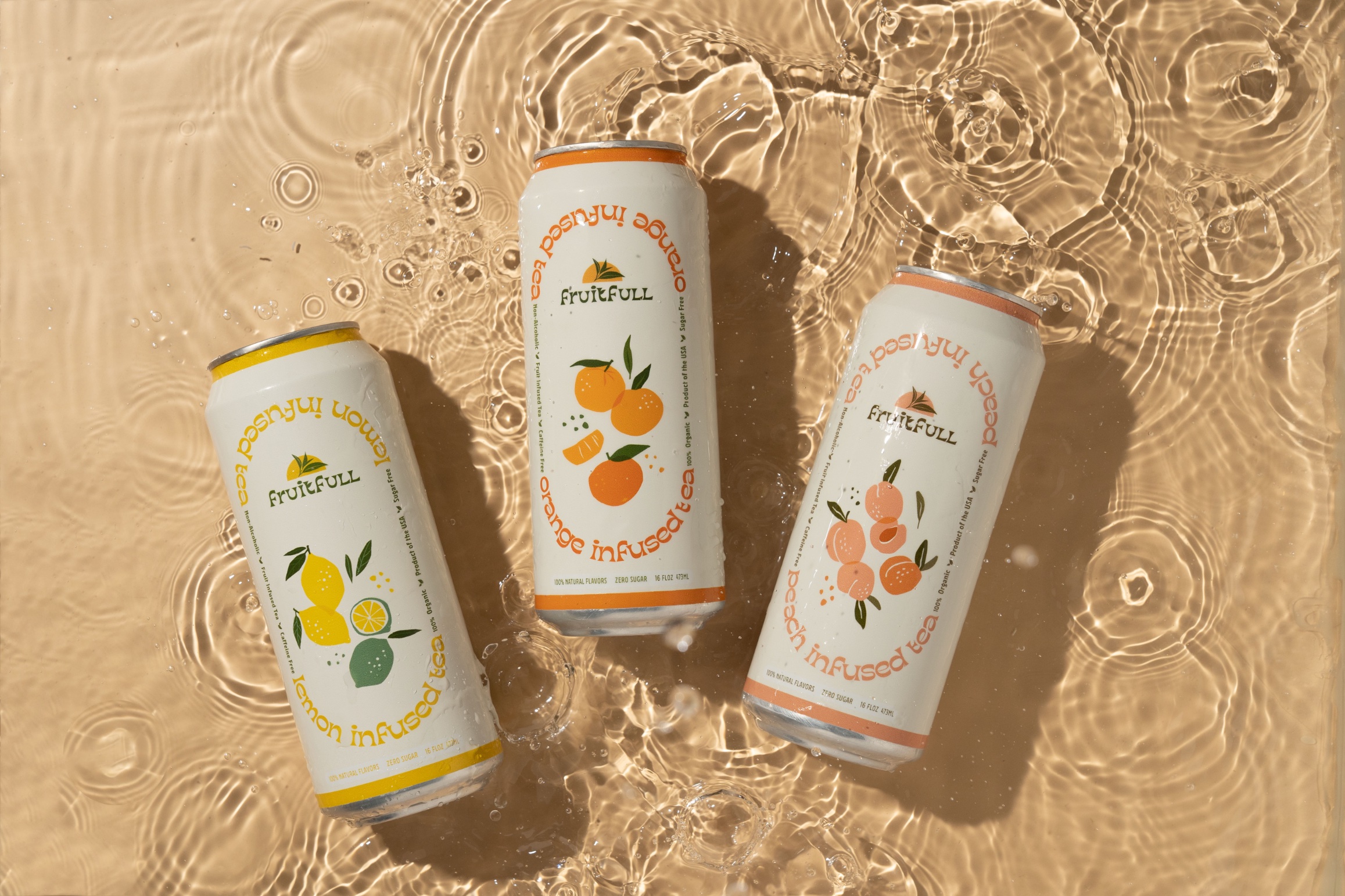
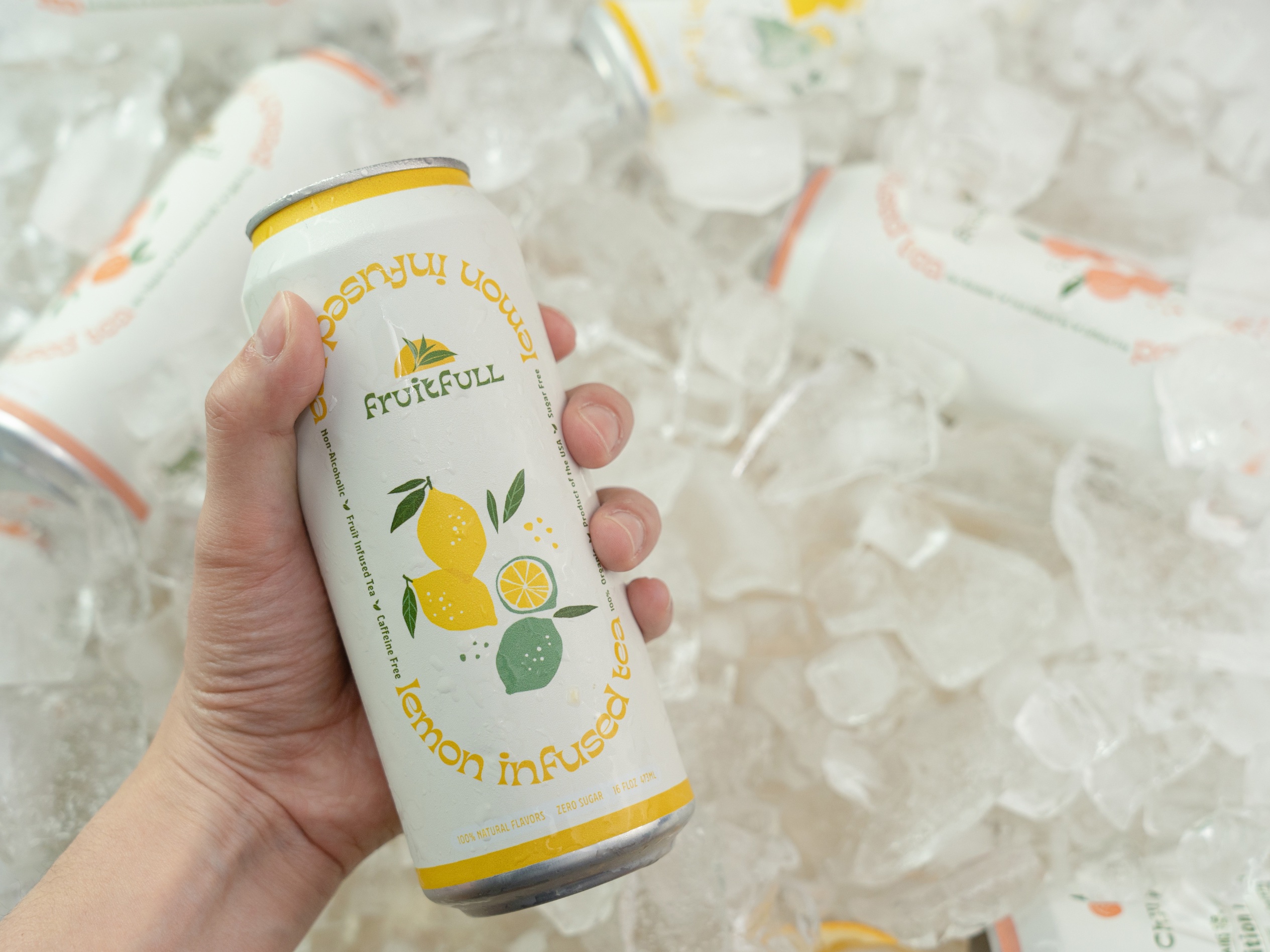
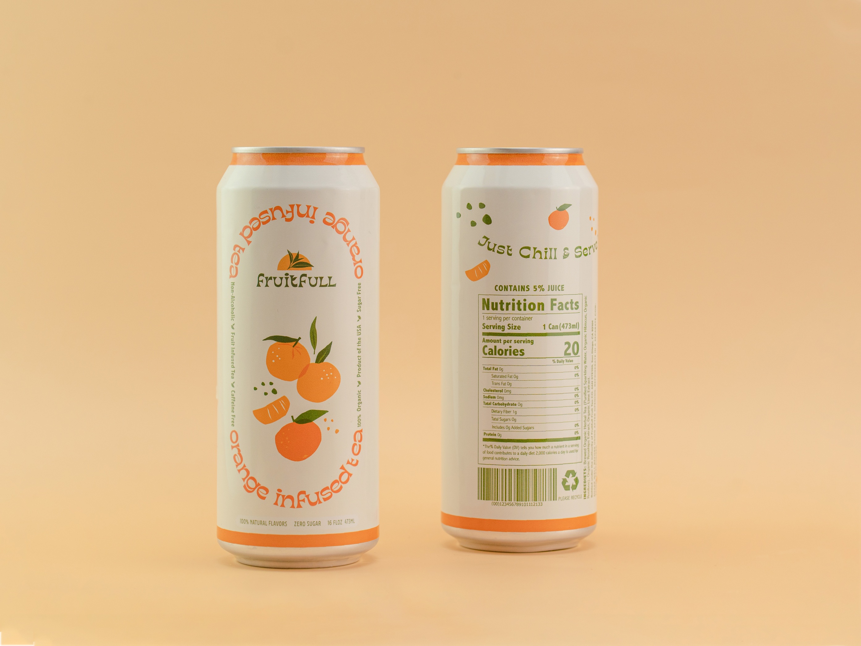
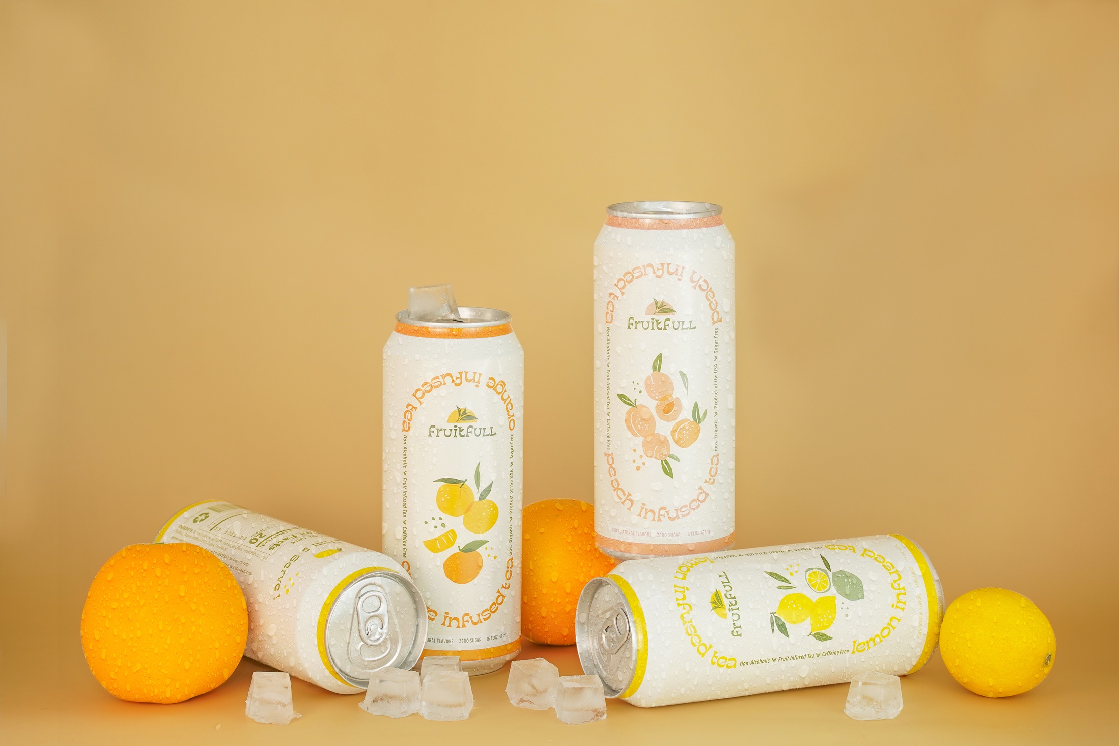
The Fruitfull range of fruit tea products provides a diverse selection of flavors, catering to individuals who aspire to live a healthier and organic lifestyle. By utilizing different color schemes for each flavor, Fruitfull ensures that its products stand out and are easily identifiable, enhancing the overall consumer experience. This visual differentiation adds to the brand’s appeal and helps customers navigate their choices within the range of fruit teas.
Website & Socials
Fruitfull’s social media posts strike a balance between providing product information and sharing the joys of life. By combining these two elements, Fruitfull creates engaging and relatable content that resonates with its audience.

CREDIT
- Agency/Creative: Annie Westwater
- Article Title: Fruitfull Tea Logo and Packaging Design
- Organisation/Entity: Student
- Project Type: Packaging
- Project Status: Non Published
- Agency/Creative Country: United States
- Agency/Creative City: San Diego
- Market Region: North America
- Project Deliverables: Logo Design, Packaging Design
- Format: Can
- Industry: Food/Beverage
- Keywords: WBDS Student Design Awards 2023/24
- Keywords: Packaging Design, Product Creation
-
Credits:
Educational Institution: San Diego City College - Graphic Design
Educator's Name: Sean Bacon and Bradford Prairie


