HeadMade Design & Co. – Frozen Desserts DaVinci
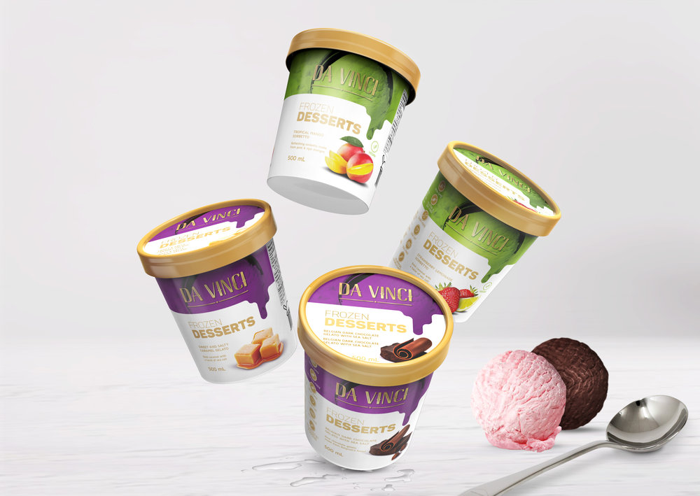
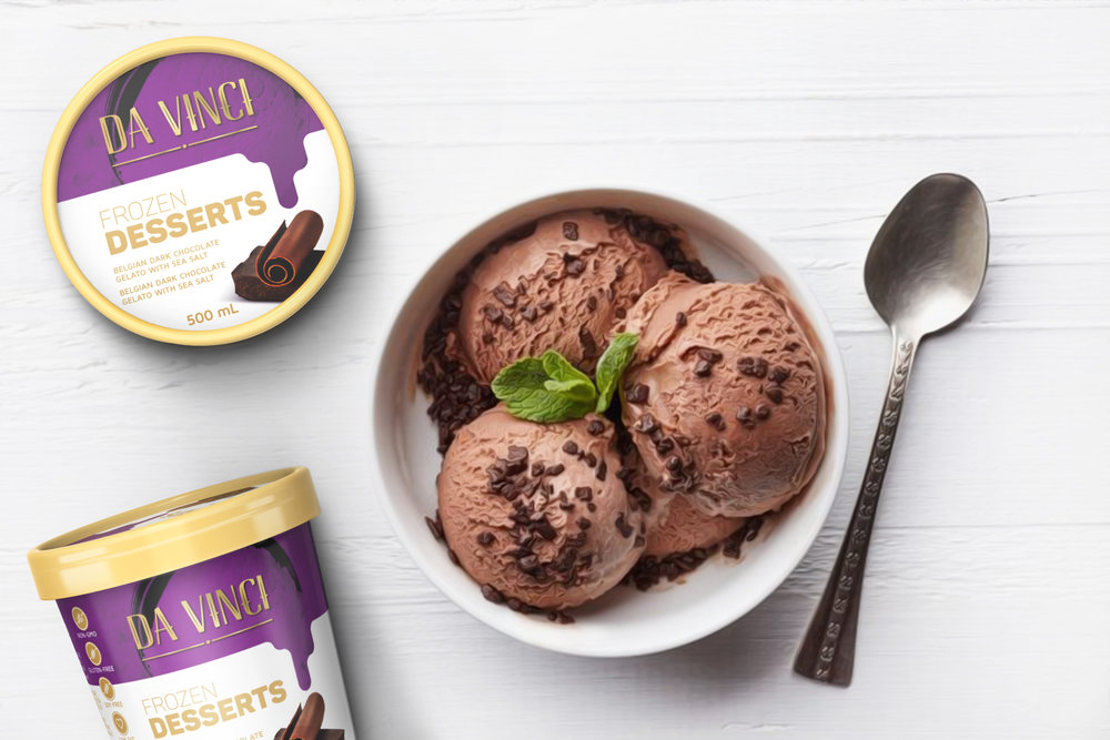
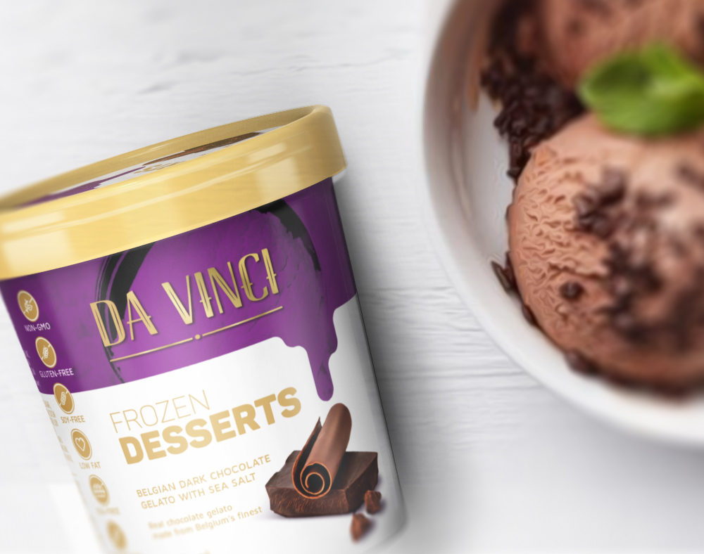
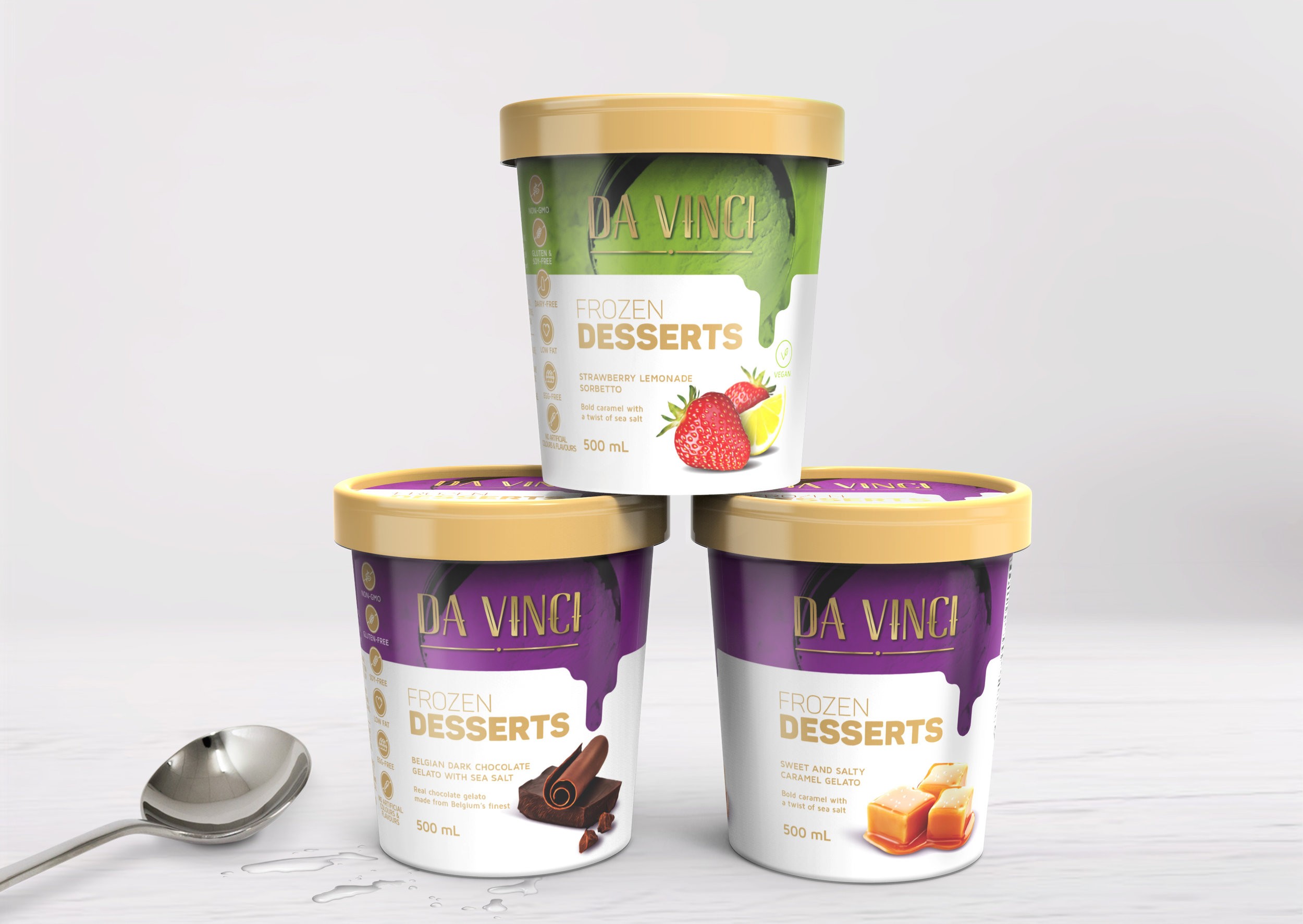
“The main purpose of the project was to launch the new DaVinci product, to highlight it at POS and to differentiate it from its competitors. Considering that it is a value-added product, the packaging needed to highlight the attributes and ingredients. In this way, through the illustrations of the flavors of each variation of the product, as well as the presence of informative icons, communication between the packaging and the consumer was facilitated.
The colours used are within the institutional palette of the brand. Purple, for traditional products and green for vegans. The gold, in detail and the lid of the product help to prove that it is an elaborate and sophisticated dessert. Because they are marketed in Canada, where French and English are official languages, the packaging has two fronts – one in each language – to fully reach the country’s consumers. Finally, the ludic aspect is taken to small details, from the melting effect on the front of the packaging, to the bar code that simulates the consumption of the product.”


CREDIT
- Agency/Creative: HeadMade Design & Co.
- Article Title: Frozen Desserts Packaging with Two Fronts for Canadian Market Official Languages
- Project Type: Packaging
- Agency/Creative Country: Brazil
- Market Region: Africa
- Format: Bucket, Cup
- Substrate: Plastic


