Since 1963, Toucan Sam has been bringing fruity deliciousness to cereal bowls everywhere. Once a leader in the cereal aisle, Froot Loops was being overlooked and Toucan Sam had become less and less relevant. His realistic features and human-like characteristics didn’t work in today’s digital environment. The logo and brand design were dated and no longer represented adventure and fun that Froot Loops stood for; as a result, the brand wasn’t meaningfully connecting with consumers.
Frooty Roots
Before modernizing Froot Loops and Toucan Sam, we followed our nose back to the beginning of the brand. Froot Loops had always been about imagination and adventure, and Toucan Sam, the quintessential friendly explorer. There was an opportunity to bring in more modern, imaginative design cues and reclaim our adventurous personality, while respecting the iconic and beloved aspects of the brand and character.
The redesign included a refreshed logo, updated Toucan Sam character and a new package design. We needed to carefully balance Froot Loops’ assets, while updating the design and tonality to be more relevant and engaging with today’s cereal lovers.
Loopy Logo
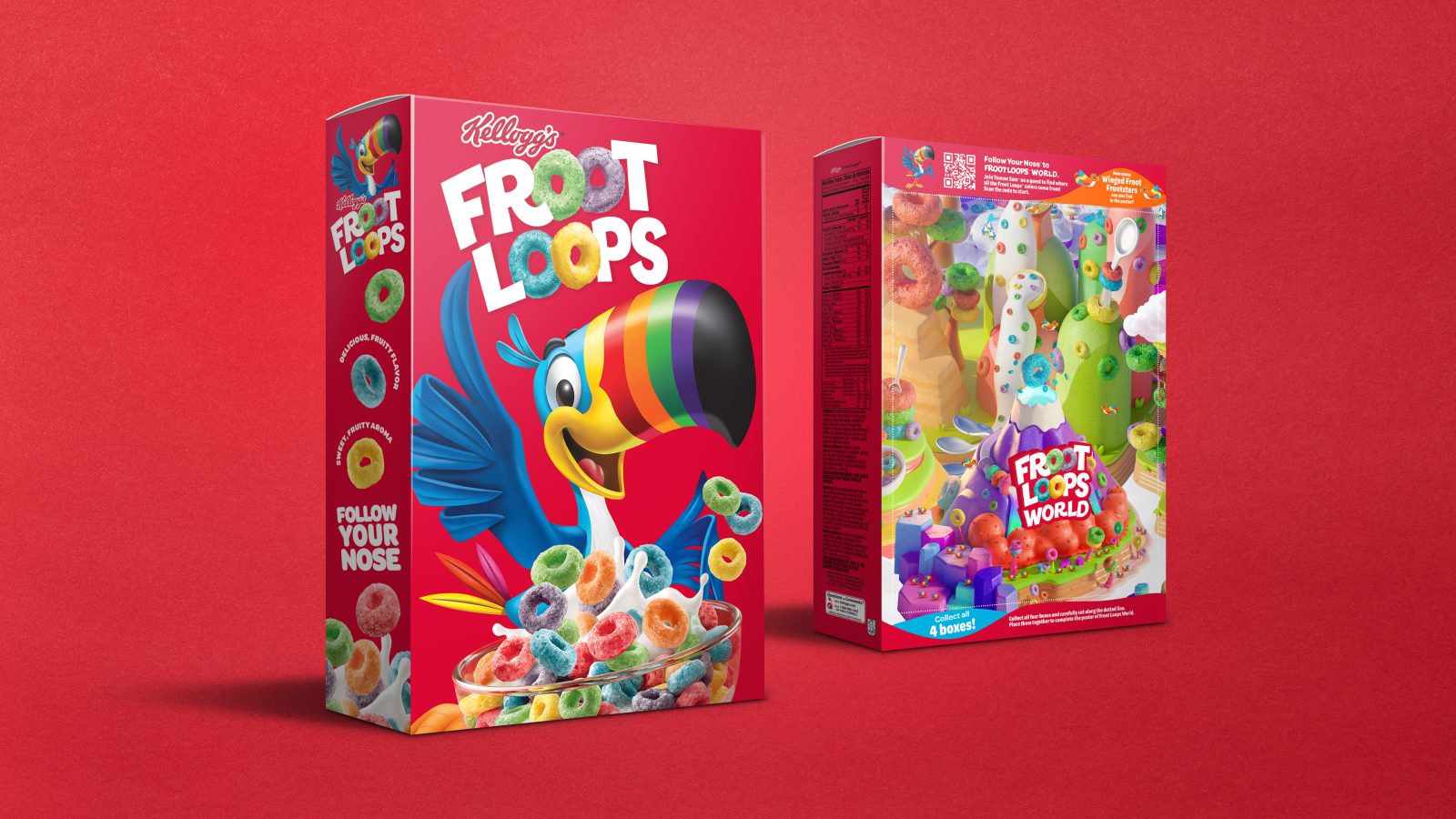
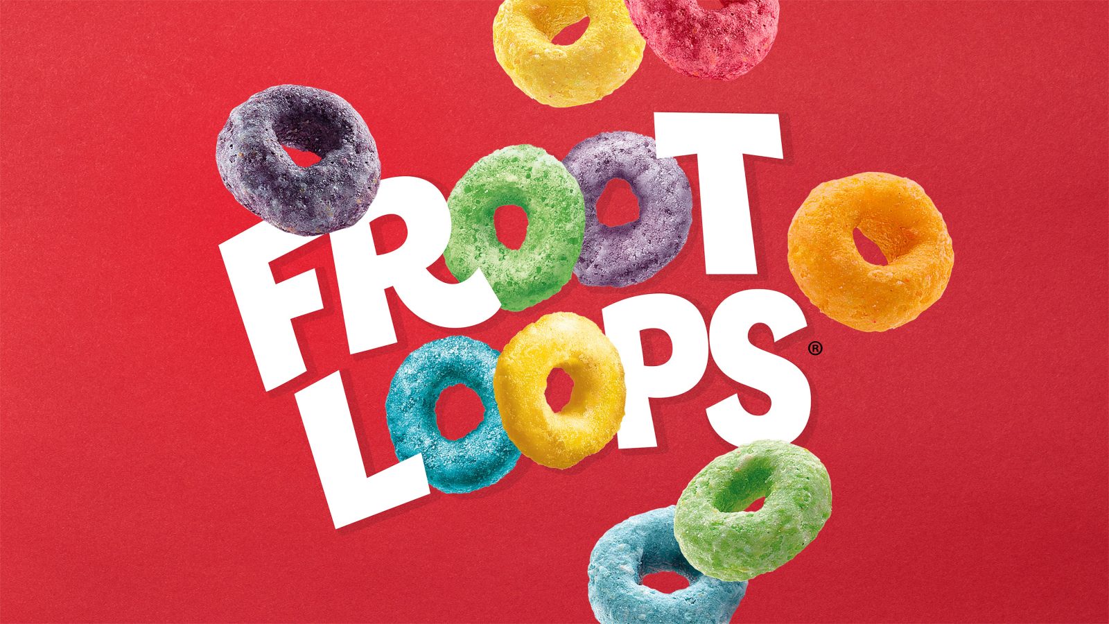
The Froot Loops brand is an iconic part of cereal history and we approached the logo update with care and craft. We began by stripping away any overly stylized graphic effects. We then crafted the letterforms, bringing to life the sense of fun and playfulness associated with Froot Loops. Integrating the iconic and colorful loops was the final touch to this ‘sweet’ logo update.
Modern Makeover
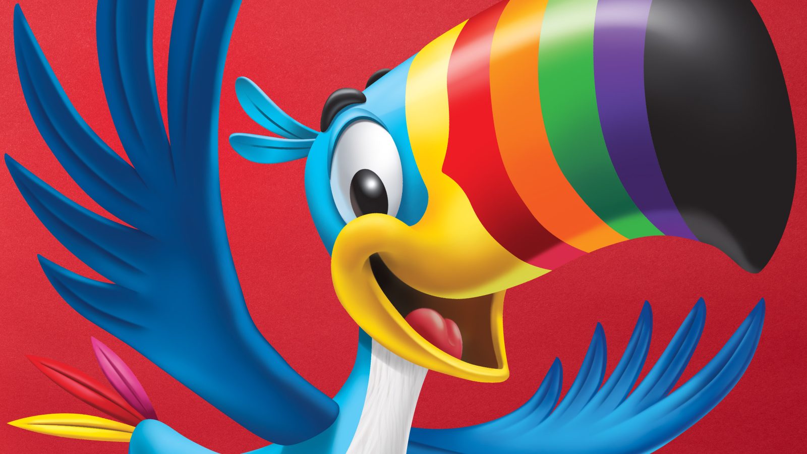
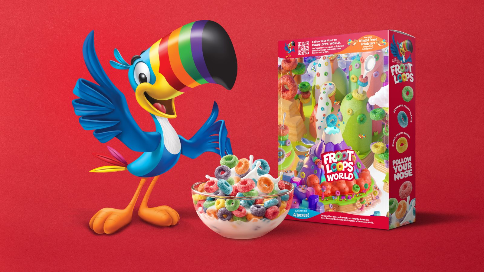
We started by clearly defining Toucan Sam’s distinctive assets. Our goal was to amplify what makes him unique and recognizable, while refreshing his illustration style, features and expressions. As a way to connect with kids and parents alike, we updated his expressions to be more cheerful, optimistic and youthful. The rings on his beak are one-of-a-kind and we used them as a way to infuse more color and vibrancy into his expression. We paid homage to the past, by incorporating the three original Froot Loops cereal colors – red, pink and yellow – into his tail feathers. We brought it all together with an illustration style that was simple but bold to ensure that the refreshed Toucan Sam popped in both print and digital environments.
Packaging Play
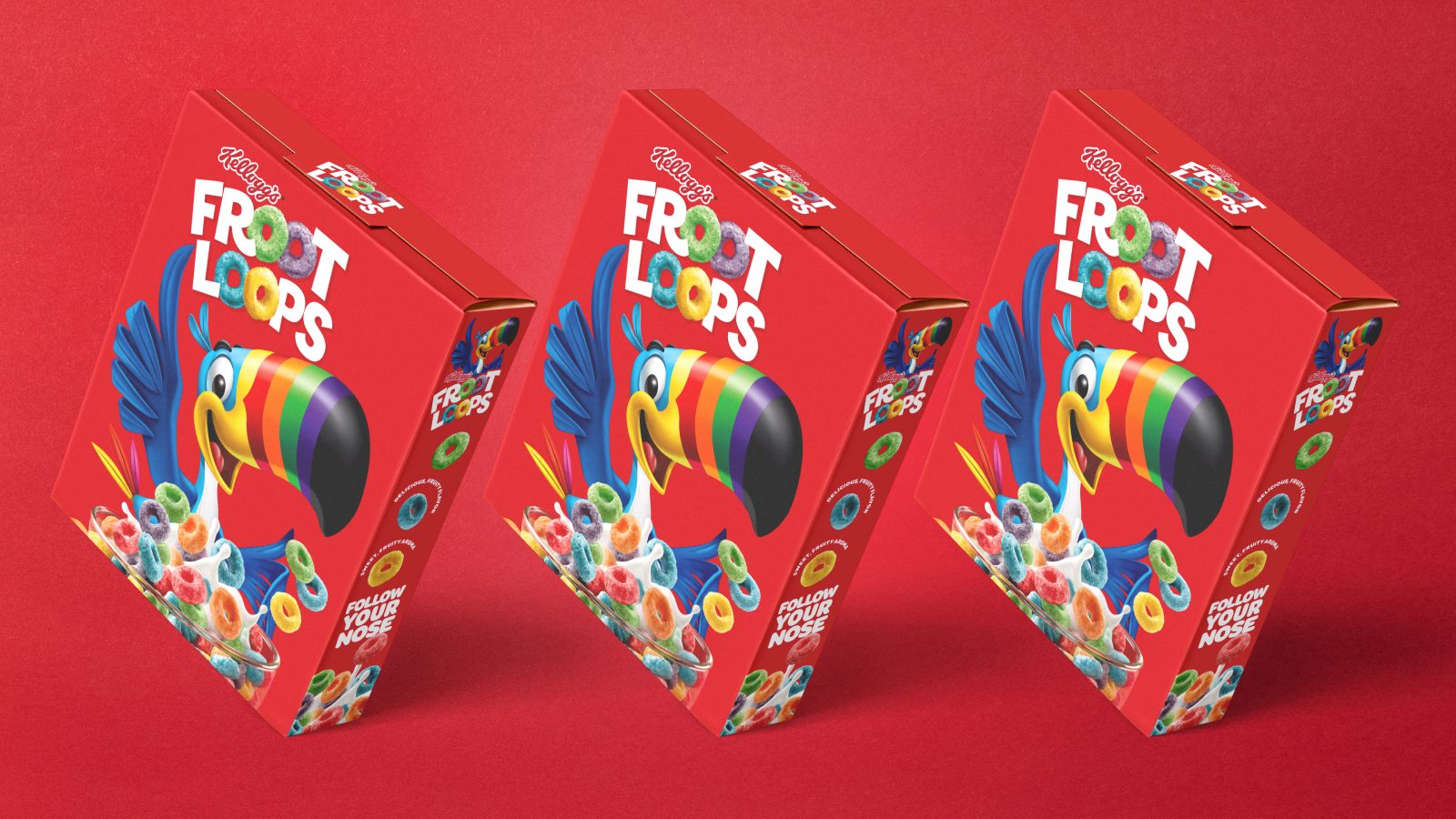
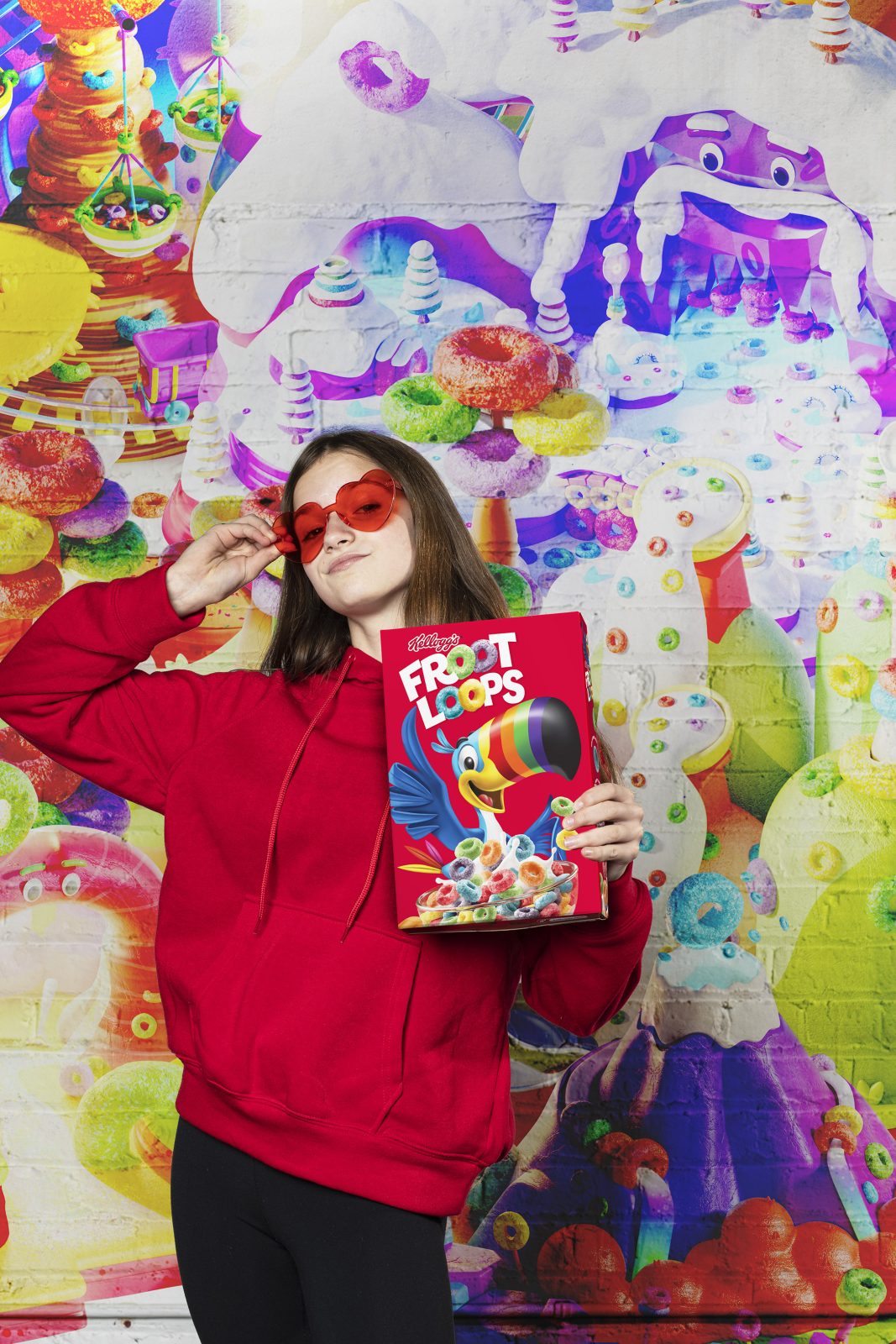
The box is an important touchpoint for any cereal brand. We wanted the front of the Froot Loops package to both celebrate the updates to the logo and character, while also highlighting the amazing one-of-a-kind food experience. We elevated the prominence of the new logo to help the brand break through the crowded cereal aisle. We also amplified the connection between Toucan Sam and the food to highlight the delicious new packaging design.
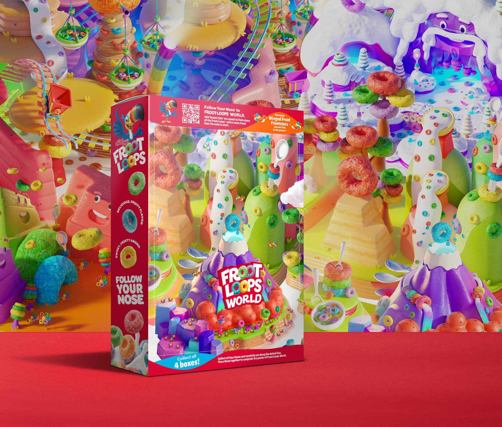
To engage kids during the eating experience, we redesigned the back panel to feature an interactive Froot Loops World. The fully illustrated experience allows kids to explore with Sam. We created four unique designs, encouraging kids to collect and combine all four boxes to create an adventurous pop-up world.
Sweet Results
In quantitative research, the new Toucan Sam was preferred by kids – “I really like this design the best. He looks like Sam, but more for now, for today.” – and the package design was perceived as new, modern and significantly higher in quality.
The modernized brand and character design resonate with parents who have strong childhood memories of Froot Loops and Toucan Sam, while connecting to their kids, a whole new generation of imaginative explorers ready to ‘Follow your Nose.’
CREDIT
- Agency/Creative: goDutch , Kellogg North America , Bailey Design , Leo Burnett
- Article Title: Froot Loops Redesign Packaging Redesign
- Organisation/Entity: Agency
- Project Type: Packaging
- Project Status: Published
- Agency/Creative Country: United States of America
- Agency/Creative City: Cincinnati , Battle Creek , Apollo Beach , Chicago
- Industry: Food/Beverage
- Keywords: WBDS Agency Design Awards 2022/23
-
Credits:
Design Lead: Jason Hargis
Design Partner: Andy Keene
Strategy Partner: Tammy Anthony
Strategy: Connie Burch
Brand Design Manager: Bridget Grever
Senior Brand Manager: Daya Pillai
Illustrator: Stephen Bailey


