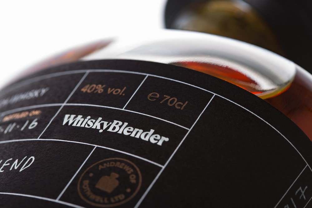
” The best projects—like the best whiskies—start with a great blend, and the combination of independent, online business Whisky Blender and Glasgow-based design agency, Front Page, is as good as it gets. Offering a bespoke whisky blending service, Whisky Blender was started by dram-loving friends Andrew Nicolson and Andy Davidson, with the intention of bringing the joy of whisky to a wider audience.
‘Some people are a bit scared of whisky,’ explains Nicolson, ‘like its something you have to know a lot about in order to enjoy. But we think that it can—and should—be appreciated by more people, and the idea behind Whisky Blender is that anyone can create a blend, so they get a sense of ownership around something they might have felt was out of their reach at one point. Plus it’s really fun!’
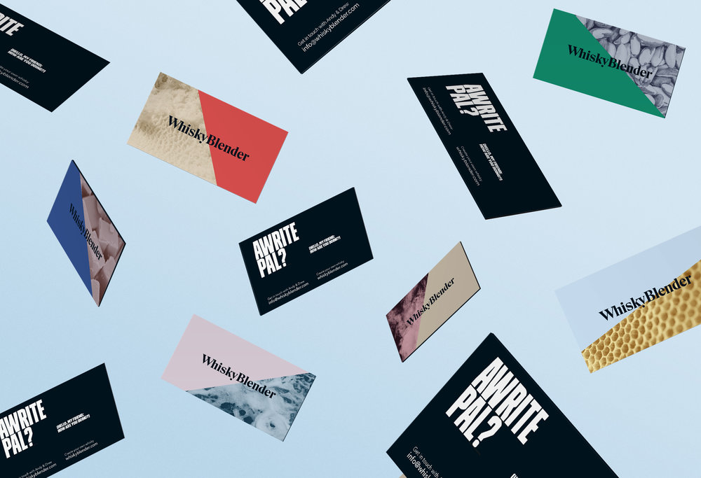
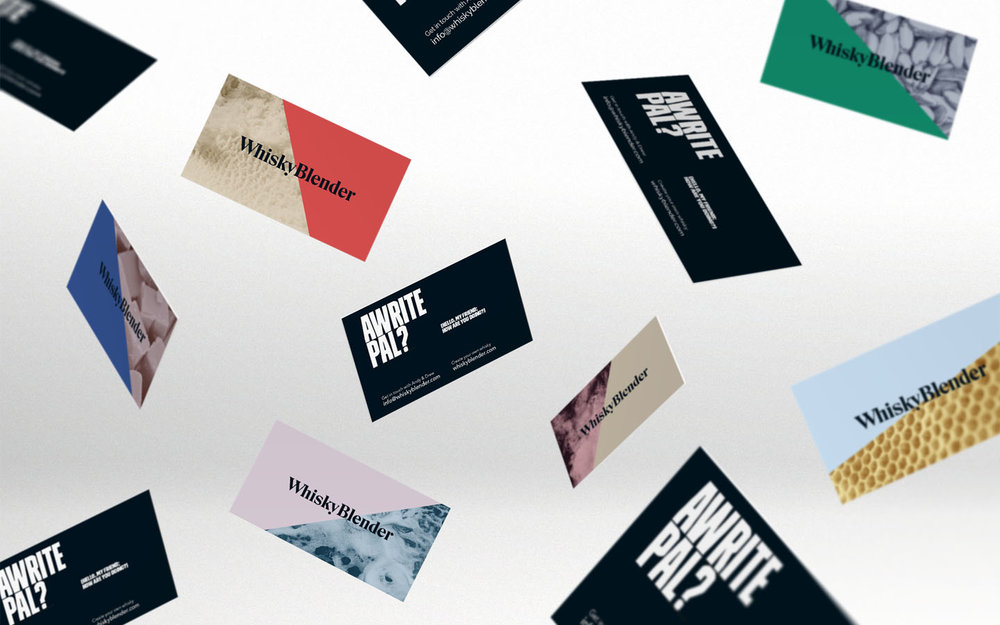
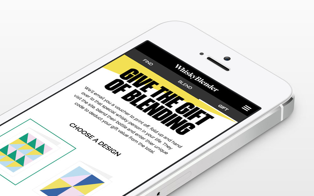
Front Page were tasked with creating a new look for Whisky Blender, to reflect the playful and inclusive nature of the company and its product. The aim was simple: to guide the customer through the blending process with ease, dispelling those common myths about the industry along the way.
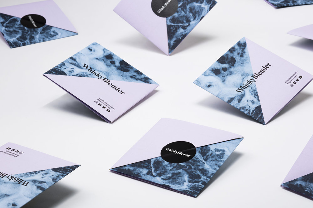
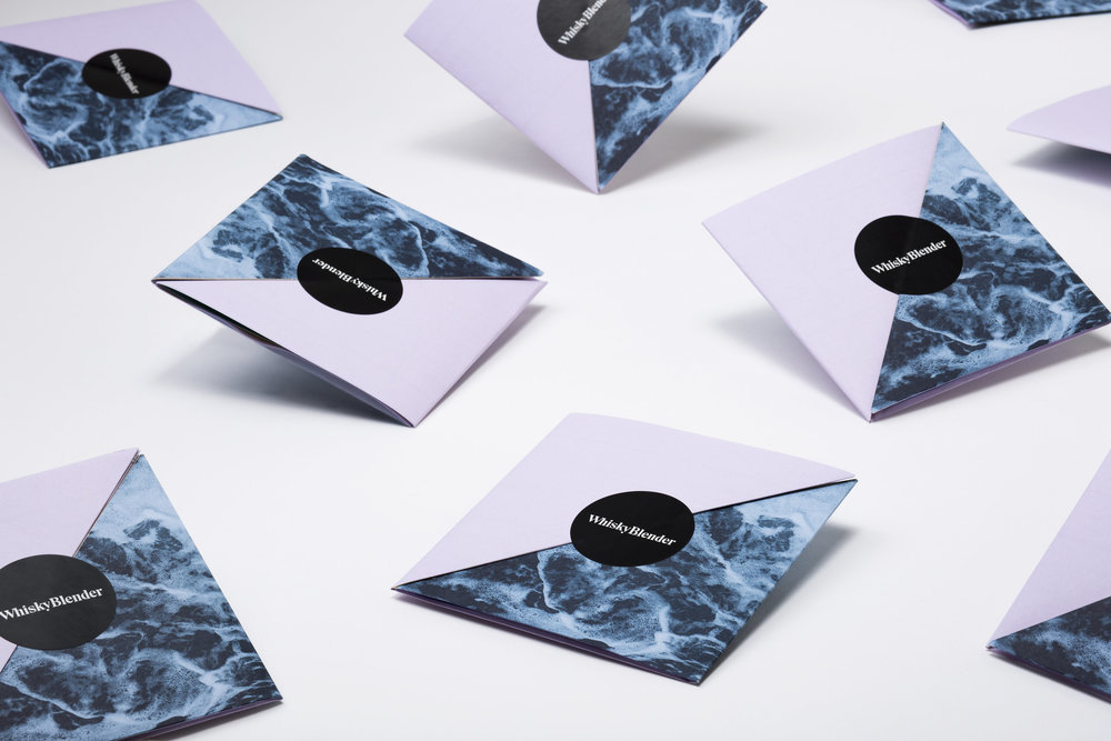
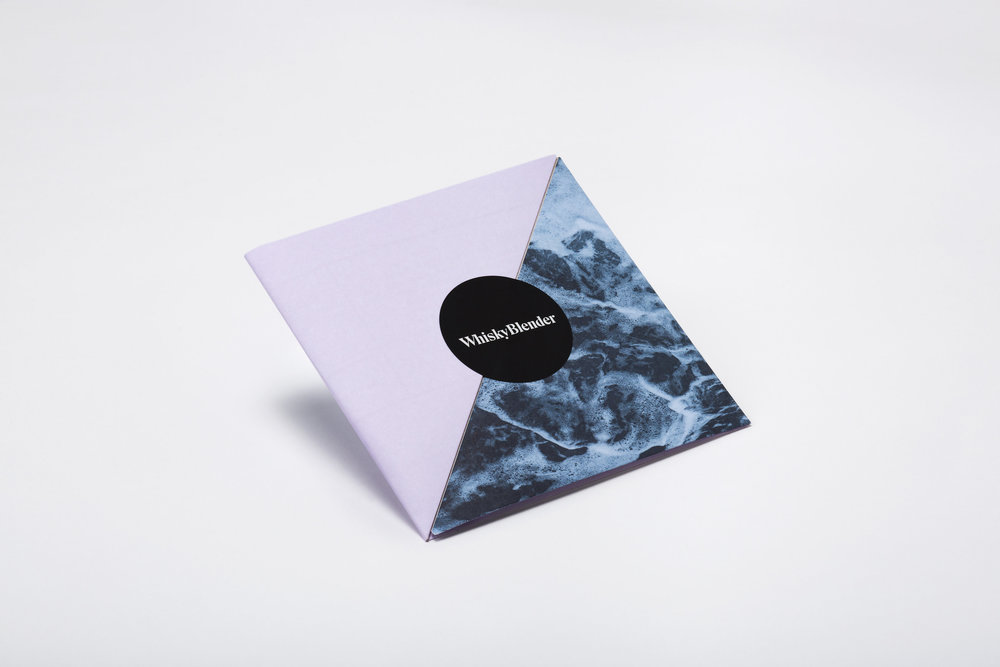
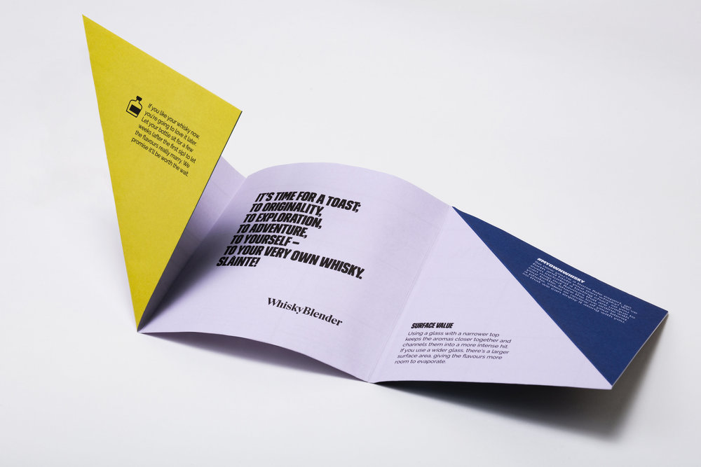
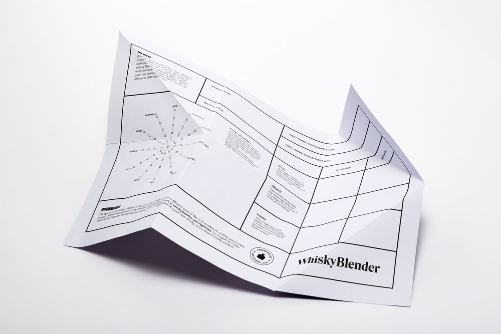
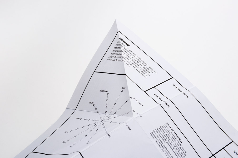
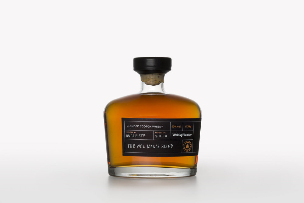
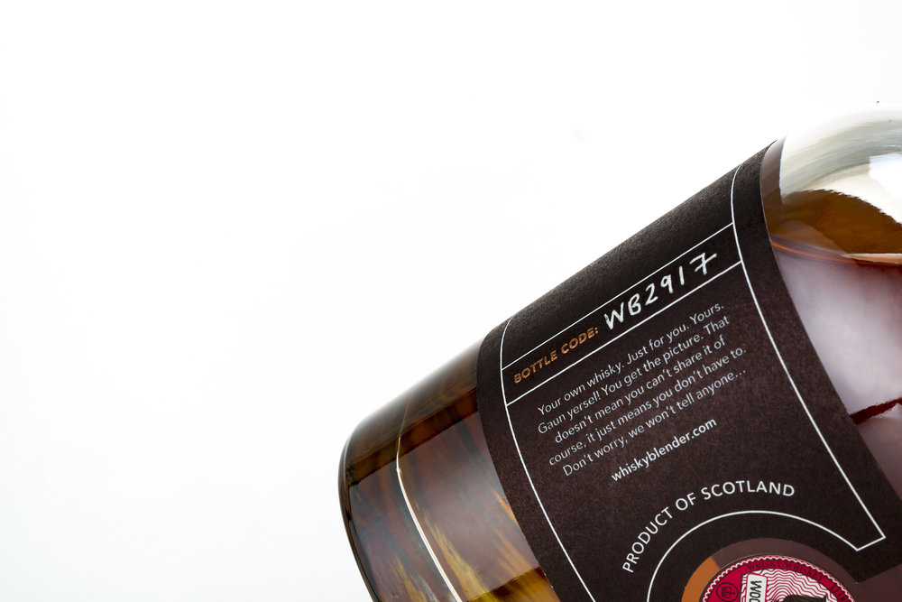
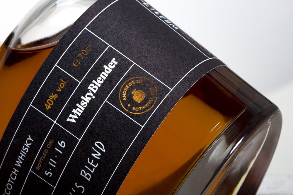
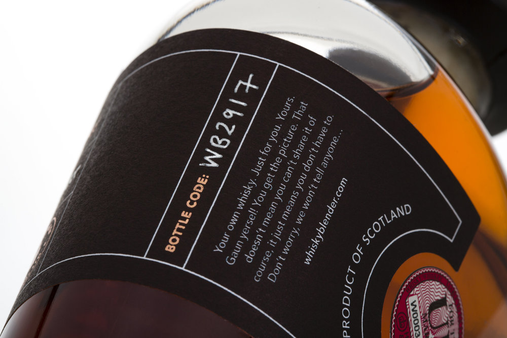
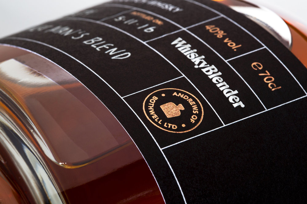
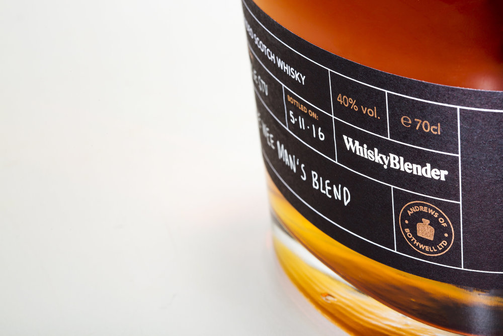
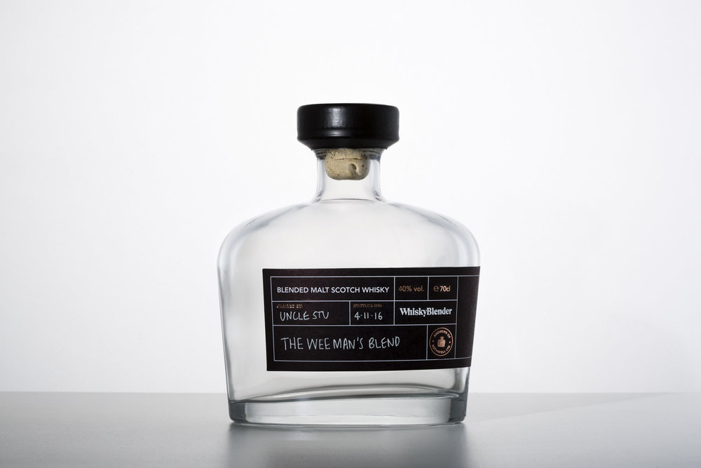
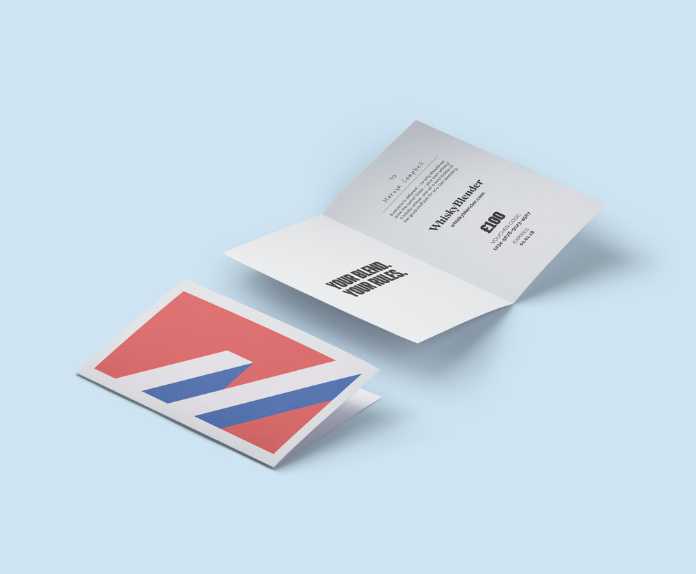
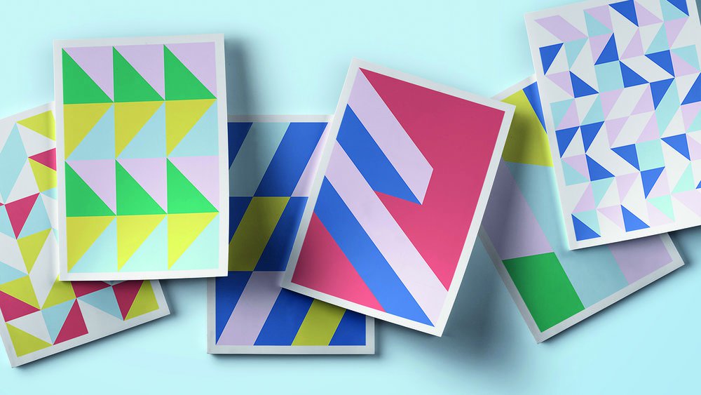
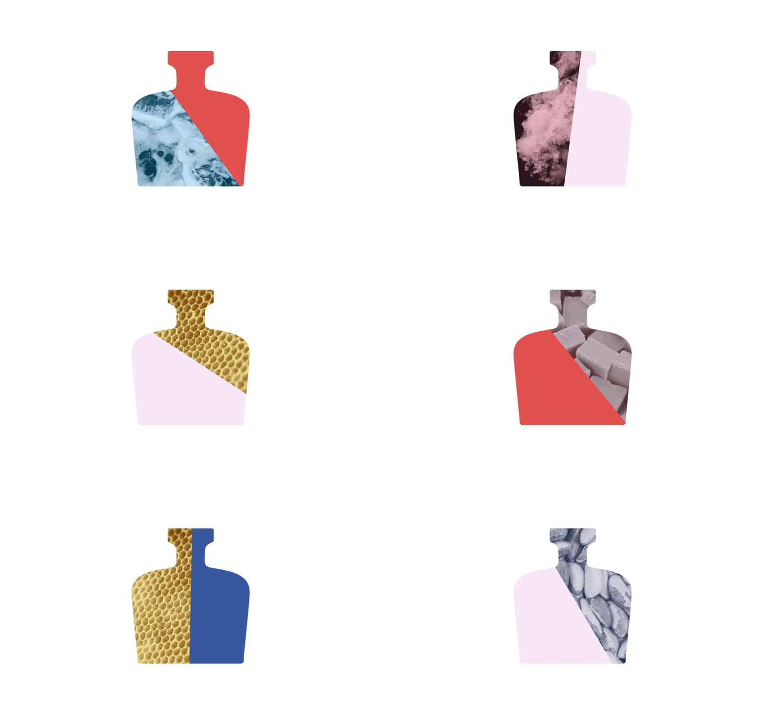
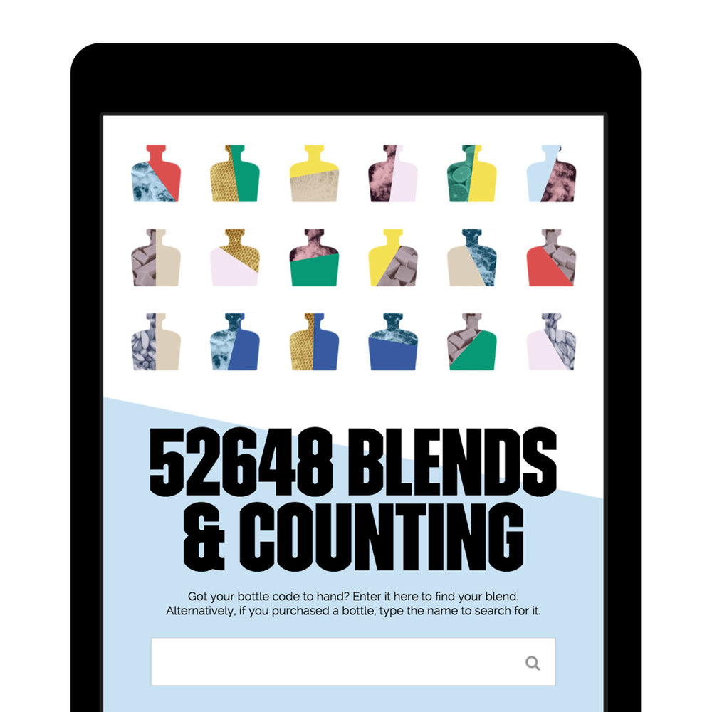
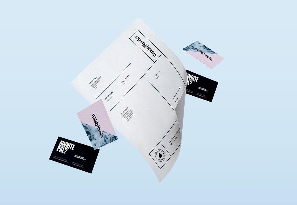
Gone was the traditional imagery and muted colour palette. In its place, a vibrant, textured look and feel, with a cheeky tone of voice that would make the customer feel as though they were talking to a close friend. The labels on the bottles are handwritten, so no two are the same, while the elegant typeface and quality stock pay a modern homage to more traditional styles of whisky branding. Front Page also produced a custom insert to be included with every bottle, featuring the bold brand colours and a step-by-step tasting chart, to guide customers through their first Whisky Blender experience.
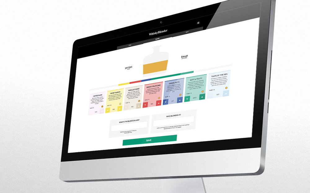
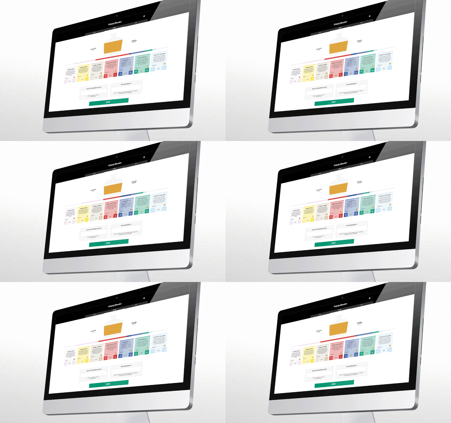
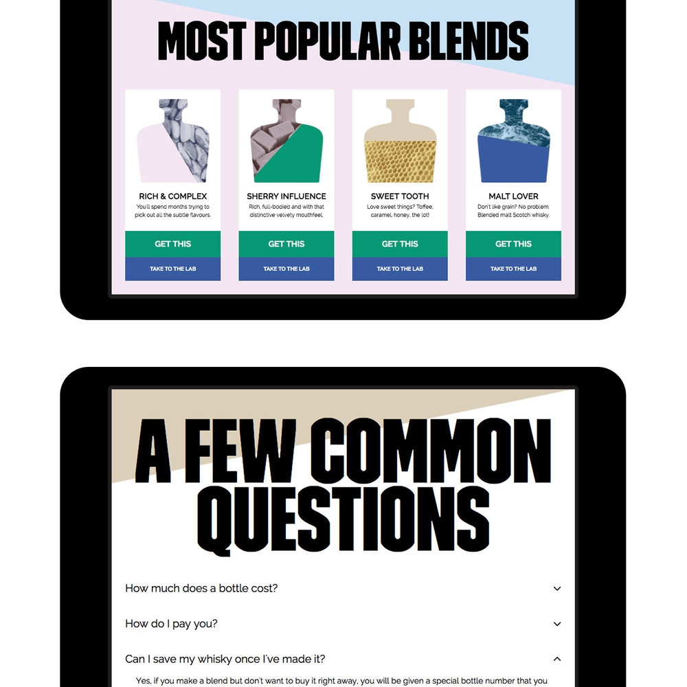
For Whisky Blender, the website is crucial, and Front Page knew that it was going to be the most important aspect of the redesign. After prototyping and user testing multiple iterations of the virtual blending lab, the final result combines a central carousel of blend options with a horizontal bar that shows the percentage makeup of the blend at any given stage. As the blend takes shape, the bottle silhouette fills up, giving an approximate representation of the colour of the final product.
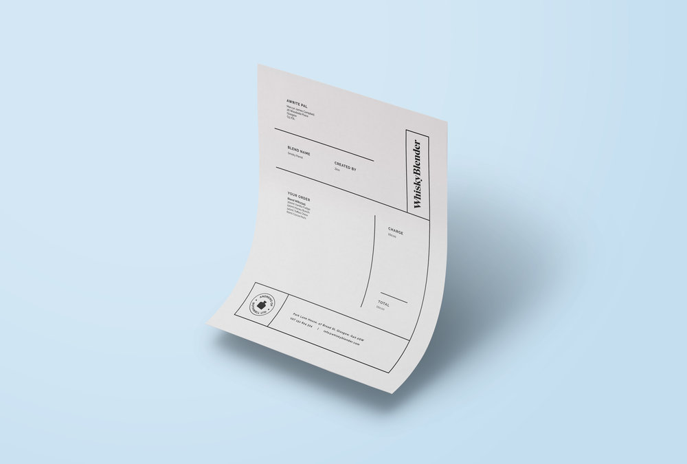
The checkout experience was also given a makeover, and now allows customers to add multiple items to one basket—an important upgrade from both a user experience and business perspective!
With such a unique and appealing product now offering an equally unique and appealing consumer experience, there’s never been a better time to try your hand at the art of whisky blending. Slàinte!”

CREDIT
- Agency/Creative: Front Page
- Article Title: Front Page – Whisky Blender
- Project Type: Packaging
- Format: Bottle
- Substrate: Glass


