


Arber Racaj – Fron Brand
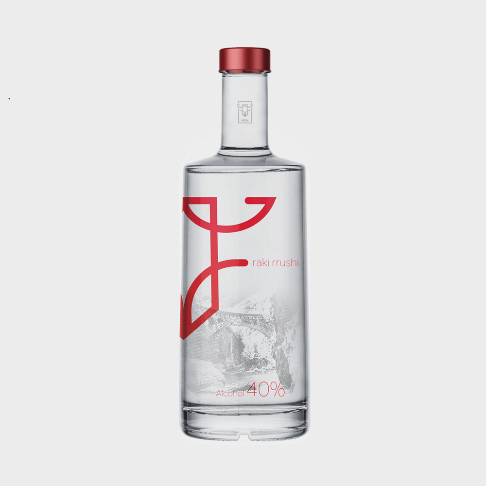
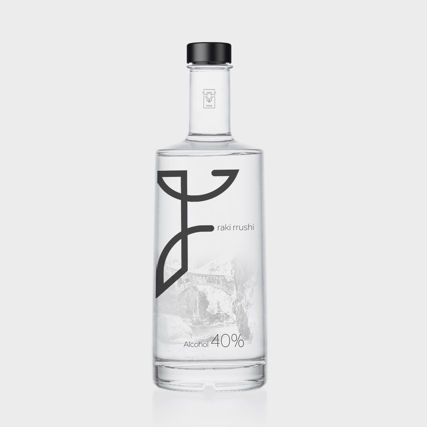
The logo is designed in a unique shape on which are presented three national elements (eagle, national element and royal throne). Rebranding has necessarily brought up the modification of bottle shape, conceptually the shape has a broken angle which is in the same angle as the pictogram. It was seen necessary that the symbol should be presented in half, where it creates the letter “F”. In the back part of the bottle is presented the image of the place from where the product originates. The image is created in a unique shape with broken lines.
CREDIT
- Agency/Creative: Arber Racaj
- Article Title: Fron Bottle Design
- Organisation/Entity: Freelance Commercial, Published
- Project Type: Packaging
- Agency/Creative Country: Kosovo
- Market Region: Europe
- Format: Bottle
- Substrate: Glass
FEEDBACK
Relevance: Solution/idea in relation to brand, product or service
Implementation: Attention, detailing and finishing of final solution
Presentation: Text, visualisation and quality of the presentation


