


The transition from the iconic “Prostokvashino” brand to the revitalized “Prosto Nashe” represents more than just a surface-level makeover; it symbolizes a strategic shift in the brand’s identity and market positioning. By recognizing the evolving tastes and preferences of Ukrainian consumers, the decision-makers behind “Prosto Nashe” embarked on a journey to reimagine their offerings while staying true to the essence of tradition.
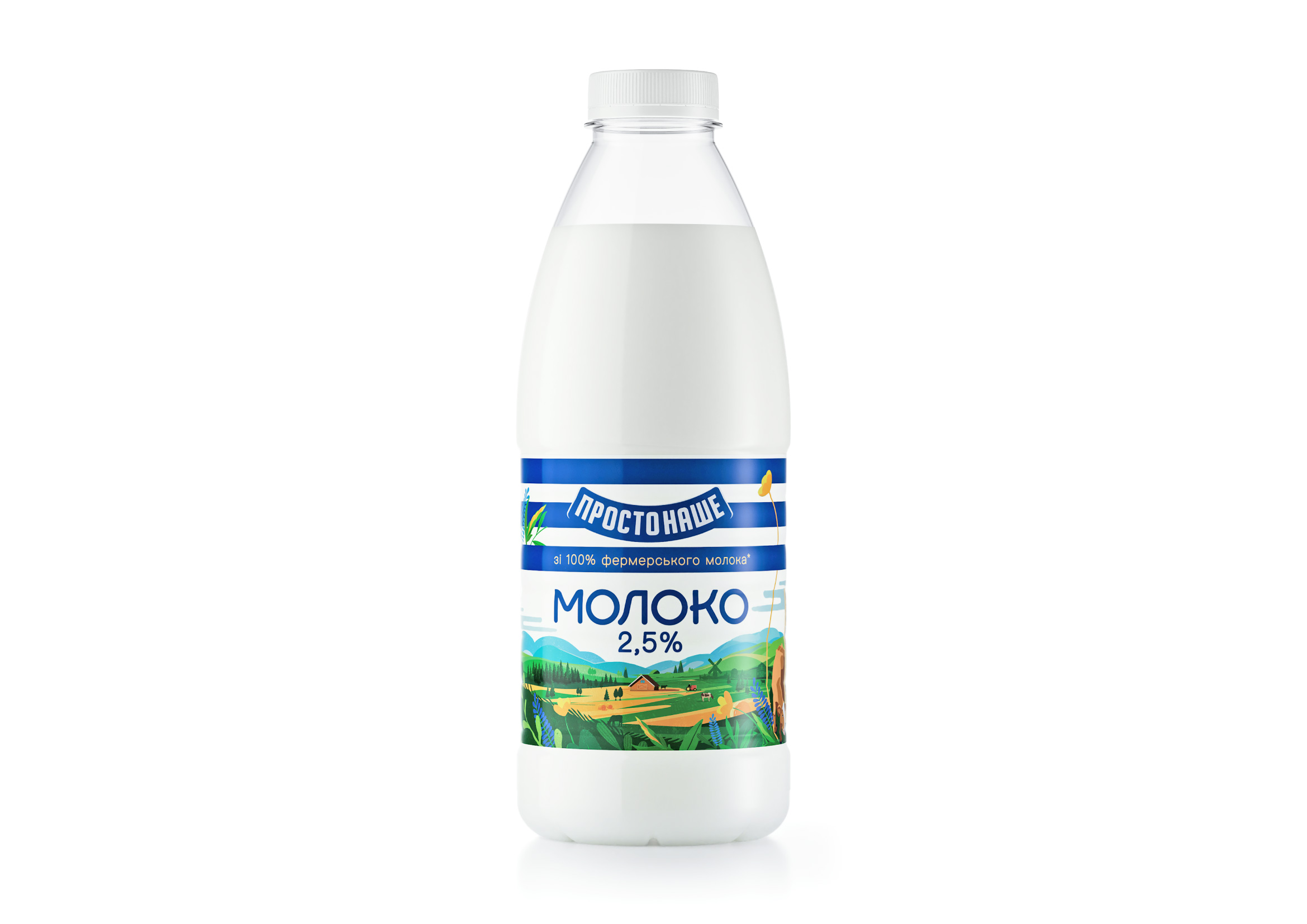
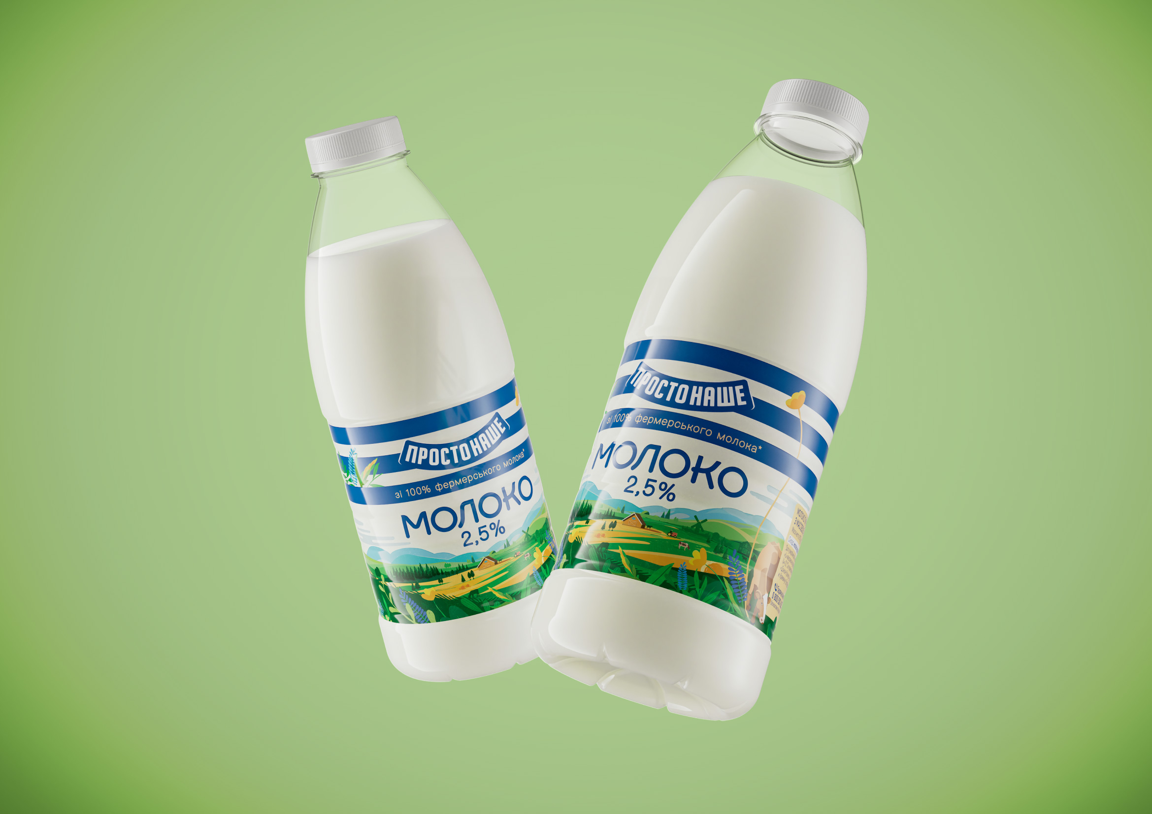
Central to this transformation was the meticulous examination of the previous packaging design and its resonance with consumers. Through comprehensive market research and consumer feedback analysis, it became evident that while the whimsical character of Matroskin held nostalgic appeal, the brand’s visual identity needed to evolve to capture the attention of contemporary audiences. Thus, the decision to replace Matroskin with a background narrative illustration was not merely a cosmetic change but a strategic one aimed at aligning the brand with the evolving sensibilities of its target demographic.
The introduction of the background narrative illustration serves multiple purposes within the new packaging design. Beyond merely filling the void left by Matroskin, this intricate visual element offers a canvas for storytelling, enabling “Prosto Nashe” to connect with consumers on a deeper, more emotive level. Whether through evocative imagery of pastoral landscapes or scenes depicting the craftsmanship behind each dairy product, the narrative illustration serves as a window into the brand’s heritage, values, and commitment to quality.
Moreover, the subtle adjustment of the trademark blue color to a warmer shade reflects a keen understanding of color psychology and its impact on consumer perception. The transition from a cooler to a warmer hue not only enhances the visual appeal of the packaging but also conveys a sense of warmth, comfort, and approachability—qualities that are synonymous with the brand’s promise of wholesome, nourishing dairy products.
In tandem with these design changes, the emphasis on locality and quality remains a cornerstone of the “Prosto Nashe” brand identity. By sourcing milk from nearby farms and producing all products at a state-of-the-art facility in the heart of Ukraine’s dairy country, “Prosto Nashe” reinforces its commitment to freshness, sustainability, and supporting local economies.
As “Prosto Nashe” expands its product line to encompass a diverse array of dairy offerings—from creamy kefir to velvety yogurt cheese—it continues to serve as a beacon of innovation and authenticity in an increasingly competitive market landscape. Through its strategic rebranding efforts, “Prosto Nashe” not only secures its foothold in the hearts and minds of consumers but also lays the foundation for a promising future characterized by continued growth, relevance, and consumer loyalty.


CREDIT
- Agency/Creative: Reynolds & Reyner
- Article Title: From “Prostokvashino” to “Prosto Nashe”- A Strategic Evolution in Brand Identity
- Organisation/Entity: Agency
- Project Type: Packaging
- Project Status: Published
- Agency/Creative Country: Ukraine
- Agency/Creative City: Kyiv
- Market Region: Europe
- Project Deliverables: Packaging Design
- Format: Bottle
- Industry: Food/Beverage
- Keywords: milk, ukraine
-
Credits:
CD: Oleksandr Andreiev


