


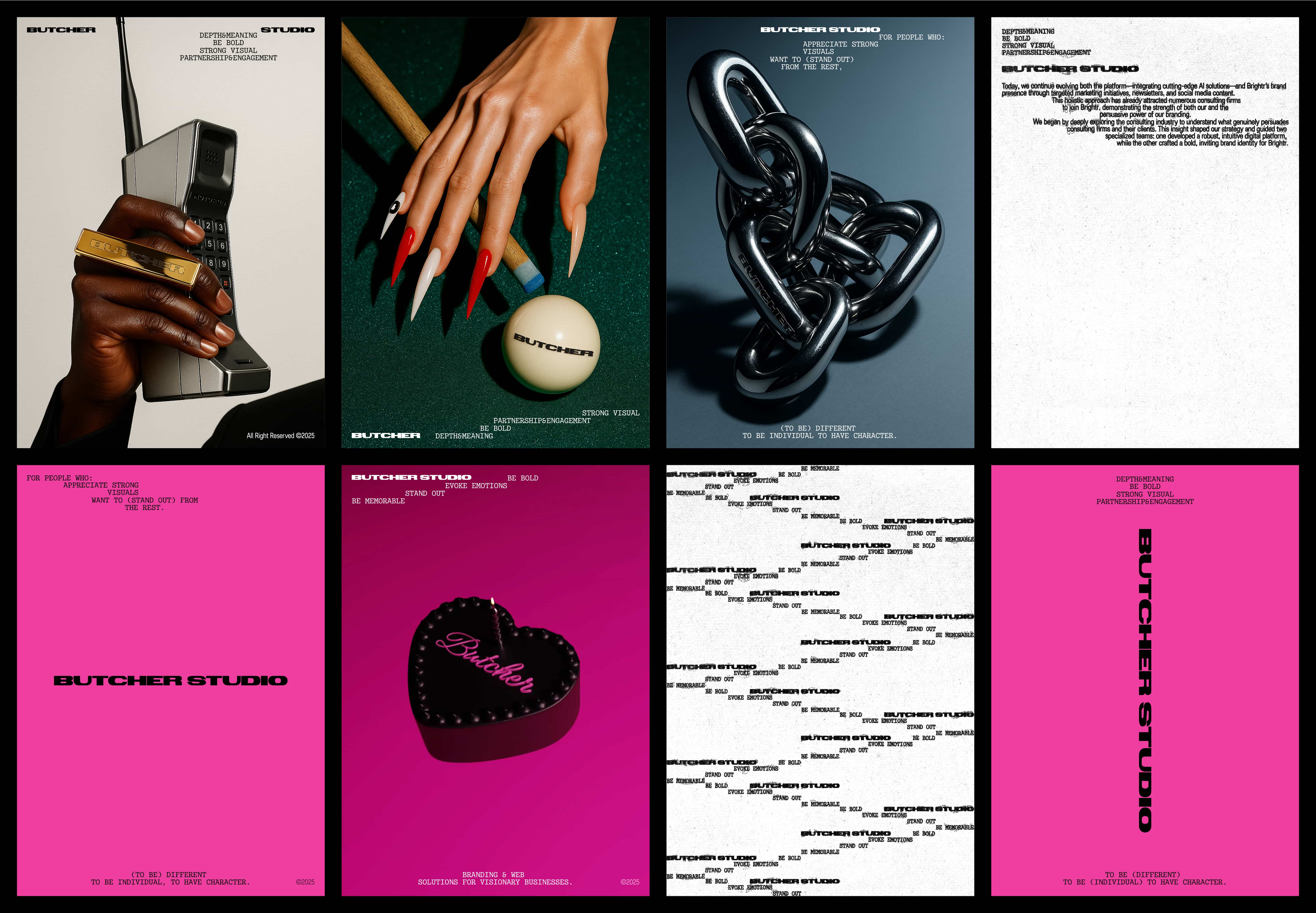
Butcher.studio has always been about clarity and character. We build brands for people who want to stand out, not fade into a polite neutral background. Over the last eighteen months our projects have grown bolder, crossing ten countries and winning twenty-five industry awards. At some point we realized our own identity no longer reflected the sharpness of our work. It had become too neat, too polite. The refresh was never about decoration; it was about honesty, expression, and building a system that feels material and direct.
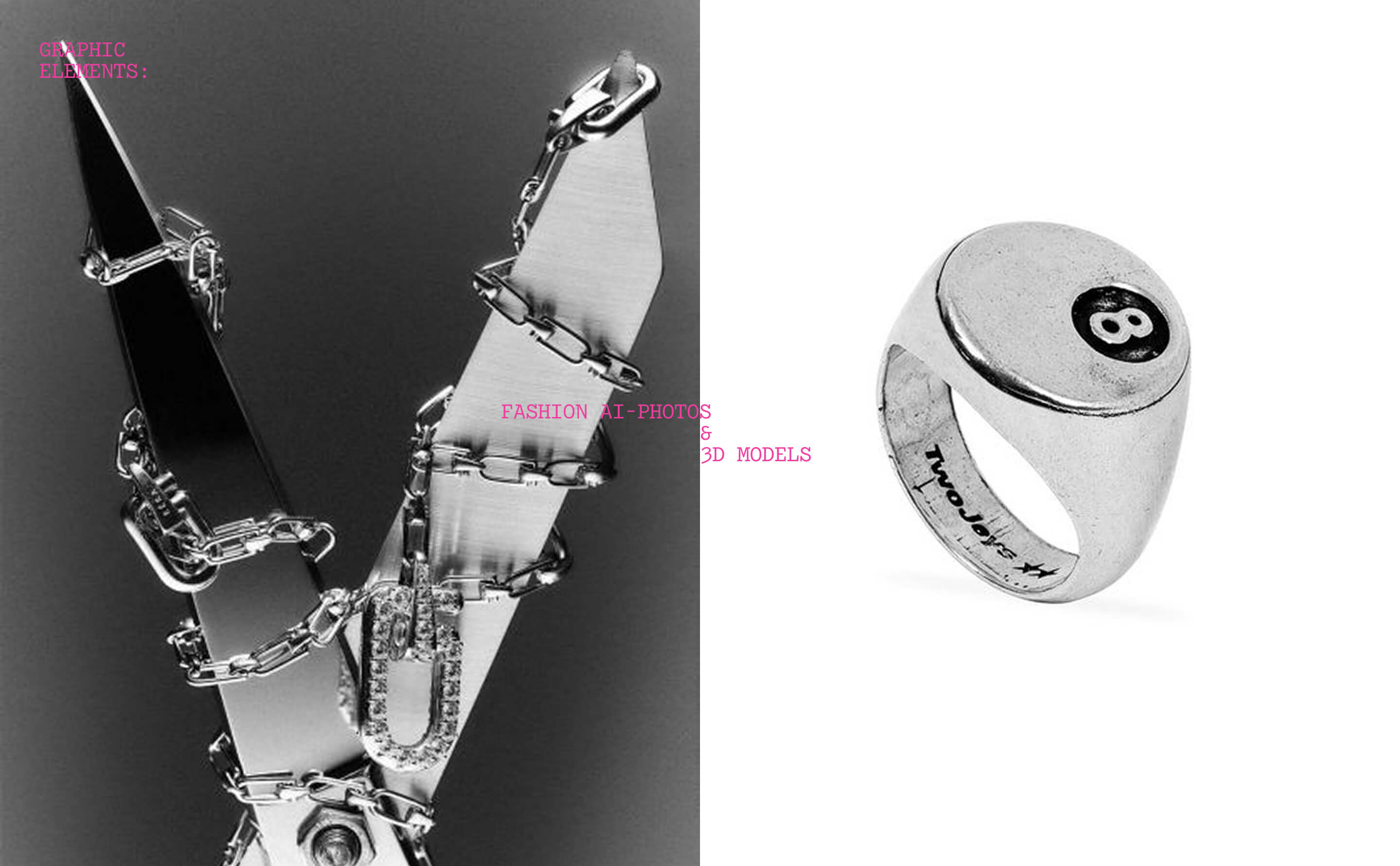
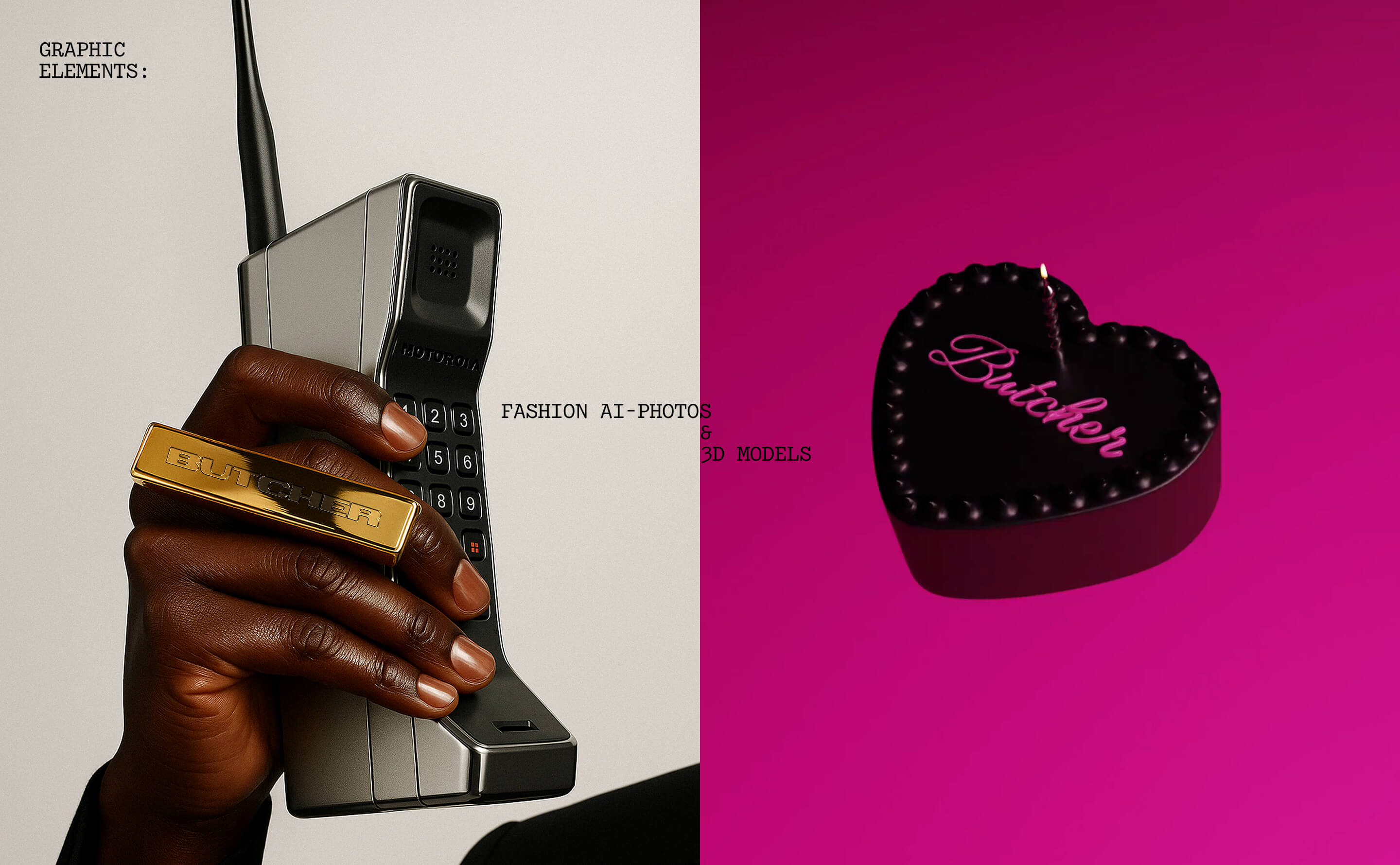
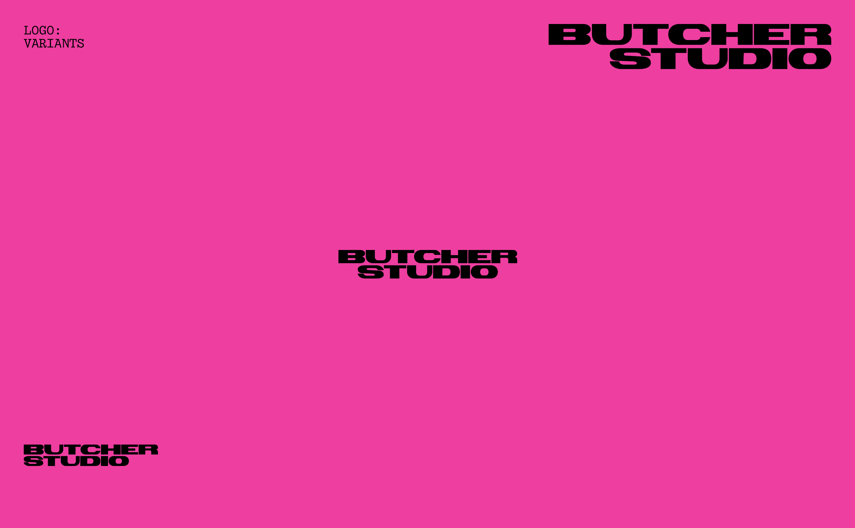
The new language is built on things you cannot ignore. Lacquered nails pressing against green felt, a hand gripping a heavy phone, a chain pulled under tension, a black heart-box that is equal parts sweet and sharp. These are everyday objects, but in our context they become totems: familiar and strange at the same time. They bring texture, physicality, and a sense of weight. Hard Pink (Pantone 806 U / #FF006E) hits against a stark black-and-white base so nothing feels timid. Chrome shapes—sculpted in Houdini and rendered in Blender—fold, fuse and break apart, visualising the tensions we cut through for clients. Even our textures had to be unique: instead of stock patterns we generated fine fibre surfaces with Stable Diffusion. This reduced early exploration time by about forty percent and gave us a material library that belongs to us alone.
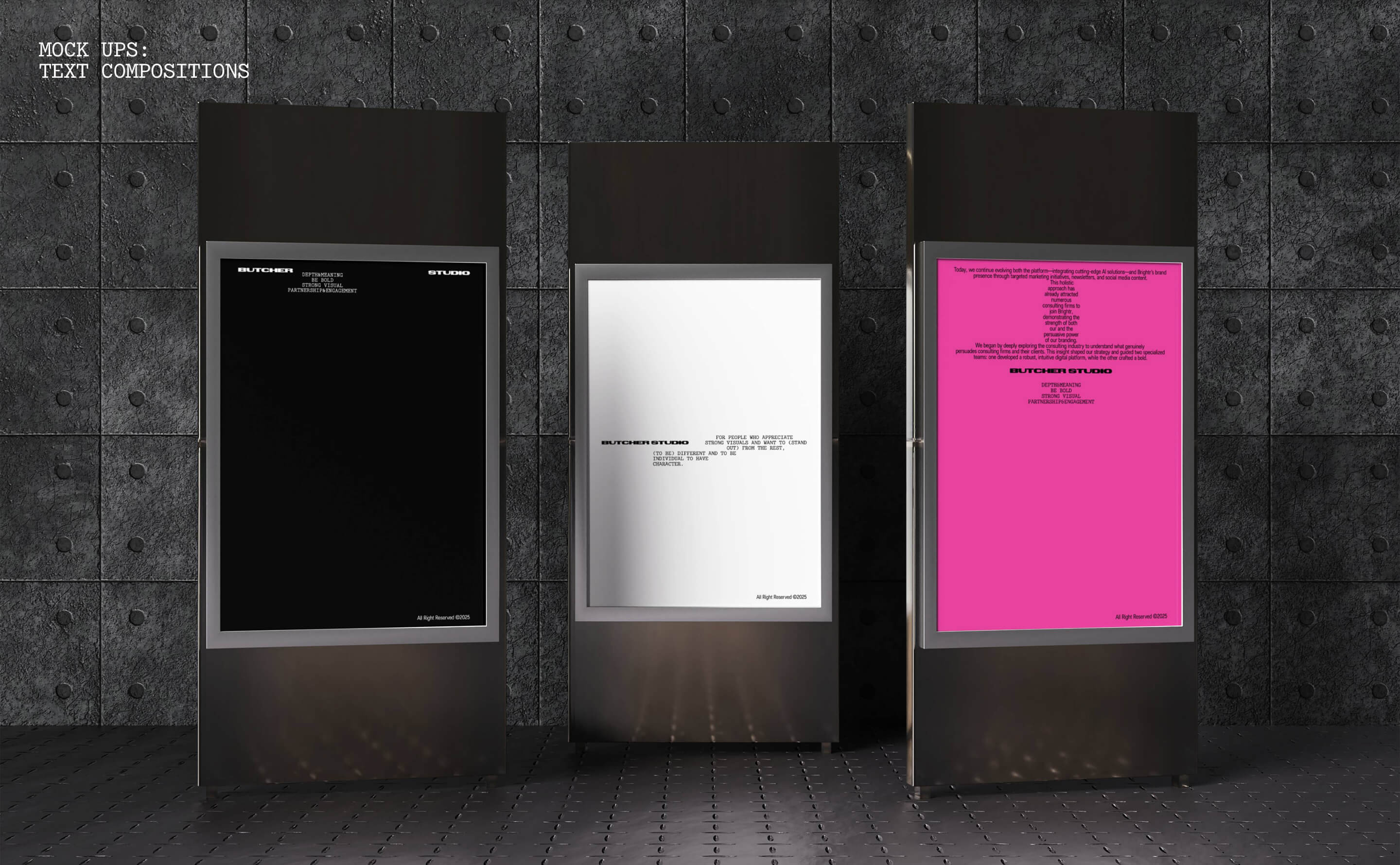
Typography works like hardware. The word Butcher is not a logo on a pedestal, it is a structural element. It can be cropped, stacked, set vertical as a spine, repeated into noise fields. Micro-copy functions like stage directions, reinforcing the bluntness of voice. In motion, the system comes alive: the mark wakes, the frame shifts, colour retreats and then strikes back. It is not random animation but a single pulse that connects posters, decks, social feeds, the site and physical environments.
What we built is not just a logo or a style but a design language that is unapologetically sharp. It is straightforward on the surface, engineered underneath, and speaks directly to those who value strong visuals and individuality. This is where a studio called Butcher should be: honest, expressive, material, and impossible to ignore.
CREDIT
- Agency/Creative: Butcher.studio
- Article Title: From Polite to Powerful: Butcher.studio’s New Visual System
- Organisation/Entity: Agency
- Project Type: Identity
- Project Status: Published
- Agency/Creative Country: Israel
- Agency/Creative City: Haifa
- Market Region: Global
- Project Deliverables: 2D Design, 3D Art, 3D Modelling, 3D Motion, Art Direction, Brand Architecture, Brand Creation, Brand Design, Brand Guidelines, Brand Identity, Brand Redesign, Brand Tone of Voice, Branding, Identity System, Logo Design, Tone of Voice, Typography
- Industry: Professional Services
- Keywords: branding, brand identity, visual identity, brand refresh, expressive design, bold visuals, contemporary branding, design system, creative direction, experimental typography, stencil wordmark, Hard Pink, Pantone 806, chrome 3D, Houdini, Blender, motion design, AI textures, Stable Diffusion, graphic design, international design studio, Butcher.studio
-
Credits:
Art Director: Margarita Golubeva
CEO: Igor L
Graphic Design: Sofia Vasilevskaya
Motion: Oleg Ladygin


