


A new graphic identity for the “Like Italy” brand, distributor of selected meats throughout the national territory. Representing a company philosophy, a mission of a large company in the Campania region. Inventing, recreating, forming and designing: a logo based on simple but decisive lines, with a strong visual and graphic impact. The brand can easily break down into its various elements while maintaining strong its identity represented on all company supports, primary and secondary.
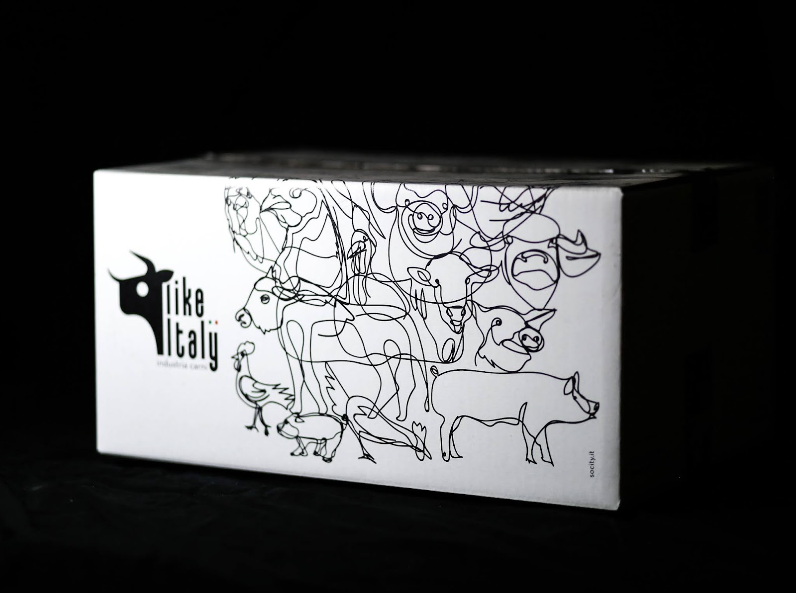
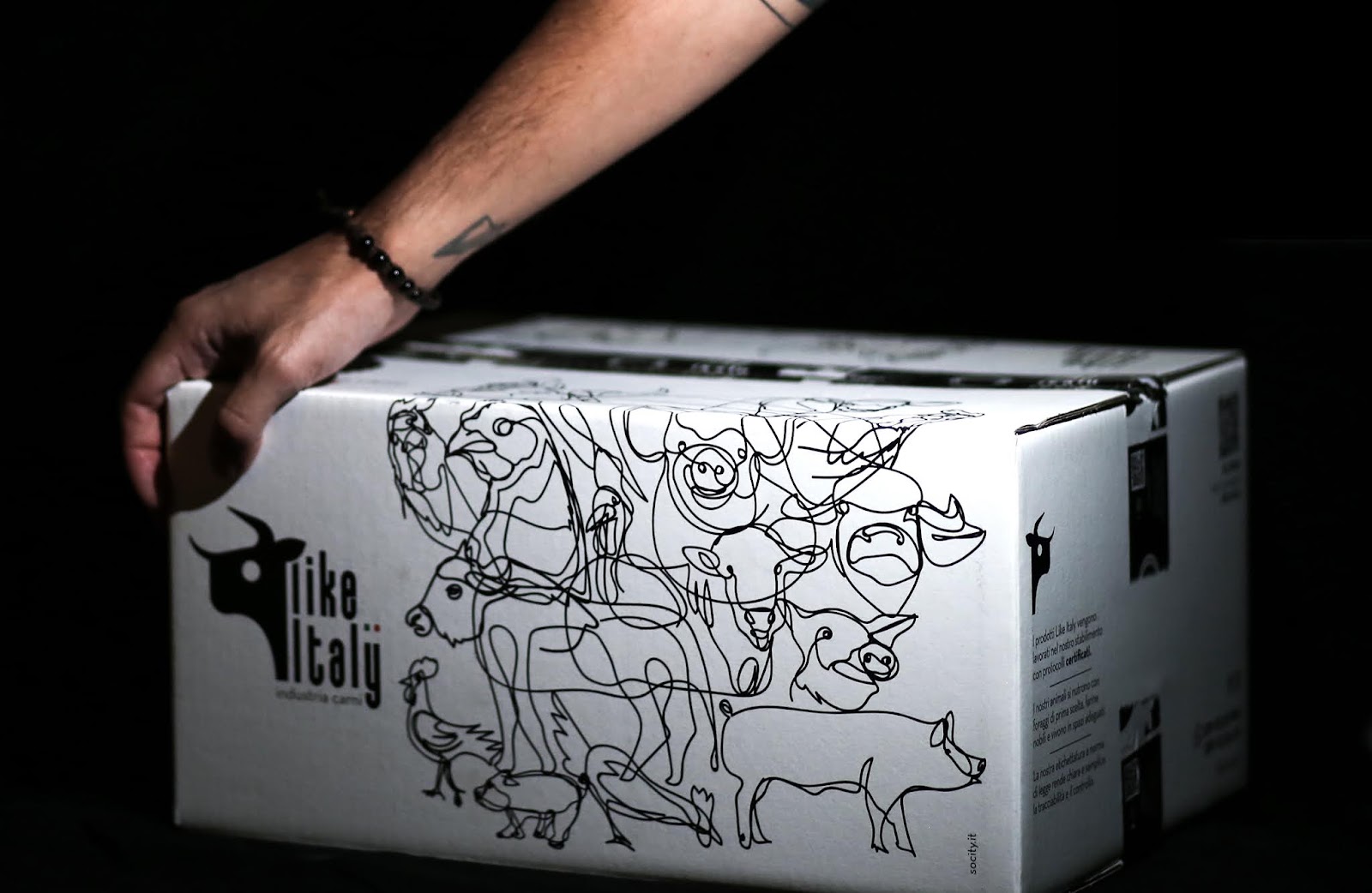
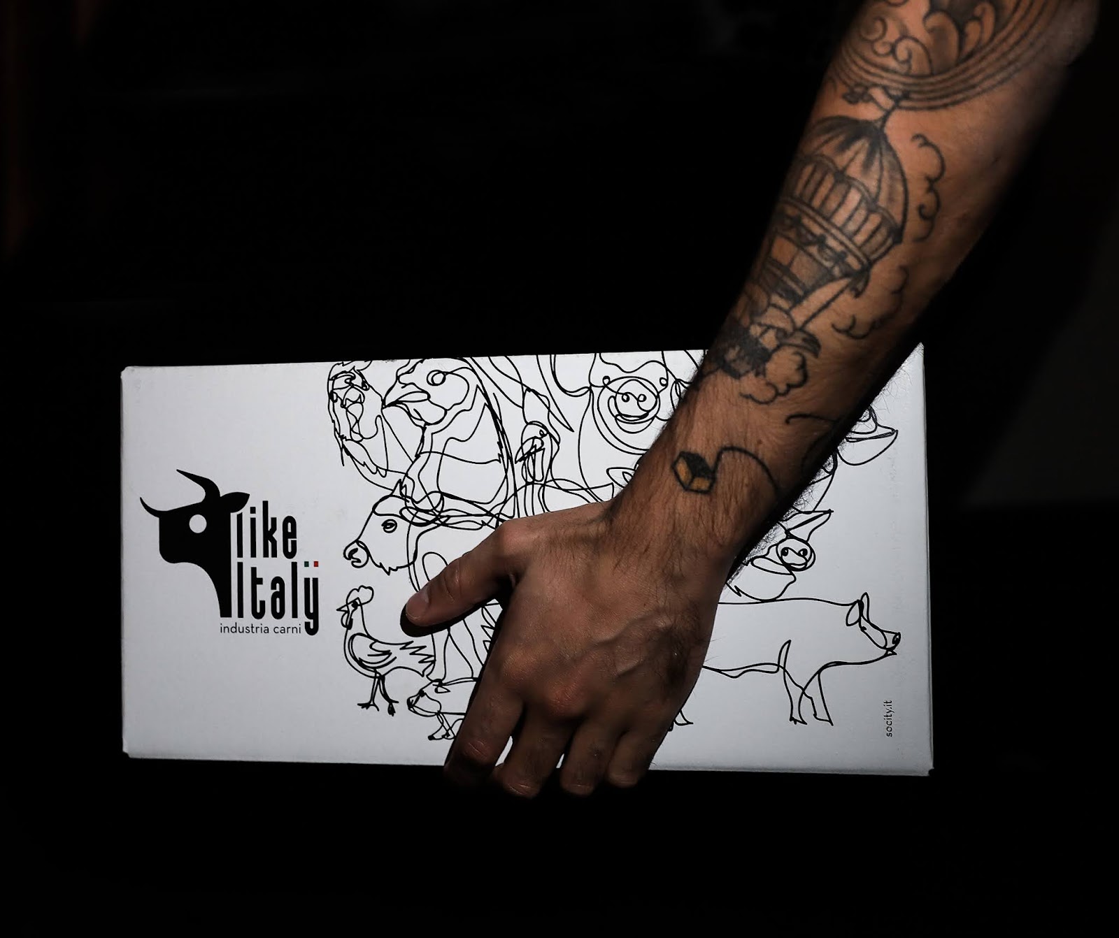
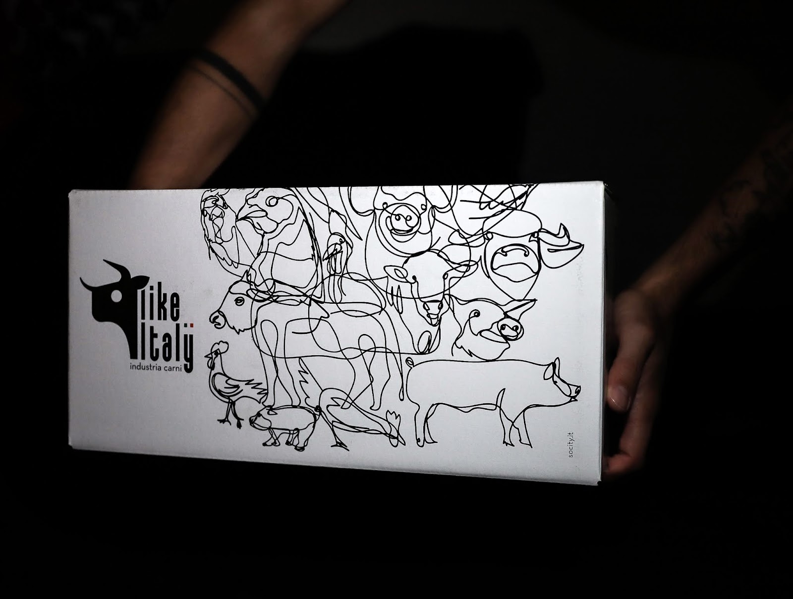
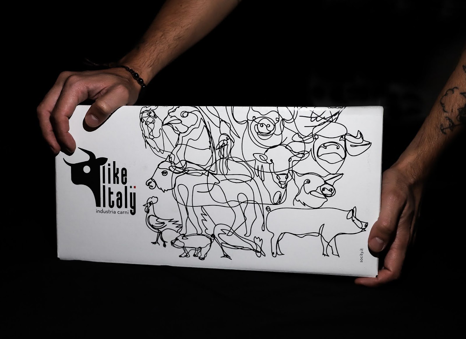
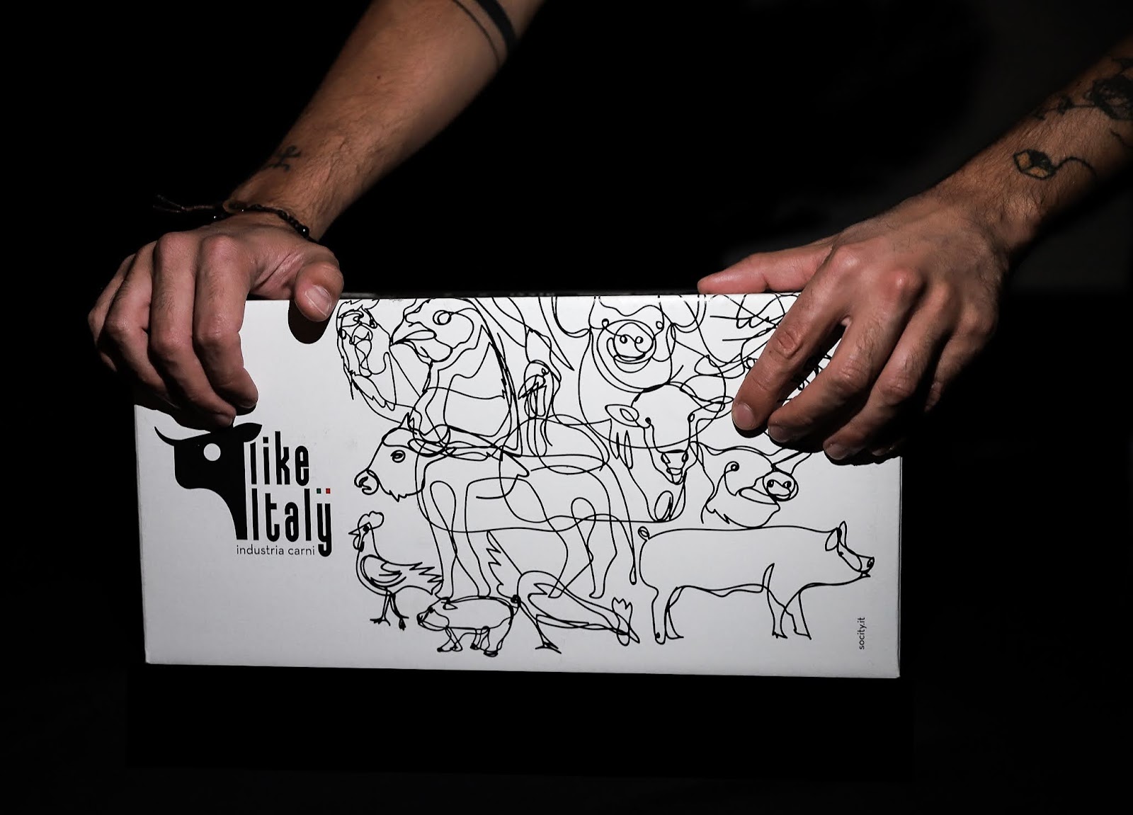
Like Italy distributes and markets a wide range of products by selecting and taking care of every detail of the production chain. To best represent and communicate this “universe” of meats and sizes, we decided to design the packaging design using an ad hoc illustration. Starting from a point, never remove the pen from the paper trying to build a constellation made of inspiration and geometry. Try to make the consumer perceive that we represent the same supply chain through a single line.
Imagining absurdly, fantasizing and starting to draw: this is the creative process that accompanies us in so many creations. Creativity and originality obviously underlie the idea. In this case we have decided to give, through this design, a real narrative experience to the consumer: when he receives the box he will try to find out more about this design, to perceive the starting and final point, to find in the middle of this creative grid all individual animals entered. It is the imagination that makes a pack magical.
Revealing all the individual details of a project sometimes make it less attractive: inserting small “secrets” instead could be the key to success. We do not describe all the animals included but we make sure that the consumer discovers them for himself, we do not want to say everything about Like Italy but we let the customer discover it through the call to action present on the pack. The pack as a treasure chest full of “mystery”, with many hidden meanings but all incredibly fascinating.
What’s Unique?
Illustrations ad hoc for the customer. A unique texture that starts from one point and creates the whole drawing: the pen never leaves the sheet.
CREDIT
- Agency/Creative: Socity - Creative Space
- Article Title: From Point to Line – A New Graphic Identity for the “Like Italy” Brand
- Organisation/Entity: Agency
- Project Type: Packaging
- Project Status: Published
- Agency/Creative Country: Italy
- Agency/Creative City: Socity/Cava de' Tirreni
- Market Region: Europe
- Project Deliverables: Packaging Design
- Format: Box
- Substrate: Pulp Carton
- Industry: Food/Beverage
- Keywords: packaging design
-
Credits:
Art Direction: Socity


