


When Amoranza approached us with their Spanish Tempranillo wine, we were excited to bring out the wine’s true character and make it stand out on the shelf. The wine shared a label with its white and rosé counterparts, which did not accurately reflect its name or temperament. So, we decided to dig a little deeper and learn more about the brand.
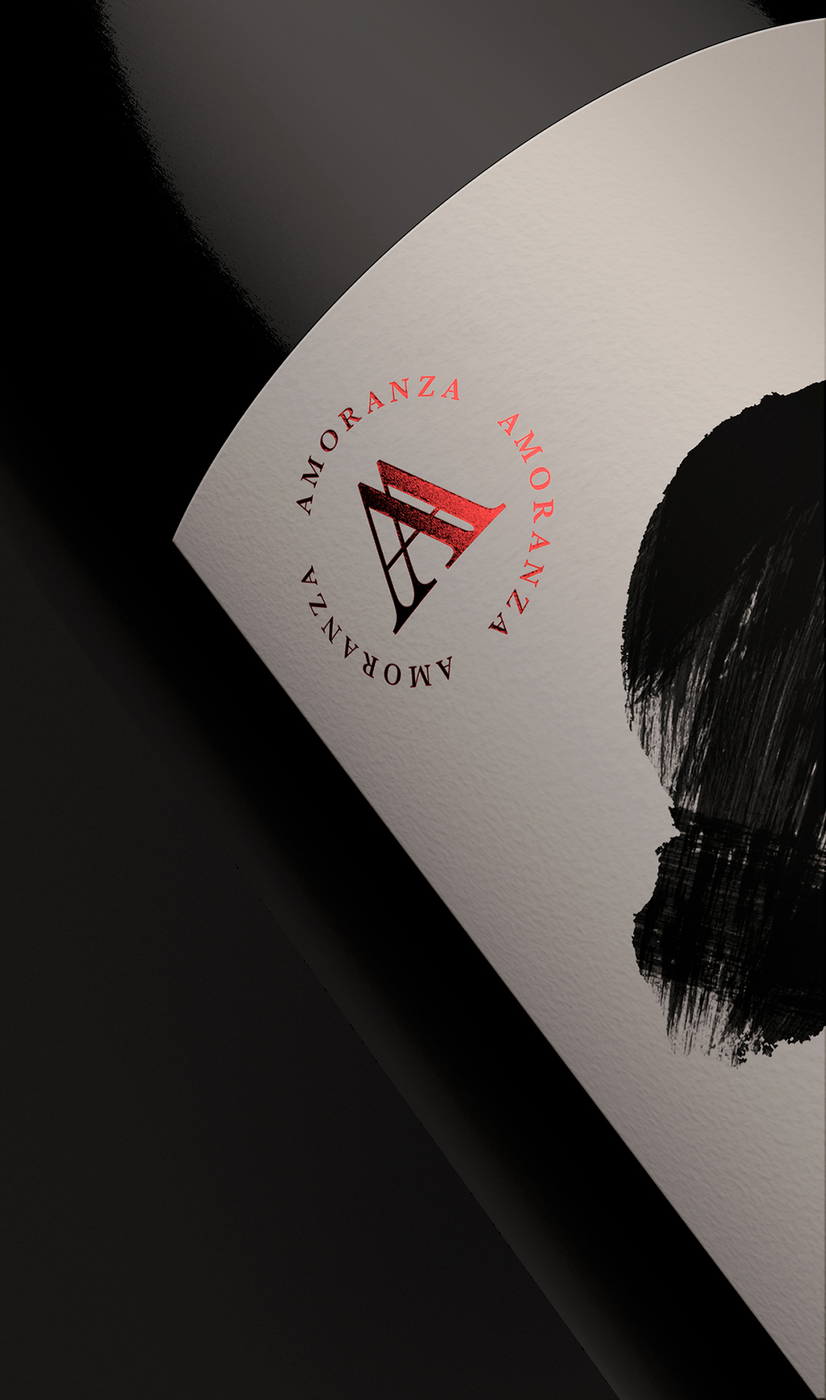
After some research, we discovered that “Amoranza” means “love affair,” which sparked our creative play. We wanted to create a design that embodied the heat and emotional expressiveness of the Latin lifestyle. We explored different ways to bring that frank and sexy sense of freedom to the fore while hinting at the wine’s complex flavor profile.
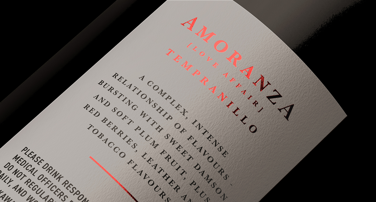
Our team delved deep into the tempestuous nature of star-crossed lovers and the intricate notes of sweet damson, soft plum, red berries, leather, and tobacco. We wanted to create a design that reflected the wine’s intense character and its unique flavor combination.
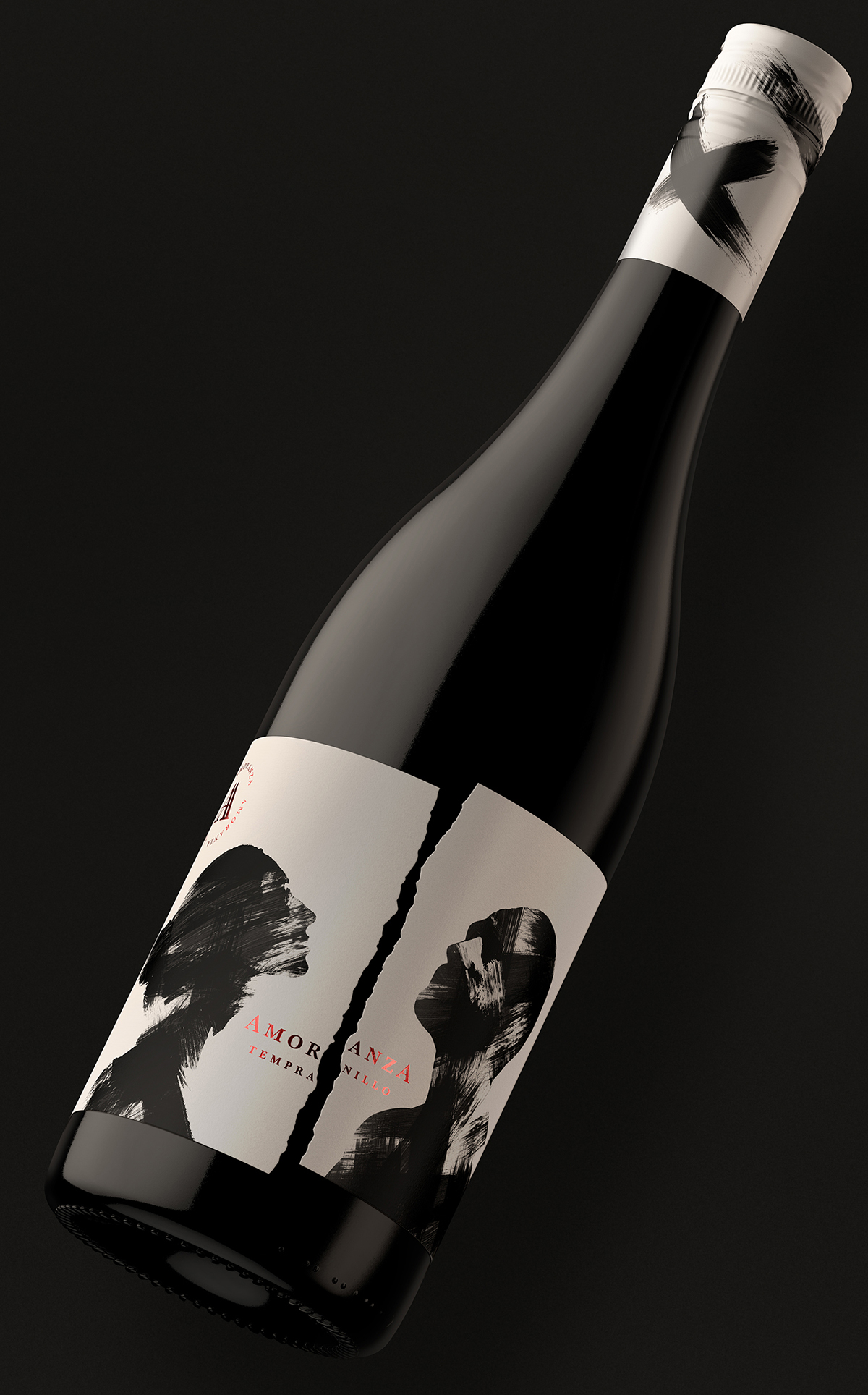
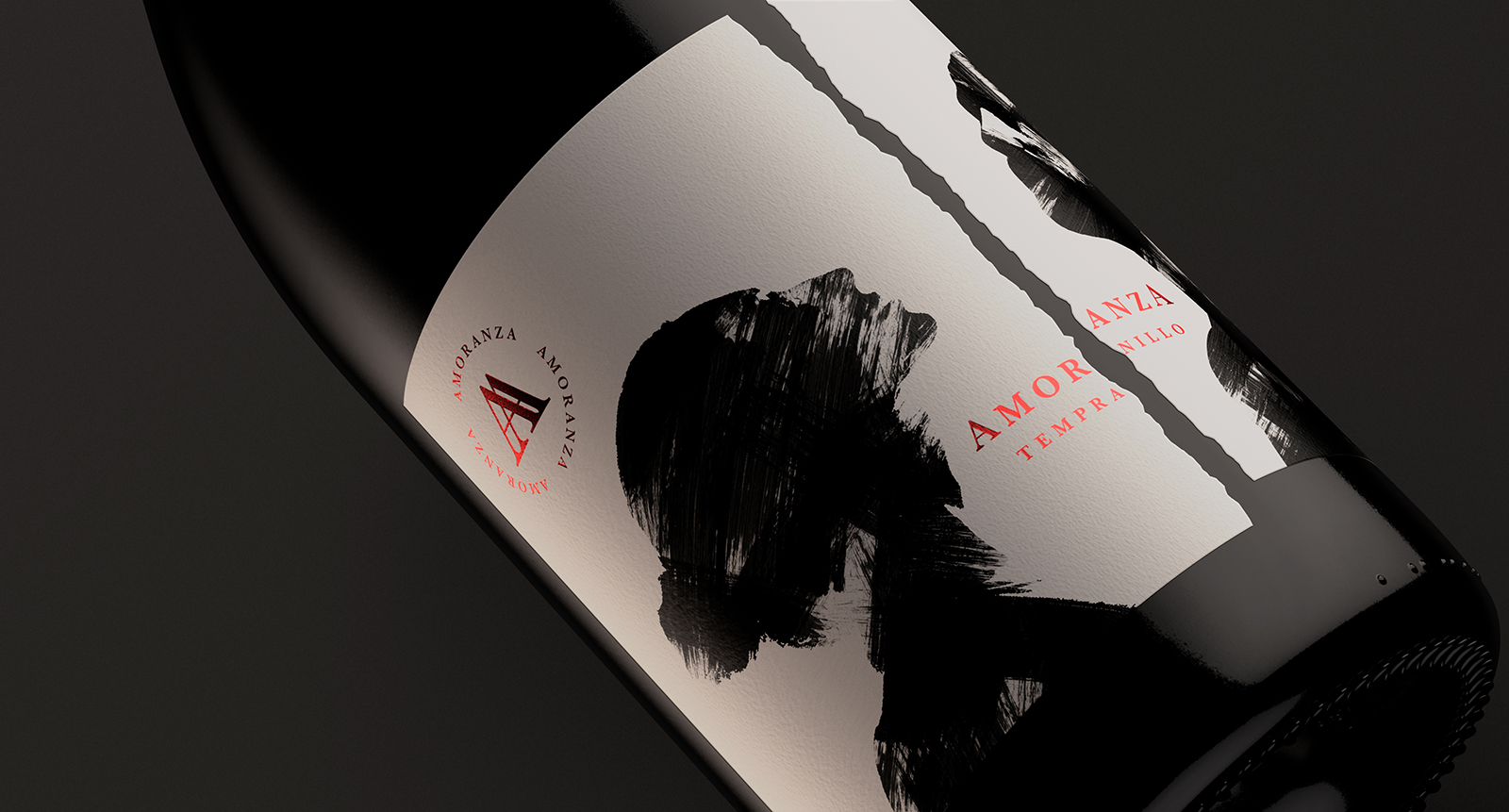
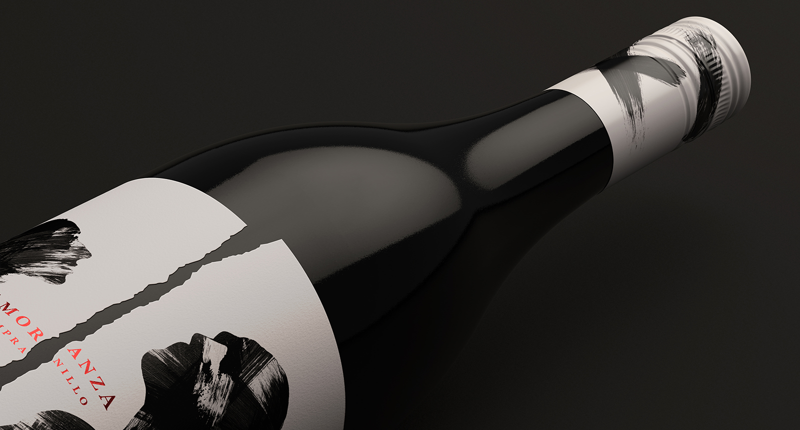
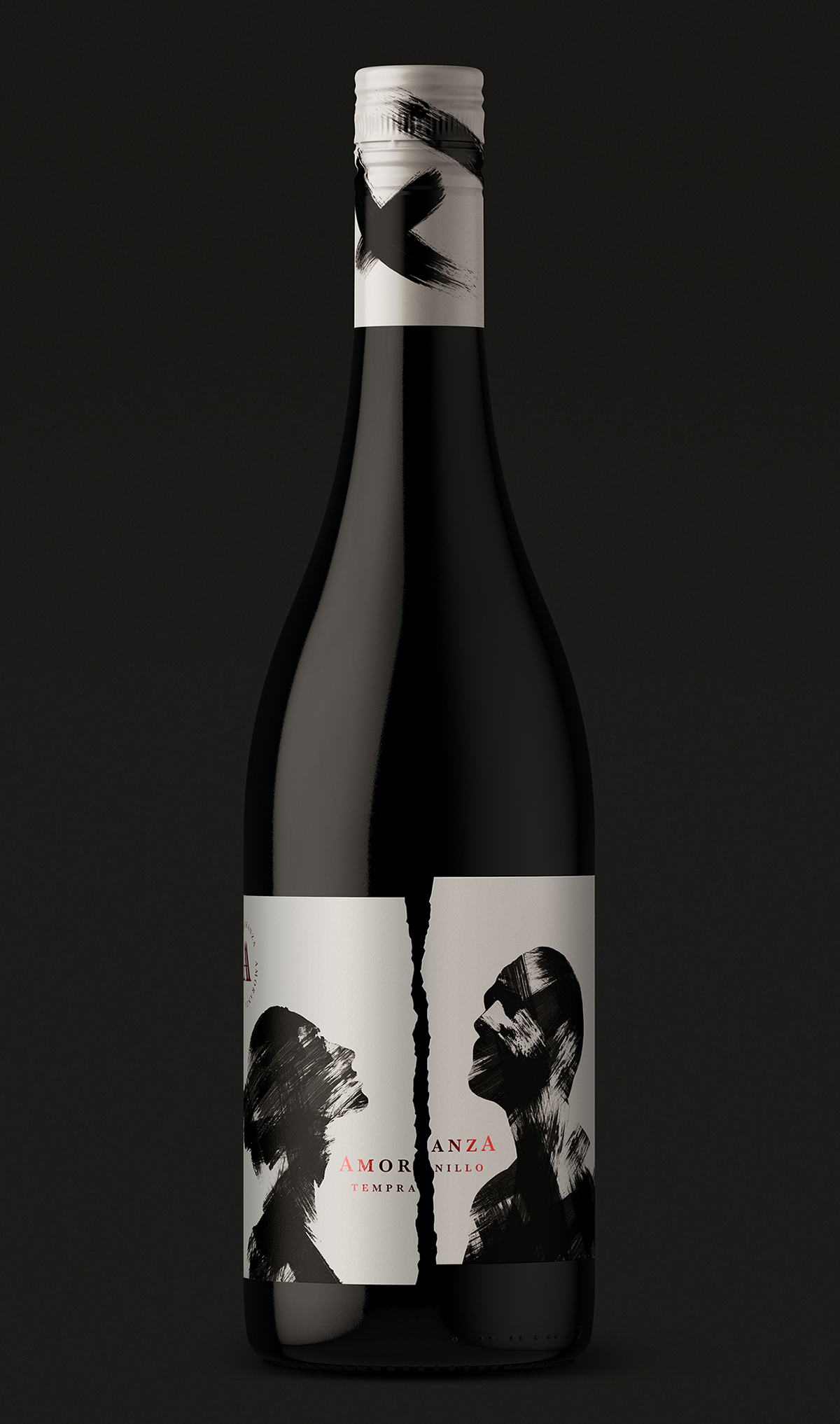
The idea we came up with was a sleek and contemporary monochrome rendition of passion and provocation. We used loose painterly brushstrokes to depict the intense connection between the couple, while the torn and off-kilter label reflected the powerfully explosive entanglement of the affair. We believe that these design elements work together to create a label that is both visually striking and reflective of the wine’s passionate and complex character.
But we didn’t stop there. We added graphic marks splashed onto the neck and cap of the bottle to draw the eye towards the label and add to the overall impact. These design elements are sure to catch the attention of consumers and make them curious about the wine’s unique character.
Finally, we included tasting notes on the back of the bottle to give consumers an idea of the wine’s flavour profile. We believe that these notes tell the intense tale of a clash of flavour personalities brought momentarily into harmony by this grape-fueled love affair. We wanted to provide consumers with an informed decision when selecting a wine, and we believe the tasting notes accomplish just that.
CREDIT
- Agency/Creative: Buddy Creative Ltd
- Article Title: From Love Affairs to Flavor Notes: A Creative Approach to Designing Amoranza Tempranillo’s Label
- Organisation/Entity: Agency
- Project Type: Packaging
- Project Status: Published
- Agency/Creative Country: United Kingdom
- Agency/Creative City: Exeter
- Market Region: Europe
- Project Deliverables: Packaging Design
- Format: Bottle
- Substrate: Glass, Pulp Paper
- Industry: Food/Beverage
- Keywords: Amoranza, Love Affair, Buddy Creative, packaging, design, wine, illustration
-
Credits:
Mark Girvan: Mark Girvan


