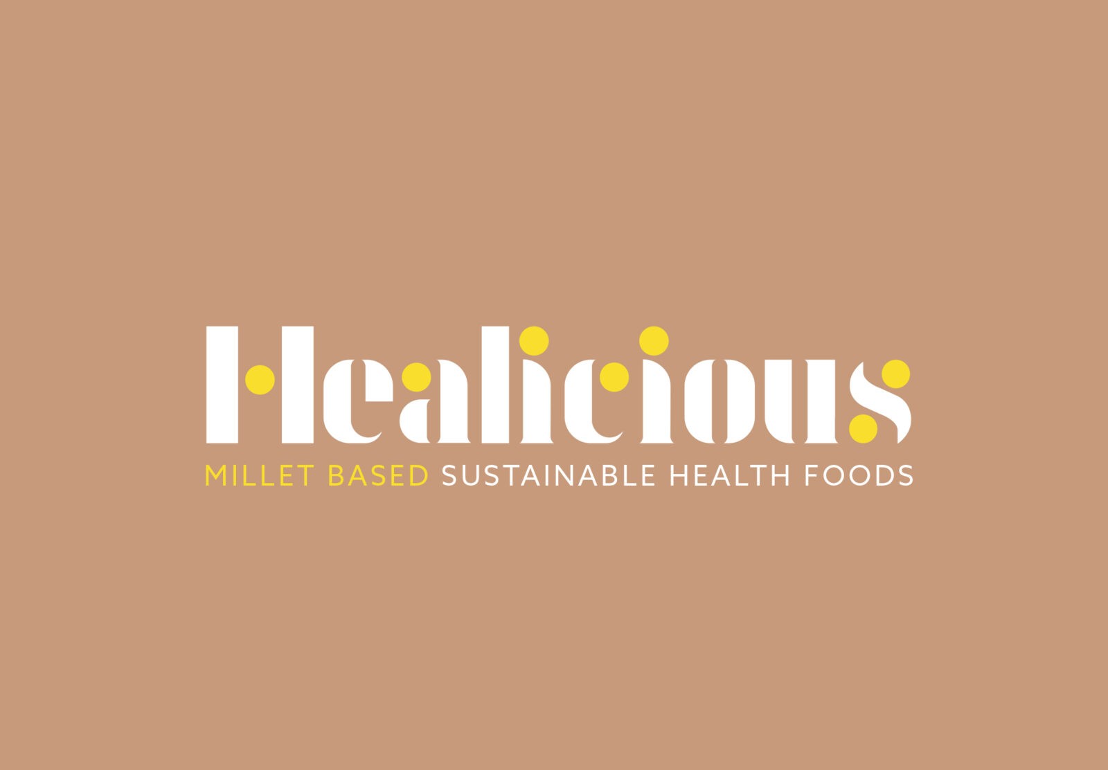
We were tasked with creating a logo and visual language for an exciting start-up food brand called Healicious (a combination of Healthy & Delicious). Who were taking an old staple food and bring it into the modern world of cuisine.
It was clear from the beginning that the product and heritage of the brand played a huge part in the business and those who drive the brand so the brand visual had to take this into account.
At healicious, their story revolves around one powerful ingredient: the millet and its origin, India. This ancient grain is what they wholeheartedly believe has the power to transform lives and nourish bodies. The brand is built upon the ethos that the millet isn’t just an ingredient; it’s the hero of their culinary journey.
Millet is one of the oldest cultivated grains in the world and has been grown throughout Africa and Southeast Asia for thousands of years. Today, it’s one of the most important cereals around and is a staple crop for humans and animals. The small round grains are so important because they’re hardy and easy to store for years without insect damage.
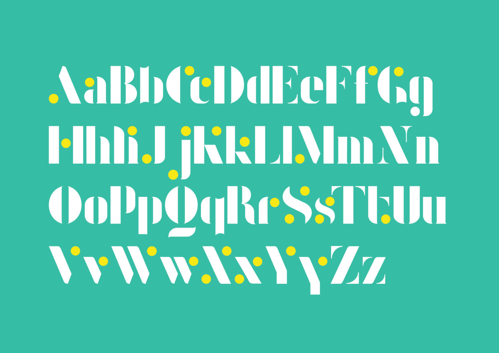
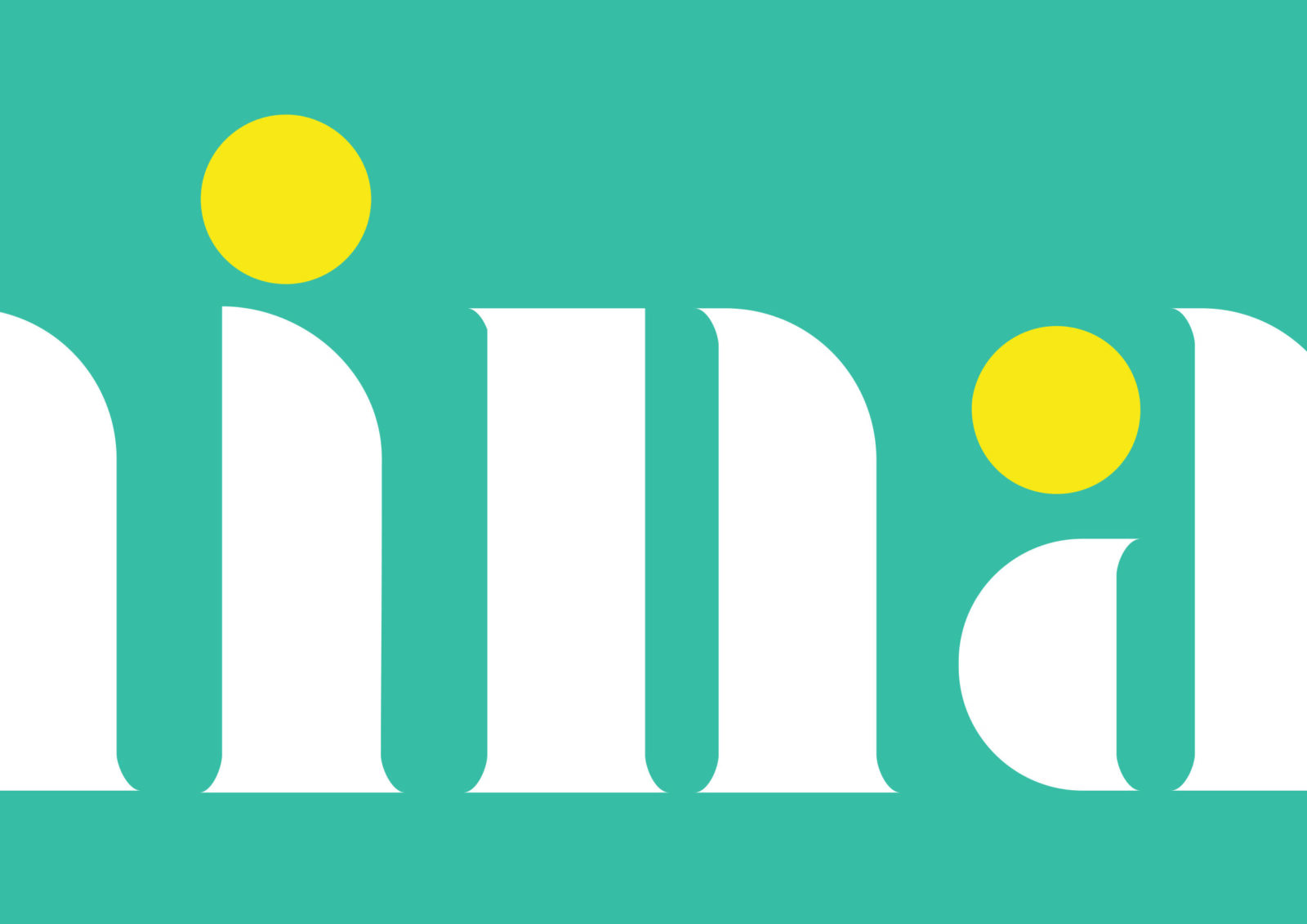
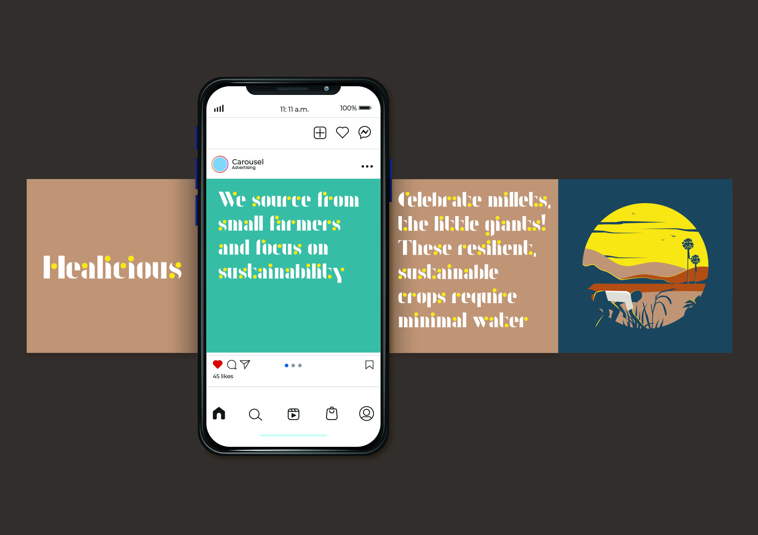
From the inception of healicious, we set out to celebrate the goodness of millet in every aspect of the brand identity. Our logo proudly embodies the essence of millet. The font we created reflects the Indian heritage of the brand with the millet being a staple element in its graphic assets.
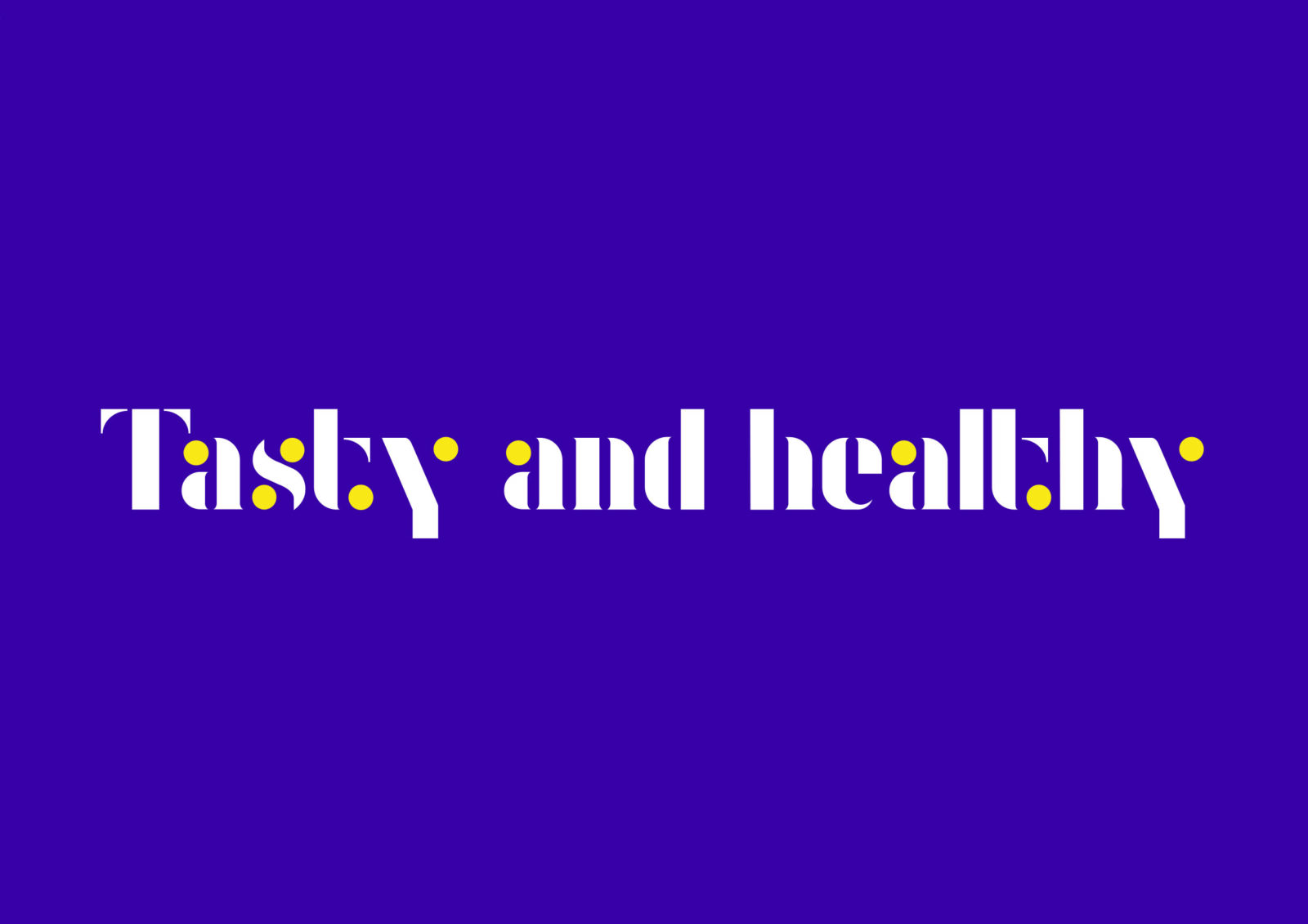
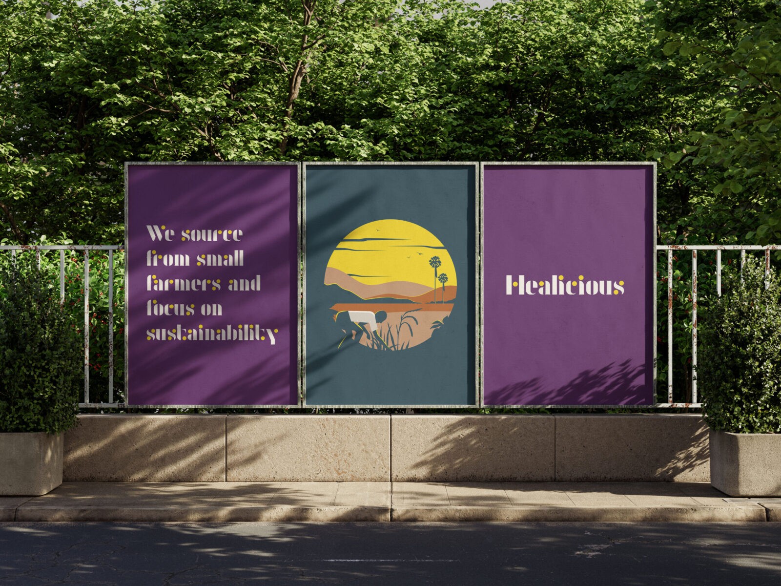
The Millet, a small yellow ball is this super-food that is full of goodness. We took the yellow dot and made it the lead role within all communication of the visual language. With the custom typeface being the hero the millet always plays a huge part of the brand messaging supported by the bold and rich colours influenced by Indian street art.
CREDIT
- Agency/Creative: Pencil Studio
- Article Title: From Grain to Great: Designing Healicious’ Logo and Brand Language Around the Power of Millet by Pencil Studio
- Organisation/Entity: Agency
- Project Status: Published
- Agency/Creative Country: United Kingdom
- Agency/Creative City: Frome
- Project Deliverables: Branding, Logo Design, Type Design, Typography
- Industry: Food/Beverage
- Keywords: WBDS Agency Design Awards 2024/25
- Keywords: WBDS Agency Design Awards 2024/25
-
Credits:
Creative Director: Luke Manning


