The Challenge:
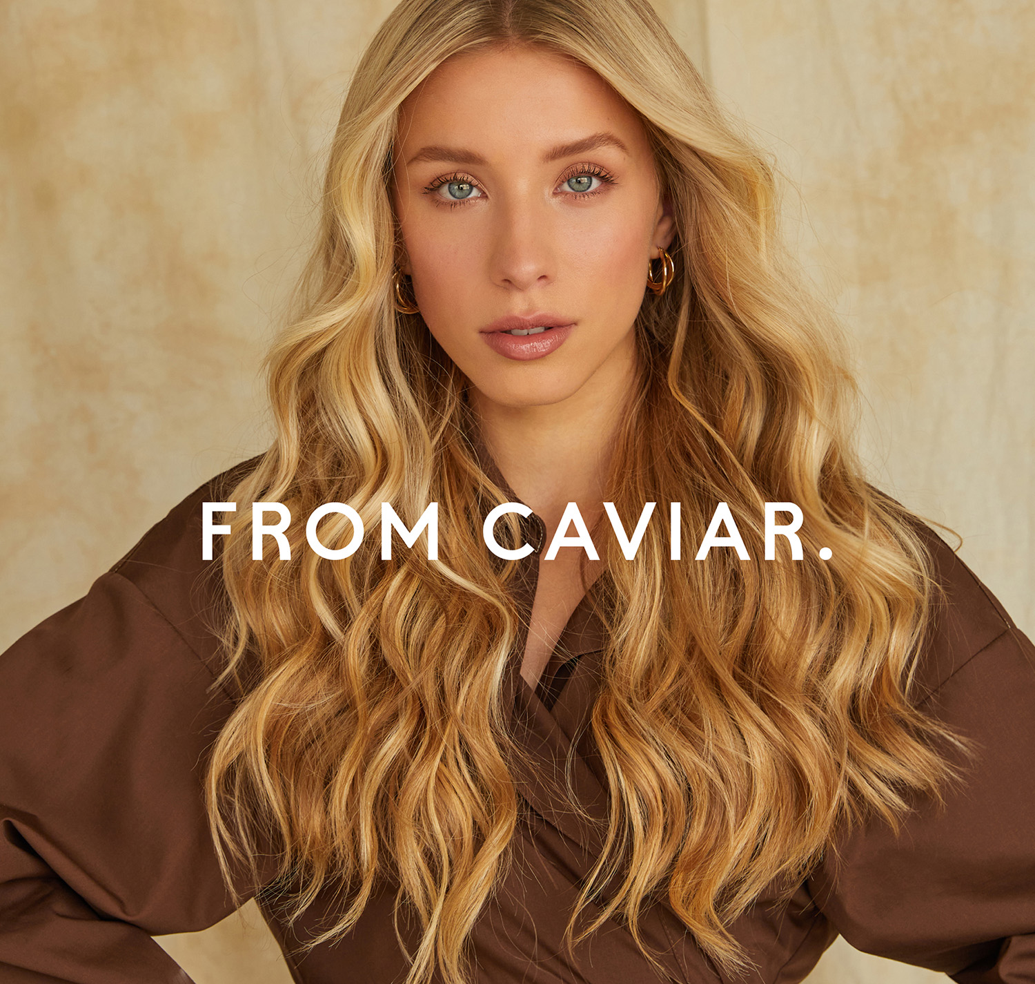
Hair of Caviar contacted me with a request to create a luxury packaging experience for their hair extensions brand. On our strategic call we understood that the business was successfully run for a few years, had a great unique product and a truly ethical approach under core. What was missing was a strong creative idea behind and a consistent visual communications across the board. At that moment, all brand communications with their customers were unaligned and did not translate the uniqueness of the product that brand offers. During our talk we decided to create new, authentic positioning that will help the business truly stand out. Finally, we ended up changing the name, creating a solid branding, brand photoshoot art direction and unparallel website experience.
The Solution:
Our first step was deciding on the brand name. We decided to leave the word Caviar as it was perfectly associated with the product itself – luxurious and rare, same as the extensions that brand is selling. All the extensions are sourced in Slavic countries which means that it is the best type of hair that people can get for their extensions. Fantastic color grades, shiny and custom made just for you.
As the product is uniquely sourced for each of the clients and there are no same tails of the hair we decide to make it a statement point. Caviar becomes a real character, the name of a woman. Receiving a gift from her becomes an ultimate experience. That’s how “From Caviar” was born.
Creative Concept:
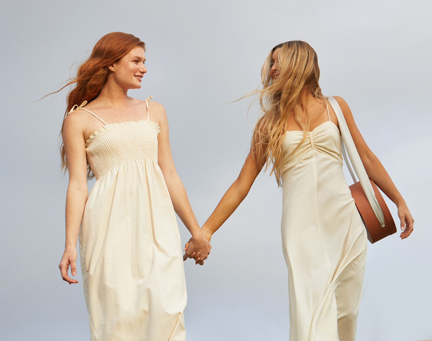
We wanted to create a truly feminine, confident and sensual atmosphere around the brand and this desire led us to the world of beautiful mermaids but now – modern.
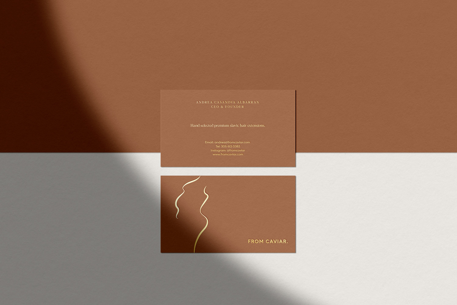
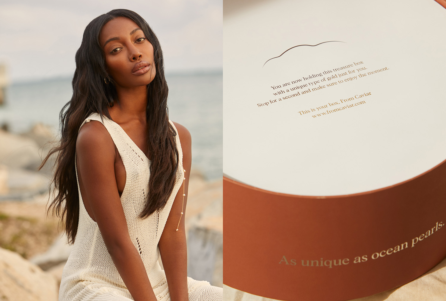
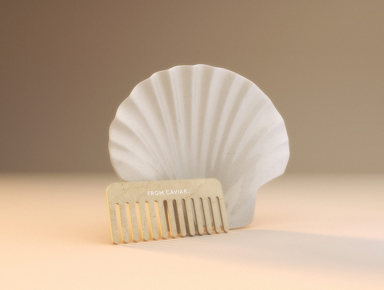
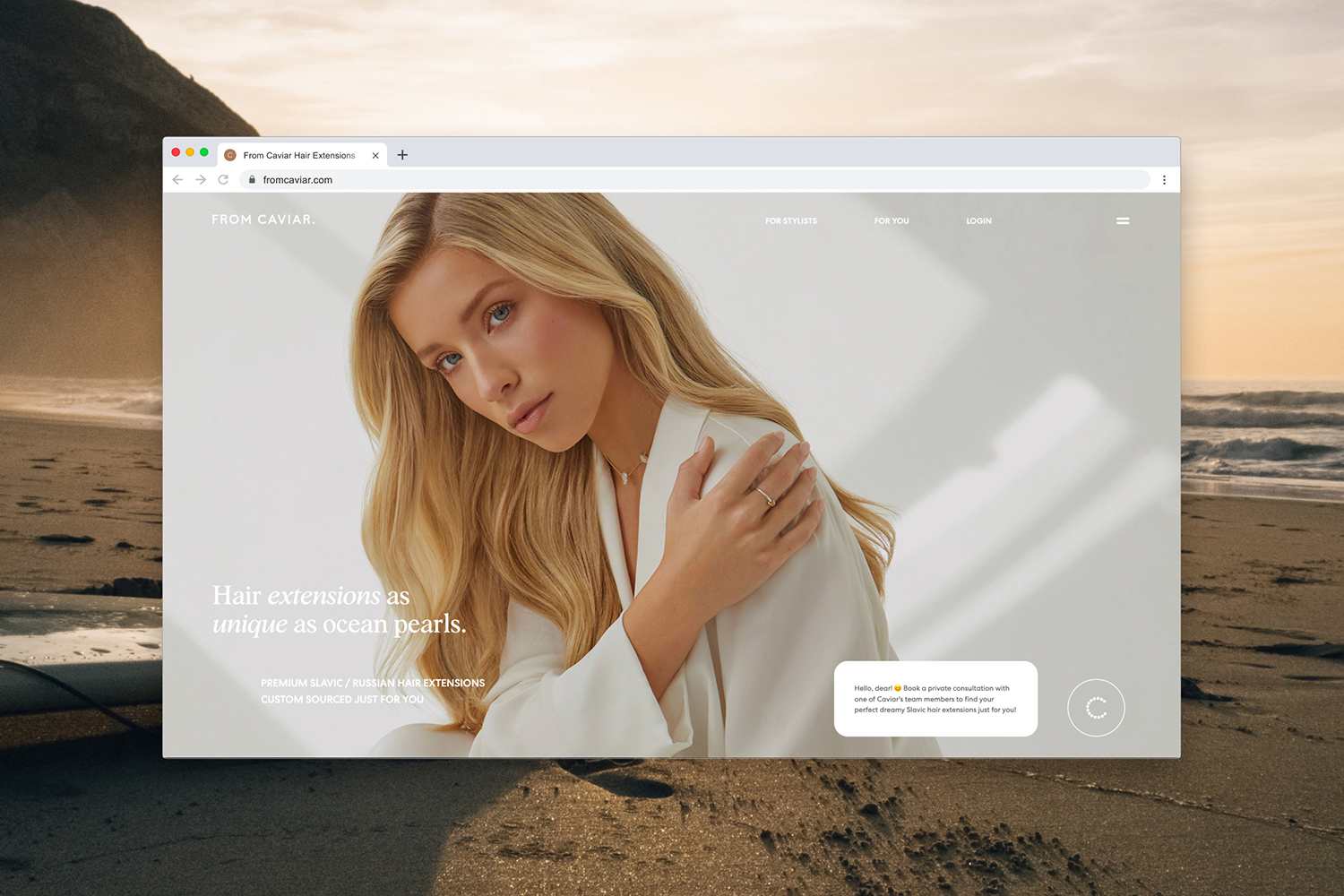
Whole brand visual language inspired by the mermaids theme and a Renaissance movement in art. Brand color palette plays in contrasts of warm deep browns and cold light purples. The typographic logotype highlights the ocean theme through the dot at the end of the brand name which symbolizes ocean pearl – main association with the product. The essence of the brand conveys its slogan “hair extensions as unique as ocean pearls”. Brand submark “C” made from the little dots that reminds us of pearls and also builds associations with an endless amount of different hair extensions available to everyone.
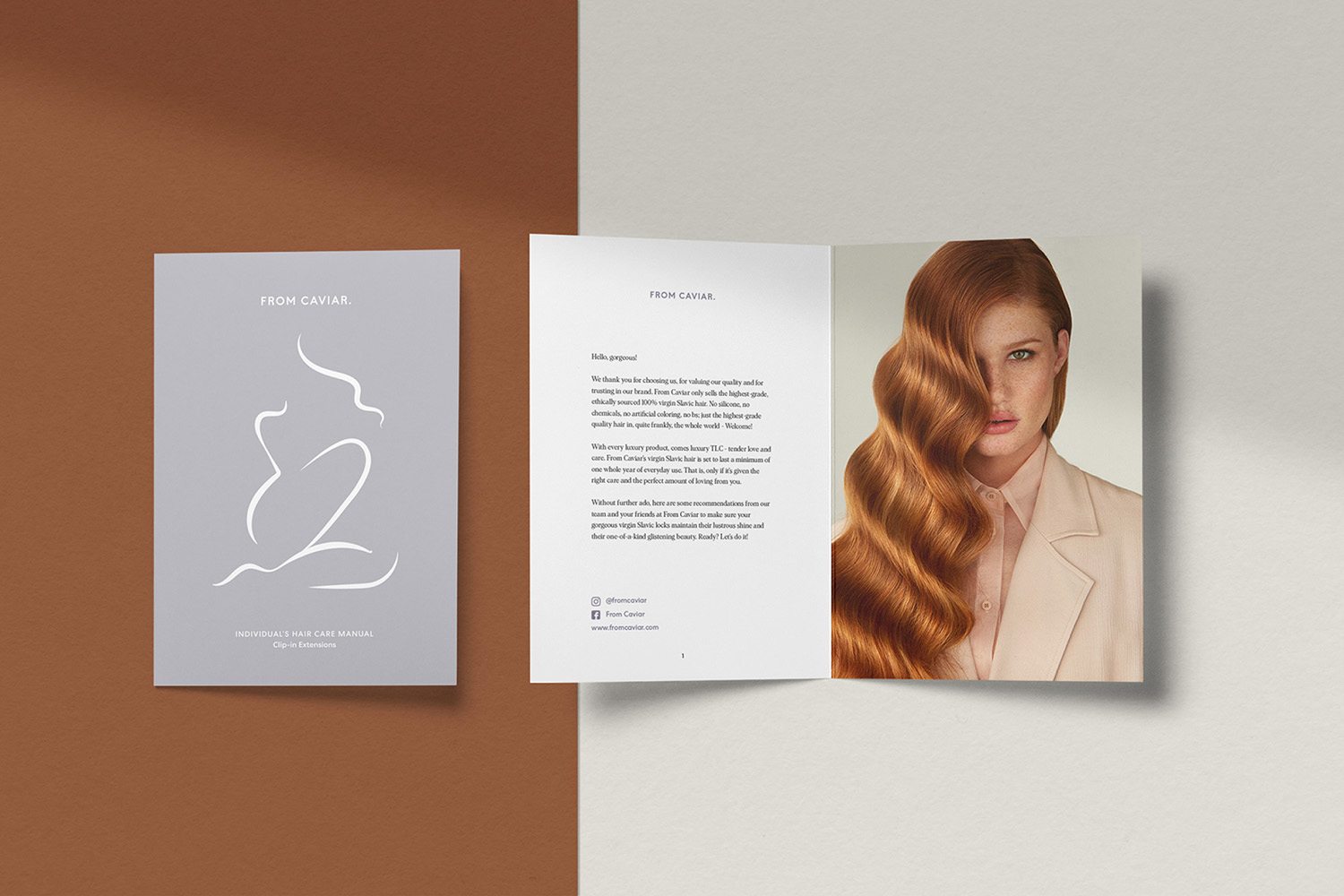
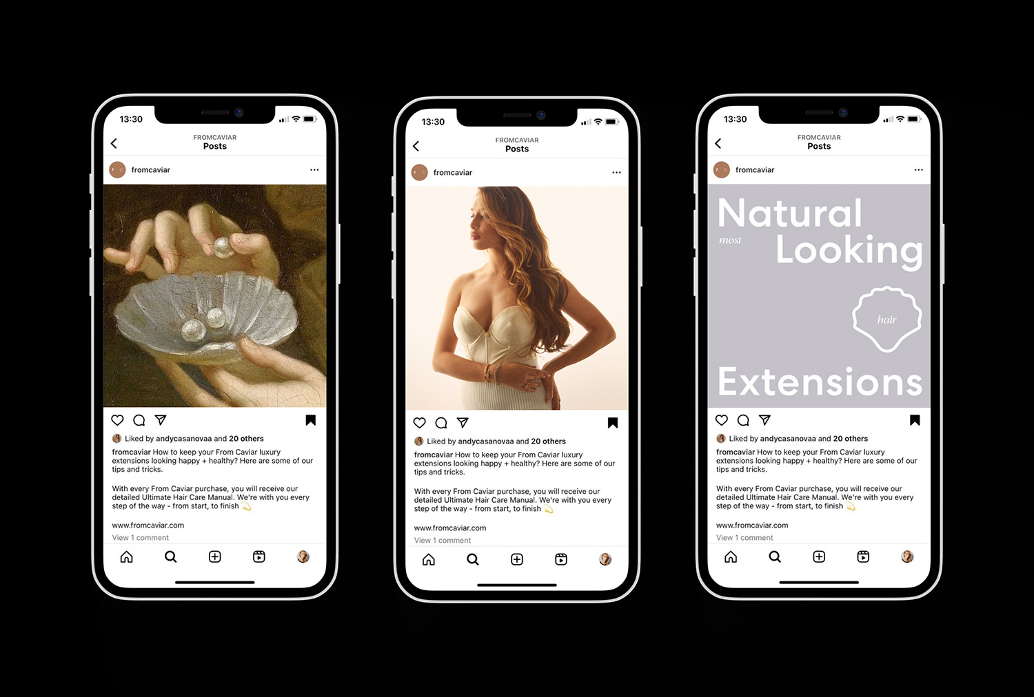
Brand graphic style is playful, sensual and repeats the different women’s bodies as well as the shapes from the ocean. You will find them in brand social media communications, printed pattern and collateral, as well as across the website.
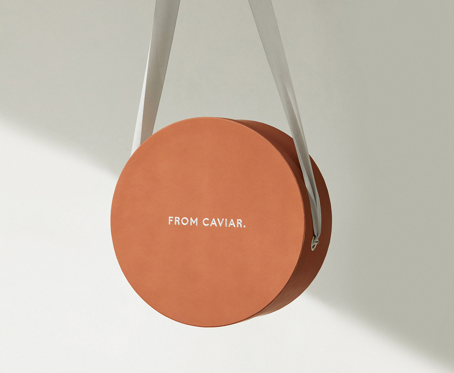
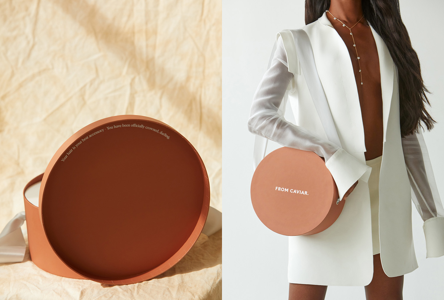
Packaging shape was inspired by the heritage of retro hat boxes used by luxury brands such as Chanel and tourists vintage round suitcases used by Hermes. Packaging looks memorable on the streets while promoting the brand. It is also perfect as a home décor element in your interior to store any hair care essentials.
CREDIT
- Agency/Creative: Anastasia Dunaeva, Studio Stacie Co.
- Article Title: From Caviar Luxury Packaging and Brand Design
- Organisation/Entity: Freelance
- Project Type: Identity
- Project Status: Published
- Agency/Creative Country: Kazakhstan
- Agency/Creative City: Almaty
- Market Region: Global
- Project Deliverables: 3D Modelling, Art Direction, Beauty Photography, Brand Design, Brand Identity, Branding, Graphic Design, Packaging Design, Web Design
- Industry: Beauty/Cosmetics
- Keywords: hair extensions, beauty, fashion, lifestyle products, haircare
-
Credits:
Art Director & Designer: Anastasia Dunaeva
Photographer: Alberto Gonzalez
Hair Stylist: Francesca Maria Alfonso
Makeup Artist: Javier Martinez


