


The Context
Founded by Sara Samavati and Dr. Isaac Flitta, Tōtika began as a sustainable beekeeping initiative in the pristine landscapes of New Zealand. Practicing ethical, bee-first beekeeping, the brand produces high-grade Mānuka honey with exceptional healing, antibacterial, and regenerating properties. Building on this expertise, the founders envisioned a skincare line that transforms this rare ingredient into gentle, effective, and naturally grounded treatments. Their ambition? To create a trusted international wellness brand that bridges nature and science, tradition and innovation, without losing its roots.
Our Mission
Our mission was twofold: to design Tōtika’s first skincare line and to lead a complete rebranding, including the logo, visual identity, and brand universe. The objective was to translate Tōtika’s core values: purity, integrity, botanical richness, and scientific care, into a strong and cohesive brand expression, positioned for premium skincare markets in New Zealand and internationally (spas, pharmacies, and beyond).
Our Approach
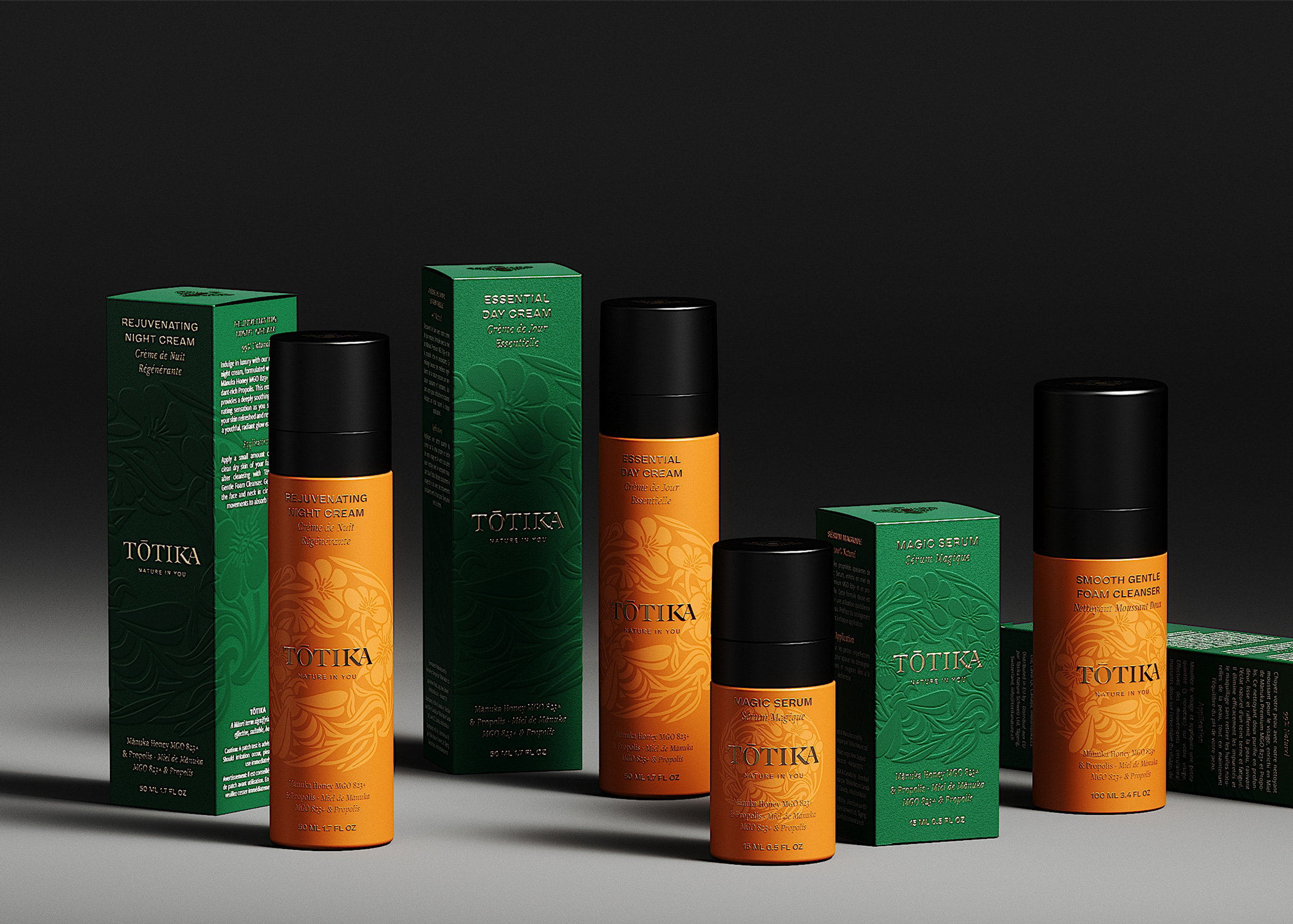
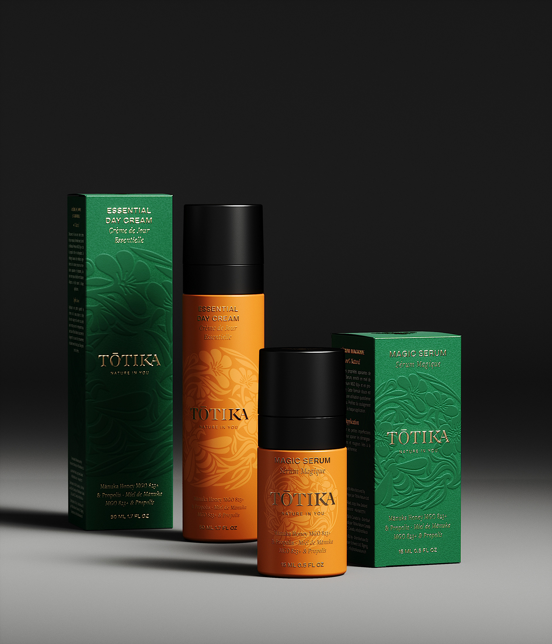
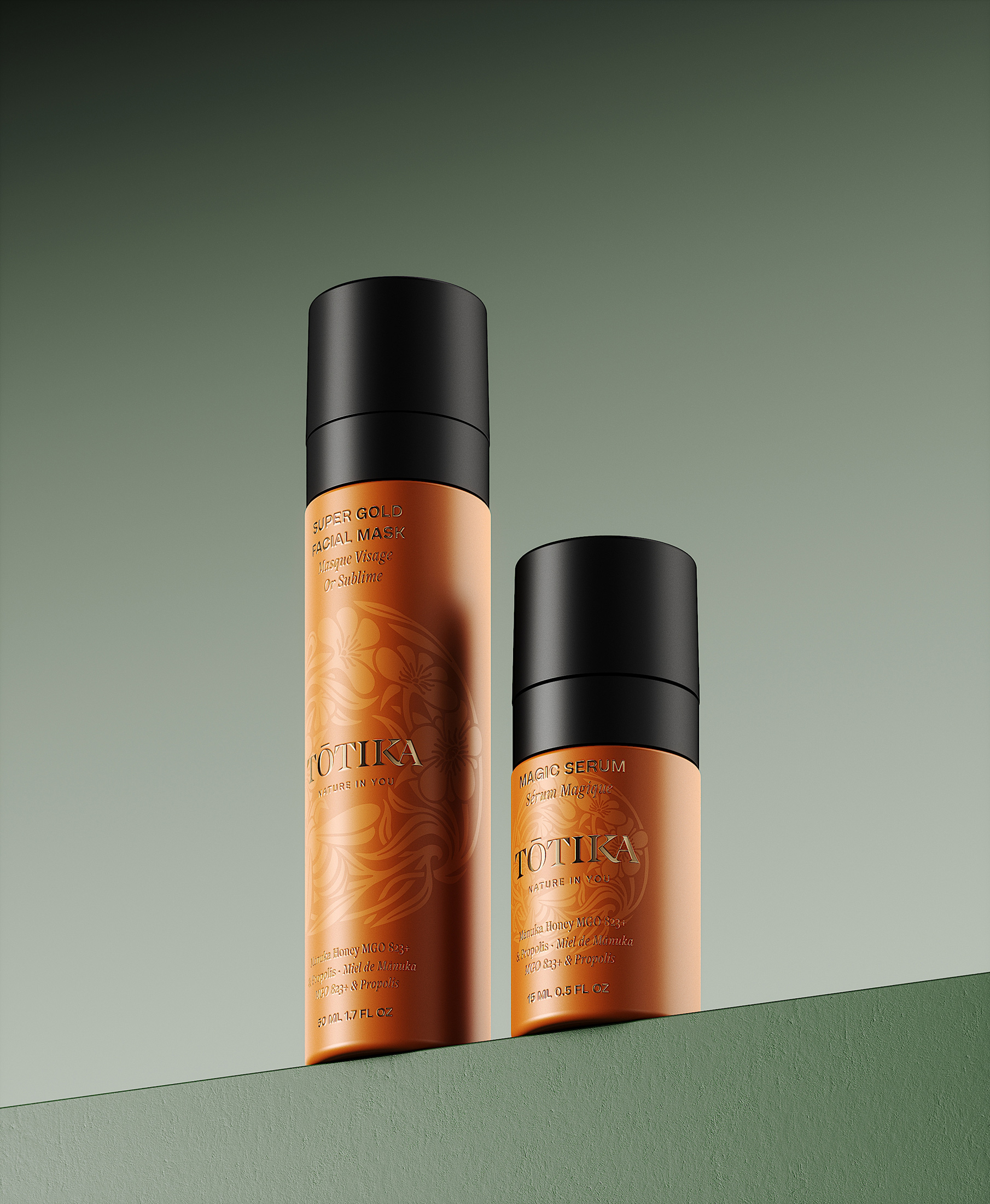
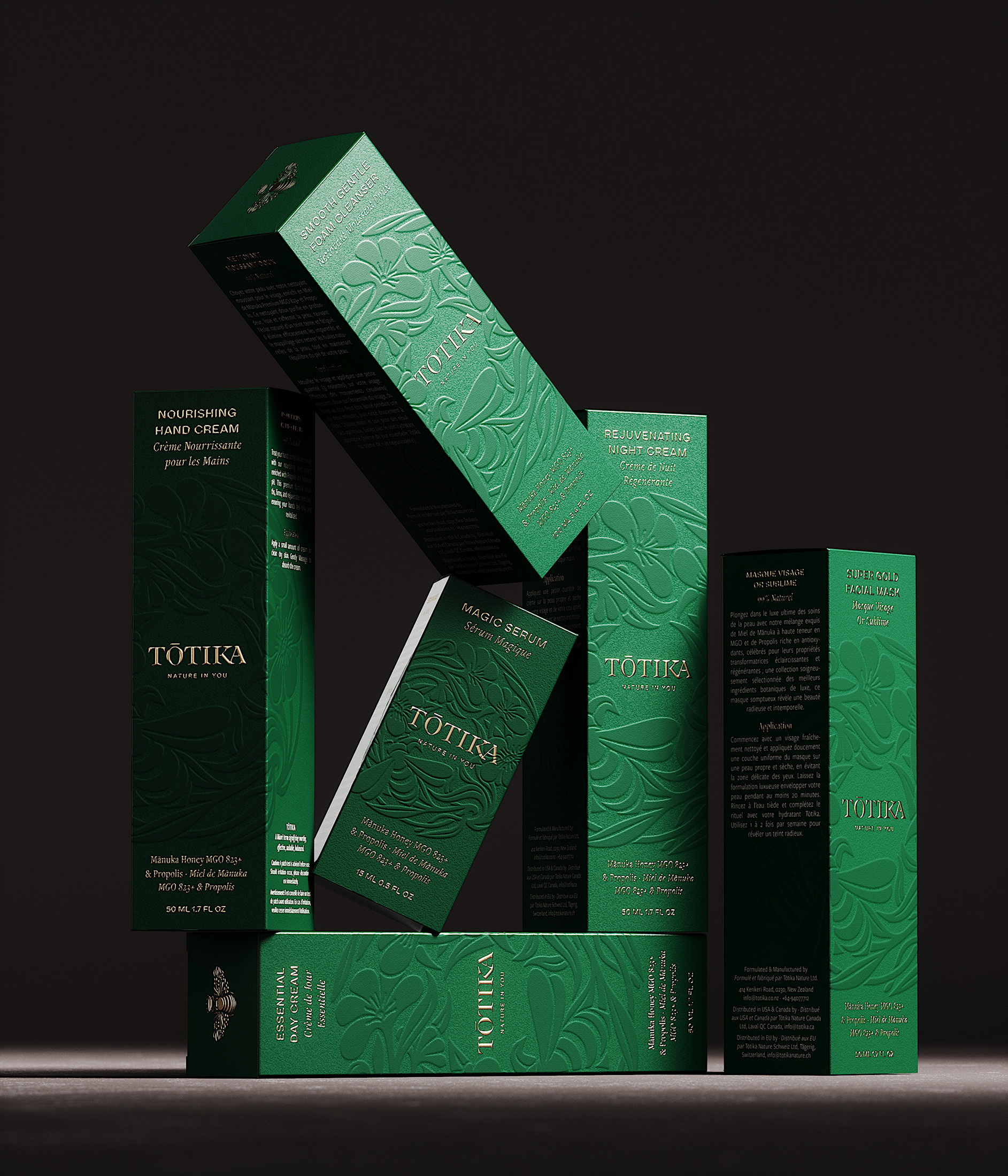
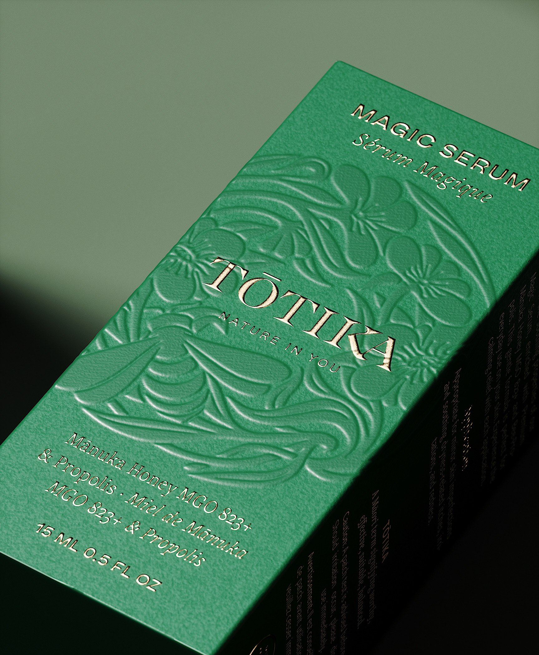
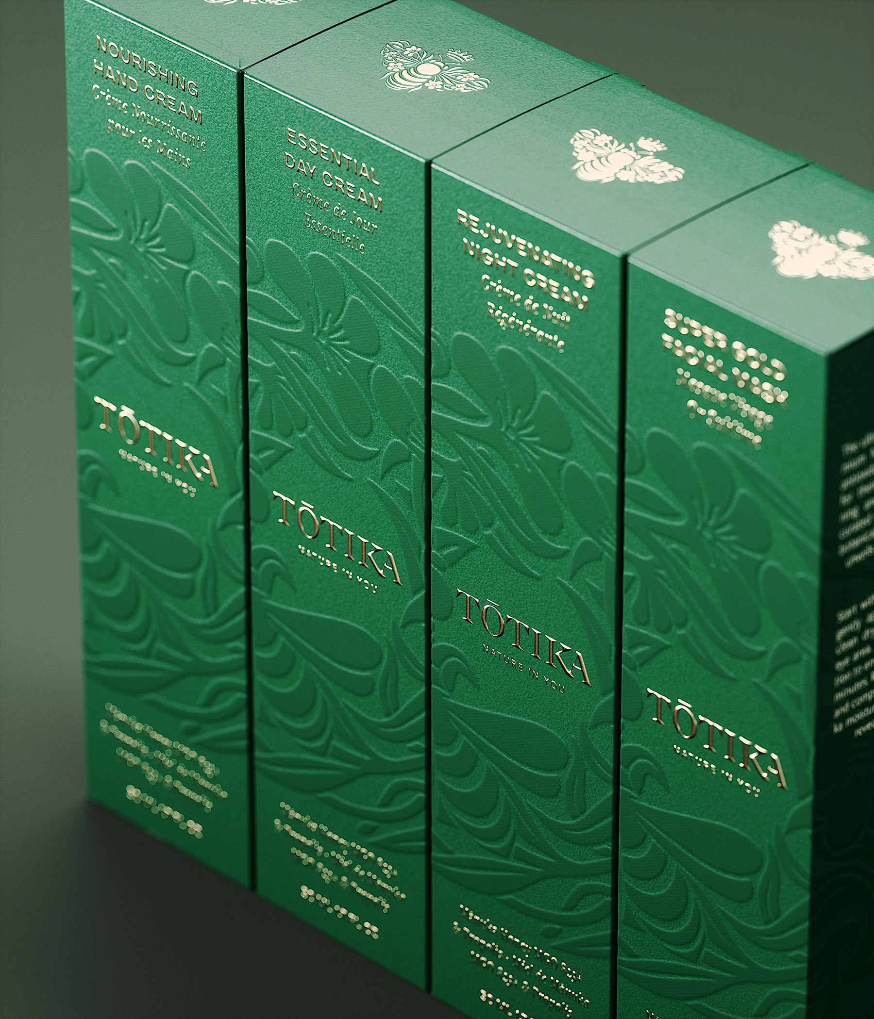
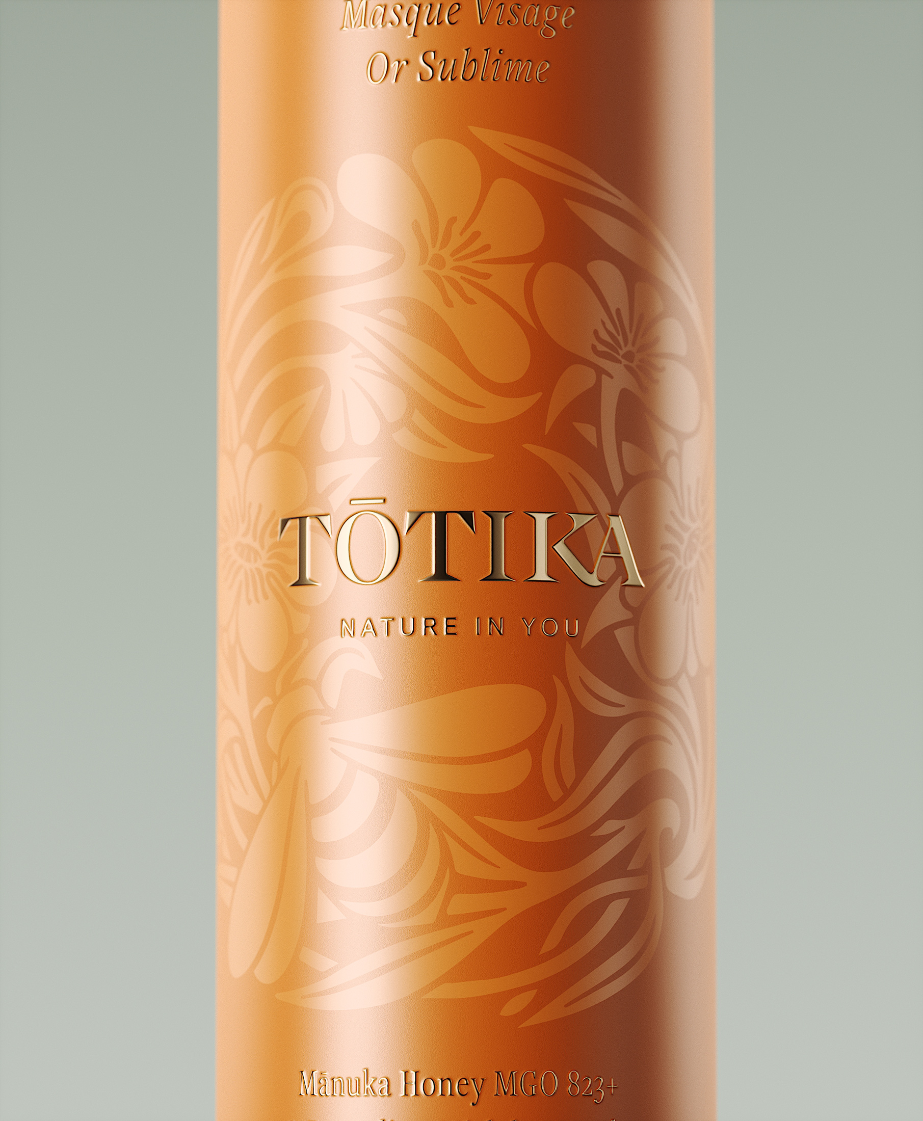
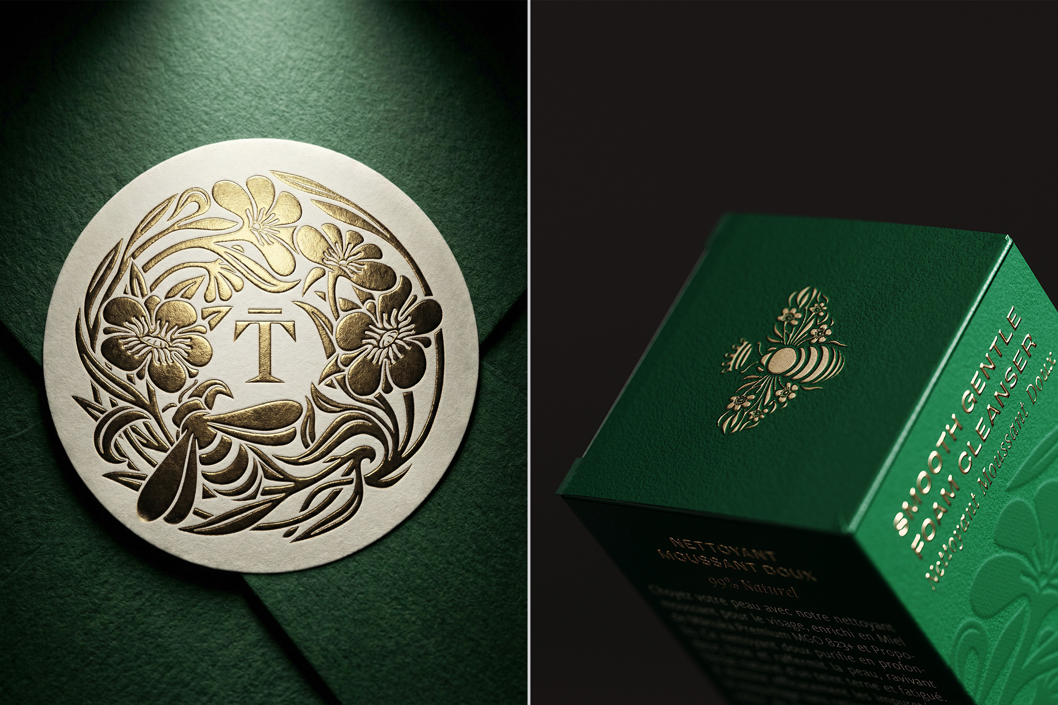
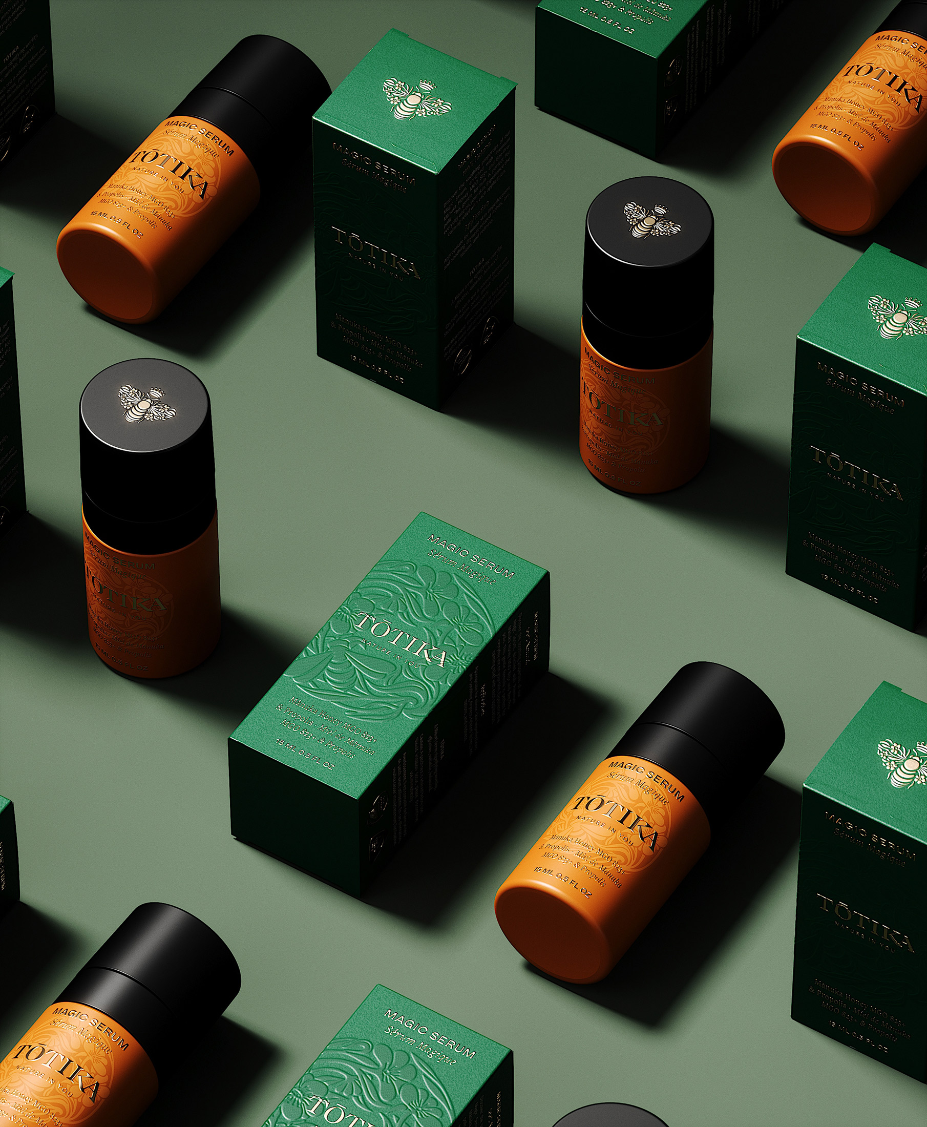
We crafted a visual identity that feels both organic and elevated, inspired by New Zealand’s lush biodiversity and the poetry of bees. The amber-toned product bottles echo the warm hue of honey, while deep green boxes recall the native forests. At the center, a hand-illustrated crown made of Mānuka flowers, foliage, and bees encircles a custom-designed logotype, a refined mark that anchors the whole system.
Among the brand’s signature symbols, the Queen Bee emblem, with wings reimagined as foliage, embodies strength, protection, and harmony with nature. It subtly reinforces the brand story and adds a memorable layer of identity across key touchpoints.
The overall aesthetic plays with materials: embossed finishes, gold hot foil, textured papers, and centered compositions evoke a sense of conscious luxury, one that feels as grounded as it is sophisticated.
The Result
By repositioning Tōtika as a skincare brand born from apicultural excellence, this project affirms a rare and authentic story in the crowded world of natural beauty. The seamless alignment between the brand’s ingredient, its origin, its symbols, and its visual language creates a powerful and aspirational narrative. The result is a brand experience that resonates with high-end consumers and wellness professionals alike, those seeking not only effective skincare, but also integrity, authenticity, and elegance. A brand that heals the skin and speaks to the soul.

CREDIT
- Agency/Creative: Petitmoulin Studio
- Article Title: From Beekeeping to Skincare: Tōtika Makes a Bold Entrance Into the Global Beauty Market With a Sophisticated Identity Rooted in Its New Zealand Origins by Petitmoulin Studio
- Organisation/Entity: Agency
- Project Type: Packaging
- Project Status: Published
- Agency/Creative Country: France
- Agency/Creative City: Dijon
- Market Region: Oceania
- Project Deliverables: 2D Design, 3D Design, Art Direction, Brand Guidelines, Brand Identity, Brand Redesign, Brand Strategy, CGI, Creative Direction, Illustration, Logo Design, Packaging Design, Packaging Guidelines, Rebranding, Set Design, Visualisation
- Format: Bottle
- Industry: Beauty/Cosmetics
- Keywords: WBDS Creative Design Awards 2025/26 , Manuka Honey, Skincare, Redesign, Brand Identity, Beauty, Brand Design, Packaging Design, Illustration, Logotype, Symbol, Branding, Logo Design, Design, Product Design, Packaging Design,
-
Credits:
Creative Director: Petitmoulin Studio


