


Following the successful rebrand of Frizzenti’s ready-to-drink cocktail range as Liberation Cocktails, Popp Studio, a UK-based brand and packaging design agency, has created the identity and packaging designs for the company’s first canned Prosecco offering.
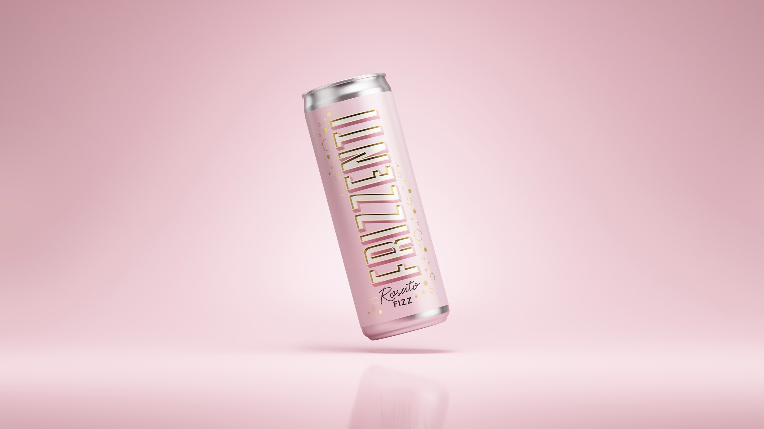
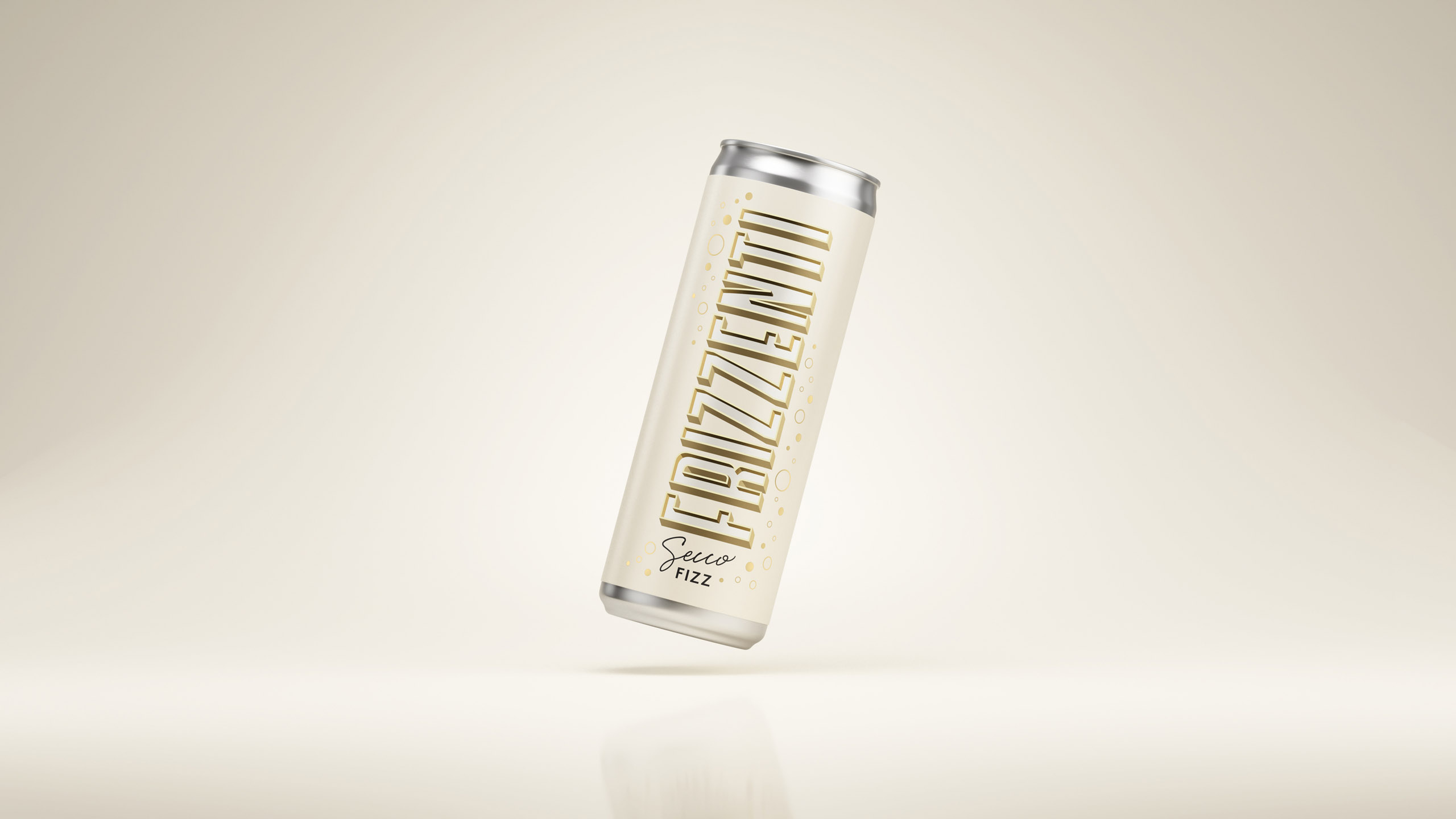
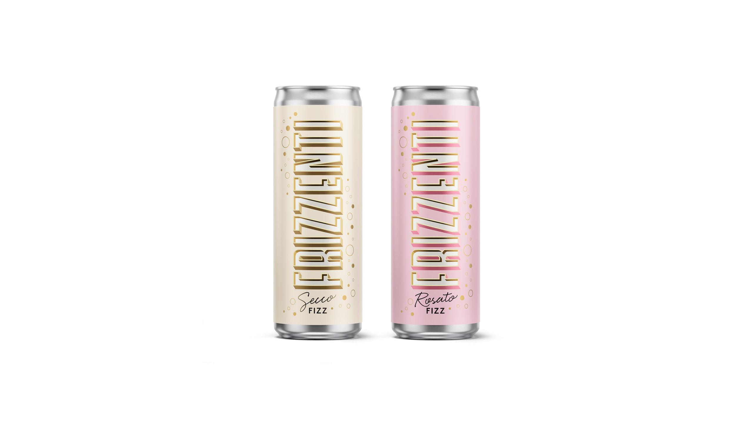
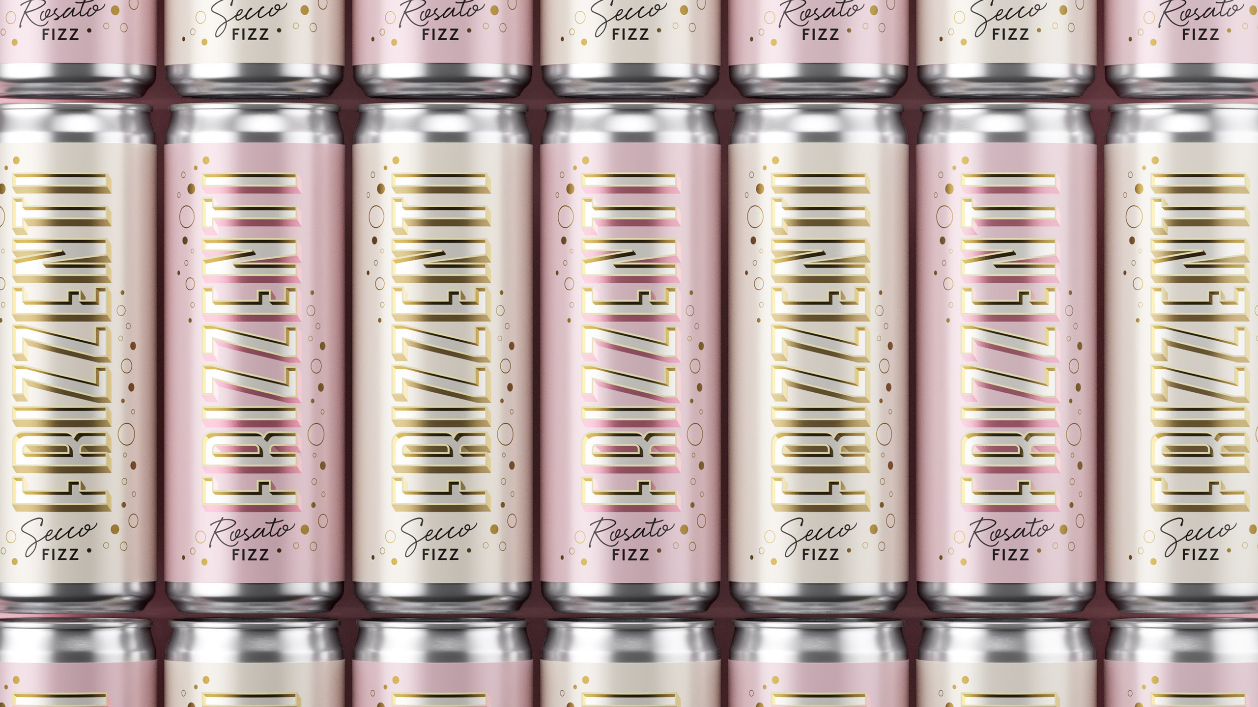
The launch range features two varietals; a white “Secco Fizz” at 11% ABV, and a pink “Rosato Fizz” at 13% ABV – both in 200ml cans.
The canned offering adds to Frizzenti’s expertise, and track record as the UK’s leader in still and sparkling wines supplied on-tap to bars, restaurants, and events. The new format is perfect for convenience and impulse purchases.
Popp’s strategy focuses on the idea of “Sparkle Time”. It is widely accepted that the best way to punctuate life’s special moments is with a glass of sparkling wine – now, the consumer decides when and where that time is, thanks to the convenient can format.
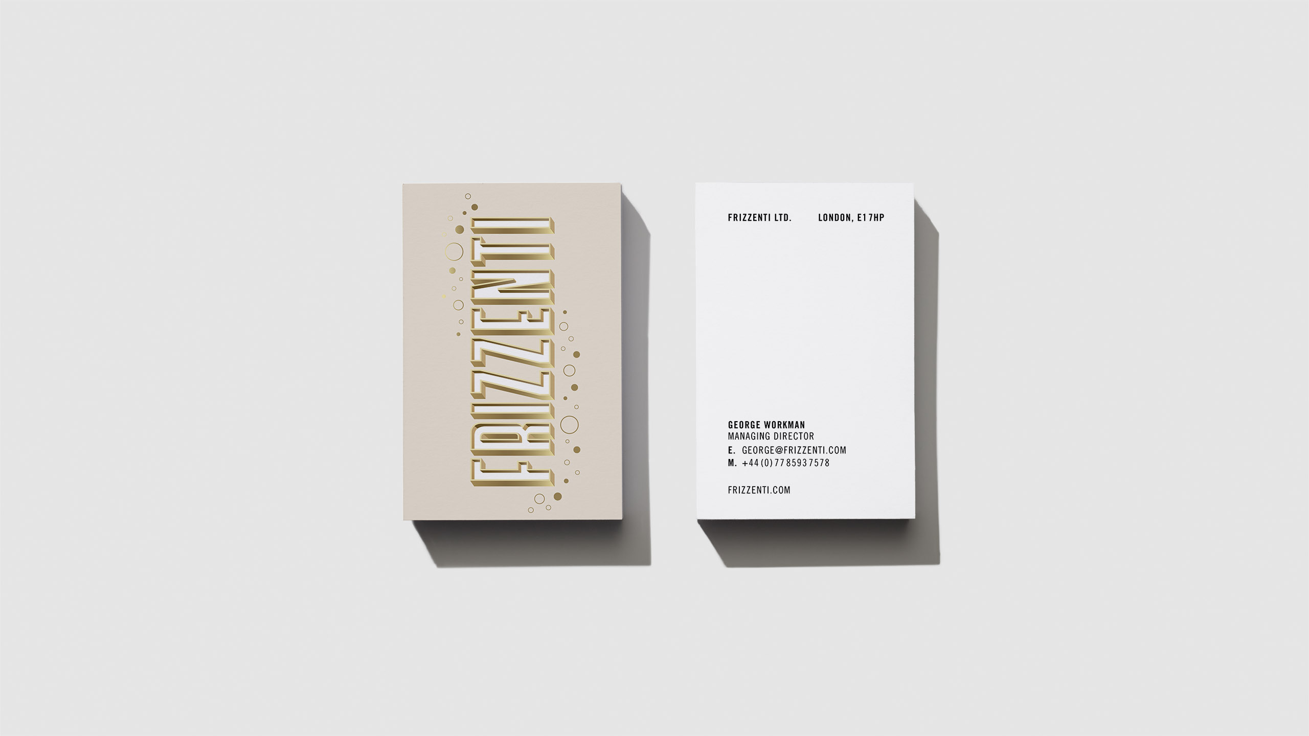
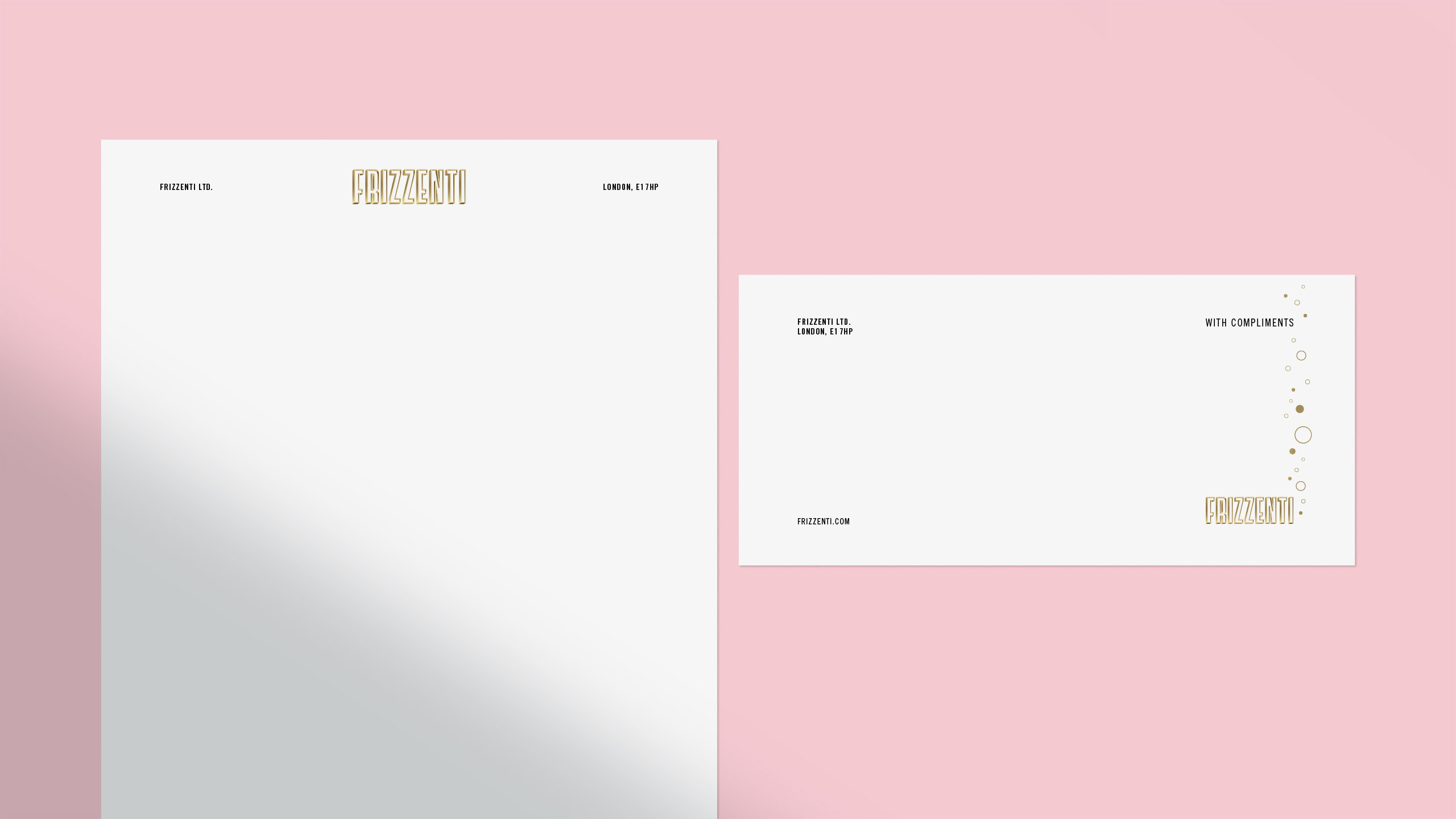
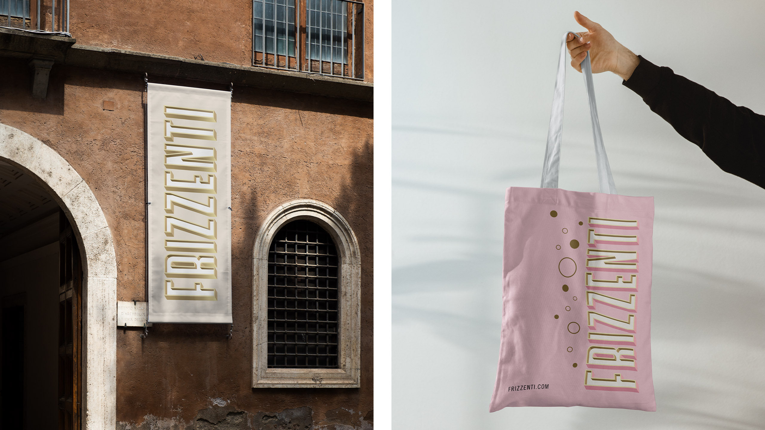
The designs feature a bold vertical wordmark for the brand name, with 3D details and shadows creating visual interest. Lettering artist Rachel Joy Price was commissioned to create the initial letterforms, which Popp then crafted.
Each variant’s colours have been picked to subtly evoke the liquid inside, create shelf impact, and express the products’ quality and sparkle with a touch of shimmering gold.
Playful graphic bubbles rise from the base of the can and nestle around the lettering to quickly communicate that the liquid is sparkling.
Popp has also kept an eye on the future: with more variants in the pipeline, the design system allows for additional still wine and Prosecco-based cocktails to join the line-up.
Frizzenti Managing Director and Co-Founder George Workman says:
“Popp has given Frizzenti an eye-catching design that clearly communicates the quality and effervescence of the liquid with a feeling of Italian style. This was our key challenge without being able to say Prosecco. Popp’s design packs a punch on a supermarket shelf or in an Instagram feed, with its on-trend style and subtle finish.”
Popp Studio Creative Director and Co-Founder Poppy Stedman says:
“Our design for Frizzenti puts the name, which is Italian for “sparkling”, centre stage, and balances bold, crafted lettering with a playful use of matte finish and metallic shimmer, that is both chic and tasty.”
![]()
CREDIT
- Agency/Creative: Popp Studio
- Article Title: Frizzenti’s New Canned Prosecco Is Set To Sparkle With Identity And Packaging By Popp Studio
- Organisation/Entity: Agency
- Project Type: Packaging
- Project Status: Published
- Agency/Creative Country: United Kingdom
- Agency/Creative City: London
- Market Region: Europe
- Project Deliverables: 2D Design, Art Direction, Brand Design, Brand Identity, Brand Mark, Brand Redesign, Brand Strategy, Brand World, Graphic Design, Lettering, Logo Design, Packaging Design, Typography
- Format: Can
- Substrate: Metal
- Industry: Food/Beverage
- Keywords: Frizzenti, Prosecco, Packaging, Can, Lettering
-
Credits:
Creative Director: Poppy Stedman
Managing Director: Andrew Slade
Lettering Artist: Rachel Joy


