


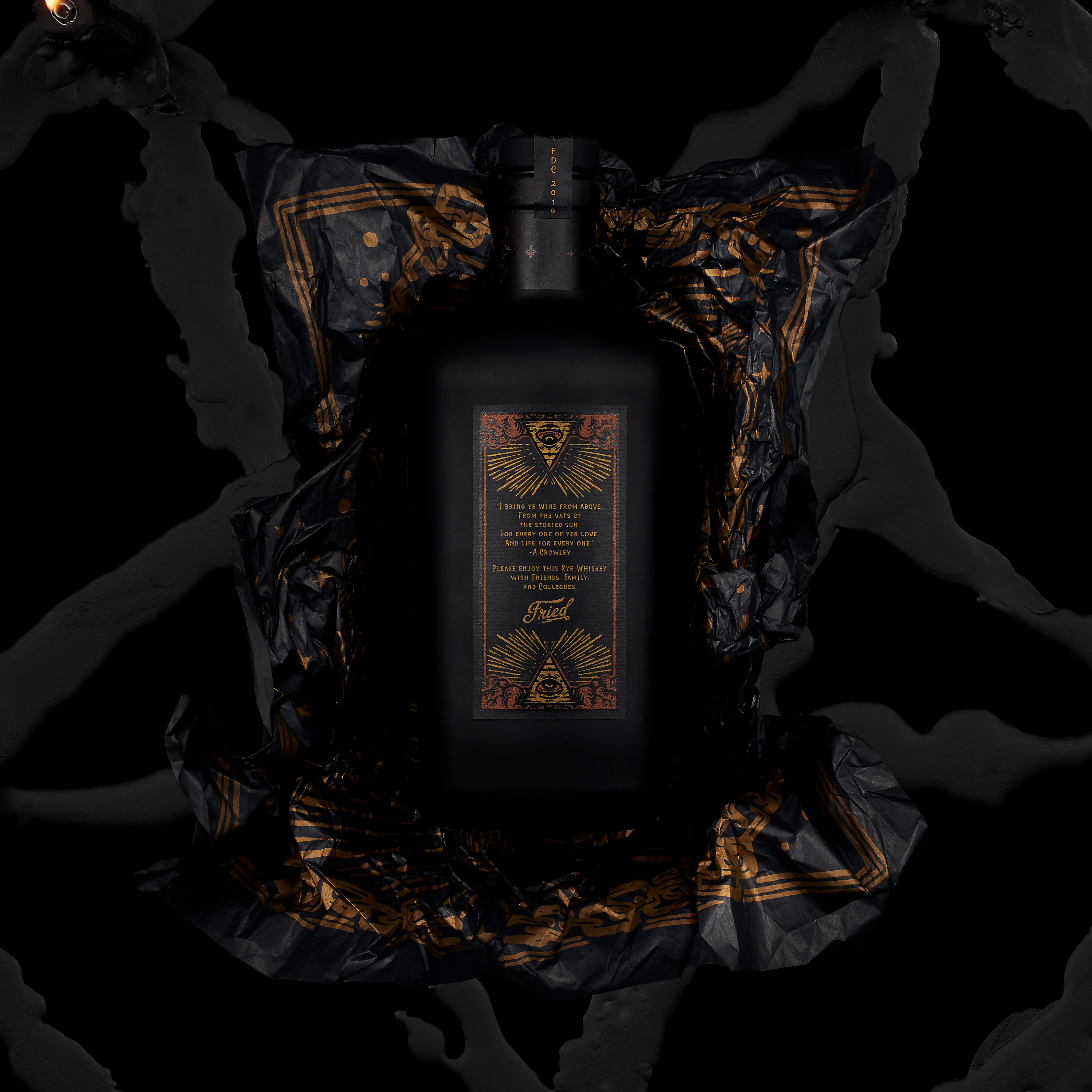
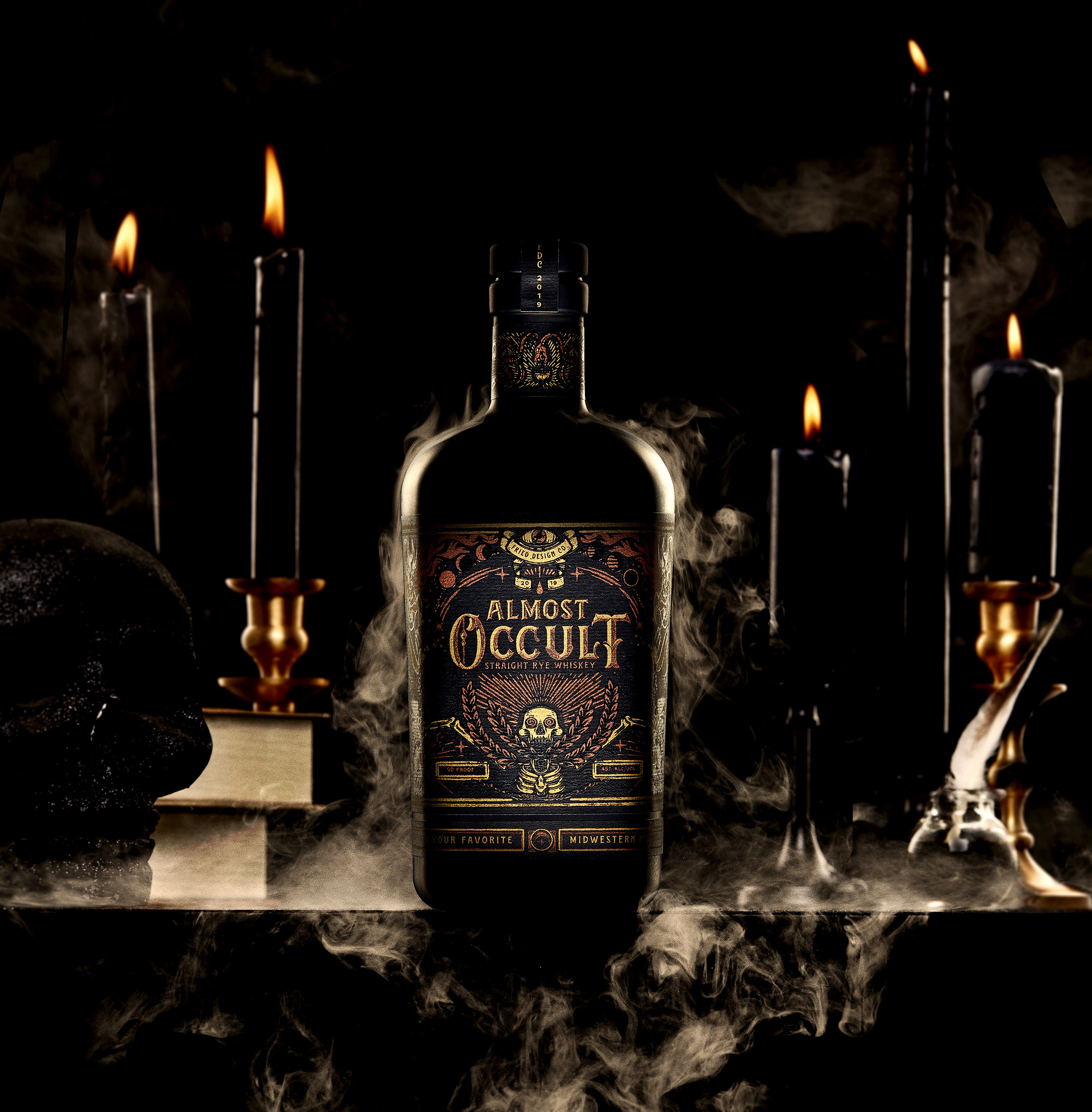
We take our whiskey neat. Amps overdriven. We prefer bonfires to fire pits. Monster trucks over luxury coups. Our passions in life are the ones teachers said were a waste of time, our relatives didn’t understand, and the pastor, bless his heart, said would lead us to ruination. So when we decided to give out client gifts this year, there was zero percent chance they were getting coffee cups and a nice note. Introducing “Almost Occult Straight Rye Whiskey” from Fried Design Company. This product utilizes matte black bottles, 5 screen printed labels on black Neenah paper, 2 metallic inks and a black detail overlay to bring the Fried Design Company brand forward. To customize the bottles even further, the metallic copper inks used were mixed with finely crushed glass particles by the folks at Mama’s Sauce in Orlando, FL. to make the ink shimmer even more. The label depicts multiple notes to Occult imagery, including hidden messages and themes throughout each label, and customized typography.

CREDIT
- Agency/Creative: Fried Design Company
- Article Title: Fried Design Company Gets in the Spirit With Almost Occult Rye Whiskey Holiday Gift
- Organisation/Entity: Agency, Published Self Promotional Design
- Project Type: Packaging
- Agency/Creative Country: United States
- Market Region: North America
- Project Deliverables: Brand Advertising, Brand Creation, Brand Naming, Branding, Packaging Design, Product Naming
- Format: Bottle
- Substrate: Glass


