


Freskin is a skin care brand that seamlessly merges premium, clinical expertise with a fresh, approachable aesthetic. The design elements like the “friendly cross” and all-white packaging convey professionalism, trust, and purity, while the subtle use of color introduces a personalized and accessible touch. This balance allows the brand to resonate with customers looking for skincare that is both high-performing and gentle.
Brand Name
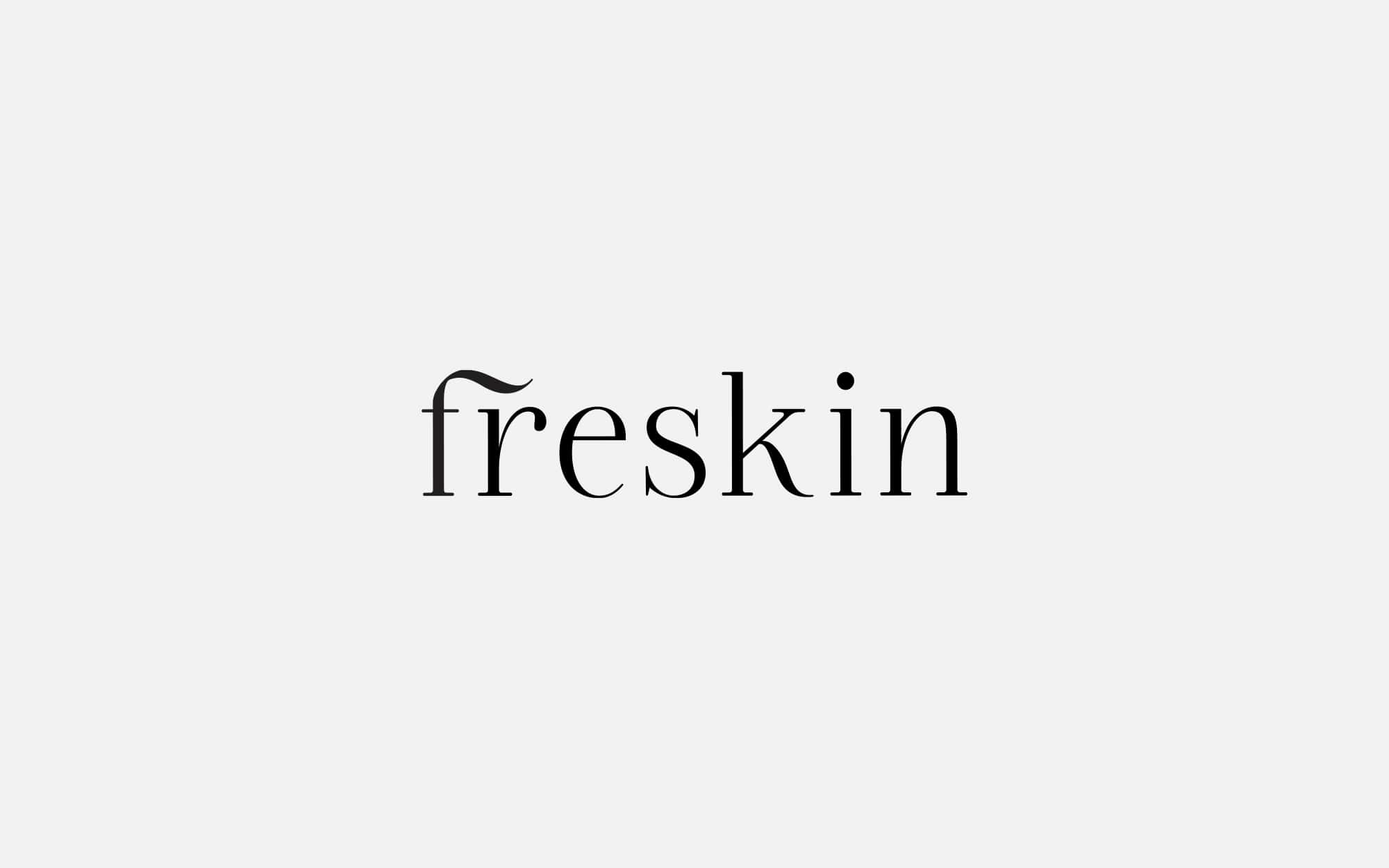
The name Freskin combines two key elements: “Fresh” and “Skin,” immediately positioning the brand as focused on skincare that is rejuvenating, clean, and invigorating. The word “Freskin” evokes a sense of purity and vitality, suggesting that the products are designed to maintain or restore healthy, radiant skin. The simplicity and clarity of the name align with the premium, clinical nature of the brand, implying trust, professionalism, and effectiveness.
Logo and Key Visual
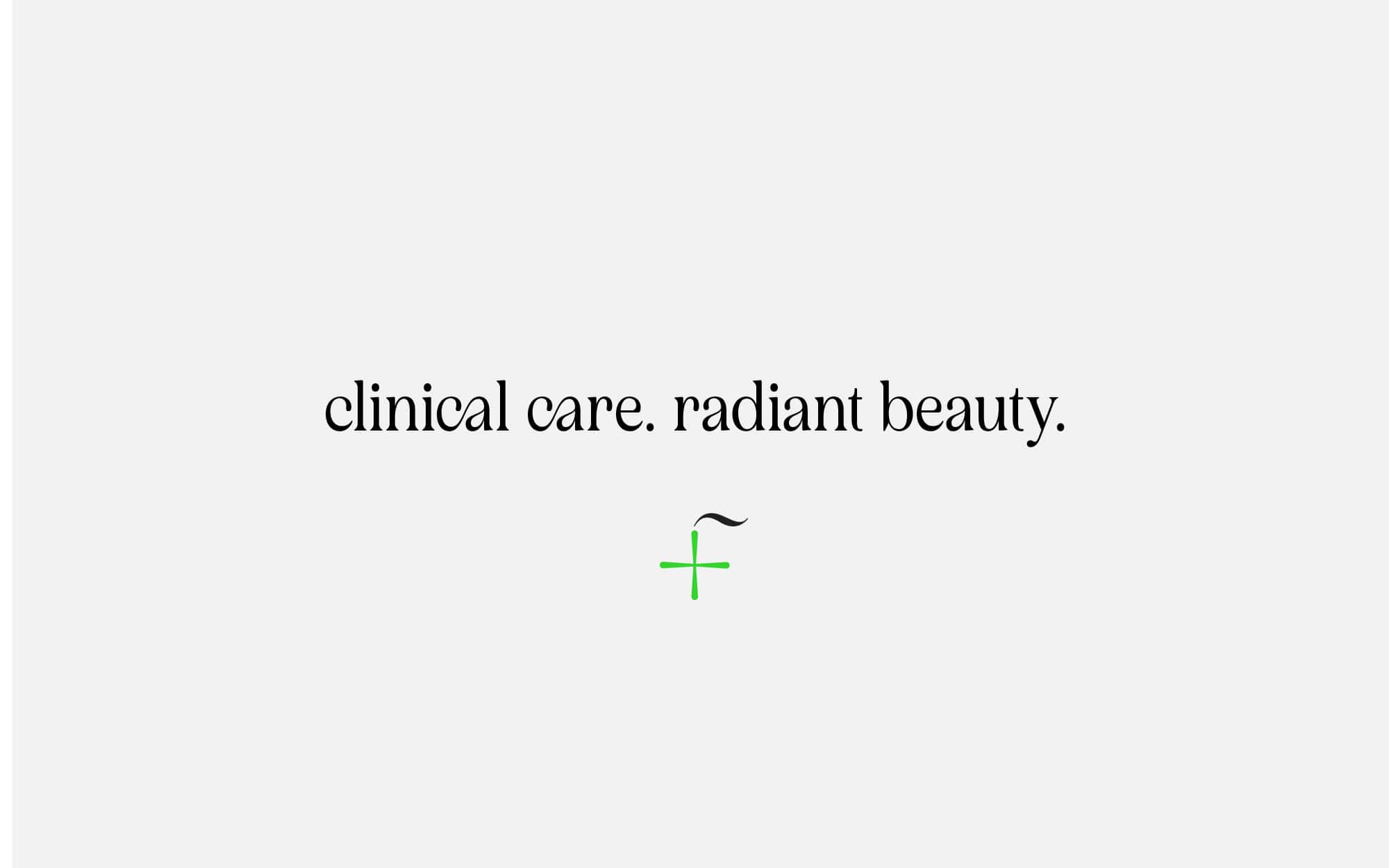
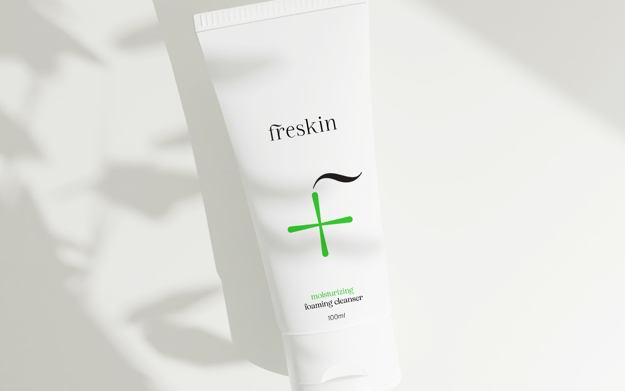
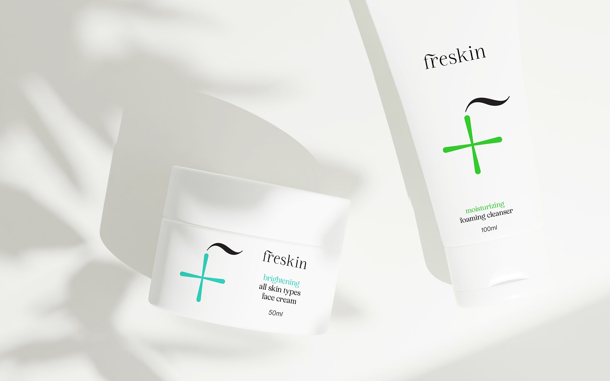
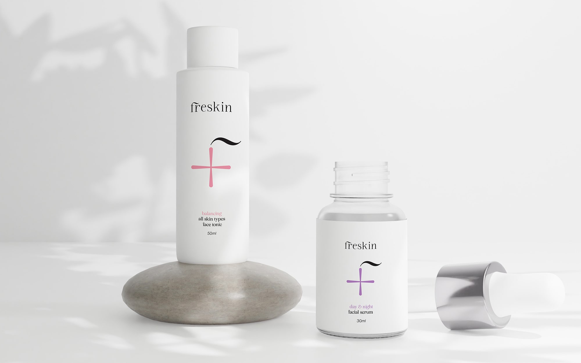
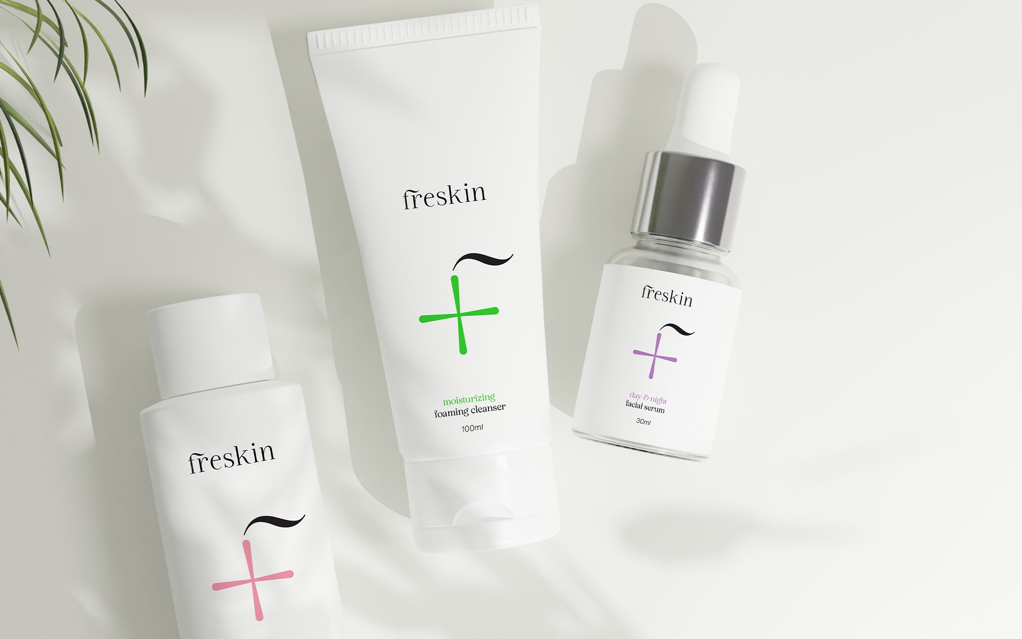
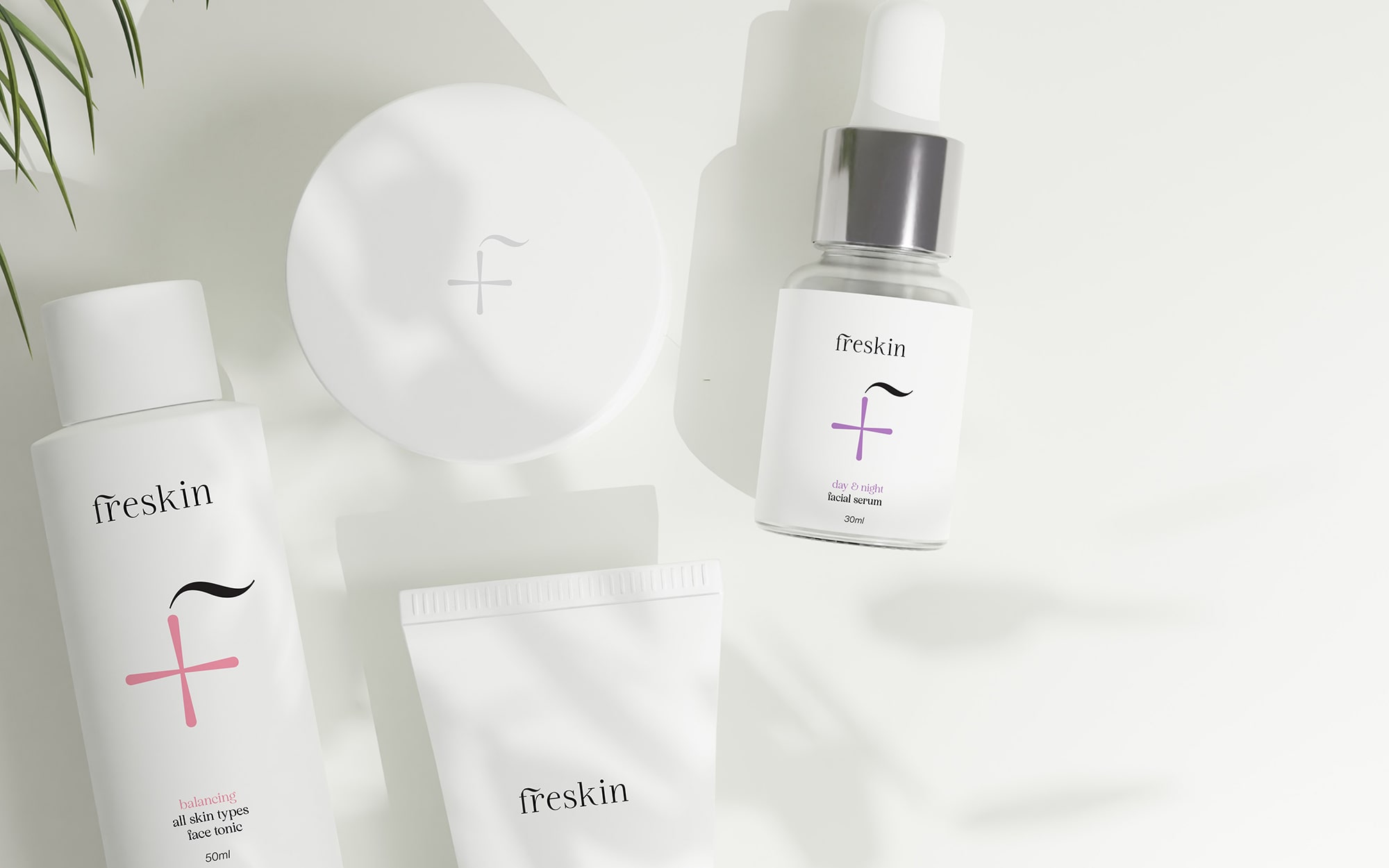
The logo’s defining feature is a “friendly cross,” symbolizing health, care, and medical-grade quality, which resonates well with the clinical positioning of the brand. The cross is universally recognized in health and wellness contexts, and its use for Freskin immediately communicates reliability and expertise.
The wave integrated into the top-right of the cross, forming an “F,” adds a layer of friendliness and approachability to the brand. The wave can symbolize freshness and the fluid, natural care associated with Freskin’s product line. It introduces a subtle dynamic element, implying movement, renewal, and the smoothness of healthy skin. This design speaks to the brand’s balance between clinical precision and gentle, nourishing care.
Packaging Design
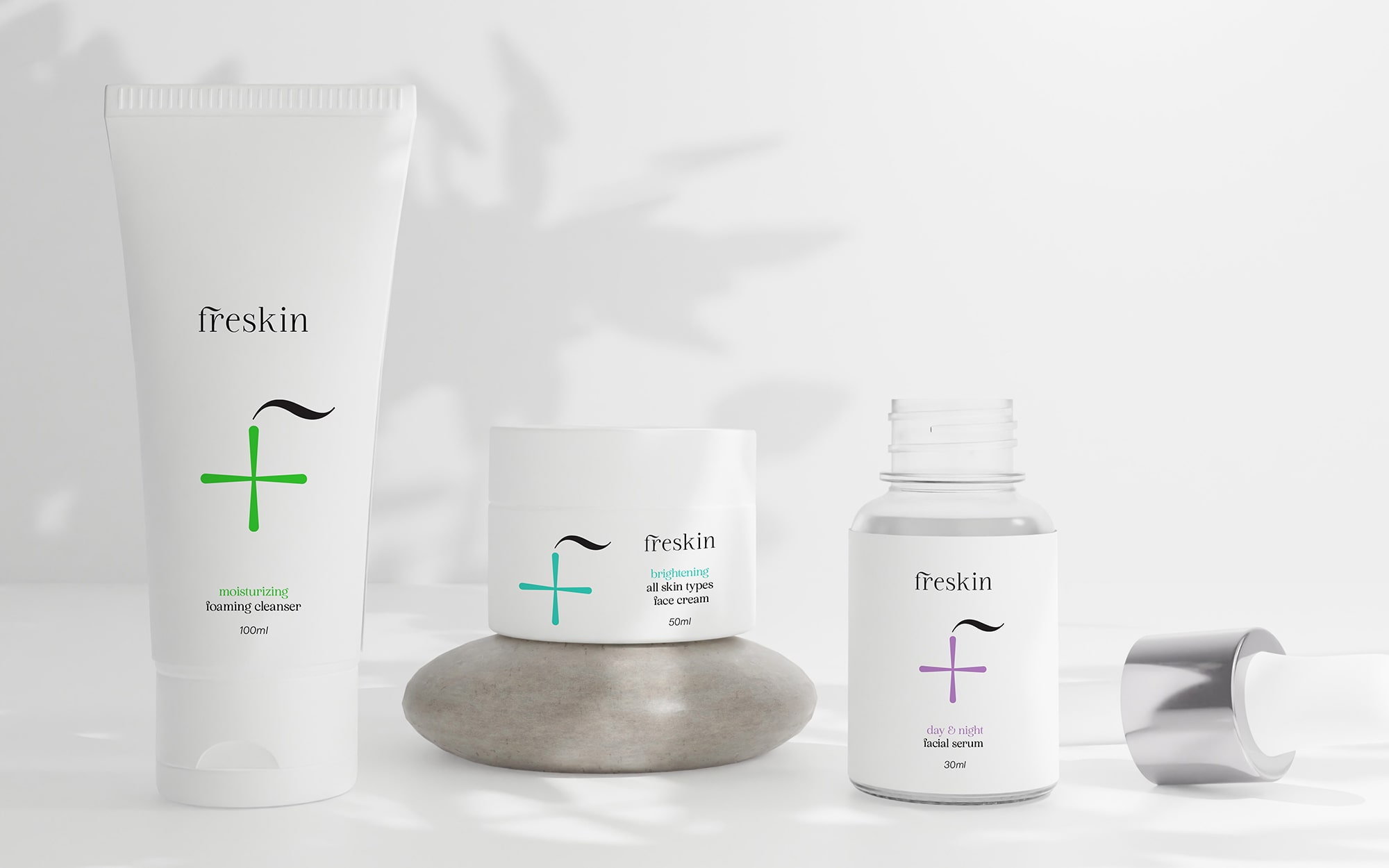
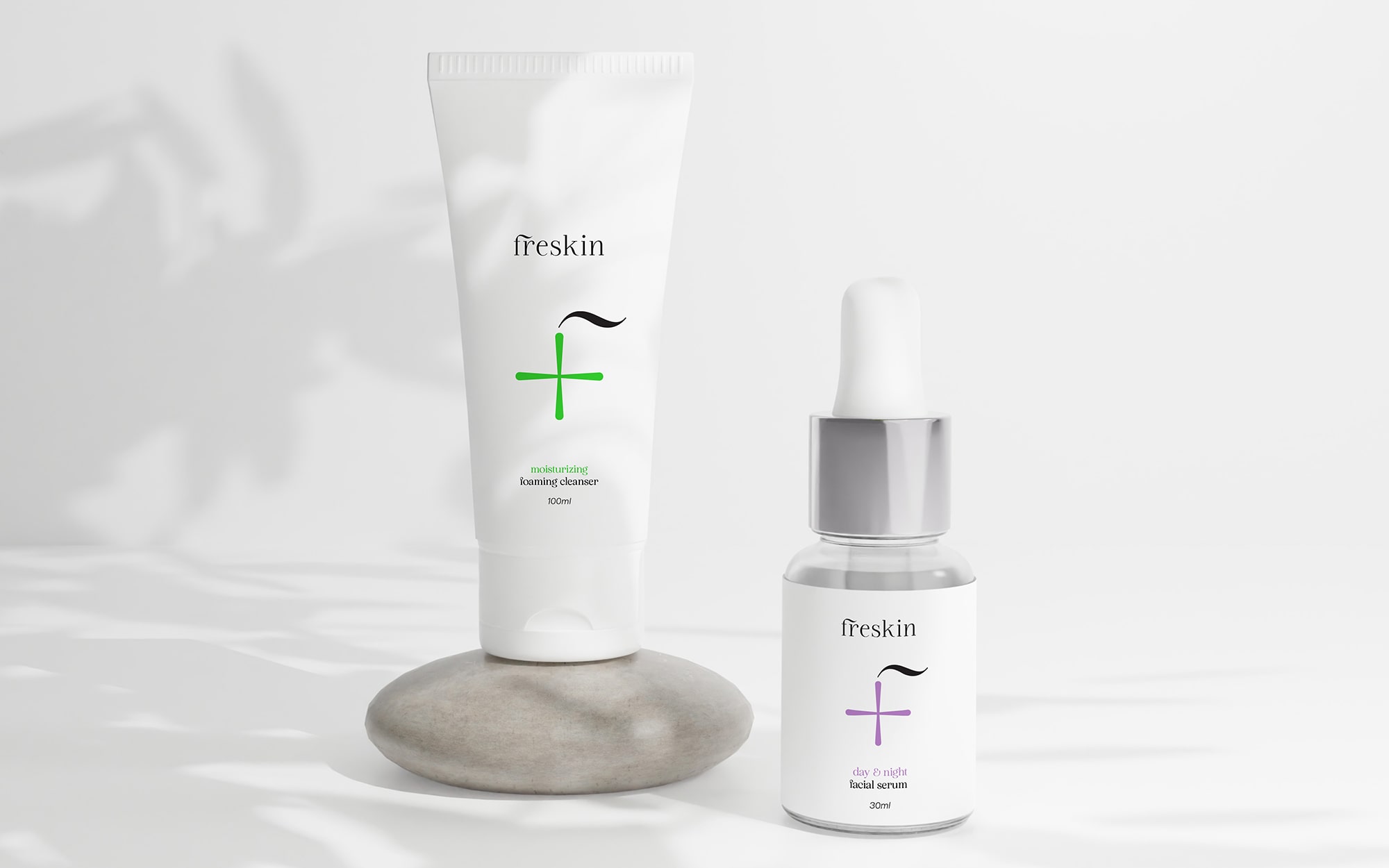
All-white packaging underscores the clinical and premium nature of Freskin. White is universally associated with cleanliness, purity, and simplicity, qualities that customers seek in high-end skincare. The minimalist design communicates sophistication while letting the subtle branding details stand out.
The cross, which changes color based on the product variant, introduces an intuitive visual system for customers to easily identify different product lines. Each color could represent different skincare needs or ingredients (e.g., blue for hydration, green for soothing, red for renewal). This color-coded approach makes the packaging both functional and aesthetically appealing while maintaining the sleek, clinical look.
Despite the clinical edge, the brand is friendly and accessible, ensuring customers feel cared for and comfortable.

CREDIT
- Agency/Creative: Sophia Georgopoulou | Design
- Article Title: Freskin Skin Care Branding by Sophia Georgopoulou
- Organisation/Entity: Freelance
- Project Type: Packaging
- Project Status: Non Published
- Agency/Creative Country: Greece
- Agency/Creative City: Athens
- Market Region: Europe
- Project Deliverables: Brand Creation, Brand Identity, Brand Naming, Design, Logo Design, Packaging Design
- Format: Tube
- Industry: Health Care
- Keywords: skin care, face care, cosmetics, premium, medical, clinical, tube, Greece, healthy skin, Sophia Georgopoulou design, sophiagdotcom, logo, packaging, branding, athens, white, cross
-
Credits:
Concept & Design: Sophia Georgopoulou


