


Defa Group, one of the largest importers of fish and seafood in the Russian Federation, has rebranded Fish&More together with the agency Ohmybrand.
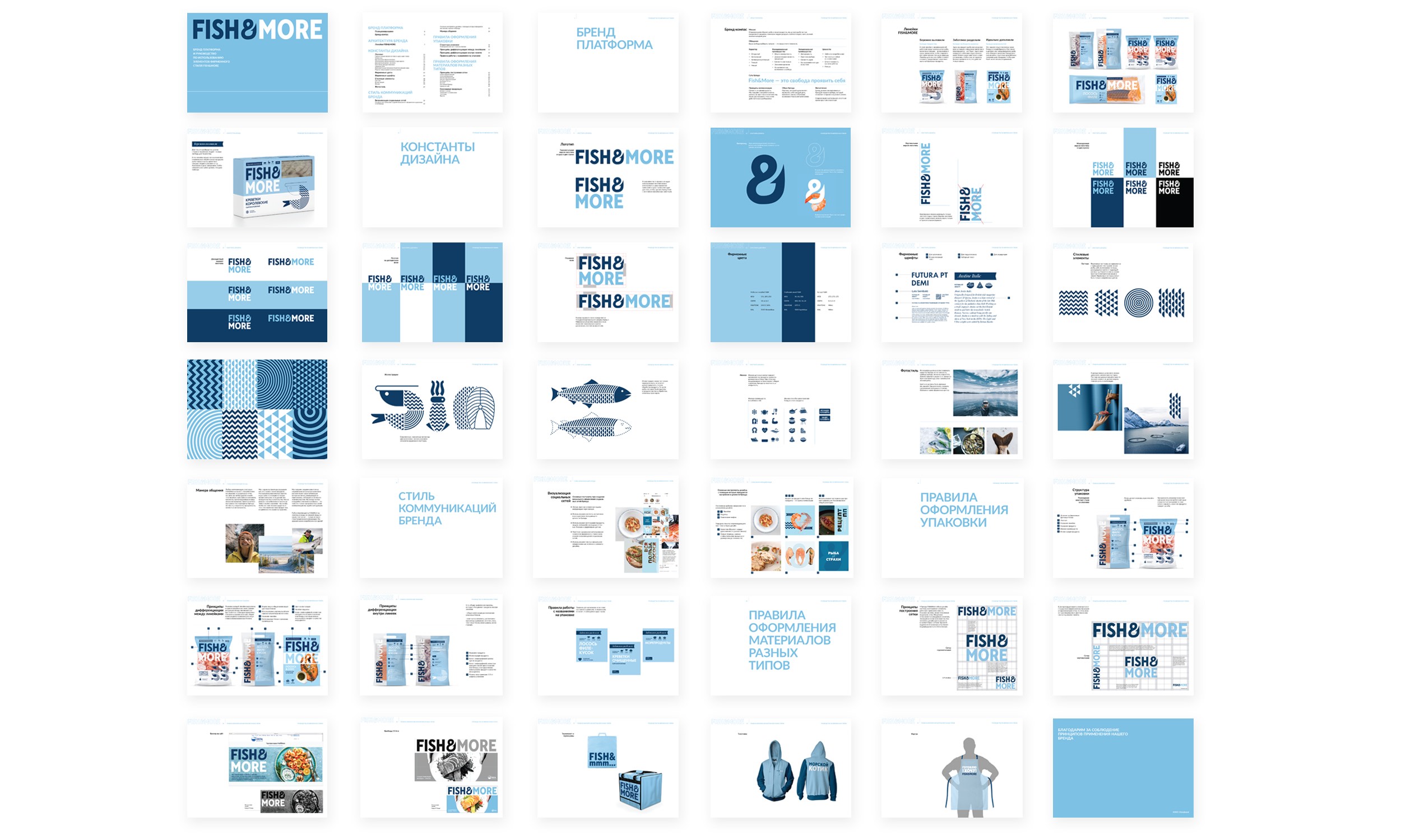
The Ohmybrand team has developed new brand positioning, packaging design, architecture and product line names as well as the principles of brand communication in various channels. The business objective of the project was to create a strong brand to replace the disparate lines that were lost among competitors. At the communication level, the goal was to help consumers choose and prepare freshly-frozen fish and seafood — and, consequently, to help them have a healthy diet.
The Fish&More brand platform is based on freedom in all its manifestations — the research stage showed that this is an important value for the core of our target audience. Fish&More is a brand for those who appreciate freedom in everything, including cooking: cook yourself or buy ready-made dishes, try new things or stay true to your usual recipes. The main principles of brand communication are freshness, originality and communication with the consumer on an equal footing, in a simple and understandable colloquial language.
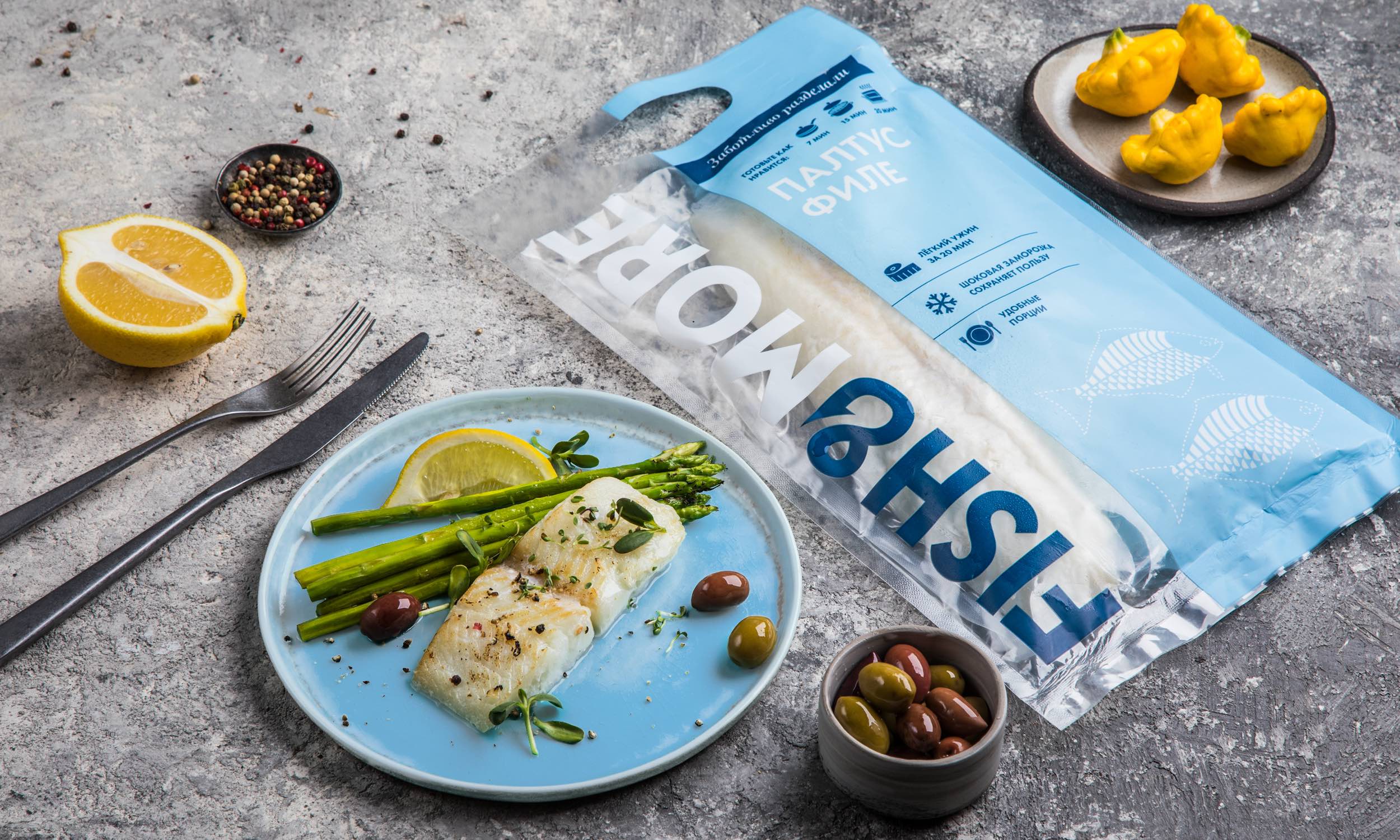
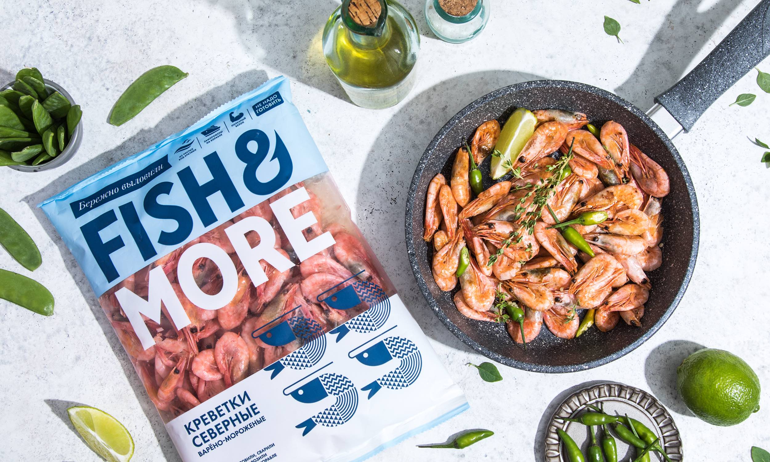
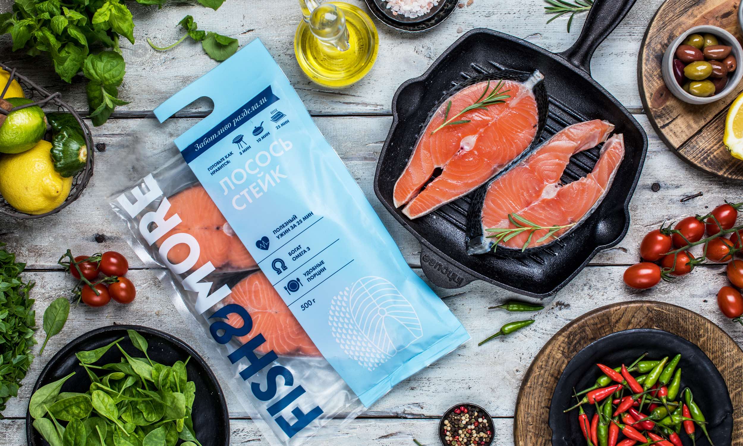
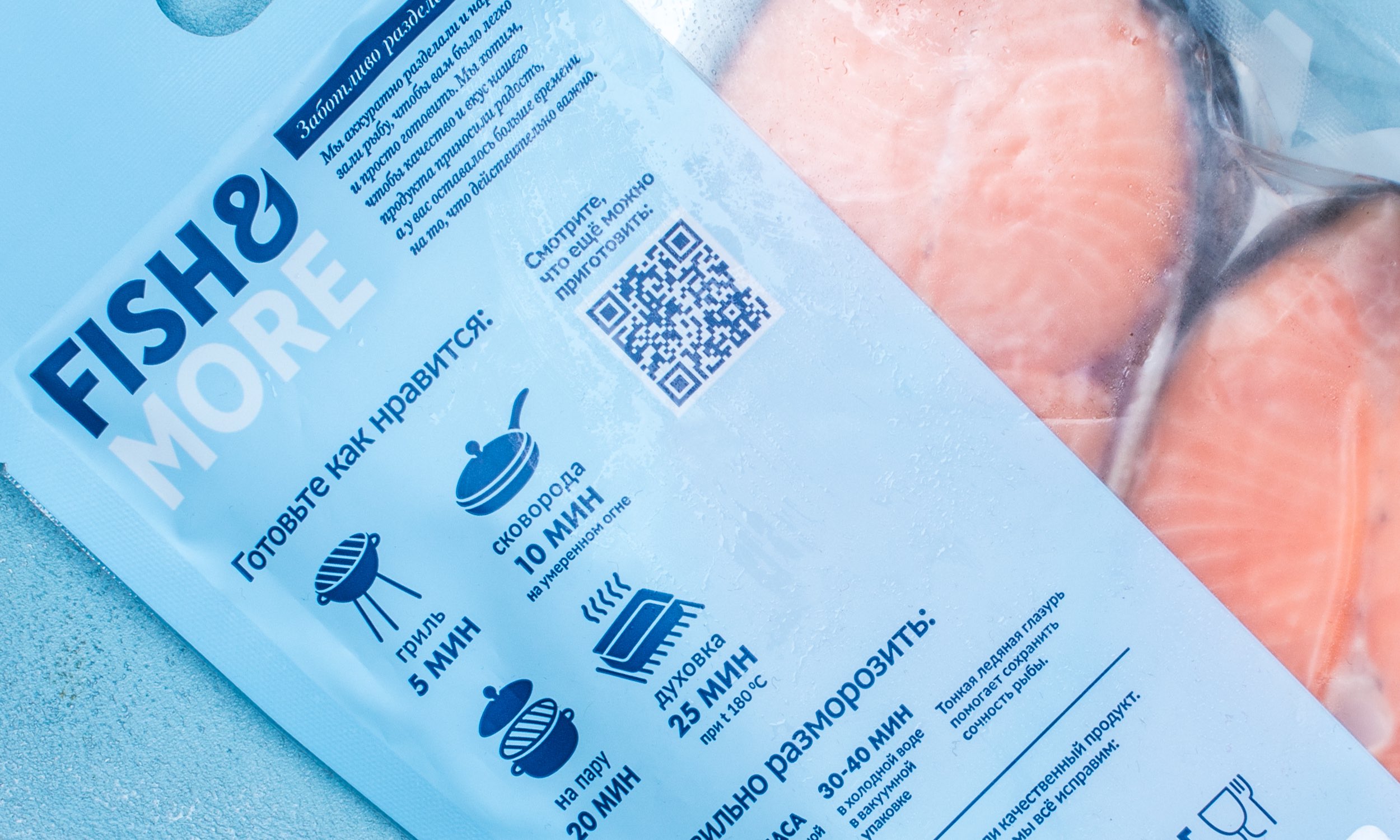
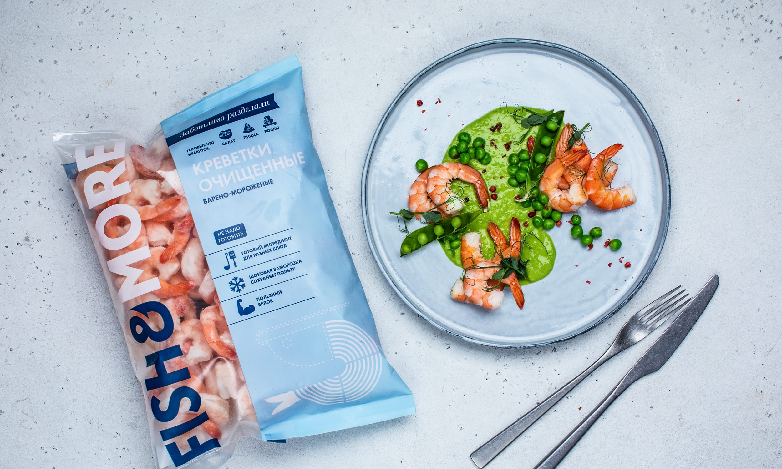
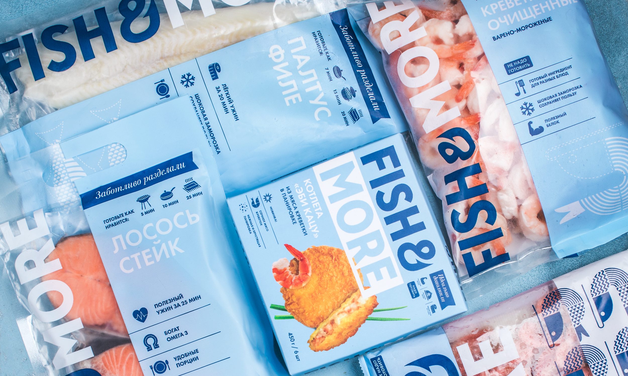
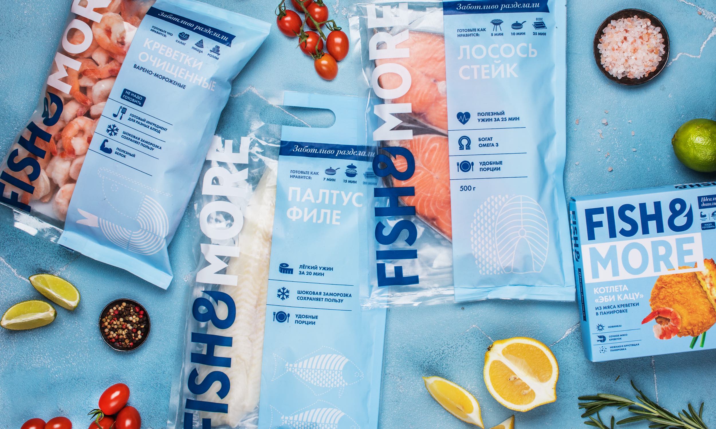
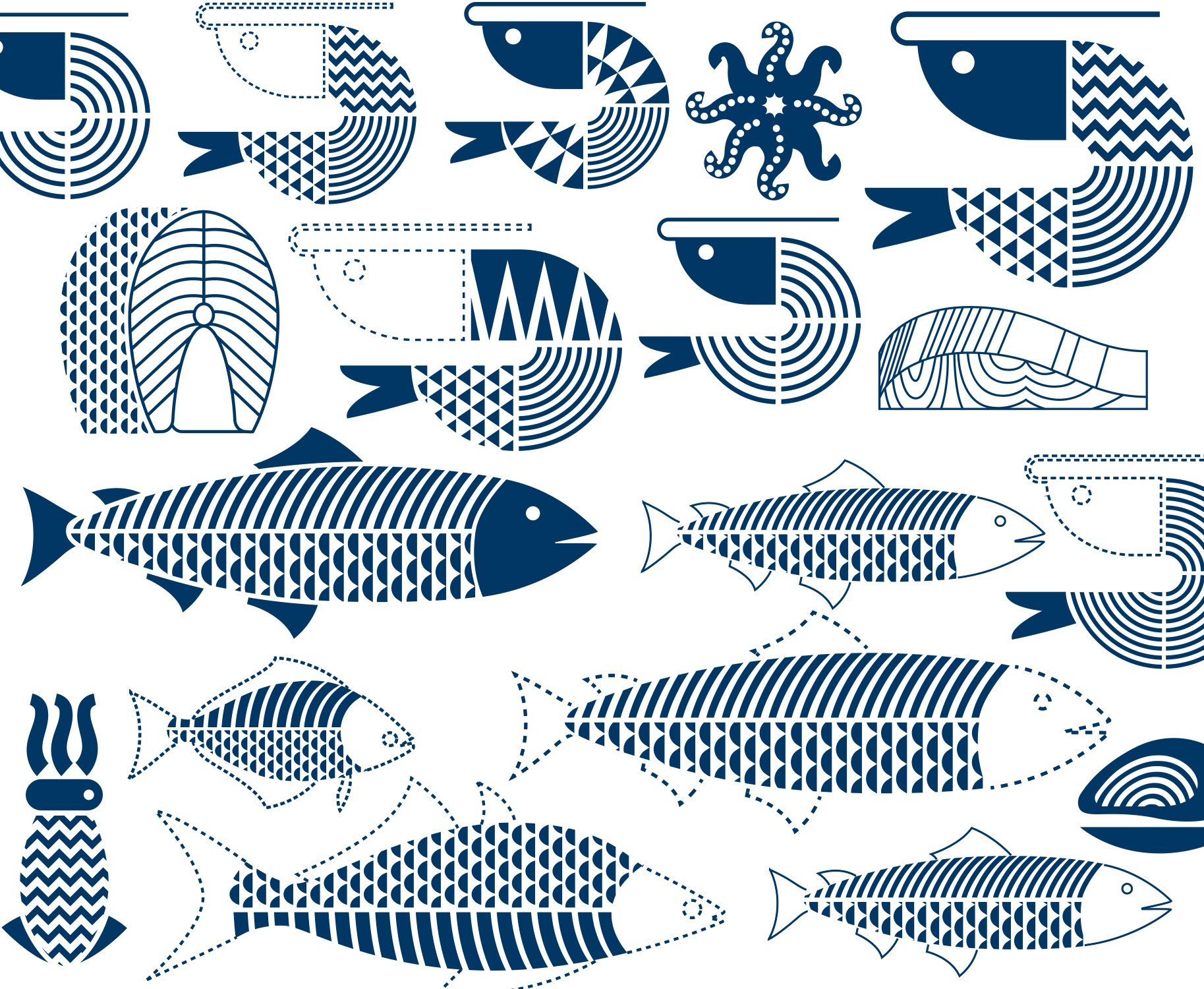
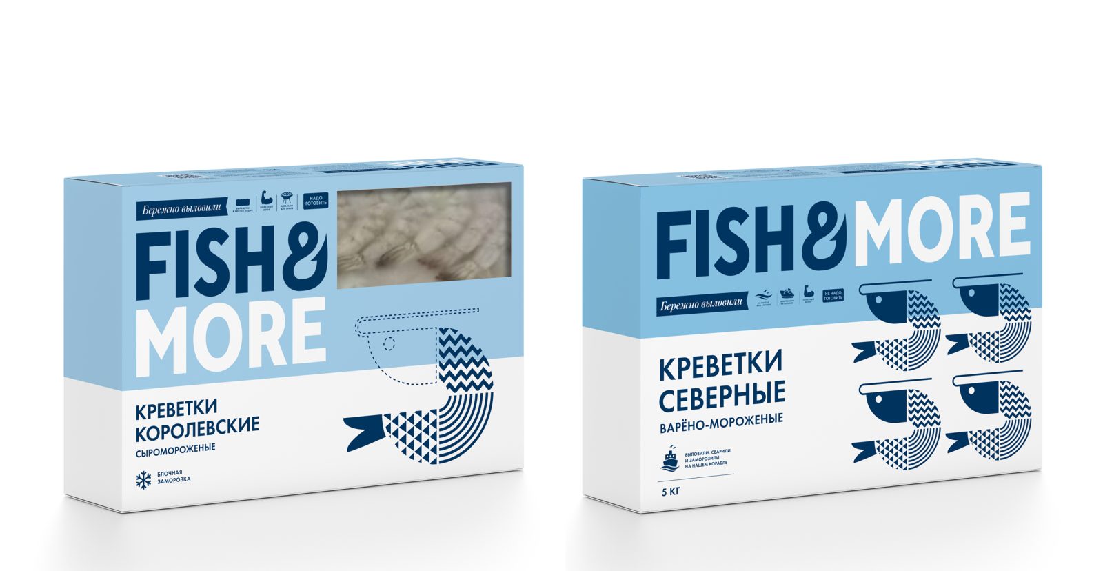
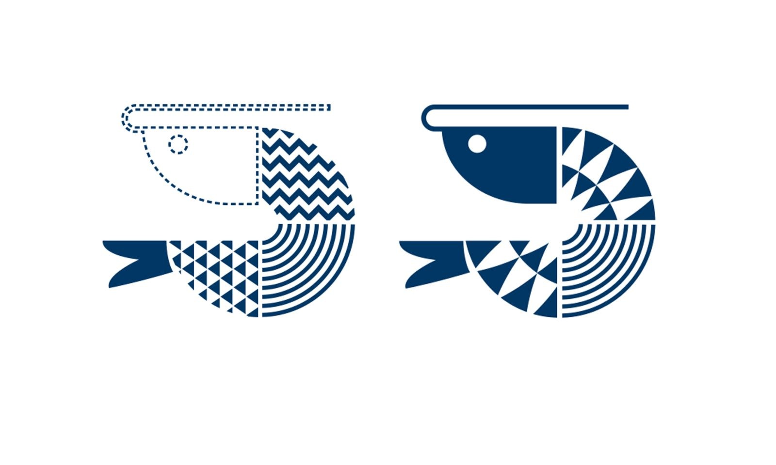
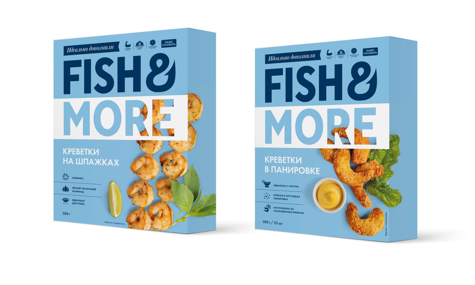
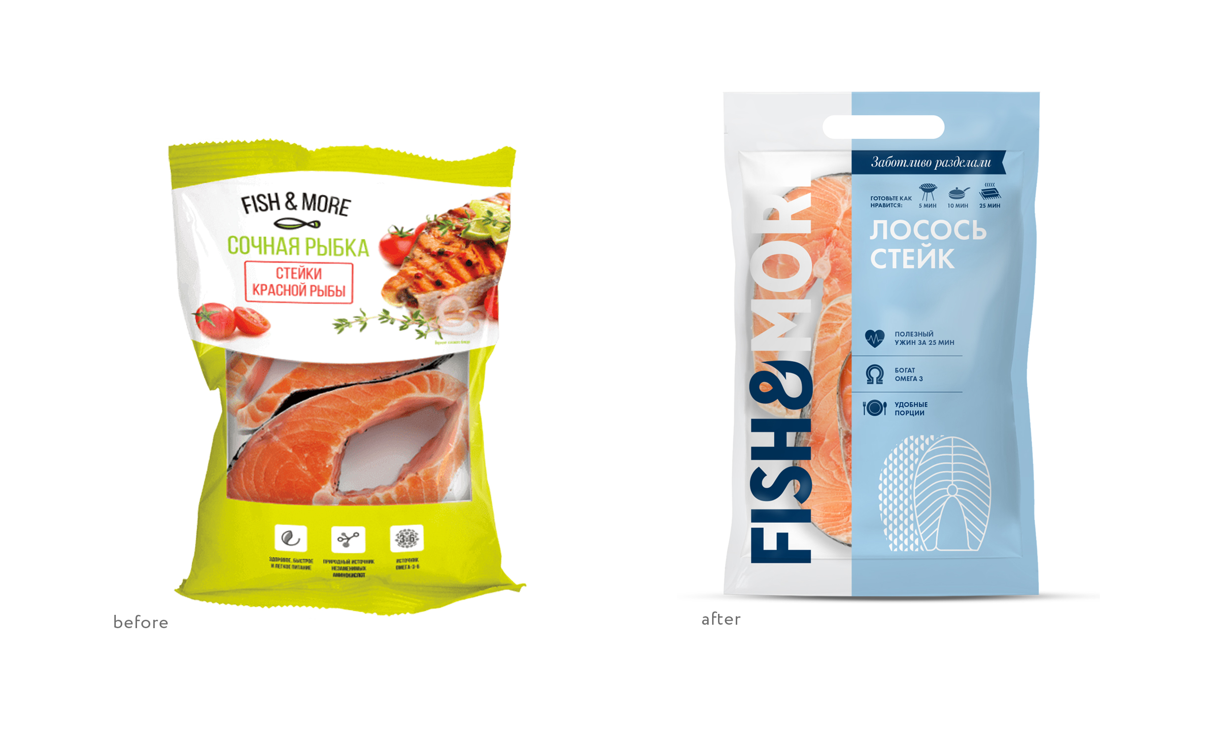
The updated Fish&More packaging fully complies with these principles. The design is concise and not overloaded with elements, it has memorable details and accents (ampersand that looks like a hook in the logo, corporate patterns that resemble natural textures, illustrations) and the color that is associated with freshness and the sea. At the level of texts there are clearly formulated answers to the problems of the consumer. All this creates a friendly yet expert image of Fish&More.
“For the consumer the category of frozen fish and seafood has always been associated with the difficulties of choice. Approaching the refrigerator with fish in the supermarket required a certain attitude and willingness to understand what was what. I am glad that together with Fish&More we help to change the situation and turn friendly, “human” design into the norm for this category,” says Nadezhda Parshina, Creative Director of Ohmybrand.
Fish&More packages have large transparent windows through which the buyers can see the fish in detail from all sides. Thus, they are given an opportunity to check the quality of the product, emphasizing the honesty and transparency that are embedded in the brand’s DNA.
The new architecture and thoughtful names of the Fish&More product lines — “Carefully Fished”, “Carefully Cut”, “Perfectly Augmented” – work to make the choice in the fish and seafood category more understandable for the consumer. Carefully designed infographic blocks can also help with the choice of a product. The infographic illustrates the benefits and methods of preparation of each product.

CREDIT
- Agency/Creative: Ohmybrand
- Article Title: Fresh Rebranding Idea for Fish&More by Ohmybrand
- Organisation/Entity: Agency
- Project Type: Packaging
- Project Status: Published
- Agency/Creative Country: Russia
- Agency/Creative City: Moscow
- Market Region: Asia, Europe
- Project Deliverables: Brand Design, Copywriting, Identity System, Packaging Design
- Format: Box, Flow-Pack
- Substrate: Plastic, Pulp Carton
- Industry: Food/Beverage
- Keywords: WBDS Agency Design Awards 2022/23
- Keywords: frozen, fish, seafood, packaging
-
Credits:
Creative director: Nadezhda Parshina
Art director: Anna Rufova
Designer: Ivan Zhinzhin
Strategy: Socrateam
Project manager: Anna Tsareva


