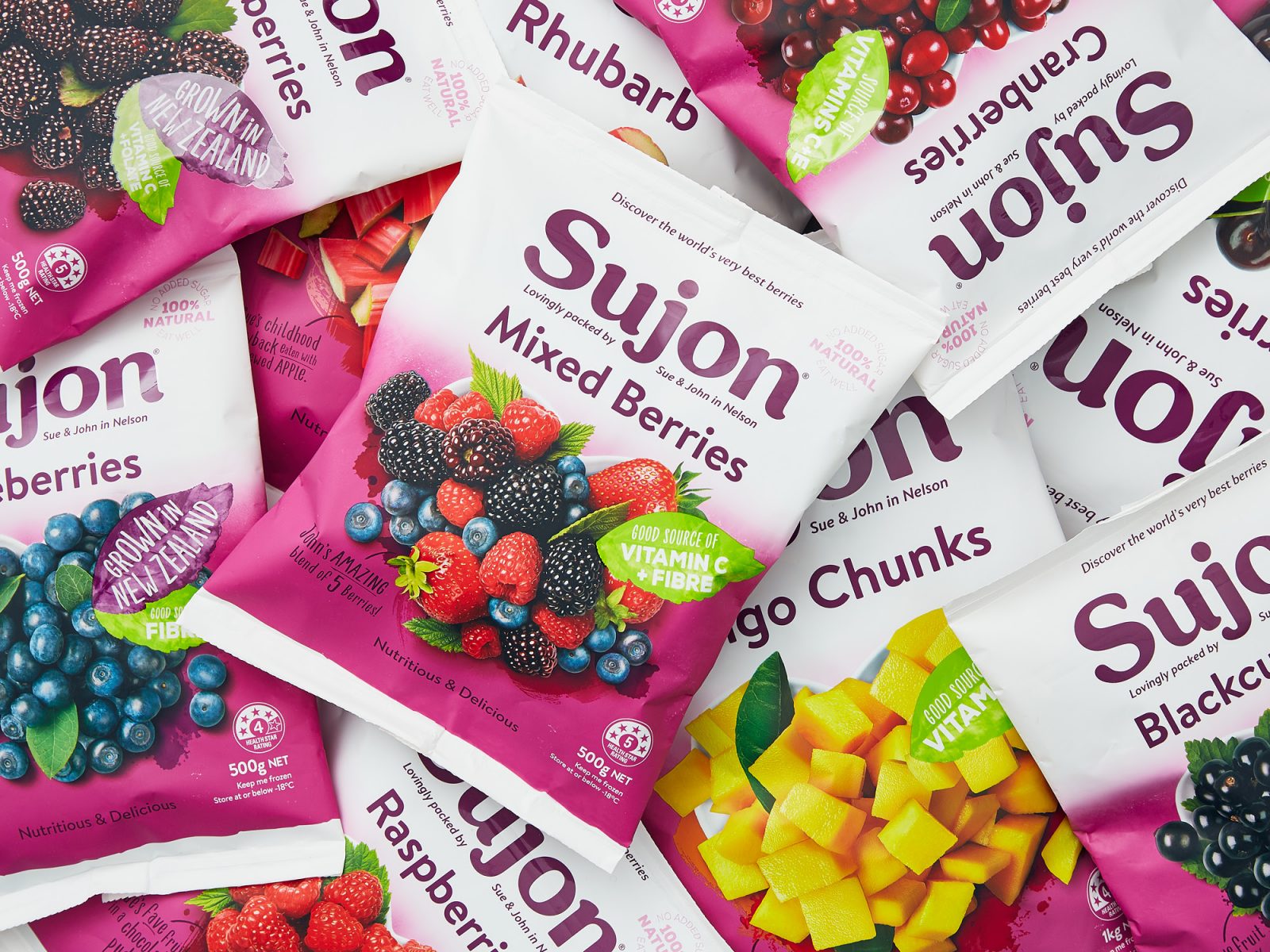
Onfire Design – Sujon Frozen Berries
Putting family values and love of their produce back into a heritage New Zealand food brand.
Back in 1981, Sue and John Gibb were berry farmers in Nelson, who sold and supplied their produce locally. Thinking about how they could get their berries into the kitchens of more New Zealander’s they came up with the idea of freezing, then packing them so they could be shipped to all corners of the country. That radical idea created ‘Sujon’. Fast forward over 35 years later, the brand is now sold across all of the country and Asia. What they can not grow here, they head overseas sourcing the very best growers to provide them with their produce.
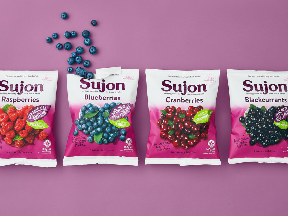
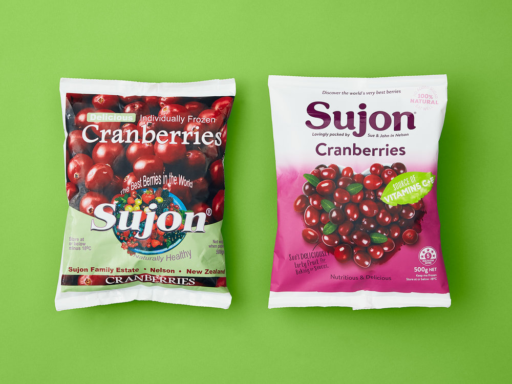
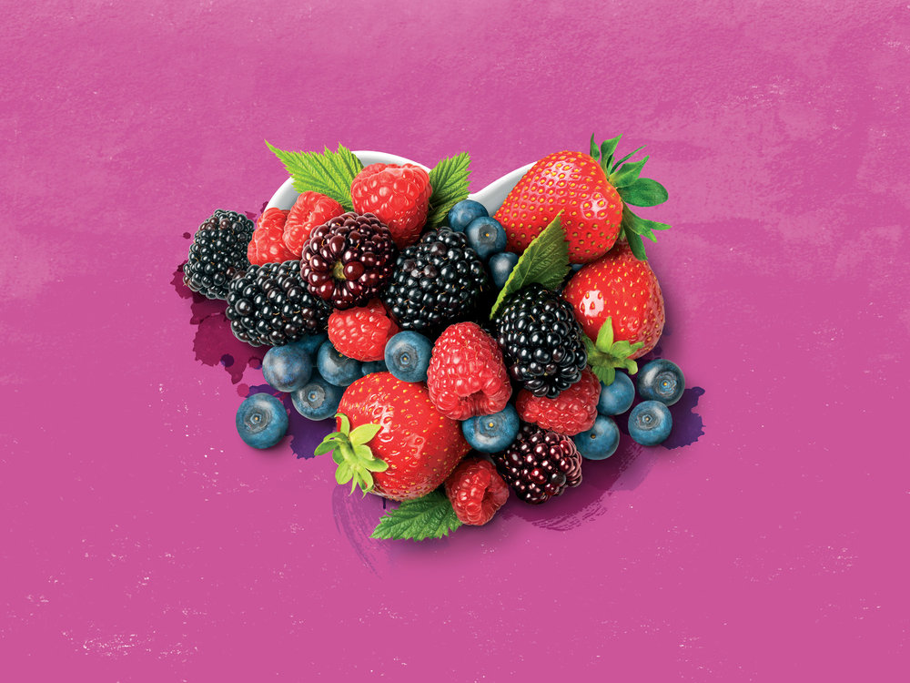
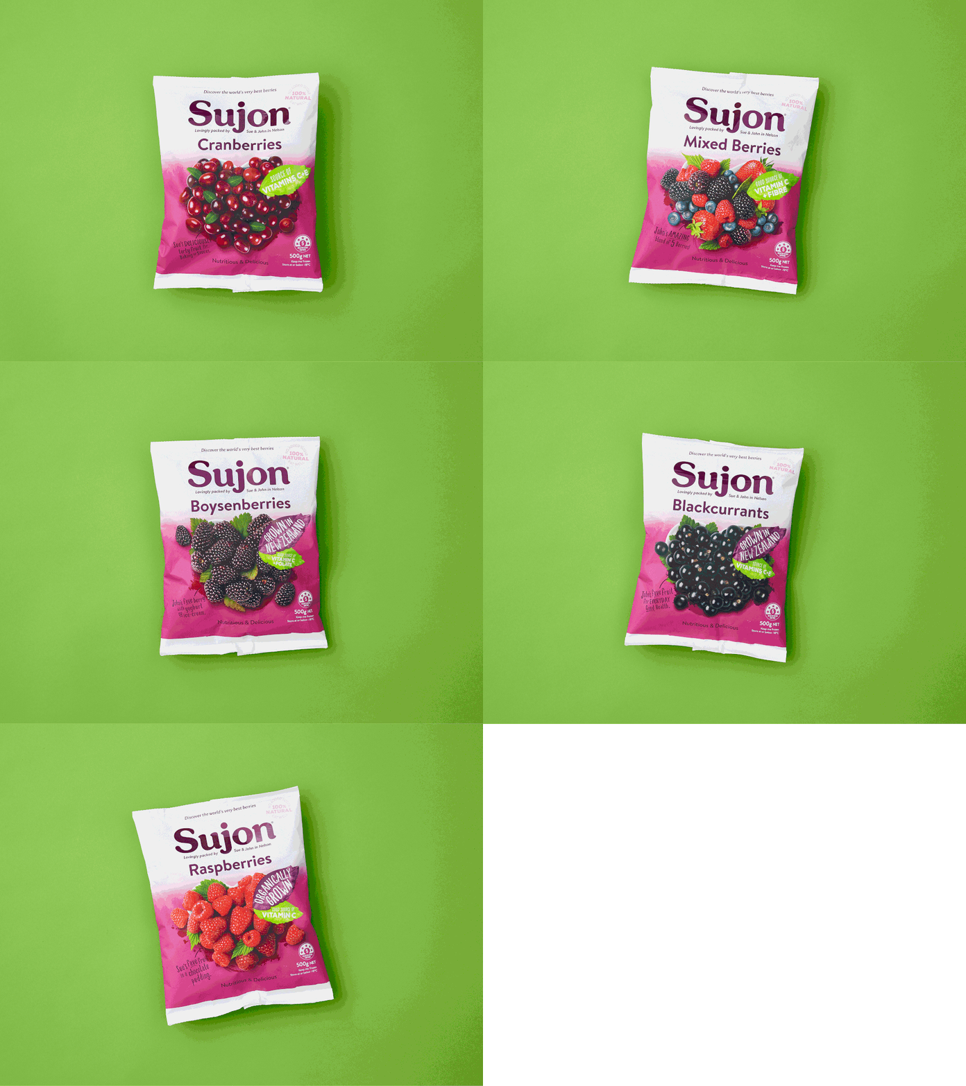
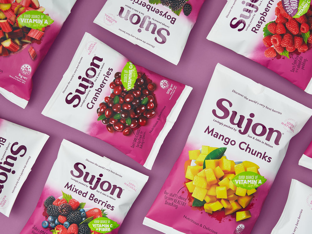
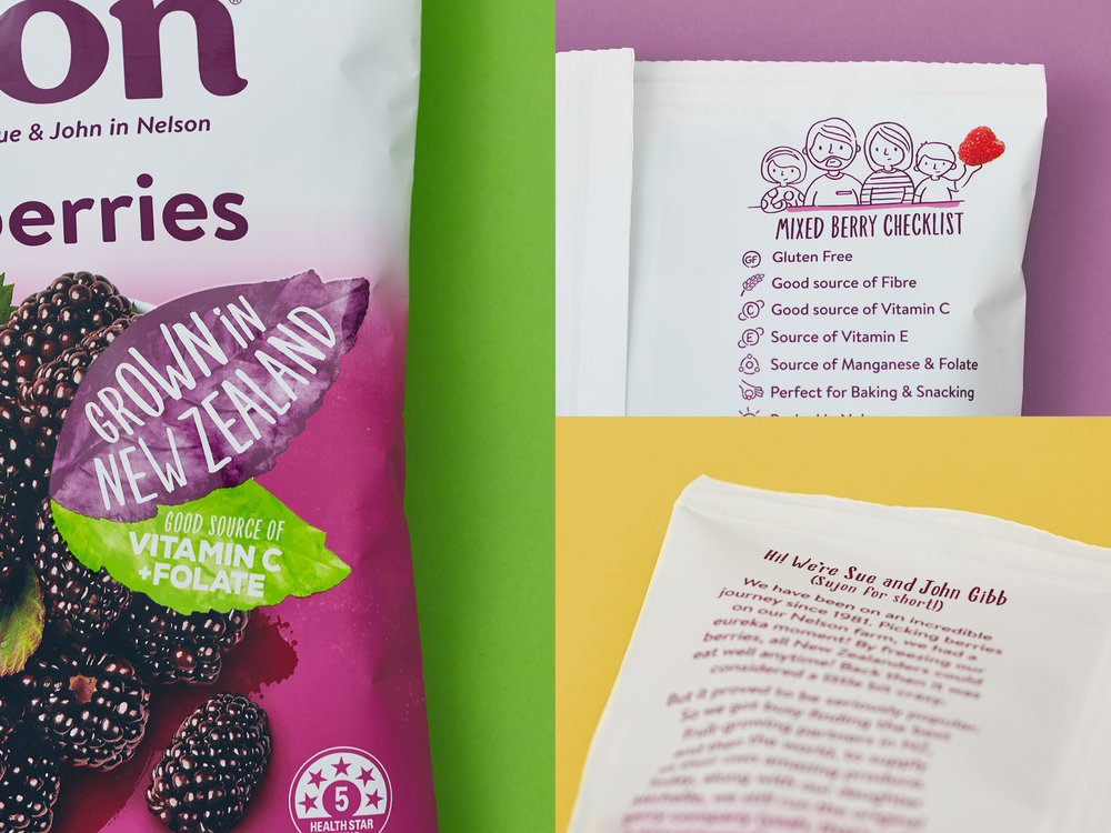
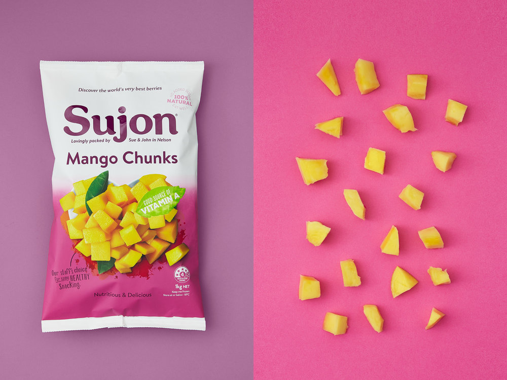
The products are truly amazing, but the retail packaging was dated in comparison to a number of competitor brands, which hindered core brand values and chiller aisle stand out. More importantly, Sujon was perceived as an overseas brand. We were asked to undertake a brand and packaging refresh. Starting with their core family and brand values we cut out all unnecessary messaging, reconnected Sue, John and their Nelson origins to the bespoke brand mark, while making the natural functionality, colours and textures of the produce the hero of each pack. Quirky messaging establishes the teams love of the products, while the back of packs showcases the pride of the Gibb family and the goodness of the products for all Kiwi famillies.
A new lush premium purple brand and consistent pack colours cut through in freezer and chiller aisles – bright, juicy and clean. A fresh new look which captures the love of a pioneering New Zealand family.
CREDIT
- Agency/Creative: Onfire Design
- Article Title: Fresh New Look for a New Zealand Family Heritage Food Brand
- Organisation/Entity: Agency Commercial, Published
- Project Type: Packaging
- Agency/Creative Country: New Zealand
- Market Region: Oceania
- Format: Bag
- Substrate: Plastic
- Industry: Food/Beverage


