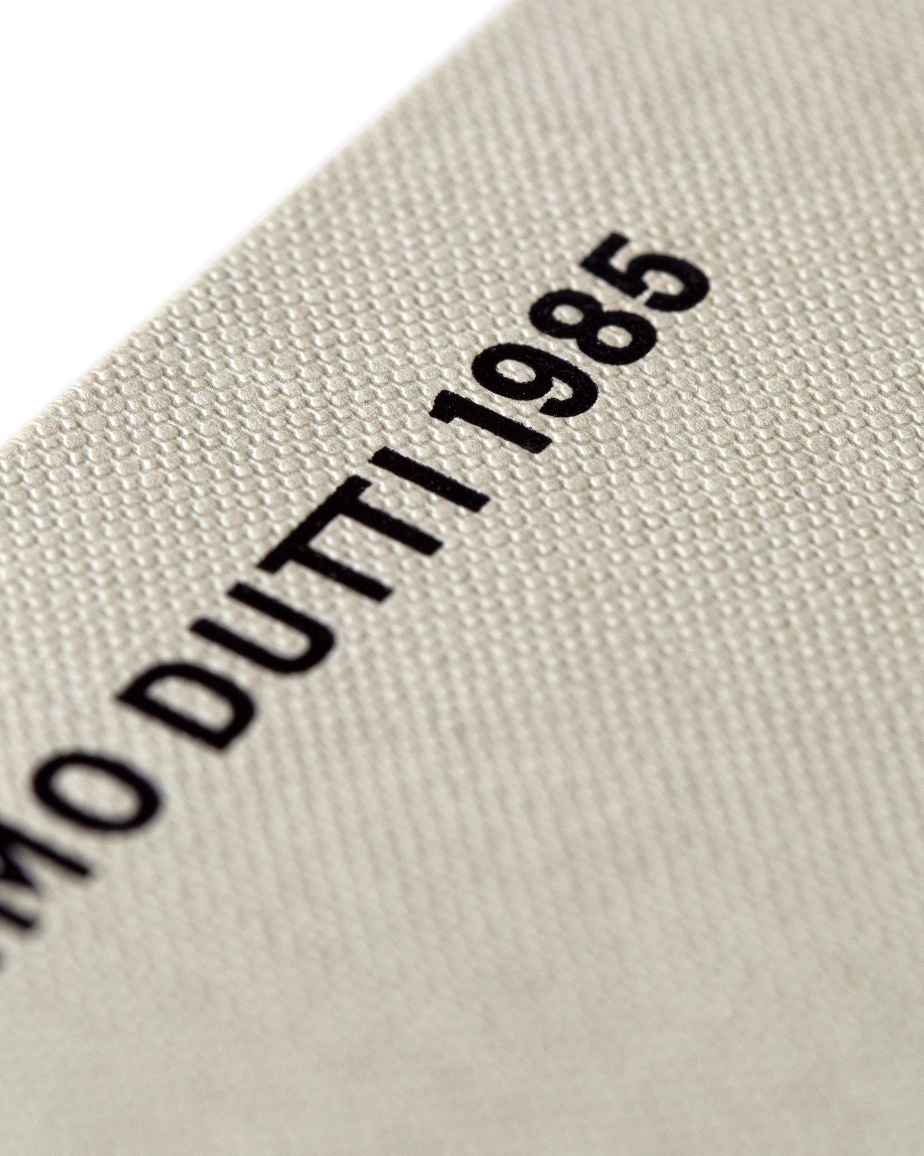
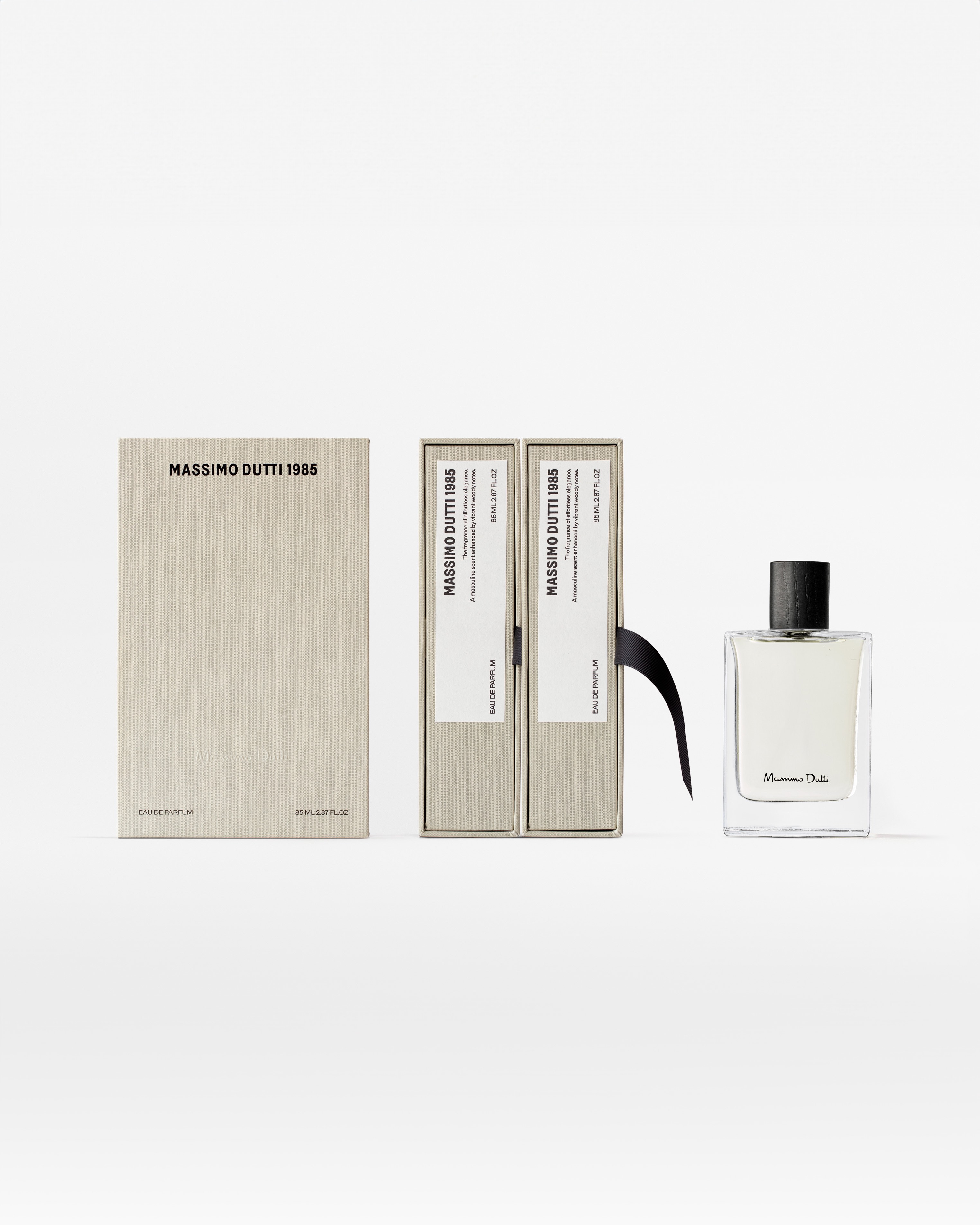
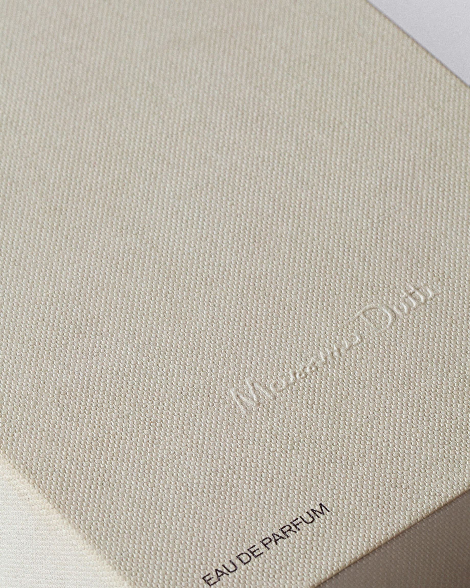
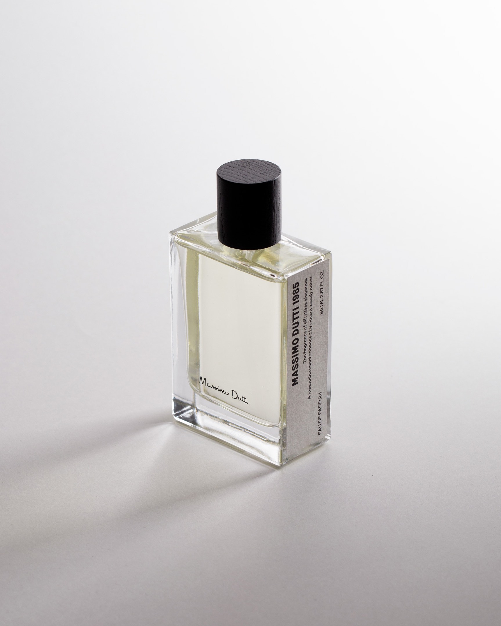
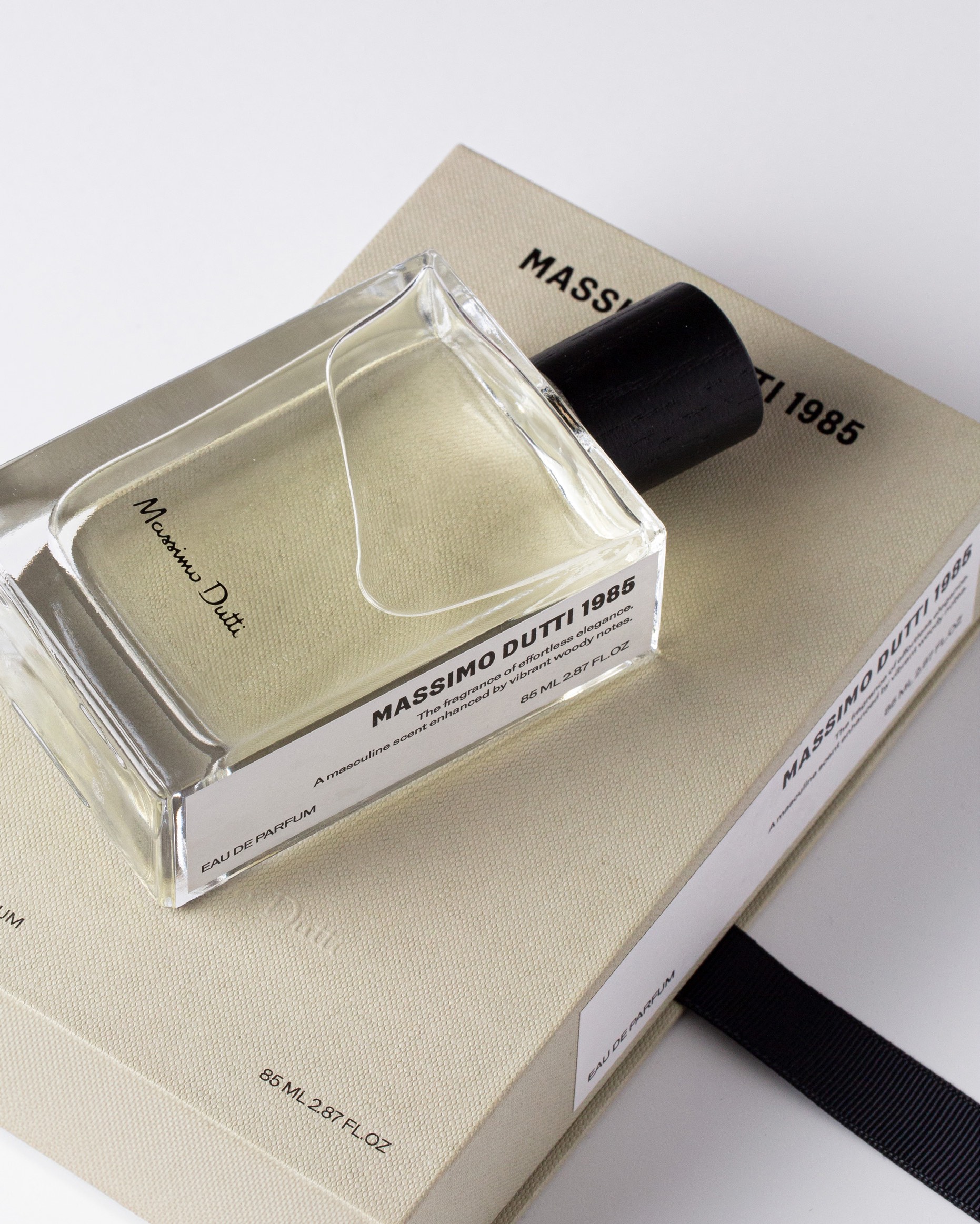
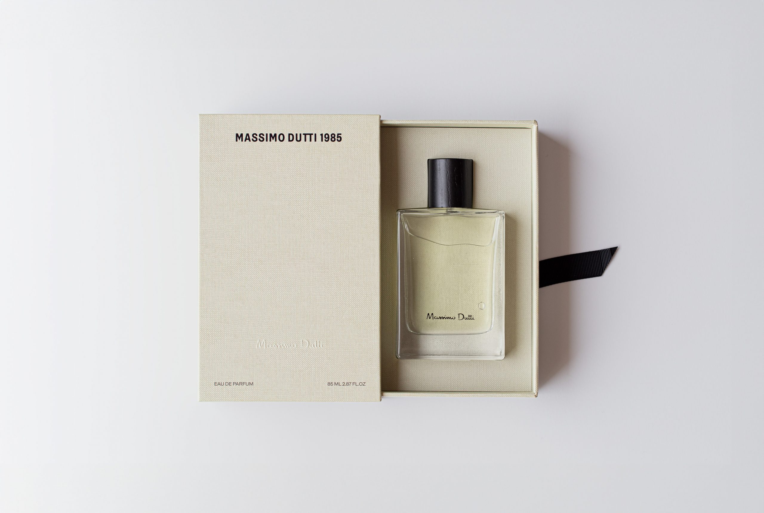
Massimo Dutti has launched this new men’s perfume, where the name “1985” refers to the year the company was founded. They wanted to give it a contemporary, youthful, and fresh vibe while maintaining the tone of elegance that characterizes the brand.. For the secondary packaging, we adopted the concept of a book so that its display in the store would resemble a library. This is why the information is provided on one of the sides, which functions as a spine. To elevate the perception of quality, it is covered in a textile-like paper and features black stamping for the brand name. Additionally, it has a fabric ribbon that makes it easy to extract the bottle, which also has a label on one side.
CREDIT
- Agency/Creative: Lavernia & Cienfuegos
- Article Title: Fresh Design Meets Classic Elegance in Men’s Fragrance for Massimo Dutti 1985, Designed by Lavernia & Cienfuegos
- Organisation/Entity: Agency
- Project Type: Packaging
- Project Status: Published
- Agency/Creative Country: Spain
- Agency/Creative City: Valencia
- Market Region: Europe
- Project Deliverables: Packaging Design
- Format: Bottle, Box
- Industry: Beauty/Cosmetics
- Keywords: parfum, fragance, massimo, dutti, lavernia, cienfuegos
-
Credits:
Agency: Lavernia & Cienfuegos
FEEDBACK
Relevance: Solution/idea in relation to brand, product or service
Implementation: Attention, detailing and finishing of final solution
Presentation: Text, visualisation and quality of the presentation


