


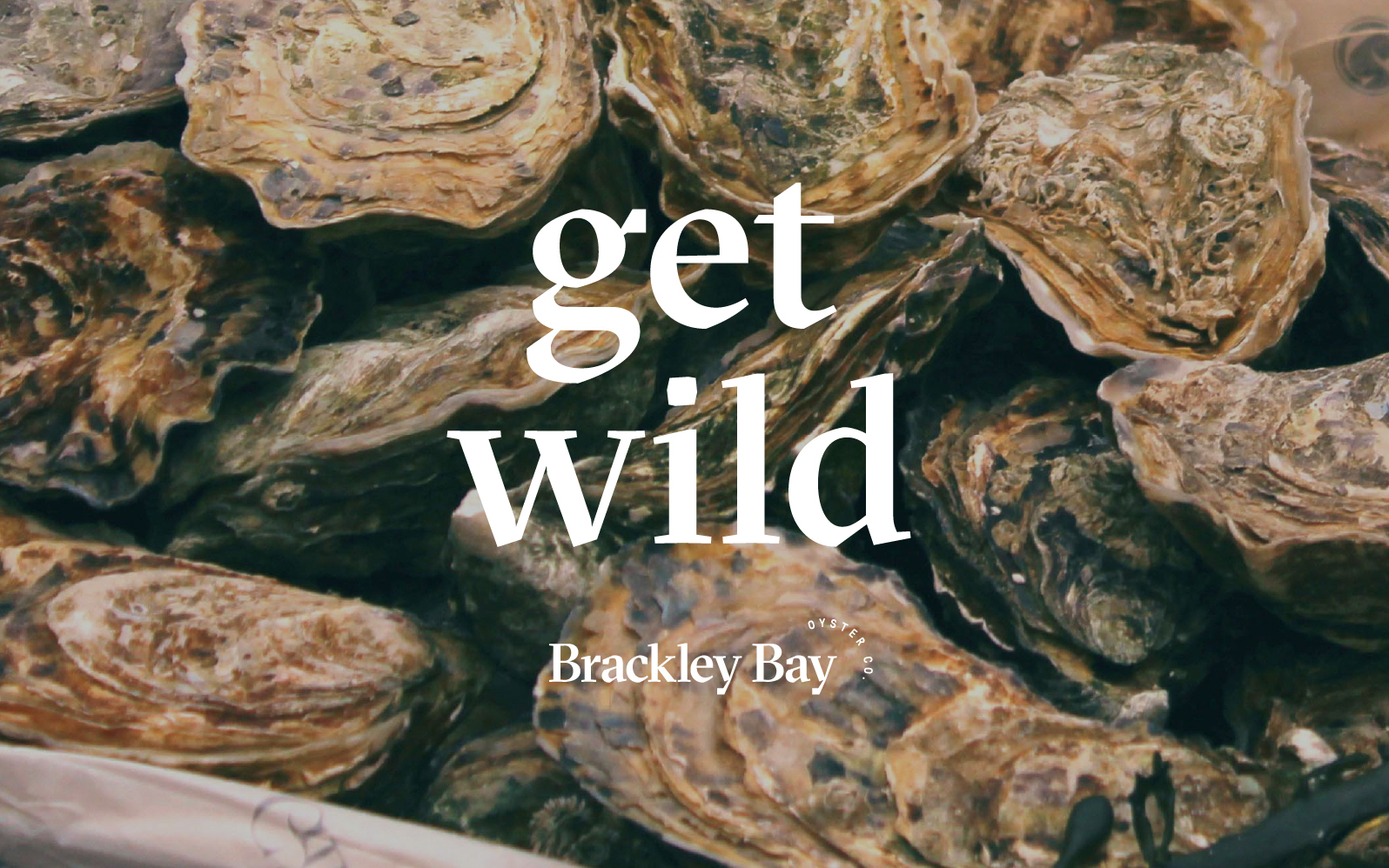
Brackley Bay Oyster Company holds one of the oldest recorded oyster leases on Prince Edward Island, dating back to 1922. Today their wild-caught oysters are in high demand as the company continues to grow.
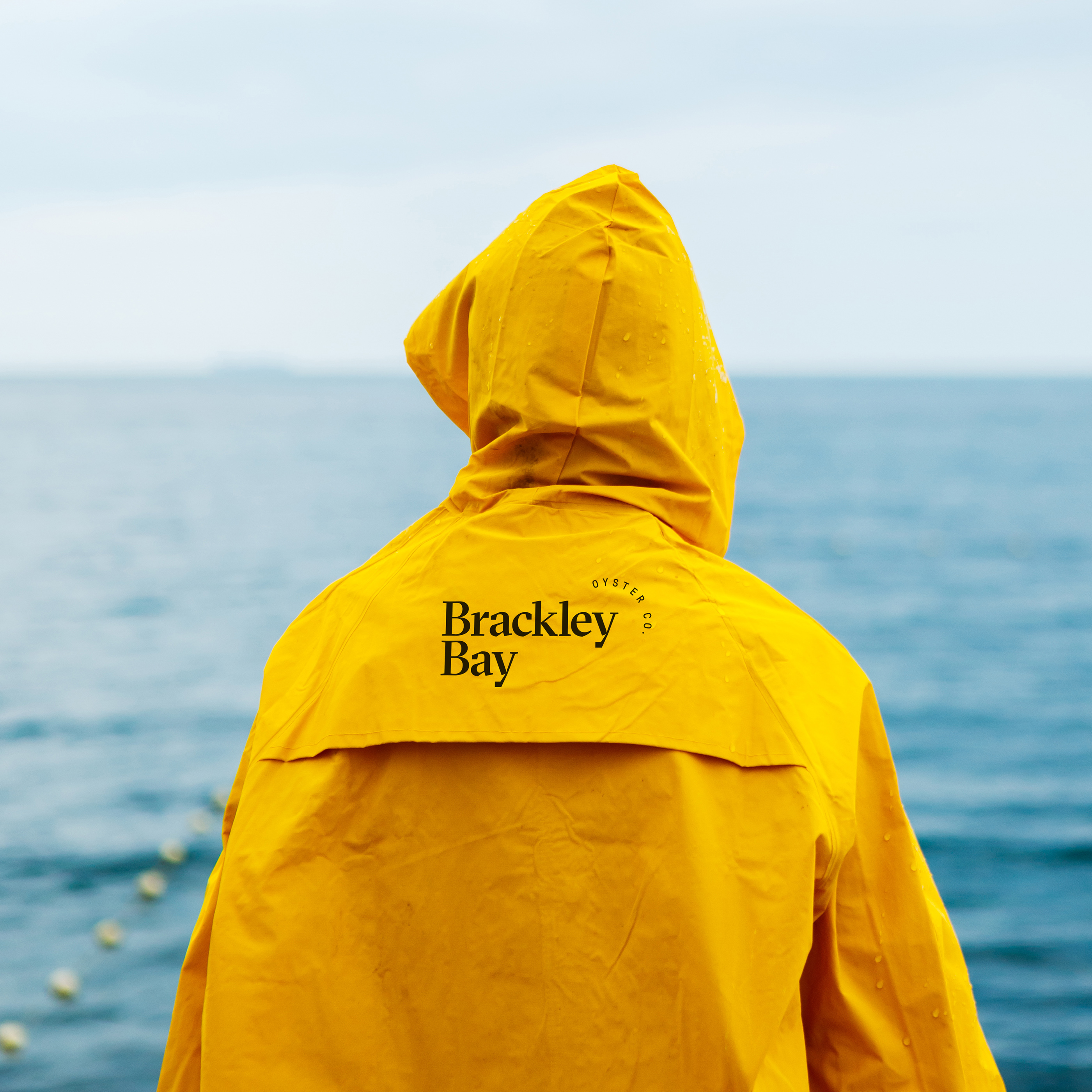
The new visual identity, developed by Hayley Burns with Furrow Studio, celebrates this strong connection to place, and offers a fresh take on heritage.
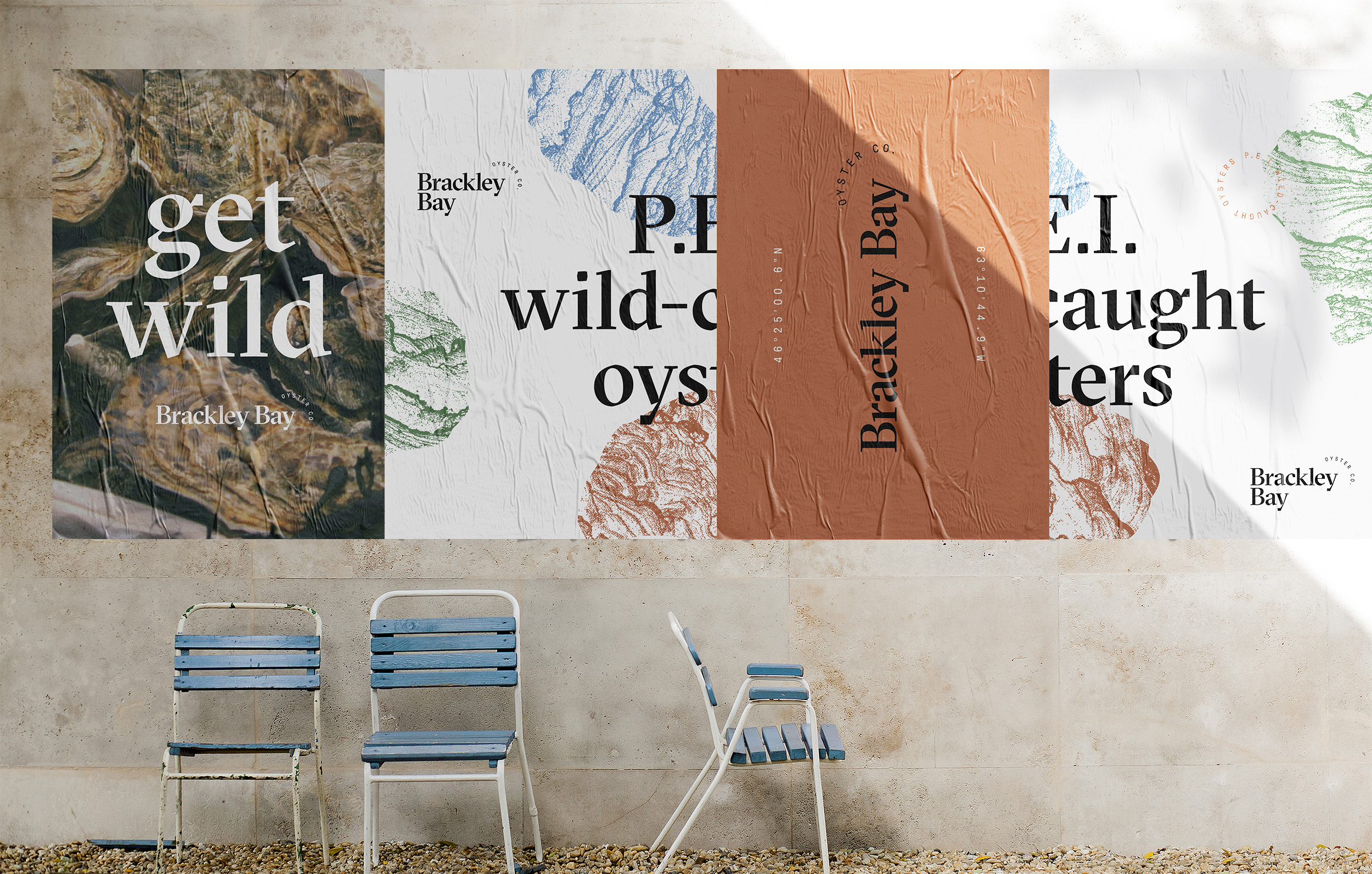
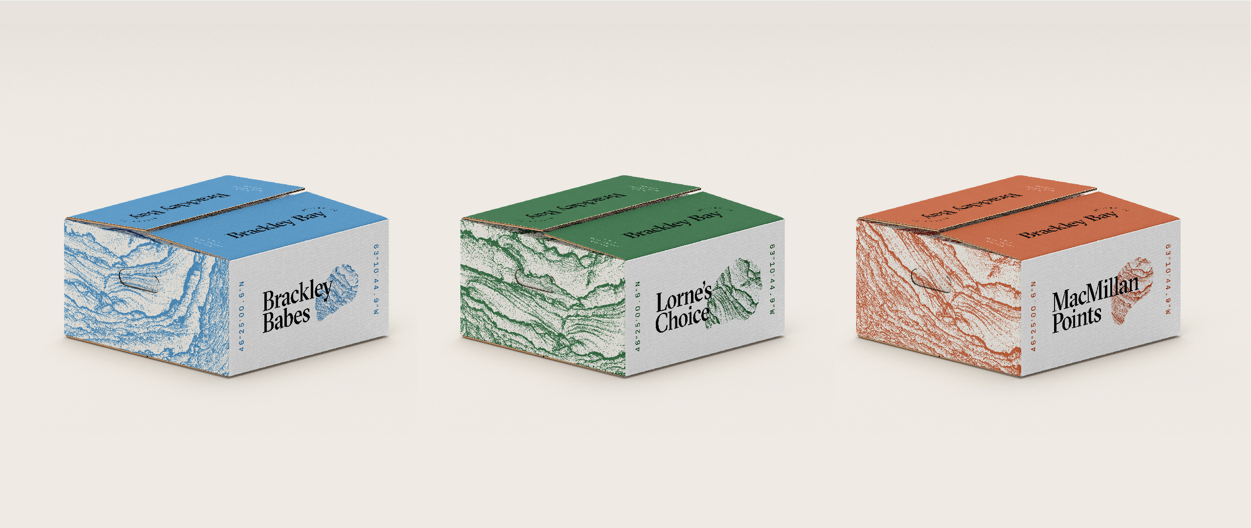
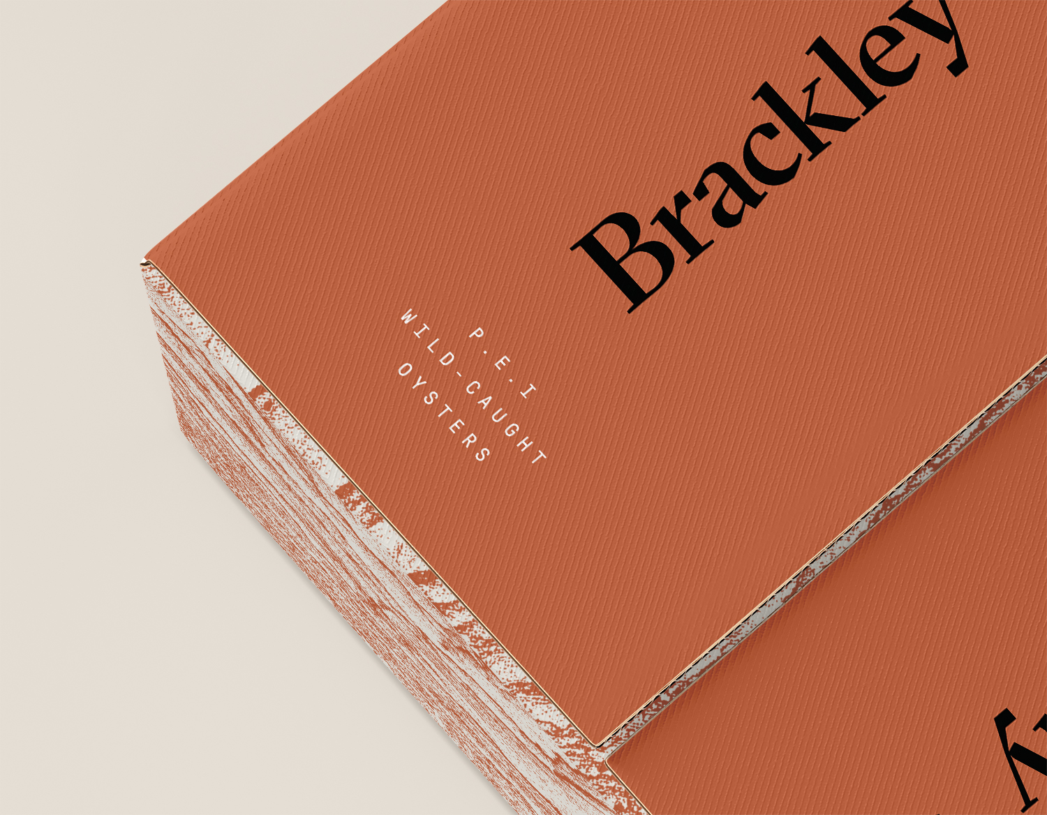
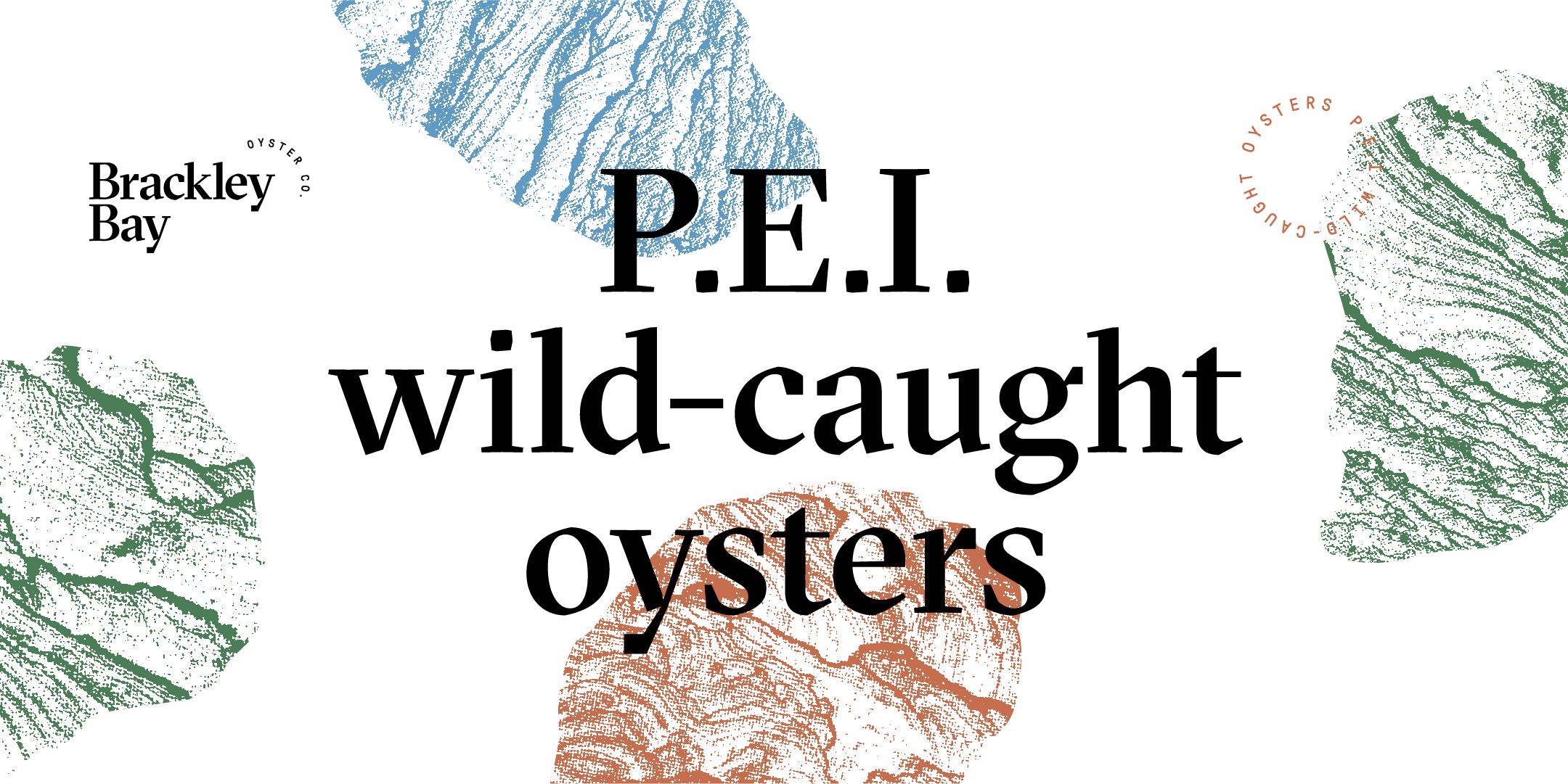
The wordmark’s angular typography invokes the coarse shape of an oyster shell. It’s paired with a modern, monospaced secondary font for typographic details.
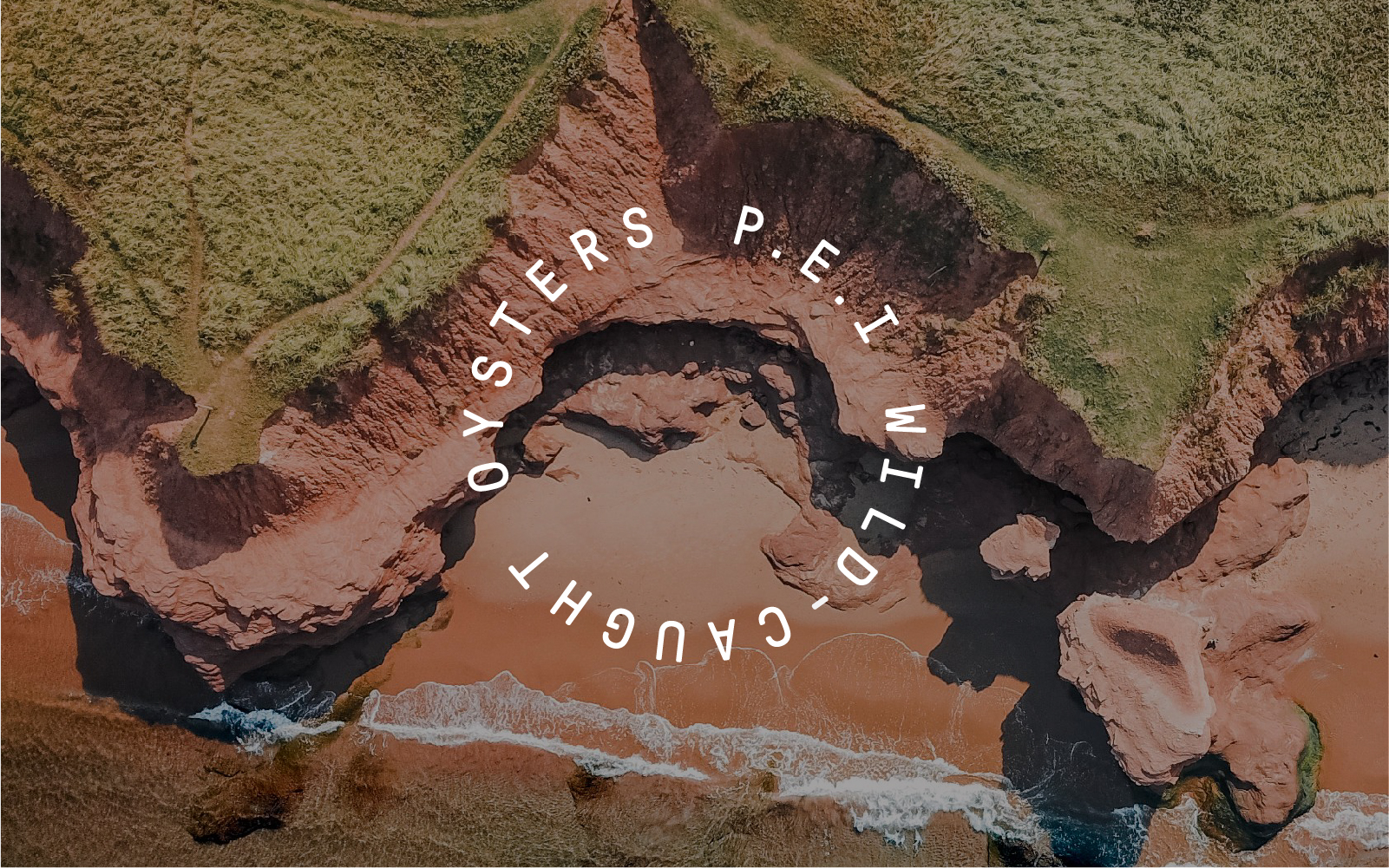
The brand’s colour palette draws inspiration from PEI’s landscape — distinctive red sand, blue sky and green fields.
A textural pattern is also utilized throughout the visual identity, reminiscent of shore lines and the layered texture of an oyster shell.
CREDIT
- Agency/Creative: Hayley Burns
- Article Title: Fresh Branding for a Wild-caught Oyster Fishery With Nearly 100 Years of History
- Organisation/Entity: Freelance, Published Commercial Design
- Project Type: Identity
- Agency/Creative Country: Canada
- Market Region: North America
- Project Deliverables: Brand Advertising, Brand Creation, Brand Identity, Brand Redesign, Brand Strategy, Branding, Graphic Design, Identity System, Packaging Design, Rebranding, Tone of Voice
- Industry: Food/Beverage
- Keywords: Branding, visual identity, packaging design, oyster company, logo design, typography, colour palette


