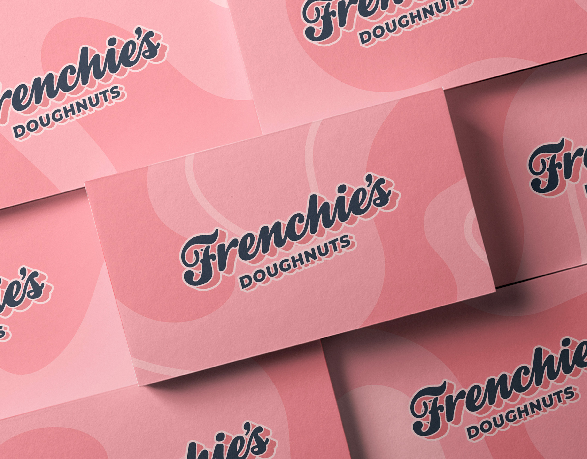
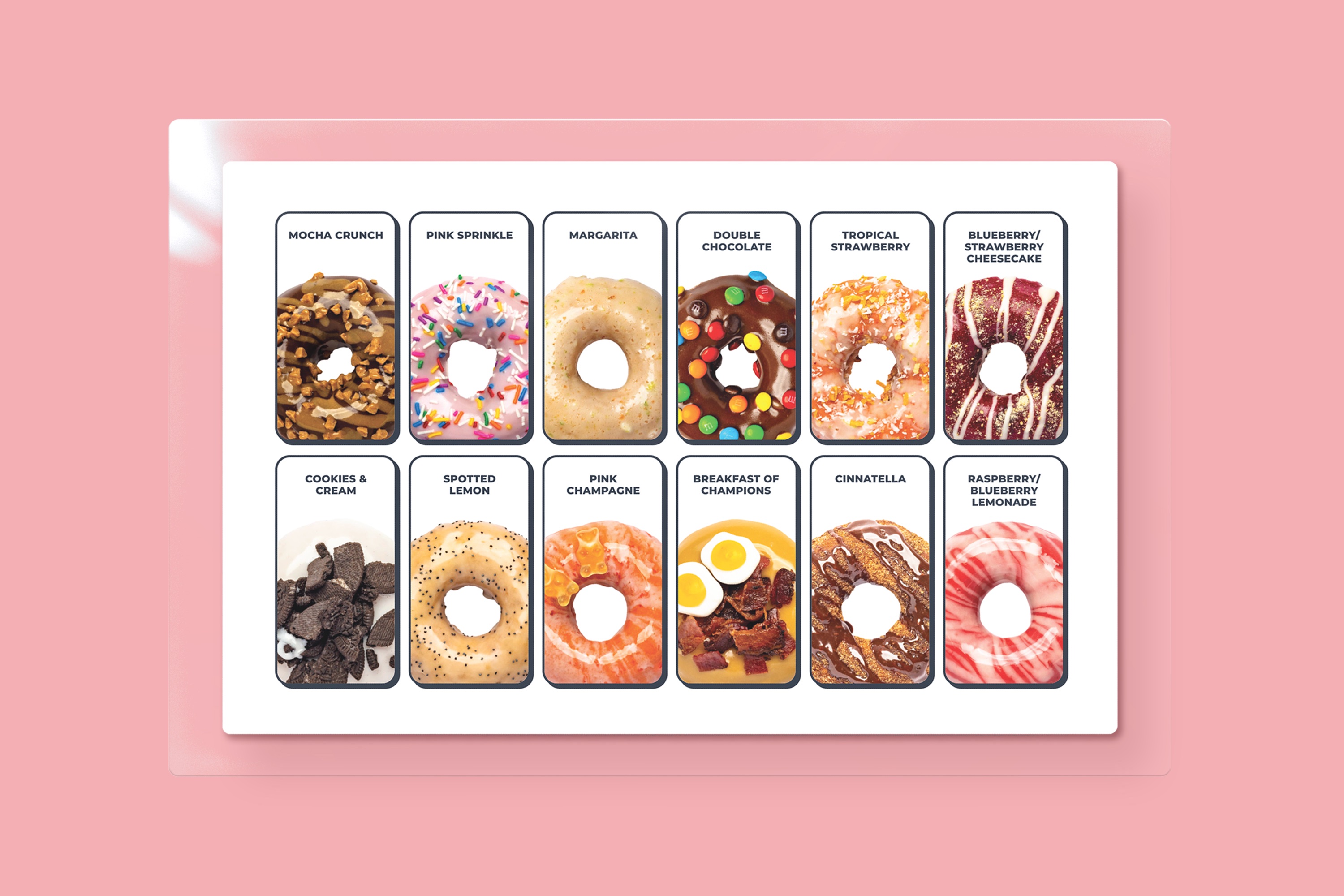
Executive Summary: Brand Identity design for Frenchie’s Doughnuts, a brand-new doughnut and coffee shop based in Etobicoke, ON. This project encapsulates the finished results of a strategic brand development that resulted in a successful launch, bringing new flavours—made with premium ingredients—to dessert fanatics.
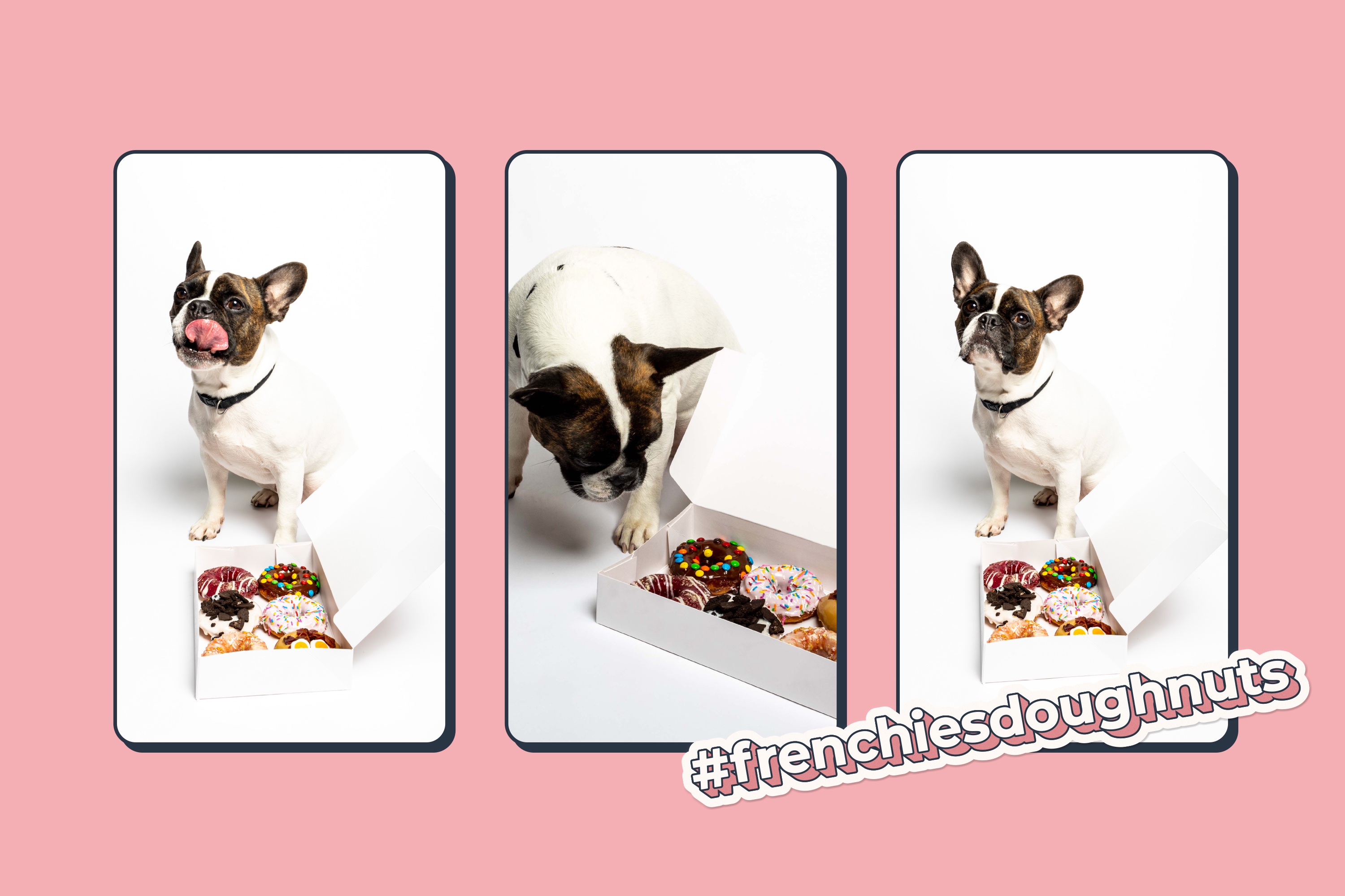
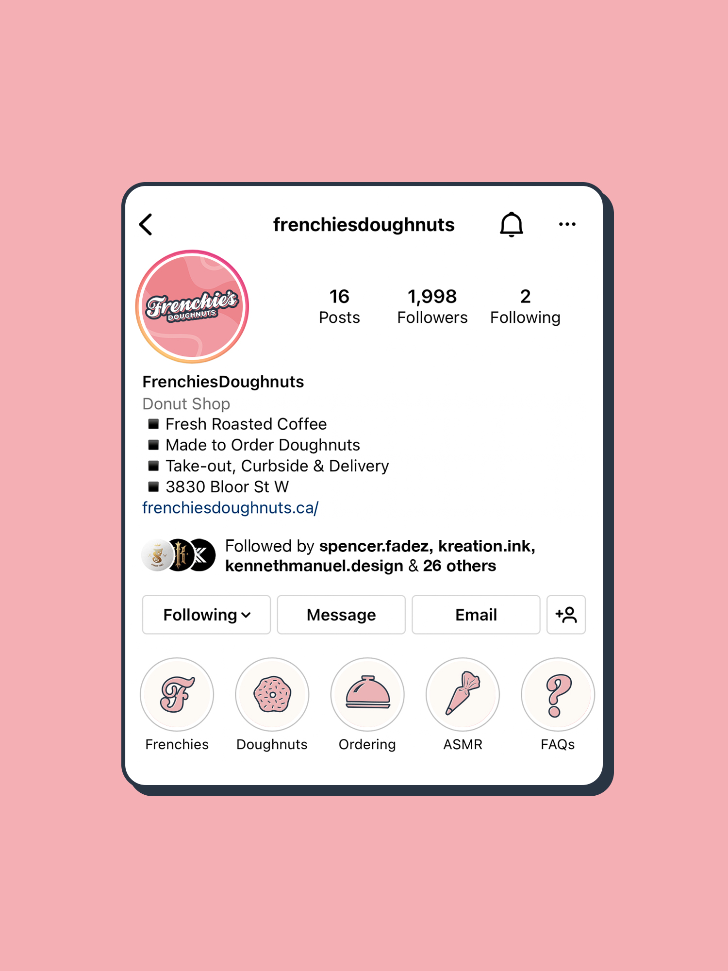
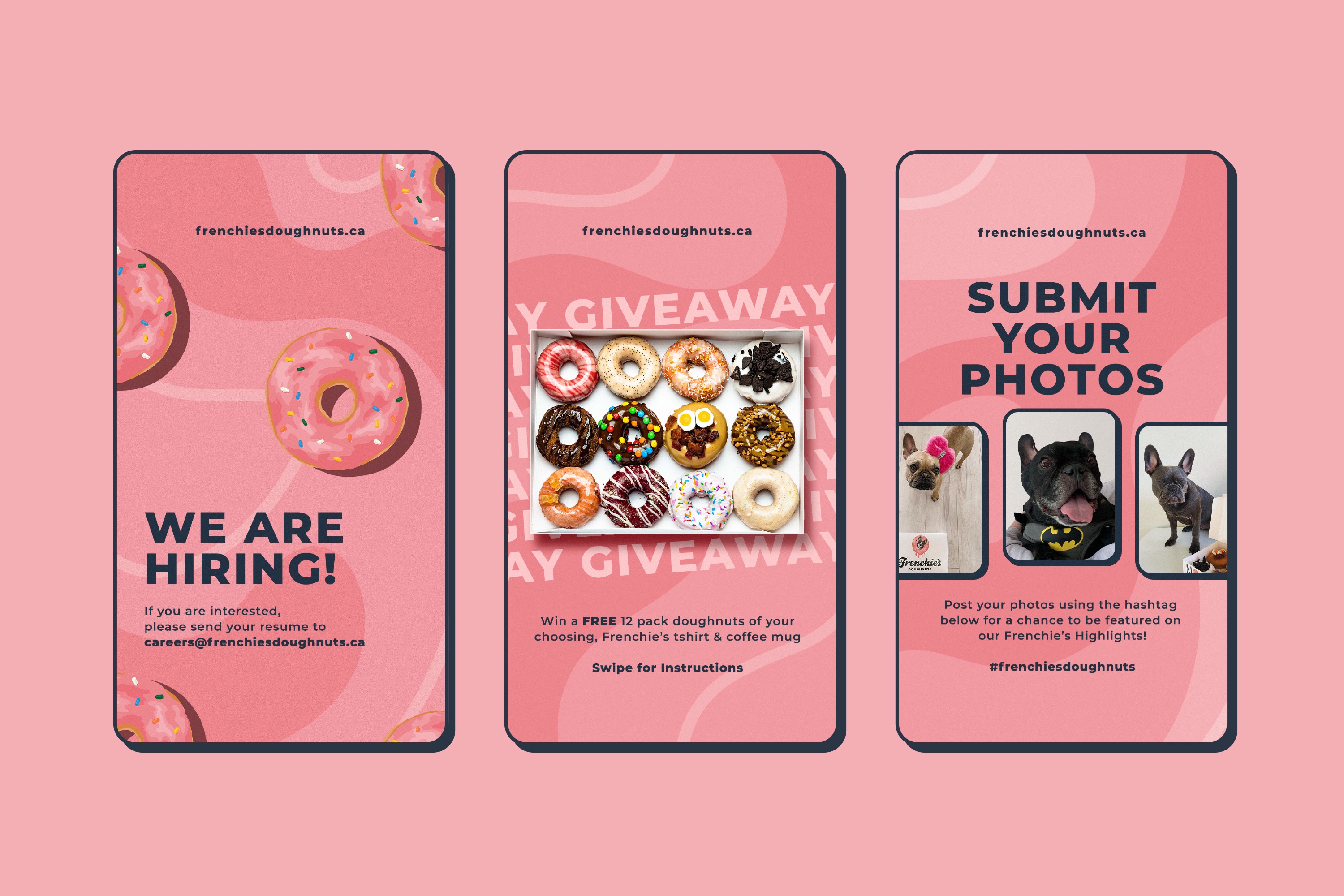
Frenchie’s Doughnuts serves warm, delicious, made-to-order doughnuts and fresh roasted coffee served hot from their brand-new bakery. We leveraged their mascot Mocha (the owner’s French Bulldog) to create #frenchiesdoughnuts, a social hub for pet and doughnut enthusiasts to engage in.
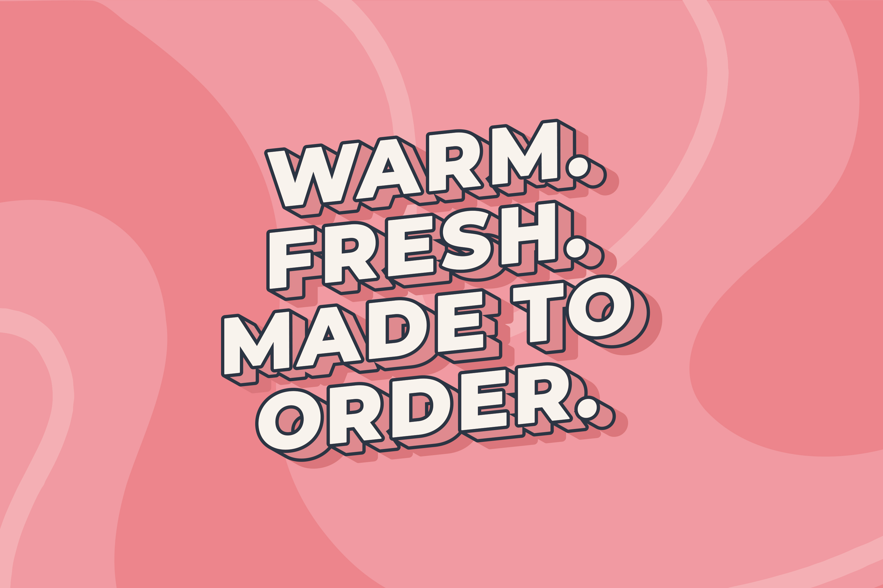
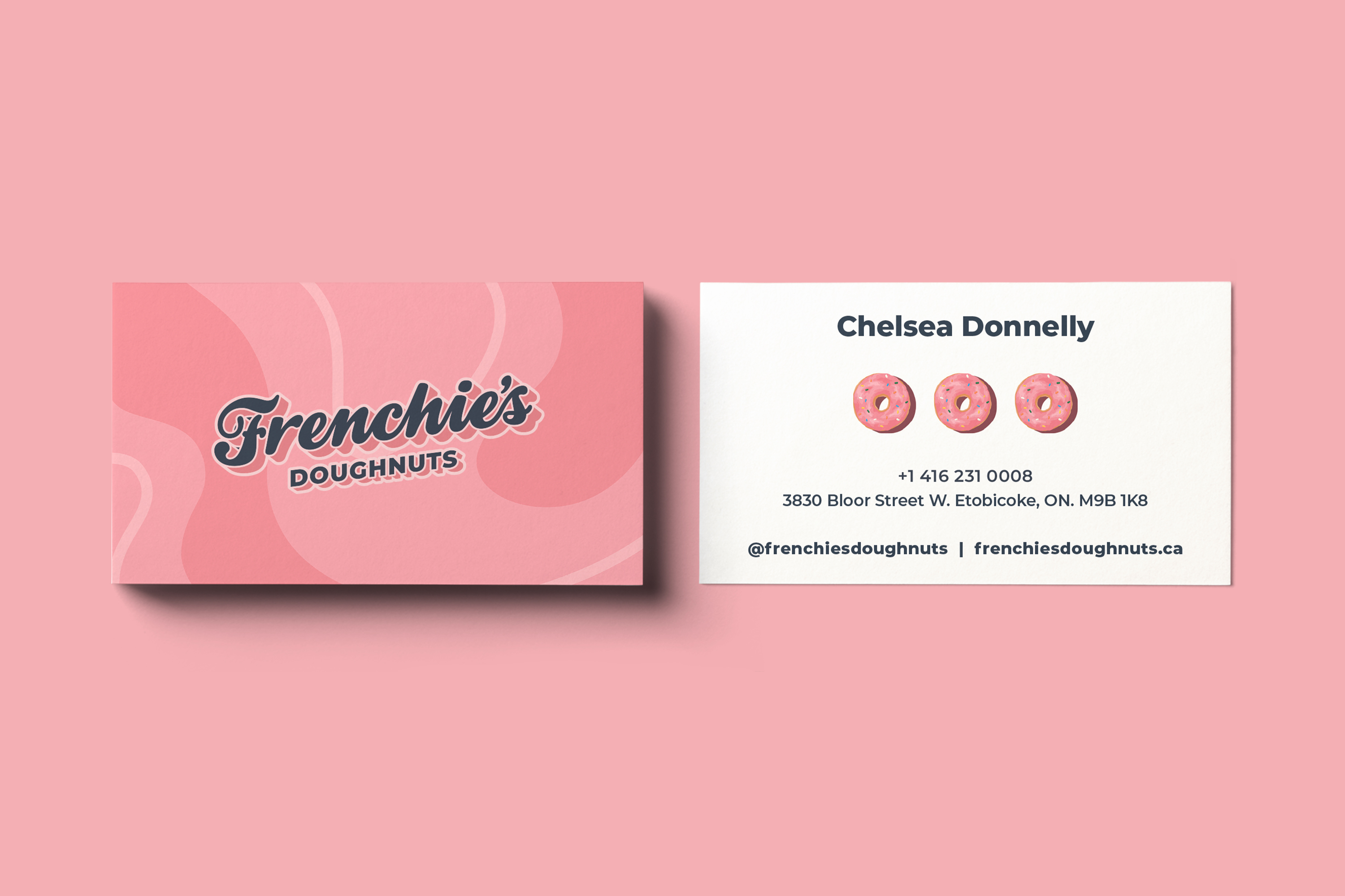
We designed the visual identity using a combination of typographic and illustrative design elements. Their tagline “Warm, Fresh & Made to Order” is the first visuals communicated when entering the store. That promise is kept when you walk out the store with a box of doughnuts that is quite literally still warm!
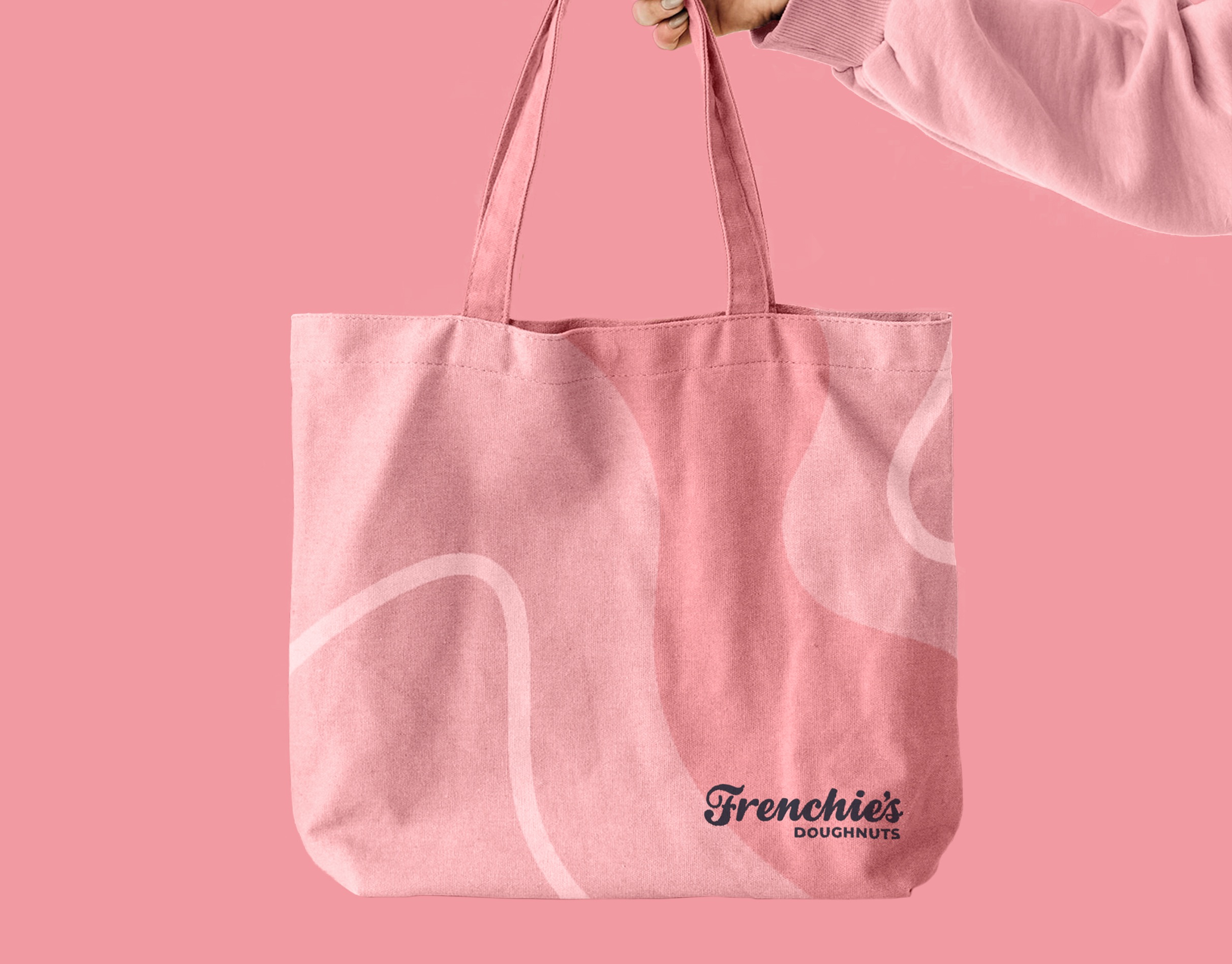
The pink and dark blue colour palette was carefully selected to evoked a lively, playful, and approachable feel for the brand. We also developed a comprehensive brand guideline that made it easier to maintain cohesiveness with all brand assets from packaging, merchandising and social media content.
Deliverables: Brand Identity, Packaging, Social Media Design

CREDIT
- Agency/Creative: Kenneth Manuel
- Article Title: Frenchie’s Doughnuts Identity Design by Kenneth Manuel
- Organisation/Entity: Freelance
- Project Type: Identity
- Project Status: Published
- Agency/Creative Country: Canada
- Agency/Creative City: Toronto
- Market Region: North America
- Project Deliverables: Brand Identity, Branding, Creative Direction, Icon Design, Illustration
- Industry: Food/Beverage
- Keywords: doughnut shop, doughnuts, bakery
-
Credits:
Graphic Designer: Kenneth Manuel


