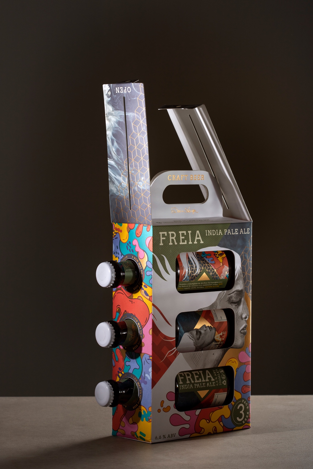
The Freia beer is produced by Ilaria Schirippa, a businesswoman in the Versilia area of Tuscany, owner of some brand restaurants.
The beer is an IPA, India Pale Ale, traditionally brewed with malts, hops, and yeasts. It has a herbaceous and fruity taste with a medium / light body and a bitterness balanced by the sweetness of caramelized malts. This beer is the first release of a line of beer labels that will have a female figure as a sign of specificity for each type of beer, thus intending to pay homage to the character and dynamism of female figures in craft production and the beer market.
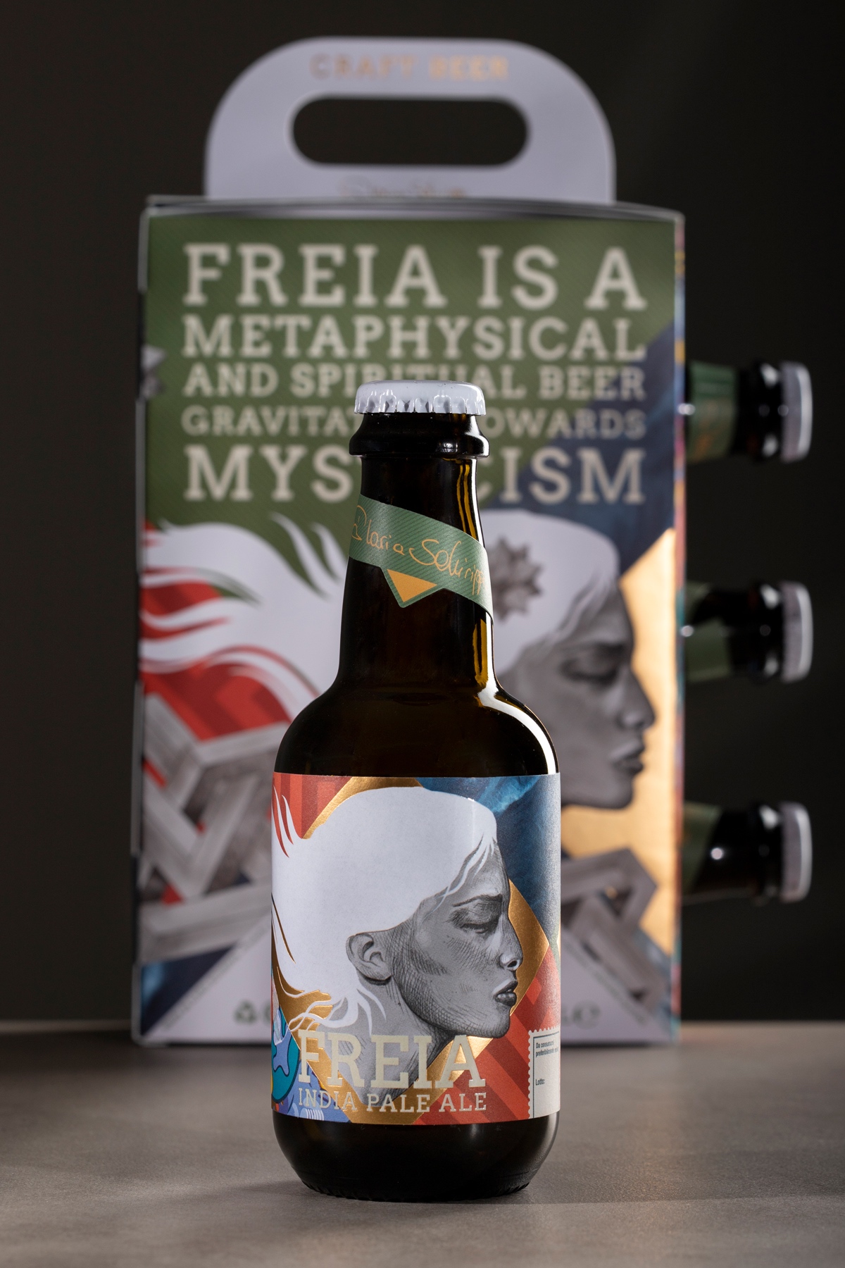
The concept for the label starts from the name chosen for the beer: Freia that refers to Norse mythology. The inspiration for the label concept takes its cue from mystical imagery and the prophetic virtues that envelop the manifestations of this Norse divinity, reworking them in a contemporary key.
The seduction is expressed in the laminations of gold on the surface. The beauty lies in a feminine profile that is not refined but is outlined by marked traits. It seems a warrior at rest.
The contemporaneity of this female figure is also highlighted by the background with which she is in dialogue. A carpet of geometries, abstract designs, and Graffiti Art intersected with each other in a game of lines and softness that recall the balanced sweetness and bitterness of the beer.
The bottle chosen is the “beer cla” model of the Saida Group company in the 330 ml format of the amber color. One bottle size and color is the classic amber color for craft beer.
The packaging was made with Arena Smooth White paper and can accommodate three bottles of Freia beer inside. On the two sides, we find the geometries and the abstract and colored graffitis, while, in the back, there is the female face of Freia.
The entire packaging is self-assembling. It presents as a typology of processing the UV offset four-color printing which allows as finishing an excellent brilliance of colors like hot lamination on gold which is also present here.
The paper used for the label is from the Fedrigoni company. In particular, the line is Premium white ws barrier.
Thanks to Barrier technology, the ultra-white paper creates a filter, a sort of barrier, between the paper and the adhesive capable of ensuring excellent resistance to thermal shocks. Both the label and the packaging feature the Luxoro MTS 495 foil for the finishing touches.
In the end, the label presents in the hair and the writing area the use of thickened graphic paint as an ennobling process. This effect is created to highlight the keywords included in the label and, above all, all the evocative power of this divinity reinterpreted in a contemporary key.


CREDIT
- Agency/Creative: Dario Frattaruolo
- Article Title: Freia Beer Product Design
- Organisation/Entity: Freelance
- Project Type: Product
- Project Status: Published
- Agency/Creative Country: Italy
- Agency/Creative City: Camaiore
- Market Region: Europe
- Project Deliverables: Product Design
- Industry: Food/Beverage
- Keywords: WBDS Creative Design Awards 2023/24
- Keywords: Product Design, Food and Beverage
-
Credits:
Print Method: Stampa Offset UV su Gallus TCS 250
Self Adhesive: Fedrigoni Premium White WS Barrier 115 gr
Paper: Fedrigoni Arena Rough
Embellishment: OFFSET UV + HOTFOIL + VARNISH
Foil: Luxoro cod MTS 495
Bottle: Gruppo Saida


