


Halfway through spring of 2020, when ideas were born and the pandemic was untold, 1HQ Netherlands was introduced to a company called Next Brush. At the time, it was ran by 3 young entrepreneurs fresh out of university.
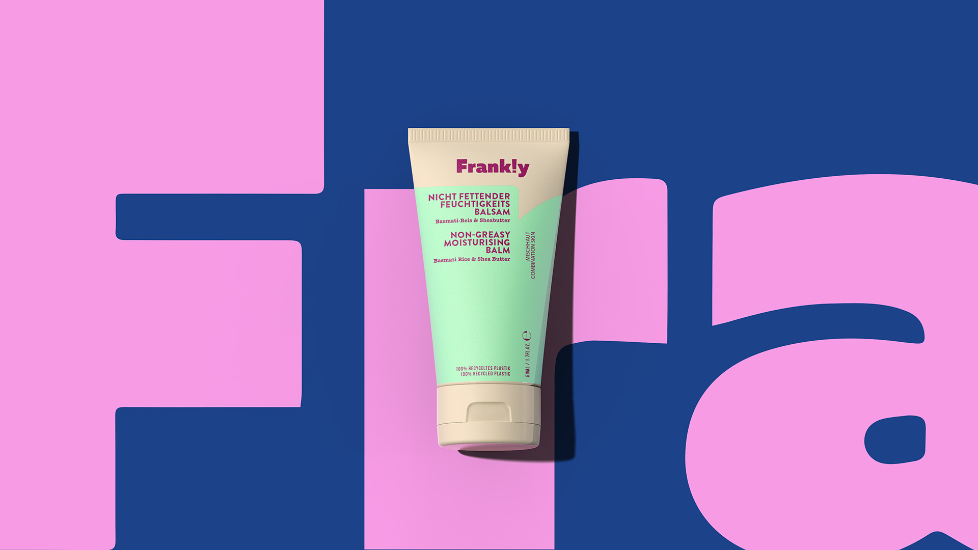
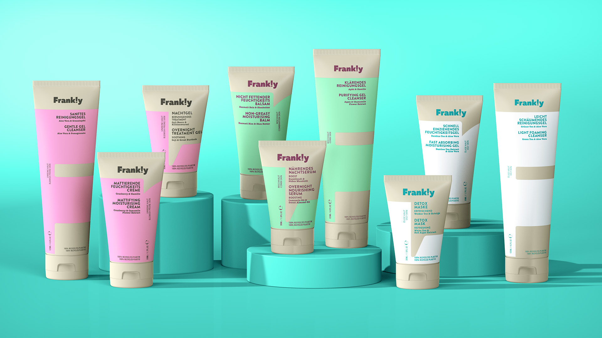
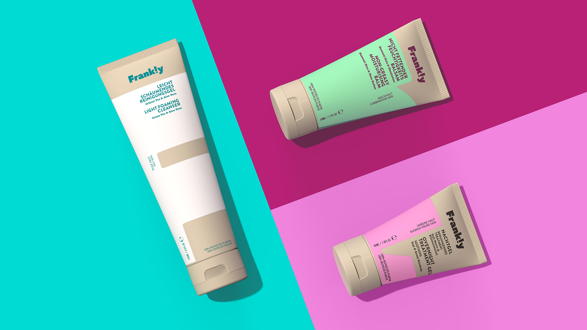
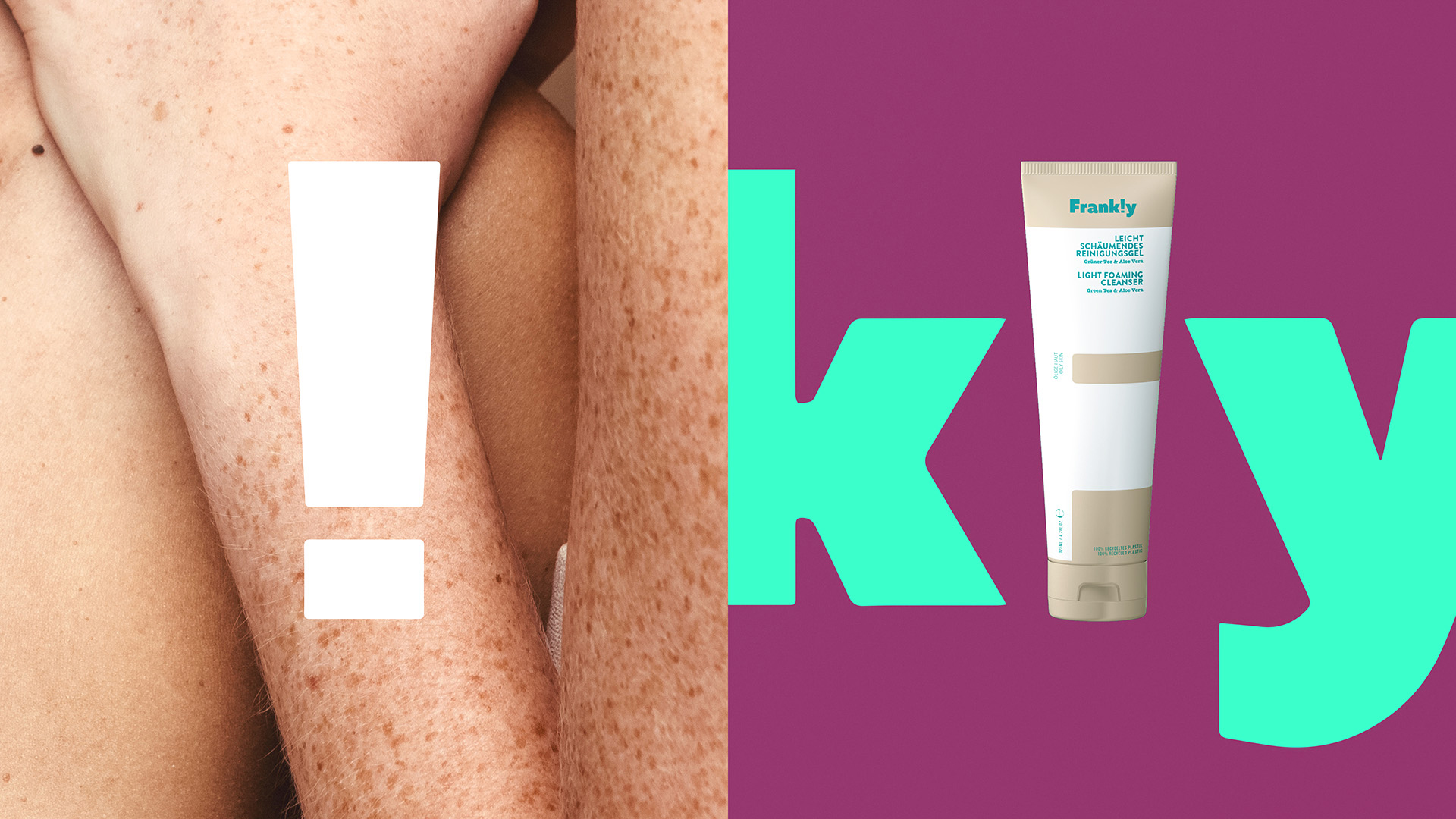
In what is a ‘rowdy’ skincare category, the clients tasked 1HQ Netherlands to create a brand of 3 ranges: one for combination skin, another for blemish-prone skin and one for the ubiquitous oily skin type. Their ‘default’ association with the young adult target group facilitated the drive to conceive, create and craft a brand that frankly speaking, gives a damn! In a country where 30% of the population is people of age up to 26 years old, the clients were determined to create a skincare brand that is tailored to young needs.
Frank!y, the newly created brand with an exclamation mark, collaborated with perfume experts, ingredient suppliers and specialty recipe formulators wrapping the brand in knowledge, efficacy and considered recipes. The products boast the highest quality protecting people and planet, they are farm sourced in The Netherlands resulting in an effortless certification from EcoCert; an accreditation for environmentally considerate production and processes.
In design, 1HQ Netherlands aimed for a clean label, aesthetically and literally. The aim was to substantiate the above through a bold, gender-neutral colour palette, with typographic clarity, as well as the mandate of re-purposing non-virgin plastic (from the factory) to minimise waste. The studio created dual language packs that are typographically led whilst maintaining an effortless canvas for the brand mark. A conscious decision was made for ‘easy’ design – without the use of excessive elements – as the typography was already creating beautiful detailing and modern layering.
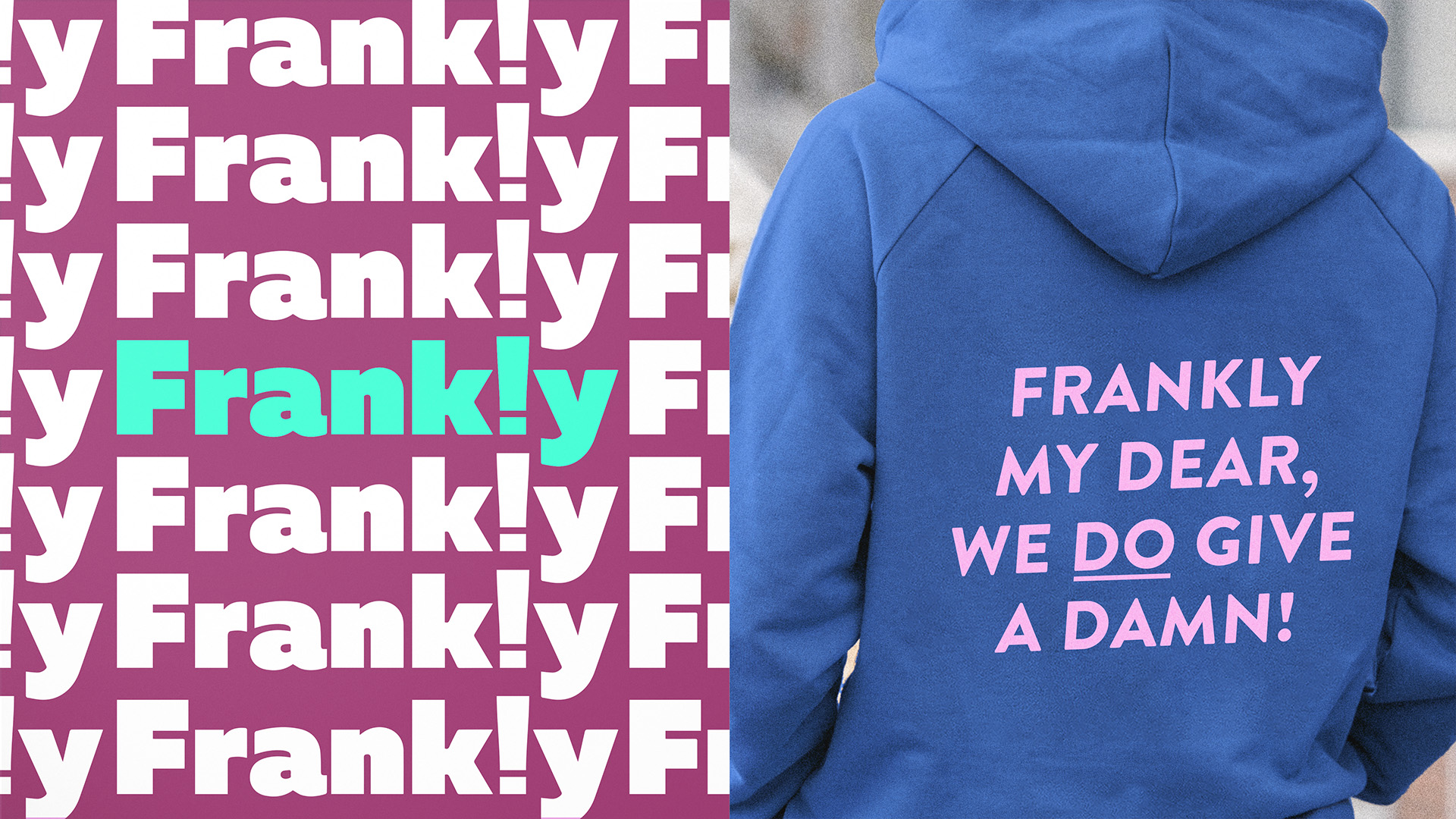
1HQ Netherlands focused their attention on the typographic ‘device’ that is the exclamation mark replacing the letter ‘L’ in the word Frank!y. This is more than just a design gimmick, it embodies the brand’s attention to detail. Simultaneously, it signifies the link between the tubes used and the exclamation in the master brand; becoming an iconic shorthand for the brand. Frank!y, the new brand, will be available in Europe at first.
CREDIT
- Agency/Creative: 1HQ Netherlands
- Article Title: Frank!y Skincare Brand and Pack Design by 1HQ Netherlands
- Organisation/Entity: Agency
- Project Type: Packaging
- Project Status: Published
- Agency/Creative Country: Netherlands
- Agency/Creative City: Amsterdam
- Market Region: Europe
- Project Deliverables: Brand Design, Branding, Design, Packaging Design, Type Design
- Format: Tube
- Substrate: Plastic
- Industry: Fashion
- Keywords: skincare, frankly, young adults, new brand, youth, bold, skin
-
Credits:
Creative Director: Kostas Konstantinou
Strategy: Andy Kirk
Designer: Benjamin Farrell
Designer: Pedro Jardim


