Zambelli design – Franela Nail Polish
Franela
As a quality permanent nail polish manufacturer, Franela wanted to stand out in a highly competitive market, which is both saturated with existing offerings and, at the same time, in constant need of new products.
In addition, Franela required a fresh design approach that would increase the usability of their products and make each product category easy to connect with its purpose through a clear visual communication.
Within Franela’s new branding strategy, Zambelli Brand Design recognized the opportunity to resolve both challenges with an innovative and affordable packaging, which is extremely rarely used for the permanent nail polisher, typically presented in bottles without the wrap.
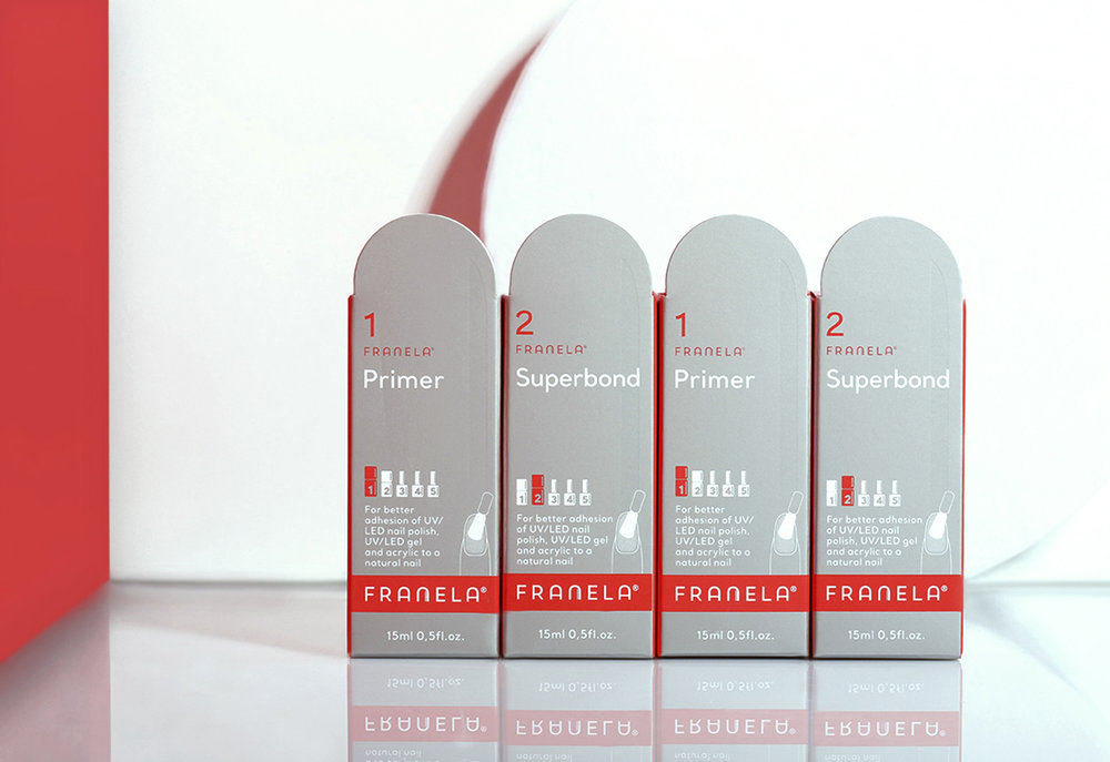
Guided by simplicity, functionality, and aesthetics, Franela’s four product categories were “dressed” in packages with different shapes and colors. With budget-friendly yet effective packages, Franela managed to increase the visibility of its products on the shelf and convey a clear message to its buyers how to use them: as the foundation, a complementary asset, or a standalone product.
To ensure brand integrity and recognition, there are two elements that spread across all product segments:
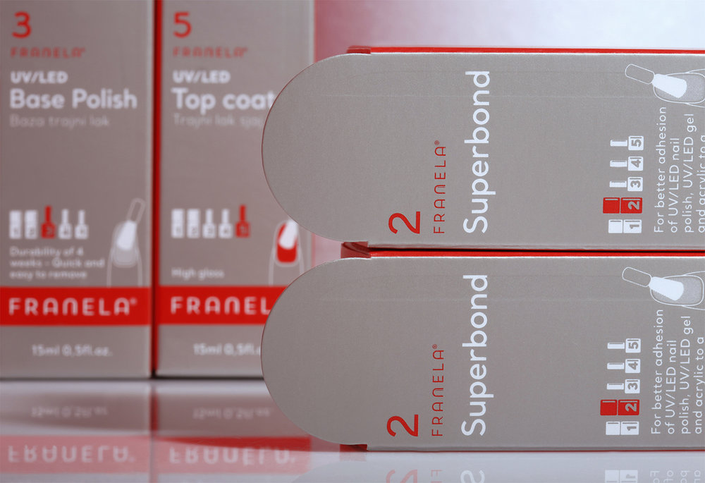
• An archway shape that symbolizes the nail, visible on the packages and in the trademark as a stylized letter “n”.
• Intensive red as a color that is easily spotted and has an iconic status in the manicure business.
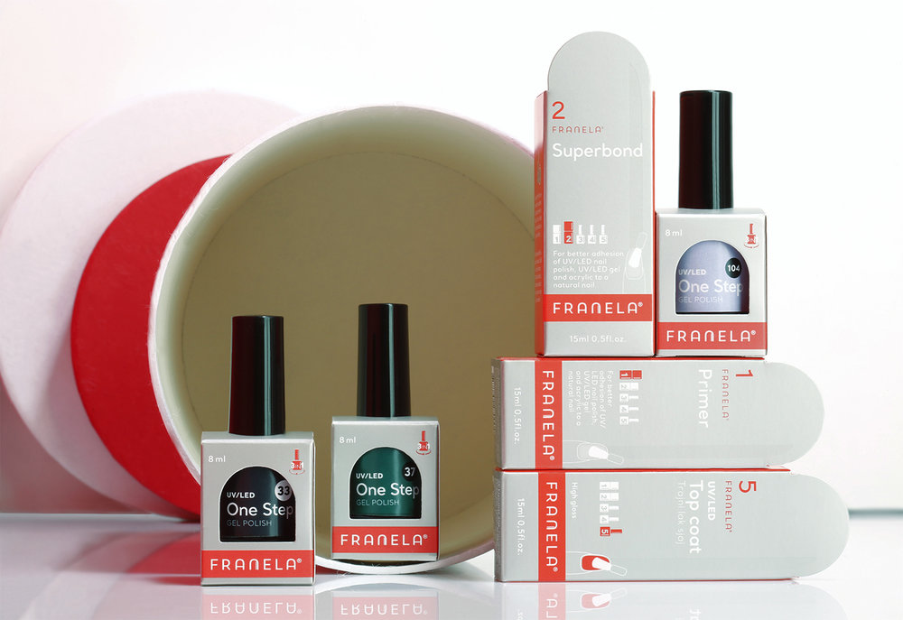
Franela’s basic line of products are defined with an arc-shaped packaging in silver color, whose neutral, the steady tone is perfectly aligned with the purpose of this product segment – they are used as the foundation for all the others. In addition, each item from the basic line is numbered for easy understanding of which product should be applied first, second, and so on.
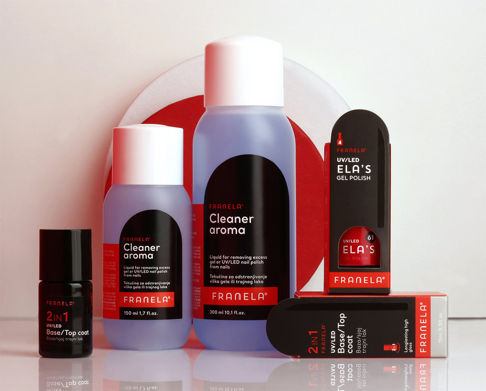
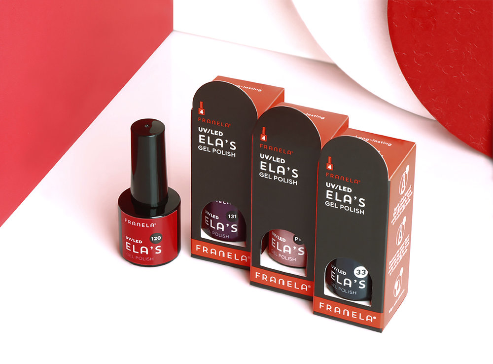
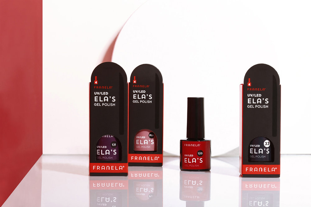
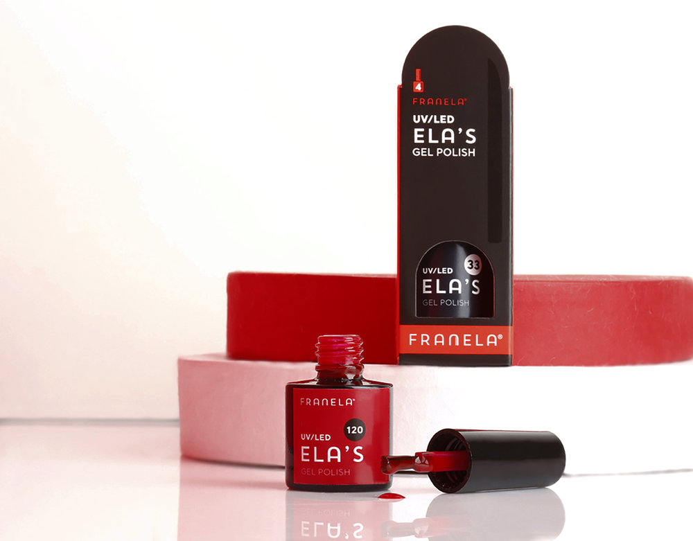
The Ella line, named after its brand ambassador, is identified with an elegant black package comprising an arc-shaped hole that makes the nail polish bottle visible from the outside, and that acts as a curved “window” into the world of vivid colors.
The package hides a small paper cushion inside on which the bottle is placed to ensure better visibility and presentation, while the black “frame” on the outside makes the colors stand out more intensively. The entire package visually connects this line with the basic items, signalizing that they have to combine the two for best results.
The packages for the Franela nail accessory line follow the same design strategy in shape and color.
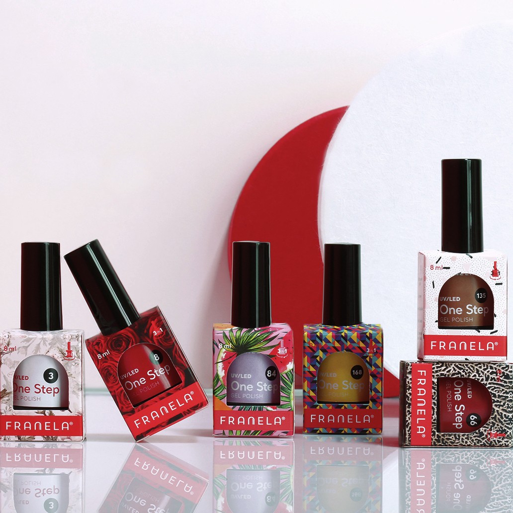
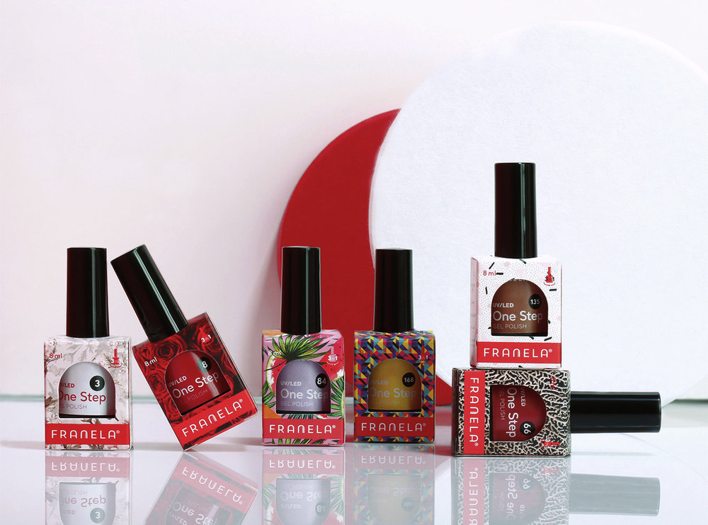
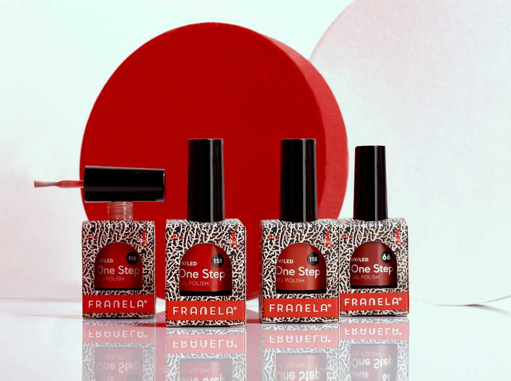
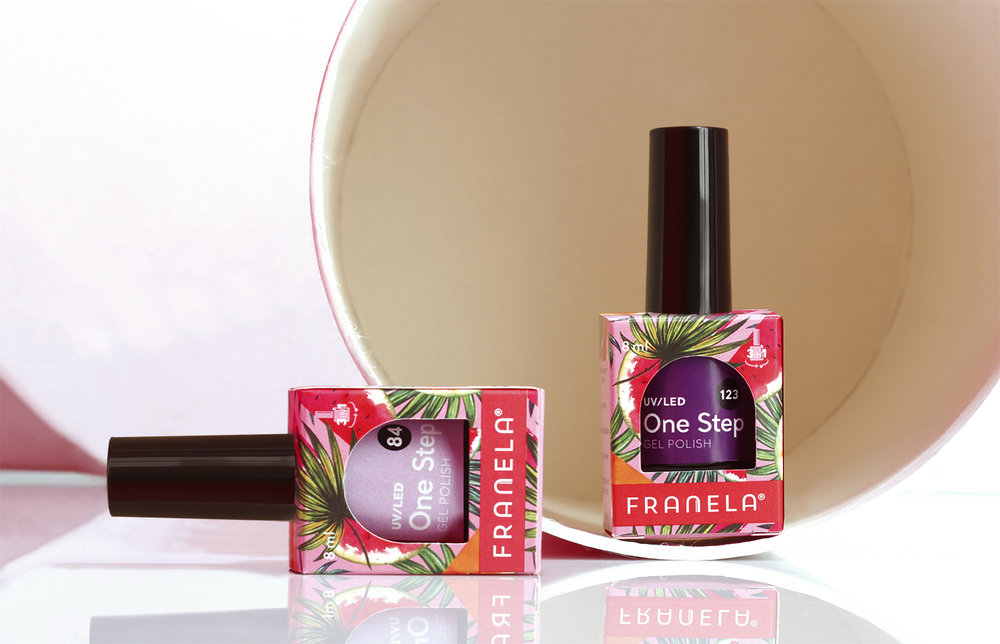
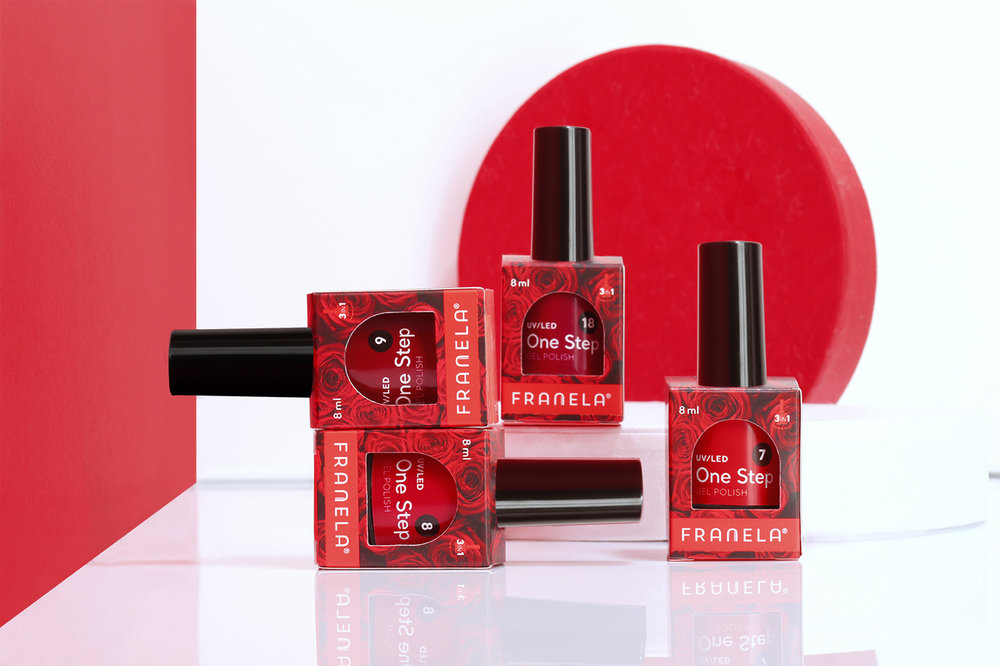
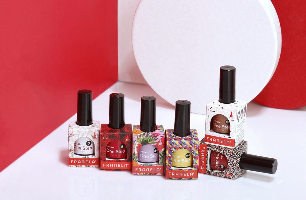
Finally, the last group of products comes in completely different set up of colors and package features because these are standalone
products. The position of the nail polish bottle inside is also heightened with a hidden cushion, boosting its appearance. These packages are full of colors and various textures, featuring individuality and freedom of choice.
CREDIT
- Agency/Creative: Zambelli desig
- Article Title: Franela Nail Polish Packaging Design
- Organisation/Entity: In-house Design, Published
- Project Type: Packaging
- Agency/Creative Country: Croatia
- Market Region: Europe
- Format: Bottle, Box
- Substrate: Glass, Pulp Carton, Pulp Paper


