


Milk Brand Agency – Framingham Wines
CONTEXT
Framingham is a small yet highly regarded vineyard known for delivering quality sustainable and organic wines. They pride themselves on being bold and original, combining knowledge and innovation to create wines that traditional Marlborough vineyards wouldn’t dare.
Our brief was to update the brand and the iconic ‘F’ symbol, capturing the character of the winery with packaging that differentiated Framingham from the pack.
APPROACH
First we met with people at the winery to find out what makes them tick – from the charming woman at the cellar door, to the romantic viticulturist distraught at impending rain, and the winemaker with a passion for punk and rock & roll. Once we had a good understanding of their passion and commitment, we began to form a clearer impression of the winery’s character as a whole.
To make Framingham stand out from the crowd, we then translated this character and their brand values into our design approach.
Perfectionist – we considered every single design detail
Bold – we added an element of rock & roll
Free – we were experimental in our expression
Non-conformist – we didn’t conform to traditional wine cues
Iconic – we wanted to create something truly individual and distinctive
That said, we were also acutely aware that the category has its own language. So while challenging the norms, we still needed to be sophisticated, genuine and ‘un-gimmicky’ in our approach.
EXECUTION
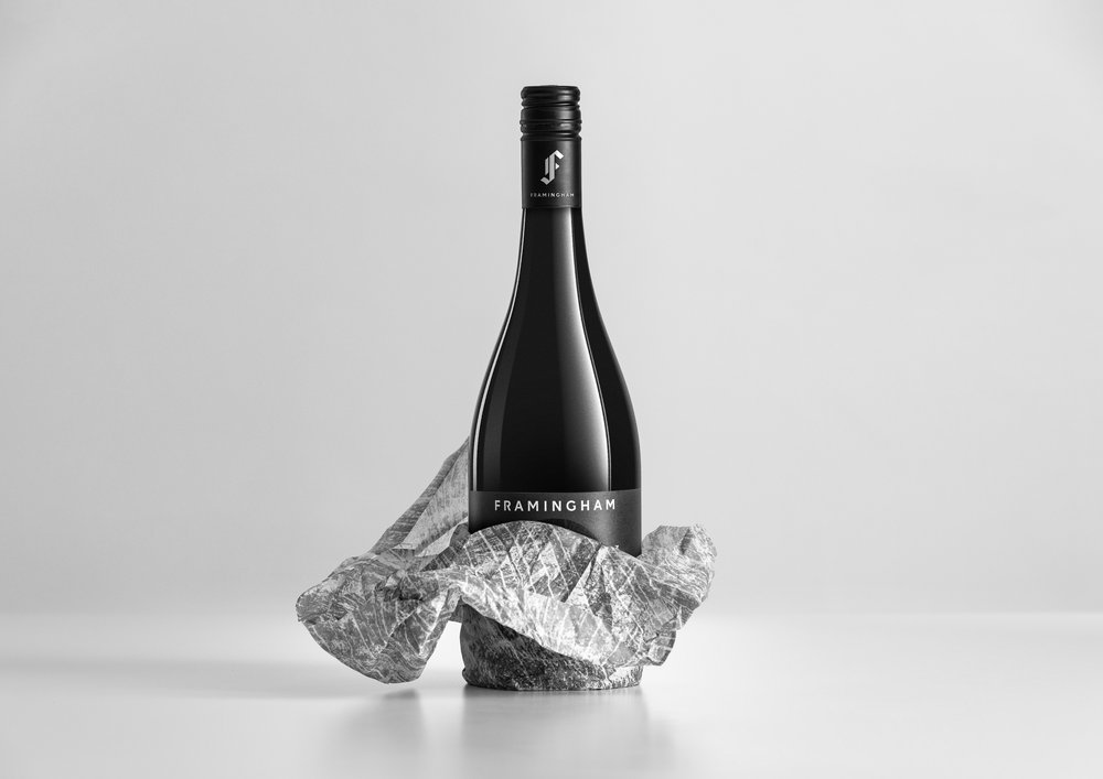
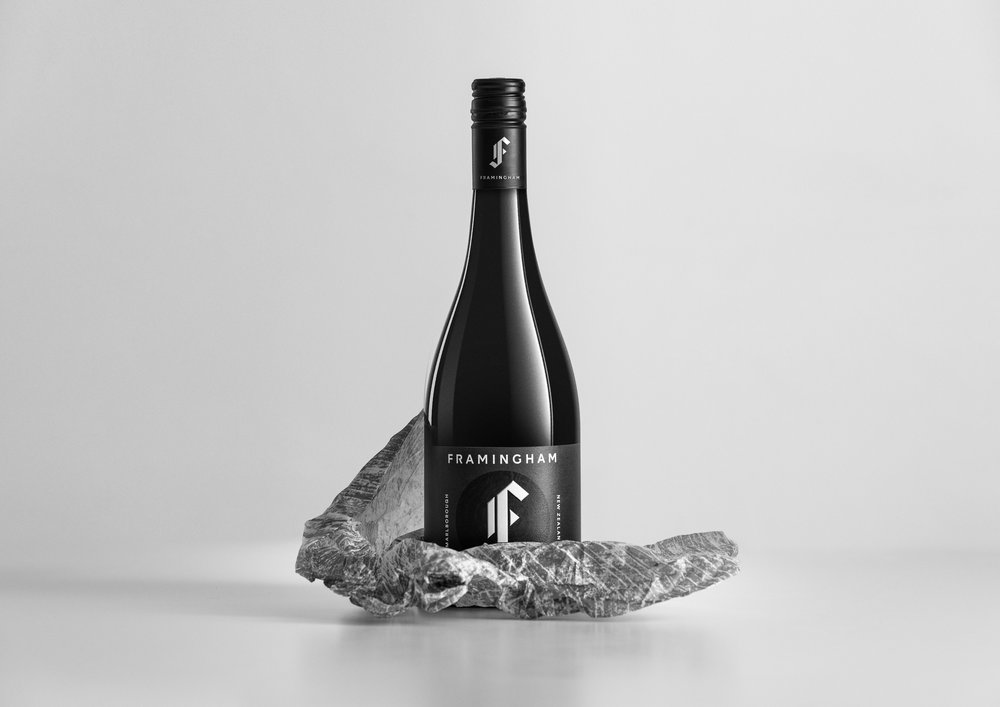
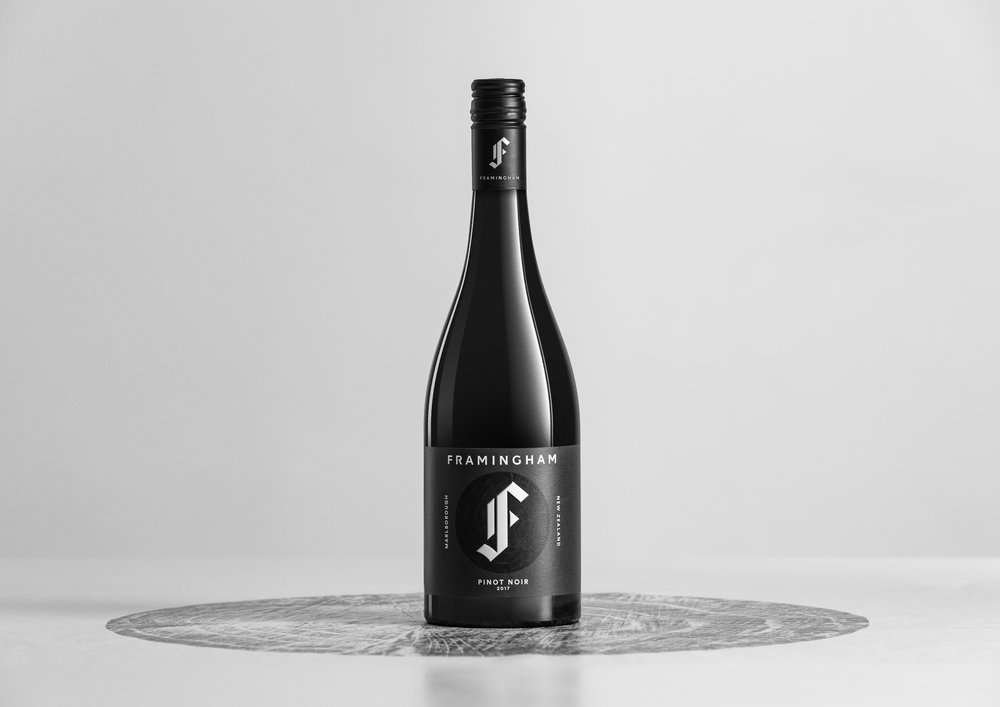
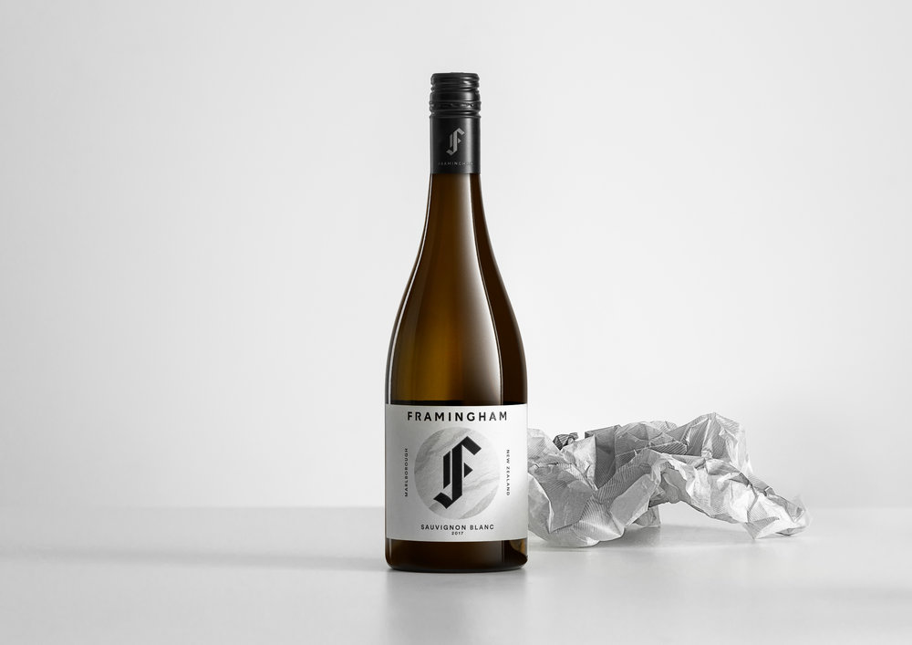
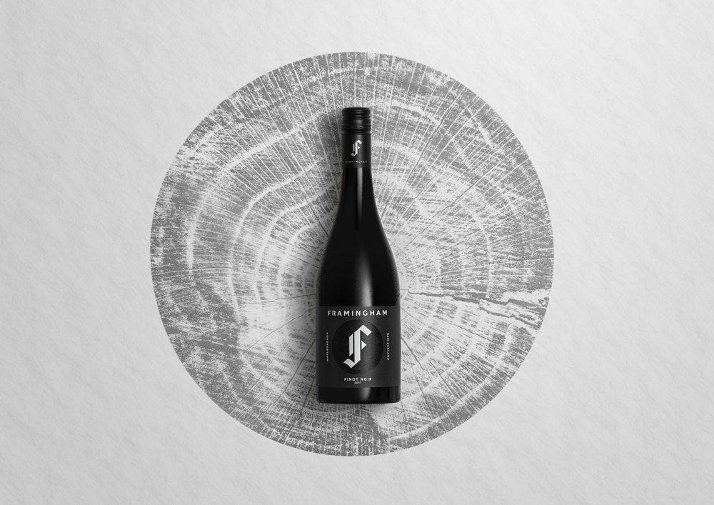
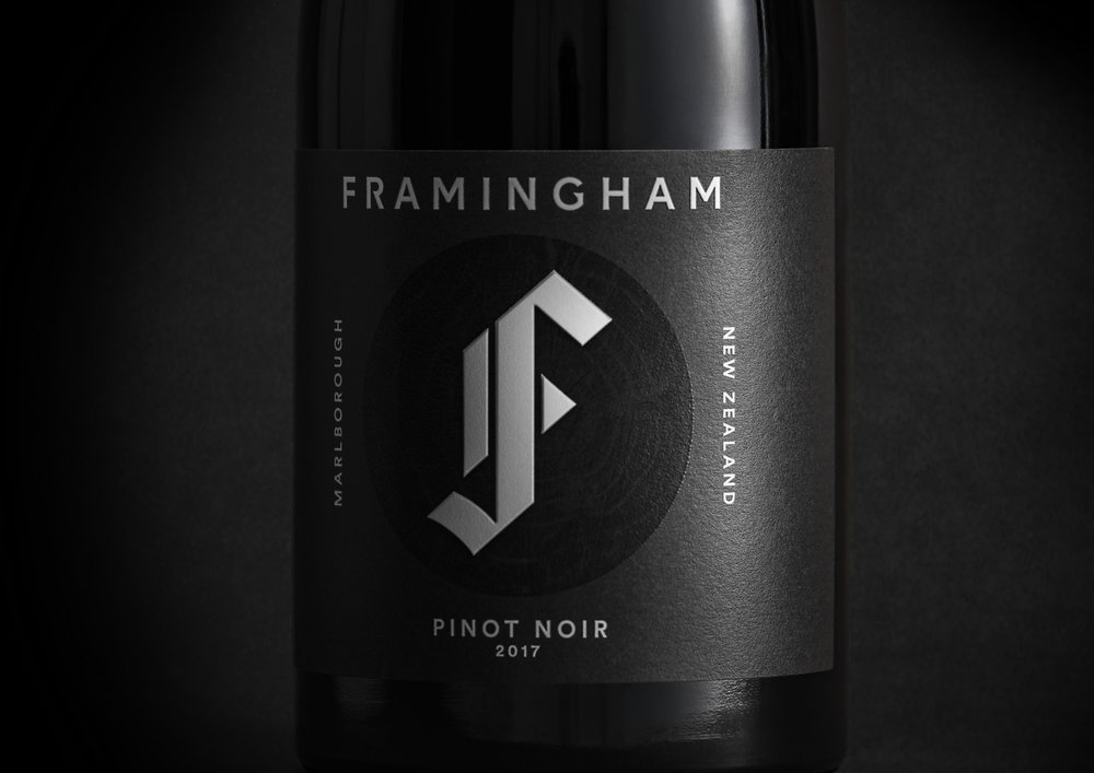
To modernise the ‘F’ symbol, we made it more geometric and removed the circles and type around the outside, giving it a cleaner look to create a more memorable impression.
We also refined the Framingham wordmark to a bespoke design with angles that link to the F and add a ‘rock & roll’ edge.
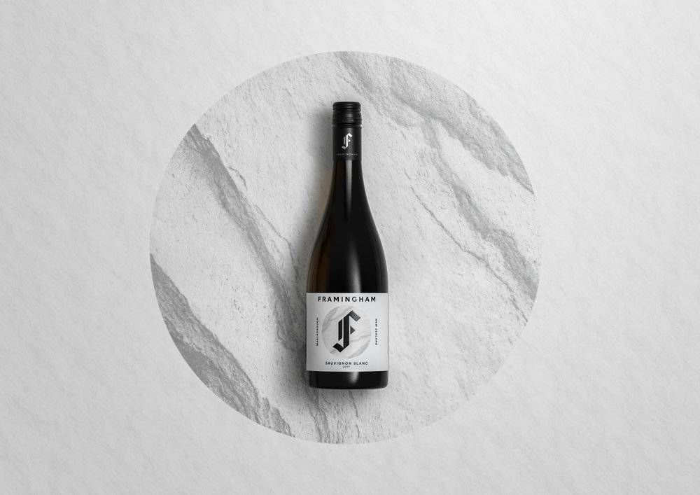
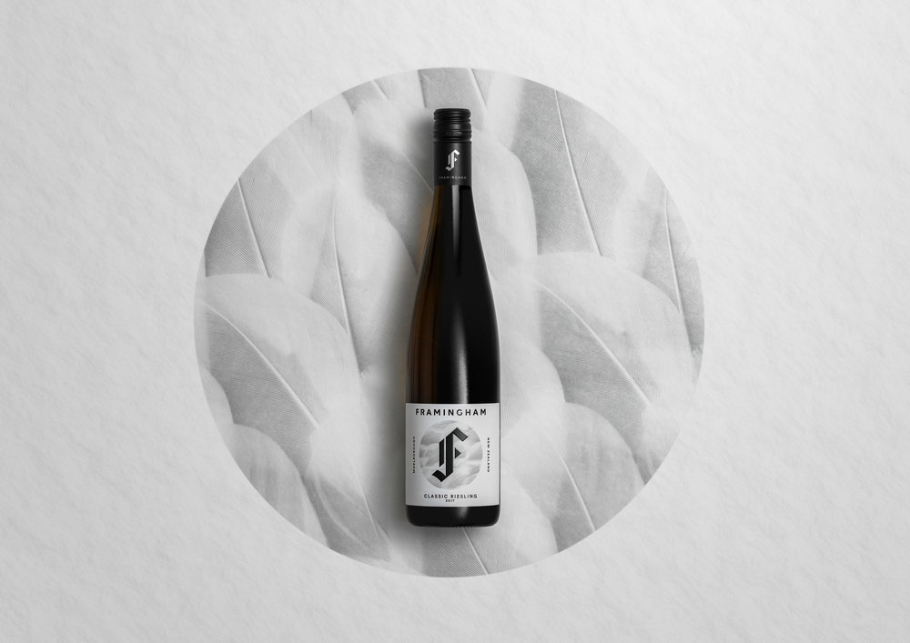
The large central iconic ‘F’ then links via textures and imagery to reflect both the people who make the wine and the different wine varietals. For example, Rebellious and edgy = Riesling, Knowledeable and intelligent = Pinot Noir etc.
We used specific printing techniques as quality cues – a high build wordmark and F icon, on a matt label with spot overgloss.
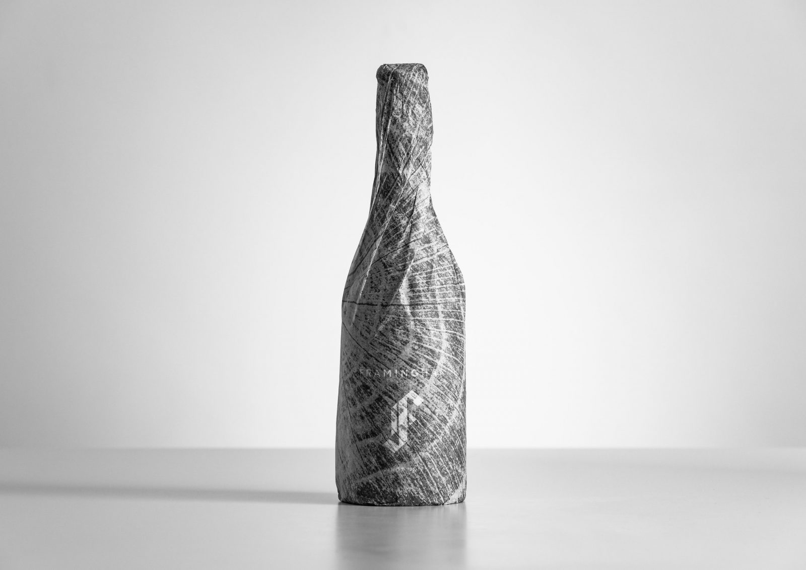
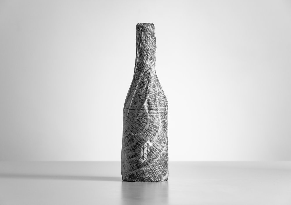
To elevate the wine further and celebrate its premium quality, we also used our different textures to create circular tissue wraps for each bottle.
In a cluttered wine landscape, Framingham now truly stands out from the crowd as a bold, innovative, individualistic and thoroughly modern wine brand.
CREDIT
- Agency/Creative: Milk Brand Agency
- Article Title: Framingham Wines Brand Re-Design
- Organisation/Entity: Agency Commercial, Published
- Project Type: Packaging
- Agency/Creative Country: New Zealand
- Market Region: Oceania
- Format: Bottle
- Substrate: Glass


