


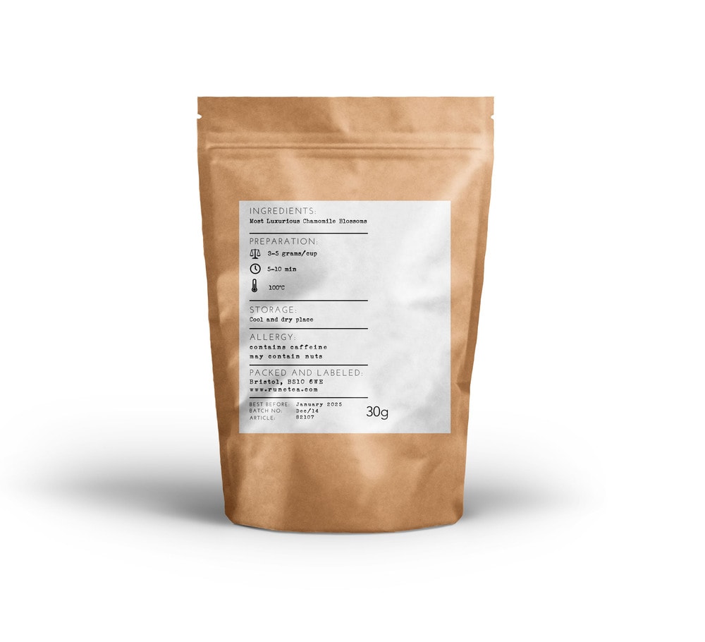
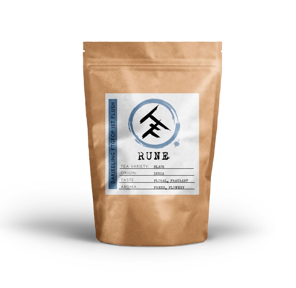
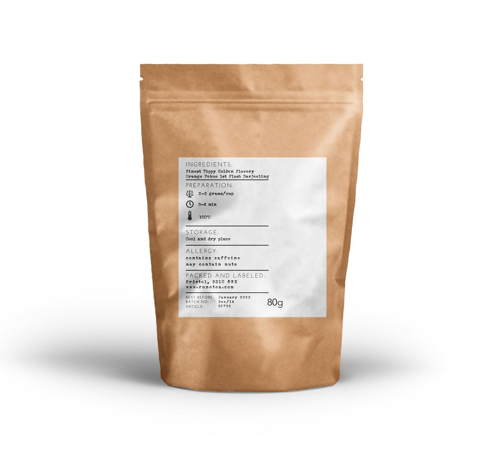
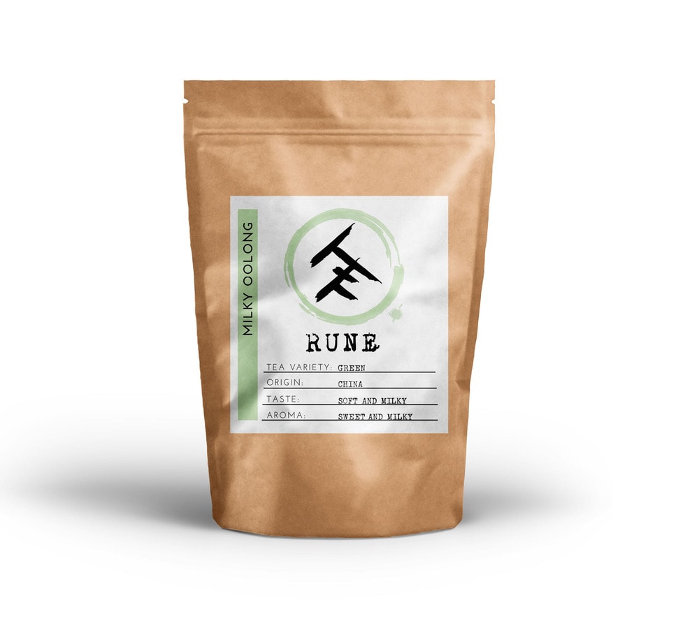
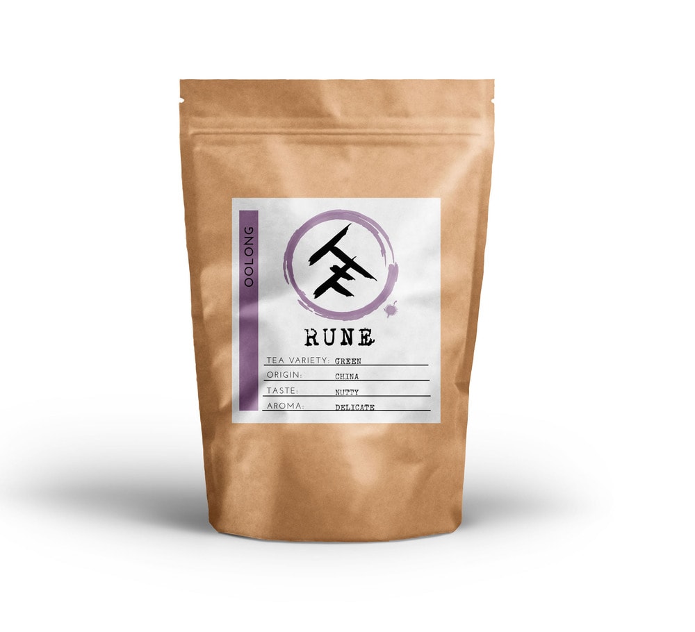
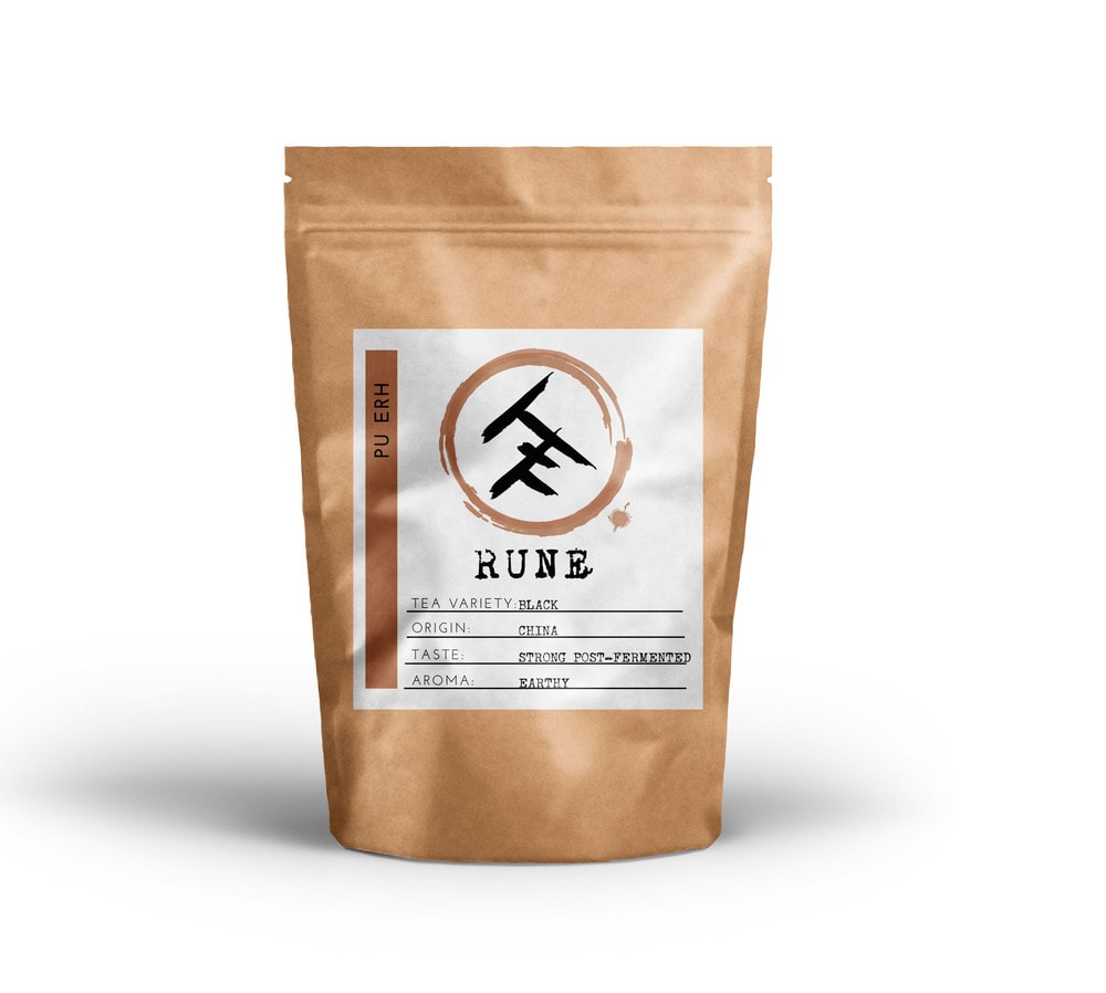
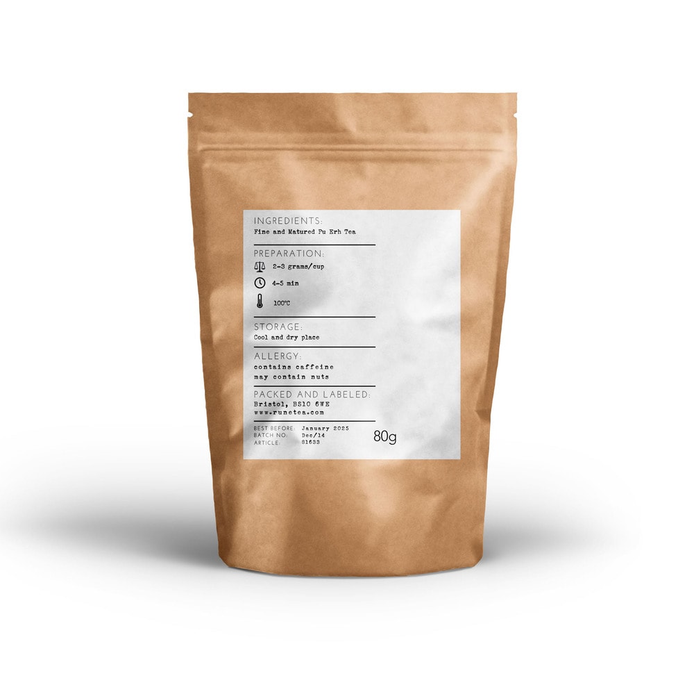
“Rune Tea has been an incredibly exciting project from a design point of view. This is the first packaging I’ve created and I am incredibly excited to see how well received has been. I picked kraft paper because I wanted to offer a more natural look and feel. After I carefully selected the right size and shape of the kraft pouch for 80-100g I started looking into designing the label. The other reason why I wanted a kraft pouch with ziplock is to allow everyone to enjoy their tea for a long time whilst keeping it fresh in the packaging. I wanted to create something beautiful as well as practical.”
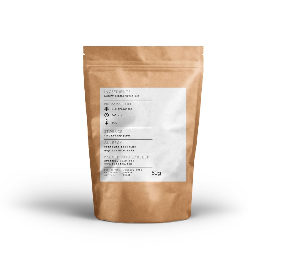
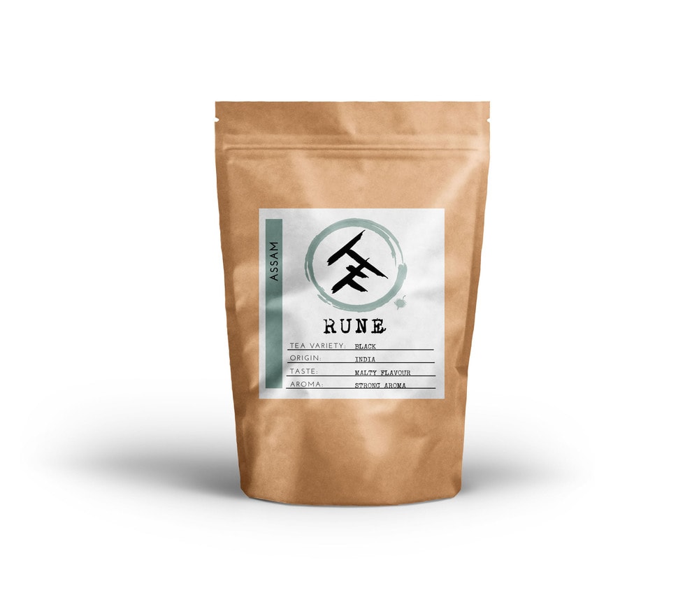
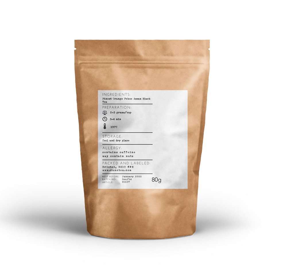
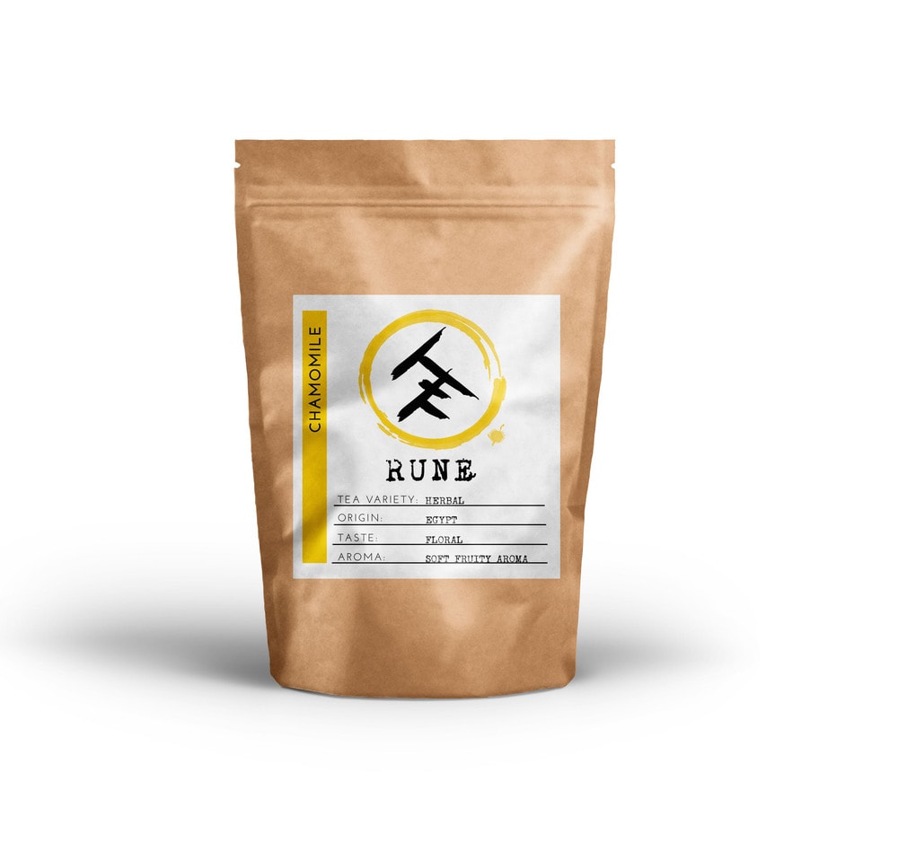
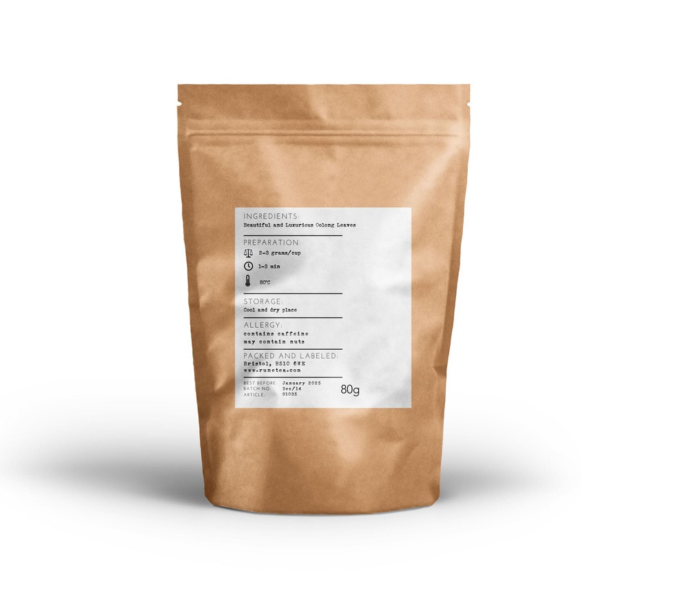
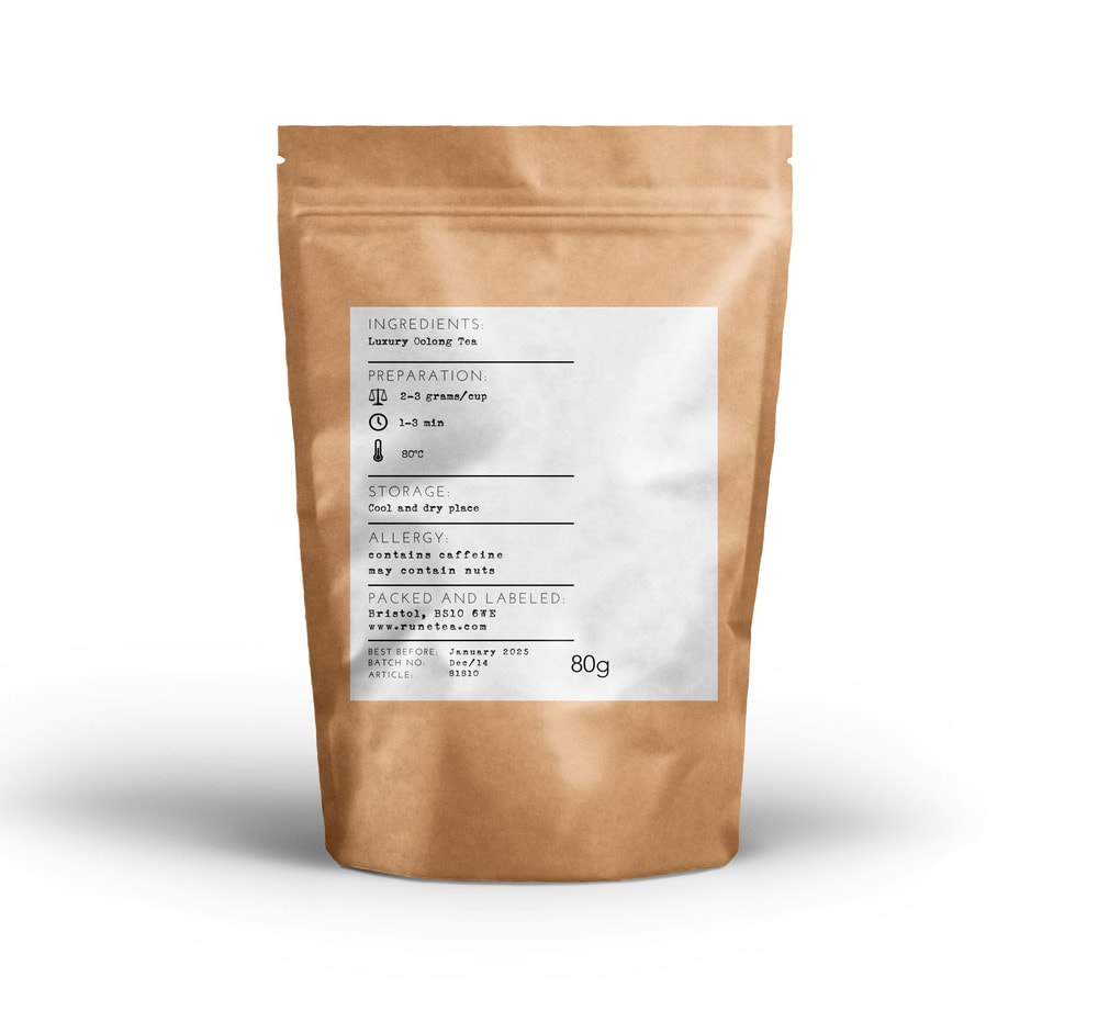
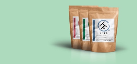
I thought that teas are so different depending on their taste, aroma and origin. Thus, I wanted to offer each tea an individuality. I carefully selected an appropriate colour for each tea and packaging. The next challenge was to keep my label super minimal whilst offering all information needed about a particular tea, so consumers can make their mind up to what they want to purchase even if they never heard of a speciality tea before. So I decided to put the taste, aroma, type of leaf and origin on the label whilst keeping it super simple and visually appealing. The back label is also very minimal with all information needed about how to make the most out of the tea.”
CREDIT
- Agency/Creative: Forty Two Droids
- Article Title: Forty Two Droids – Rune Tea
- Project Type: Packaging


