


FlowOps – AI Automation for Operations
FlowOps Project Description
FlowOps is a workflow automation platform built to move approvals, routing, and conditional work out of spreadsheets and into a single, repeatable system. The goal of the brand project was to make FlowOps feel practical, confident, and easy to use for operations managers and their teams. The brand must speak to people who need reliable tools that save time and cut mistakes.
The main challenge was that many automation brands sound either too technical or too vague. Operations teams want clear value and tangible results. They do not want buzzwords. We needed an identity that showed FlowOps was powerful and dependable, while staying straightforward and approachable for everyday users.
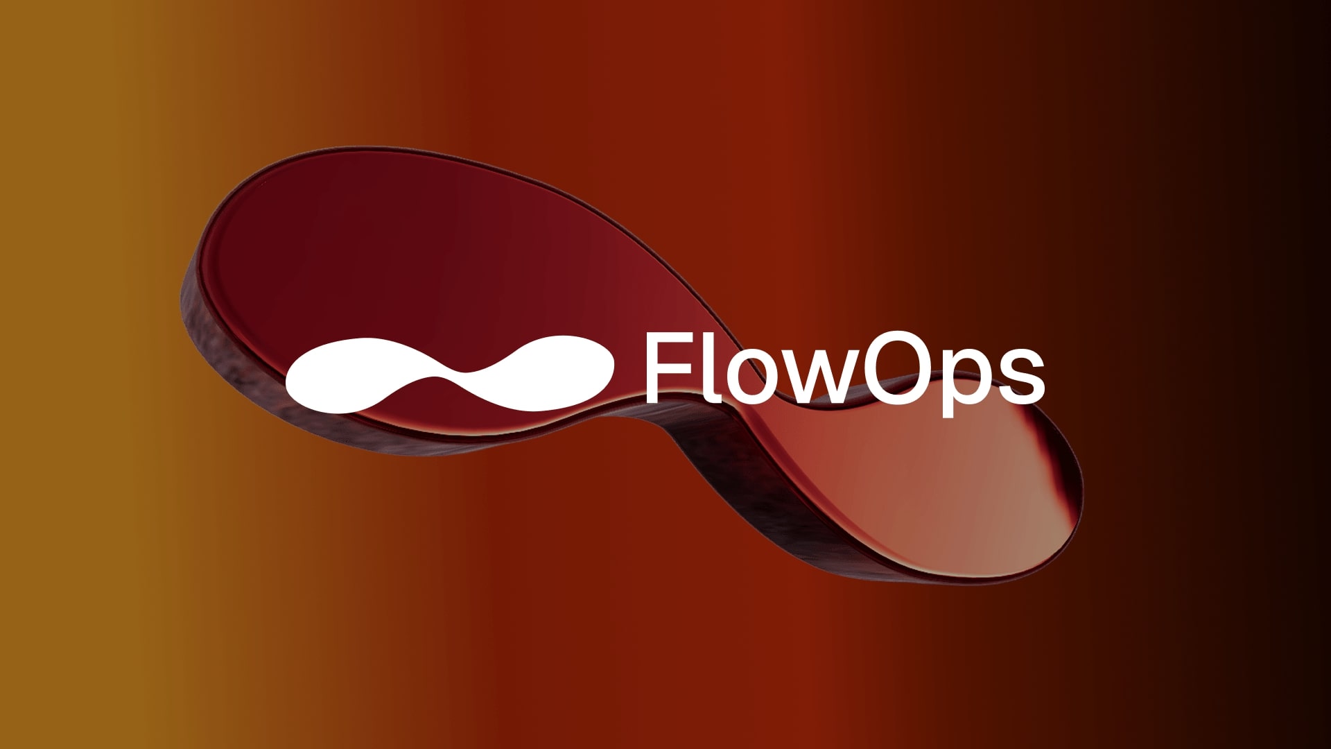
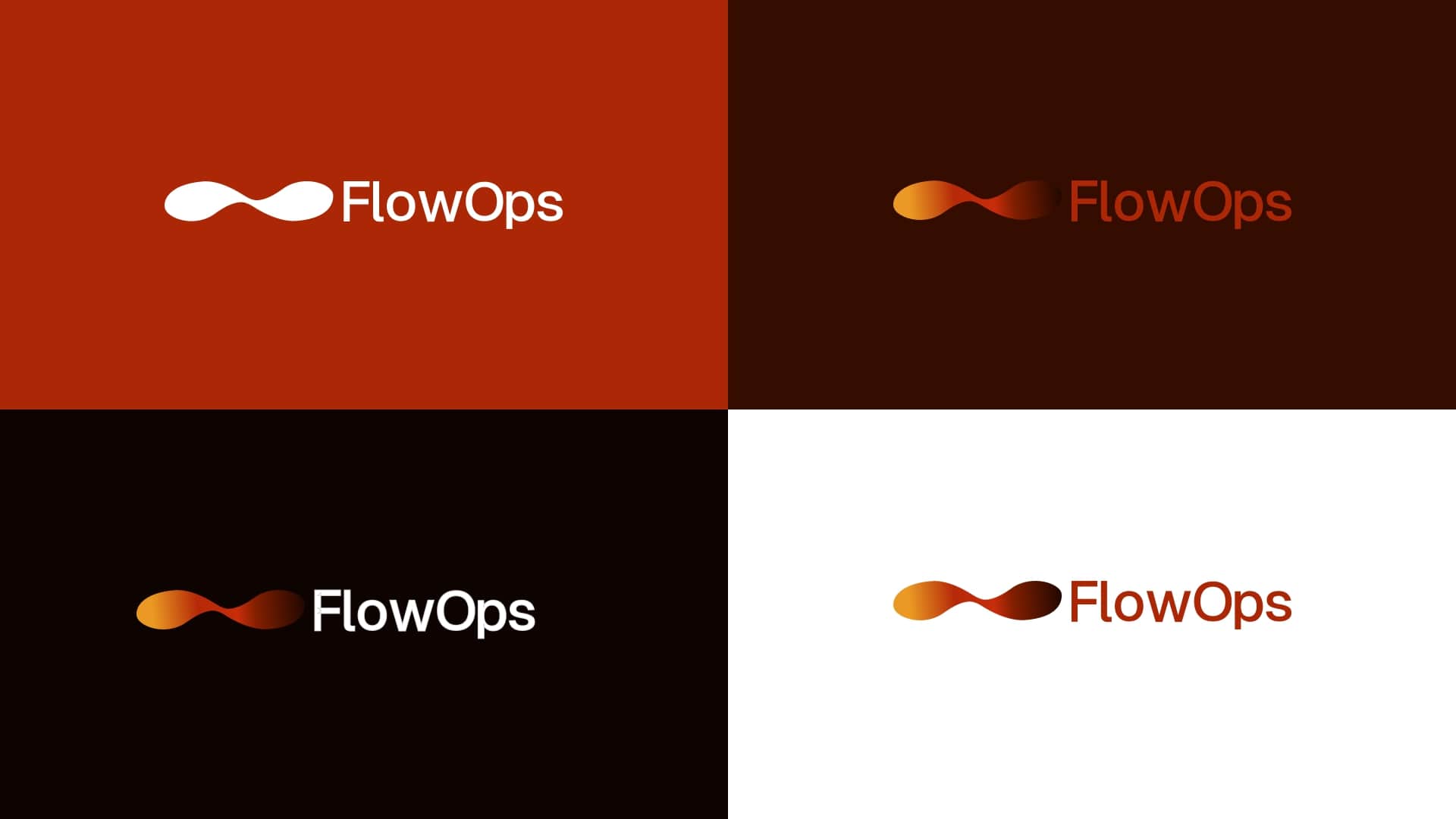
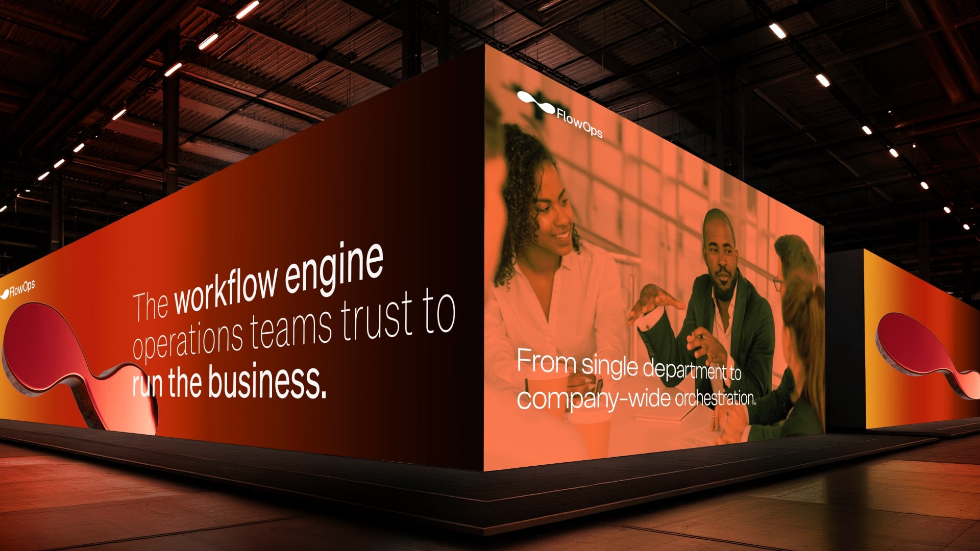
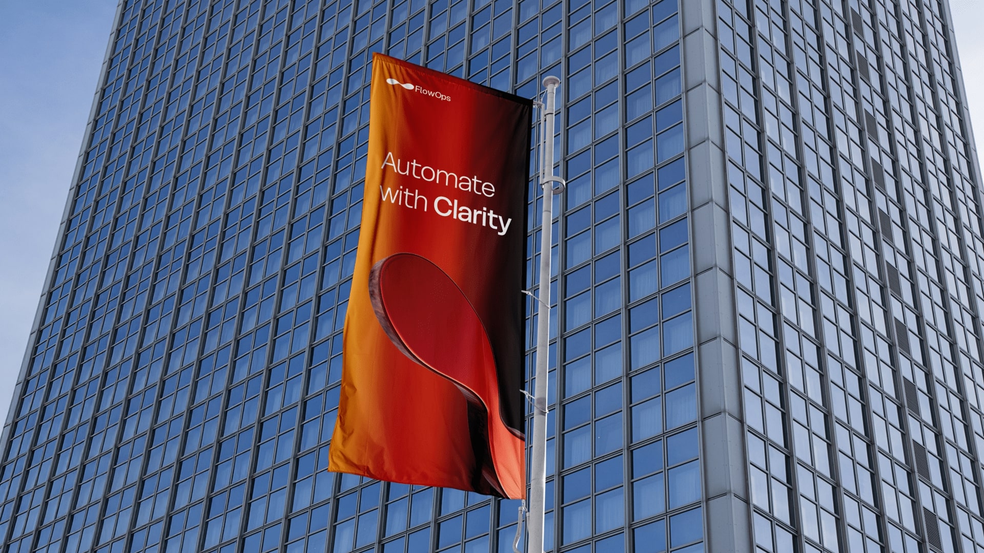
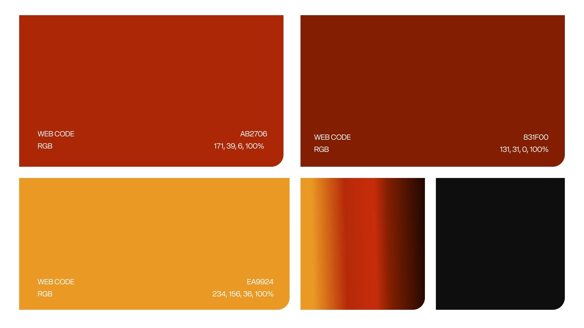
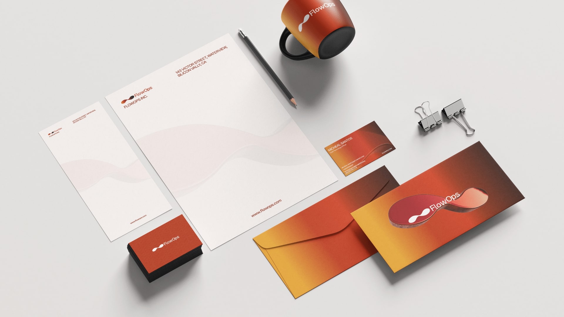
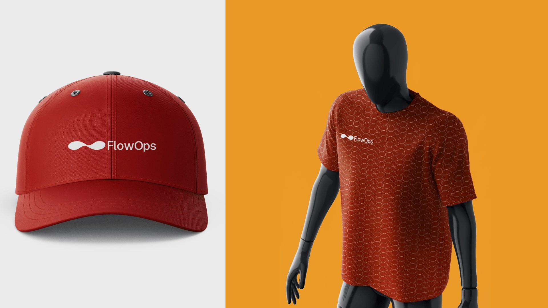
Our approach was simple. We used direct design and plain language. The logo pairs an abstract mark that suggests a flow with a strong wordmark for the product name. The mark reads well at small sizes and works in motion for product intros. The visual system used a combination of sunny-orange and red colours for structure and a bright accent to guide attention. Typography is compact and easy to read at UI sizes. Voice rules favour short sentences, active verbs, and outcome-focused lines. Microcopy is action-oriented so users always know the next step.
FlowOps: Building a Brand for Workflow Automation
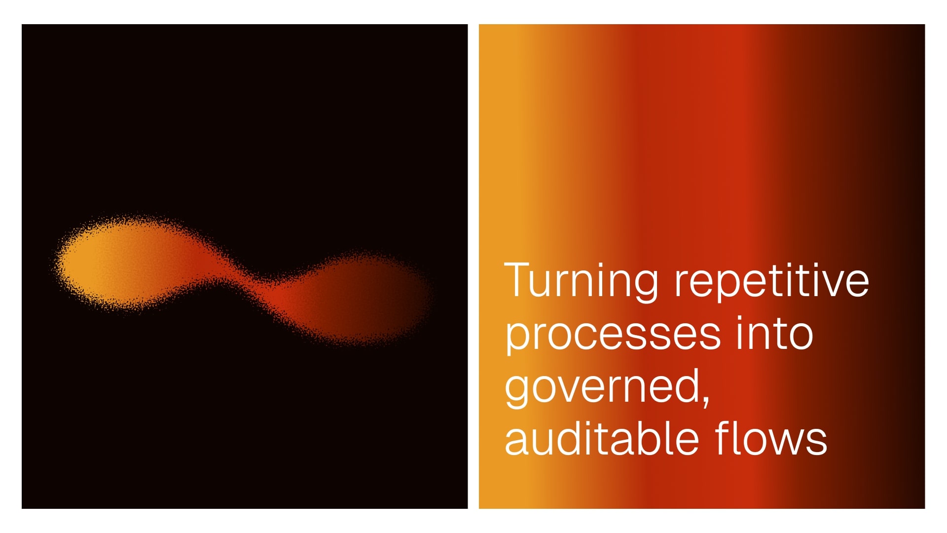
Operations teams live in spreadsheets. Approvals get stuck in email chains. Routing decisions happen ad hoc. FlowOps moves this chaos into a system that repeats, scales, and actually works.
The real challenge: automation brands sound either too technical or too vague. Operations managers want concrete results—faster approvals, fewer mistakes, time saved. They hate buzzwords and can spot empty marketing instantly. We needed an identity that proved FlowOps was dependable and powerful without sounding corporate.
Our approach was simple: strip away anything unnecessary and lead with clarity. The mark suggests movement and flow without resorting to tired arrow clichés. Paired with a strong wordmark, it reads quickly at any size.
For color, we used a warm sunrise orange and red combination. A bright orange accent guides attention and signals action. Typography is condensed for information density and clean for readability.
Voice and microcopy favor short sentences and active verbs. Every line answers: what happens next? Users always know their next step.
Deliverables included a full logo, color and type systems, visual identity mockups and other logo application templates. Everything handed off in Figma with export-ready assets.
Early results showed the identity made FlowOps feel approachable for operations users while maintaining a professional look for buyers.
Deliverables were a full logo suite with animated versions, a color and type system, a UI-ready icon set, a small brand guide, and templates for website hero, pitch deck, and trade show graphics. All files were handed off in Figma with export-ready assets and clear tokens for spacing and color.
Early results showed the identity made the product feel more approachable for operations users while keeping a professional look for buyers. The animated mark increased recognition in demos. The design handed off cleanly to product and marketing teams.
Next steps are to roll the identity into the product UI, update onboarding with the new microcopy, and use the animated mark in demos and trade show materials. These steps will help FlowOps present a clear and consistent brand across product and marketing.

CREDIT
- Agency/Creative: Fornite Studio
- Article Title: Fornite Studio Elevates FlowOps With a Strategic Identity for AI Workflow Automation
- Organisation/Entity: Agency
- Project Type: Identity
- Project Status: Published
- Agency/Creative Country: Nigeria
- Agency/Creative City: Lagos
- Market Region: Global
- Project Deliverables: Brand Creation, Brand Design, Brand Naming, Logo Design
- Industry: Technology
- Keywords: Saas, AI
-
Credits:
Brand Designer: Hilary Peters


