


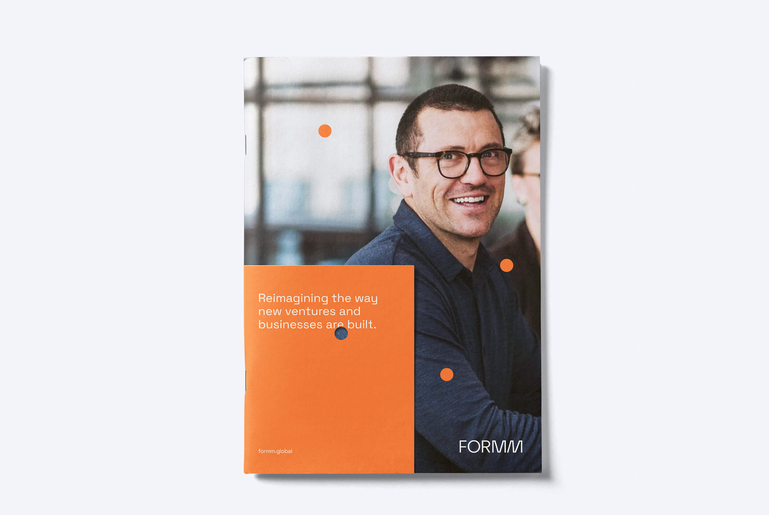
Reimagining how a start-up can disrupt the traditional digital consulting model.
Chasm Digital was an established consultancy and venture studio based in Australia who were looking to scale up their services globally. Their operating model was different to competitors, requiring them to attract talent and build a partner network from within the start-up community. They were facing practical issues regarding the name itself: the pronunciation was unclear, felt uninspiring and wasn’t in line with their vision to go beyond digital solutions.
Following a successful capital raise and appointment of a new marketing leader and advisors, the brief was to rethink how Chasm could appeal to both talent and a variety of clients, big or small, across various industries. The task involved a complete relaunch of the brand identity with a new name, a new logo and tagline to kick start ambitious plans for thinking big and disrupting the industry.
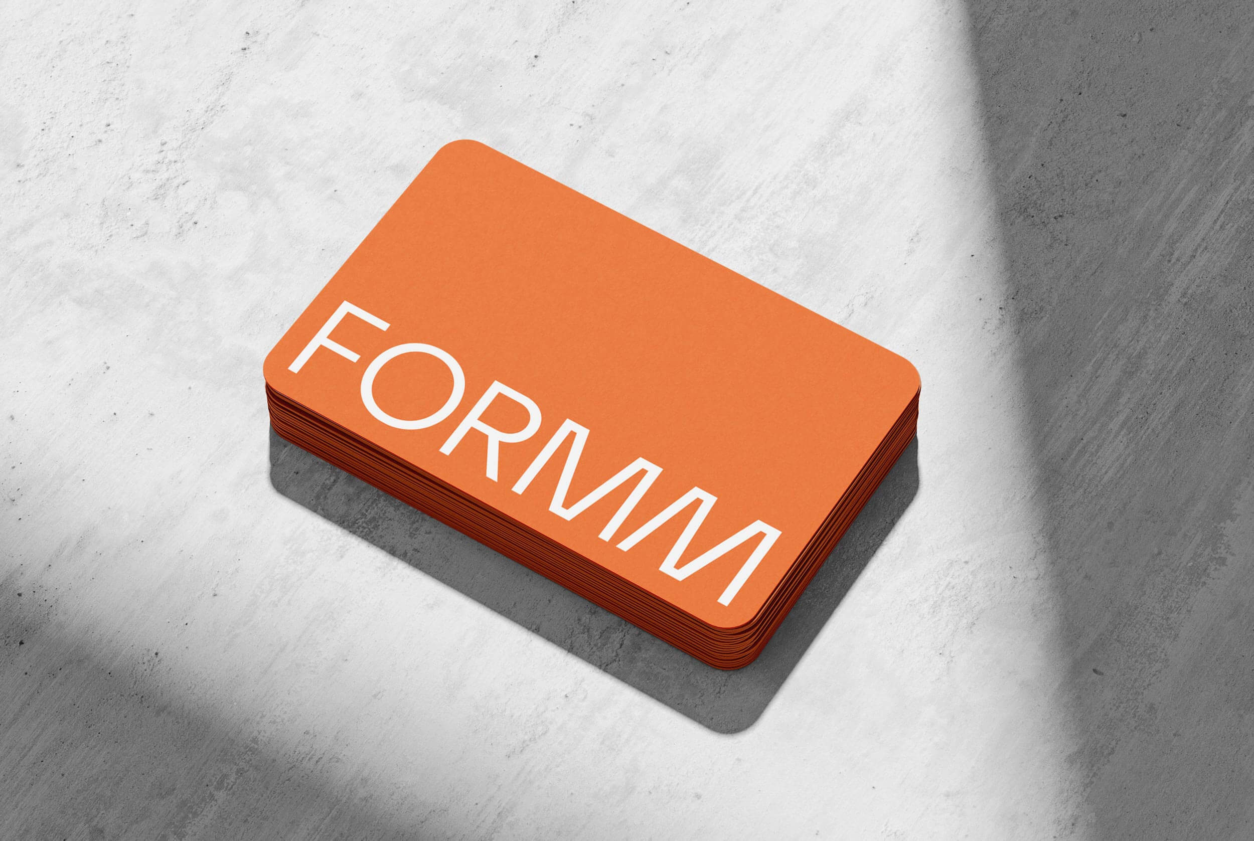
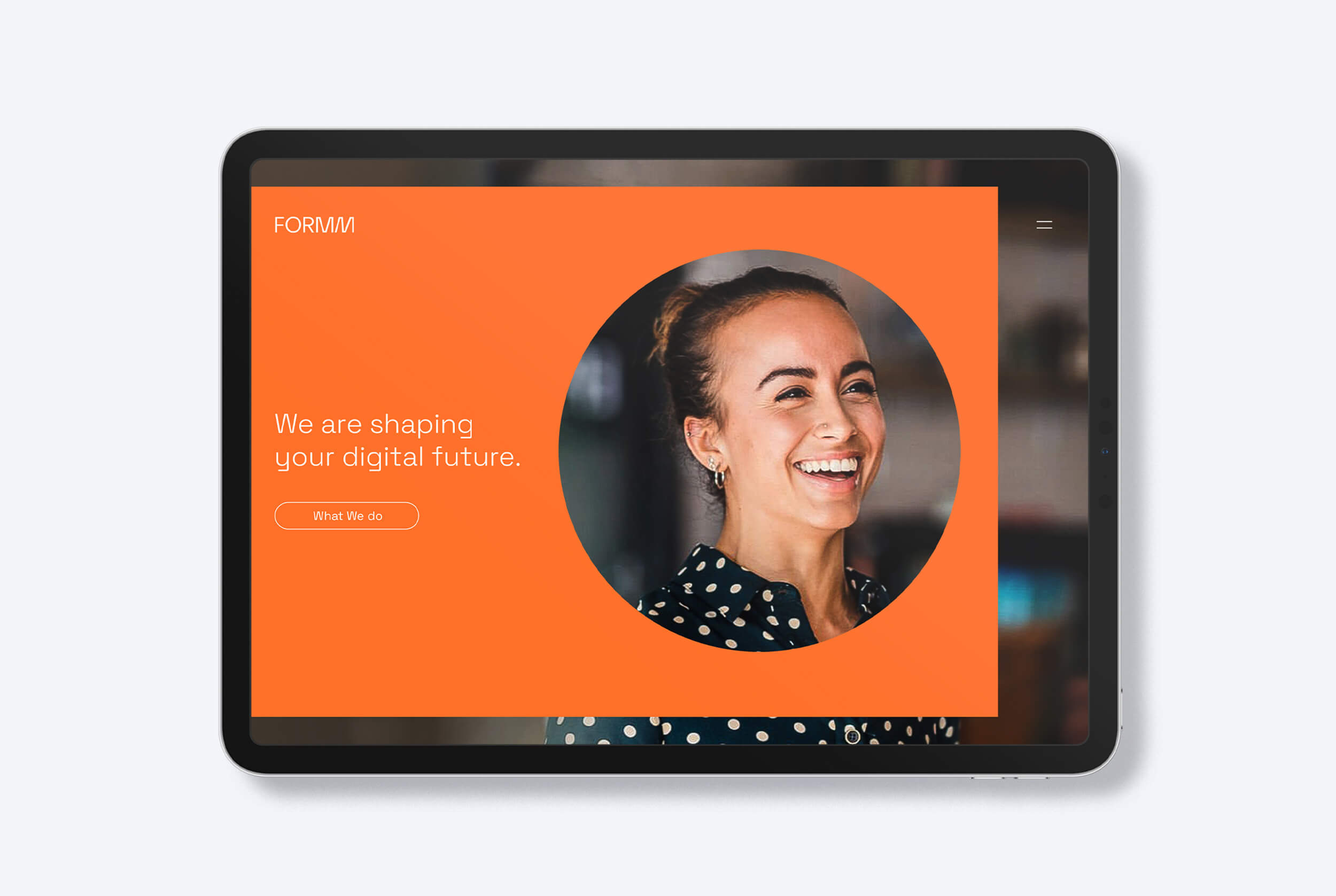
Due to the innate nature of the company that both champions the “little guy” and helped to build better businesses that survive and thrive in the digital age and supports the aspirations of the big firms, the name we finally landed on was FORMM. The name itself derives from the word form (to shape or configure something) needed to capture how the brand harness diverse skills and mindsets from the startup and consulting community and helps clients to achieve the inconceivable, with an agile and lean process that is fast but that doesn’t compromise on quality.
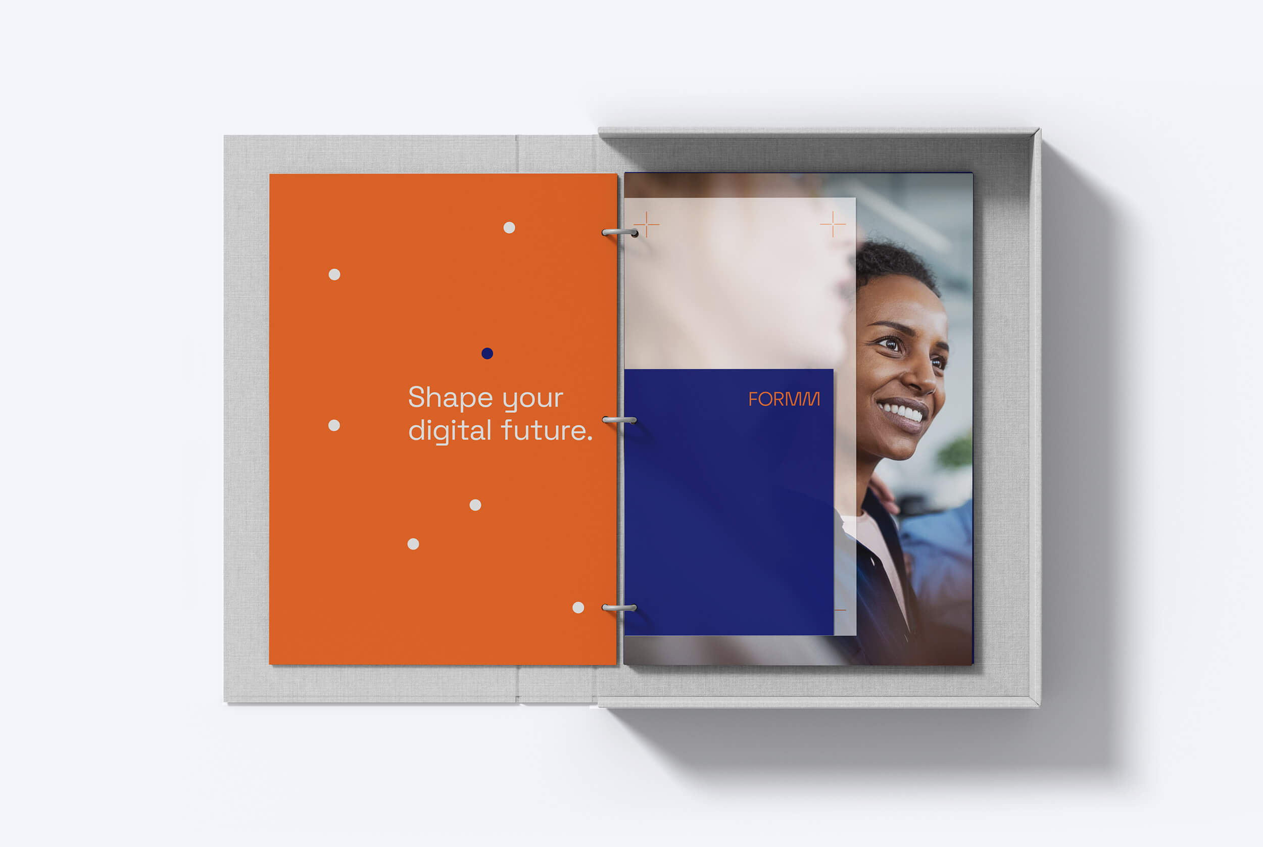
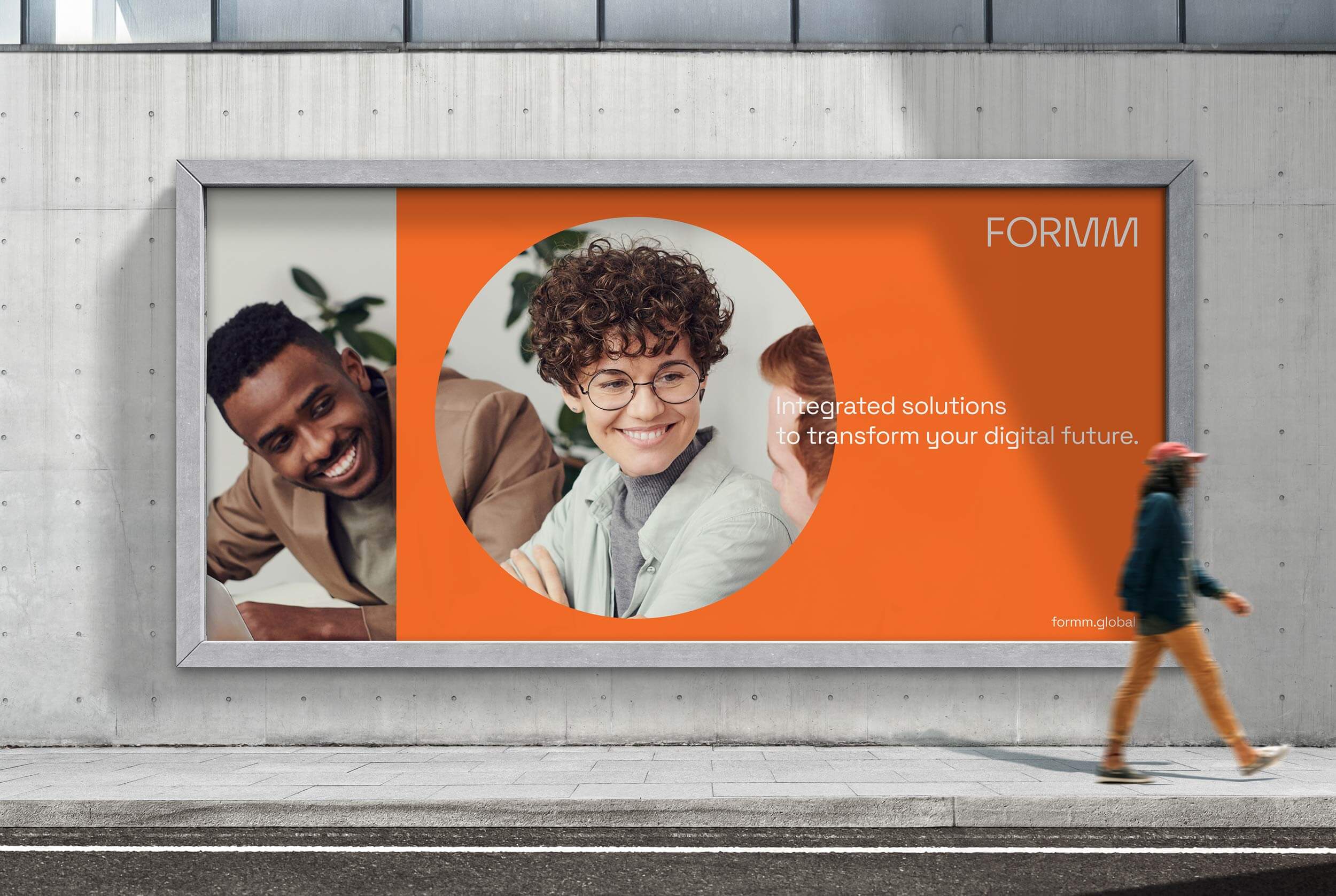
The tagline “Shape your digital future” was a natural play on the word “form” and how a digital transformation is essential for the survival for most companies and the need to move fast in business in this particular time and age.
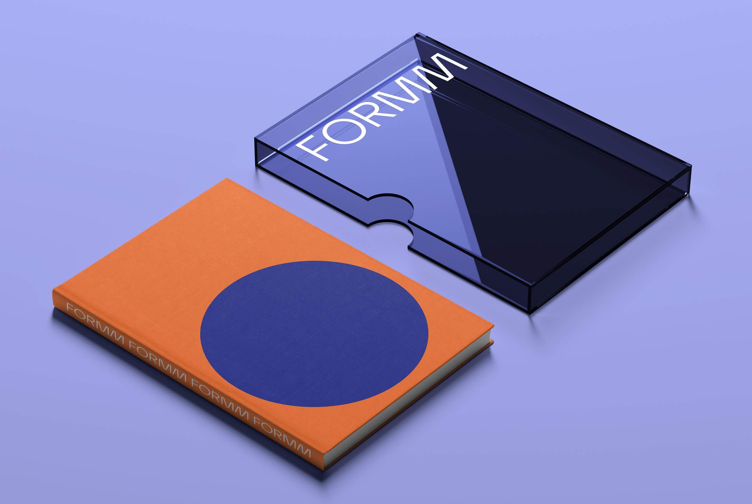
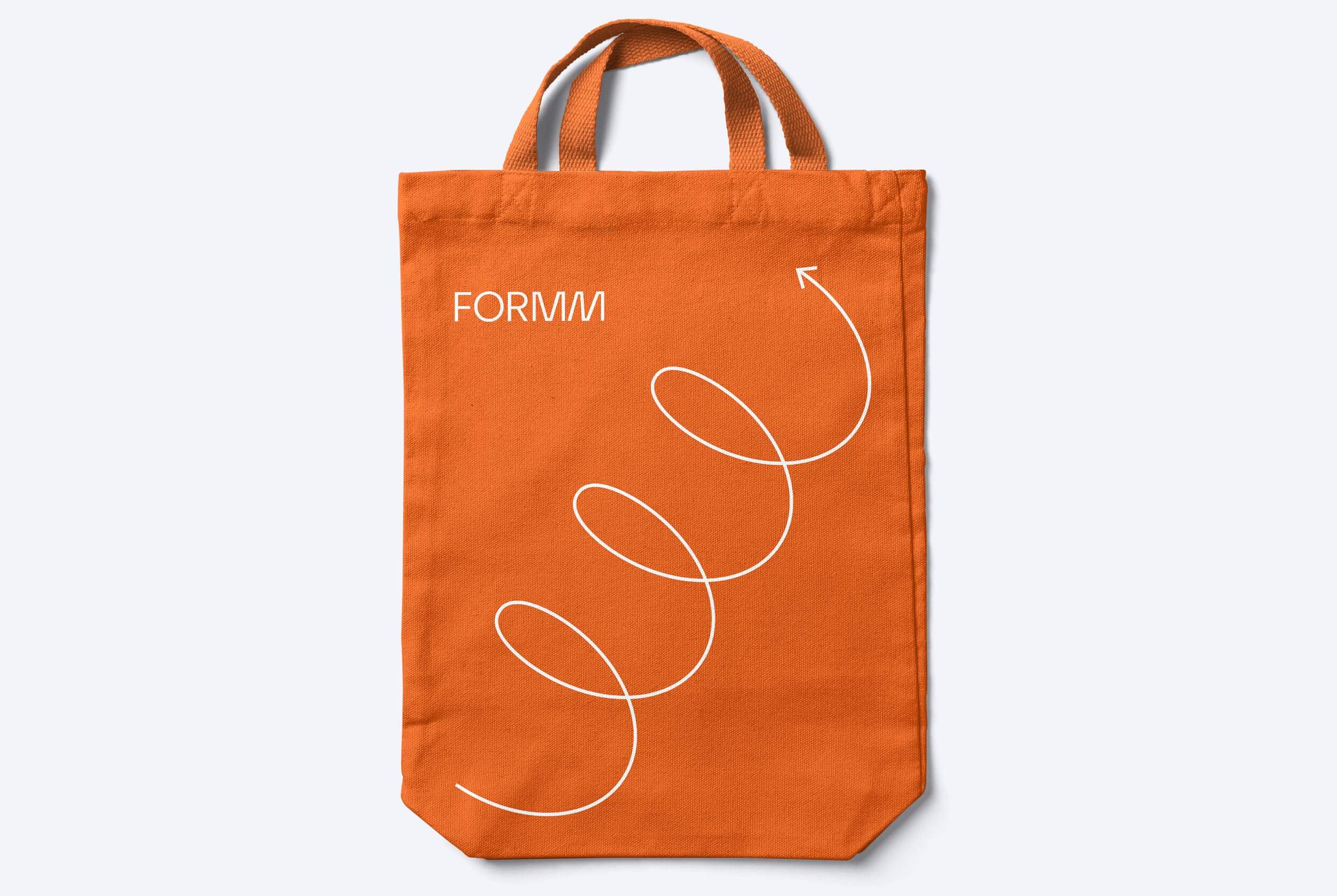
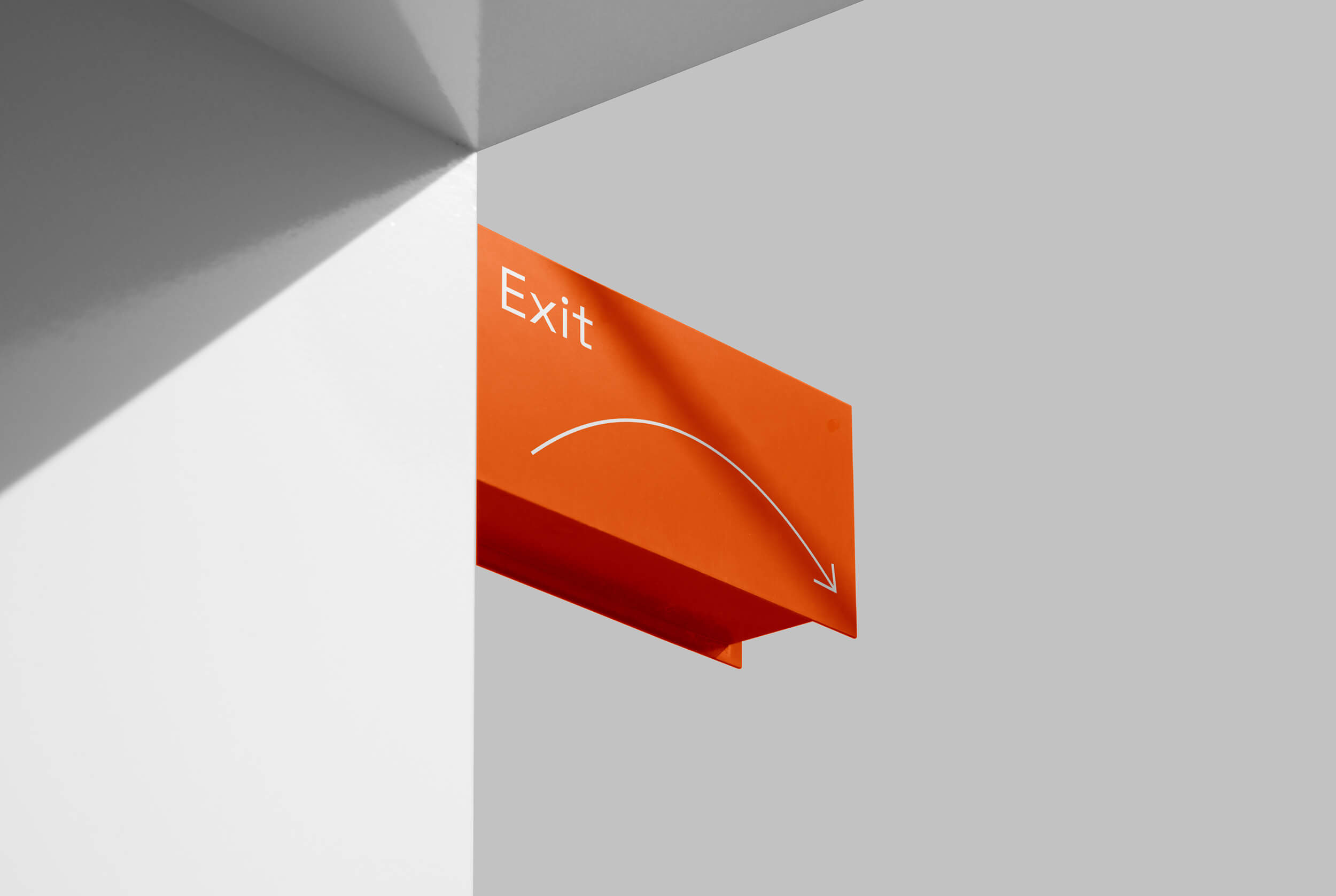
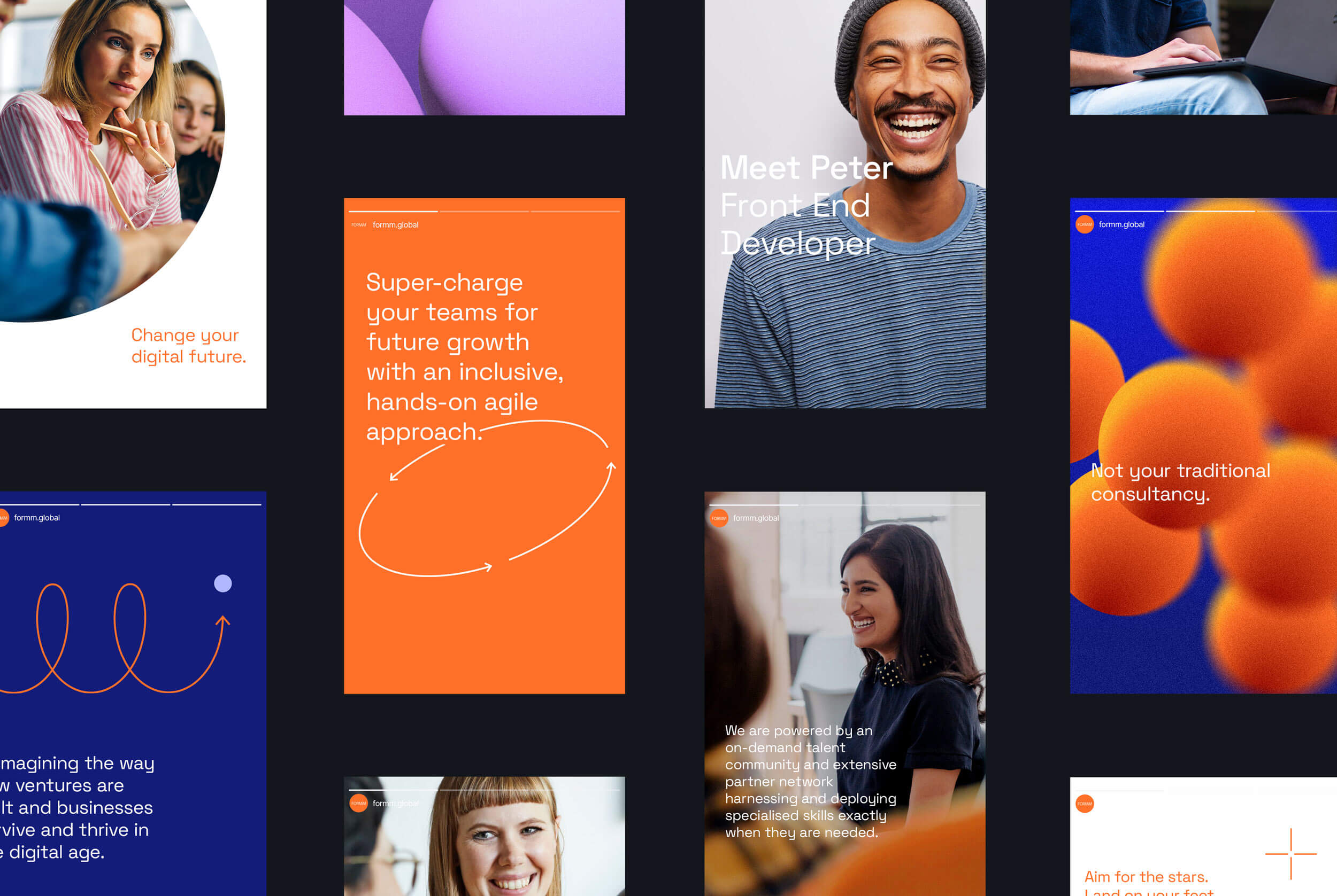
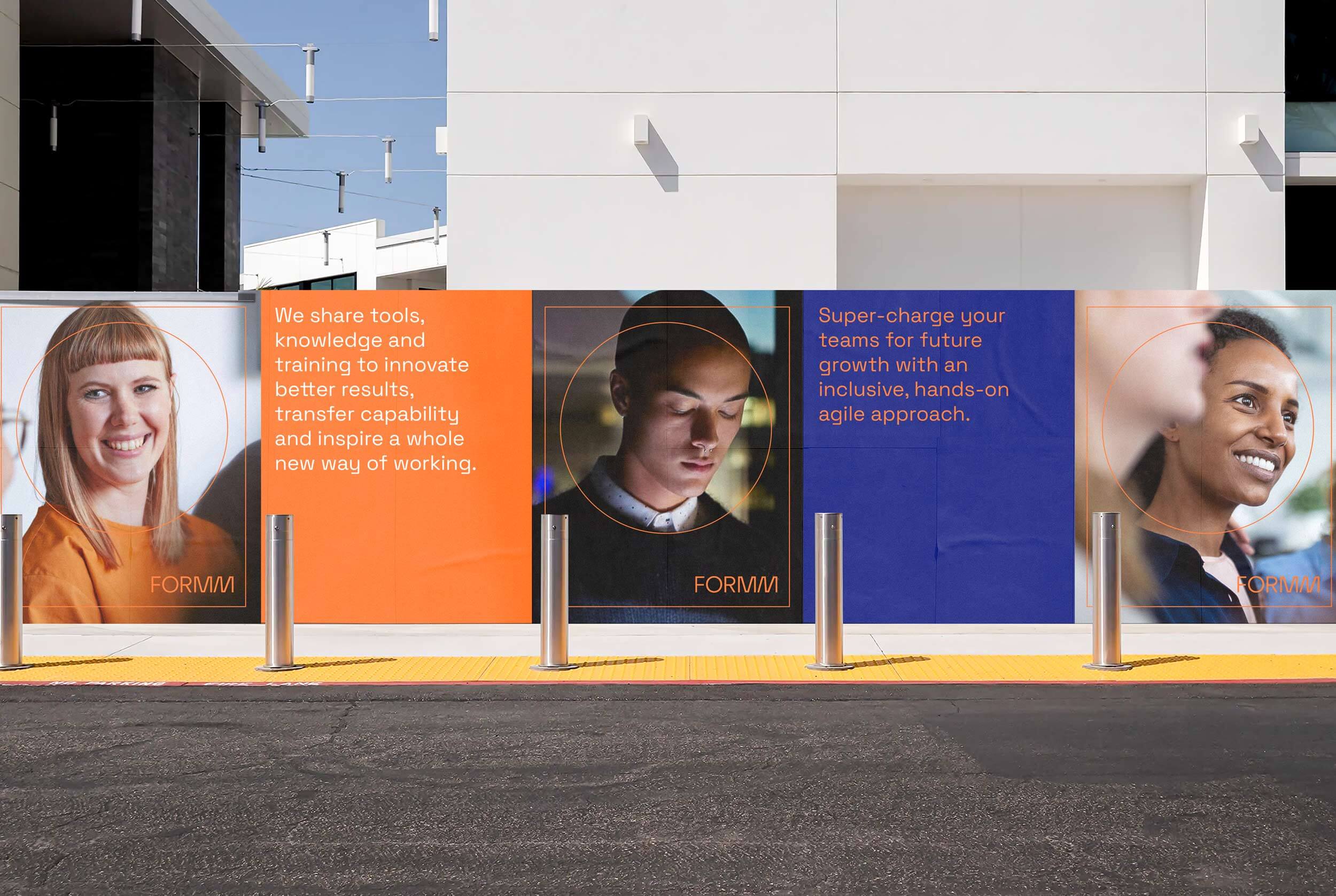
The birth of a lean visual identity, intrinsically ambitious that also feels accessible. A complete toolkit with a bold name and logo, with an energetic palette and a series of exciting symbols to showcase smart thinking and freshness of approach in a simple and effective way. The letter O in the logo was the inspiration for the circle as a flexible brand element. This shape began to be used to capture ideas, frame images or highlight relevant content.
A series of symbols were also uniquely drawn as an extension of the brand narrative and helped the FORMM’s team convey complex ideas and business concepts in a simple and engaging way.
CREDIT
- Agency/Creative: Michele Verze
- Article Title: Formm Brand Identity Designed by Michele Verze
- Organisation/Entity: Freelance
- Project Type: Identity
- Project Status: Published
- Agency/Creative Country: Australia
- Agency/Creative City: Sydney
- Market Region: Oceania
- Project Deliverables: Brand Identity, Brand Naming, Branding, Icon Design, Logo Design, Rebranding
- Industry: Professional Services
- Keywords: formm branding logodesign logo typography iconography
-
Credits:
Designer: Michele Verze


