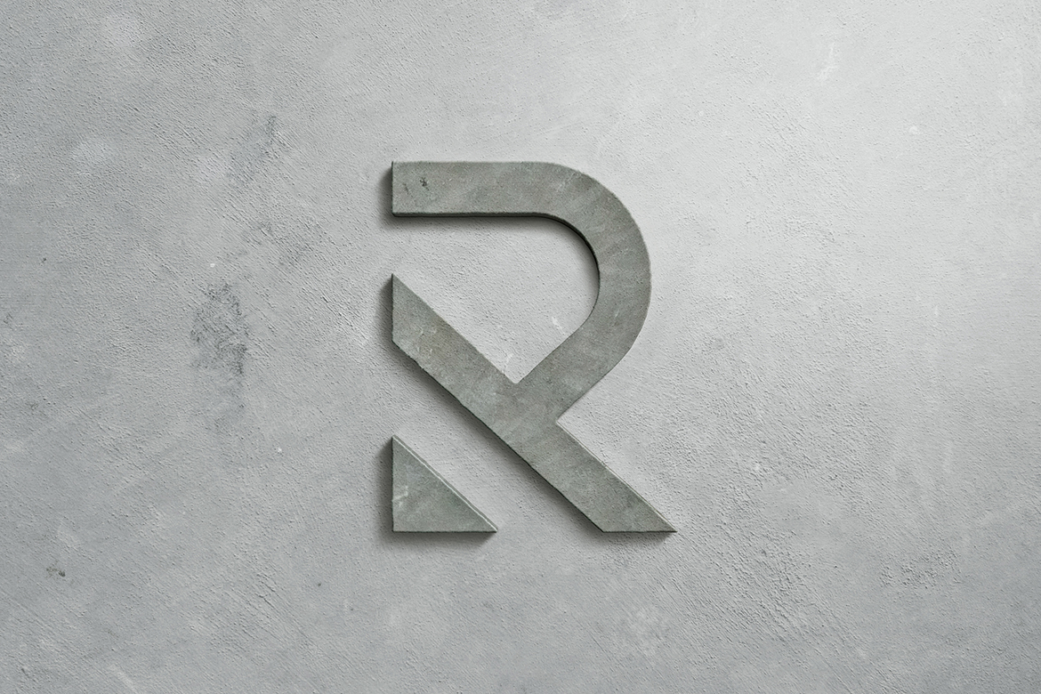
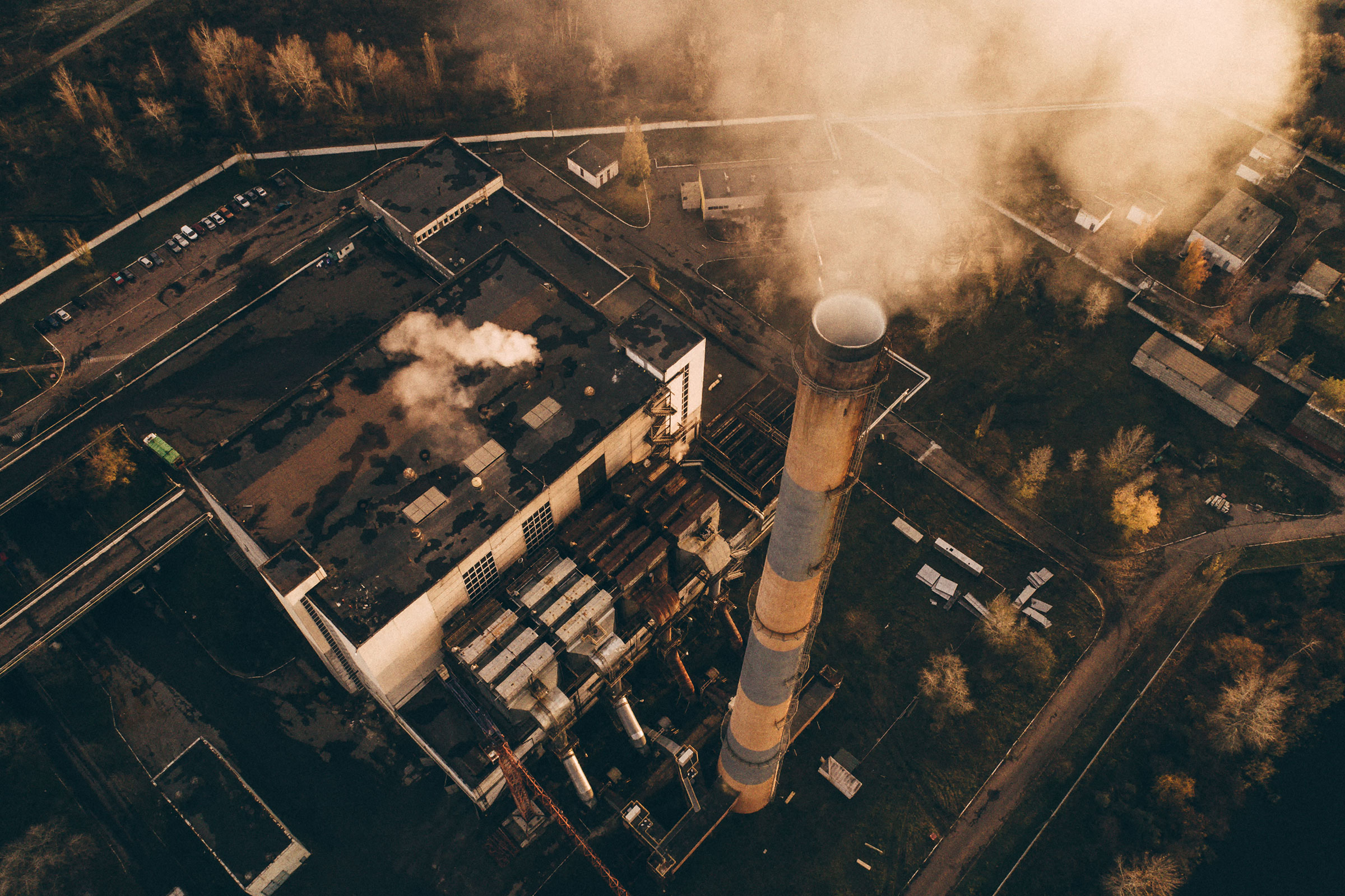
Recycl8 are an award-winning sustainable energy organisation based in Scotland, who are delivering a game-changing, low-carbon concrete solution to the global construction industry. With cement being responsible for 8% of the world’s CO2 emissions, their invention not only has the potential to drastically reduce carbon emissions on a global scale, but also offers a cost-efficient and accessible product that adds significant contributions to the Circular Economy.
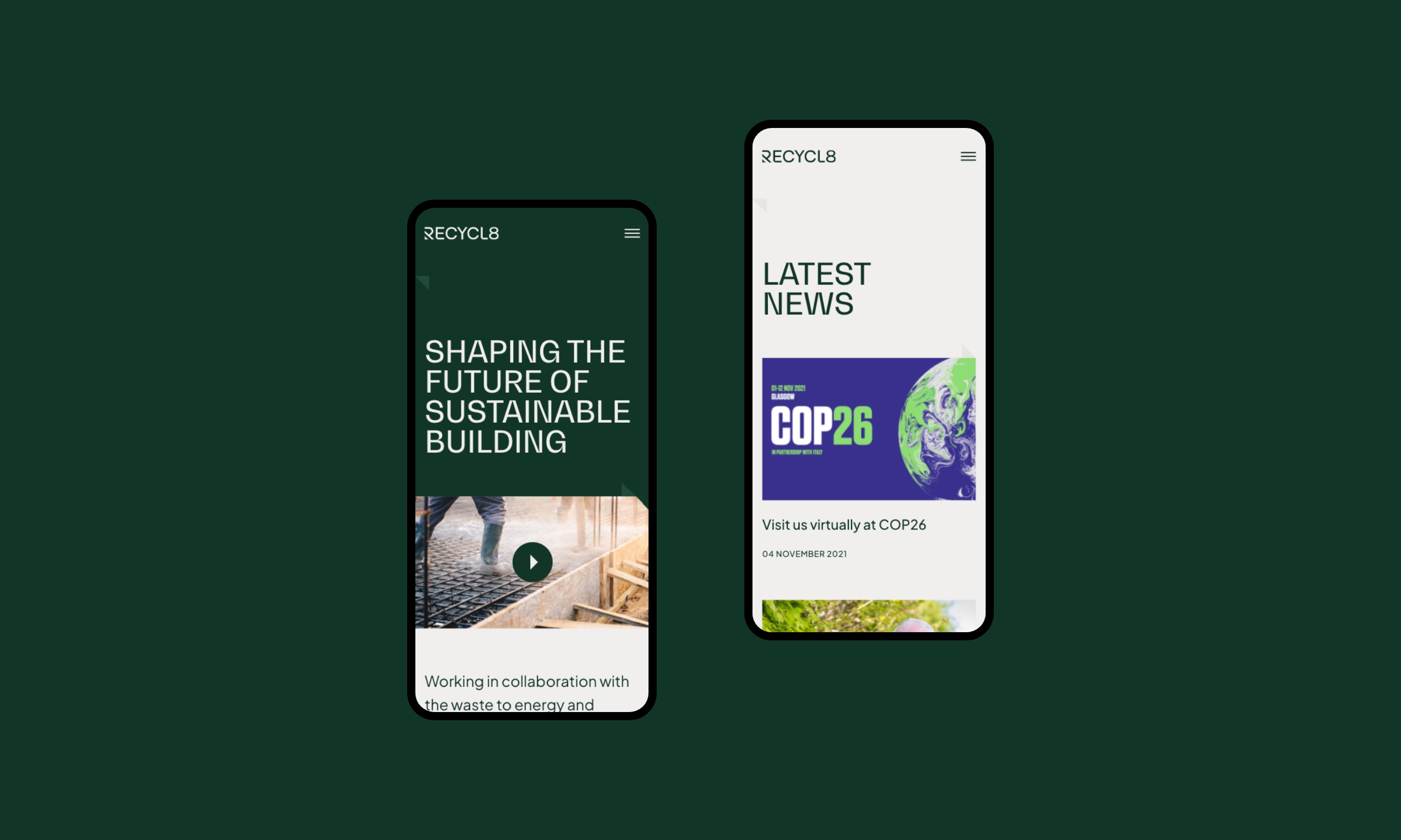
A company with such a progressive mission, needs a digital presence that expresses the positive impact of their innovation, and we were delighted to take on the task of revitalising their identity. Recycl8’s existing identity did not reflect their level of expertise or the modern efficiency of their product, so it was our job to translate this message.
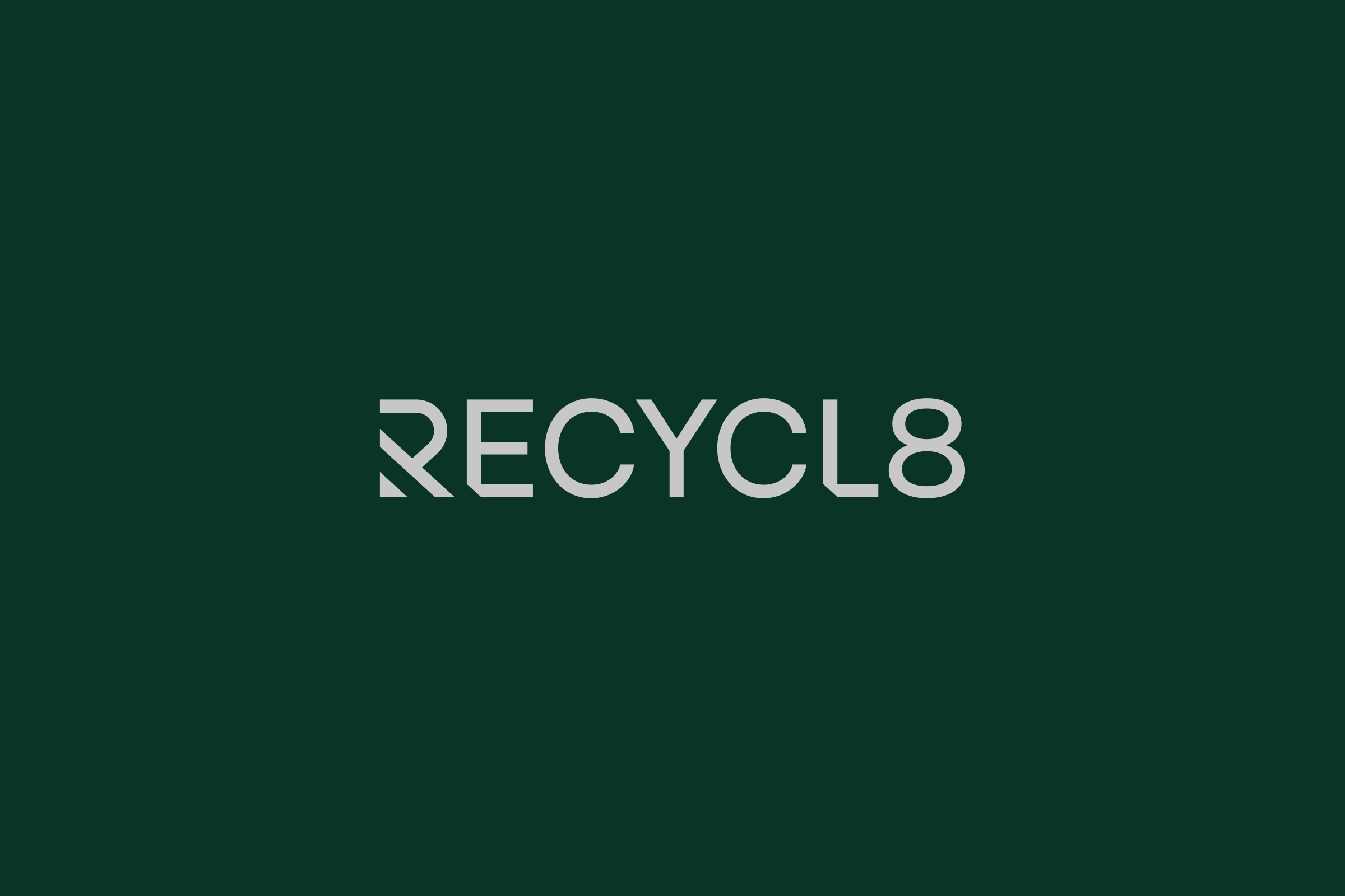
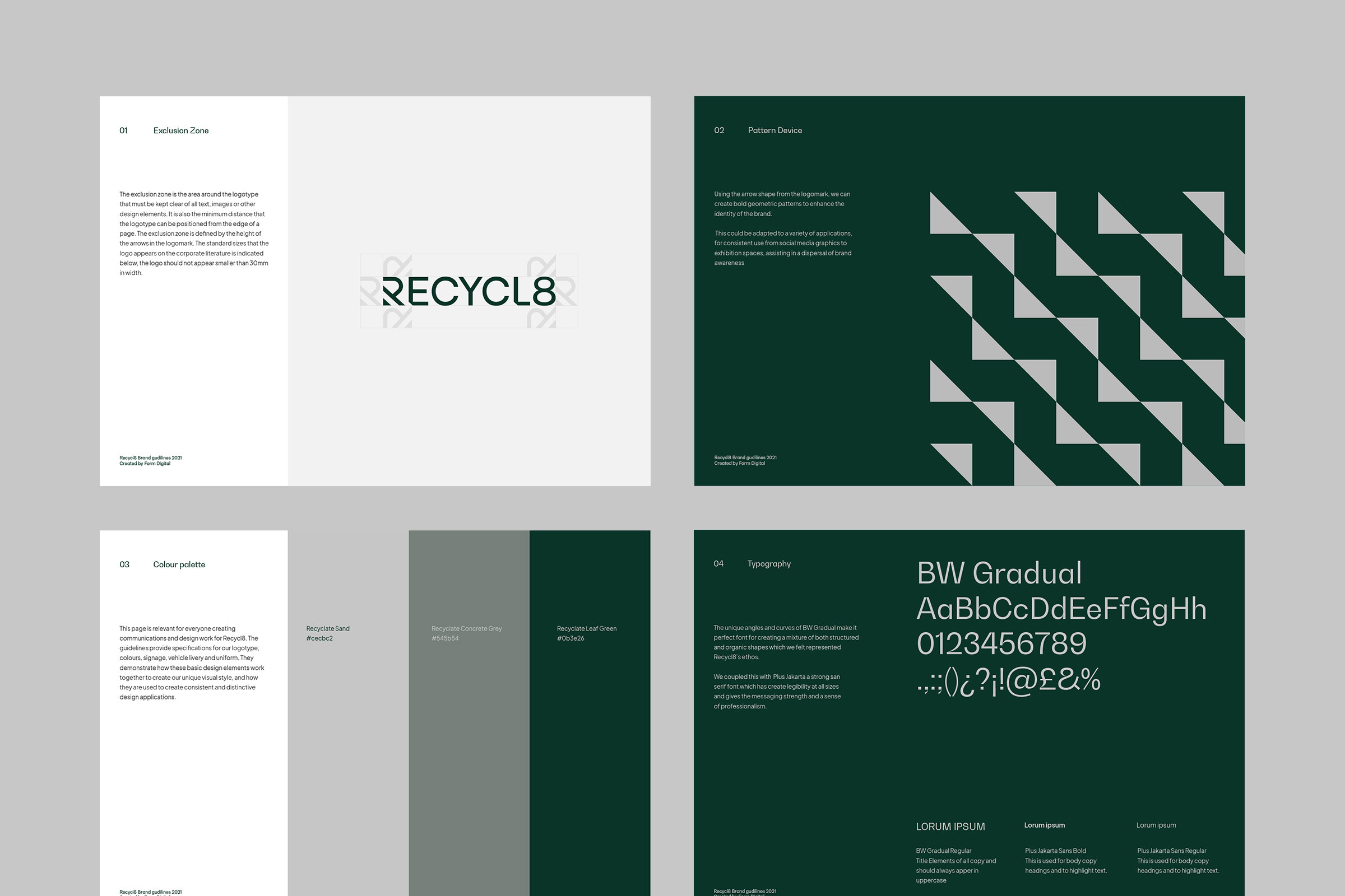
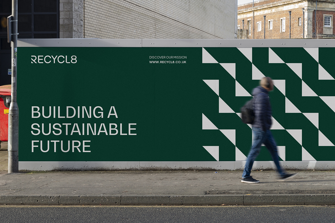
Due to the nature of the work, Recycl8 can’t rely on photography to achieve this, so our solution was to create a type-driven visual style with a modern edge. We explored typeface options to establish how we could powerfully reflect their ethos in text on marketing materials, and decided on BW gradual which blends a structural engineering feel with subtle organic curves in natural contrast. This balanced a symbolisation of both the innovation of the product, with the natural world they are striving to preserve.
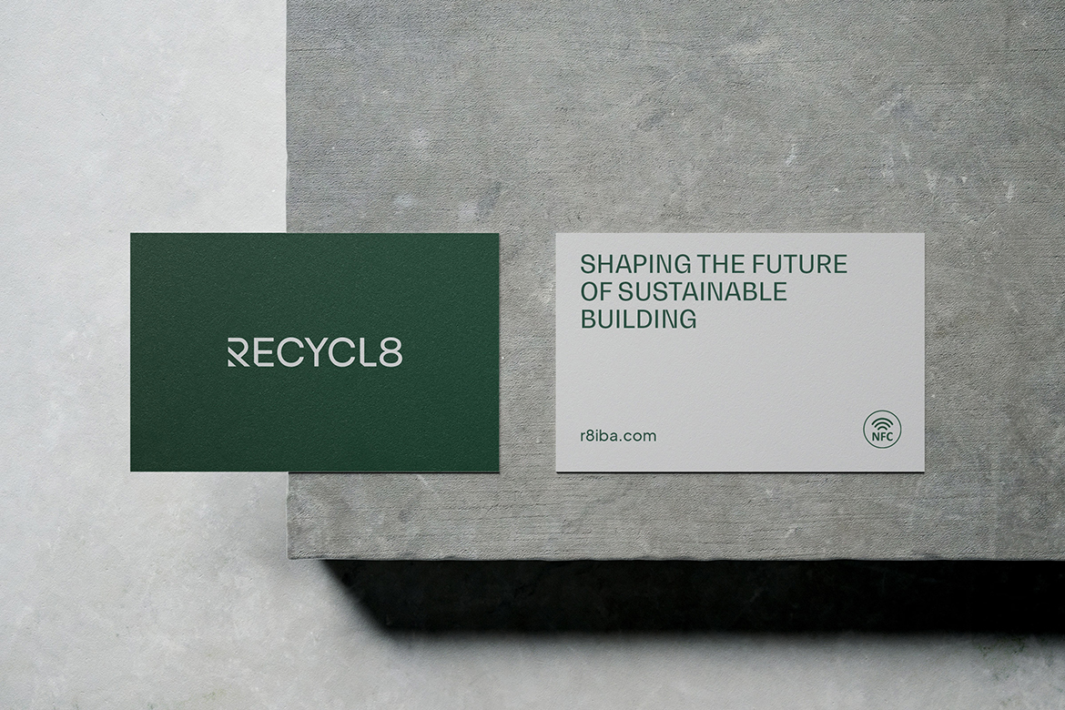
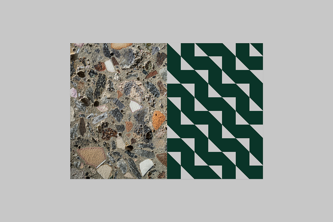
We accompanied the text with a pattern that visually mimicked the product itself. This could be adapted to a variety of applications, for consistent use from social media graphics to exhibition spaces, assisting in a dispersal of brand awareness. We opted for a digital first approach in all marketing materials to ensure as low an impact on the environment as possible, utilising the latest technologies such as NFC contactless business cards and interactive PDF documents.
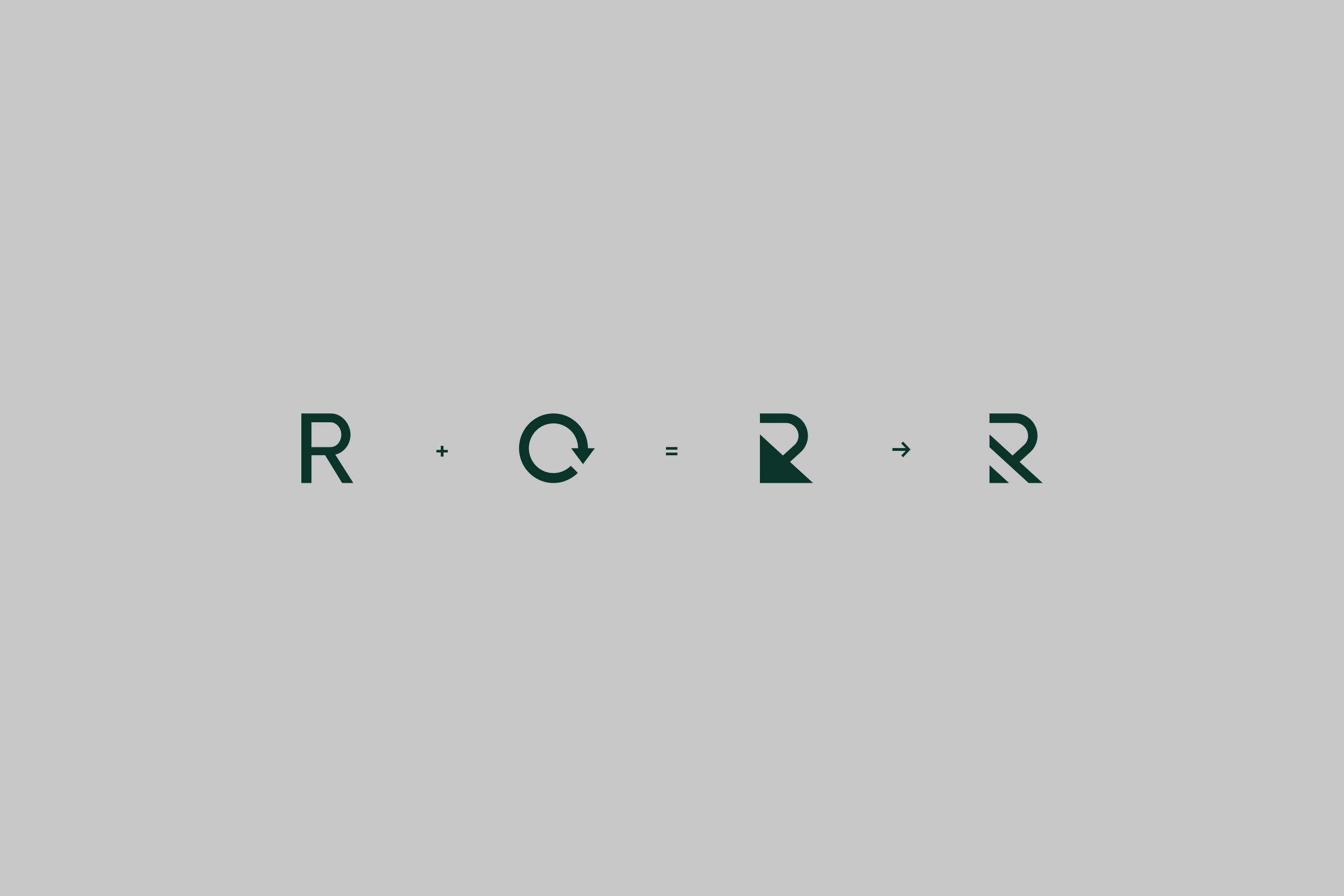
The logo marque blends the letter R with the recycling symbol to represent the products’ genesis in waste, reinforcing the environmental credentials of the brand.
We acknowledged that clear messaging would be crucial for demystifying environmental initiatives for prospective collaborators, so we created animations to be used by the marketing team that could concisely explain how the product works and why it’s universally beneficial.
Our project with Recycl8 was particularly meaningful because of their evident consideration for local causes, both environmental and economical. Designing a brand for a local company with such an earnest mission, who’s potential has been acknowledged by both the Scottish Edge awards and Scottish enterprise, means that we get to play a part in showcasing Scotland as a leader in renewable engineering.
CREDIT
- Agency/Creative: Form Digital
- Article Title: Form Digital Help Build Future Sustainable Construction Brand Recycl8
- Organisation/Entity: Agency
- Project Type: Identity
- Project Status: Published
- Agency/Creative Country: United Kingdom
- Agency/Creative City: Form Digital
- Market Region: Europe
- Project Deliverables: Brand Guidelines, Brand Identity, Brand Mark, Web Design
- Industry: Construction
- Keywords: renewable, eco concrete, recycle, construction, innovatoion
-
Credits:
Design & Motion: Form Digital


