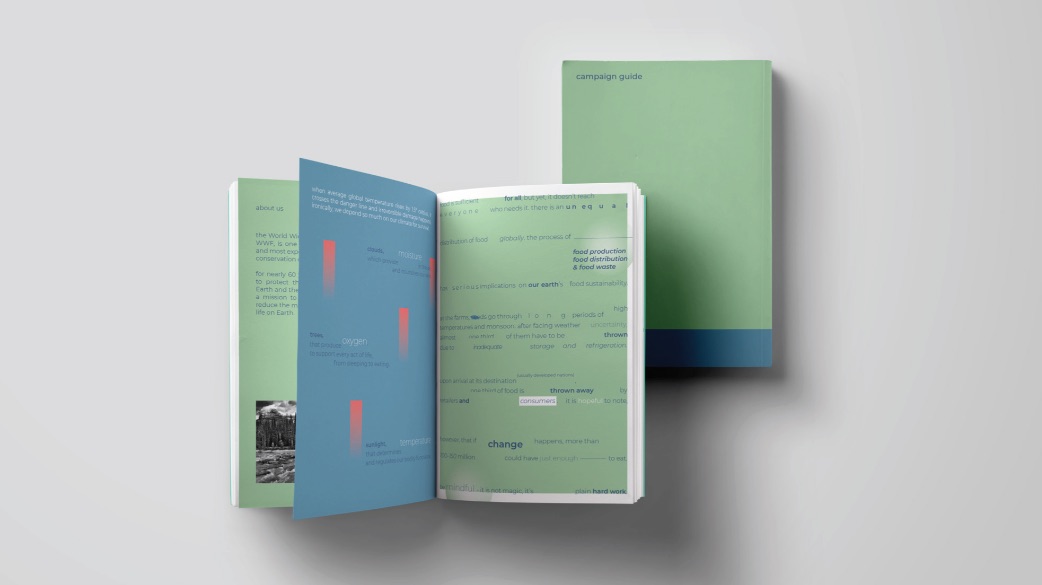
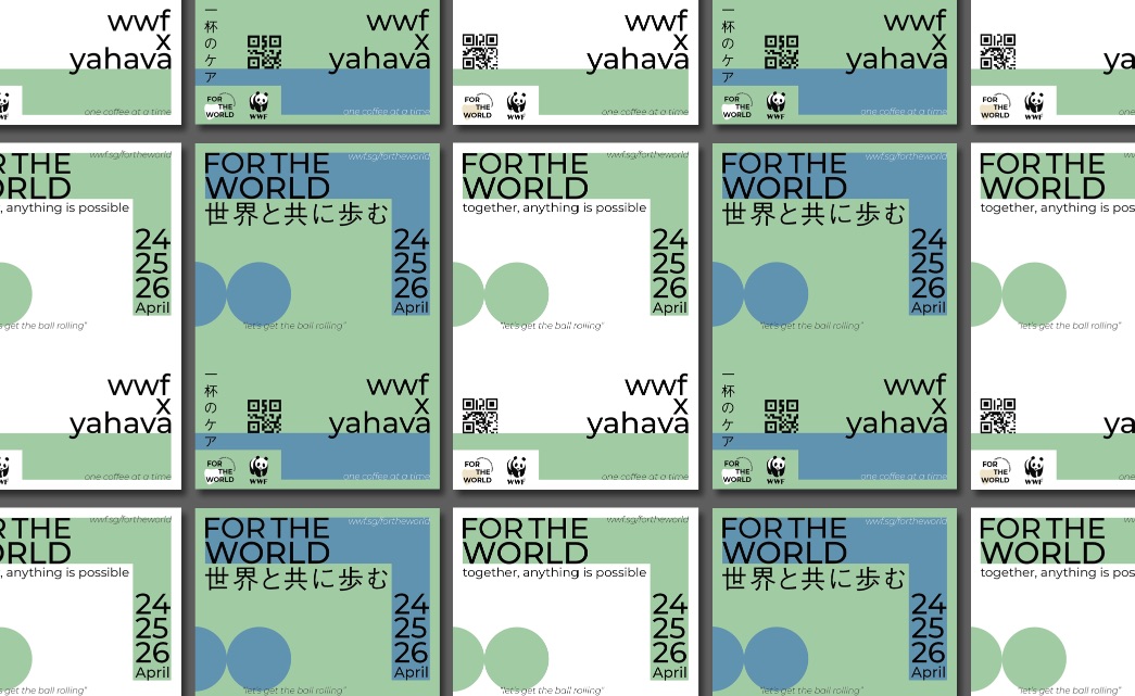
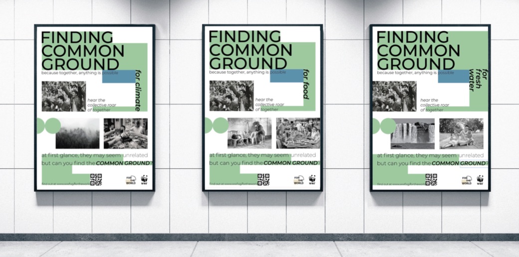
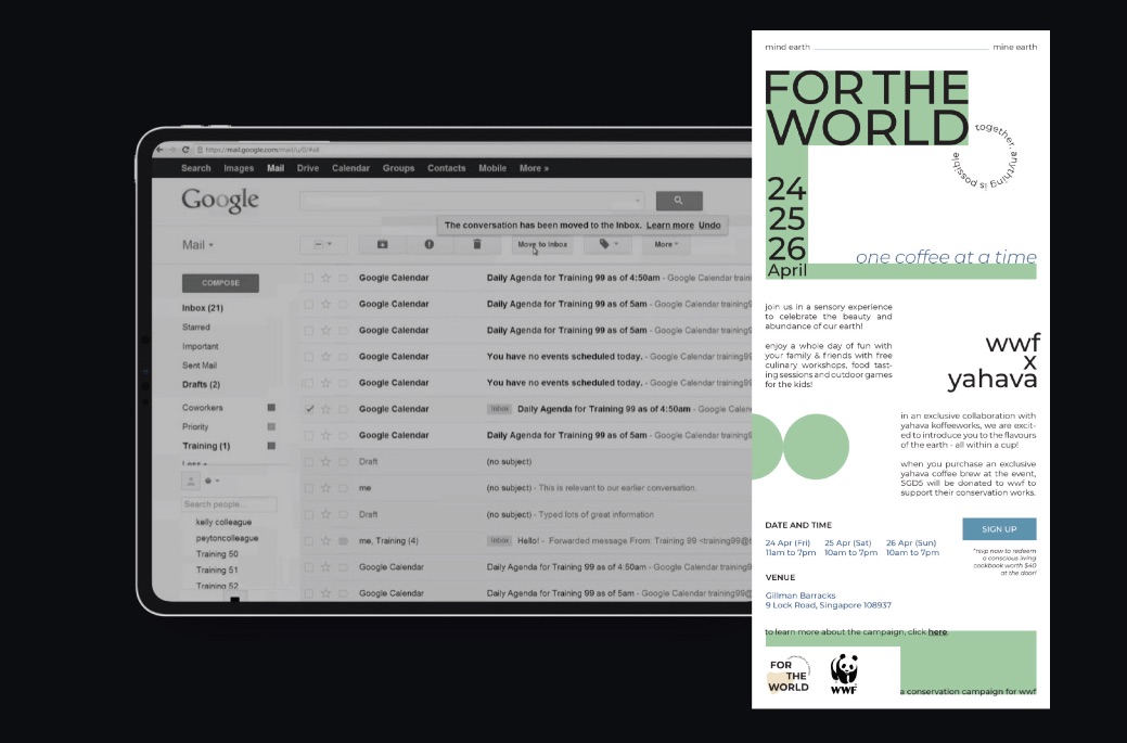
For The World – Finding Common Ground is a conservation awareness campaign concept designed for World Wide Fund for Nature (WWF) in Singapore. The campaign aims to educate individuals from all walks of life, especially millennials, on how a simple action can add up to make a huge difference to our environment and safeguard the world’s biodiversity. The campaign will also help to raise awareness about conservation challenges related to food, climate and fresh water supply, thereby encouraging contributions and conscious efforts for the environment. The integral message of the campaign is centred around being mindful of the past, present and future of our resources. The anchoring concept of common ground refers to the collective conscience WWF aims to impart to audiences to act for our world’s well-being, and the reminder to all stakeholders involved that there is close relationship between our well-being and the health of our world. To generate publicity for the event, a special collaboration between WWF and Yahava Coffeeworks, a local sustainable coffee brewery will be created. The brewery will function as a community space for awareness and interaction, and exclusive merchandises and beverages can be sold to raise funds for the organisation.
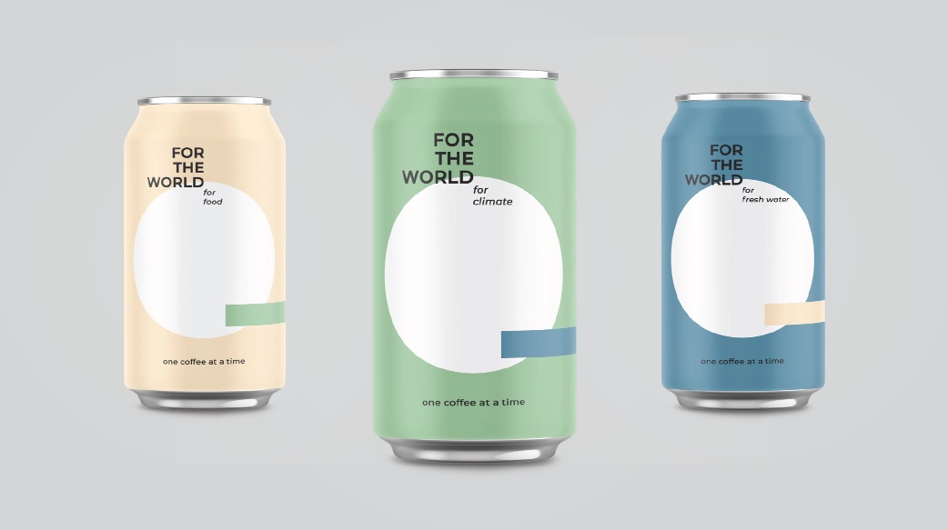
Audiences are likely to resonate with the honest, nurturing and contemplative brand voice that is conveyed in the campaign branding. This voice is represented by the design elements, such as colours, graphics and copy. The use of pastels is harmonious, soothing and gentle. This reinforces the approach of the campaign – affirmative, and not forceful. The analogous pairing of pastel blue and green create great visual harmony, yet remains fresh and relevant to the theme of nature and the millennials population. A deep ocean blue will be used sparingly as an accent colour for grounding purpose. The use of pastels might not be familiar with past WWF works, but conveys the bold and progressive approach that will carry the mission of WWF forward into the future.
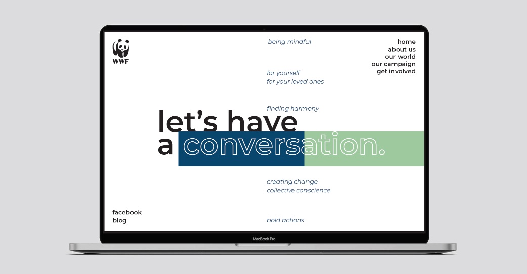
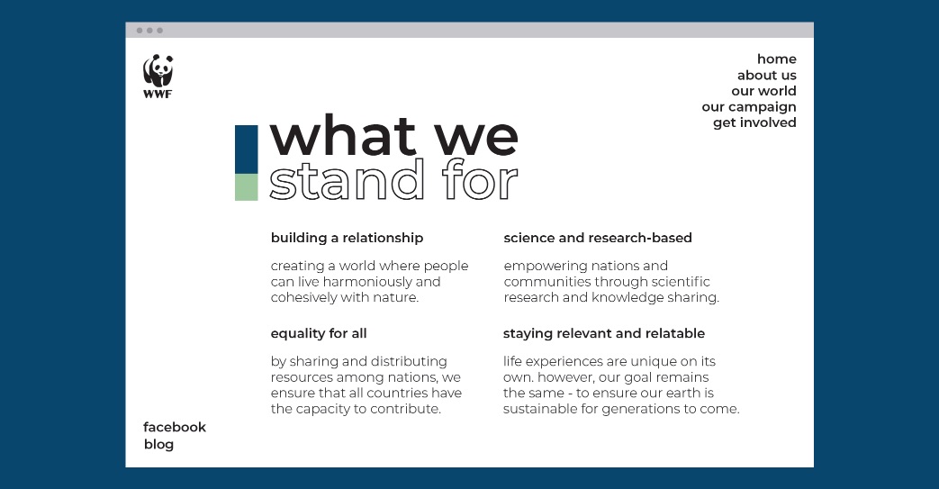
The typographic choice is Montserrat. It will be the main font used in this branding project to communicate a consistent and harmonious visual language. It was chosen for its great readability, a clean and minimal aesthetic, and its geometric sans-serif look that conveys modernity. Its simple and no-frills look is expected to read well and convey complex information in an immediate manner. The overall look and feel is bold, impactful and relevant, while being honest and concise in delivering the campaign objectives.
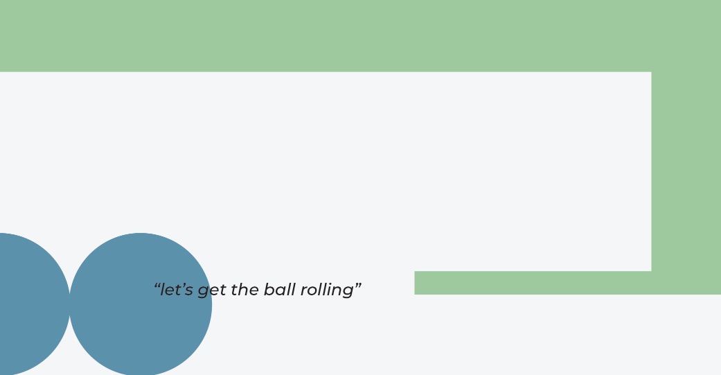
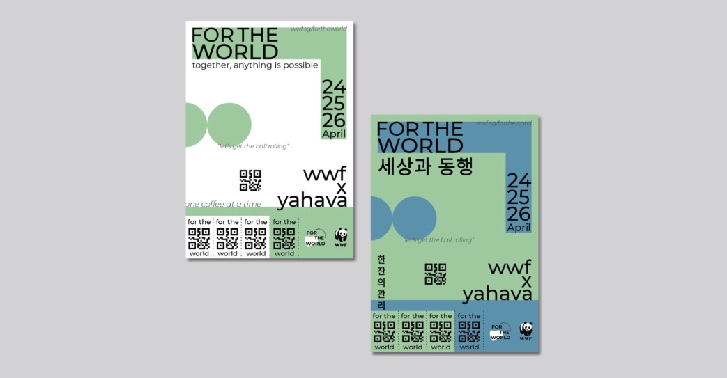
The visual language created is bold, raw and immediate to viewers, since it was inspired by the Brutalist approach to design. The use of primary shapes makes it highly versatile and adaptable – which helps to complement the overall composition yet not drawing excessive attention away from important messages. The use of circles in the graphics represents energy and momentum, while rectangles depict foundation and stability. These graphics come together harmoniously to enhance the campaign message, while delivering a unique brand identity to differentiate itself from past works.
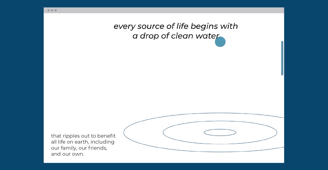
Both print and digital mediums would be used to reach potential audiences in Singapore, and beyond. Tactile interest is especially important for the printed materials, and hence a textured, off-white paper, called Maple White will be used. It is matt, natural looking (less bleached) and gives a raw touch and feel. This helps to convey the honest and contemplative brand voice and encourages audiences’ engagement with the printed campaign materials. The website is designed with the user in mind and the outcome is straightforward and immediate. This helps to grab and sustain viewers’ attention when conveying a repertoire of complex information. By eschewing conventional template-based webpage layouts, a stylised look can be achieved to deliver the campaign outcomes in a more attractive and purposeful manner, thereby increasing the effectiveness of this integrated campaign.
CREDIT
- Agency/Creative: Cliff Chong
- Article Title: For The World Creative Campaign Concept
- Organisation/Entity: Student
- Project Type: Campaign
- Project Status: Non Published
- Agency/Creative Country: Singapore
- Agency/Creative City: Singapore
- Market Region: Global
- Project Deliverables: Brand Identity
- Industry: Public Utility
- Keywords: WBDS awards, Student
-
Credits:
Educational Institution: Orita Sinclair School of Design & Music
Educator's Name: Chih Boon Lim


