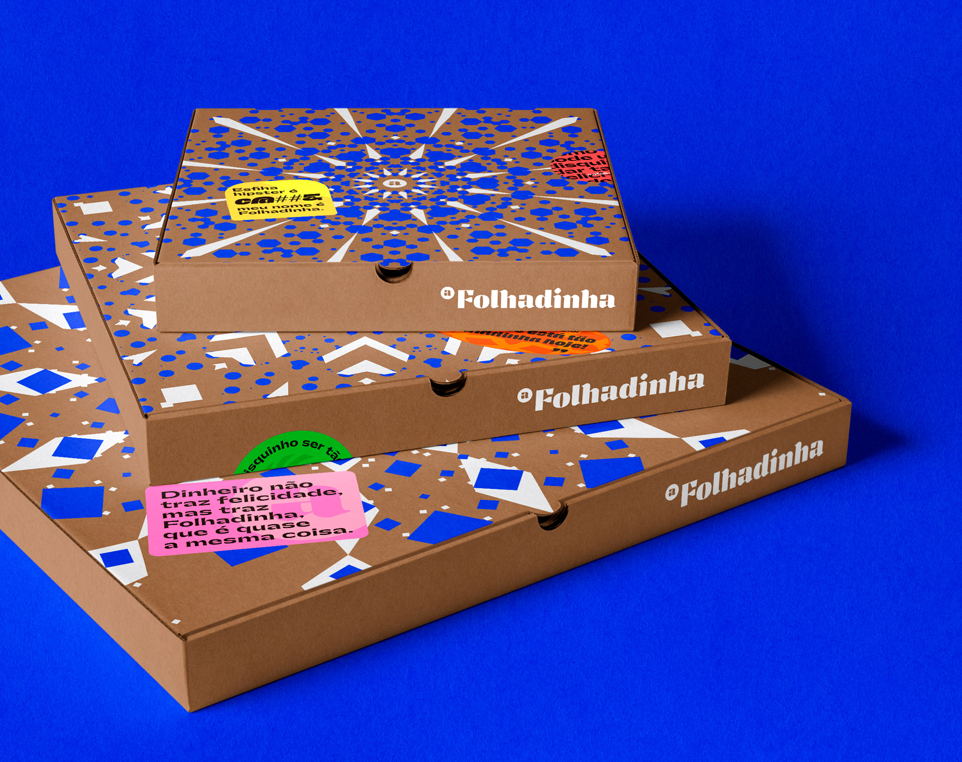
Folhadinha is an Arab restaurant located in the city of São Paulo – Brazil. On its menu we find very traditional Lebanese cuisine. Based on a cuisine with a family tradition, Folhadinha did not intend to be known as an Arab restaurant like so many others.
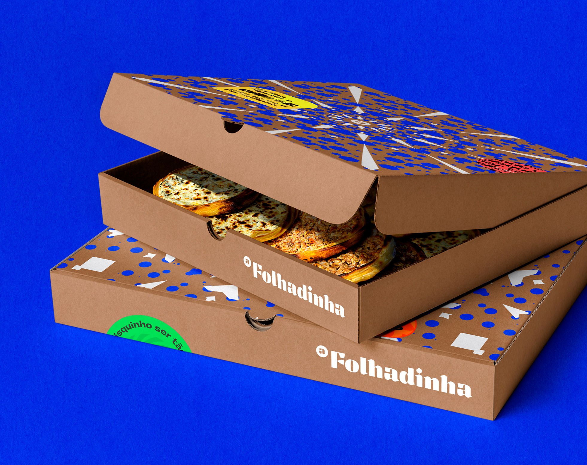
Exploring maximum flavour in its meals, the restaurant did not intend to be known as a monotonous environment, without color and even less without flavour, it needed to be POP, modern, demonstrate in its brand identity, store items and packaging for delivery all this explosion of flavour and differentiation.
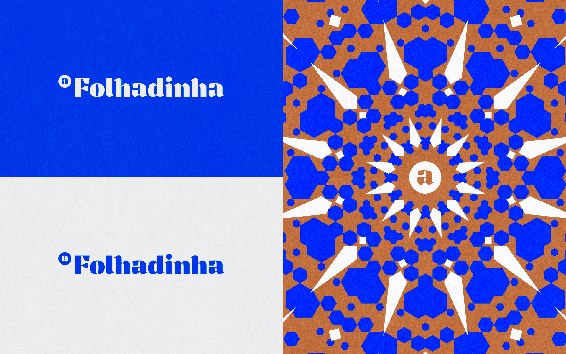
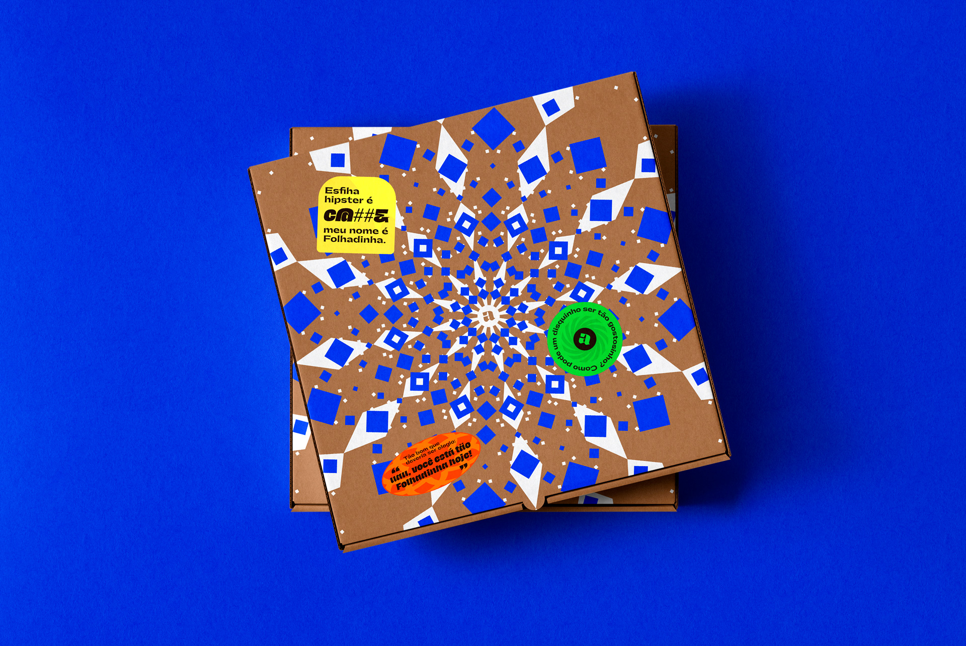
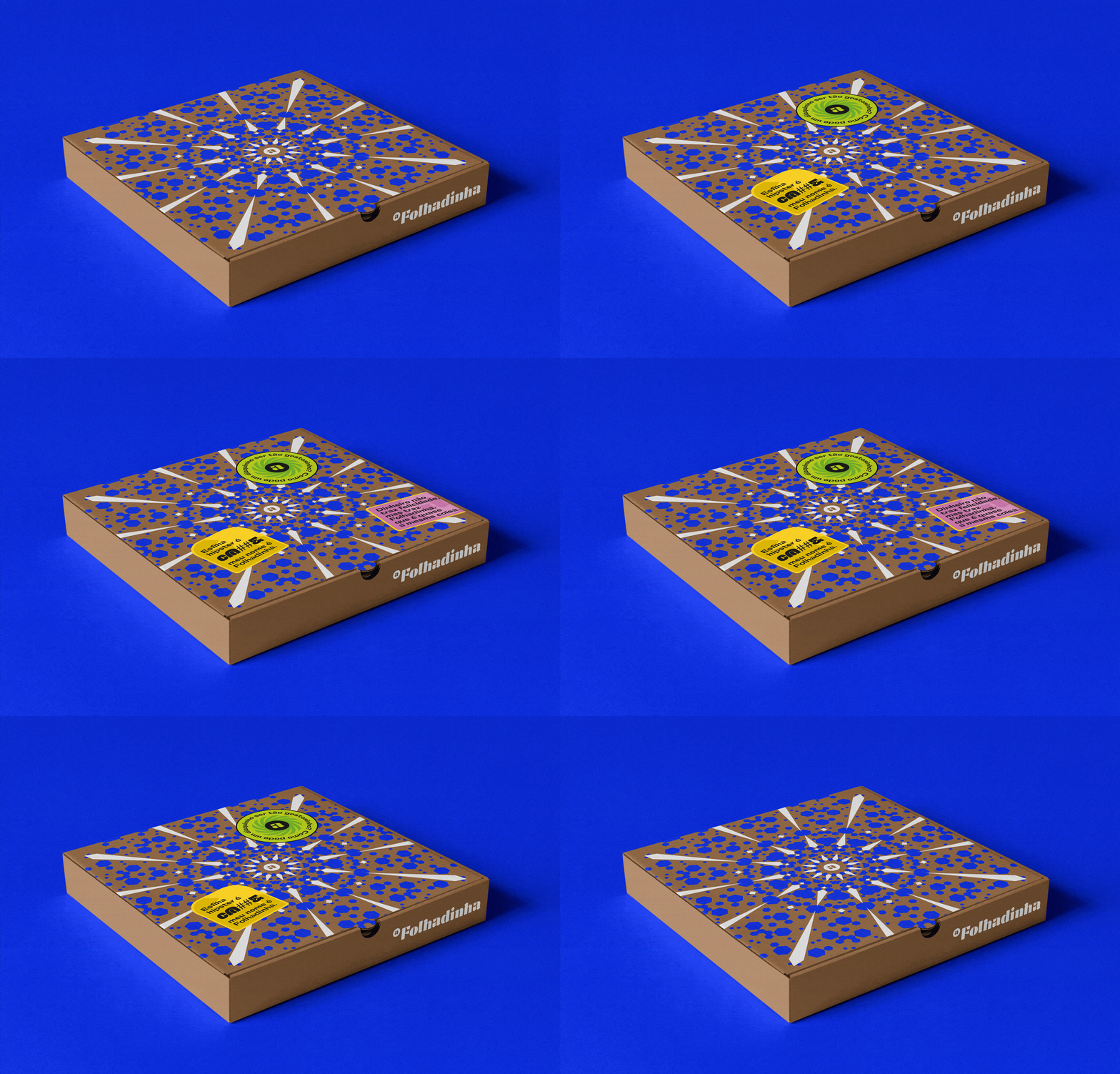
The flavor explosion concept was the main point to be reflected in all the brand material, as it was a truth about the product sold in the restaurant. To reflect this concept graphically, mandalas were created inspired by some elements present in Lebanese culture. Tapestry is visually rich and very true for Lebanon, as is ancient architecture in contrast to modern architecture. This culture shock is very important and relevant to the brand.
The typography of the logo needed to reflect Arabic writing in a modern way, making use of heavy elements contrasting with fine and precise lines. The Tocco Ultra Bold from the Papanapa studio was used with some adjustments to synthesize the whole idea intended for the brand.
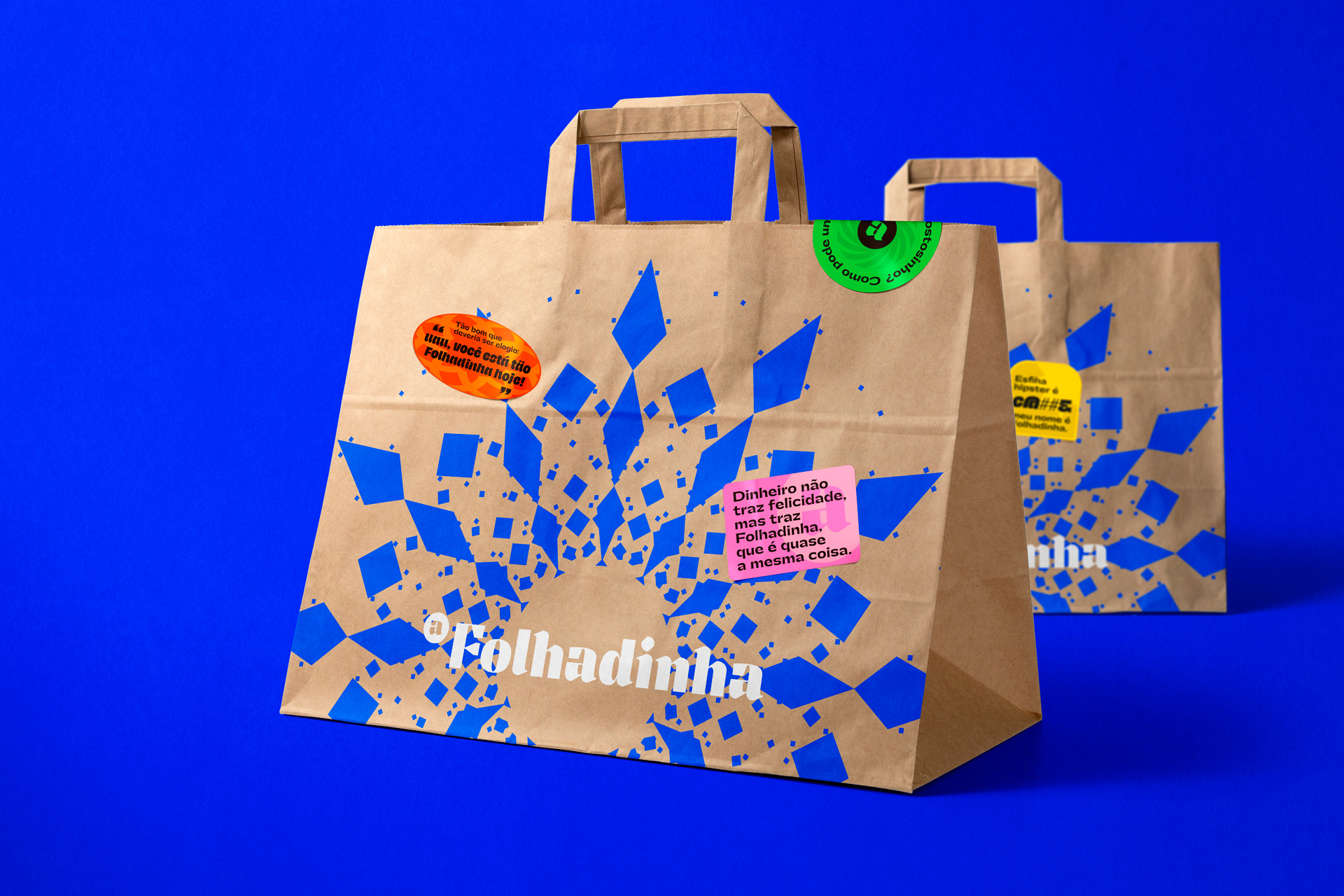
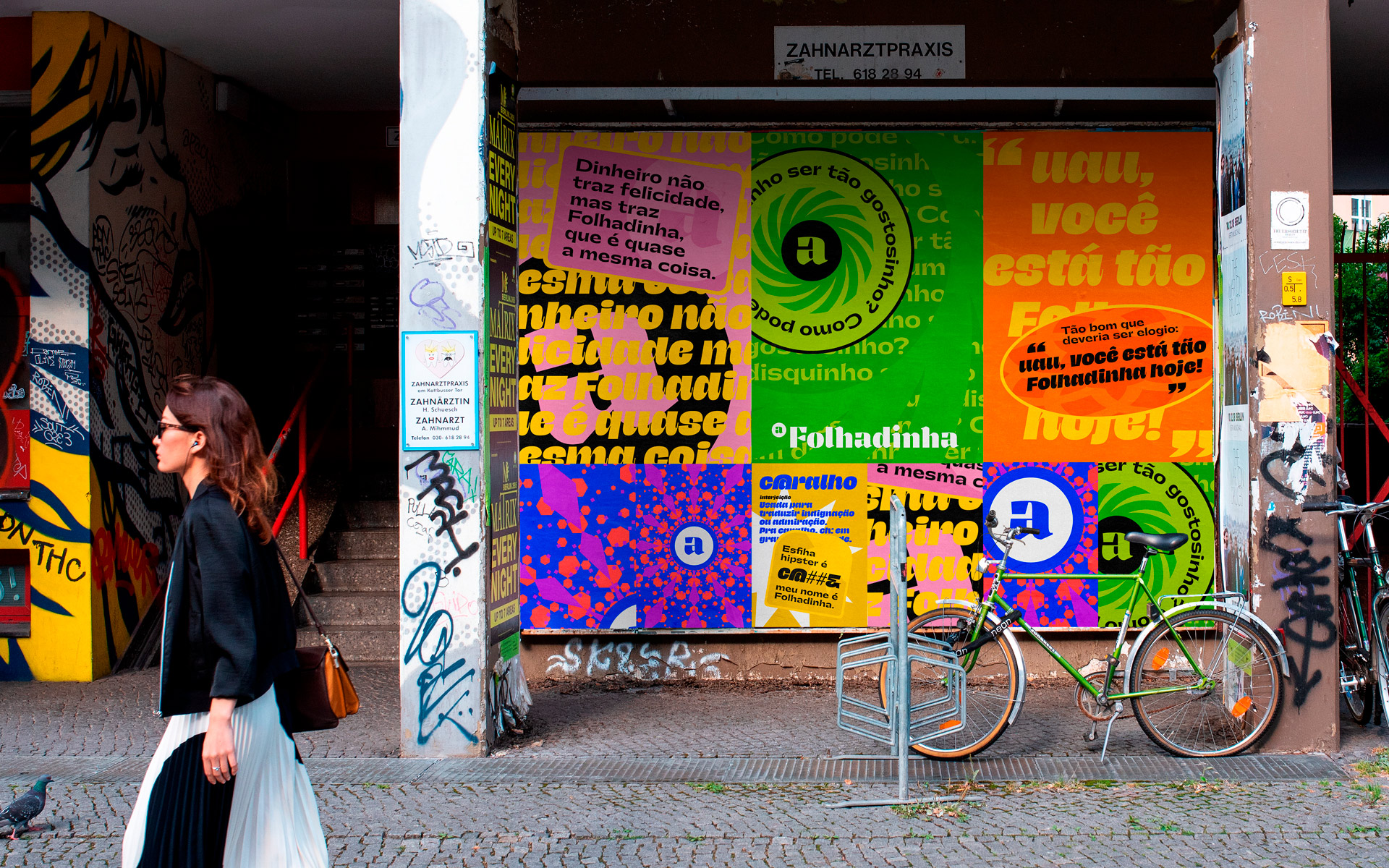
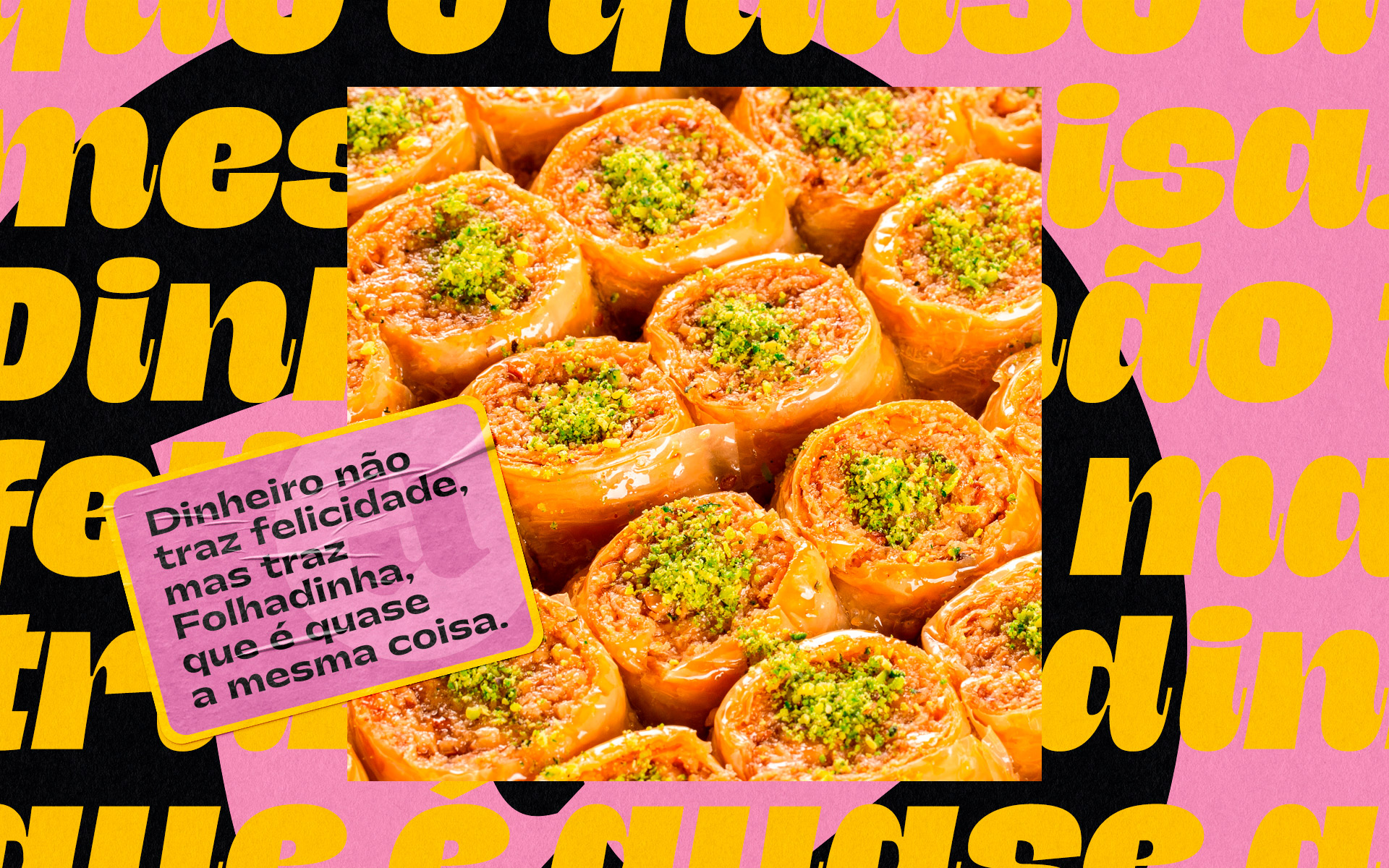
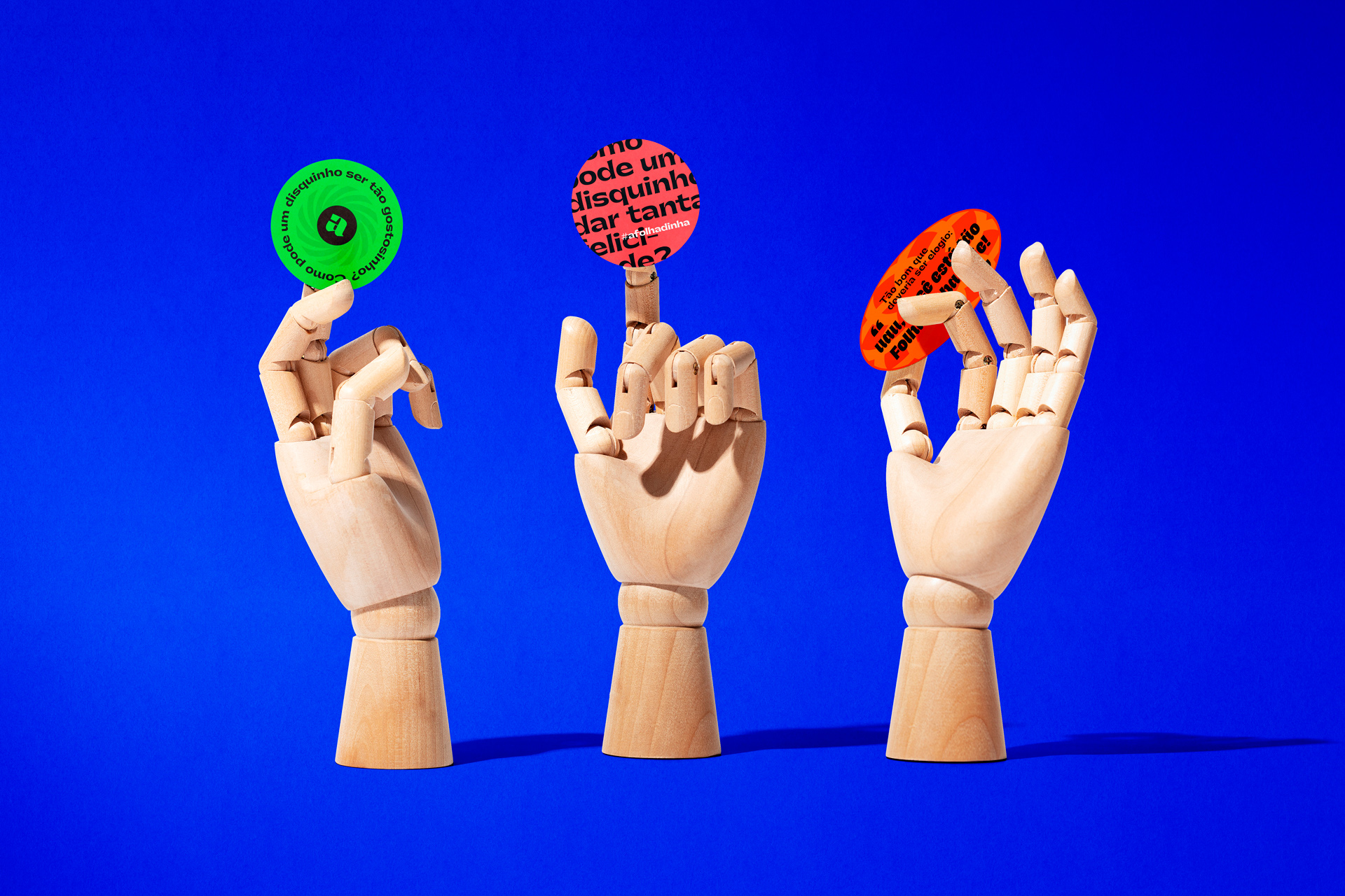
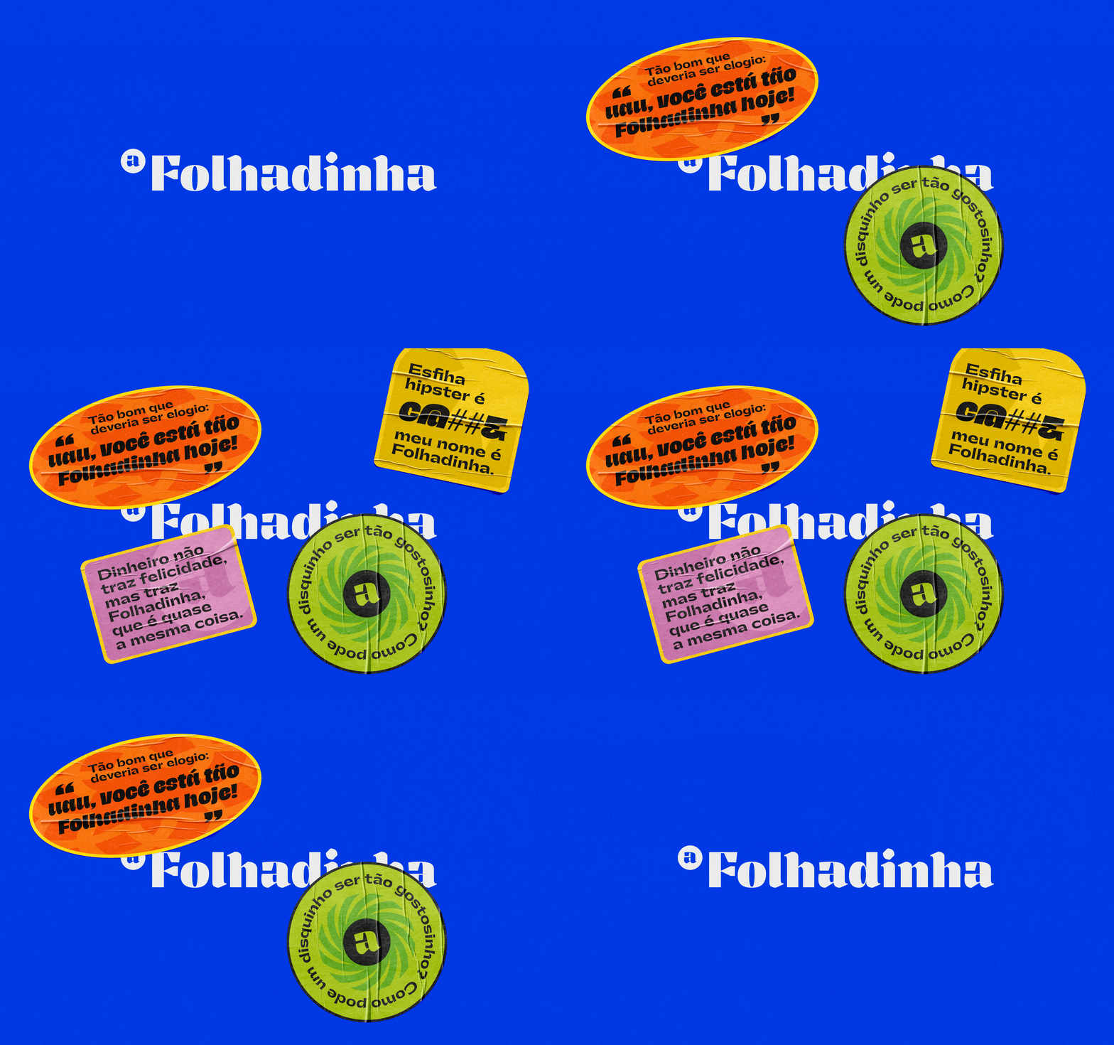
The graphic materials created for the restaurant were intended to create an impression and impact when received by the customer. For this, some striking variations were created and we explored powerful elements graphically. Along with all this, stickers were created with good-natured phrases playing as the product was tasty or for example how money does not bring happiness, but brings Folhadinha, which is almost the same thing 🙂 The stickers give even more dynamism to the graphic diversity of brand and has a fundamental role in working the company’s tone of voice for current and relaxed themes of true and proprietary.
The numerous graphic possibilities created for the brand are important to represent in a modern way and with a language that reaches its consuming public in an environment that generates social engagement on social networks.
CREDIT
- Agency/Creative: ADD Branding - André Candeloro
- Article Title: Folhadinha Arab Restaurant Packaging and Branding by Add Branding
- Organisation/Entity: Freelance, Published Commercial Design
- Project Type: Packaging
- Agency/Creative Country: Brazil
- Market Region: South America
- Project Deliverables: Brand Guidelines, Brand Identity, Graphic Design, Packaging Design, Tone of Voice
- Format: Bag, Box
- Substrate: Pulp Carton


