


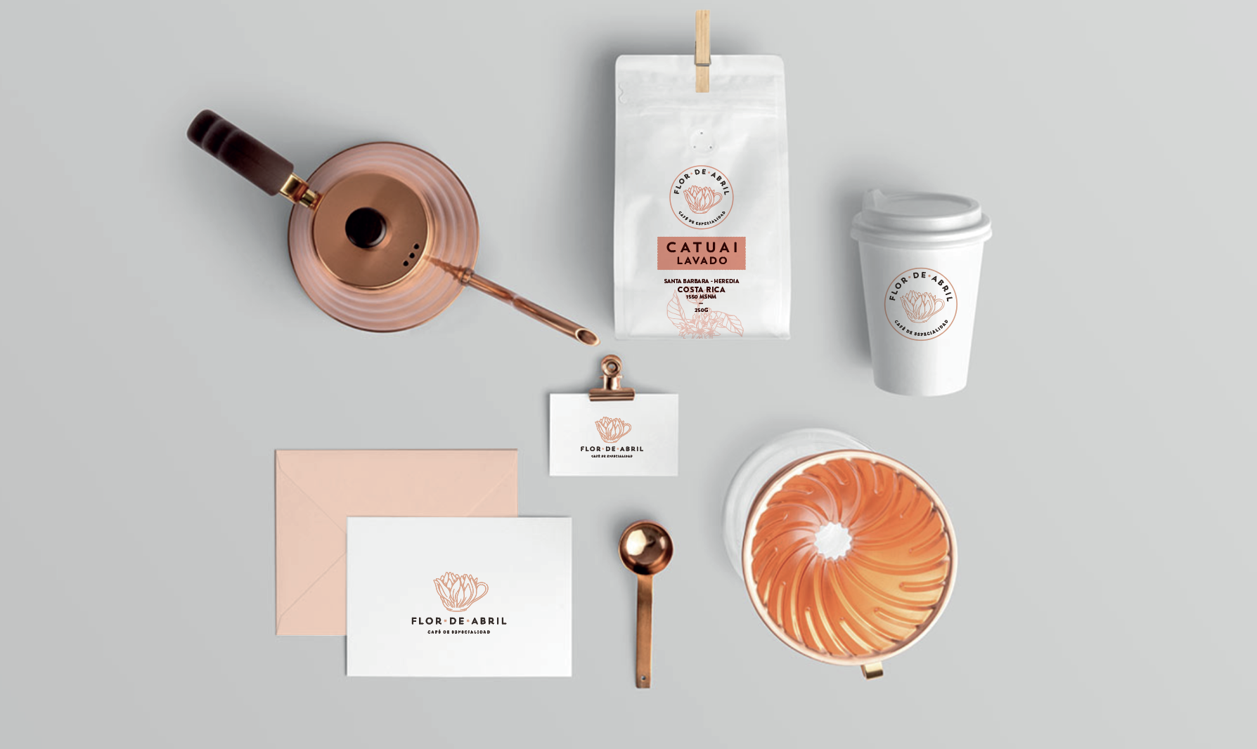
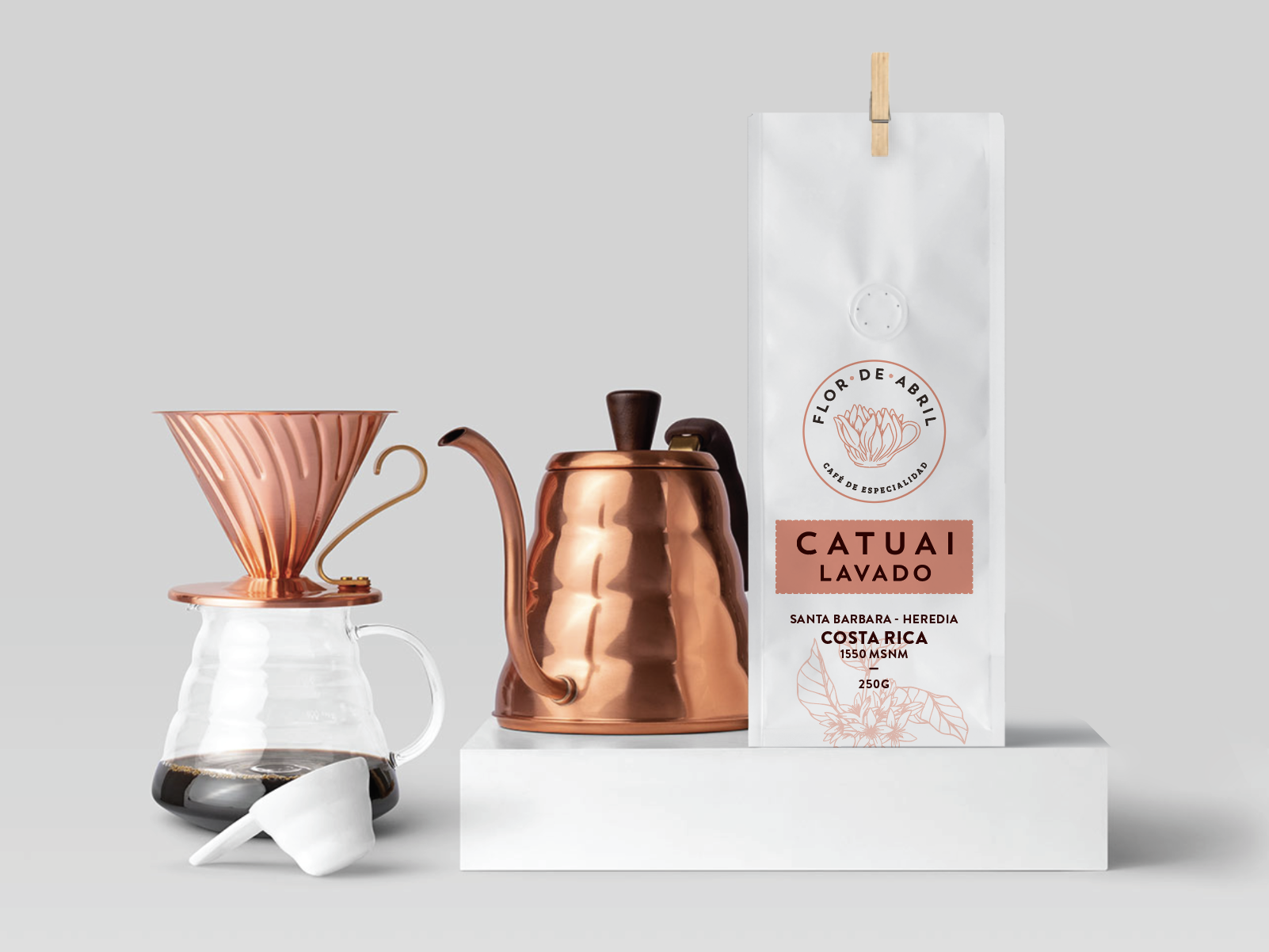
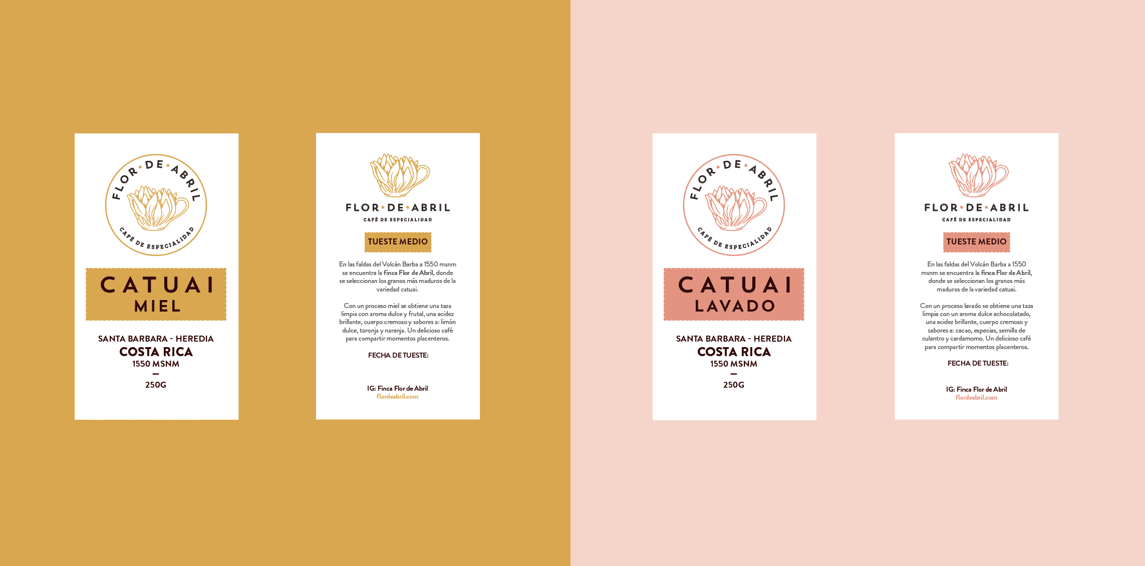
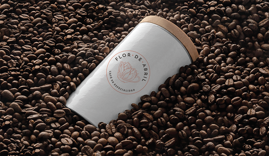
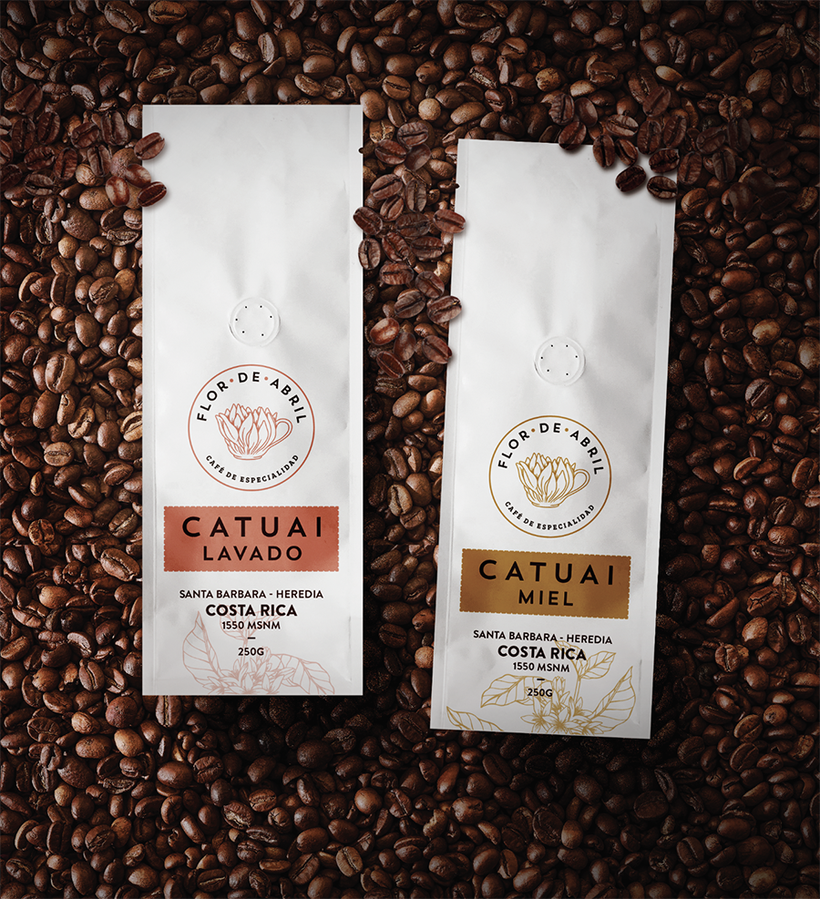
We created this project for our client “Flor de Abril”. The logo is inspired by the coffee flower. April comes from “Aperio”, which means “to open”. This month acquired this name because it is in this period of time that the plants begin to open and bloom. It stands for “freshness, vigor, freshness, youth”


CREDIT
- Agency/Creative: Gitanos Consulting
- Article Title: Flor de Abril Coffee Packaging Design
- Organisation/Entity: Agency, Published Commercial Design
- Project Type: Packaging
- Agency/Creative Country: Costa Rica
- Market Region: Global
- Project Deliverables: Brand Creation, Brand Strategy, Brand World, Branding, Graphic Design, Illustration, Packaging Design
- Format: Bag
- Substrate: Plastic
FEEDBACK
Relevance: Solution/idea in relation to brand, product or service
Implementation: Attention, detailing and finishing of final solution
Presentation: Text, visualisation and quality of the presentation


