Premium PSU, a company with more than 40 years of experience in electrical conversion solutions, power supplies and batteries for the electrical, railway transportation and high-tech equipment industry, is launching a division for the fabrication of high-capacity chargers for electrical vehicles.
With the increasing use of electric vehicles, the need for a faster and more efficient charging capacity in public spaces is growing. Floox wants to offer solutions that optimise direct current (DC) charging – faster than domestic AC charging – and to be able to offer fast chargers. This is the essence of this new company, which has asked us to help it create its new brand, its positioning and the different elements of its identity and communication, both off and online.
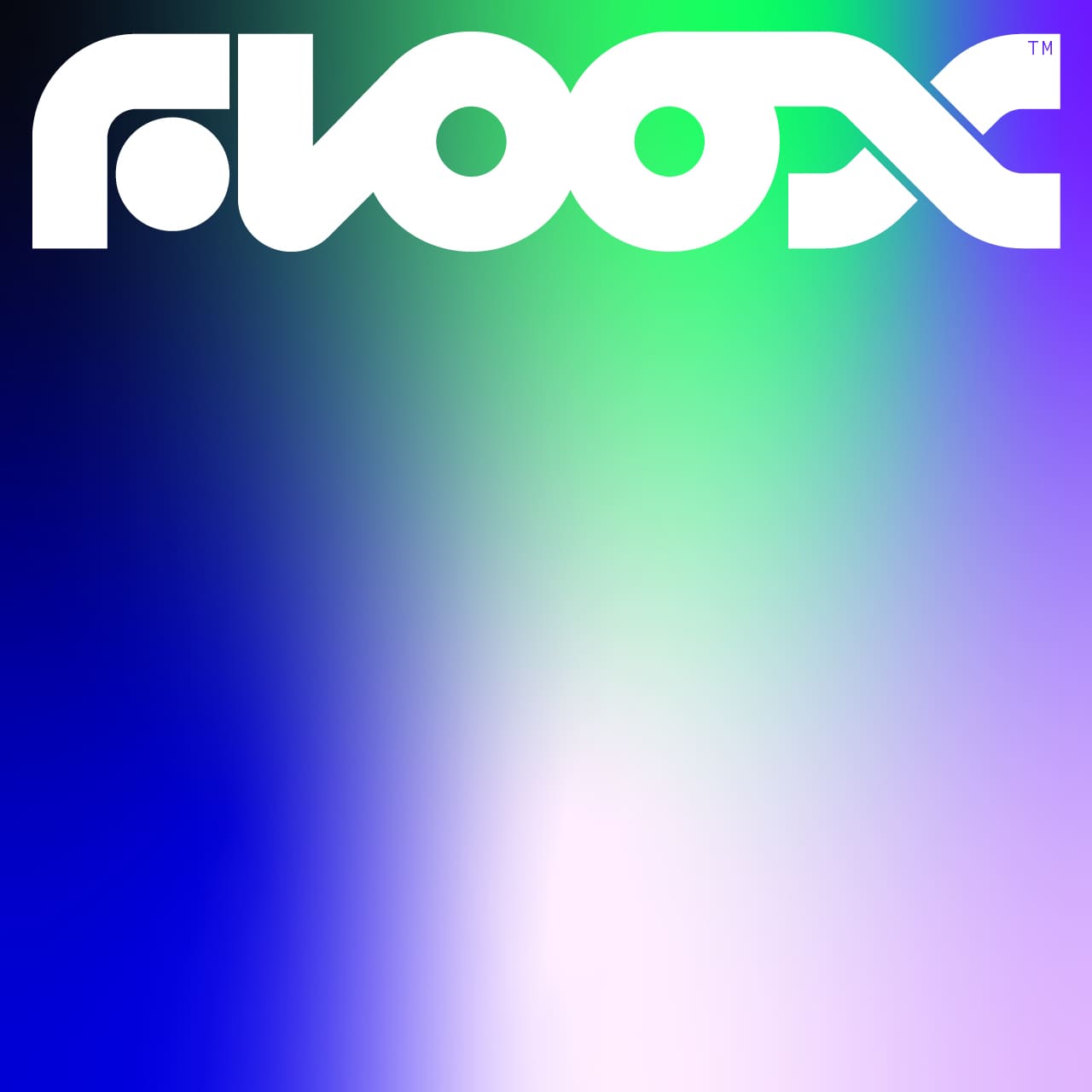
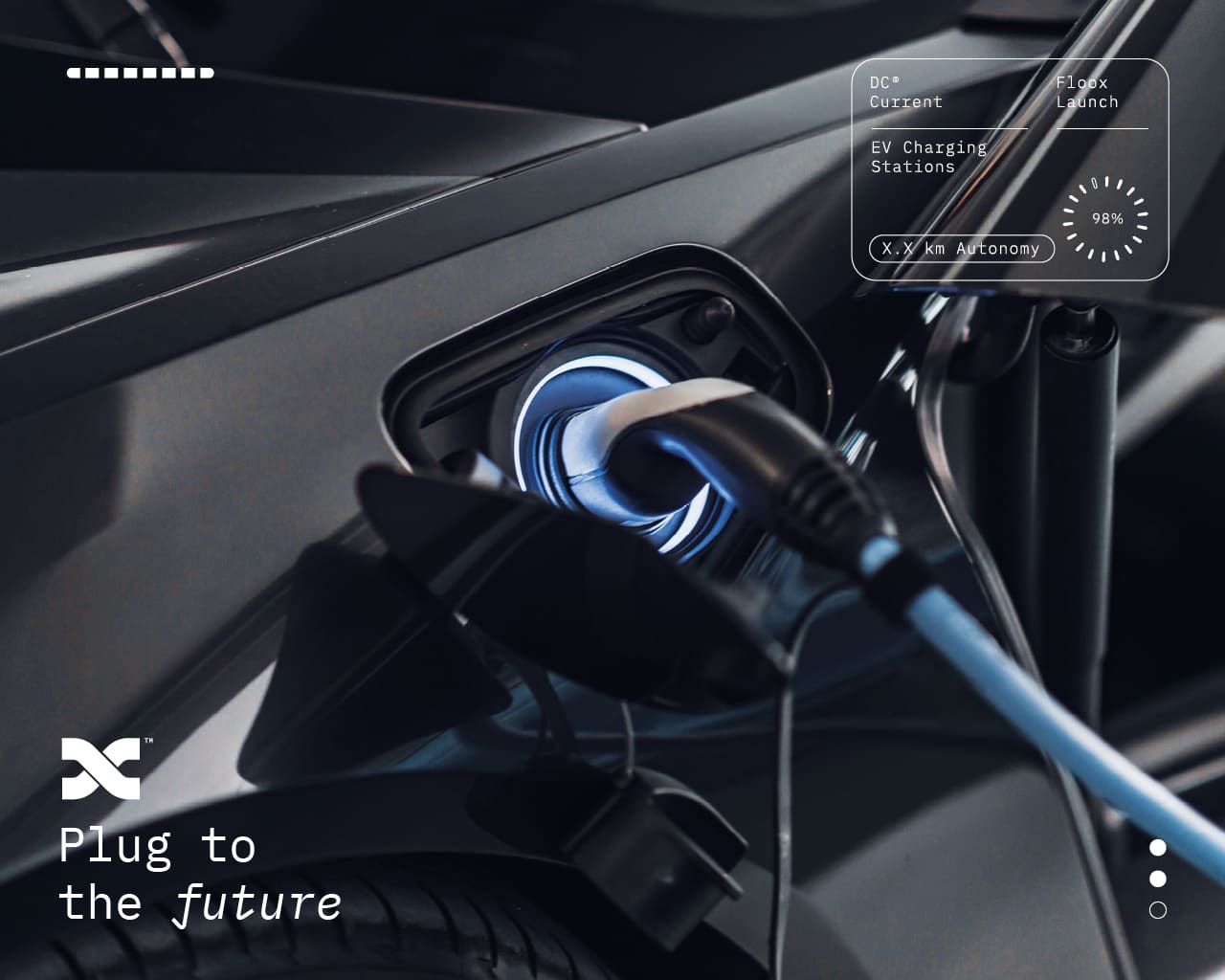
Floox, the proposed name, is an abstract word that refers to the concept of “energy flow”, more specifically focusing on the fluid that flows to provide “energy” to a vehicle. The sonority of the double “o” makes it a strong personalised brand, easily reminiscent and which we accompany with the baseline “plug to the future” with a clear link to the future of energy mobility as a clear reference and homage to the film “Back to the future”.
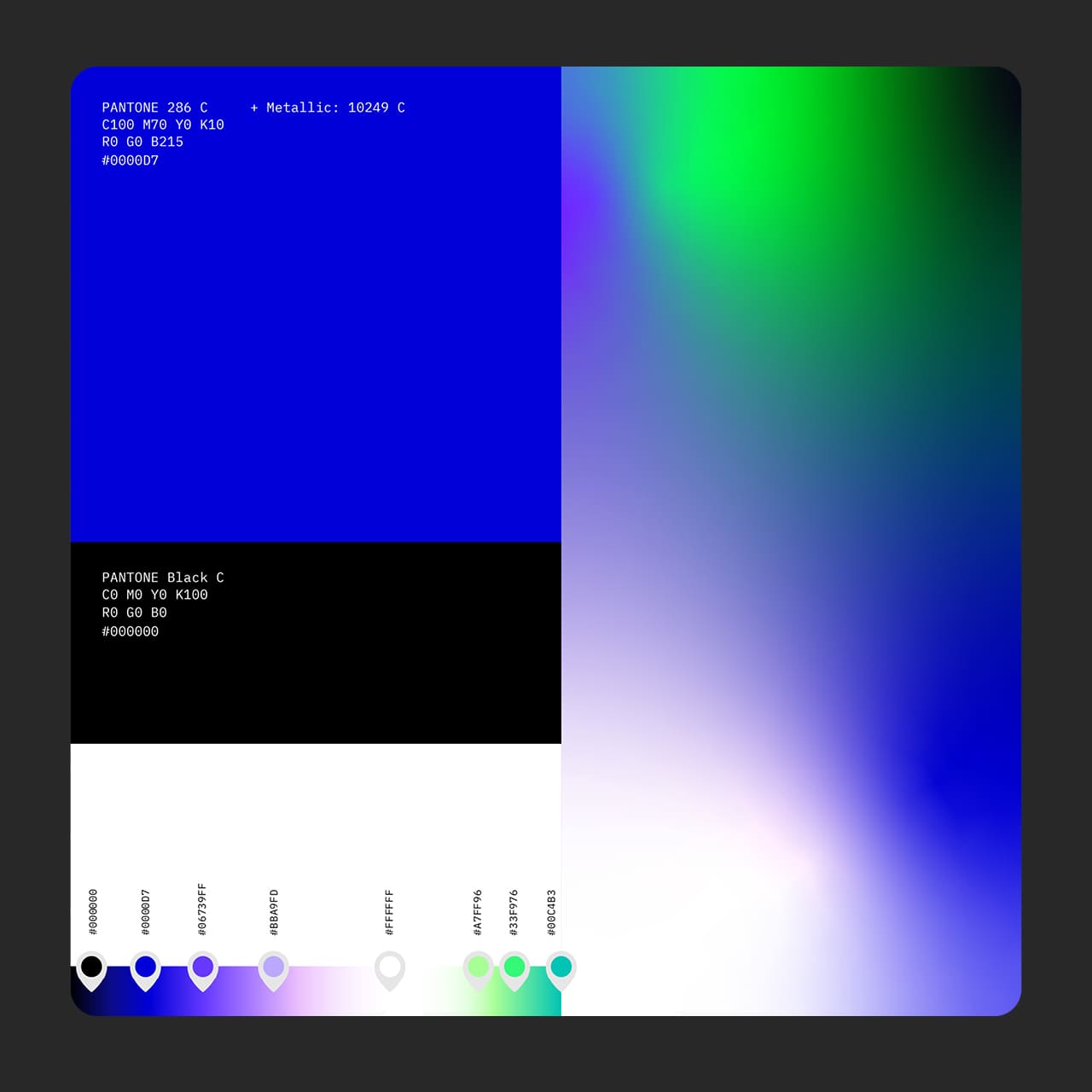
The visual imagery created links to a luminous body that transports energy and gives speed and power to the vehicles that are recharged. A sci-fi and futuristic universe, which, in addition to describing the value of the brand, allows us to build a relevant visual narrative linked to energy.
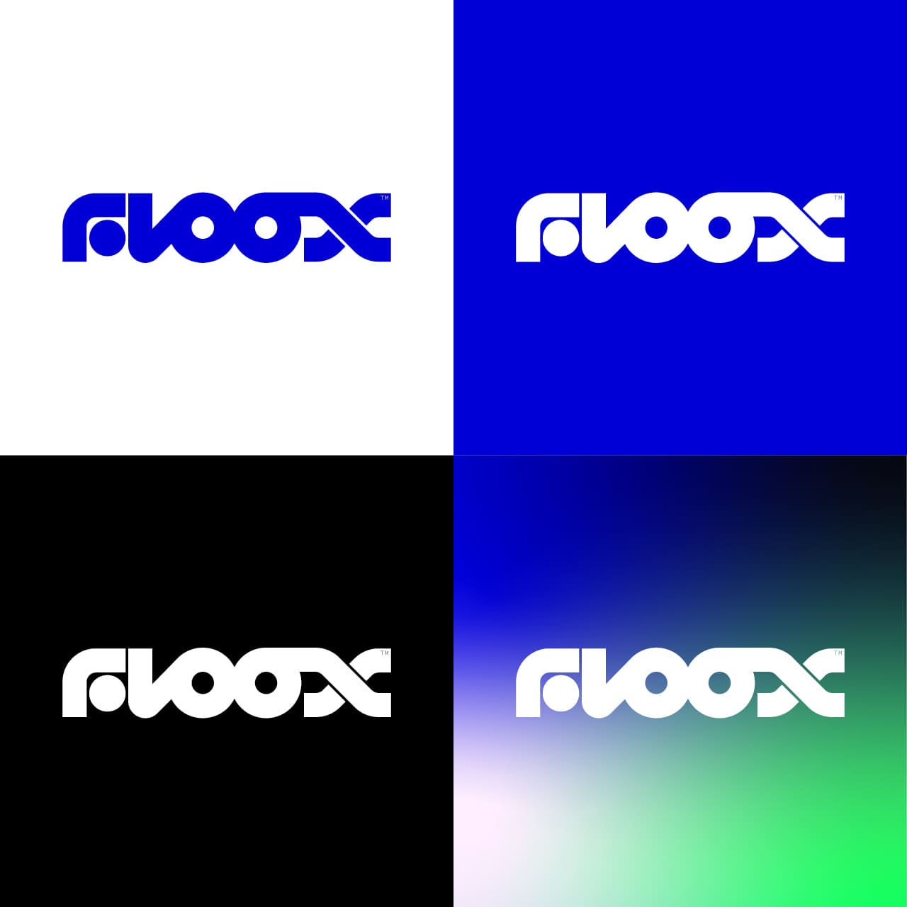
The logo is built by a lettering that unites its letters and is kept alive thanks to a flow of internal energy that in digital applications takes movement. The graphic code refers to science fiction interfaces and helps to recreate the idea of energy, movement and charge.
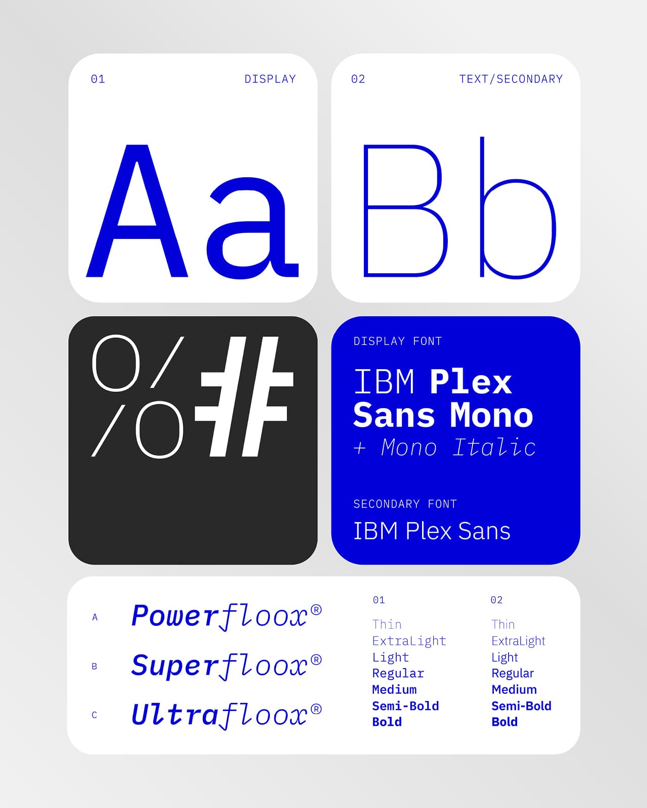
Moving in a field based on pillars such as digitalisation, innovation and transformation, we have built a language that seeks to translate the transition to a new mobility in a clear, accessible and authentic language across all media where the brand communicates.
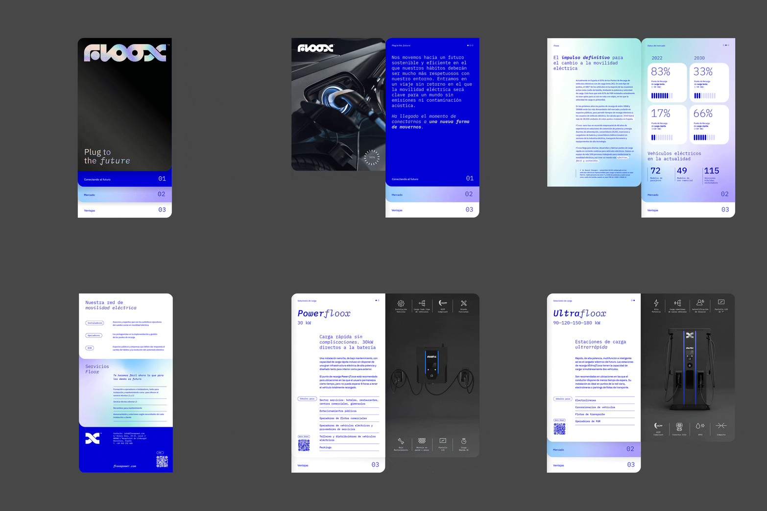
To accompany the launch of Floox, we have developed an impactful digital experience focused on discovering the details of the different types of chargers. The art direction is oriented to play with the concepts of light and darkness, with light being the conceptual representation of the brand and the element that gives life to the navigation of the contents. Other graphic materials, brochures and product sheets complement the graphic and informative environment of the new brand.

CREDIT
- Agency/Creative: Toormix
- Article Title: Floox Branding Designed by Toormix
- Organisation/Entity: Agency
- Project Type: Identity
- Project Status: Published
- Agency/Creative Country: Spain
- Agency/Creative City: Toormix
- Market Region: Europe
- Project Deliverables: Brand Creation, Brand Design, Graphic Design, Web Design
- Industry: Energy
- Keywords: chargers, electric mobility,
-
Credits:
Designer: Toormix


