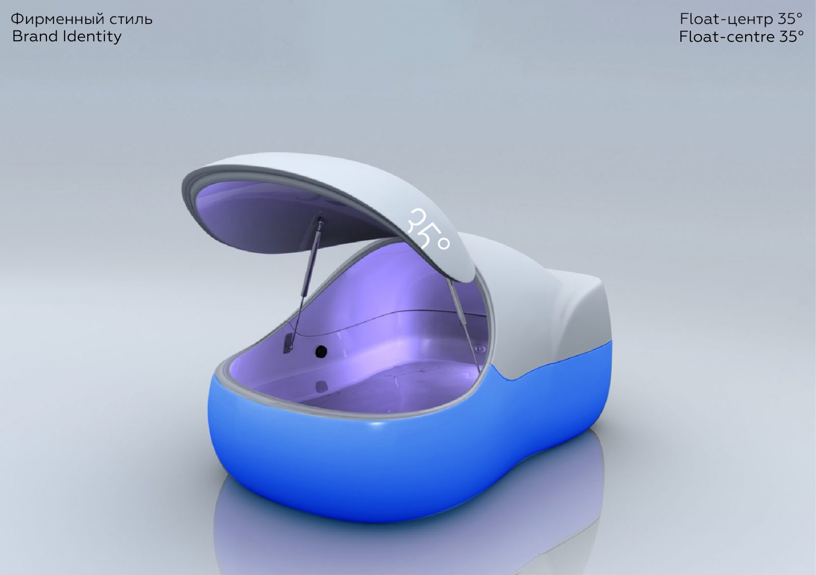
The Float-center is a place where people can relax from the hustle and bustle of the city. In such a center there are sensory deprivation chambers (capsules). In 1 hour in a sensory deprivation capsule, you can achieve the deepest relaxation as in an 8-hour sleep. This result is achieved due to sound and light-tight chambers, which are also filled with 25 cm of salty, warm water (35 ° C), so that the body can relax as much as possible while afloat.
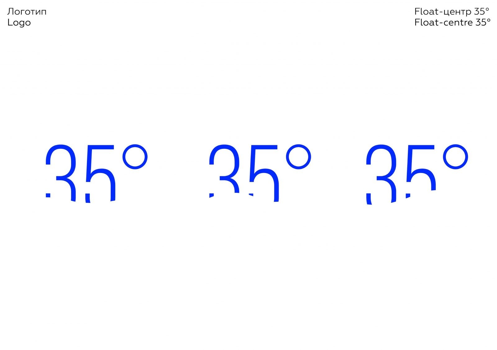
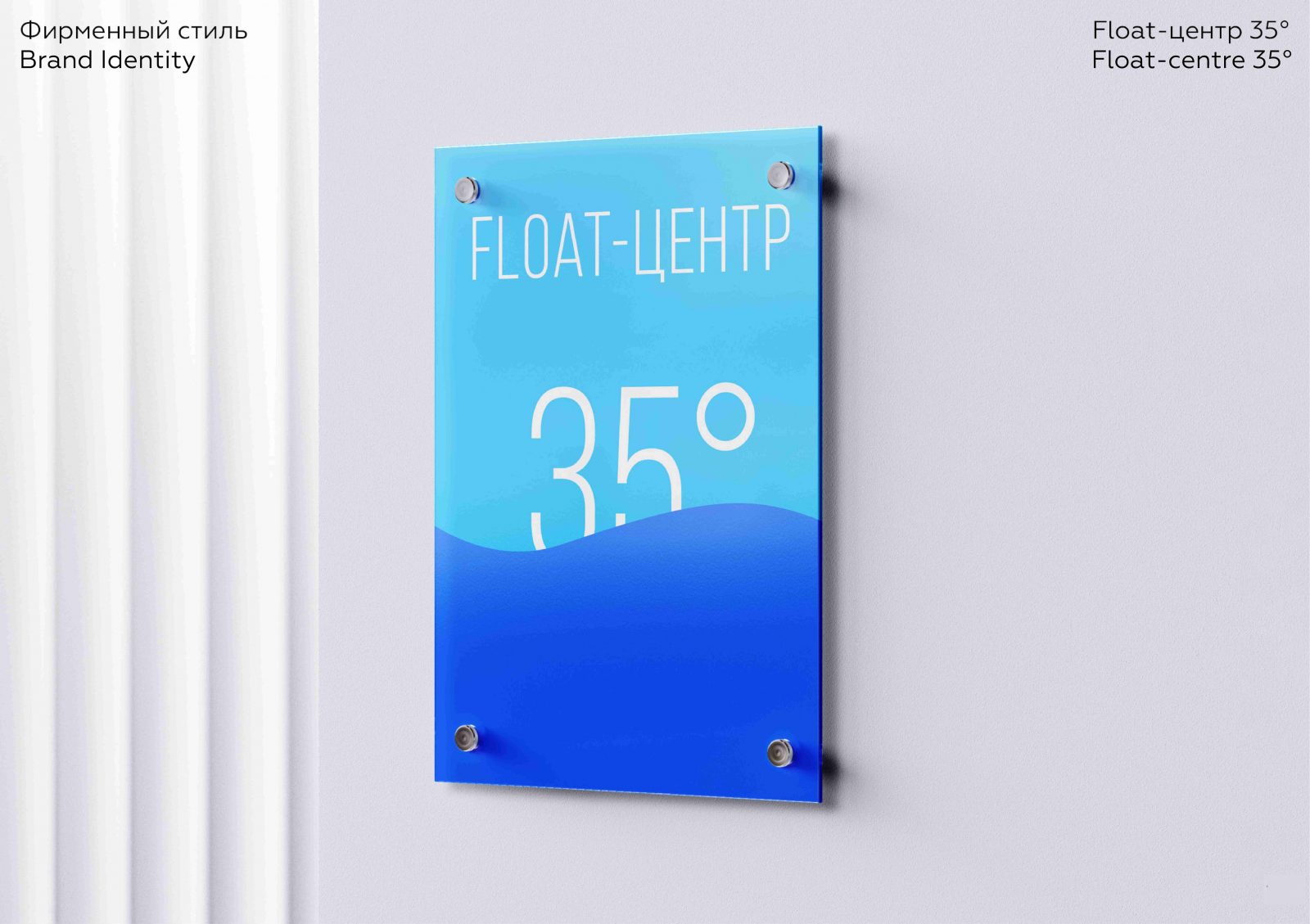
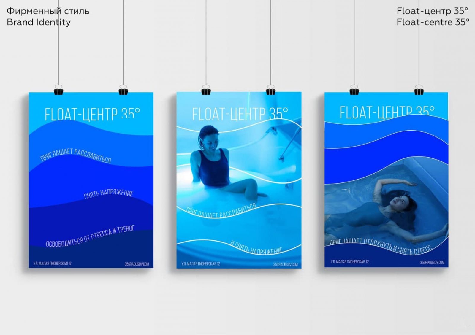
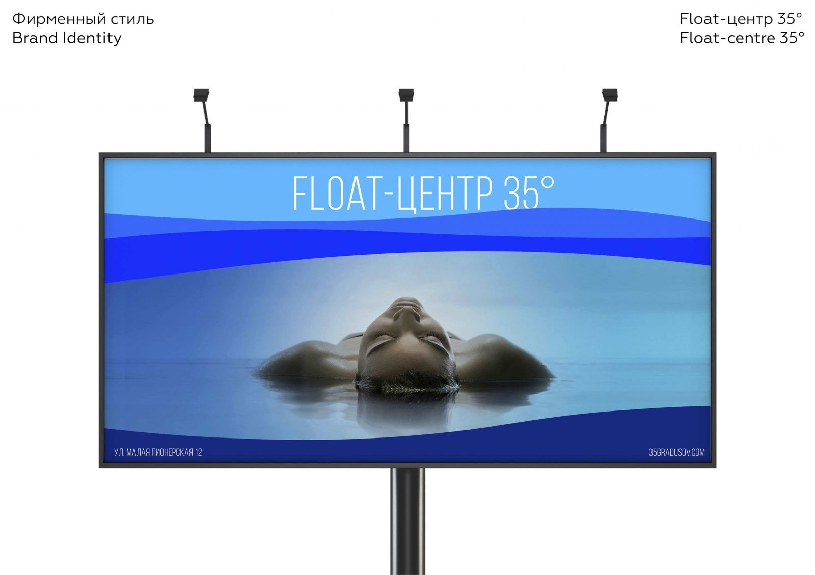
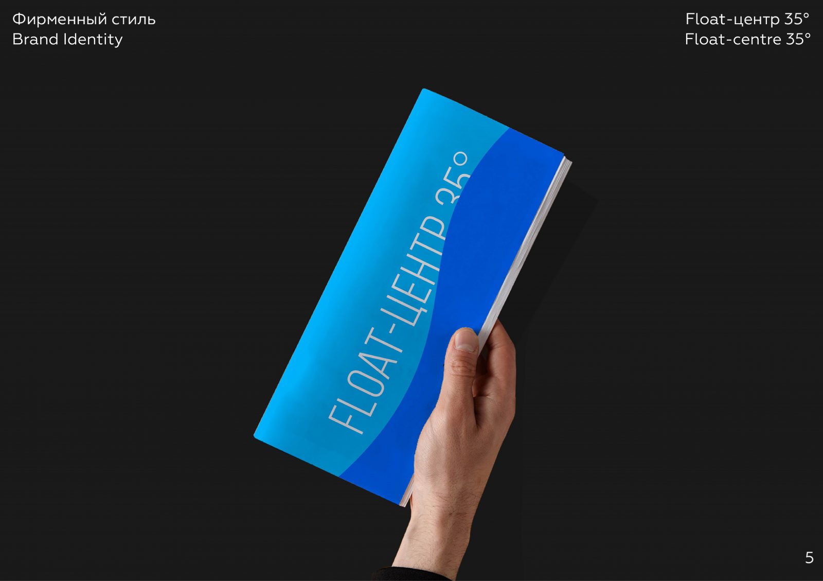
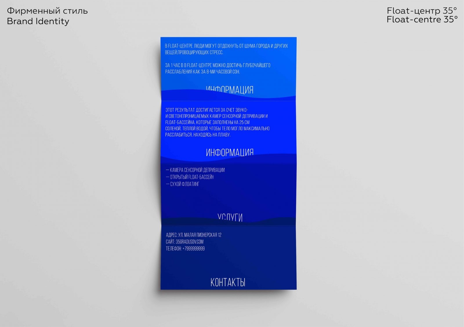
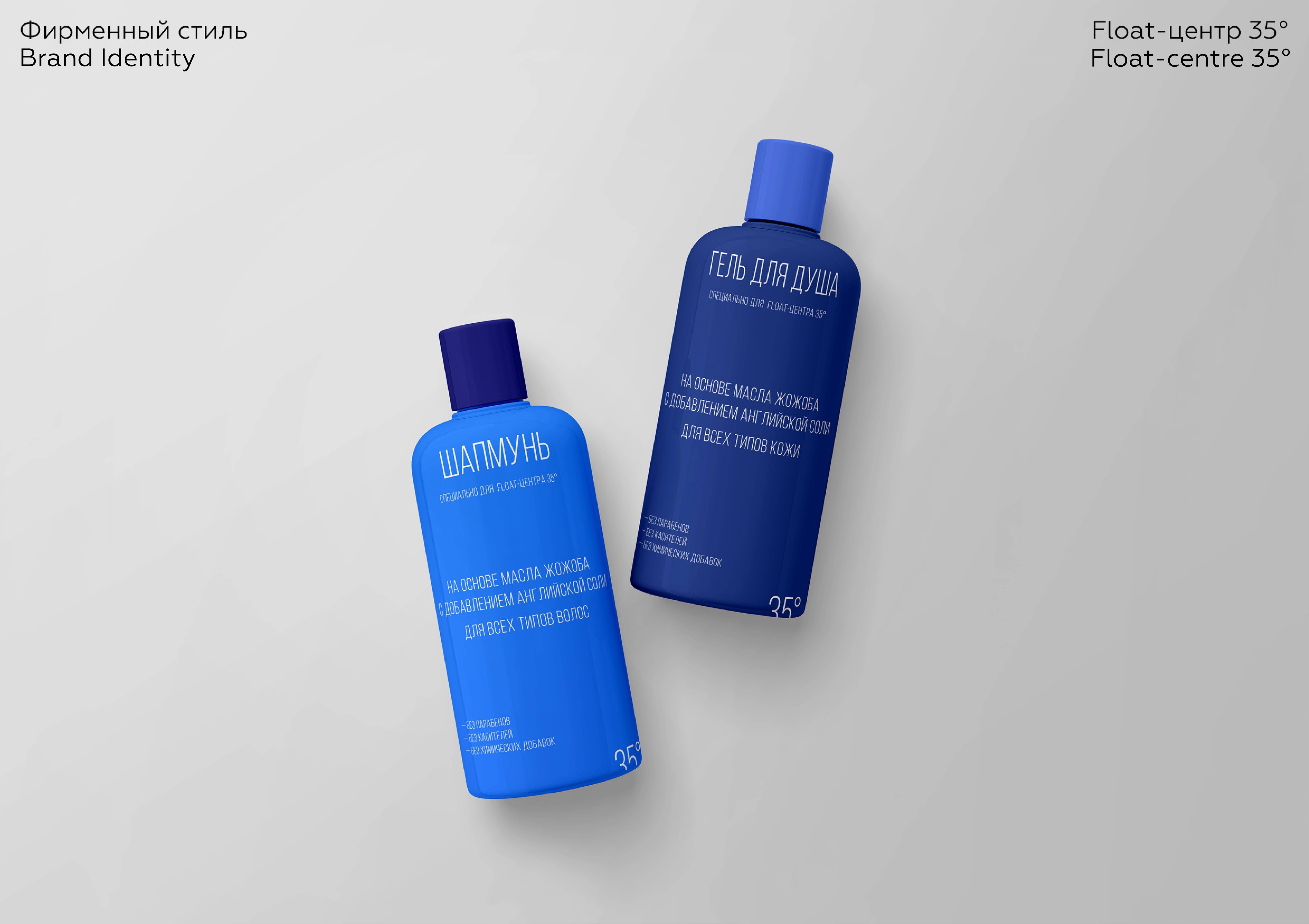
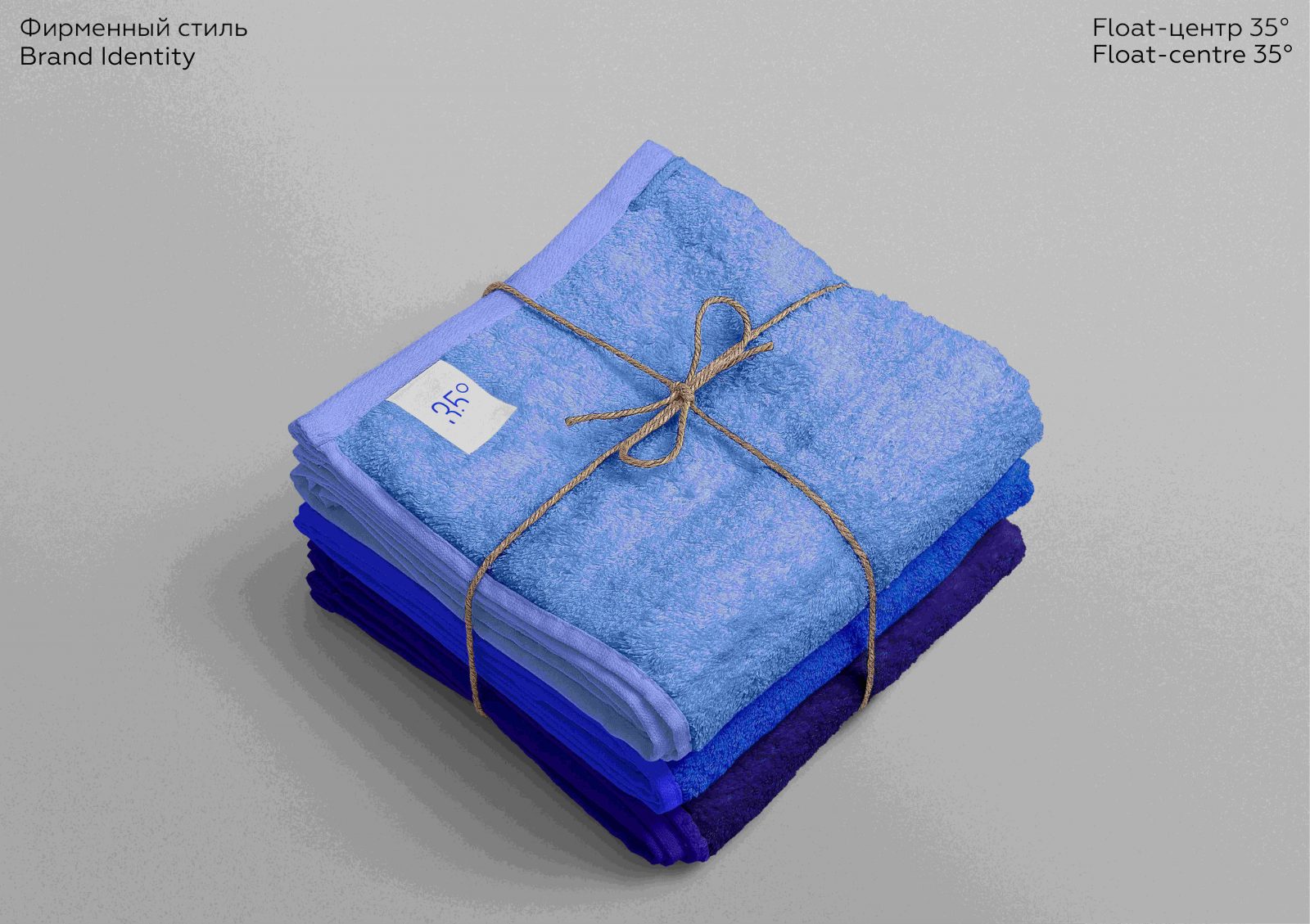
For the corporate identity, I used the metaphor of immersion not just in water, but self-immersion, because this is the only way to achieve the deepest relaxation. In the logo, I refer to the temperature of the water, and the logo itself, as well as the design with waves, is variable. The gradation of color directly symbolizes the process of immersion, because the longer you stay in the capsule, the deeper you relax. The blue color and its shades were chosen not only because it symbolises water, but also because these shades have a calming effect on a person. Typography has also found its role. She is also submerged in water. The tall font was chosen specifically so that the readability would remain.
In my opinion, the design turned out to be multifunctional. The customer can use it from the business card to the sensory deprivation chamber itself. Also, this design differs from competitors in its semantic load, as well as relevant graphics. If the design in such a niche was competent, then the popularity of sensory deprivation would increase.
CREDIT
- Agency/Creative: Jasmin Sabirova
- Article Title: Float-centre 35° Branding by Jasmin Sabirova
- Organisation/Entity: Student
- Project Type: Identity
- Project Status: Non Published
- Agency/Creative Country: Russia
- Agency/Creative City: HSE ART AND DESIGN SCHOOL
- Market Region: Europe, Global
- Project Deliverables: Graphic Design, Identity System
- Industry: Health Care
- Keywords: Relax, Water, Health, Recovery
-
Credits:
Designer: Jasmin Sabirova
Curator: Evgeny Kashirin


