


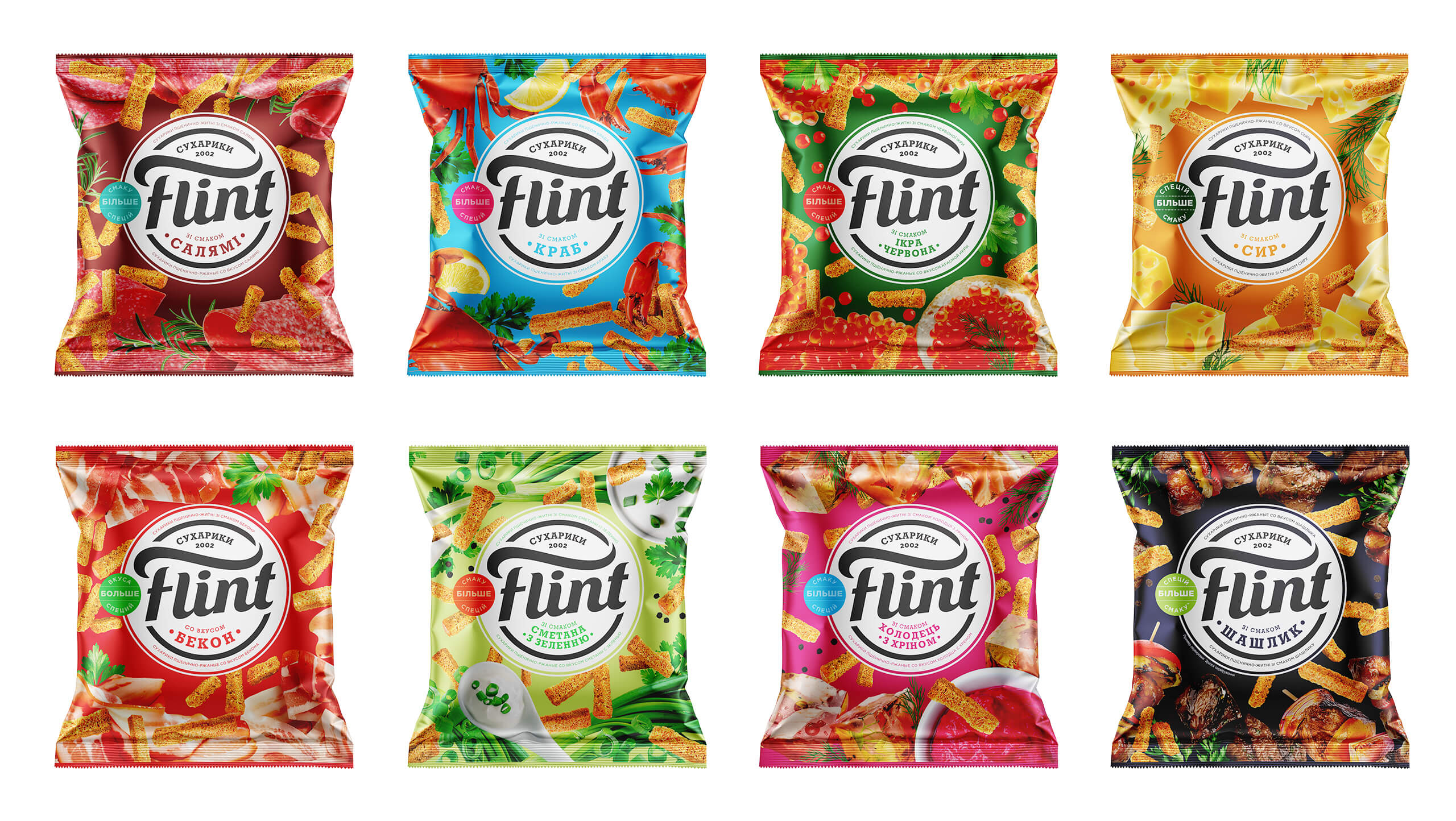
Lively pleasures are not just about colors. They’re about tastes, in this case. Our agency took pleasure in re-branding Flint.
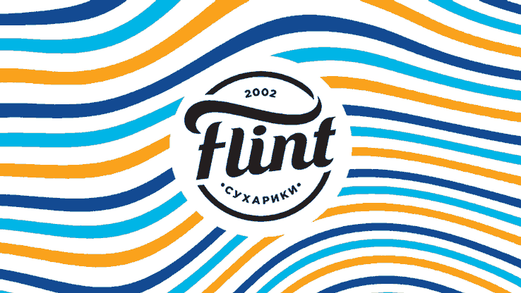
Catch the wave, buzz, and catch the crackers too! New corporate identity embodies the essence of the brand. Treat life easily, dodge problems and immerse yourself in pleasure. Bright, but calm waves – a lighthouse for living in Flint style.
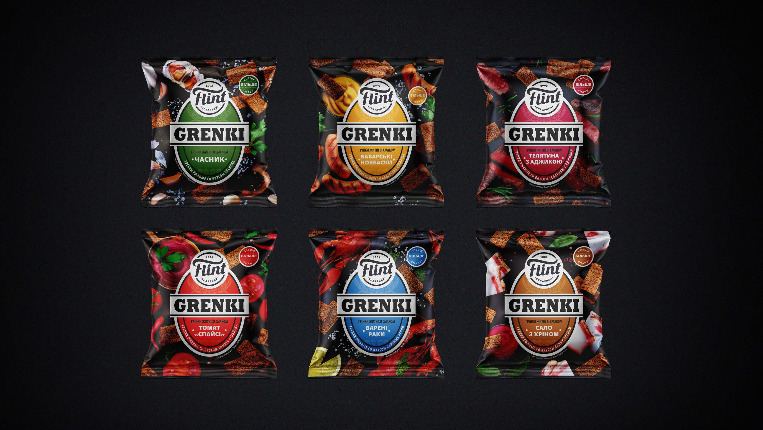
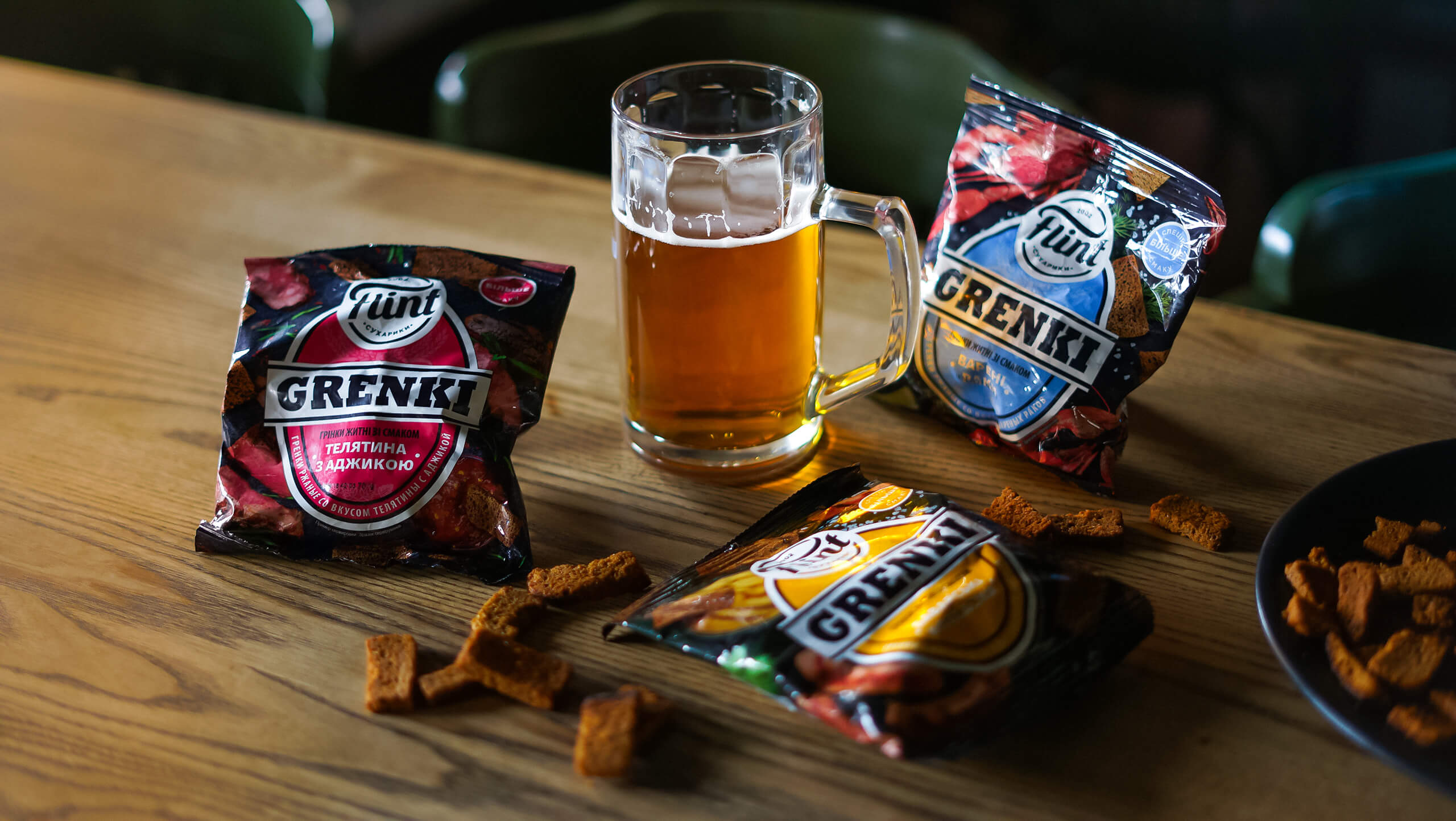
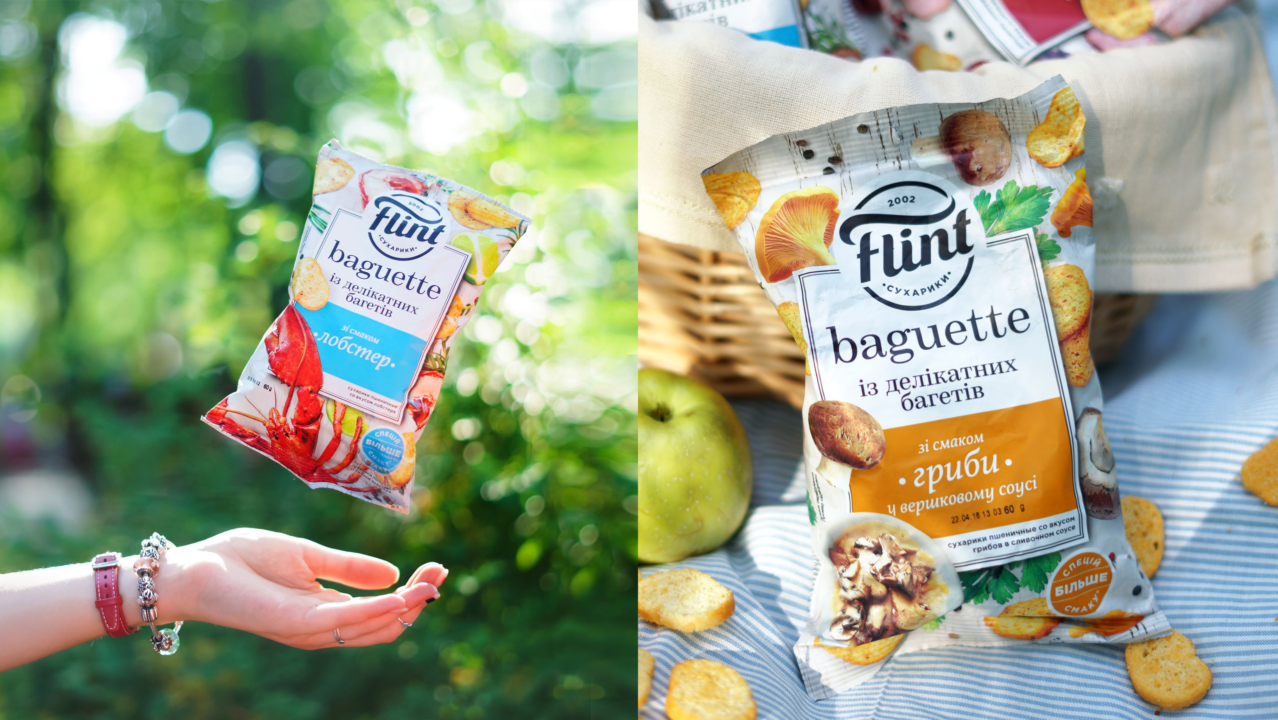
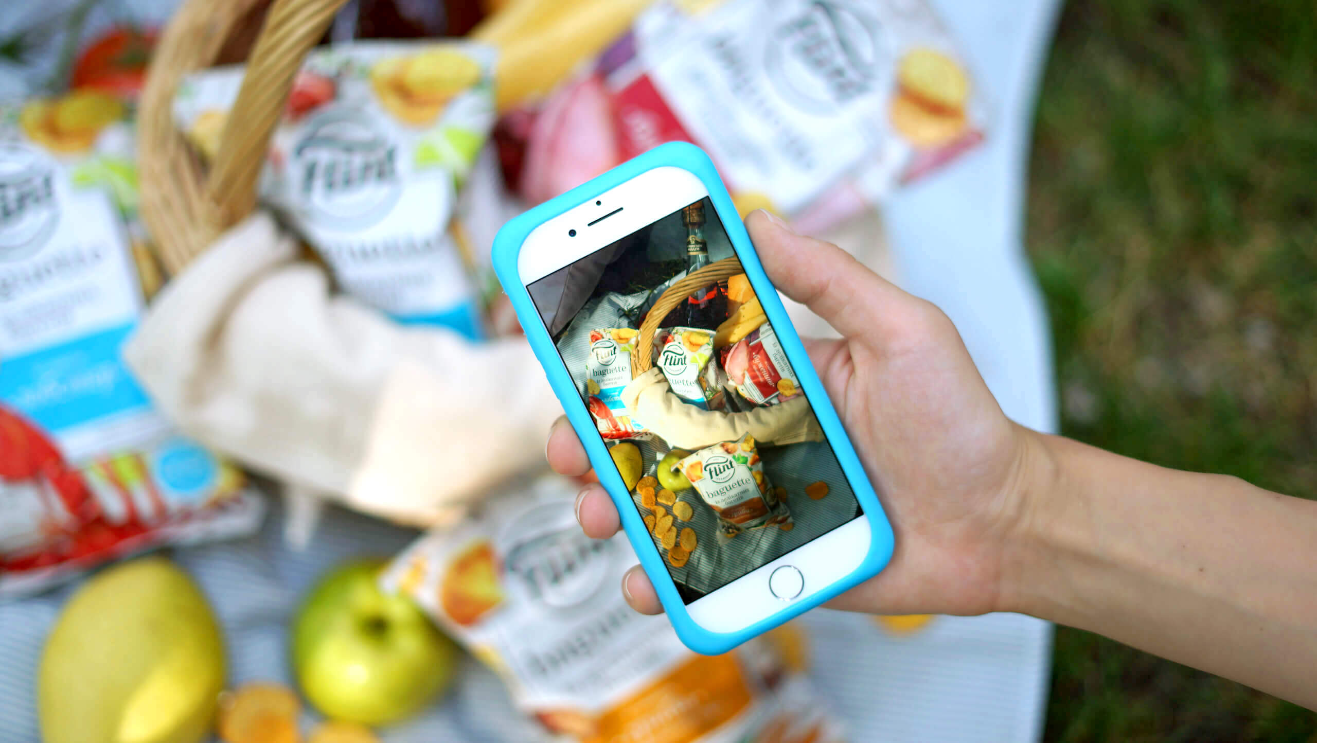
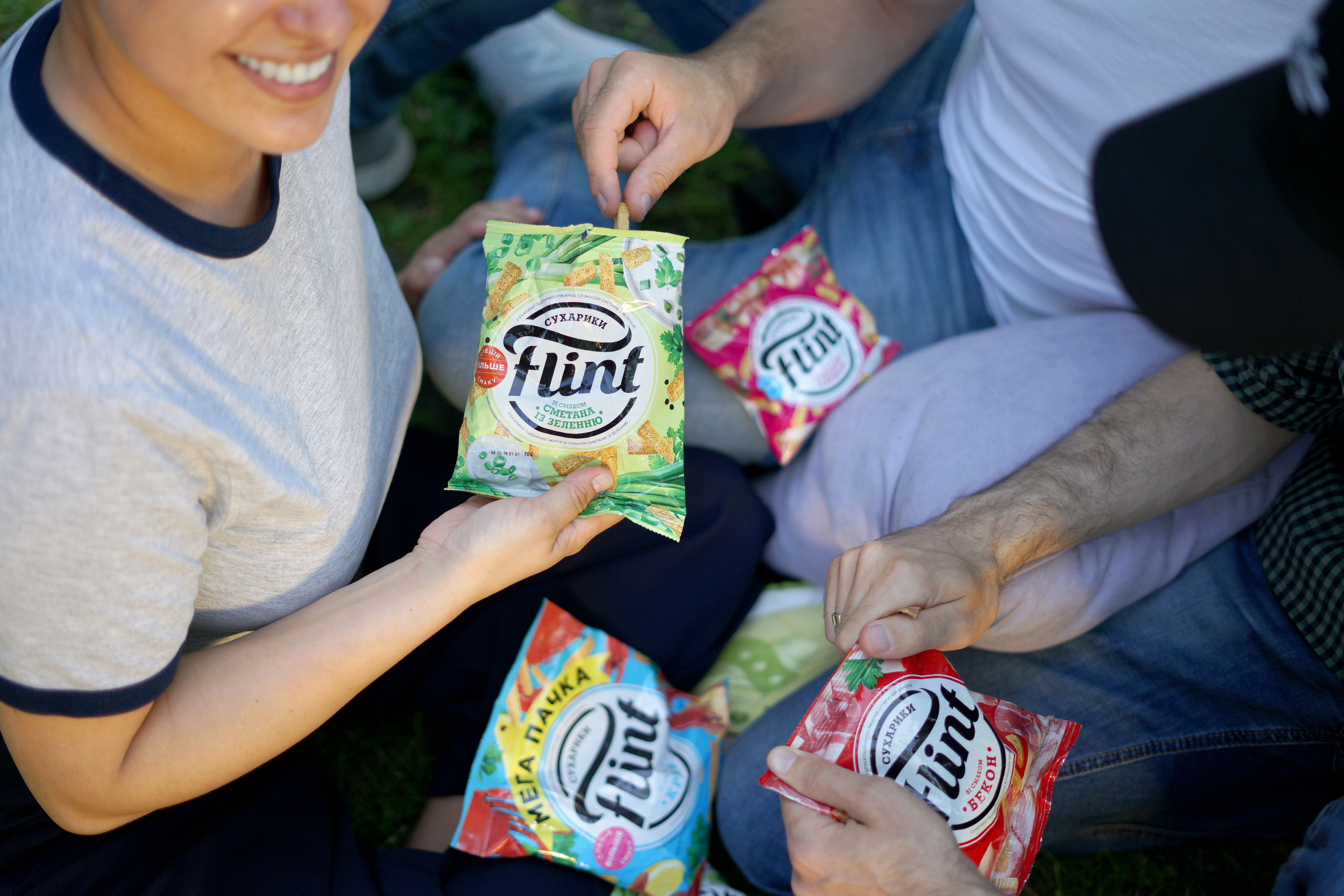
The mish-mash of colors on the supermarket’s snack stacked shelves is, of all places, the worst. To stand out against such sloppiness is quite a challenge. We had to find a visual identifier. We drew up a vibrant logo block to strike the eye amid the brightly-colored products. We suggested a free and dynamic food composition to represent the brand essentials. We plunged the croutons into the beer aesthetics and wrapped the baguettes with exquisite hedonism.
CREDIT
- Agency/Creative: Dozen Agency
- Article Title: Rebranding for Flint Snacks, Just Crunch It!
- Organisation/Entity: Agency, Published Commercial Design
- Project Type: Packaging
- Agency/Creative Country: Ukraine
- Market Region: Europe
- Project Deliverables: Brand Strategy, Graphic Design, Illustration, Packaging Design, Photography, Rebranding, Research, Tone of Voice
- Format: Flow-Pack
- Substrate: Plastic


