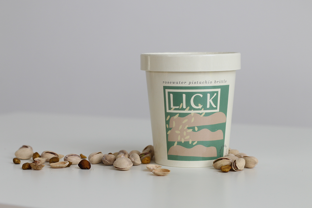
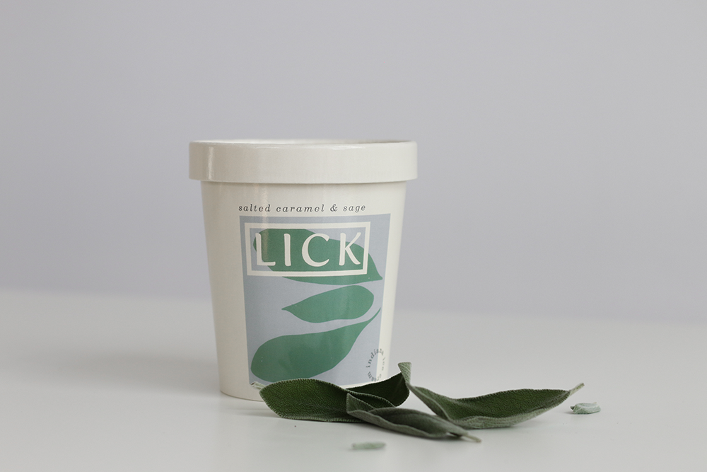
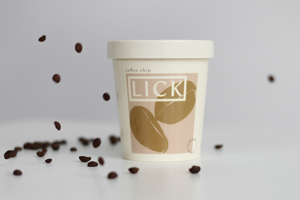
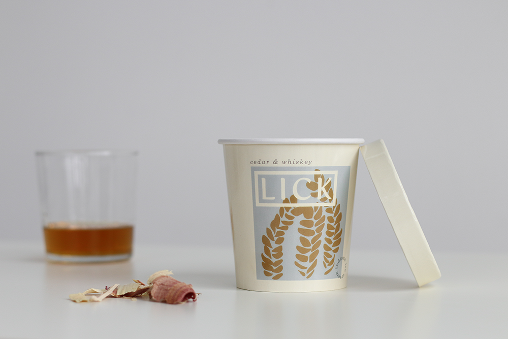
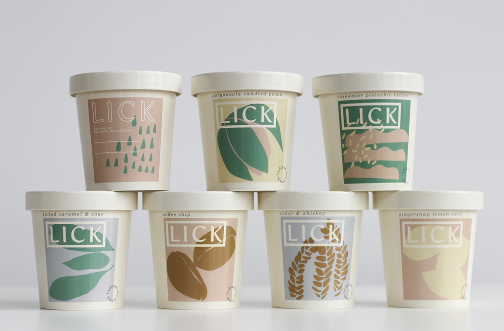
Lick is contemporary, playful and refined. They provide the fine folks of Indiana with unique experiences through thoughtful sourcing and an artful approach to their frozen goods. Lick is a modern take on a classic. Their unique combinations of quality ingredients and dutiful care result in an ice cream that warms the heart. We were fortunate to be a part of the rebranding of this 10 year old staple of Indiana Ice Cream. We worked closely with Lick to develop a new identity, packaging and a new flagship location coming in 2020
CREDIT
- Agency/Creative: Flatland Kitchen
- Article Title: Flatland Kitchen Rebrand and Packaging Update for LICK Ice Cream
- Organisation/Entity: Agency, Published Commercial Design
- Project Type: Packaging
- Agency/Creative Country: United States
- Market Region: North America
- Project Deliverables: Brand Creation, Brand Guidelines, Brand Identity, Brand Redesign, Brand Refinement, Brand Strategy, Branding, Graphic Design, Identity System, Illustration, Packaging Design, Rebranding, Retail Brand Design, Tone of Voice
- Format: Cup
- Substrate: Pulp Paper
FEEDBACK
Relevance: Solution/idea in relation to brand, product or service
Implementation: Attention, detailing and finishing of final solution
Presentation: Text, visualisation and quality of the presentation


