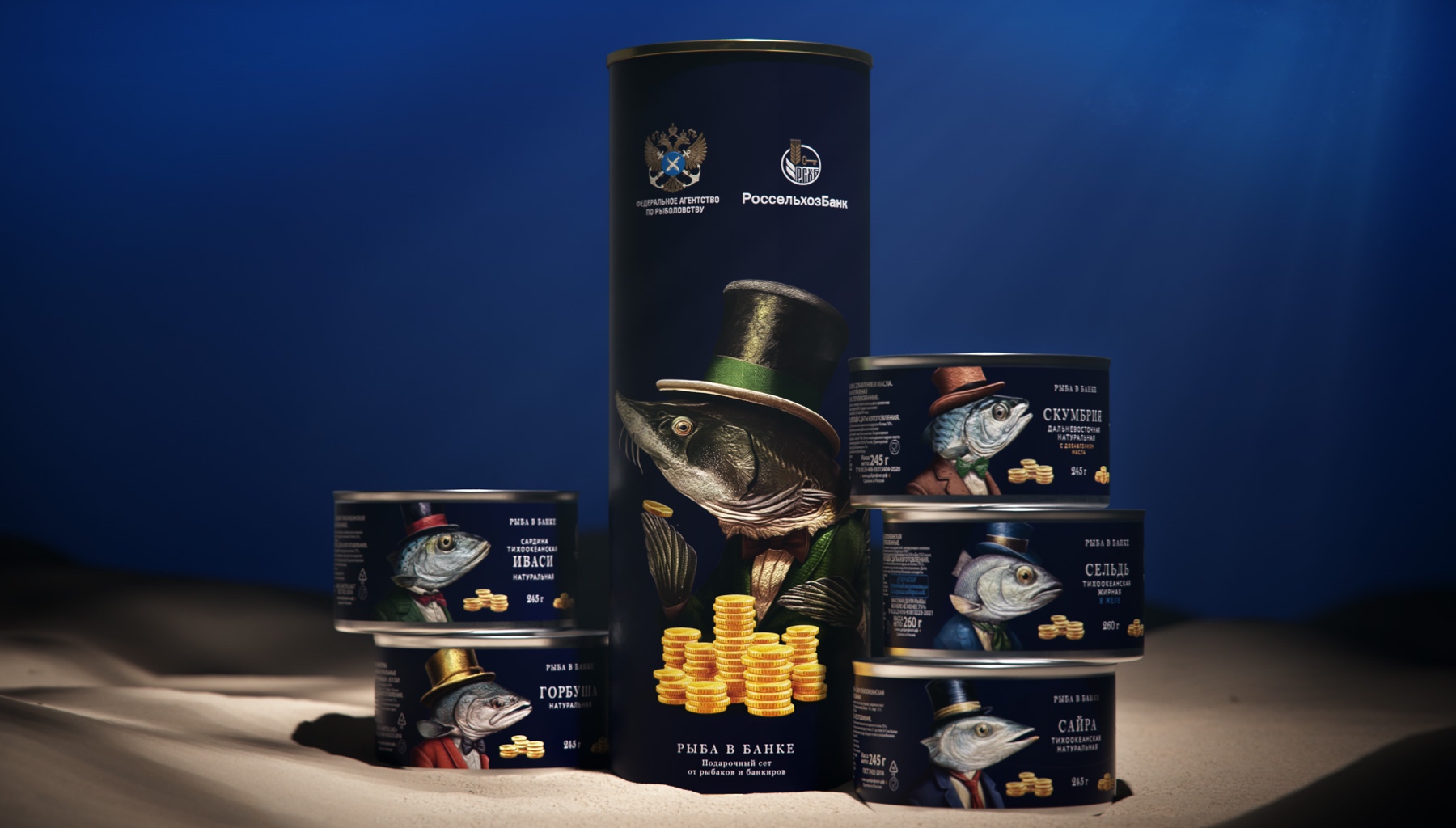
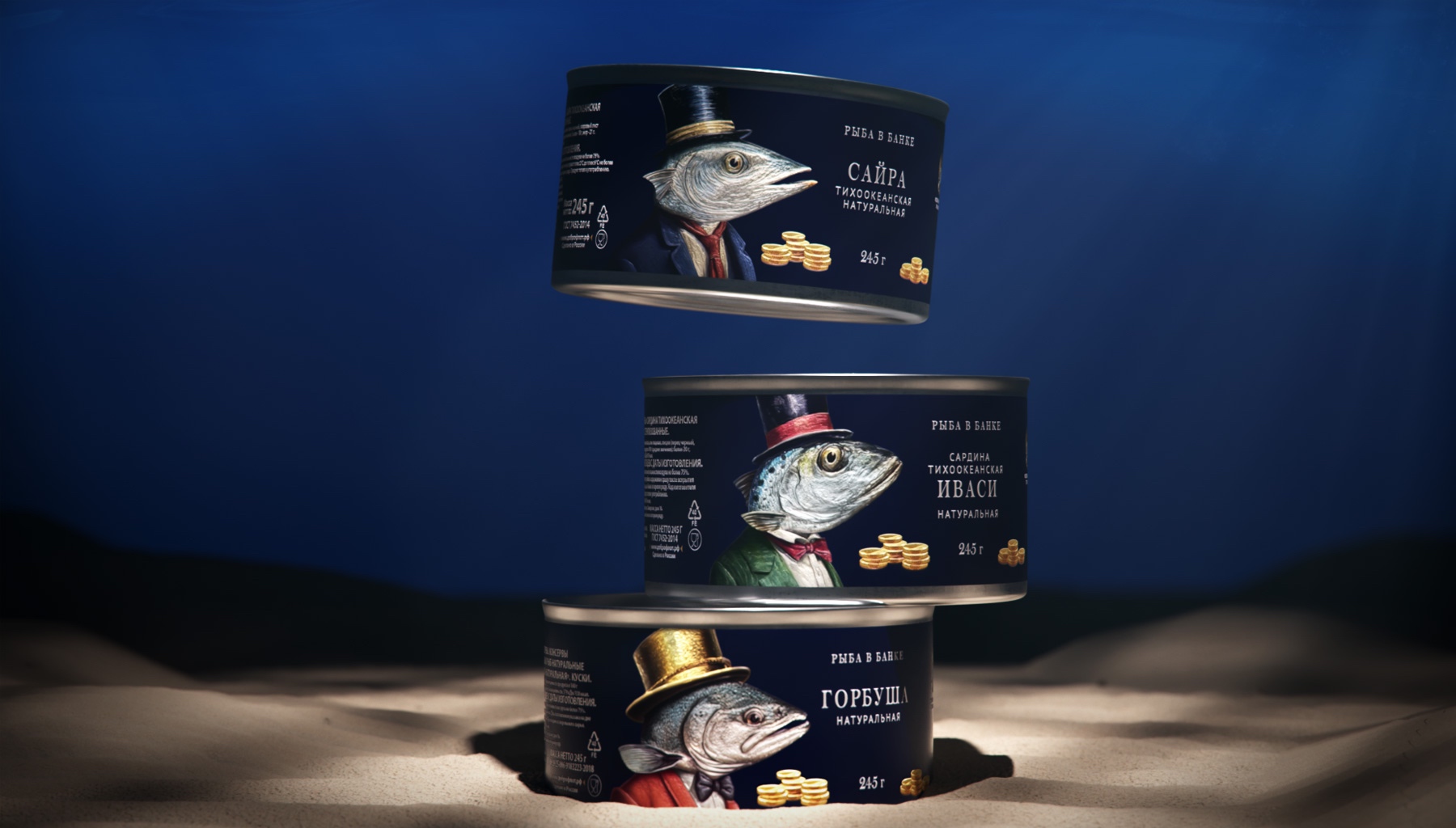
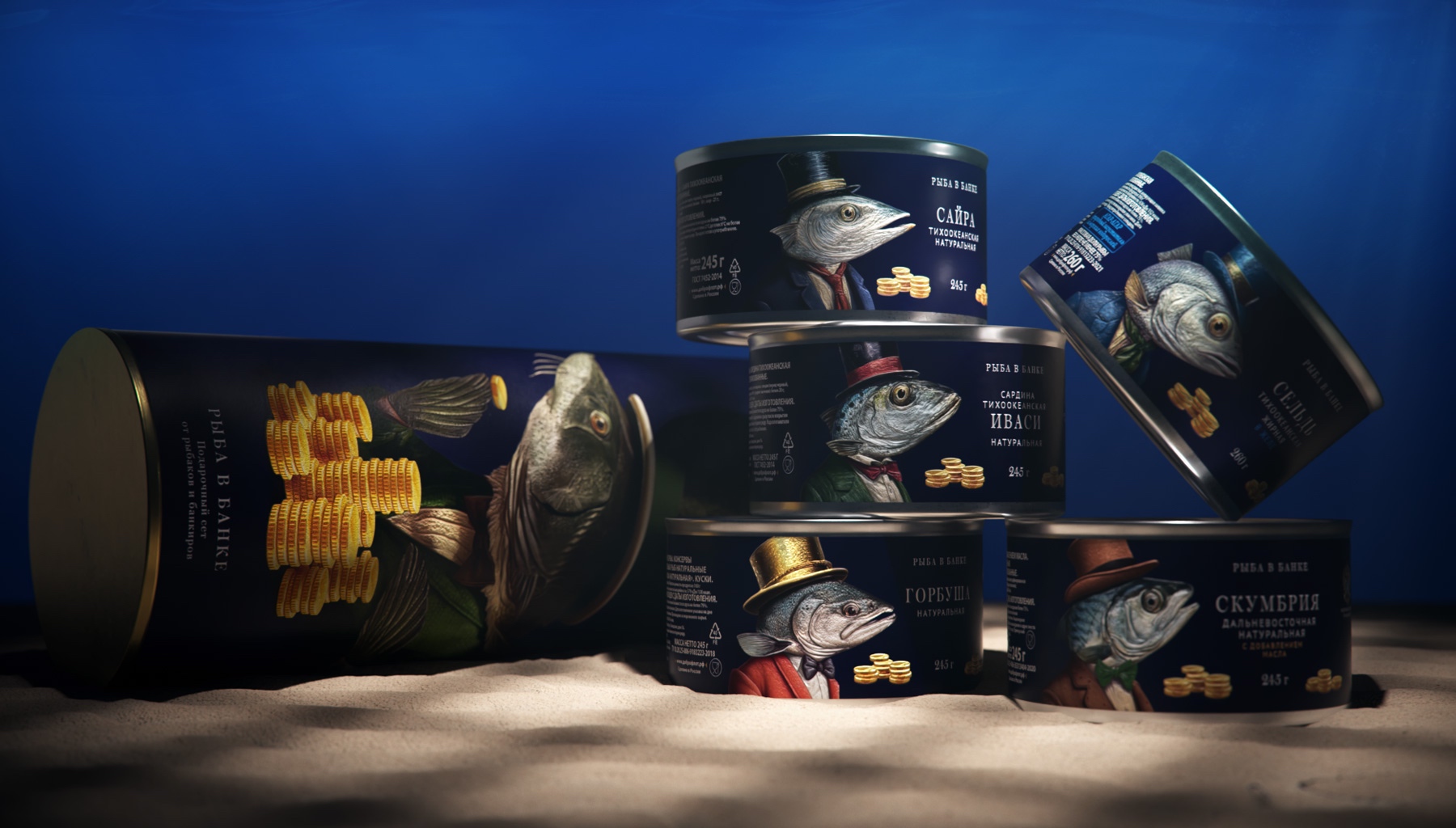
As part of the Eastern Economic Forum, the Ministry of Rosrybolovstvo and Bank Rosselkhozbank presented the “Fish in a Can” project. The name is a play on words in Russian, since “bank” is both a tin can and a financial institution. The project was presented in the form of a cardboard tube with canned fish of various flavors.
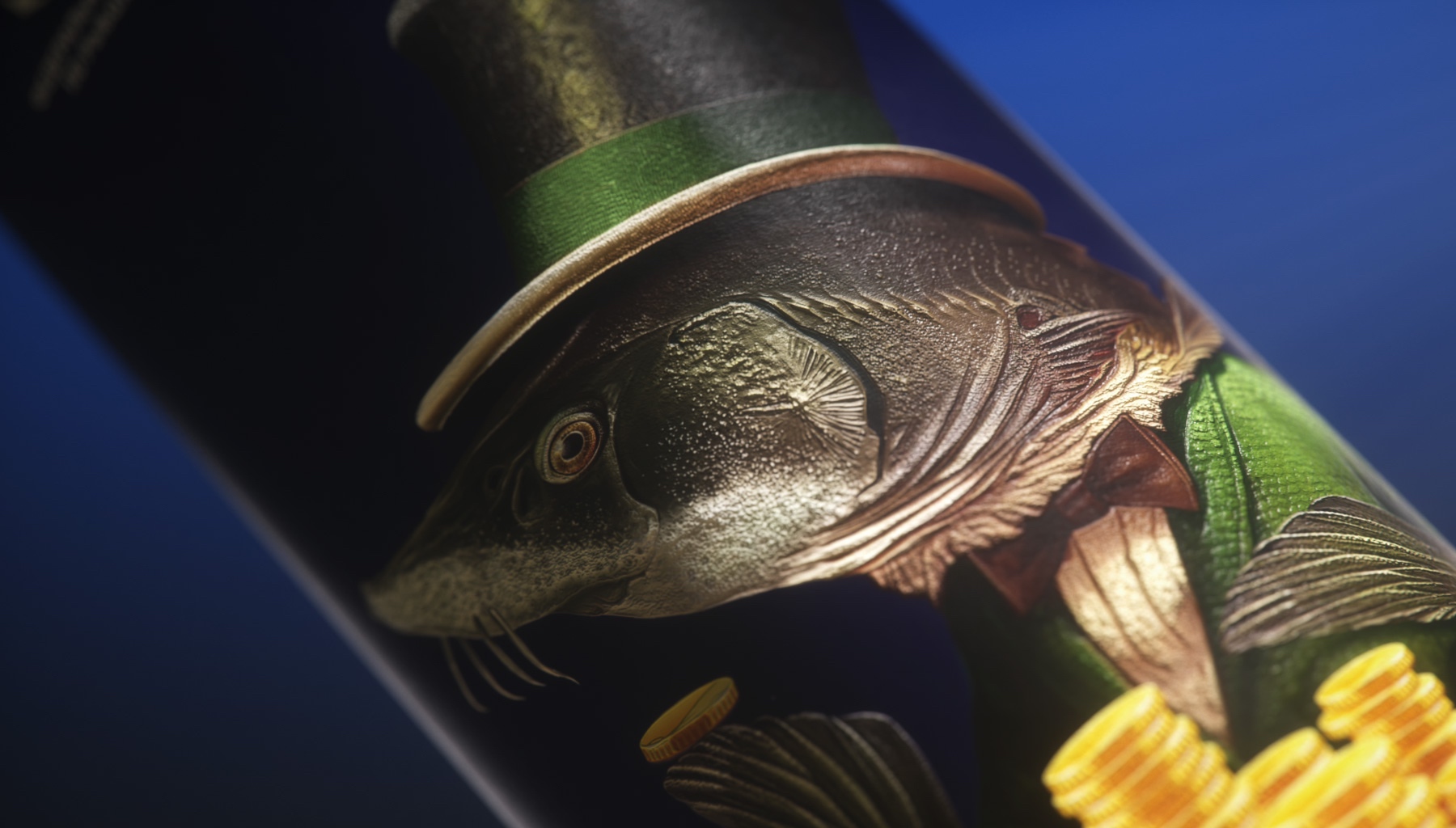
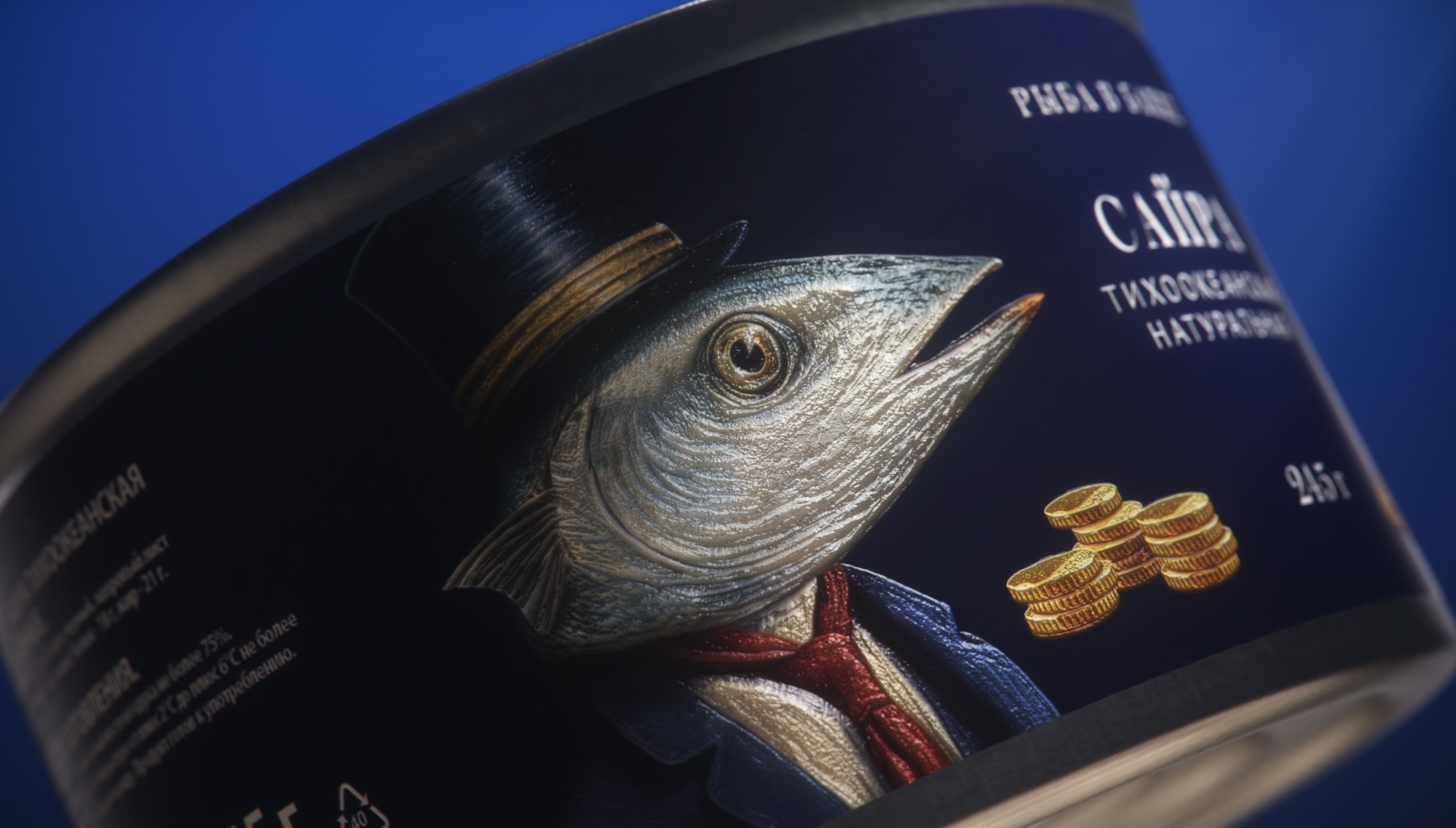
We came up with a fun concept: the fish are represented as traditional European bank employees. The fish illustrations were created to be anatomically correct, so you can recognize the type of fish (after all, the fishing company is very knowledgeable about them!) Clerk fish help fishing companies understand financial instruments and increase their profits.
The presentation received positive feedback and aroused great interest.
This shows that the use of modern technology, creativity and collaboration between different organizations can lead to a successful project.


CREDIT
- Agency/Creative: Ohmybrand
- Article Title: Fish in a Bank Illustrations and Packaging Design
- Organisation/Entity: Agency
- Project Type: Packaging
- Project Status: Published
- Agency/Creative Country: Russia
- Agency/Creative City: Moscow
- Market Region: Europe
- Project Deliverables: Packaging Design
- Format: Can
- Industry: Food/Beverage
- Keywords: WBDS Agency Design Awards 2023/24
- Keywords: Packaging Design, Product Creation
-
Credits:
Creative Director: Nadie Parshina
Senior Designer: Julia Zhdanova
Senior Designer: Alya Zaripova


