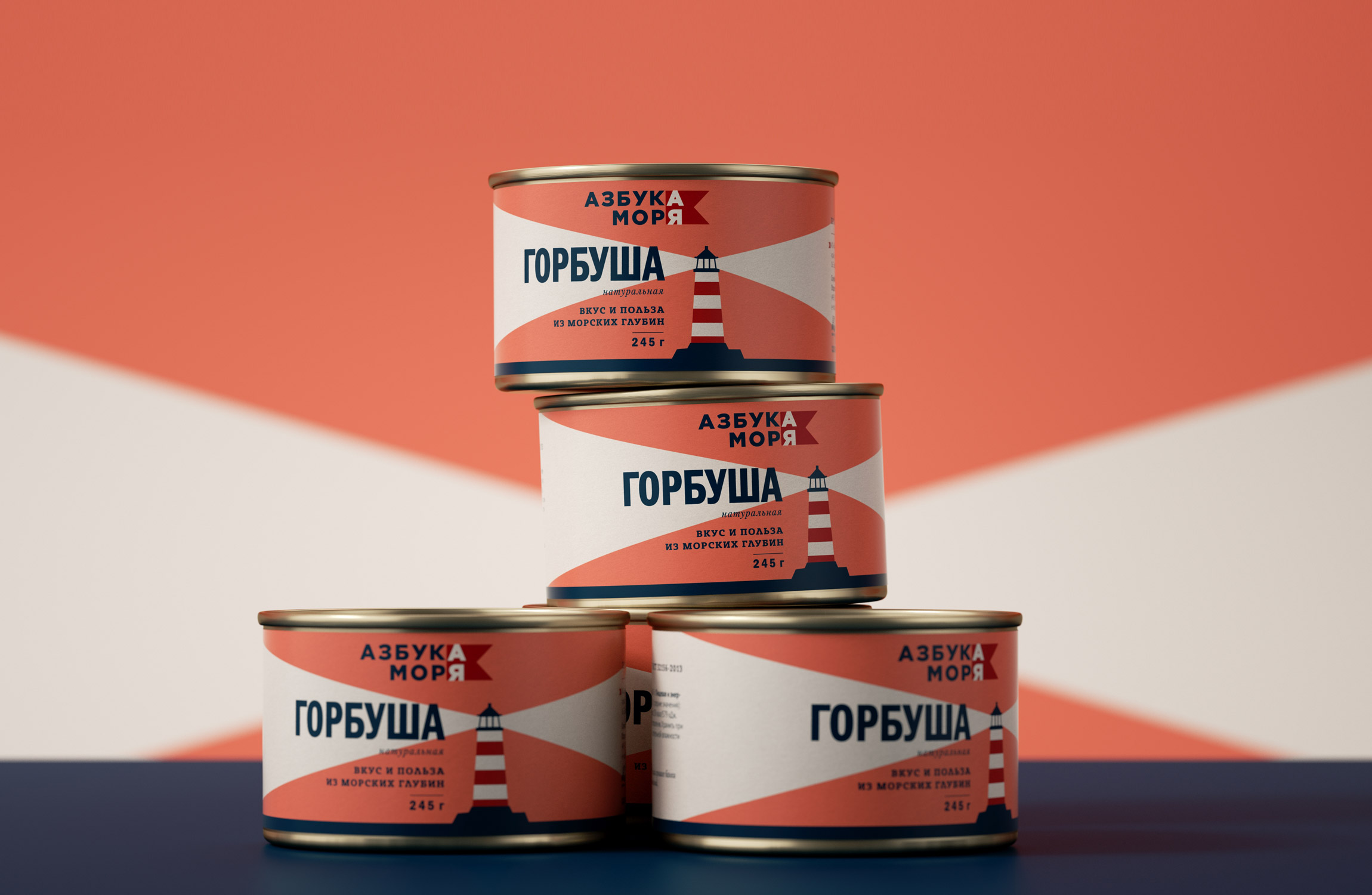
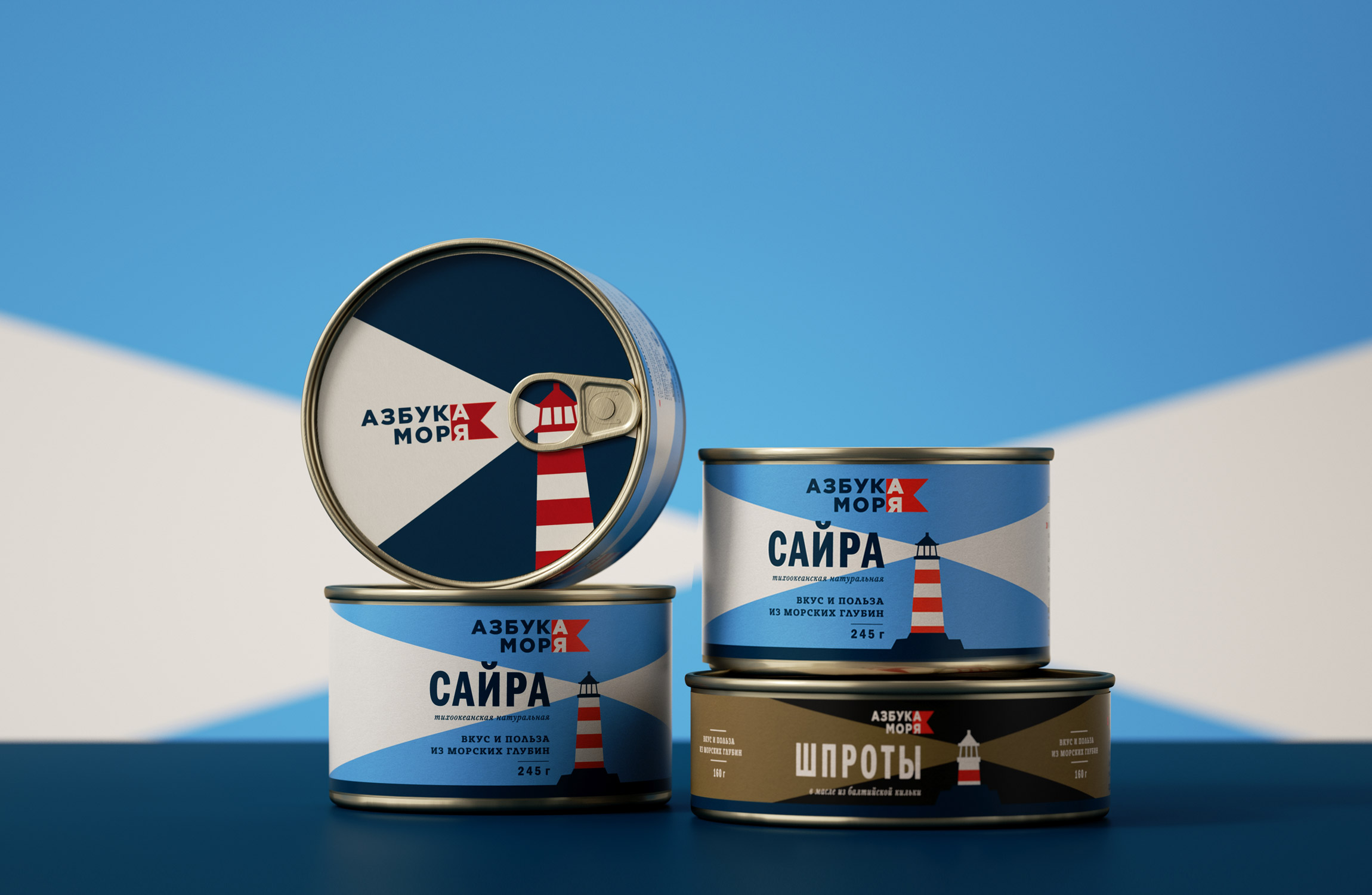
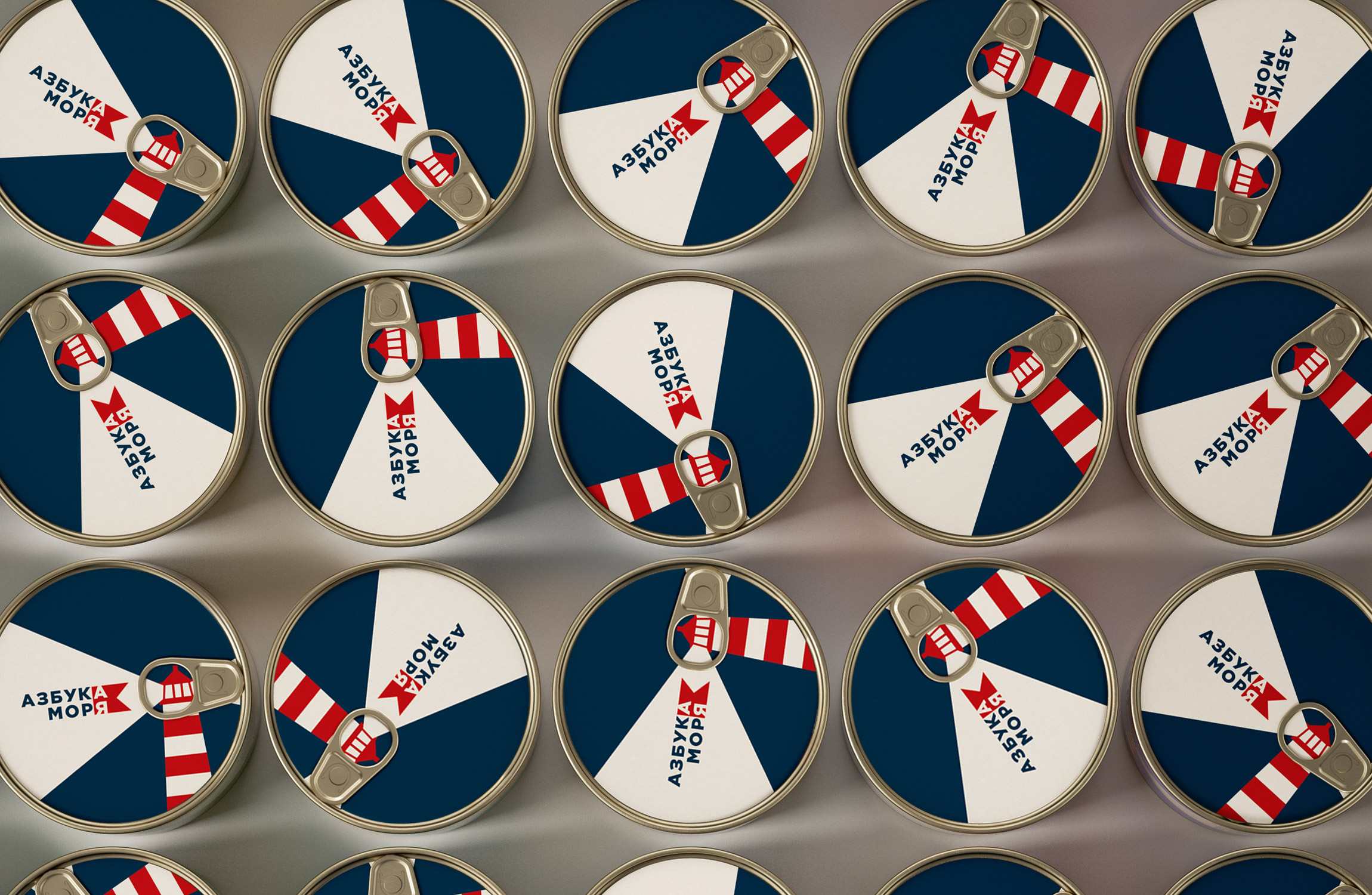
The Ohmybrand Studio has developed the brand “Azbuka Morya” for the Dobroflot Company. Its packaging design refutes the established consumer bias that canned fish is a product for the “older generation”.
TASK
Ohmybrand had a task to develop the packaging design for a new brand of canned fish in the most capacious price segment — the average. The packaging had to reflect the healthiness, convenience, availability as well as high quality of the product – сanned fish is quite affordable, and the quality is superior to many premade products because, contrary to a popular myth, it does not contain preservatives, soy and other additives. Moreover, the goal of the new brand was to speak the language of new consumers and to “rejuvenate” the audience of canned fish, refuting the popular belief that canned food is something old-fashioned.
SOLUTION
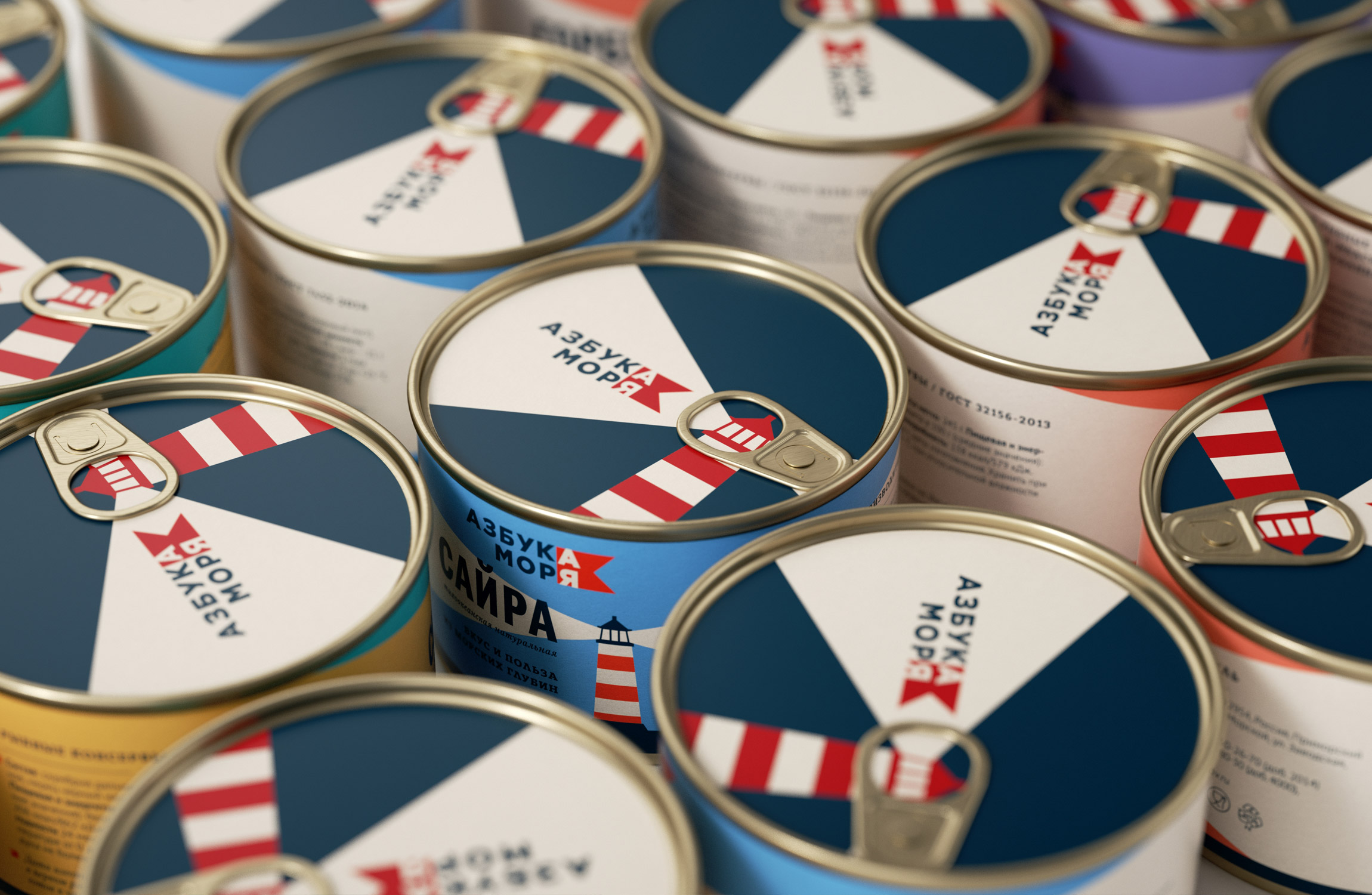
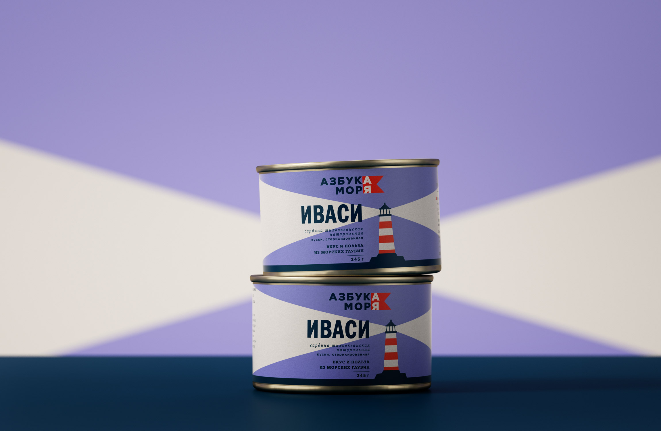
The designers of Ohmybrand offered to “Azbuka Morya” an extremely concise packaging design with simple fonts and minimalistic modern graphics that is connected to the marine theme. The logo without unnecessary puzzles and complex associations makes the brand name memorable.
“We tried to make a tin of canned food the way so that it was about the sea and not about canned food. We wanted to make something that is really pleasant to get out of the kitchen cupboard when there is no time for an intricate dinner or if you have unexpected visitors,” says the speaker of Ohmybrand Nadie Parshina.
Despite the seeming simplicity of the project, the Ohmybrand team, as usual, paid close attention to details. For example, the Studio specialists recommended to give up on the metallized label that the customer had planned to use initially, in favor of a matte one, so that the packaging looks more modern.
We should also note the color differentiation of SKUs – it is intuitive for consumers and makes it easier to find the right product. Different types of fish, liver and salad have labels with different backgrounds, fish with the addition of oil is distinguished by a yellow accent, etc. At the same time, the design allows for almost unlimited expansion of the line.
RESULT
“Azbuka Morya” products are already on sale, they can be found in grocery stores all over Russia.
CREDIT
- Agency/Creative: Ohmybrand
- Article Title: Fish from “A” to “Z” – New Brand “Azbuka Morya” (“ABC of the Sea”)
- Organisation/Entity: Agency, Published Commercial Design
- Project Type: Packaging
- Agency/Creative Country: Russia
- Market Region: Europe
- Project Deliverables: Brand Architecture, Branding, Packaging Design, Tone of Voice
- Format: Can
- Substrate: Metal


