


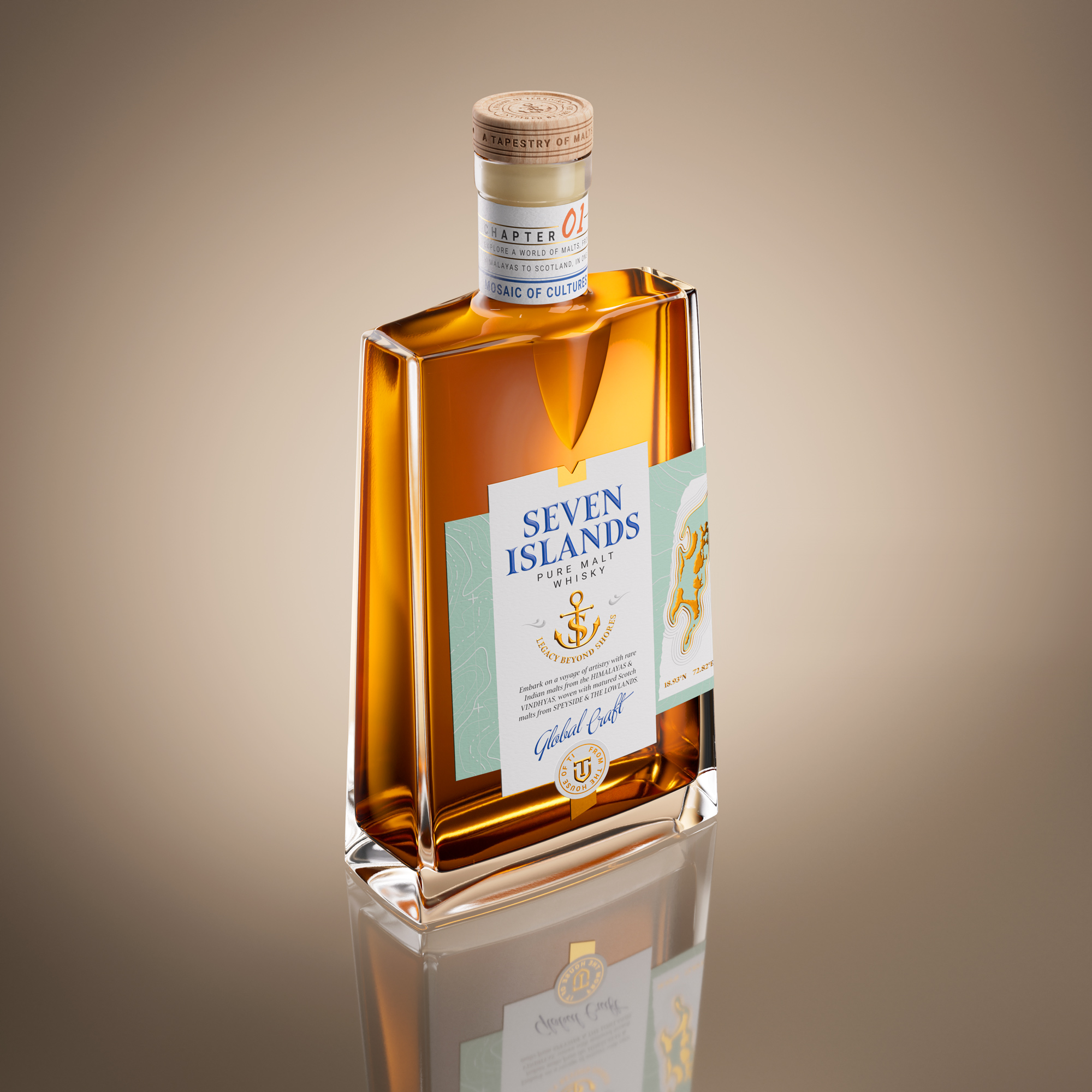
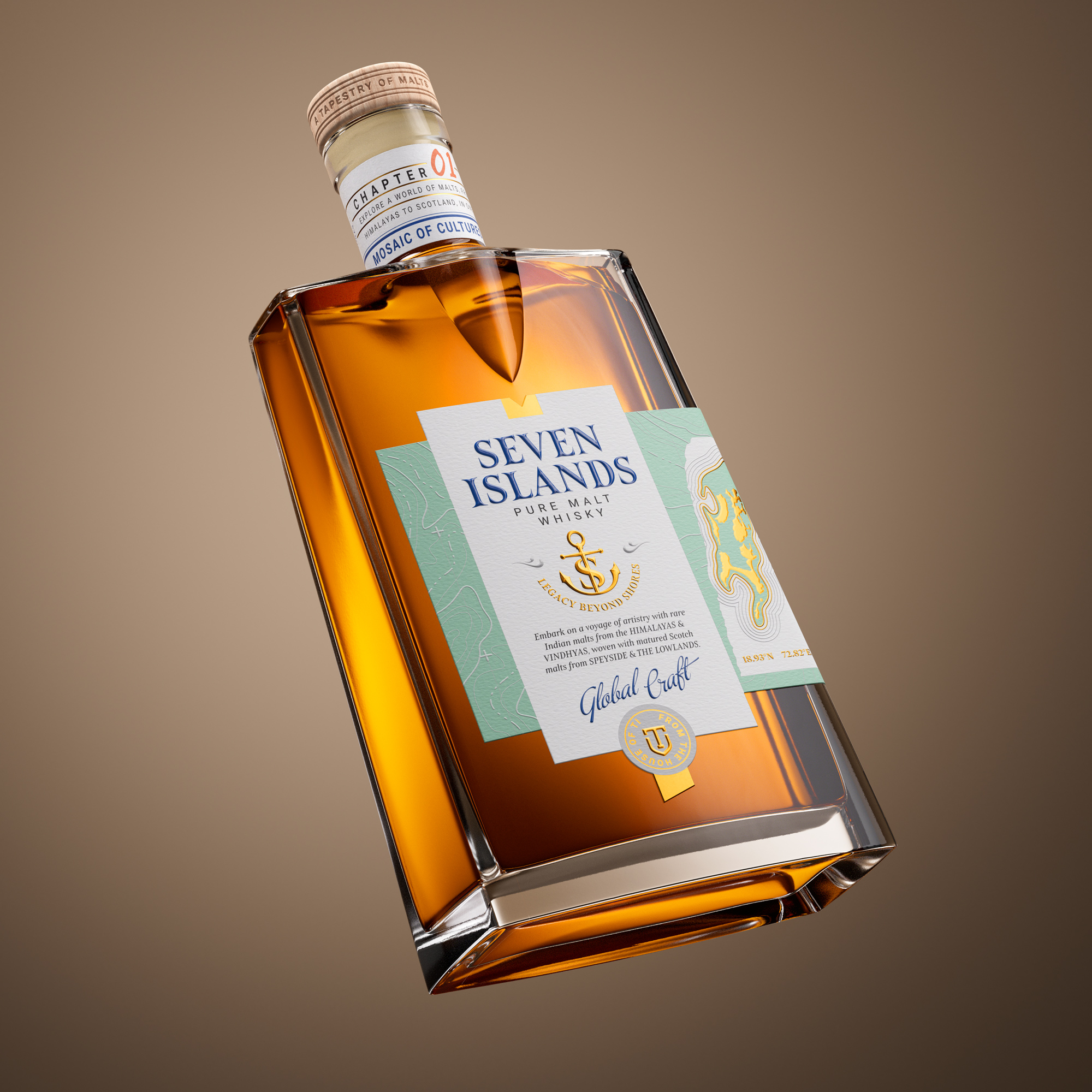
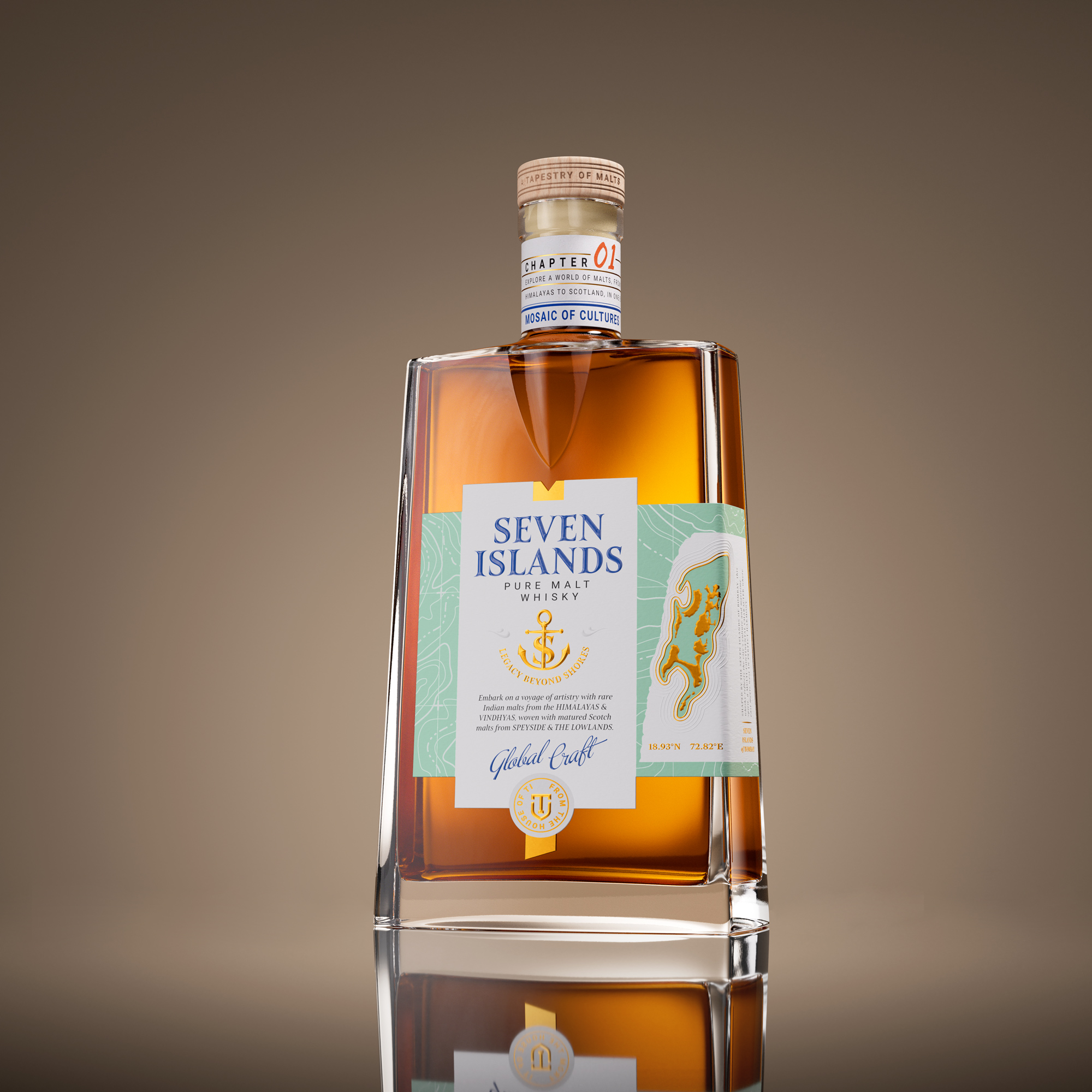
Seven Islands Pure Malt is created from four single malts sourced from India and Scotland. Its soul lies in a deeper story inspired by the seven ancient islands that once shaped the geography of Mumbai. The design captures this origin through an interplay of maps, textures and sculpted moments.
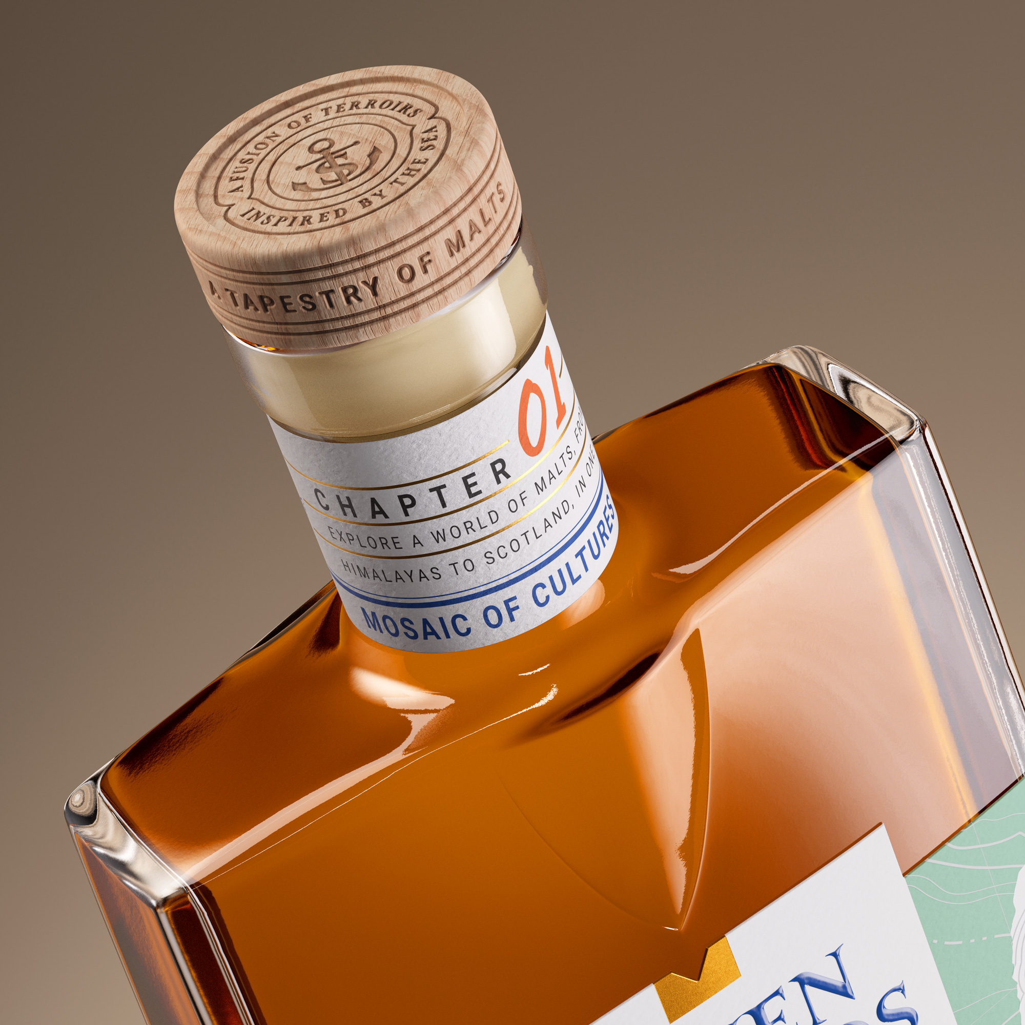
The bottle form is influenced by coastal landforms with crisp planes and a recessed contour that reflects the pull of tide against land. This carved feature becomes the signature of the silhouette and anchors the overall composition.
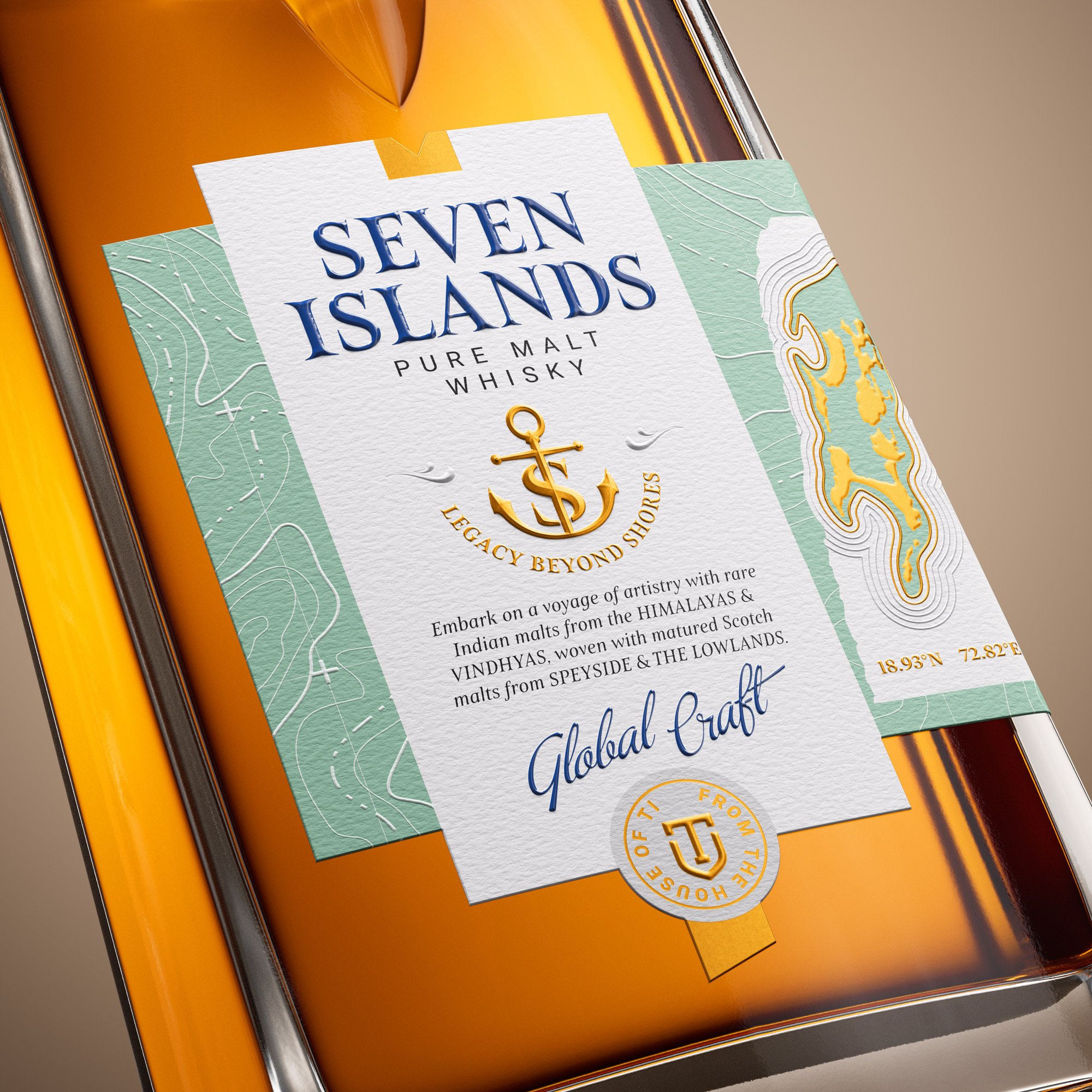
Across the label system, cartographic lines drift across sea foam green panels. The island map on the right side is rendered in warm metallic gold to highlight land emerging from water. These visual layers bring alive the idea of travel, discovery and the merging of coastlines.
The typography is modern and confident while the anchor emblem reinforces the idea of journeys connecting Indian and Scottish malts. The neck strip introduces Chapter 01 and sets the tone for a larger narrative of cultures meeting through craft.
Every detail is intentional from the micro embossing to the gold accents and the sculpted glass. Seven Islands celebrates the spirit of convergence a whisky shaped by landscapes, histories and the flow of tides that once defined Mumbai.
Seven Islands Chapter 1 is just the beginning. A foundation for a legacy shaped by heritage, imagination and modern craft.
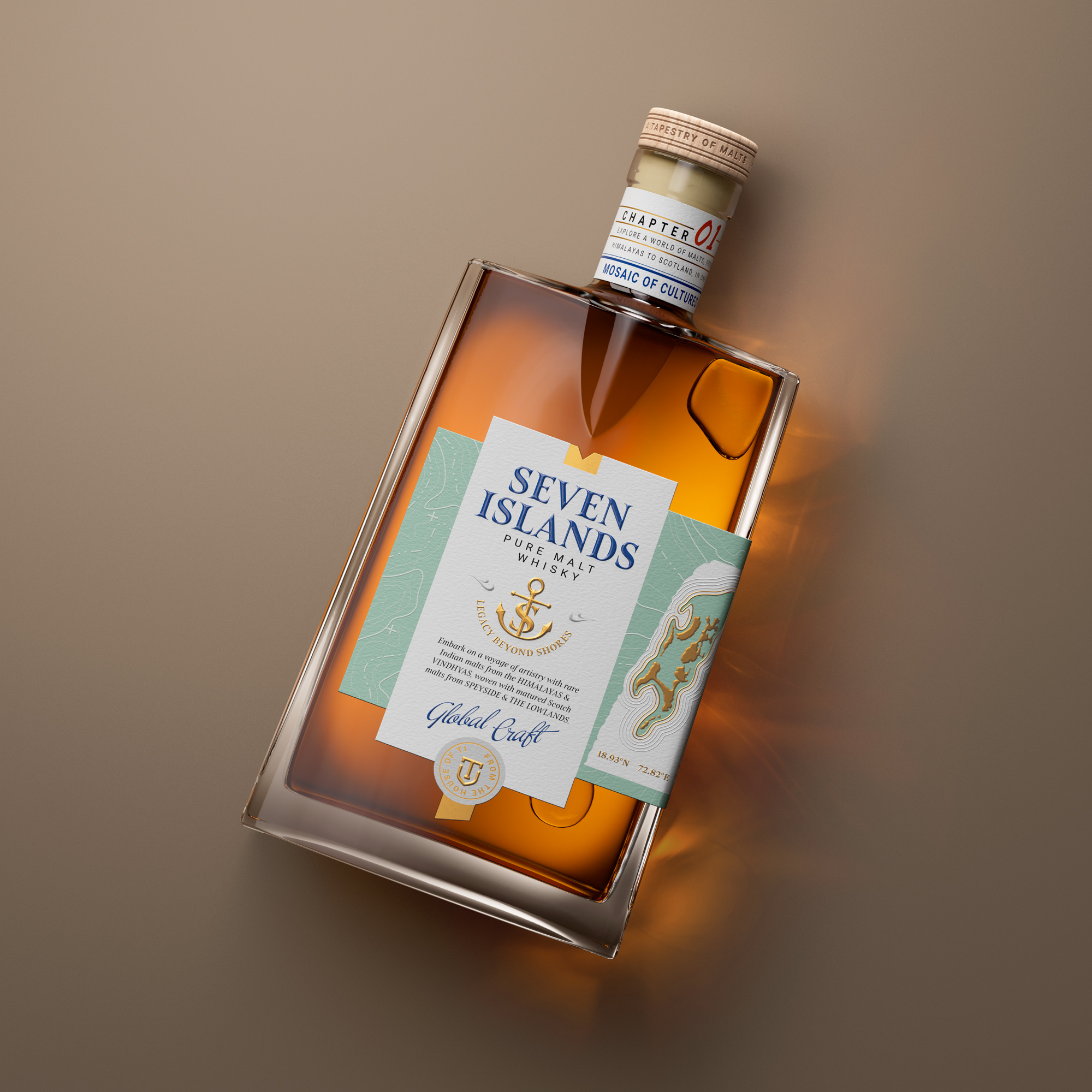
Seven Islands Pure Malt is crafted from four single malts from India and Scotland, and its design is inspired by the seven original islands that once shaped the geography of Mumbai. The bottle and label system together express a story of coastlines, convergence and global craft.
The sculpted bottle features crisp planes and a recessed contour that echoes the meeting of tide and land. This carved detail becomes the signature of the form and sets the tone for the entire visual language. On the label, hand drawn cartographic textures, island outlines and tidal patterns create a layered map like surface that rewards close inspection.
Sea foam greens and maritime blues evoke coastal freshness, balanced with refined gold accents that reference sunlight on water and the richness of malt. The anchor symbol represents Legacy Beyond Shores and reflects the union of Indian and Scottish malts. The neck introduces Chapter 01 which frames the journey from the Himalayas and Vindhyas to Speyside and the Lowlands.
CREDIT
- Agency/Creative: Firstbase
- Article Title: Firstbase Reimagines Seven Islands Pure Malt Through a Story of Geography, Craft and Coastal Heritage
- Organisation/Entity: Agency
- Project Type: Packaging
- Project Status: Published
- Agency/Creative Country: India
- Agency/Creative City: Gurgaon
- Market Region: Global
- Project Deliverables: Brand Design, Packaging Design
- Format: Bottle
- Industry: Food/Beverage
- Keywords: Whisky, Global Launch, World Malt Whisky, Seven Islands
-
Credits:
Creative Design: Firstbase


