


Oriente Rice rebrand – The rice design revolution
How Oriente’s vision and bold design is shaking up a long-overlooked
supermarket staple.
Commercial impact from the redesign.
Doubled market share in Portugal (the home market) to 4%, with +75% in
sales volume vs. the previous year in May 2025, and +62% in sales value in
the same time period (Nielsen data).
Oriente is now the leading brand in growth segments, in rice.
Oriente, a new-generation premium rice brand, is redefining what consumers can expect from one of the world’s most essential staple foods. In a commodity-driven category, Oriente stands apart by placing grain quality, and high production standards at the heart of its mission — transforming rice from a simple pantry item into a product of pride, purpose, and passion. Oriente is a premium rice brand that combines heritage, sustainability, innovation, and design to bring consumers rice of exceptional quality. With global farming partnerships, a pioneering milling process, and bold brand ambitions, Oriente is committed to setting new standards in the rice industry.
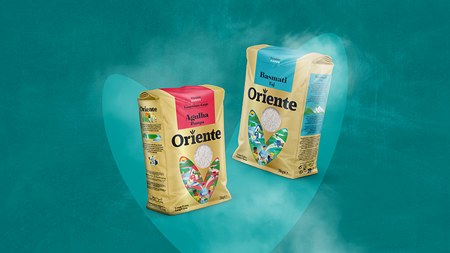
A bold new look for a bold new vision
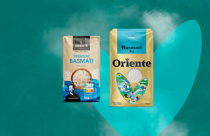
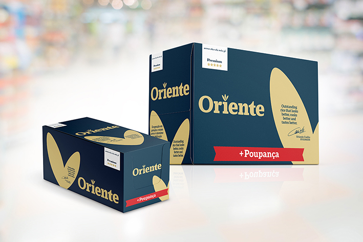
In line with its mission to disrupt the rice category, Oriente has unveiled striking new packaging. Designed to be bold, iconic, and modern, the new look reflects the brand’s values of authenticity, sustainability, and quality. Oriente’s redesign challenges the homogeneity of the rice aisle, with packaging that visually conveys the care, farmer collaboration, and family stewardship behind every bag. The goal is clear: to become a leader in the premium rice market.
“Distinctive colours and shape equities are underdeveloped in this category. With
Oriente we had a clear opportunity to move things forward in a way that could create brand impact, storytelling and quality. The packs feature an all over metallic gold that is punctuated by bright variant colour panels. It is this balance of quality/heritage and contemporaneity that drives the new
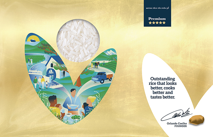
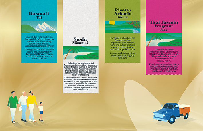
design. But our design secret weapon was the use of the ‘Rice Grain V’ shape that holds the brand illustration. Oriente is a brand with depth, tied to culture and tradition, where the brand backstory is the front page of the pack design – brought to life by illustrator, Neil Webb. The illustrations continue to tell the story of the brand on the sides and back of pack. A lot of attention was paid to making sure that each type of rice product could be understood by the consumer. Something that hasn’t been done in the category before:
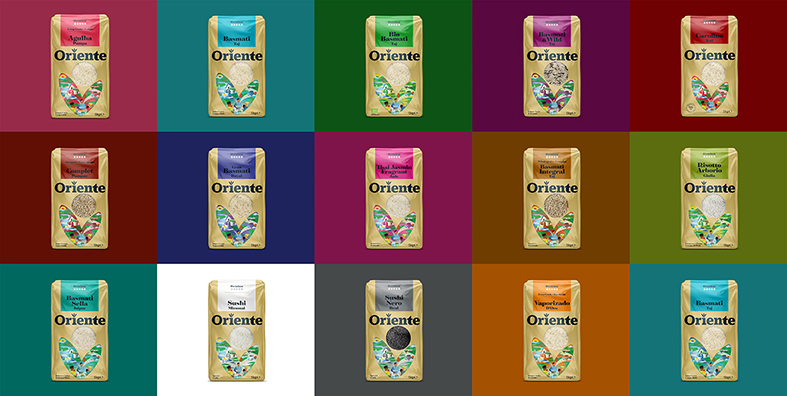
the origin of the grains, what types of meals it should be used for along with recipe pairings. Each product has a unique name that goes beyond the regular naming convention of the rice category. The Oriente portfolio includes ‘Basmati Taj from the Himalayas’, ‘Sushi Mizumai from Japan’ and ‘Arborio Giulia from Italy’ and so on. We also set up a retail ready design toolkit for the brand which helped the rebrand launch with various point of sale applications.”
John-Paul Hunter, Firecactus Creative Director.
Oriente’s brand strategy
“Commodity staples like rice rarely trigger emotional connections — which makes
branding them one of the toughest challenges. With Oriente, we applied our SPARQ formula to creating the brand proposition: storytelling, passion, attitude, roots, and quality. It helped us uncover Oriente’s true soul:
We used this framework to find Oriente’s brand soul.
S. Oriente rice has an exceptional purity value of over 99%. Oriente works closely with farmers globally to optimise water use and enhance crop yield.
P. Where other brands clean and polish their rice in two stages, Oriente uses five.
A. Oriente is all about living your healthiest, happiest life.
R. Owned by a single family, dating back to the 1930’s and now in the 4th generation of guardianship and ownership.
Q. Oriente is the trusted choice of restaurant chefs, because the rice cooks so
consistently well.”
Andy Percy, Strategic Director, Firecactus.
Client quote
“The strategy you delivered was outstanding — it captured our brand’s essence and opened up fresh opportunities we hadn’t imagined. The designs are not only beautiful, but genuinely inspiring; they’ve brought real energy to our team and our customers. Above all, working together on this project has been an absolute pleasure. Everything ran so smoothly, and your collaborative spirit made the whole process enjoyable from start to finish.”
Carlos Botelho, Chief Marketing and Sales Officer. Novarroz rice brands.
CREDIT
- Agency/Creative: Firecactus
- Article Title: Firecactus Reimagines Oriente Rice with a Design-Driven Market Breakthrough
- Organisation/Entity: Agency
- Project Type: Packaging
- Project Status: Published
- Agency/Creative Country: United Kingdom
- Agency/Creative City: Firecactus
- Market Region: Global
- Project Deliverables: 2D Design, Brand Creation, Brand Design, Brand Redesign, Packaging Design
- Format: Bag, Pouch
- Industry: Food/Beverage
- Keywords: Rebrand, Redesign, Commodity, rice Design system, illustration, Portugal
-
Credits:
Creative Director/Designer: John-Paul Hunter


