The new brand for a real estate digital platform.
Amid the global changes and the turbulence of financial markets, real estate remains one of the most reliable investments. Previously developers and agents used to sell the idea of a beautiful life in a new house. Now their focus is shifting towards the idea of an attractive investment.
Fimmo is a real estate digital platform based in France. Fimmo allows its users to focus on investing, leaving aside the usual complexities of dealing with properties.
We wanted to create a new brand that would emphasize the key advantage of Fimmo: making real estate investing easy for everyone. The client informed us that the main point of differentiation will be the new real estate currency that was developed specifically for the platform. The currency called «key» will be exchanged inside the platform and represent the investment shares in properties. We suggested to visualize this idea in branding.
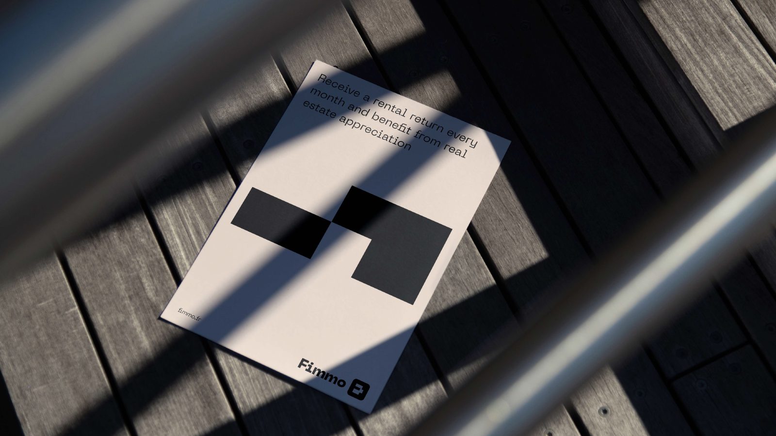
The idea for the design concept is based on the construction set. The rectangular blocks resemble building structures and apartment layouts. This idea of construction set can also be seen as a metaphor for investment. So the visual language perfectly captures the essence of the brand.
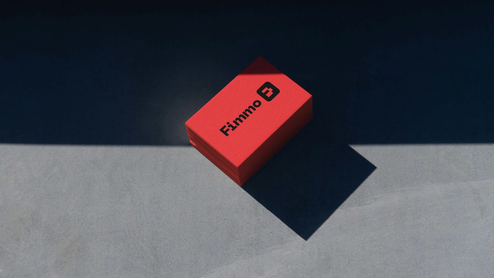
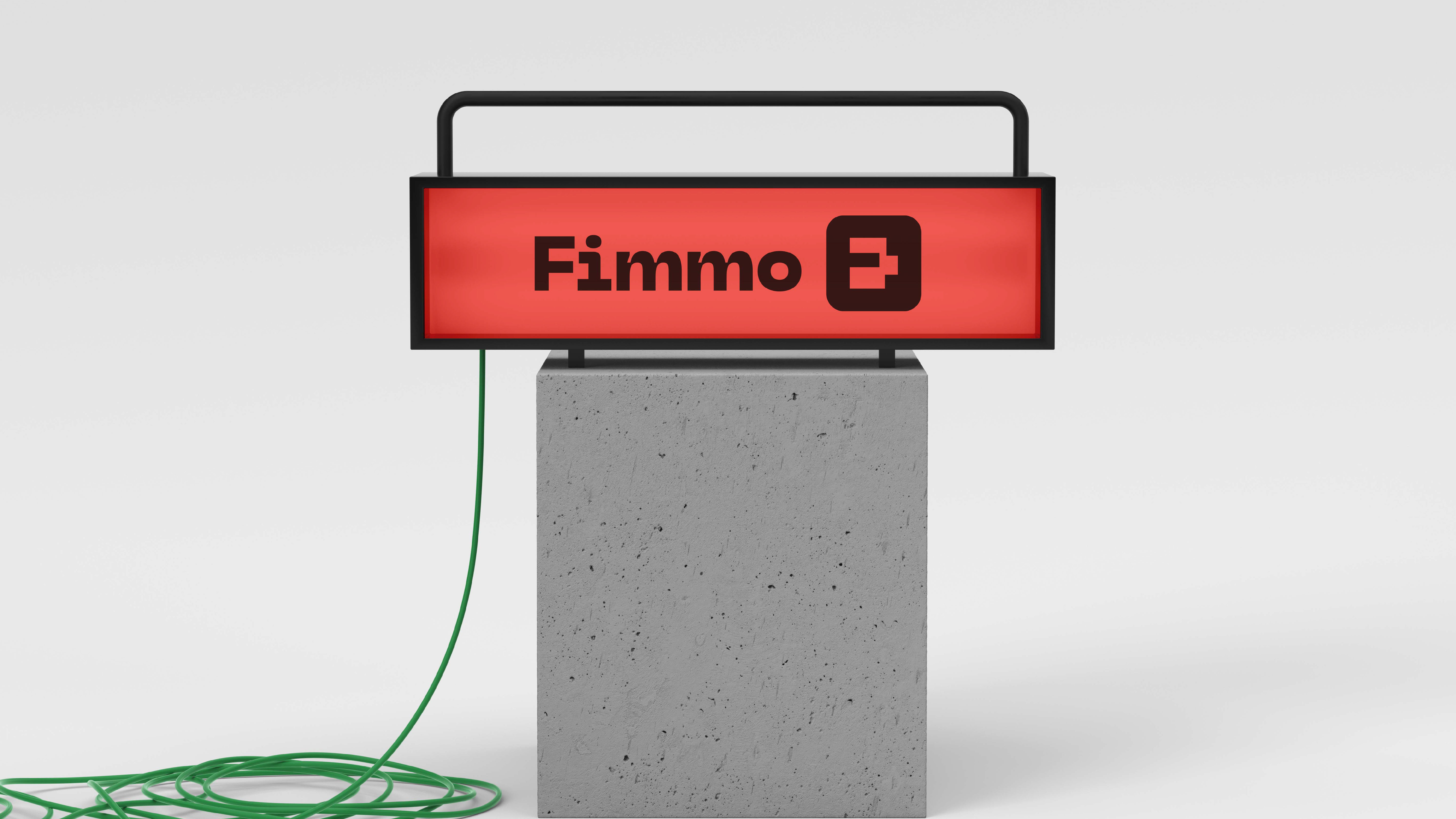
We found the inspiration for the logo concept in the brand name itself. While searching for the right kind of lettering for the wordmark, we saw an interesting shape in the space between the letters. It resembles the shape of a key.
A vibrant orange is used as the main color. It is very eye-catching and fits in with the real estate. The main color is complemented by a palette of more classic pastel tones.
The typeface is geometric and constructivist. Large elements give the typeface a strong character, yet it is well readable and looks very modern.
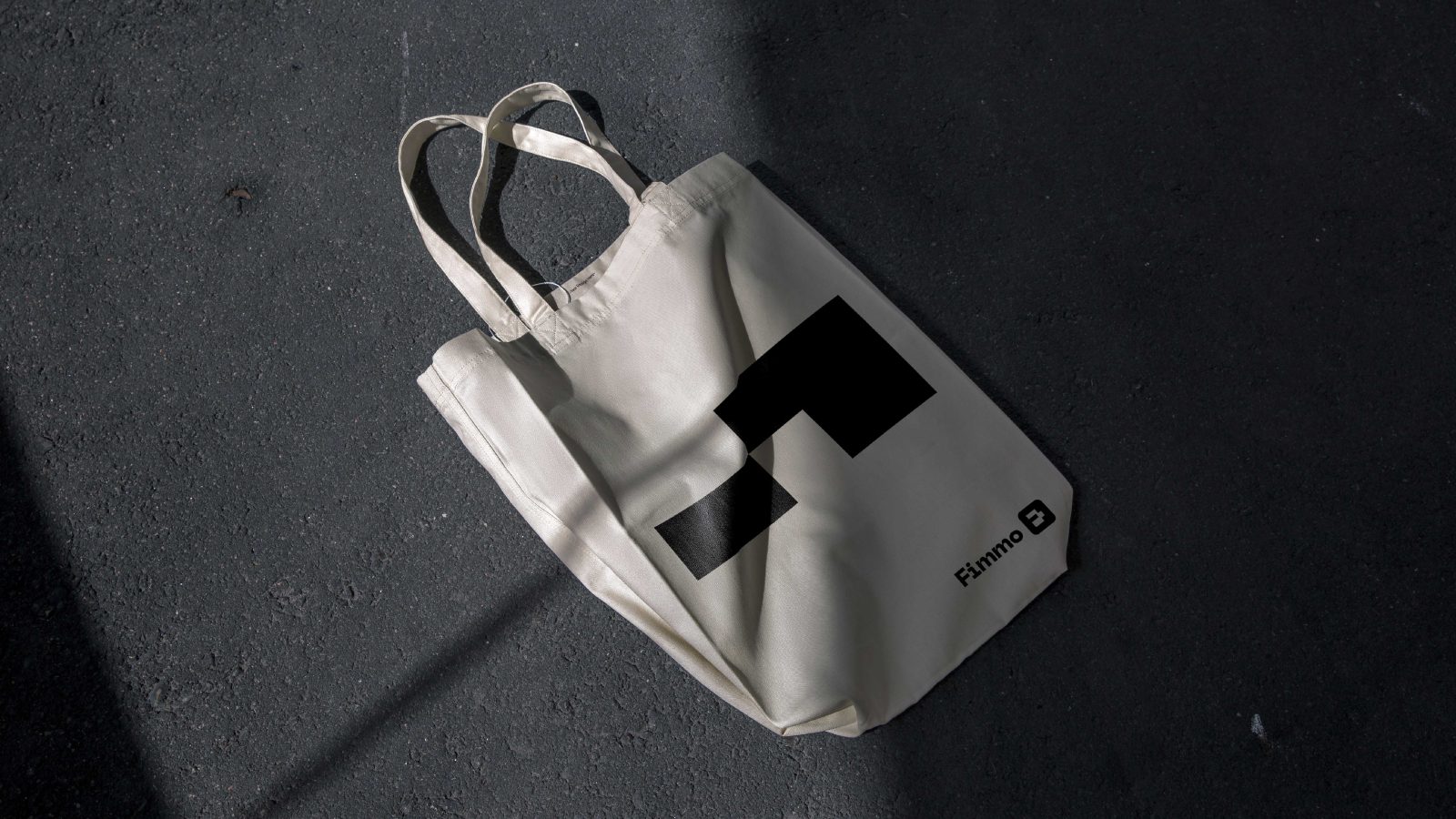
Using a key shape, we have developed a set of simple design elements that resemble construction blocks. These shapes can be used as independent design elements, or they can form the layout system.
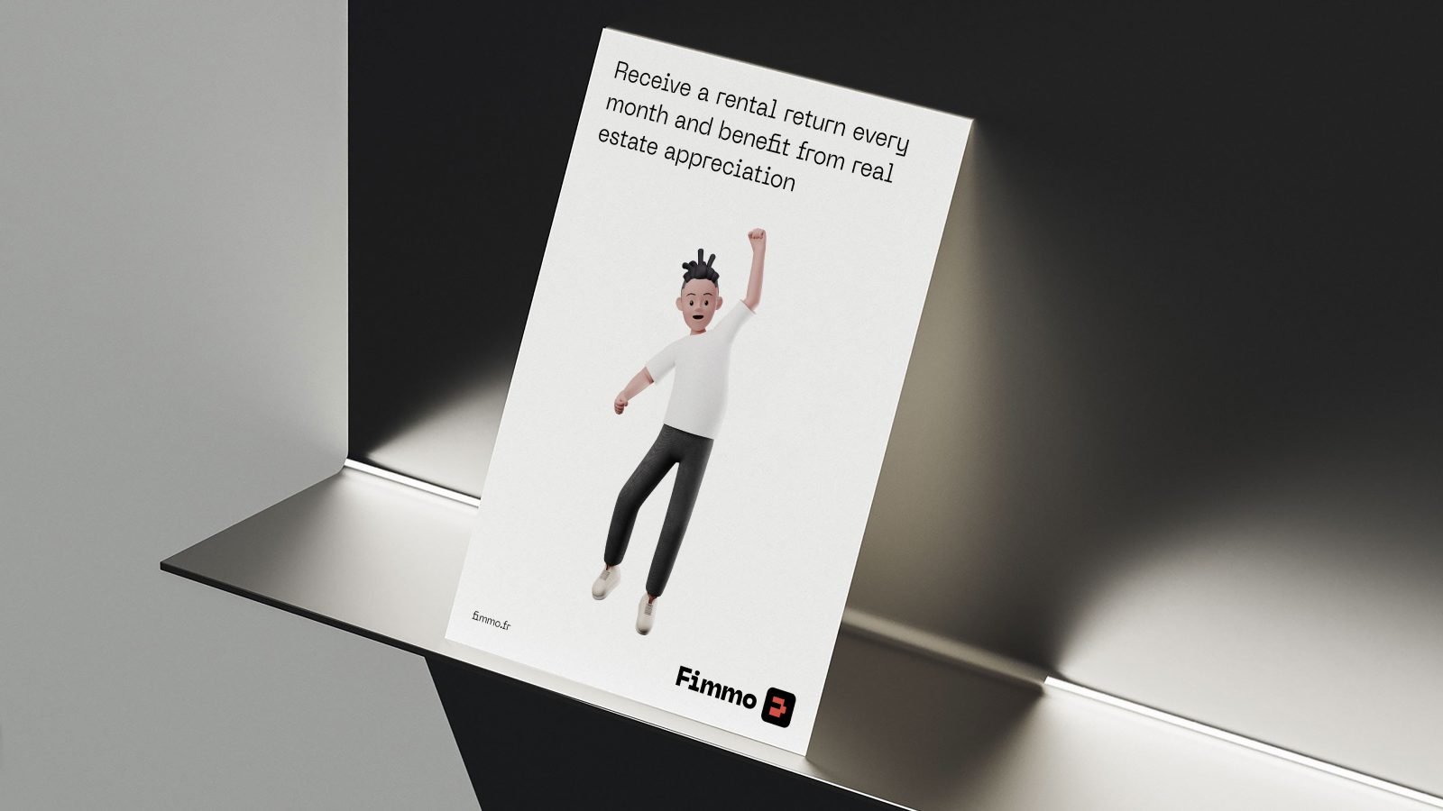
The layout system becomes the framework for visual and textual content and goes well with illustrations. A set of modular blocks can be easily transformed to fit any template.
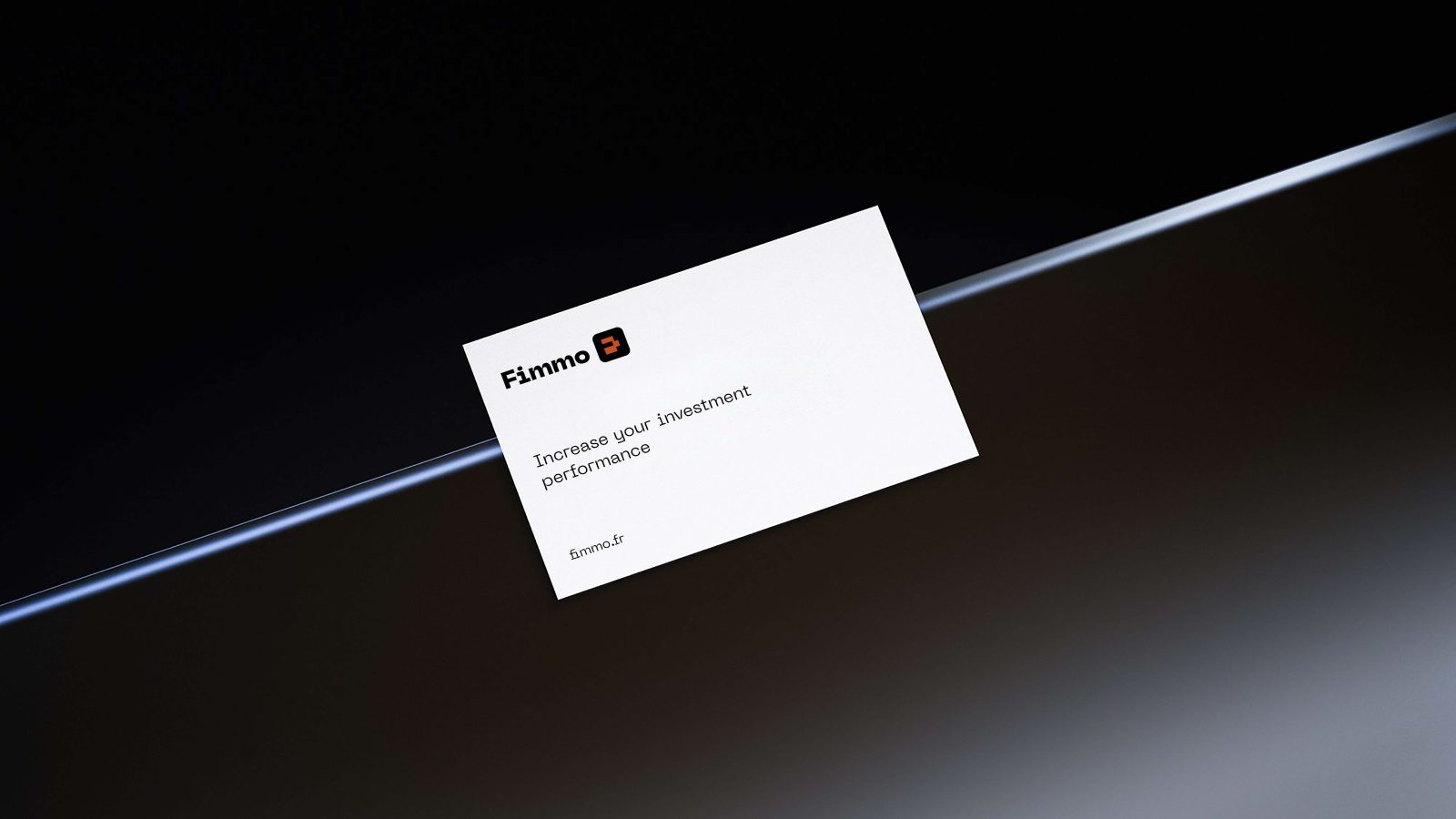
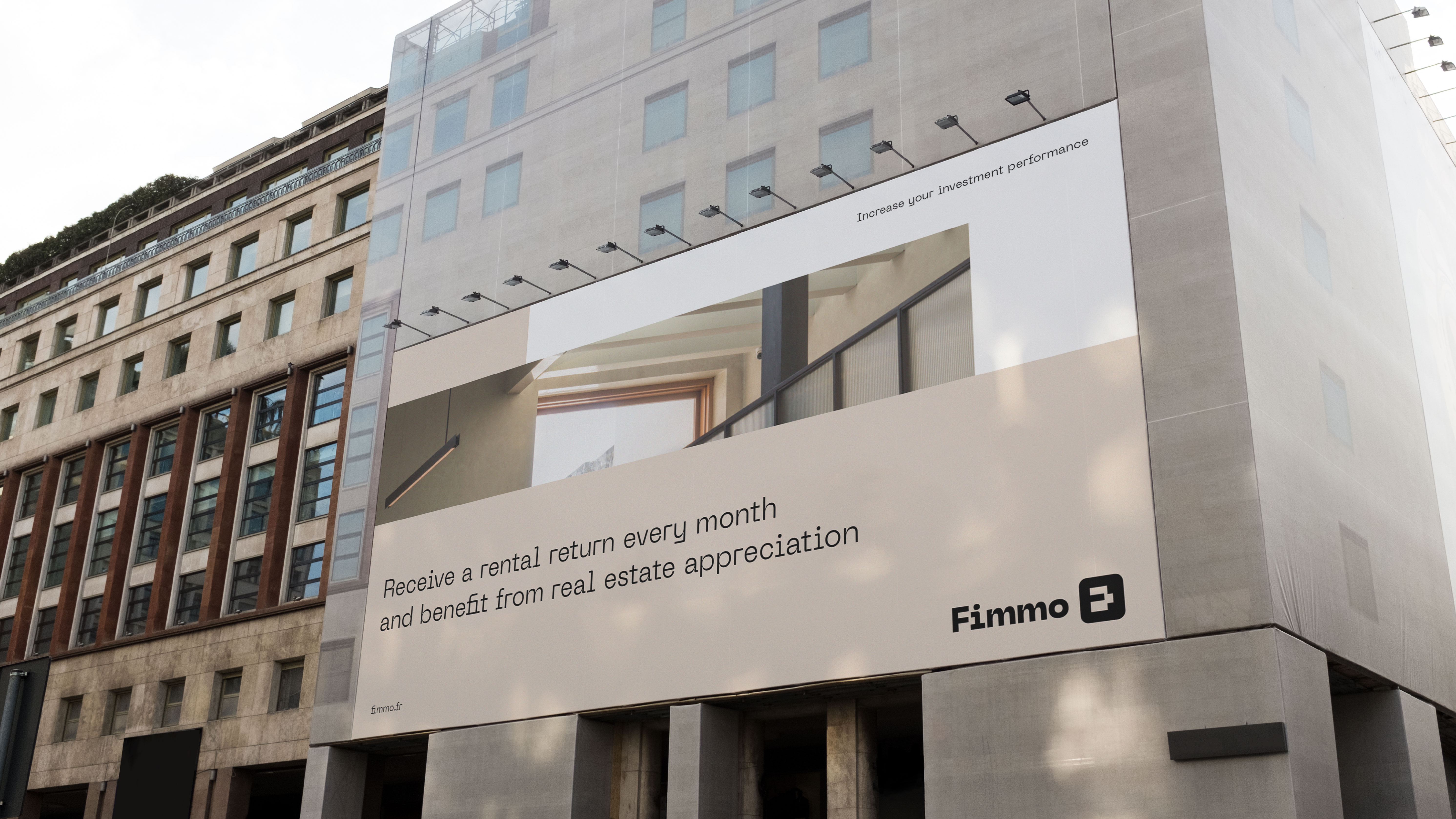
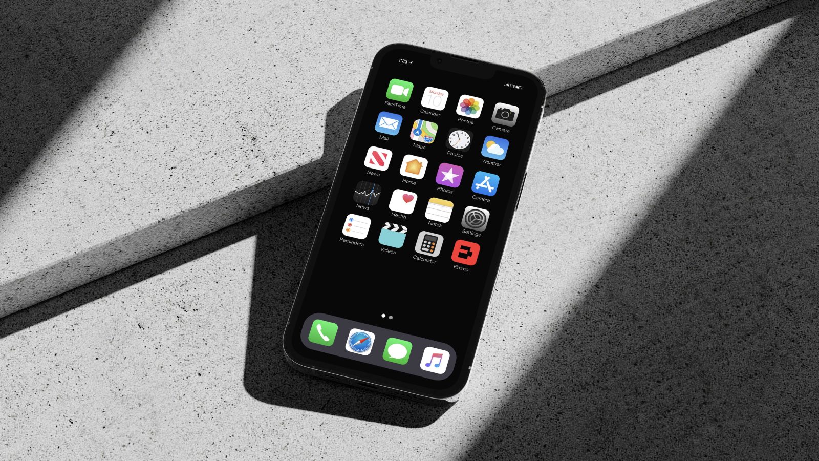
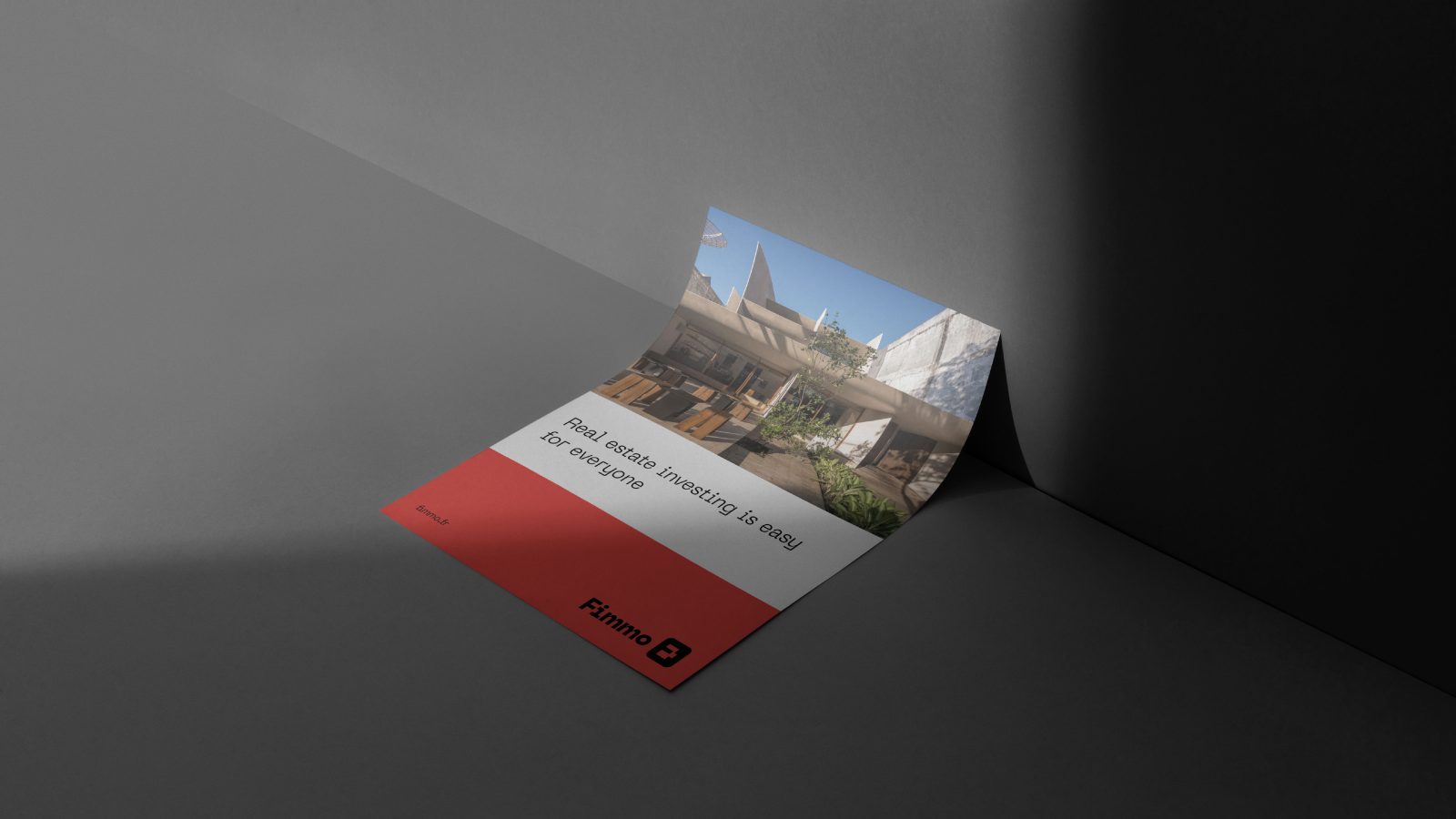
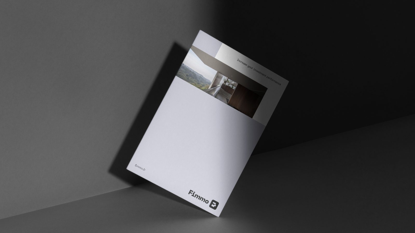
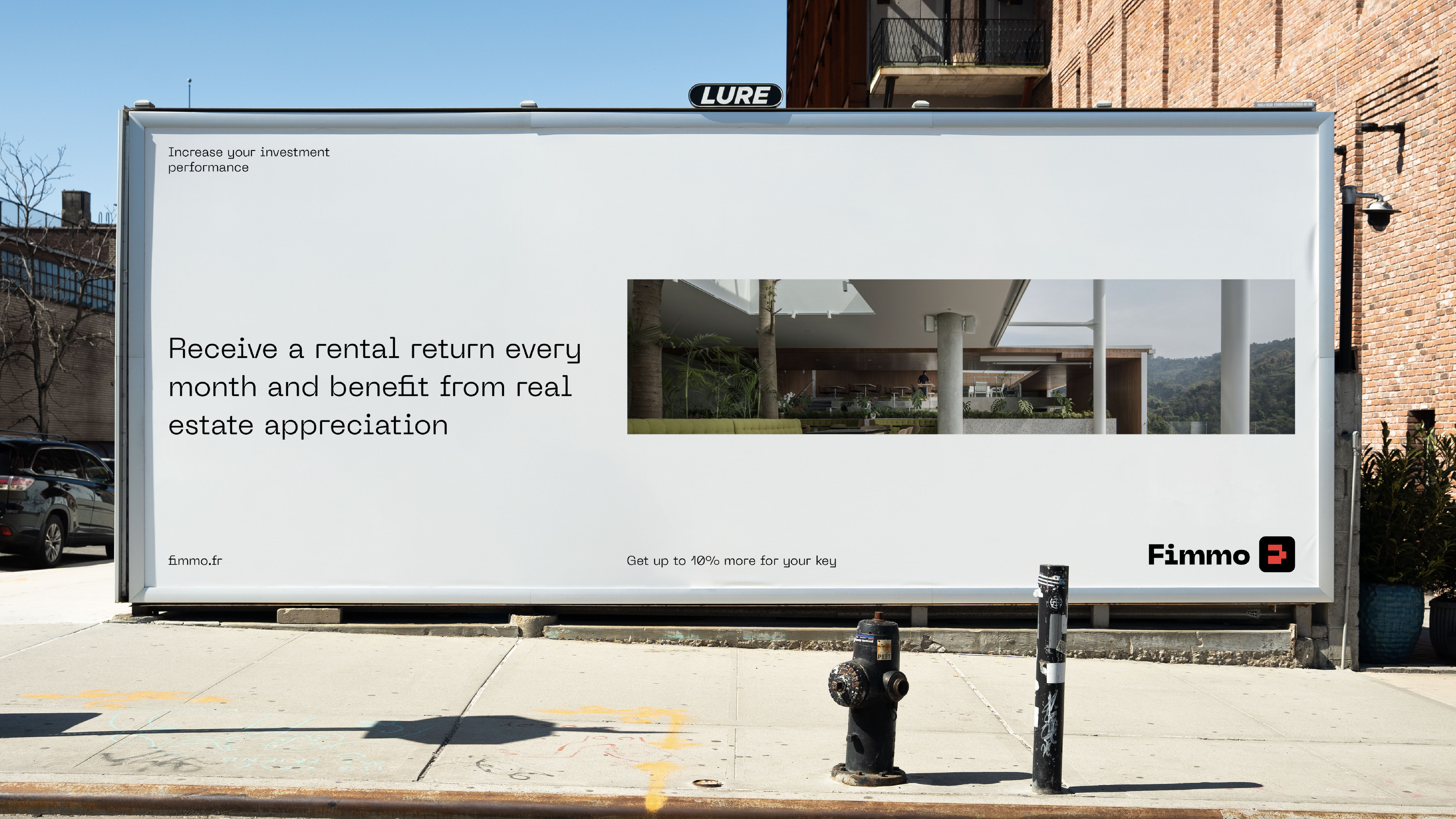
As a result we created a complete brand design which works well both online and offline. The design system looks vibrant and energetic which is important for an investment brand. At the same time, the overall style of Fimmo brand looks relevant for the market of real estate. Modern illustration and photo style create a premium look and feel.

CREDIT
- Agency/Creative: Electric Brand Consultants
- Article Title: Fimmo Real Estate Digital Platform Branding
- Project Type: Identity
- Project Status: Published
- Agency/Creative Country: Georgia
- Agency/Creative City: Tbilisi
- Keywords: WBDS Agency Design Awards 2022/23
-
Credits:
Creative Director: Beso Turazashvili
Head of Account: Daria Vorobyova
Project Manager: Elizaveta Gasheva
Head of Strategy: Dimitrina Mitakova
Design Lead: Irina Skabelkina


