


When the art of distilling meets the art of storytelling, something truly remarkable emerges. Such is the case with the latest collaboration between the revered Filliers Distillery and creative studio Quatre Mains. At the heart of this project lies a celebration of legacy, craftsmanship, and the powerful role that packaging plays in preserving and elevating both.
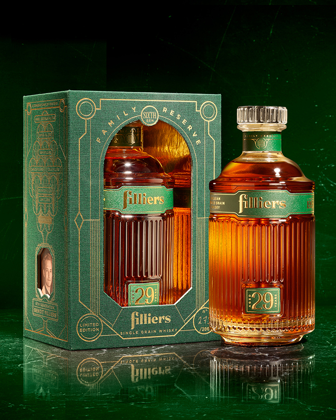
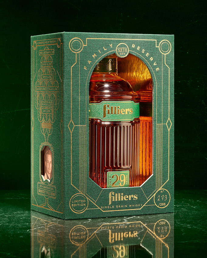
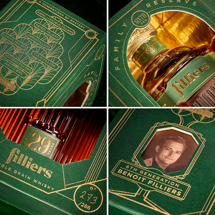
To mark a significant milestone in their storied history, Filliers has unveiled the Limited Edition ‘Family Reserve’ Whisky, a 29-year-old single grain whisky that embodies the family’s unwavering dedication to excellence. Distilled in 1995—the birth year of Benoit Filliers, the 6th generation of this pioneering distilling family—this rare expression has matured for nearly three decades in one of the distillery’s last remaining casks from that era. It’s not merely a whisky; it’s a living archive of family history, tradition, and refined mastery.
In crafting the visual and tactile identity for such a prestigious release, Quatre Mains was tasked with more than just creating a beautiful design. The goal was to build an immersive narrative experience, one that honors the passage of time, the weight of heritage, and the artistry passed down through generations. The result is a packaging concept that feels more like an heirloom than a box—a true keepsake in every sense.
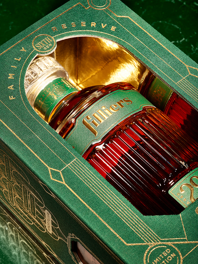
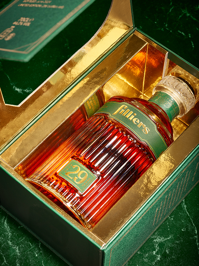
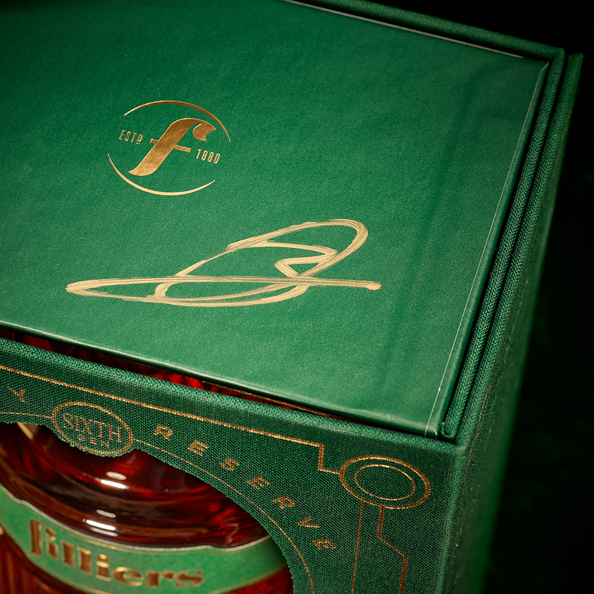
The presentation begins with a textured fabric card, rich to the touch and elegantly embellished with gold foil, lending a sense of timeless sophistication. This wraps around a gatefold display box, a structural nod to storytelling and presentation, which opens to reveal a bottle unlike any other. Through a central window, the bottle is placed on a pedestal, framed by a shimmering reflective gold interior that casts light upon the rich amber tones of the whisky—an effect designed to echo the warmth of history itself.
The art deco-inspired bottle draws from the golden age of design, paying homage to the distillery’s long-standing presence while simultaneously evoking a modern sense of luxury. Each element—be it the typeface, the finish, or the tactile feel—was meticulously chosen to amplify the product’s rarity and reinforce its premium character.
With only 286 bottles in existence, the Filliers Family Reserve is as rare and refined as the cask it came from. The packaging does more than protect the whisky inside—it magnifies its essence, ensuring that opening the box becomes an experience in itself. A ritual. A reverent unveiling of something to be savoured, not just tasted.
This collaboration between Filliers and Quatre Mains is more than a design project—it’s a fusion of vision and values, where branding, materials, and storytelling all serve to elevate a spirit that’s been three decades in the making. It stands as a reminder that in the world of premium packaging, the details are not just decorative—they’re narrative threads that connect the past to the present.
So, who’s ready to taste history?

CREDIT
- Agency/Creative: Quatre Mains
- Article Title: Filliers X Quatre Mains. A Collaboration Rooted in Heritage and Elegance
- Organisation/Entity: Agency
- Project Type: Packaging
- Project Status: Published
- Agency/Creative Country: Belgium
- Agency/Creative City: Donk
- Market Region: Global
- Project Deliverables: Packaging Design
- Format: Box
- Industry: Food/Beverage
- Keywords: Whisky, Limited edition, Spirits, Luxury, Cardboard, Bottle design, Packaging design, Branding
-
Credits:
Creative farmer: Patrick De Grande


