


Sophia Georgopoulou | Design – Filema Snacks
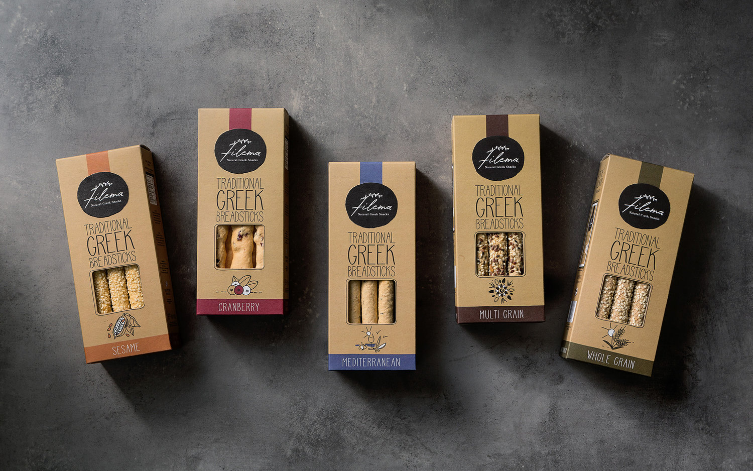
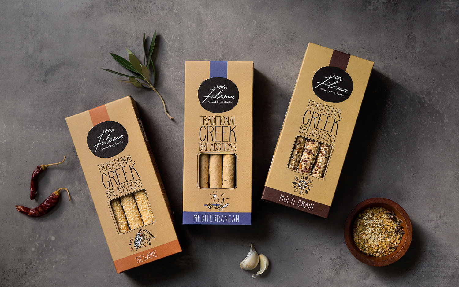
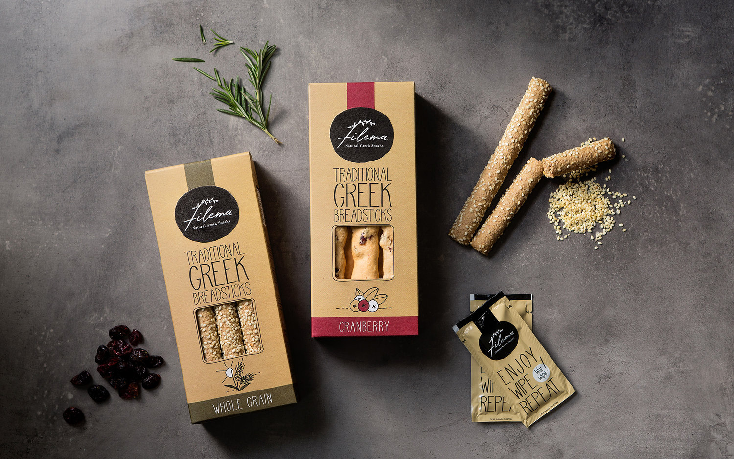
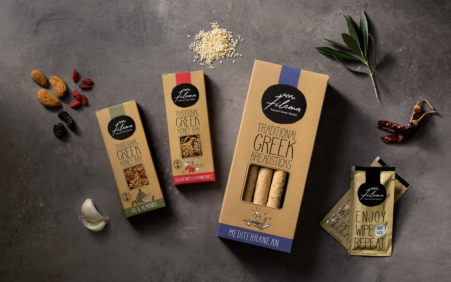
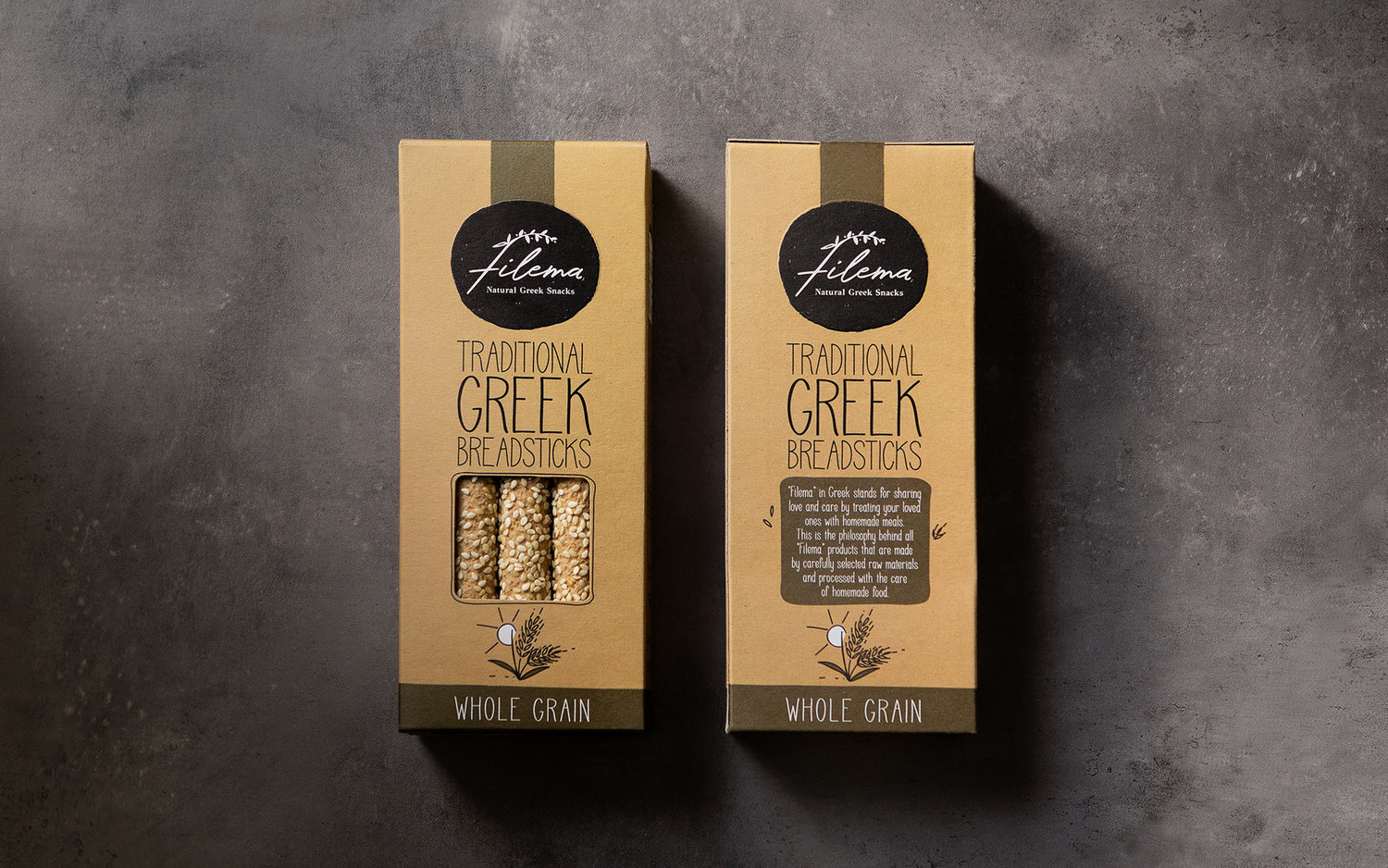
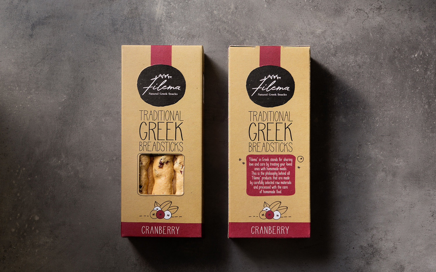
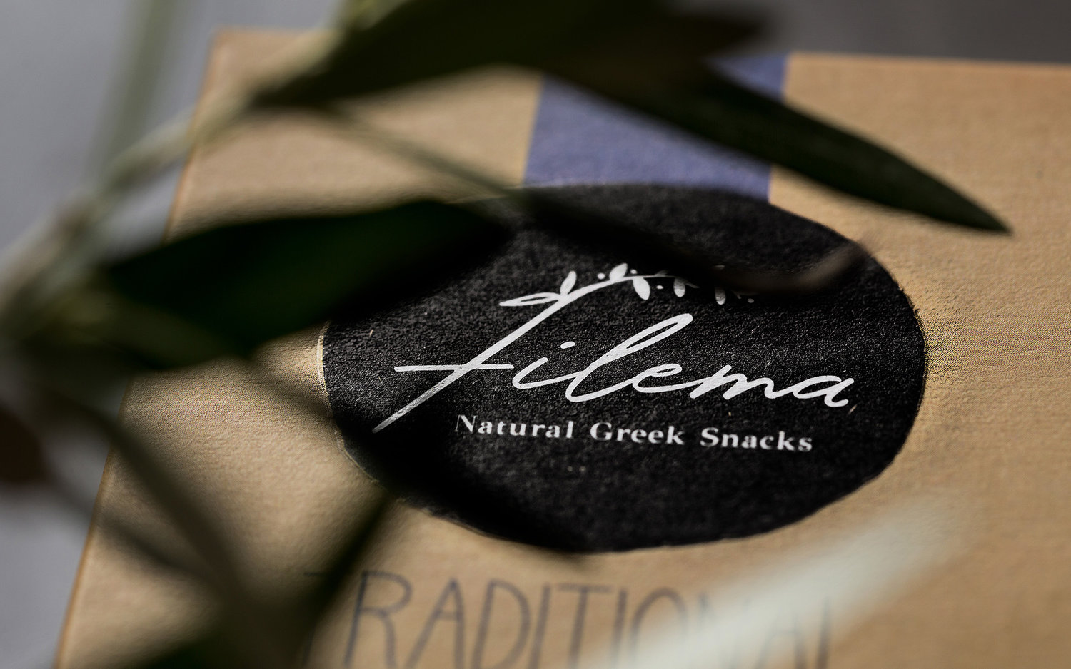
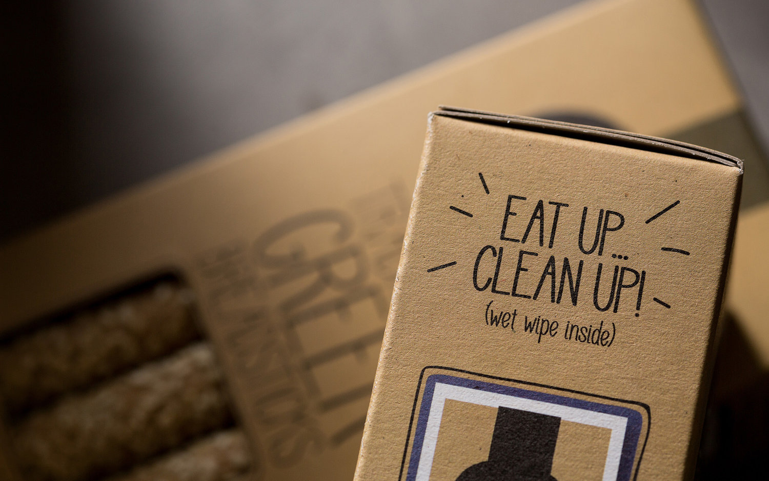
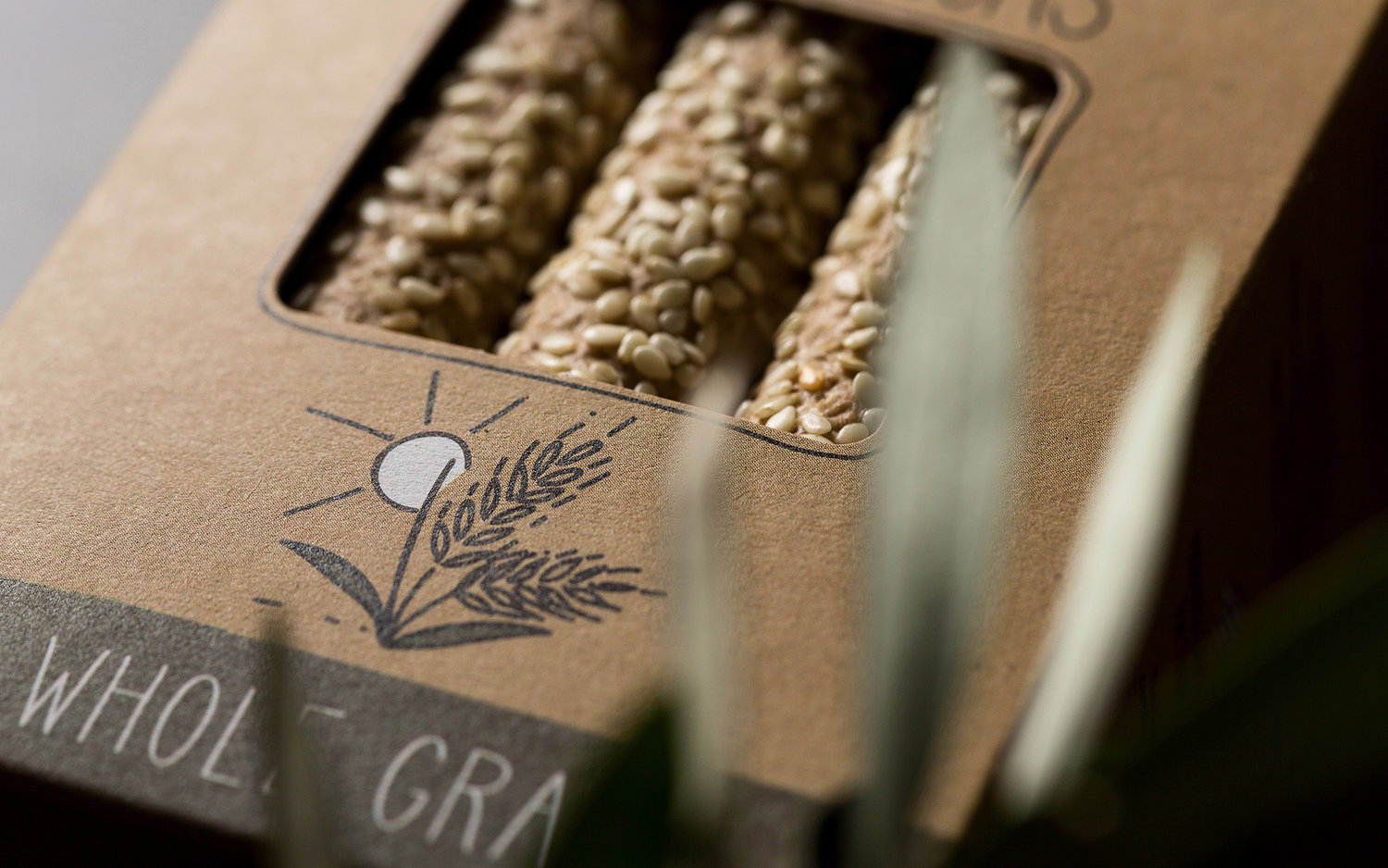
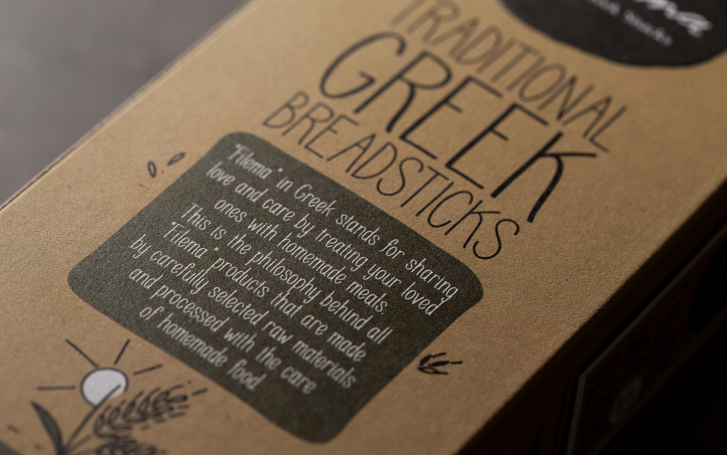
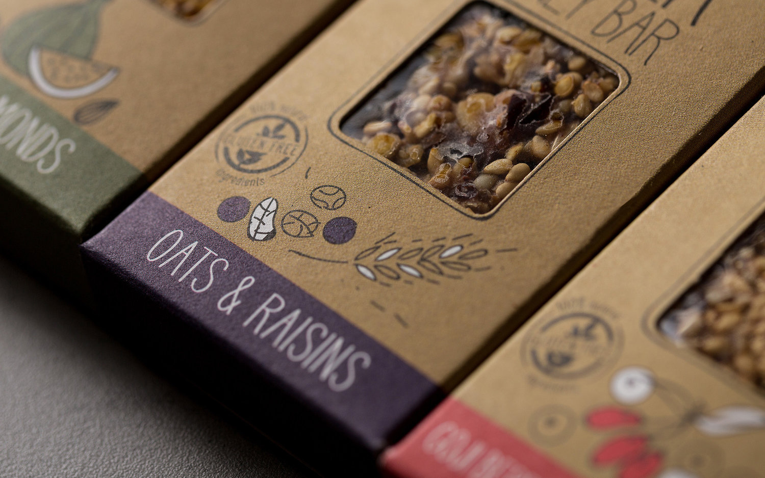
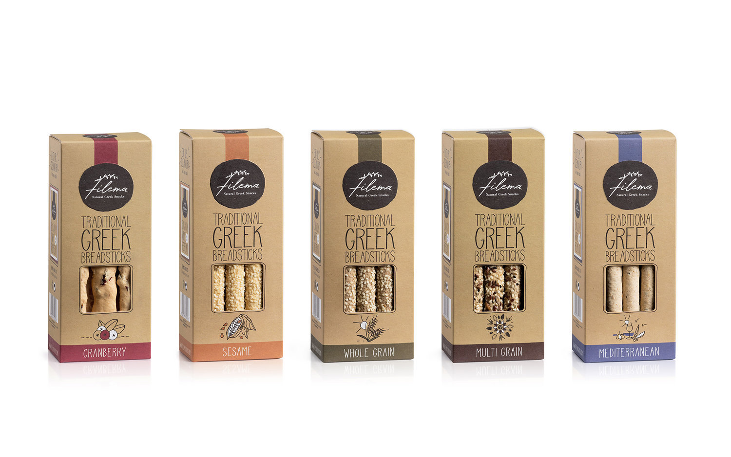
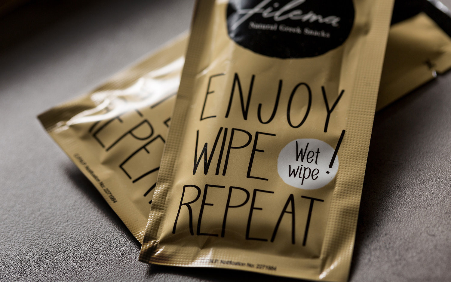
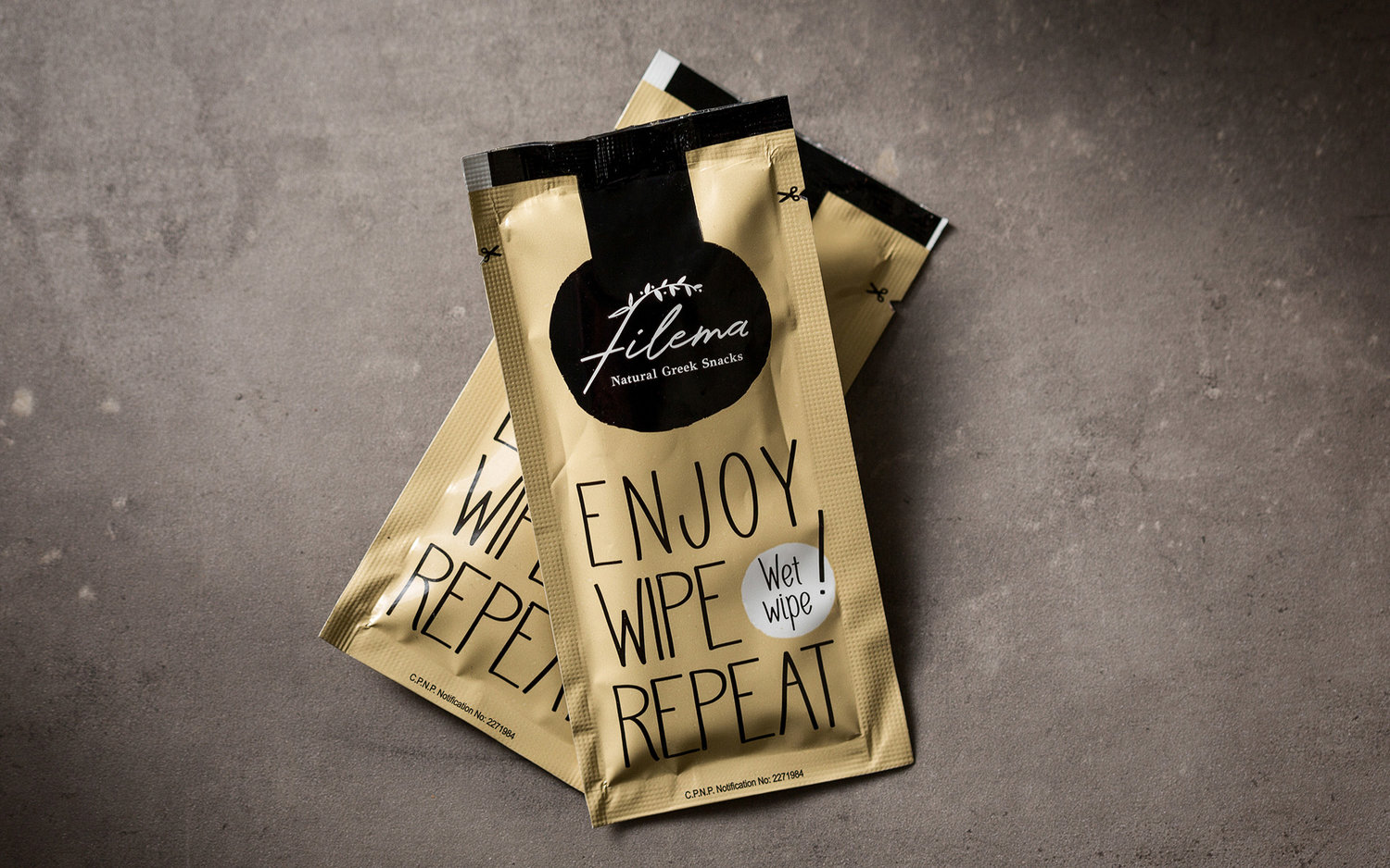
BRIEFThe global regime of snacks has been undergoing a transformation lately. Taking a turn for the healthier without relinquishing taste and pleasure, experimenting with surprising ingredients, combinations, shapes and formats the market is really booming. This evolving scenery presents unique opportunities as well as challenges. Greek producers start from an advantageous starting point, as they can take advantage of the rare gifts of the Greek land and the global recognition of the Mediterranean diet. Filema is a Greek snack company with a mission: they are poised to connecting people to real food offerings, healthy yet delicious and full of excitement. Their idea of doing business is shaped by being true to Nature and bringing the best that the Greek land has to offer, while topping their products with a welcome touch of innovation. In their initial lines, products are accompanied by a branded wet napkin.TARGET GROUPExport markets and consumers who are health-conscious and appreciative of the Mediterranean diet an Greek natural products – and are willing to pay a premium for that.CREATIVE CONCEPTAs we dealt with gifts of the Greek land, simplicity and purity were key priorities, alongside with promises of a great sensorial experience and thus desirability. This led us to draw inspiration from the land itself – the color of the soil and the grains. The basic directive of craft, earthly colors was thus set, accompanied with the need to glorify the key differentiating ingredient each time.DESIGN APPROACHThe key color of the brand and its packaging is an earthly, warm light brown regardless of SKU. The logo itself applies a minimalistic script that embodies elements of a grain plant stalk, encased on what could be perceived as a base for a traditional pie. The end-result is reminiscent of a craft small scale bakery, friendly, inviting and full of delicious surprises. Each product is slightly differentiated by embodying a color that derives from the extra ingredients, while the latter feature as stripped-down pictograms at the bottom. The enclosed wet wipe is accompanied by the text ‘enjoy, wipe, repeat’ further enhancing the idea that enjoyment is guaranteed.SERVICESLogo, brand identity, packaging


CREDIT
- Agency/Creative: Sophia Georgopoulou | Design
- Article Title: Filema Natural Greek Snacks
- Organisation/Entity: Freelance, Published Commercial Design
- Project Type: Packaging
- Agency/Creative Country: Greece
- Market Region: Multiple Regions
- Format: Box
- Substrate: Pulp Board, Pulp Carton


