Client:
Ferrarelle, a revered Italian brand with a heritage that traces its roots back to 1893, is a name synonymous with the production of mineral water and beverages. Nestled in the picturesque landscape of Riardo, Campania, Ferrarelle has earned international acclaim for its naturally effervescent mineral water, sourced exclusively from the legendary Ferrarelle spring. With over a century of excellence to its name, Ferrarelle has become an integral part of Italian culture, gracing the tables of households across the nation.
Assignment:
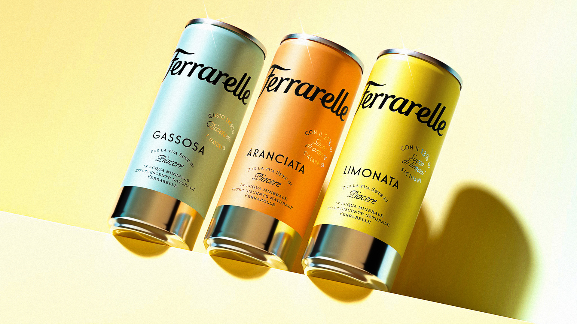
Our assignment was nothing short of a celebration of Ferrarelle’s legacy. We were entrusted with the design of the packaging for Ferrarelle’s latest line of beverages, a trio of tantalizing SKUs: lemonade, orangeade, and soda. The primary objective was to create packaging that not only captures the essence of these exceptional beverages but also pays homage to the high-quality ingredients that define them. These drinks are crafted with generous portions of fruit juice and the natural effervescence of mineral water sourced from the iconic Ferrarelle spring. A spring that has been a source of refreshment and purity for Italian families for well over a century. The physical embodiment of this project was a 250ml aluminum can.
Solution and Process:
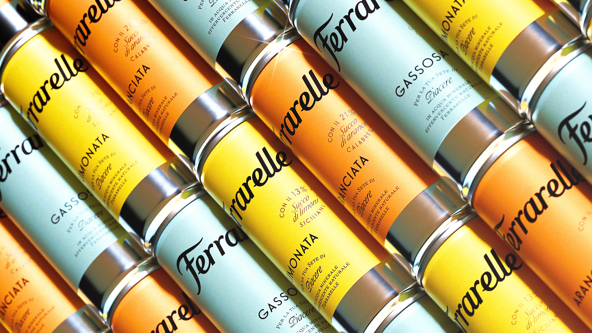
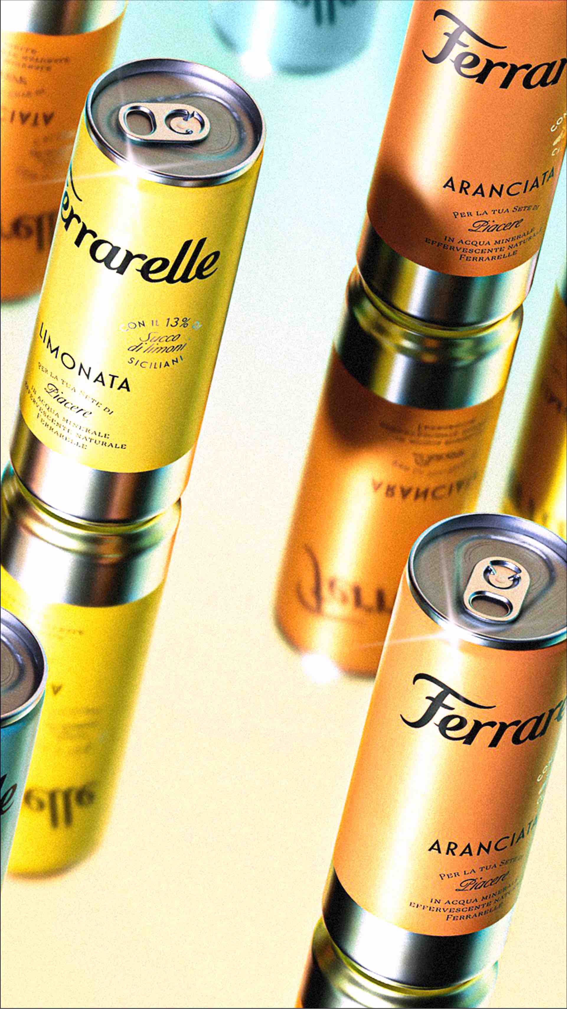
To encapsulate the essence of Ferrarelle, we embarked on a journey of typographic elegance and sophisticated design. Our typographic compositions are carefully structured to convey the premium quality, Italian heritage, and brand strength that Ferrarelle represents. Each SKU is artfully distinguished by a color palette chosen to resonate with the unique character of the product it contains. A segment of the can retains its original silver finish, which is mirrored in a discreet typographic seal—an exquisite touch that adds a premium finish to the packaging.
The outcome is a can that doesn’t just contain a beverage; it embodies a tradition of excellence. Its bold colors, oversized logo, and overall design exude a sense of luxury, inviting customers to savor not just a drink but a legacy that has spanned generations. This packaging is a visual and tactile representation of Ferrarelle’s enduring commitment to excellence and the pride of being an essential part of Italian culture and households.


CREDIT
- Agency/Creative: Auge Design
- Article Title: Ferrarelle Soft Drinks Packaging Design
- Organisation/Entity: Agency
- Project Type: Packaging
- Project Status: Published
- Agency/Creative Country: Italy
- Agency/Creative City: Firenze
- Market Region: Europe
- Project Deliverables: Packaging Design
- Format: Can
- Industry: Food/Beverage
- Keywords: WBDS Agency Design Awards 2023/24
- Keywords: Packaging Design, Product Creation ,
-
Credits:
Executive Creative Director: Davide Mosconi
Design Director: Giovanni Stillittano
Designer: Alessandro Rovatti


